10,000 search results
(0.036 seconds)
- Woonder by Khaiuns,
$15.00 Woonder Script Fonts, a handcrafted brush font! This bold, free-flowing, confident brush font is designed to be easily customized to your liking with 2 letter sets, also featuring swashes and some unique textures. Find a unique Woonder Script Font by adding a plus (+) to each letter and number and you'll have a cool letter. Woonder Script Fonts is a brush font which you can use and enjoy again and again, for anything from promotional material and handwritten quotes, to product packaging, merchandise and branding projects. Please message me if you want your language included or If there are any features or glyph requests, feel free to send me a message, I would like to update it. I hope you have a blast using Woonder Script Fonts!
 - Zoelander by Locomotype,
$15.00 Zoelander is an experimental geometric font. The distinctive feature of this font is having an irregular x-height. This will look unusual, but if you are looking for something unique and looks different, Zoelander can be an alternative to making an attractive typography. Zoelander comes in two versions, Zoelander Regular and Zoelander TF. Each has a bold and rounded style. Zoelander Regular is a sans serif font with irregular x-height but if you want the same x-height size, the stylistic alternates feature allows you to do it. While Zoelander TF is the development of a regular version where each letter is connected in a line at the baseline. Some of the other opentype features make it easier for you to explore more interesting typographic designs.
 - Route Du Soleil by Hanoded,
$15.00 Probably everyone living in Europe has heard of the (in)famous Route Du Soleil. The Route Du Soleil (Motorway Of The Sun) is a stretch of road from Paris to Lyon (in the south). It is THE route holiday makers take to reach southern France, so they can get there before everyone else does. The result: endless traffic jams, overheated engines and people and more toxic exhaust fumes than your average petroleum distillery. Route Du Soleil is also a very nice hand written font that comes with swashes and ligatures. If you happen to find yourself in a traffic jam on your way to southern France, then I hope you have downloaded this font. Just one look at it and you’ll forget your problems! ;-)
 - Geogrotesque Stencil by Emtype Foundry,
$69.00 Geogrotesque Stencil is a member of the popular Geogrotesque family, and despite being thought as a display typeface, it goes one step further and tries to solve some of the typical problems with stencils fonts. Geogrotesque Stencil comes with 3 widths of cut (A, B and C). These cuts not only allow a better performance when printing at different sizes, you can also move across versions A, B or C in accordance to the rigidity of the material used. The family consists of 42 styles, 7 weights with 3 versions each plus italics, all of them in Open Type format including ligatures, tabular figures, fractions, numerators, denominators, superiors and inferiors with support for Central and Eastern European languages. For more details see the PDF.
 - Macahe by Rômulo Gobira,
$10.00 Macahe is a modern slab serif with dynamic and irregular shapes. It comes with 7 weights, 3 widths and matching (true) italics. The typeface was inspired and name after the city I was born (Macaé-RJ, Brazil), turning the mixture between nature/beach life and the chaotic urban growth into typography. The options (weight, width and true italics) make the font useful both for web and print in multiple occasions; think websites, posters, logos, signage, packaging and etc. Macahe covers multiple languages, including a wide range of Latin and some Cyrillic languages. It also includes a full range of numerals (included old style figures, numerators, denominators), small caps, standard & discretionary ligatures and stylistic alternates. Those features and variations make Macahe a useful tool for any graphic designer.
 - Bunday Clean by Buntype,
$22.50 Bunday Clean is a minimalist and friendly font family with different moods. It drops everything unnecessary like spurs and ears and appears crisp and contemporary with a slightly squarish touch. Like the other members of the superfamily (Bunday™ Sans and Bunday™ Slab), Bunday Clean provides uprights, a second set of styles with characters that reference handwritten cursive. These curvy styles give words a distinct look and are especially attractive for use in display applications and logotype design. Bunday™ Clean is space-saving and creates a homogenous text color with good legibility. The font was manually hinted and contains extensive handcrafted kerning tables to ensure perfect appearance in all media. It ships with 9 standard, 9 upright, and the corresponding italic styles from a considerably thin hairline to a quite thick heavy. It supports at least 99 languages and provides OpenType® features for ligatures, alternative glyphs, localized forms, and much more. Feature Summary*: -4 Moods: Normal, Upright, Italic and Upright Italic -9 weights: Hair, Light, Thin, SemiLight, Regular, SemiBold, Bold, ExtraBold and Heavy -Supports at least 99 Languages incl. eastern european -Overall width: Narrow or Space-Saving -Advanced f- ligature set including fb -Discretionary s- and c- ligatures -Alternative Characters: a, e, f, g, l, t, y, A, E, F, L, and more -Capital German Eszett -Extra characters with Polish Kreska -Catalan Punt Volat -More than 570 characters per font * Some features may only be available in OpenType®-savvy applications Please, take a look at the other Bunday superfamily members: Bunday™ Sans Bunday™ Slab
 - AE Prosperity by Altered Ego,
$50.00 Well suited for headlines, packaging and display applications, AE Prosperity will be a robust and versatile addition to your script library. It’s purposefully designed to infer the visual connections of letters for a hand-lettered feel. Some characters will connect, and others will guide your eye to the next letter from, making it highly legible. In 1779, the schooner Prosperity sailed the high seas. Commissioned by a young continental congress, with 6 guns & at twenty tons, she sailed under a Letter of Marque for patriotism and profit. Look lively, because with contextual and alternate glyph sets (contextual glyphs, alternate lower case glyphs and an extended set of alternate capitals), this robust typeface is as inspiring as her namesake and adapts to whatever winds may blow. Prosperity is designed as a free-flowing script, for a spontaneous and historic aesthetic. Contextual glyphs include variations on tt (short and longbar), t longbar, ll, cc and other characters. Contextual features change ascender heights and descender styles. Alternate glyphs (set 1) include variations on b,d,f,g,h,l,o,p,r,s,t,y. Alternate capitals (set 2) include a complete set of alternate upper case letters. Most useful with Adobe® InDesign®, multiple variations of letter combinations can be achieved by selecting Contextual glyphs, and/or set 1 and set 2 from the Character Palette: OpenType: Stylistic Sets menu. Alternate glyphs and contextual characters will be available based on the OpenType support of your application. AE Prosperity™ is available exclusively in OpenType format.
 - Sangoma by Scholtz Fonts,
$19.00I named the font "Sangoma" after the traditional healers of the Southern African tribes. Sangomas often work by "throwing bones". The shapes of the bones have suggested the shapes of the characters in the Sangoma font. The font is useful for creating designs or producing text that has an African look. Typified by an African angularity the characters reflect the ethos of Africa. The Sangoma font contains the full range of upper and lower case characters, all punctuation and special characters as well as the accented characters used in the major European languages. - Remora Sans by G-Type,
$39.00 Remora is an extensive new humanist sans serif which comes in 2 style variations, the effervescent Remora Sans and its corporate business partner Remora Corp . Both styles include 5 individual width sets ranging from the condensed W1 to the extra-wide W5. Furthermore, with an impressive 7 weights (Thin to Ultra) and true matching italics in each pack Remora is an ultra versatile super family comprising 140 individual fonts, perfect for any typographic assignment or design brief. Remora was designed by G-Type founder Nick Cooke. Both the Sans and Corp families share the same proportions, with the exception of certain key characters that change the overall appearance. Remora Sans is an exuberant and characterful typeface while Remora Corp, as its name suggests, is a businesslike typeface more suited to corporate typography. Quite early on in the design process Nick decided to give Remora Corp equal billing instead of incorporating these glyphs as alternates or a stylistic set that may get overlooked. “I created two separate families after learning a valuable lesson with one of my earlier typefaces, Houschka”, says Nick. “Houschka contained distinctive rounded A’s W’s and w’s, with ‘straight’ styles as character alternates. Even though style sets and alternates are easy to activate they are rarely used, so after many requests for customised versions of the fonts with the straight characters as defaults it was decided to create the separate ‘Alt’ family. So I cut straight to the chase with the two Remora variants and created two complementary families.” Both sets contain many shared letterforms, but it is the alternate characters that significantly alter the appearance of each font. Remora has been carefully designed for optimum legibility at large and very small sizes. Although fairly monolinear in appearance, especially in the lighter weights, particular attention has been paid to optical correction like the overshoots of the curved characters. Open counters and painstaking attention to detail (e.g. weight contrast between horizontal and vertical strokes, junctions of shoulders and stems etc) all boost readability and make Remora a great choice across all media. Remora Sans and Corp are ‘humanist’ rather than ‘geometric’ in style, meaning they’re not strictly based on rectangles and circles, resulting in a warm and friendlier feel. The slightly ’super-elliptical’ rounded forms create generously attractive curves. Remora has very distinctive italics in that they are only inclined by 8 degrees, but are not just based on slanted uprights. The italic styles are very alluring when used for display at large sizes and the good news is they come bundled free with their respective uprights. Each family also contains many OpenType features including proportional and tabular numbers, small caps, discretionary ligatures, plus five stylistic sets for ultra versatile typography.
 - Remora Corp by G-Type,
$39.00 Remora is an extensive new humanist sans serif which comes in 2 style variations, the effervescent Remora Sans and its corporate business partner Remora Corp. Both styles include 5 individual width sets ranging from the condensed W1 to the extra-wide W5. Furthermore, with an impressive 7 weights (Thin to Ultra) and true matching italics in each pack Remora is an ultra versatile super family comprising 140 individual fonts, perfect for any typographic assignment or design brief. Remora was designed by G-Type founder Nick Cooke. Both the Sans and Corp families share the same proportions, with the exception of certain key characters that change the overall appearance. Remora Sans is an exuberant and characterful typeface while Remora Corp, as its name suggests, is a businesslike typeface more suited to corporate typography. Quite early on in the design process Nick decided to give Remora Corp equal billing instead of incorporating these glyphs as alternates or a stylistic set that may get overlooked. “I created two separate families after learning a valuable lesson with one of my earlier typefaces, Houschka”, says Nick. “Houschka contained distinctive rounded A’s W’s and w’s, with ‘straight’ styles as character alternates. Even though style sets and alternates are easy to activate they are rarely used, so after many requests for customised versions of the fonts with the straight characters as defaults it was decided to create the separate ‘Alt’ family. So I cut straight to the chase with the two Remora variants and created two complementary families.” Both sets contain many shared letterforms, but it is the alternate characters that significantly alter the appearance of each font. Remora has been carefully designed for optimum legibility at large and very small sizes. Although fairly monolinear in appearance, especially in the lighter weights, particular attention has been paid to optical correction like the overshoots of the curved characters. Open counters and painstaking attention to detail (e.g. weight contrast between horizontal and vertical strokes, junctions of shoulders and stems etc) all boost readability and make Remora a great choice across all media. Remora Sans and Corp are ‘humanist’ rather than ‘geometric’ in style, meaning they’re not strictly based on rectangles and circles, resulting in a warm and friendlier feel. The slightly ’super-elliptical’ rounded forms create generously attractive curves. Remora has very distinctive italics in that they are only inclined by 8 degrees, but are not just based on slanted uprights. The italic styles are very alluring when used for display at large sizes and the good news is they come bundled free with their respective uprights. Each family also contains many OpenType features including proportional and tabular numbers, small caps, discretionary ligatures, plus five stylistic sets for ultra versatile typography.
 - YT Steel Latin by Yangtype,
$9.00 The concept of this letter is a tall, well-dressed man with moderate muscles, decent appearance, and manners. We are always impatient. I miss someone who can give me some space. This letter gives you some leeway that you can rely on for a moment.
 - Arrevederci JNL by Jeff Levine,
$29.00 The 1954 sheet music for the song "Arrevederci Roma (Goodbye to Rome)" [from the MGM film "The Seven Hills of Rome"] was hand lettered in a medium-wide sans serif. This design is now available digitally as Arrevederci JNL in both regular and oblique versions.
 - Raimoo by Tama Putra,
$12.00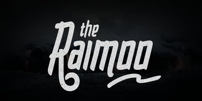 Raimoo is a handwritten typeface. It is suitable for any design needs, branding, cover title, t-shirts, posters and more. The Raimoo typeface includes multi-lingual and currency support, numerals, and punctuations. It comes comes with standard ligatures, stylistic alternates and 3 stylistic sets.
 - Aliefba Script by Sulthan Studio,
$14.00 Aliefba Script is a charming font with beautiful curves This font has 430 glyphs, includes alternative characters and also has language support, and all characters can be accessed via the Character Map, Font Book, or your preferred font management program. For help in either program,
 - ASTYPE Ornaments Accolades A by astype,
$28.00 The astype series Accolades A offers the designer a fine balanced set of calligraphic swashes, swirls and floral ornaments. The shapes are in systematic order and harmonize in contrast and detail. The shapes can be combined easily and the advanced designer can build hundreds of sophisticated compositions. No matter, whether packaging lables, invitations or greeting cards - every assignment with the need of a delightful appeal will be served well. Accolades A and A2 share the same base set of ornaments but differ in some of the major shapes. Despite these differences, the total width of the shapes will be always the same. If you are looking for some good companion fonts, give Gracia and Adana a try. Every classic high contrast stroke design like Didot or Bodoni works well. Note: To look perfect, adjust the size of the ornament font to fit in contrast the design of the companion font. So if you use a Bodoni font as companion, try to match the thickness of the thinnest part of a upper case Bodoni letter with the thinnest part of a shape from the ornament. Note 2: Each package comes with a technical documentation and an InDesign2 sample file.
 - Kereru by Daniel Reeve,
$20.00 Artist and calligrapher Daniel Reeve, well known for the lettering and maps in The Lord of the Rings films, is creating hand-crafted fonts of some of his writing styles - Kereru is the inaugural release, allowing users to emulate some of his much-admired calligraphy. Nominally a half-uncial style, clever arrangements of the stylistic sets allow Kereru to be set as full uncial or standard roman, as well as offering numerous alternates, ligatures, swashes and flourishes, ornaments, unlimited fractions, scientific inferiors and numeric superscript, all accessible via OpenType features. Cyrillic and Greek alphabets are included, in addition to the letters required for all the languages of Western, Central and Eastern Europe, Scandinavia and the Baltic. Kereru is very legible and easy on the eye, without sacrificing calligraphic flair. A pdf description of the Stylistic Sets and their usage is included with the font package, which comprises regular, bold and italic variations. Kereru Italic supercedes and improves upon its previous incarnation, Shire Regular. The name Kereru comes from New Zealand's Maori language - it is our native wood pigeon, a bird of generous and rounded form, like the font itself.
 - Fixture by Sudtipos,
$39.00 Fixture is our massive 72-font take on plentiful offerings of the late 19th century’s typefaces, posters and wood letterpress sundry done in the Grotesk genre. Four widths ranging from Ultra Compressed to Expanded each come in nine weights and accompanying italics. Some common sans-serif alternates, such as the a and g, are included in all the fonts. The idea with this design was to put together a workhorse font family with enough functional flexibility to work in multiple environments, from the subtlety of magazine layout or film credits to the visual drama of billboards or packaging. Aesthetically speaking, it is quite interesting — though in retrospect quite unintentional — that each different width and/or weight of this face ended up pulling a different dominant trait from the melting-pot origins of the entire family. It’s almost like a tribute album to some famous band’s covers of older songs. It may also be a good conversation piece on our tools shaping the very things for which they’re used. Can’t really get any more post-Grotesk than this. In the 21st century, this is the one genre to rule them all.
 - Typnic by Corradine Fonts,
$19.95 Everybody likes to have a picnic: some fresh fruits, cheese, ham, wine and so on. Like a “typographic picnic,” Typnic font system gathers many fonts with different flavors too, and you can enjoy them mixed or on their own. Typnic was drawn and calligraphed by hand and is made with eighteen typefaces, including three totally compatible yet different styles. It also has enhancement sets containing labels, dingbats, patterns and ornaments. The Headline style has six layered fonts that can be mixed in a wide variety of combinations to obtain powerful mastheads and headlines. It can be used to construct very nice advertising pieces. If you need to write informal texts, then use Typnic Script, which also comes in six variants and additionally has a complementary font with tails, double letters and ornamented ascenders. Finally, use Typnic Roman to add some secondary texts without losing the general appearance of your work. Typnic has a cool and natural feeling and could be used in all sorts of projects. Typnic is a very ambitious project and we will be working on it to further expand the whole system. Please check out our Typnic Headline Slab.
 - Primot by Plau,
$49.00 Primot is an upright script heavily influenced by italian gelaterias . After releasing 3 sans serifs , we were looking for an opportunity to design a display type with less constraints for legibility and expression. We started playing with brush lettering and looking into vintage scripts from different eras. Some cool things that made it into Primot were some unusual vertical connections and the sweet brush flairs in the letter endings. From that point on, we set out to create a beautiful looking vertical script – something we don’t see that often – in which each word set could would make a nice piece of graphic design (think logos, video game titles, shop windows etc.). We also made it smart by including hand-lettering inspired features such as initial and final forms for letters, contextual alternates and swashes. The result is a versatile 900+ glyphs display typeface, suitable for a wide range of applications. We hope you have as much fun with it as we had designing it! And while we’re here, you may like that it also pairs beautifully with our sturdy sans-serif family Motiva Sans .
 - EraMax 123 by Our House Graphics,
$15.00 EraMax 123 is a multi-layered display geometric sans serif, meant to be set BIG, for large, colourful statements. It's the perfect face for packaging, posters & branding, where a strong, colourful voice is needed... Did I mention posters? The "Max" in EraMax comes from the ultra bold weight, but also, and mainly as a tip of the hat to Peter Max, the designer and artist, known for creating so many images which have come to be emblematic of the sixties and seventies. The bold gradient effects in some of his posters were the inspiration behind the dotted and striped layers. This font's vintage flavour truly stand out in a retro setting, but also has a modern flavour that lends it the flexibility to work well in a more contemporary context. This is the second of what is to be an extended family of typefaces based on the original hand painted signage found in the T. H. & B Railway station in Hamilton Ontario, a classic Art Moderne building, designed by the New York architectural firm of Fellheimer and Wagner for the Toronto Hamilton and Buffalo Railway line and completed in 1933.
 - NorB ARCHITECT LINE by NorFonts,
$35.00 NorB Architect Line architectural fonts will add a beautiful architectural hand-lettering style to all your CAD project drawings. Architects have always wanted their CAD drawings to look more like they were drawn by hand, rather than by a CAD program. These AutoCAD fonts are the first step in bringing back that “artistic hand-drawn” feel to your CAD drawings or any graphic design project that can use true type fonts. They even can be used with any word processing program for text and display use, print and web projects, apps and ePub, comic books, graphic identities, branding, editorial, advertising, scrapbooking, cards and invitations and any casual lettering purpose… or even just for fun! NorB Architect Line is a retracing from scratch of my "NorB Architect" font coming in a sharp and round look, featuring small caps with some long stems of the following letters: b, d, f, h, k, l so resulting in more dynamic lettering font. It comes with 8 weights: Regular Italic Bold Bold Italic Round Round Italic Bold Round Bold Italic Round Note: The Italic versions are intentionally set to 20° rather to 12° for more dynamic lettering look.
 - Rishgular by ffeeaarr,
$10.00 rishgular is inspired by a regular weight, is a unique sans serif font with display character. rishgular is include with tech characters
 - NORTH 06 by Fonts of Chaos,
$7.00 A true north font of 152 characters, inspired by the black metal culture but more readable. UPPERCASE lowercase Numerals Punctuation 152 characters
 - Cross Stitch Delicate by Gerald Gallo,
$20.00 Cross Stitch Delicate is based on upper case characters 21 stitches tall and contains the characters A-Z and numbers 0-9.
 - Hambuger Script by DonyaDesign,
$17.00 Hambuger brush script font textured perfectly and based on the expression of the signature style that flows freely, friendly and organic. Hand painted with love. It includes ligatures and alternates characters in Open Type Features. Perfect for brand projects, logos, product packaging, posters, invitations, greeting cards, news, blogs, everything including personal charm. How to access all alternative characters, using Windows Character Map with Photoshop: https://www.youtube.com/watch?v=Go9vacoYmBw How to access all alternative characters using Adobe Illustrator: https://www.youtube.com/watch?v=XzwjMkbB-wQ Hambuger is encoded with Unicode PUA, allowing full access to all additional characters without designing special software. Mac users can use Font Book, and Windows users can use Character Map to view and copy one of the extra characters to paste into your favorite text editor / application. Thank you for your purchase!
 - Honey Bumbles by Rachel White Art,
$18.00 I am crazy about my font, Honey Bumbles! It has sweet curls, very round loops, and lots of fun alternates and ligatures to create amazing designs. It is super smooth. Every character is special, and has unique curves, swirls, and loops. Includes: - alternate glyphs for selected characters - initial lowercase alternates for shown characters - terminal lowercase alternates for shown characters - ligatures for selected double letter combinations - 4 options for ampersands
 - Bogen by Linecreative,
$16.00 Bogen - Bold italic font with sharp angles for dynamic effects. Use ligature characters to give you unlimited designs, this font is great for your work such as posters, logos, branding, covers, banners, t-shirts and headers, or even large-scale artwork Bogen , offers you: Bogen -italic bold font including Upper & Lowercase characters(ALL CAPS has a different form characte), Ligatures Character Supports Multi linguage (Latin Western Europe), Numbers and Punctuation
 - Rowling Stone Semi Bold - Unknown license

- Scentogram by PizzaDude.dk,
$20.00Scentogram is a deco font inspired by some 1950-60 ads. - Martin&Hellen by Supfonts,
$14.00 Martin&Hellen will be perfect for wedding lettering, beautiful frame for your home, book covers, greeting cards, logos, marketing, magazines or anything that requires cute handwritten lettering :) What's inside: Martin&Hellen.otf Multilingual support Cricut support Swashes If you have any questions, please contact me directly or in instagram @superdizigner
 - Mogaloa Script by Bosstypestudio,
$15.00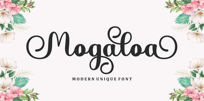 Mogaloa Script in a beautiful handwritten style. Equipped with 300 glyphs. Mogaloa Script is perfect for branding projects, home appliance design, product packaging, use in business cards, invitation cards, etc. Simply as a stylish text overlay onto a background image or anything that requires a touch of elegance.
 - Marbella Script by Bosstypestudio,
$14.00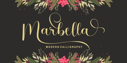 Marbella Script with a smooth handwriting style and very pretty and lovely. Marbella Script is perfect for branding projects, home appliance design, product packaging, use in business cards, invitation cards, etc. Just like a stylish text overlay to a wallpaper or anything that needs a touch of love.
 - Magic Charm by Supfonts,
$10.00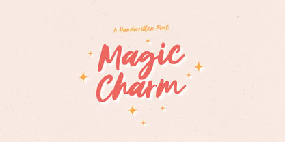 Magic Charm will be perfect for wedding lettering, beautiful frame for your home, book covers, greeting cards, logos, marketing, magazines or anything that requires cute handwritten lettering :) What's inside: - Magic Charm Script - Multilingual support - Cricut support If you have any questions, please contact me directly or in instagram @superdizigner
 - Daisy Flowers by Supfonts,
$12.00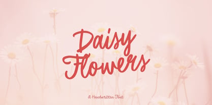 Daisy Flowers will be perfect for wedding lettering, beautiful frame for your home, book covers, greeting cards, logos, marketing, magazines or anything that requires cute handwritten lettering :) What's inside: Daisy Flowers font Multilingual support Cricut support If you have any questions, please contact me directly or in instagram @superdizigner
 - Bloodred by Supfonts,
$9.00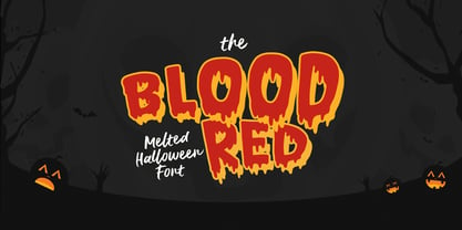 Bloodred Cyrillic will be perfect for halloween lettering, beautiful frame for your home, book covers, greeting cards, logos, marketing, magazines or anything that requires cute handwritten lettering :) What's inside: Bloodred Script Multilingual support Cricut support If you have any questions, please contact me directly or in instagram @superdizigner
 - Pumpkinly by Supfonts,
$14.00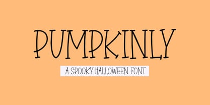 PUMPKINLY Cyrillic will be perfect for halloween lettering, beautiful frame for your home, book covers, greeting cards, logos, marketing, magazines or anything that requires cute handwritten lettering :) What's inside: PUMPKINLY Script Multilingual support Cricut support If you have any questions, please contact me directly or in instagram @superdizigner
 - Hallo Queen by Supfonts,
$10.00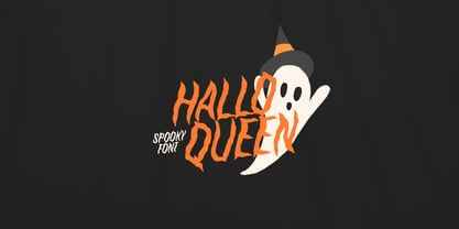 HalloQueen Cyrillic will be perfect for halloween lettering, beautiful frame for your home, book covers, greeting cards, logos, marketing, magazines or anything that requires cute handwritten lettering :) What's inside: HalloQueen Script Multilingual support Cricut support If you have any questions, please contact me directly or in instagram @superdizigner
 - Strawberry Monday by Supfonts,
$9.00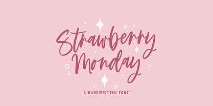 Strawberry Monday will be perfect for wedding lettering, beautiful frame for your home, book covers, greeting cards, logos, marketing, magazines or anything that requires cute handwritten lettering :) What's inside: Strawberry Monday Script Multilingual support Cricut support If you have any questions, please contact me directly or in instagram @superdizigner
 - Comment Below by Supfonts,
$9.00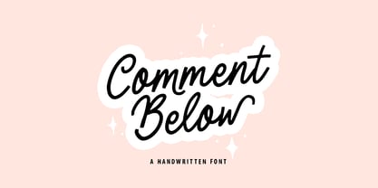 Comment Below will be perfect for wedding lettering, beautiful frame for your home, book covers, greeting cards, logos, marketing, magazines or anything that requires cute handwritten lettering :) What's inside: Comment Below Script Multilingual support Cricut support If you have any questions, please contact me directly or in instagram @superdizigner
 - Movie Set JNL by Jeff Levine,
$29.00 The hand lettered title on the poster for the 1929 film comedy “Why Leave Home?” inspired Movie Set JNL, which is available in both regular and oblique versions. A classic “thick-and-thin” design with early Art Deco influences, this condensed typeface is perfect for any period projects.
