6,036 search results
(0.02 seconds)
- Ovallique by Vanderfont,
$24.00 Ovallique shares roots with its looser cousin Beachbuoy. But don't mistake Ovallique's casual parentage for hand me down genes. Ovallique is the well-tailored relation, with limousine and driver at the ready. Dom Casual meets Dom Perignon for supper at the revolving restaurant. OK, so the wallpaper is slightly faded. Ovallique's x-height makes it legible even after apéritifs. It's kitschy slumming for the streamlined set!
 - 1648 Chancellerie by GLC,
$42.00 This font was inspired by the hand-written 1648 Munster peace treatise signed by French King Louis XIV and German emperor Ferdinand II. It is a Cancellaresca font style, meticulously written and almost legible. It contains Western (including Celtic) and Northern European, Icelandic, Baltic, Eastern, Central European and Turkish diacritics. The numerous alternates and ligatures made the font looking like a real various hand.
 - Candy Coloured Clown by Jeremy Woods,
$15.00 Candy coloured clown is a unique and quirky display font created to invoke feelings of fun and carelessness that one might experience while visiting a carnival or circus. The font has a comic strip or cartoon aesthetic with it's thick outline and bubbly appearance. Candy Coloured Clown features a broad range of highly legible characters in both uppercase and lowercase, making it a guaranteed eye catcher.
 - ITC Kristen by ITC,
$29.99ITC Kristen is the work of American designer George Ryan. He describes it as not your average text or display font." The inspiration for the design came from the handwritten menu at a neighborhood restaurant. With time, the forms moved away from the originals and towards something more like a child's scrawl. The result is singularly unique. ITC Kristen remains legible without losing any charm. - Folio by Linotype,
$29.99Folio was designed by Konrad F. Bauer and Walter Baum and appeared with the Bauer font foundry (Bauersche Gießerei) in 1957. The designers based their ideas on Helvetica but Folio did not turn out to pose the competition they had hoped. The font has the same applications as Helvetica and is an extremely legible font. Folio is particularly good for text and has an objective, neutral character. - Odisean SC - Personal use only

- Unovis by ParaType,
$30.00 PT Unovis™ was designed for ParaType in 2001 by Tagir Safayev. Inspired by the shapes of lettering of the Russian Avant Garde artists of Kazimir Malevich’s circle at the beginning of the 20th century. Based on simple geometric forms. Caps only. For use in advertising and display typography.
 - Printed Moments by PeachCreme,
$23.00 MODERN CASUAL SCRIPT FONT VOL.35 Printed Moments is a new stylish font with a modern flair. It includes a full set of uppercase and lowercase letters, multilingual symbols, numerals, punctuation, and 134 ligatures. The font has a smooth ball pen texture. It has beginning and ending lowercase ligatures.
 - New Moon by Melissa Lapadula,
$14.95This font has been derived from different transformations of the moon transcending into different moods which affect the world. A full moon can cause human beings to be aggressive. While a new moon is a good time for new beginnings. This font can function as headings and subheadings. - The Fashionist by Mas Anis Studio,
$16.00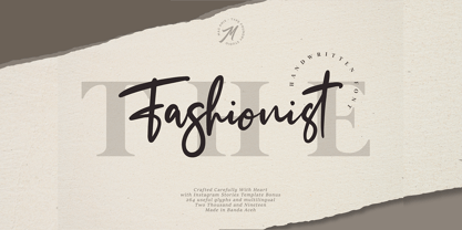 The Fashionist is a natural handwritten font, this font Is perfect for logo, invitation, stationery, wedding designs, social media posts, advertisements, product packaging, product designs, label, photography, watermark, special events or anything. Comes with full set of uppercase and lowercase letters, lowercase beginning & ending swashes , multilingual symbols, numerals, punctuation.
 - Rinat by Samtype,
$34.00 This hebrew typeface is inspired in prayer books from the beginning of the XX century. You can apply modern hebrew marks like Kamats Katan, Sheva Na, Dagesh Chazak and Cholam Chaser. It's a classic style with the most modern of a digital font technology and a easy lecture.
 - Training Film JNL by Jeff Levine,
$29.00 The title card “Airplane Hydraulic Brakes” in the beginning of a WWII armed services training film had the words "hydraulic brakes" hand lettered in an Art Deco slab serif style. This served as the model for Training Film JNL, which is available in both regular and oblique versions.
 - JAF Domus Titling by Just Another Foundry,
$42.00 JAF Domus Titling is a rounded typeface with classical Roman proportions. It is unique in that it was designed as an all-caps sans from the beginning. The fonts range from Extralight to Extrabold and include a large number of accented characters as well as small caps and alternates.
 - Blacksmith JNL by Jeff Levine,
$29.00What started as an image of a single vintage brass stencil of the letter 'P' spotted in an online auction has turned into Blacksmith JNL. From that single letter Jeff Levine has created a complete Western stencil font, retaining the hand-made look of the original stencil piece. - Valjean by Solotype,
$19.95Here is a wood type from Tubbs & Co., about 1900. Its lack of decoration reflects the changes that were rapidly occurring in the design of printed pieces at the beginning of the 1900s. There were several similar types in metal in the first decade of the 20th century. - Showpiece JNL by Jeff Levine,
$29.00 Showpiece JNL was redrawn from the hand lettering for the name and address of a music publisher found on some 1930s-era sheet music. The lettering style has features influenced a bit by both the end of the Art Nouveau period and the beginning of the Art Deco movement.
 - Horse Puckey JNL by Jeff Levine,
$29.00Horse Puckey JNL is a lighthearted and fun, Western-styled font based on Halavah Twist JNL by Jeff Levine. This font lends itself to the less-serious side of Cowboy life... rodeos, barbecue cookouts, barn dances, etc. Use it liberally wherever the Western look is needed for informal headlines. - Maple Memories by Attype Studio,
$14.00 Maple Memories is a delicate and incredibly handwritten font. Fall in love with its incredibly versatile style and use it to create spectacular designs! What's Included : - Beginning & Ending Swash - Multilingual Support (Afrikaans, Albanian, Catalan, Danish, Dutch, English, Estonian, Finnish, French, German, Icelandic, Italian, Norwegian, Portugese, Spanisch, Swedish, Zulu)
 - Gummed Letters JNL by Jeff Levine,
$29.00The idea for Gummed Letters JNL came from an online auction of some foil-embossed gummed letters from the 1940s and 1950s. One particular set was of a sans serif face that hadn't been produced in decades, and Jeff Levine felt it was worthy of a digital treatment. - Chamber Of Commerce JNL by Jeff Levine,
$29.00Chamber of Commerce JNL is loosely based on a type style used for some rubber stamp letters and numbers from a vintage child's printing set. Originally a cast shadow design, Jeff Levine felt the lettering merited a direct treatment in both regular and oblique styles without the shadow effect. - P22 Vienna by P22 Type Foundry,
$24.95 The Vienna Workshop (Wiener Werkstätte) produced a tremendous variety of art from the turn of the century until the beginning of World War II. This set, which includes three typefaces and a collection of graphic extras, draws on both the Art Nouveau and Expressionist traditions of the Workshop.
 - Hazel Shadow by Tanincreate,
$16.00 Hazel Shadow is a beautiful calligraphy font, perfect for elegant logos, wedding stationery, websites, titling, headlines, posters, branding and any other projects requiring a handwritten touch. A range of beginning and ending lowercase alternates are included so that you can give your creative design a custom, hand-calligraphy look.
 - Maritha by MJB Letters,
$17.00 Maritha is a classy handwritten script, it has beautiful beginning and ending swashes, this font is perfect for branding design, packaging, logo design, watermark, fashion design, wedding invites, and more. this font includes the full set of lowercase and uppercase letters, numeral, punctuation, multilanguage support, titling, and ending swashes.
 - Linotype Tetria by Linotype,
$29.99Tetria was designed by Martin Jagodzinski, who says that the font came from the need for a compact, constructivist typeface. Tetria combines the expression of simplicity of the 'norm' typefaces like DIN Mittelschrift with elements of Old Face typefaces which optimize legibility. It therefore contains old style figures and a larger stroke contrast, which makes the font legible even in smaller point sizes." Sources of inspiration for Tetria were the designs of Joost Schmidt and Herbert Bayer as well as the norm typefaces. The name comes from the Greek word for 'four', tetra. "Four is the number of many simple and useful objects, four wheels on a car, four corners of a book. Also, the basic forms of Tetria come from the simple geometric form of the square." The space-saving Tetria is well-suited to a variety of uses, from corporate typeface to text to display on posters, flyers or onscreen." - P22 Hedonic by IHOF,
$24.95This 12-font family employs several unique features including a 2-part Chisel set which allows for the look of stone incised lettering. Hedonic has just a hint of a slab serif and even that is used so sparingly that it almost feels like a sans serif font. Its design does appear to be painfully simple but there are many interesting features including a selection of weights, small caps with old style numerals and display weights that make it very useful. And legible. Old style numerals are included with the small caps and italics. Also for display purposes are two "Chisel" fonts. Used together, set one on top of the other, they create a stylish 3D effect—ideal for logos and headlines or anything that needs a strong graphic punch. Hedonic may not be as eccentric as many fonts out there, but overall it is clean and legible with a few extra flourishes to stand out from the crowd! - Aptifer Slab by Linotype,
$39.00 Aptifer Sans and Aptifer Slab are two 21st century typeface families created by Mårten Thavenius. Each family has seven weights, in roman and italic respectively, making 28 font styles in total. A heritage from two design traditions can be seen in Aptifer. One is the robust American gothic typefaces, like M. F. Benton’s, from around 1900. This is combined with the openness and legibility that comes from the humanist tradition. The sans serif part of the family, Aptifer Sans, is designed without excessive details disturbing the reading. Its sibling Aptifer Slab with its wedge slab serifs is more eye-catching but still suited for text settings. The italics fit well into the text flow of the roman. They are a bit narrower than the roman and have cursive characteristics. Both Aptifer Sans and Aptifer Slab are highly legible typefaces and can be used both in print and on screen. Featured in: Best Fonts for PowerPoints
 - 1589 Humane Bordeaux by GLC,
$38.00 This family was created inspired from the Garamond patern set of fonts used by S. Millanges "imprimeur ordinaire du Roy", in Bordeaux, circa 1580-1590. Especially for reprint L'instruction des curés (Instructions to parish priests), from Jean Gerson. The set contains two styles, Normal and Italic, the second one with a lot of caps and ligatures variants. The initials, except a few decorated letters (six in total) where only large caps, covering no more than three lines. Added are a few fleurons. It can be used as variously as web-site titles, posters and flyers design, publishing texts looking like ancient ones, or greeting cards, all various sorts of presentations, as a very elegant and legible font... This font supports strong enlargements as easily as small size (legible from 6 points when printed) remaining very smart and fine. Its original cap height is about five millimeters. Decorated letters like 1512 Initials, 1550 Arabesques, 1565 Venetian, can be used with this family without anachronism.
 - Lucida Sans Typewriter by Monotype,
$29.99Lucida Sans Typewriter adapts the humanized look of Lucida Sans to the fixed pitch of typewriter fonts, in which all letters have the same set width. The vertical proportions, strong stem weights, and crisp details of Lucida Sans are continued in the Lucida Sans Typewriter font family. The result is a strong, clear, fixed-pitch design that can be used wherever a functional, legible monospaced font is needed, in typewritten correspondence, memos, and telefaxes, in commercial forms, invoices, and packing lists, in programming and data processing applications, and in line printer emulations and terminal emulations. Lucida Sans Typewriter is economical in setting: at a 10 point size, it is equivalent to a 12 pitch typewriter font. For improved legibility in long lines of 80 characters or more, users can add extra line spacing, equivalent to 20% or more of the font size. When proportional fonts are needed for text to accompany Lucida Sans Typewriter, then Lucida Bright can be used. - Bio Sans Soft by Dharma Type,
$29.99 Bio Sans Soft is a super neutral sans-serif family for text designed by Ryoichi Tsunekawa and the whole family consists of 6 weights from ExtraLight to ExtraBold and their matching Italics. The basic concept of this family is the same as Bebas Neue which is the our most popular free font and used all over the world, that is to say, Neutral, Natural, Minimal, Harmless, Super-flat, Transparent and Legible. The basic skeleton of their letterform was designed geometrically and the sophisticated design gives them universality, neutrality and sense of unity for the use in all media, all purposes and their large x-heights makes this family legible and readable even on small size screen. Bio Sans supports almost all European languages: Western, Central, South Eastern Europeans and Afrikaans. And proportional figures, superior figures, inferior figures, denominators, numerators, fractions, ordinals and case-sensitive-forms can be accessed by using OpenType features.
 - Klint by Linotype,
$40.99 Type designer Hannes von Döhren created Klint. A sans serif typeface with a technical appearance and humanistic streak. The family includes five weights; each weight ships in three widths: condensed, regular, and extended. All of the 15 Klint variants have a companion Italic, rounding out family at 30 fonts. Klint's large x-height makes the design especially legible at small point sizes. In today's day and age, appliance manufacturers and/or companies in the mobile phone, computer hardware and software or Internet sectors are becoming ever more important. Klint fills the rising need for superfamilies with a technical feeling that are also legible in both text and display settings. Through conspicuous letters like R, K, k, or g, as well as the independent nature of its Italic, Klint exudes an ethos that separates it from the competition. Longer text passages in brochures, catalogs, or magazines would be well served by Klint's Light, Regular, and Medium weights. The heavier cuts are optimized for poster settings and headlines."
 - 1885 Germinal by GLC,
$38.00 This script font was inspired by a lot of manuscripts, notes and drafts, written by the famous french novelist Émile Zola (1840-1902). Specially, letters and notes from the period he was writting "Germinal" one of his very famous novel (published in 1884-1885) depicting the french minor's life in the past middle of eighteens. It is an elegant pen written type, sometimes connected, sometimes disrupted, but always regular and legible, with many variants, ligatures and contextual alternate glyphs specialy numerous in the OTF version. It is used as variously as web-site titles, posters and fliers design or greeting cards, all various sorts of presentations, menus, certificates, letters. This font, in spite of its small size, supports very strong enlargements as well as small sizes ( the original size was about 22 to 30 pts ). When printed, it remain perfectly legible and elegant from 12/14 pts even if using an ordinary inkjet printer.
 - Brave Brothers by Strong,
$20.00 Brave Brothers is a stylish modern font that's perfect for use in fashion-related design projects. Its elegant thin font makes it ideal for branding and logo design, while low legibility height makes it perfect for use in websites, advertising, and other types of communications. Brave Brothers Modern Font is perfect for adding a touch of luxury and elegance to your designs. This stylish font was created with care to be perfect for use in modern fashion logos, websites, and marketing materials. Brave Brothers is a stylish modern font that's perfect for use in fashion-related design projects. Its elegant thin font makes it ideal for branding and logo design, while low legibility height makes it perfect for use in websites, advertising, and other types of communications. Brave Brothers Modern Font is perfect for adding a touch of luxury and elegance to your designs. This stylish font was created with care to be perfect for use in modern fashion logos, websites, and marketing materials.
 - Panton by Fontfabric,
$47.00 NEW! Update 3.0 What’s New: • New Narrow version of 18 weights • Bulgarian Localization Support • Tabular Figures • Case-Sensitive Punctuation • Extended Glyph Case • Icon Sets PDF Specimen available: http://myfonts.us/suAc3K Panton has been expanded with Panton Narrow! It has 9 uprights and 9 matching italics ranging from Thin to Heavy. The Panton font family includes 54 fonts - 19 uprights with 19 matching italics and 16 icon sets as a bonus! It is characterized by excellent legibility in both web & print design areas, well-finished geometric designs, optimized kerning, excellent web-font performance and legibility etc. Inspired by the classic grotesque typefaces - Panton has his own unique style, expressed in perfectly softened geometric forms. The font family is most suitable for headlines of all sizes, as well as for text blocks that come in both maximum and minimum variations. Panton font styles are applicable for any type of graphic design in web, print, motion graphics etc and perfect for t-shirts and other items like posters and logos.
 - ITC Chino by ITC,
$40.99 ITC Chino is a type family (Display & Text) designed by Hannes von Döhren and Livius Dietzel. ITC Chino Pro brings legibility and distinction to text copy. It is also a friendly design that will invite readers into content at large or small sizes. It is a melding of soft brush stokes and crisp edges. This is readily apparent in the bolder italic weights where the straight stems provide a counterpoint to the cursive terminals. The Typefamily is highly legible in a wide range of sizes. The text side of the family contains five weights of roman, each with an italic companion. Ranging from Light to Black, ITC Chino Pro provides a rich typographic palette. The OpenType fonts have an extended character set to support Central and Eastern European as well as Western European languages. Each font includes small caps, fractions, old style-, lining-, tabular numbers, scientific superior/inferior figures and a set of arrows.
 - Mafins by Nathatype,
$29.00 Mafins is a combination font of thick display and serif fonts which is simply designed in formal, modern, elegant impressions like other serif fonts. The differences between the thick and thin lines on each character is dramatic and the letters' edges have small hooks for a legibility reason. Due to the great legibility, you can use this font for any text sizes. Make your every design perfect with Mafins font to create the best impressions on your designs. Features: Stylistic Sets Ligatures Multilingual Supports PUA Encoded Numerals and Punctuations Mafins fits for various design projects, such as posters, banners, logos, magazine covers, quotes, name cards, invitations, headings, printed products, merchandise, social media, etc. Find out more ways to use this font by taking a look at the font preview. Thanks for purchasing our fonts. Hopefully, you have a great experience using our font. Feel free to contact us if you require more information when you are dealing with a problem. Thank you. Happy designing.
 - Lucida Grande Mono by Monotype,
$50.99 Lucida Grande Mono is a humanist, sans-serif, monospaced font with a large x-height, clear letterforms, and space-saving economy. Its easy reading qualities make it legible for printing and screen displays even down to small sizes. Lucida Grande Mono matches the weight, vertical proportions and look of Lucida Grande but with fixed-width functionality that has made its design popular in a wide range of practical applications, including programming, terminal emulation, and typewriter styling for business or personal correspondence on-line or print. Lucida Grande Mono is part of the Lucida superfamily of fonts from Bigelow & Holmes. Lucida is highly regarded for legibility and its extensive range of type styles. The Lucida Grande Mono has four fonts: Regular, Italic, Bold and Bold Italic. Each font has 685 glyphs and supports the W1G character set. This includes Latin, Greek and Cyrillic alphabets to support many languages in Europe, the Americas, and worldwide.
 - YR Basma by Alrefaiy,
$20.00 YR Basma is a slab serif font that is renowned for its bold and distinctive appearance, which is designed to create a powerful impact. It is characterized by its strong and striking letterforms, with bold and thick strokes that give it an intense and impactful look. The font is also highly legible, with a focus on clear and easy-to-read letterforms that are meticulously crafted to balance visual weight and vertical alignment. YR Basma is ideal for a broad range of design projects that require a robust and striking visual presence, such as headlines, posters, packaging, and branding. It boasts a comprehensive set of glyphs, including both upper and lowercase letters, numerals, and symbols, making it highly versatile and adaptable to diverse design needs. YR Basma font offers a bold and commanding aesthetic, while maintaining excellent legibility and clarity of letterforms. Its powerful design makes it an excellent choice for various design projects where a strong and dominant visual presence is desired.
 - Coastly by Design A Lot,
$14.00 Meet Coastly, a handwritten font that makes you think about vacation, summer, holidays, friends and family. It’s a calm and relaxing font that works great headlines, posters, product design, quotes, branding, marketing materials and more. This font supports latin alphabet with its accents and glyphs. It also covers the most used punctuation marks and glyphs. Coastly is your friendly go to font. We made it thinking of the Amalfi Coast in Italy and its lemons, explaining its name and colour palette. Thinking of limoncello, lemonade from fresh squeezed lemons, granita, ice cream, beach and ferry trips. But we’ve also associated Coastly with your yearly holidays as: Christmas, Thanksgiving, Easter, New Years Eve, Mothers Day and so on. It’s a celebration of life and what its delights.
 - Deberny by Typorium,
$15.00 The Deberny typeface is an interpretation–carrying a contemporary imprint–of a typographic style which appeared and spread at the end of the 19th century until the begining of the 20th. These typefaces were named Italian, Venetian, Veronese and were classified in the Hellenic category, a spontaneous typographic movement caracterized by triangular and heavy serifs. They found their inspiration among numerous references, from incised to slab serif typefaces and their extreme expressions in wood type letterforms. The Deberny font family is made of 26 styles in 3 complementary sets of style, offering a wide palette of visual resonance: • Deberny Line is ideally suited for editorial, branding, posters and billboards. It has sharp contrast between thick and thin strokes. Heavy horizontal strokes are not frequent in roman letters, but here they fit naturally with the italic letters. • Deberny Open is a stylish outline declination of Deberny Line Medium and Medium Italic. • Deberny Text is an adaptation of Deberny Line made for broader use. Its shapes are less contrasted, which makes it perfectly legible for print or screen reading in small size text. Old style figures and small caps complete Deberny Text in all its 8 styles. The Deberny typeface family supports Latin-based languages and will be available soon in Cyrillic and Greek. Deberny Narrow will be released this year in all its 26 styles.
 - Rare Bird Specimen VI by Rare Bird Font Foundry,
$200.00 Specimen VI is a refined hand by artist Aileen Fretz of Plume Calligraphy: thoroughly modern yet absolutely timeless. We have our sights set on this one becoming an instant classic. OBSERVATIONS Specimen VI takes its inspiration from the old world, while remaining thoroughly contemporary. It is unique while maintaining legibility. DEFINING CHARACTERISTICS At 2,580 characters, we dare say it is one of the most robust script fonts on the market today. The font includes extensive Opentype programming that authentically replicates Aileen’s unique handwriting pattern. As you type, watch the letters automatically adjust between connected and disconnected forms. Specimen VI also features formal titles, prepositions, social media wordart, and web navigation wordart, serif and sans serif Roman numerals, in and out-stroked letterforms at beginning and end of words, multiple alternate lowercase t cross-strokes, realistic double-letter ligatures, seamlessly connecting calligraphic letters, multiple styles of alternate capital letters, including swashes, and basic Latin encoding. Specimen VI is a typesetters’ dream. POTENTIAL SIGHTINGS In the pages of your favorite wedding tome; the signage, robe embroidery, and dinner menus of that coveted boutique hotel on the Italian Riviera, the labels of an artisanal hand-poured candle line, your new favorite Rosé, hand-crafted Belgium chocolate truffles, the indie cosmetic line fit for royalty, in any instance that you may be in need of a refined modern script.
