10,000 search results
(0.028 seconds)
- Sveglia by Wacaksara co,
$15.00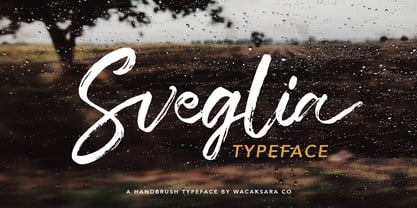 Sveglia is a hand brush casual script font inspired by urban fashion. This font is great for your next creative project such as Logotype, printed quotes, invitations, cards, product packaging, headers, Letterhead, Poster, Apparel Design, Label, and etc. Sveglia comes with uppercase, lowercase, numerals, punctuations and so many variations on each character include OpenType alternates, and common ligatures to let you customize your designs.
 - Inked Balterm by Adam Ladd,
$25.00 Inked Balterm is a hand-inked typeface with a humanist touch. It provides visual interest through the contrasting elements of the thin strokes mixed with the solid ball terminals. The placement of each ball terminal is varied and placed at the most defining point of interest and distinction in each letterform; creating an appealing visual rhythm. Great for display and works in smaller text settings.
 - Militia by Canada Type,
$24.95Militia is the face of well-orchestrated military coups, tanks and gun barrels, maps and covert plans, camouflage and war paint. It has no irony, patience, or give-and-take politic. It is strong, successful, swift and significantly in your face. Militia comes in all popular font formats, and offers a full range of Latin support, including Western, Eastern and Central European languages, as well as Baltic, Celtic/Welsh, Cyrillic, Esperanto, Greek, Maltese, Turkish, and Vietnamese. The Open Type font is entitled Militia Pro, and contains class-based kerning. - His Embrace by SSI.Scraps,
$27.00 The His Embrace is hand brush font with scratch bold natural textures. it is a rough texture script. your design will look brave, great and powerful. Fall in love with its incredibly versatile style and use it to create gorgeous and timeless designs with Dry Brush, an interesting and unique handwritten brush font. Fall in love with its incredibly stylish look and use it for logos, quotes, invitations, business cards, power point presentations, and more!
 - Bird Park by Epiclinez,
$18.00 Meet Bird Park, the newest handwritten font from our studio. It is perfect for DIY projects and invitations or giving a personal touch to your cards, prints, and other creative projects. With a carefully crafted hand-drawn style this font is both cute and fun! So what’s included : Basic Latin Uppercase and Lowercase Numbers, symbols, and punctuations Multilingual Support. PUA Encoded and fully accessible without additional design software Simple Installations Works on PC & Mac
 - Burdigala Sans by Asgeir Pedersen,
$19.99 Burdigala is a clean-cut, modern yet classic typeface inspired by Didones and Aicher’s Rotis family. Burdigala Sans is especially well suited for on-screen usage such as in apps and pdf documents. It is also ideal for larger amounts of (printed) texts in brochures, magazines and books. It is slighty narrow in order to conserve space, but spacious enough to faciliate reading and overall clarity. Check out its sibling, the Burdigala Semi Serif version. The expanded versions, being wider and more open, works equally well in media intended both for print and on-screen reading, e.g. in Pdf-documents etc. Burdigala is the ancient Roman name of the city of Bordeaux France.
 - Eight Cylinder by Vozzy,
$10.00 Introducing a vintage look label font named Eight Cylinder. All available characters you can see at the screenshot. This font have 8 styles - Regular, Full, Shadow, Shine, Shadow FX, Shine FX, Outline and Print. This font will good viewed on any retro design like poster, t-shirt, label, logo etc.
 - Apothecary Serif by Pixel Colours,
$26.00 Apothecary Serif is a font collection inspired in vintage and antique prints. Great for texts or headings and perfect as a pairing font. Design quotes, packaging, wedding invites or labels and branding with a vintage style. Lovingly designed to match my original Apothecary Script (sold separately) Includes: - Apothecary Serif: a serif font with an antique print press texture. - Apothecary Serif Spaced: beautifully spaced for texts or as a pairing font. - Apothecary Serif Caps: rich bold and tall textured capitals font that includes the lowercases as a secondary uppercase font, slightly smaller. Great for headings or as drop caps. - Apothecary Serif Caps Spaced: beautifully spaced for texts or as pairing font.
 - Zainer by Proportional Lime,
$9.99 Günther Zainer, (or Zeyner or Zeiner), was the first printer to operate in the city of Augsburg. He was active from 1468 to his death in 1478. In that single decade he was responsible for printing 80 works. Most of these editions were for the clergy but he also printed the first Calendar and large-scale illustrated book intended for the wider public. This font is based on one of his more interesting and peculiar fonts. And it has been enlarged to include over a 1,000 defined glyphs for modern use and also for historical purposes many glyphs recommended by the Medieval Unicode Font Initiative organization have also been included.
 - Mg Dalenaf by NJ Studio,
$19.00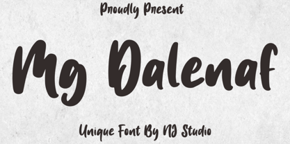 Hi...Thank for your visit :) Mg Dalenaf a unique font. It features unique characters that will take your projects to the next level! This font is PUA code which means you can easily access all the glyphs and swashes that are full of love! It also features many special features including glyphs. font designs that are made for various vector designs, printing such as digital wedding blogs, online shops, social media, while printing can be used in the field of product clothing, accessories, bags, pins, logos, business cards, watermarks and many others ... so it can make your product look cute and attractive, and also Multilingual support!!! Happy design ...
 - Chopsee by TypeUnion,
$35.00 Chopsee is a fun, fluid, versatile font family of 8 weights and matching italics designed by Dan Jones for TypeUnion. The font aims to encompass movement and fluidity with its accentuated curves and terminals. The raised x-height creates more synergy between the lowercase and uppercase characters thus enhancing the visual appearance. The family of 8 weights & italics means you have plenty of usage options whether digital, branding or print - Chopsee black is perfect for that new brand idea you have, while the lighter weights provide a subtle support to clean layouts whether it’s call out text on a website or in print applications such as posters or magazine layouts.
 - Linotype Finerliner by Linotype,
$29.99Linotype Finerliner is part of the Take Type Library, chosen from the contestants of Linotype’s International Digital Type Design Contest. The American artist Gary Munch, from whom we also have Linotype Ergo and Ergo Sketch, designed Linotype Finerliner as a handwriting font with calligraphic influences. The small, regularly formed lower case letters contrast nicely with the generous, sweeping capitals. The font is available in a light and medium weight and displays no stroke contrast. The lighter weight, micro, is best used for shorter texts in point sizes 18 or larger and the medium weight, macro, is mainly intended for headlines in larger point sizes. - Metro New One by JAB'M,
$15.00The main inspiration is from Art Nouveau which flourished in Europe at the end of the 19th and beginning of the 20th centuries. This design included furniture (Majorelle, Lalique) and architecture (Victor Horta, Henry Van de Velde, Gaudi, Alfons Mucha). But Hector Guimard remains the favorite for all aspects of its art and, of course, its typefaces used on the Parisian Metropolitan posters. In particular, the various kerning of the various letters he used to make the poster a whole design from singular designs, leading to numerous variations. As a designer, I first worked with the individual glyphs Hector Guimard designed and I discovered that they vary constantly from a poster to another, depending on the overall result he was looking for. Another difficulty in transferring his design to printing is that there was no lower case. I was excited to create the whole font from the original designs of Hector Guimard, incorporating its variations and "crazy kerning". After several attempts, it appeared to be impossible to include all variations and I slightly moved to my own new design as a complete font, upper and lower case, with kerning. I voluntarily limited the ascenders and descenders to the usual typography so that it can be used from 10 / 12 points. This version can be used to edit letters and books in the context of Art, specially Art Nouveau and Art Deco of course, posters of any kind. - SCR-N by URW Type Foundry,
$39.99 SCR fonts are screen optimized (also called 'pixel fonts'). Unlike standard fonts (and like the few well-hinted fonts like Verdana or Arial), they give a crisp look on screen at very small sizes, thus increasing legibility. The perfect applications for those fonts are web pages and software user interfaces (computer, cellular phones, console games and any other system that uses a screen interface). Unlike most pixel fonts, SCR fonts contain kerning information. Kerning is the adjustment of space between certain pairs of characters (like 'AV') to make text look more fluid, thus increasing legibility and appeal. To benefit from this feature, auto-kerning must be activated in the application. In Photoshop, kerning must be set to 'Metrics'. Although SCR fonts are optimized for screen, they can be used for print (in Illustrator or Indesign for example) for a decorative 'computer text' effect. In this case, there is no constraint: they can be used as any other font. For screen use (in Photoshop, Fireworks, Flash... ), they have to keep aligned with the screen pixel grid not to look blurred or distorted. To achieve this, here are the guidelines to follow: RESOLUTION If the application permits it (Photoshop, Fireworks), document resolution must be set to 72 pixels per inch. SIZE The font size must be set to 10 (or multiples of 10) points. POSITIONING & ALIGNMENT The reference points of text fields and text blocks (upper left corner for left aligned text, upper right for right aligned text) must be positioned at integer values of pixels. In Photoshop, text can be precisely moved with [Edit Free Transform]. In Flash, movie clips containing text fields must also be positioned at integer values on the stage. Text must be aligned to the left or right only. Center alignment can be simulated with left alignment by adding spaces at the begin of each line. To dispense with the positioning and alignment constraints, text anti-aliasing can be turned off if the application permits it (Photoshop, Flash MX 2004). OTHER SETTINGS Leading (line spacing), tracking (letter spacing), manual kerning and baseline shift must be set either to integer values of points or to multiples of 100 units (depending on the application). Vertical and horizontal scaling must be set to 100%. Faux bold or Faux italic must not be used. The document must neither be resized on export, nor allow resizing (Flash Movies).
 - SCR-I by URW Type Foundry,
$39.99 SCR fonts are screen optimized (also called 'pixel fonts'). Unlike standard fonts (and like the few well-hinted fonts like Verdana or Arial), they give a crisp look on screen at very small sizes, thus increasing legibility. The perfect applications for those fonts are web pages and software user interfaces (computer, cellular phones, console games and any other system that uses a screen interface). Unlike most pixel fonts, SCR fonts contain kerning information. Kerning is the adjustment of space between certain pairs of characters (like 'AV') to make text look more fluid, thus increasing legibility and appeal. To benefit from this feature, auto-kerning must be activated in the application. In Photoshop, kerning must be set to 'Metrics'. Although SCR fonts are optimized for screen, they can be used for print (in Illustrator or Indesign for example) for a decorative 'computer text' effect. In this case, there is no constraint: they can be used as any other font. For screen use (in Photoshop, Fireworks, Flash... ), they have to keep aligned with the screen pixel grid not to look blurred or distorted. To achieve this, here are the guidelines to follow: RESOLUTION If the application permits it (Photoshop, Fireworks), document resolution must be set to 72 pixels per inch. SIZE The font size must be set to 10 (or multiples of 10) points. POSITIONING & ALIGNMENT The reference points of text fields and text blocks (upper left corner for left aligned text, upper right for right aligned text) must be positioned at integer values of pixels. In Photoshop, text can be precisely moved with [Edit Free Transform]. In Flash, movie clips containing text fields must also be positioned at integer values on the stage. Text must be aligned to the left or right only. Center alignment can be simulated with left alignment by adding spaces at the begin of each line. To dispense with the positioning and alignment constraints, text anti-aliasing can be turned off if the application permits it (Photoshop, Flash MX 2004). OTHER SETTINGS Leading (line spacing), tracking (letter spacing), manual kerning and baseline shift must be set either to integer values of points or to multiples of 100 units (depending on the application). Vertical and horizontal scaling must be set to 100%. Faux bold or Faux italic must not be used. The document must neither be resized on export, nor allow resizing (Flash Movies).
 - Sunmood by Seemly Fonts,
$12.00 A distinctive display font is called Sunmood. This font looks great on stationary, logos, t-shirts, papers, print designs, website headers, picture frames, flyers, album covers, posters, and image sliders, among other things.
 - Leader Santa by Seemly Fonts,
$12.00 Leader Santa is a brand new display font. Leader Santa is perfectly suited for stationery, t-shirt, paper, print design, website header, photo frame, flyer, music cover, poster, image slider, and much more.
 - Darkening by Seemly Fonts,
$12.00 Darkening is a brush display font. This font works well for many different things, including stationary, logos, t-shirts, papers, print designs, website headers, picture frames, flyers, album covers, posters, and image sliders.
 - Chevin Eco by G-Type,
$39.00 Chevin Eco is a whimsical display variation on the original Chevin typeface with knocked-out circular holes producing a glitzy neon effect that saves toner when printed. Simultaneously glamorous, green and good fun.
 - Lovesome by Seemly Fonts,
$14.00 Lovesome is a brand-new, brushed display font. Lovesome is perfectly suited for stationery, logos, t-shirts, paper, print designs, website headers, photo frames, flyers, music covers, posters, image sliders, and much more.
 - Conscious Valentine by Seemly Fonts,
$14.00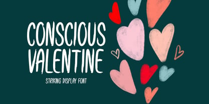 Conscious Valentine is a brushed display font. Conscious Valentine is perfectly suited for stationery, logos, t-shirt, paper, print designs, website headers, photo frames, flyers, music covers, posters, image sliders, and much more.
 - Keep Me by Seemly Fonts,
$12.00 Keep Me is a brand new display font. Keep Me is perfectly suited for stationery, t-shirt, paper, print design, website header, photo frame, flyer, music cover, poster, image slider, and much more.
 - Calling Cards by Ana's Fonts,
$12.00 Calling Cards is simple and clear, slightly condensed sans serif font family in 3 styles: Regular, Italic and Bold. Each font includes ligatures and stylistic alternates. Calling Cards looks great in quotes, logos, print, and social media, and is perfect for both short and long texts, at small and large font sizes.
 - Coranto 2 by TypeTogether,
$49.00 Now available as Opentype font with extended character set, Coranto 2. It is originally based on Unger’s typeface Paradox, and arose from a desire to transfer the elegance and refinement of that type to newsprint. Coranto 2 has a larger x-height and in many places has been made more robust. Over the past 25 years newspaper production has seen spectacular improvements in paper and print quality, the introduction of colour printing, and vastly better register. Newspaper production still demands a lot of letter forms, but advanced printing brings out details better and makes typography more appealing to readers. For text type the newspaper is no longer an environment in which survival is the chief assignment. Today, newspapers are not merely a matter of cheap grey paper, thin ink and super-fast rotary printing, and type design no longer has to focus on surviving the mechanical technology and providing elementary legibility. Now there is also room to create an ambience, to give a paper a clearer identity of its own; there is scope for precision and refinement. One consequence of this is that newspaper designers can now look beyond the traditional group of newsfaces. Conversely, a newsface can be used outside the newspaper — not an uncommon occurrence. The update to this beautiful font family, Coranto 2, includes the addition of over 250 glyphs featuring full Latin A language support, new ligatures, 4 sets of numerals, arbitrary fractions and superiors/inferiors. Furthermore, kerning was added and fine tuned for better performance.
 - The Begundals by HansCo,
$12.00 The Begundals is a modern brush script font in hand lettering style. This font looks cool in any design and is very recommended for craft, posters, books, branding, quotes, print templates, packaging, invitations or anything else that needs a unique and fun touch. The Begundals comes in uppercase and lowercase, with punctuation, symbols, numerals, stylistic alternate sets, ligatures, and also has multi-lingual support. You can access all alternates from your OpenType panel in your design software. Tutorial how to Install & use Alternate / Special Character : https://hanscostudio.com/tutorial/ Enjoy!
 - Honey Dolista by Mega Type,
$19.00 Honey Dolista is an elegant serif look with lots of ligatures and alternative bindings that will make your presentation or logo stand out! Bring your brand to life and add a touch of elegance and style with the Honey Dolista font. customize it for your titles, logos, business cards, printed quotes, all kinds of invitations, cards, packaging and your website or social media branding. Features Include: -Uppercase & Lowercase -Swash, Ligature -Alternates Binders -Numbers & Symbols -Multi language Please contact us if you have any questions, we are happy to help you! Enjoy!
 - LiebeChristmas by LiebeFonts,
$19.90 LiebeChristmas is a hand-crafted collection of Santas, Rudolphs, gifts, treats and more Christmas items in countless variations and sizes. Create pretty Christmas greetings with a personal touch. Surprise your family and friends by printing individual cards for everyone. Decorate your blog or website for the holiday season. More than 100 carefully crafted drawings are included in this single font and can be used in any text or graphics application. How about creating your own wrapping paper with LiebeChristmas patterns? Or how about making Christmas cards in combination with our popular typeface LiebeErika?
 - Fuuld by That That Creative,
$20.00 Fuuld is a brutalist condensed modern display font that mixes organic and geometric, hand made, and digital production. it has a contemporary look perfect for logos, posters, branding, magazines, and avant garde social media accounts be it instagram, TikTok, or whatever. The cool thing about this font besides how cool it looks is that it uses less ink than a regular font in its weight. this makes it perfect for any environmentally conscious print projects. Try the font with no fill and a stroke for a whole new style.
 - Hugnesh by Ditatype,
$29.00 Introducing Hugnesh Font. Hugnesh font is a monoline display font. Create from our talented font designer. The design of typeface will make your design more beautiful and inspiring. This font will suitable for any project, like branding, print template, logo and etc. Includes : Hugnesh (OTF) Features : Multilingual Support Beautiful Ligature PUA encoded Stylistics Set Numerals and Punctuation (OpenType Standard) Full Support Thanks for visiting and purchasing my font!
 - Lockdown Christmas by Kaer,
$19.00 Are you ready for Christmas and New Year 2022? Have you prepared gifts for your loved ones and colleagues? Are all the cards, T-shirts, and souvenirs printed? Lockdown Christmas is a knitted fonts family in regular and icons styles. All letters are inspired by sweater designs made of bold round knits. Just take a try! Please feel free to request to add characters you need: kaer.pro@gmail.com *Best wishes, Roman!*
 - Giane Sans by XdCreative,
$25.00 Description Giane sans. is contemporary and stylish sans serif with large x-height, low/minimal stroke contrast and large chunky sans with closed apertures. Giane san is matching pair with Giane Serif (https://www.myfonts.com/fonts/xdcreative/giane/) Giane sans Perfectly suited for graphic design and any display use ( for the logos, t-shirts, the web as well as for print, and also great for headings), Thank You _xd
 - Vegas x by XdCreative,
$25.00 Vegas-X is a futuristic squared display font. This font is inspired by films, books, science and space technology, composed of a squared shape with smooth curves that gives a modern and futuristic impression. Vegas-X It is perfect for display, logo, icon and it will look stunning on any poster flyer or print. Use this font for your designs and explore its endless possibilities. Thank you _xd
 - Chumba Wamba by Putracetol,
$24.00 Chumba Wamba - Display Rough Font is a captivating display typeface characterized by its intentionally messy and rough outlines, featuring textured details within each letterform. This font possesses a subtle classic flair, yet its thick and disheveled appearance imparts a touch of playfulness. Perfectly suited for logo design, posters, headlines, titles, printing designs, stickers, greeting cards, and business branding, Chumba Wamba adds a unique and eye-catching dimension to your creative projects.
 - Overgreed by Invasi Studio,
$17.00 Overgreed is a modern blackletter font with a touch rounded style. With an elegant modern style, it adds a bold touch to your projects and will inspire you to create something unique and modern. Besides that, this font is also equipped with alternative characters and multi-language support. Overgreed Font is ideal for headings, flyers, greeting cards, product packaging, book covers, printed quotes, logotype, apparel design, and album covers.
 - Natalya by insigne,
$24.99 Natalya is a flashy and rhythmic script. The script has more space between characters than most for better legibility, and the basis point for the ornate swirls is the golden ratio. This makes for an especially harmonious typeface with timeless appeal. The typeface includes three alternates with variations of the ascenders and descenders. All three fonts include OpenType ligatures, oldstyle figures and ending swashes for an even more elaborate appearance.
 - Stem by ParaType,
$40.00 The thing is that many sans-serif typefaces are usually intended for universal usage. But sometimes faces that work fine in body text look not so good in large point sizes for display purposes when all the contrast in non-contrast sans-serif, or ink traps, become visible to the naked eye. Every designer solves this problem in his own way. We offer a drastic solution in our Stem: a sans-serif with optical sizing. The first part of the type family, Stem Display, is for use in largest point sizes, from 36 pt indefinitely. Stem Display consists of 12 faces of widths from Hairline to Bold, and it has true italics. The development of Stem type family will include Stem Text for body text and “traditional”, universal use, and Stem Caption for small point sizes. Stem is a geometric sans-serif with semi-closed aperture, large x-height and modern proportions of uppercase letters, like in famous Avenir and Gotham. Its important feature is a professionally designed and carefully tested Cyrillic glyph set.
 - Times New Roman PS Cyrillic by Monotype,
$67.99In 1931, The Times of London commissioned a new text type design from Stanley Morison and the Monotype Corporation, after Morison had written an article criticizing The Times for being badly printed and typographically behind the times. The new design was supervised by Stanley Morison and drawn by Victor Lardent, an artist from the advertising department of The Times. Morison used an older typeface, Plantin, as the basis for his design, but made revisions for legibility and economy of space (always important concerns for newspapers). As the old type used by the newspaper had been called Times Old Roman," Morison's revision became "Times New Roman." The Times of London debuted the new typeface in October 1932, and after one year the design was released for commercial sale. The Linotype version, called simply "Times," was optimized for line-casting technology, though the differences in the basic design are subtle. The typeface was very successful for the Times of London, which used a higher grade of newsprint than most newspapers. The better, whiter paper enhanced the new typeface's high degree of contrast and sharp serifs, and created a sparkling, modern look. In 1972, Walter Tracy designed Times Europa for The Times of London. This was a sturdier version, and it was needed to hold up to the newest demands of newspaper printing: faster presses and cheaper paper. In the United States, the Times font family has enjoyed popularity as a magazine and book type since the 1940s. Times continues to be very popular around the world because of its versatility and readability. And because it is a standard font on most computers and digital printers, it has become universally familiar as the office workhorse. Times?, Times? Europa, and Times New Roman? are sure bets for proposals, annual reports, office correspondence, magazines, and newspapers. Linotype offers many versions of this font: Times? is the universal version of Times, used formerly as the matrices for the Linotype hot metal line-casting machines. The basic four weights of roman, italic, bold and bold italic are standard fonts on most printers. There are also small caps, Old style Figures, phonetic characters, and Central European characters. Times? Ten is the version specially designed for smaller text (12 point and below); its characters are wider and the hairlines are a little stronger. Times Ten has many weights for Latin typography, as well as several weights for Central European, Cyrillic, and Greek typesetting. Times? Eighteen is the headline version, ideal for point sizes of 18 and larger. The characters are subtly condensed and the hairlines are finer." - Times New Roman Seven by Monotype,
$67.99In 1931, The Times of London commissioned a new text type design from Stanley Morison and the Monotype Corporation, after Morison had written an article criticizing The Times for being badly printed and typographically behind the times. The new design was supervised by Stanley Morison and drawn by Victor Lardent, an artist from the advertising department of The Times. Morison used an older typeface, Plantin, as the basis for his design, but made revisions for legibility and economy of space (always important concerns for newspapers). As the old type used by the newspaper had been called Times Old Roman," Morison's revision became "Times New Roman." The Times of London debuted the new typeface in October 1932, and after one year the design was released for commercial sale. The Linotype version, called simply "Times," was optimized for line-casting technology, though the differences in the basic design are subtle. The typeface was very successful for the Times of London, which used a higher grade of newsprint than most newspapers. The better, whiter paper enhanced the new typeface's high degree of contrast and sharp serifs, and created a sparkling, modern look. In 1972, Walter Tracy designed Times Europa for The Times of London. This was a sturdier version, and it was needed to hold up to the newest demands of newspaper printing: faster presses and cheaper paper. In the United States, the Times font family has enjoyed popularity as a magazine and book type since the 1940s. Times continues to be very popular around the world because of its versatility and readability. And because it is a standard font on most computers and digital printers, it has become universally familiar as the office workhorse. Times?, Times? Europa, and Times New Roman? are sure bets for proposals, annual reports, office correspondence, magazines, and newspapers. Linotype offers many versions of this font: Times? is the universal version of Times, used formerly as the matrices for the Linotype hot metal line-casting machines. The basic four weights of roman, italic, bold and bold italic are standard fonts on most printers. There are also small caps, Old style Figures, phonetic characters, and Central European characters. Times? Ten is the version specially designed for smaller text (12 point and below); its characters are wider and the hairlines are a little stronger. Times Ten has many weights for Latin typography, as well as several weights for Central European, Cyrillic, and Greek typesetting. Times? Eighteen is the headline version, ideal for point sizes of 18 and larger. The characters are subtly condensed and the hairlines are finer." - Times New Roman WGL by Monotype,
$67.99 In 1931, The Times of London commissioned a new text type design from Stanley Morison and the Monotype Corporation, after Morison had written an article criticizing The Times for being badly printed and typographically behind the times. The new design was supervised by Stanley Morison and drawn by Victor Lardent, an artist from the advertising department of The Times. Morison used an older typeface, Plantin, as the basis for his design, but made revisions for legibility and economy of space (always important concerns for newspapers). As the old type used by the newspaper had been called Times Old Roman," Morison's revision became "Times New Roman." The Times of London debuted the new typeface in October 1932, and after one year the design was released for commercial sale. The Linotype version, called simply "Times," was optimized for line-casting technology, though the differences in the basic design are subtle. The typeface was very successful for the Times of London, which used a higher grade of newsprint than most newspapers. The better, whiter paper enhanced the new typeface's high degree of contrast and sharp serifs, and created a sparkling, modern look. In 1972, Walter Tracy designed Times Europa for The Times of London. This was a sturdier version, and it was needed to hold up to the newest demands of newspaper printing: faster presses and cheaper paper. In the United States, the Times font family has enjoyed popularity as a magazine and book type since the 1940s. Times continues to be very popular around the world because of its versatility and readability. And because it is a standard font on most computers and digital printers, it has become universally familiar as the office workhorse. Times?, Times? Europa, and Times New Roman? are sure bets for proposals, annual reports, office correspondence, magazines, and newspapers. Linotype offers many versions of this font: Times? is the universal version of Times, used formerly as the matrices for the Linotype hot metal line-casting machines. The basic four weights of roman, italic, bold and bold italic are standard fonts on most printers. There are also small caps, Old style Figures, phonetic characters, and Central European characters. Times? Ten is the version specially designed for smaller text (12 point and below); its characters are wider and the hairlines are a little stronger. Times Ten has many weights for Latin typography, as well as several weights for Central European, Cyrillic, and Greek typesetting. Times? Eighteen is the headline version, ideal for point sizes of 18 and larger. The characters are subtly condensed and the hairlines are finer."
 - Times New Roman by Monotype,
$67.99 In 1931, The Times of London commissioned a new text type design from Stanley Morison and the Monotype Corporation, after Morison had written an article criticizing The Times for being badly printed and typographically behind the times. The new design was supervised by Stanley Morison and drawn by Victor Lardent, an artist from the advertising department of The Times. Morison used an older typeface, Plantin, as the basis for his design, but made revisions for legibility and economy of space (always important concerns for newspapers). As the old type used by the newspaper had been called Times Old Roman," Morison's revision became "Times New Roman." The Times of London debuted the new typeface in October 1932, and after one year the design was released for commercial sale. The Linotype version, called simply "Times," was optimized for line-casting technology, though the differences in the basic design are subtle. The typeface was very successful for the Times of London, which used a higher grade of newsprint than most newspapers. The better, whiter paper enhanced the new typeface's high degree of contrast and sharp serifs, and created a sparkling, modern look. In 1972, Walter Tracy designed Times Europa for The Times of London. This was a sturdier version, and it was needed to hold up to the newest demands of newspaper printing: faster presses and cheaper paper. In the United States, the Times font family has enjoyed popularity as a magazine and book type since the 1940s. Times continues to be very popular around the world because of its versatility and readability. And because it is a standard font on most computers and digital printers, it has become universally familiar as the office workhorse. Times?, Times? Europa, and Times New Roman? are sure bets for proposals, annual reports, office correspondence, magazines, and newspapers. Linotype offers many versions of this font: Times? is the universal version of Times, used formerly as the matrices for the Linotype hot metal line-casting machines. The basic four weights of roman, italic, bold and bold italic are standard fonts on most printers. There are also small caps, Old style Figures, phonetic characters, and Central European characters. Times? Ten is the version specially designed for smaller text (12 point and below); its characters are wider and the hairlines are a little stronger. Times Ten has many weights for Latin typography, as well as several weights for Central European, Cyrillic, and Greek typesetting. Times? Eighteen is the headline version, ideal for point sizes of 18 and larger. The characters are subtly condensed and the hairlines are finer."