2,347 search results
(0.01 seconds)
- Yenthida by RCKY Studio,
$15.00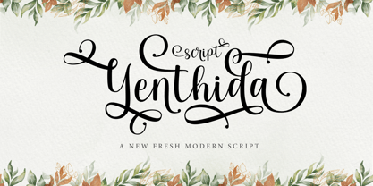 Yenthida Script is a modern calligraphy design, including Regular. This font is casual and beautiful with strokes. Can be used for various purposes. such as logos, product packaging, wedding invitations, branding, headlines, signage, labels, signatures, book covers, posters, quotes, and more. Yenthida Script includes changes in OpenType stylistics, binding, and international support for most Western languages.
 - Personnel JNL by Jeff Levine,
$29.00 The hand lettered title found on the 1938 sheet music for "I Haven't Changed a Thing" is a condensed Art Deco thick-and-thin sans serif with rounded corners. Reminiscent of office door and similar signage, this classic bit of lettering from the past is now available as Personnel JNL in both regular and oblique versions.
 - SF Sultan by Sultan Fonts,
$19.99Sultan is a font family for print and web. It includes four coordinated weights: Light, Regular, Medium, and Bold. Sultan supports Arabic, Latin, Persian, Urdu, and Kurdish. Graphic designers can use the variable Sultan font to reach wider options in working with the text, such as changing the weight, width, and slant of the font to create different effects. - Media Blackout by KC Fonts,
$14.00 Media Blackout is a handmade font with rugged good looks. The Media Blackout Family consists of three fonts: Normal, Italic & Marker. Media Blackout Marker takes the handcrafted look one step further by adding heavy hand etched lines for a truly unique look. For an even more handmade look, switch between uppercase and lowercase for a change of etching.
 - Le Mans Classic by Kazer Studio,
$6.00 LE MANS - CLASSIC is a font inspired by vintage motorsport racing. In particular, advertising posters from the 70's. This time period was important as it showcased not only the cars that changed but also the illustrative styles & typography. Features: Offered in 2 Styles - Regular & Compressed Extensive Language support Specialised Kerning on all character combinations Designed by KAZER STUDIO
 - Drakkar by Jorgensen-fonts,
$30.00Drakkar is a Latin typeface based on runes, the medieval script of the Vikings and Northern Europe. It imitates letters carved in wood with flared strokes. Just as the actual runes, it is a single-case font; instead of lower case letters, Drakkar has a set of slightly changed caps to enable the user to express handmade lettering. - Glosta by TRF,
$23.00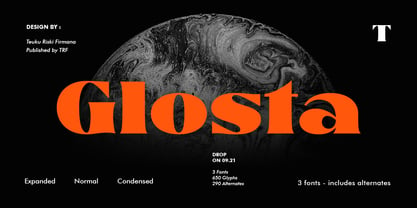 Glosta is a serif font that comes with a very beautiful change character that will bring a touch of luxury and style to your projects. Glosta is perfect for editorial design, branding, headings, logos, magazines and more. Glosta has 650 glyphs and 290 alternate characters, including multiple language support. With OpenType features with an elegant alternative style.
 - Spirrevip by Bogstav,
$18.00 Spirrevip is for that moment when you need something legible, organic and obviously handmade at the same time. The letters are straightforward, yet variable in thickness of strokes, height and width. Spirrevip is definitely playful and serious at the same time. I have added 5 slightly different versions of each letter, and they automatically changes as you type!
 - Antara Script by Hrz Studio,
$16.00 Antara script is a calligraphy font that comes with very beautiful changing characters, a type of classic decorative copper script with a modern touch, designed with high detail to present an elegant style. Antara Script is attractive because the typeface is smooth, clean, feminine, sensual, glamorous, simple, and very easy to read because there are many luxurious letter connections.
 - Helsinki by Ludwig Type,
$45.00 Helsinki 2.0 is a completely updated version of our popular Helsinki typeface. We expanded the character set, changed the weight structure, and also added italics. Helsinki is inspired by the Finnish traffic sign typeface. It is based on geometric shapes, with technical and masculine forms. Helsinki is rather narrow, which makes it well suited to headlines and short text.
 - Summer Goodbyes by Demi Michele,
$9.00 Summer Goodbyes is a fun, warm, and playful font that welcomes the fall as the season changes. All characters are the same height to add a quirky and clean feeling to any project. It includes English capital and lowercase glyphs along with multilingual characters. It also includes minimal stylistic alternatives and discretionary ligatures and numbers as well.
 - House Doodles by Outside the Line,
$19.00 Little houses, little houses and none are the same. Cute cottages, beautiful bungalows, homey homes and darling dwellings to use to make ads, flyers, invitations for moving, change of address, open house parties, address stamps... Some have a lot of detail so use them at larger sizes. The less detailed for can be used in a smaller size.
 - Guzzles by PizzaDude.dk,
$15.00 Guzzles is a very legible font and has that great ‘unevenish’ look - making it a great typeface for packaging and books, and practically everything that has to with organic and creative projects. I have added 4 slightly different versions of each letter, and they automatically changes as you type - and of course there is a strong multilingual support
 - FF Milo Slab by FontFont,
$68.99 FF Milo Slab is not just the sans with slabs attached. It has undergone a wide range of careful adjustments from increased contrast, longer ascenders and descenders and modified glyphs in the heavier weights. All these changes amount a typeface that feels enough like Milo but also can stand on its own as a new and fresh typeface.
 - Snipple - Unknown license

- Rollerscript by G-Type,
$72.00 Rollerscript is, in effect, a more modern version of Olicana whose letterforms were drafted using a nibbed pen and ink. Handwriting tends to change depending on what instrument you're using and with Rollerscript the outcome is decidedly more casual and informal than Olicana, though equally realistic. Pronounced pressure points where characters start, end or join make for a very authentic hand drawn appearance which is enhanced still further through the use of over 100 standard ligatures. Character pairings like ‘tt’ or ‘gg’ in normal handwriting fonts never look natural but in Rollerscript will now automatically change as you type! Rollerscript’s handwriting credentials are given a further boost with the inclusion of multiple underlines and sketched icons, arrows and emoticons. There is an extra stylistic set for alternate styles of cursive r and z. You can also choose between Rough and Smooth styles.
 - Tusque by Eclectotype,
$40.00 Tusque is a layered chromatic type family with a Tuscan flavor. Regular, Circus and Tooled can stand alone, while Highlight and Deco are purely for layering up multicolored gorgeousness. Tusque lends itself to fairy tales, wine labels and boutique logos, and makes some particularly delectable drop caps. Although it’s all caps, the lower case slots are all different from the upper case so you can mix and match to your heart’s content. There are also a bevy of swash alternates and ligatures at your disposal. The contextual alternates feature cleverly substitutes alternate versions of more triangular glyphs like A and V to give a better fit. The ordinal feature changes ‘a’ and ‘o’ to the feminine and masculine ordinals for Spanish etc. but also changes ‘c’ and ‘ac’ to superscript lowercase versions for names like McBride and MacDonald.
 - Waypointer by Tarallo Design,
$18.99 Waypointer is a font of arrows. These can be used to indicate direction or emphasis in documents, signage, or websites. The arrow sizes match the standard cap height of most fonts making it simple to use within text. The arrows are accessed with the standard keyboard keys. Make your own arrow of any length with the 1 to 9 keys. Use uppercase (A to Z) and lowercase (a to z) for pre-made arrows that point right, left, up, or down. Those who use OpenType will find useful features, such as stylistic sets for changing arrow directions in 360 degree angles and stylistic alternates for quick changes between pointing right and left. It has a few extras such as a map pin, anchor, and lightning bolt. These are included and accessed with the comma, period, and zero key.
 - Baskuline by Zeenesia Studio,
$15.00 Introducing the new font Baskuline. Baskuline font is a HanwrittenHandbrush handwriting on paper with a coarse type brush, to produce a consistent texture. Baskuline also has ligature which is very suitable if you don't really like lowercase letters and want to change some letters with available ligature letters. and available lowercase alternatives that you can change according to your taste. Baskuline suitable for various projects such as stationery invitations, social media, logos, weddings, branding, graphic design with the addition of several binders and swashes. and can be combined with various types of serif fonts to perfect the project you want to work on. We hope you enjoy the font, please feel free to comment if you have any thoughts or feedback. Or simply send me a PM or email me at zeenesia@gmail.com. Thanks for purchasing and have fun!
 - HorstCaps Caps:001.001 - Unknown license

- Dong - Unknown license

- Saltwater - Unknown license

- ZsaZsa Galore by Chank,
$39.95Chank created Zsazsa Galore as a fresh alternative to Mister Frisky, another jerky, hypercaffeinated interpretation of the traditional roman alphabet. The difference this time is that the new font has no descenders. Every letter comes to rest hard on the baseline. It sits there firmly rooted with branches wiggling around in the air. It was released as the Chank Font of the Month in October 1999 and it was named after Zsa Zsa Gabor because she is beautiful. - Anahita Extra Bold by Naghi Naghachian,
$95.00 Anahita ExtraBold is designed by Naghi Naghashian. This Headline Font is developed on the basis of specific research and analysis on Arabic characters and definition of their structure. This innovation is a contribution to modernisation of Arabic typography, gives the font design of Arabic letters real typographic arrangement and provides more typographic flexibility. This step was necessary after more than two hundred years of relative stagnation in Arabic font design. Anahita supports Arabic, Persian, and Urdu. It also includes proportional and tabular numerals for the supported languages. Anahita Font is available in ExtraBold. This font is designed to be used as advertising and newspaper headlines. Anahita design fulfills the following needs: A Explicitly crafted for use in electronic media fulfills the demands of electronic communication. Anahita is not based on any pre-digital typefaces. It is not a revival. Rather, its forms were created with today's technology in mind. B Suitability for multiple applications. Gives the widest potential acceptability. C Extreme legibility not only in small sizes, but also when the type is filtered or skewed, e.g., in Photoshop or Illustrator. Anahita's simplified forms may be artificial obliqued in InDesign or Illustrator, without any loss in quality for the effected text. D An attractive typographic image. Anahita was developed for multiple languages and writing conventions. E The highest degree of geometric clarity and the necessary amount of calligraphic references. This typeface offers a fine balance between calligraphic tradition and the contemporary sans serif aesthetic now common in Latin typography.
 - Kremlin II Pro by CheapProFonts,
$10.00 Most uppercase letters of these constructivist fonts are made to look like cyrillic letters, so by carefully interspersing those you can set your text and headlines with it and make it look Russian! To a native Russian this of course looks very silly indeed, so to make amends for toying with their letters I have also included a full proper and genuine cyrillic character set. So these are the first CheapProFonts fonts to support languages using the cyrillic script in addition to the usual 65 latin-based languages. Check out Kremlin Pro for a version with different designs for these glyphs: ¡ ¿ 0 3 6 9 K k M m N n R r V v X x ? ! ALL fonts from CheapProFonts have very extensive language support: They contain some unusual diacritic letters (some of which are contained in the Latin Extended-B Unicode block) supporting: Cornish, Filipino (Tagalog), Guarani, Luxembourgian, Malagasy, Romanian, Ulithian and Welsh. They also contain all glyphs in the Latin Extended-A Unicode block (which among others cover the Central European and Baltic areas) supporting: Afrikaans, Belarusian (Lacinka), Bosnian, Catalan, Chichewa, Croatian, Czech, Dutch, Esperanto, Greenlandic, Hungarian, Kashubian, Kurdish (Kurmanji), Latvian, Lithuanian, Maltese, Maori, Polish, Saami (Inari), Saami (North), Serbian (latin), Slovak(ian), Slovene, Sorbian (Lower), Sorbian (Upper), Turkish and Turkmen. And they of course contain all the usual "western" glyphs supporting: Albanian, Basque, Breton, Chamorro, Danish, Estonian, Faroese, Finnish, French, Frisian, Galican, German, Icelandic, Indonesian, Irish (Gaelic), Italian, Northern Sotho, Norwegian, Occitan, Portuguese, Rhaeto-Romance, Sami (Lule), Sami (South), Scots (Gaelic), Spanish, Swedish, Tswana, Walloon and Yapese.
 - DT Skiart Subtle by Dragon Tongue Foundry,
$9.00 ‘Skiart Serif Subtle’ is now available online. Originally inspired by the san serif font ‘Skia’ by Mathew Carter for Apple. ‘Skiart’ was designed to feel more like a serifed font, but without any serifs. It took a step between sans serif and serif fonts. Next on the path towards a serif font came Skiart Serif Mini, with tiny serifs added. This was a true serif font, all be it on the small side. Skiart Serif Subtle is less of a serif than Skiart Serif Mini, in that it doesn’t have actual 'serifs' as such. It has a subtle flare where a serif might normally be found. It remains fully readable and feels as clean and normal as any of the best body copy serifs, and yet still has the strong solid bones of all the other Skiart font families. If compared to one of the more commonly used serifs like ‘Times New Roman’, the ‘Skiart Serif Subtle’ lowercase is more open with a taller x-height, increasing its readability and friendliness. The serifs are smaller and less distracting. They are not pretending to be ligatures. Where ‘Times’ makes its p q b d forms out of a barely touching oval and stem, the ‘Serif Subtle’ forms are much more firmly attached, appearing clearly as single letters. The standard setting for the a’s and g’s are round single story, feeling warmer and more inviting in the ‘Serif Mini’ font. Much more friendly than the stuffy double-storied versions in fonts such as ‘Times’ etc.
 - Heller Sans JNL by Jeff Levine,
$29.00 Heller Sans JNL is based on the main letterforms of an experimental alphabet designed by Steven Heller; noted author of over 170 books on design and visual culture. Some modifications were made in turning his design into a digital font. In his own words, here is the background to this typeface: “I recently recovered this from the junk heap. It is a yellowing photostat of my first and only typeface design (1969-70). Total folly! At the time I was smitten by Art Moderne lettering. I called it “Klaus Boobala Bold” because I liked the K and B. I’ve lost the letters S through Z, which were made. The letters were drawn with compass, Techno pen (that frequently clogged). as well as a triangle and T-square. The inline and outline made no real logical sense. I based the design, in part, on Kabel, Avant Garde and it was a product of whatever I could accomplish with those tools. The caps-only alphabet was photographed and produced as a film negative that was cut in foot-long strips and spliced to fit on a Typositor reel. Sadly, the negatives made for the font were too brittle and the splice snapped apart in the Typositor. I worked on it for well over a month and used the face only once. I realized with this attempt, like so many other times I attempted different challenges, that type design — indeed mechanical drawing — was not my strong suit.” Heller Sans JNL is available in both regular and oblique versions.
 - Bamdad by Naghi Naghachian,
$95.00 Bamdad Extra Bold Condensed is designed by Naghi Naghashian. This Headline Font is developed on the basis of specific research and analysis on Arabic characters and definition of their structure. This innovation is a contribution to modernisation of Arabic typography, gives the font design of Arabic letters real typographic arrangement and provides more typographic flexibility. This step was necessary after more than two hundred years of relative stagnation in Arabic font design. Bamdad supports Arabic, Persian, and Urdu. It also includes proportional and tabular numerals for the supported languages. Bamdad Font is available in Extra Bold Condensed. This font is designed to be used as advertising and newspaper headlines. Bamdad design fulfills the following needs: A Explicitly crafted for use in electronic media fulfills the demands of electronic communication. Bamdad is not based on any pre-digital typefaces. It is not a revival. Rather, its forms were created with today’s technology in mind. B Suitability for multiple applications. Gives the widest potential acceptability. C Extreme legibility not only in small sizes, but also when the type is filtered or skewed, e.g., in Photoshop or Illustrator. Bamdad's simplified forms may be artificial 'obliqued' in InDesign or Illustrator, without any loss in quality for the effected text. D An attractive typographic image. Bamdad was developed for multiple languages and writing conventions. E The highest degree of geometric clarity and the necessary amount of calligraphic references. This typeface offers a fine balance between calligraphic tradition and the contemporary sans serif aesthetic now common in Latin typography.
 - Parto by Naghi Naghachian,
$78.00 Parto Font family is designed by Naghi Naghashian. This Font is developed on the basis of specific research and analysis on Arabic characters and definition of their structure. This innovation is a contribution to modernization of Arabic typography, giving the font design of Arabic letters real typographic arrangement and providing more typographic flexibility. It enables, moreover, the use of this typeface for decorative headlines. This step was necessary after more than two hundred years of relative stagnation in Arabic font design. Parto supports Arabic, Persian, and Urdu. It also includes proportional and tabular numerals for the supported languages. Parto Font is available in Regular and Bold. Parto design fulfills the following needs: A Explicitly crafted for use in electronic media fulfills the demands of electronic communication. Parto is not based on any pre-digital typefaces. It is not a revival. Rather, its forms were created with today’s technology in mind. B Suitability for multiple applications. Gives the widest potential acceptability. C Extreme legibility not only in small sizes, but also when the type is filtered or skewed, e.g., in Photoshop or Illustrator. Parto's simplified forms may be artificial obliqued in InDesign or Illustrator, without any loss in quality for the effected text. D An attractive typographic image. Parto was developed for multiple languages and writing conventions. E The highest degree of geometric clarity and the necessary amount of calligraphic references. This typeface offers a fine balance between calligraphic tradition and the contemporary sans serif aesthetic now common in Latin typography.
 - Solpera by Storm Type Foundry,
$32.00This type face fills one of the gaps between the world of Roman alphabets and that of linear alphabets. The first to be designed was the set of upper-case letters. The expression of these characters cannot conceal that they were originally intended only for the sculptor's use, as a type face for three-dimensional inscriptions. Their width proportions reflect a dialogue between the contemporary feeling and the legacy of classical Roman inscriptions. The type face was later complemented with a set of lower-case letters and elaborated into further designs. Its clear, concise letter forms end with small serifs which not only make the type face more refined, but above all anchor the individual letter signs visually to the horizontal of the text line. The austere construction of the majority of the letters is balanced by the more exuberant, humanizing forms of the most frequently used letters "a"; "e". (The three variants of the lower-case "e" enable to create rhythmically differentiated texts.) The letters in which a straight stroke is connected with an arch are designed in two ways. That means that the letters "n", "h","m" and the group of letters "b","d","p","q" are conceived in a different way. Thus an interesting tension is created in the structure of the text, which, however, does not endanger legibility. The economizing, slightly narrowed design of this type face predetermines its use for the setting of usual texts. In larger sizes, however, it produces a rather serious, even solemn, impression. - Amerika Pro by CheapProFonts,
$- This is the 200th font released by CheapProFonts, and again I wanted to make something special - so I have chosen to upgrade another well-known font by the infamous Fredrick "Apostrophe" Nader: Amerika! The whole character set for this stylish font has been polished for consistent baseline placement and serif thickness, and proper overshoots has been implemented. All the alternate letterforms (and some new ones) have been included as OpenType alternates AND they have now been made available with accents, too! The Greek and Cyrillic letterforms are properly encoded and kerned. I hope many will enjoy the improvements - and naturally: it is still free! ALL fonts from CheapProFonts have very extensive language support: They contain some unusual diacritic letters (some of which are contained in the Latin Extended-B Unicode block) supporting: Cornish, Filipino (Tagalog), Guarani, Luxembourgian, Malagasy, Romanian, Ulithian and Welsh. They also contain all glyphs in the Latin Extended-A Unicode block (which among others cover the Central European and Baltic areas) supporting: Afrikaans, Belarusian (Lacinka), Bosnian, Catalan, Chichewa, Croatian, Czech, Dutch, Esperanto, Greenlandic, Hungarian, Kashubian, Kurdish (Kurmanji), Latvian, Lithuanian, Maltese, Maori, Polish, Saami (Inari), Saami (North), Serbian (latin), Slovak(ian), Slovene, Sorbian (Lower), Sorbian (Upper), Turkish and Turkmen. And they of course contain all the usual "western" glyphs supporting: Albanian, Basque, Breton, Chamorro, Danish, Estonian, Faroese, Finnish, French, Frisian, Galican, German, Icelandic, Indonesian, Irish (Gaelic), Italian, Northern Sotho, Norwegian, Occitan, Portuguese, Rhaeto-Romance, Sami (Lule), Sami (South), Scots (Gaelic), Spanish, Swedish, Tswana, Walloon and Yapese.
 - Longhorn by Belldorado,
$20.00 I saw a cool UT-Ligature on an old (maybe 70's or 80's) Texas Longhorns fan-shirt - it was in 3D and I wanted something like that with my own initials A and B to print it on a baseball hat. I started drawing it and when I was finished, I thought it might be nice to do the same for my officemates. I needed another G, T and K. After finishing that I thought it might be cool to do this for other people as well. Since the source of all the 3D glyphs is found in the regular ones which get moved by a 45 degree angle and then connected with lines , I first draw all the uppercase regular glyphs. The thing that followed was kind of an addiction: after finishing the uppercase letters, I wanted to add lowercase letters, after finishing the 3D letters, I thought it would be nice to have a fill version to layer with the 3D letters. Having a rough, woodcut version of the regular style would be cool, too. And the font is also pretty much suited to make a stencil version. When all this was done, I was interested on how the font would look like without the serifs and curves instead of the 45 degree angles, so I did the Longhorn Sans. Good to use for all sports-related designs, especially retro-style soccer/football shirts. Uppercase characters can be combined to form ligatures or logotypes.
 - Faible by Identity Letters,
$29.00 An open-hearted humanist sans-serif. Playful and friendly. Faible is everybody’s darling. You cannot not like this good-natured humanist typeface. Sure, it’s a typeface for serious work—but all serious work is better when you put a smile on your face and a whistle on your lips. The typeface itself isn’t rooted in calligraphy, but there are quite some details in Faible that reference handwriting and add a friendly, humanist facet to its appearance. Take the bowls of B, P, and R: they are merrily bulged, like balloons about to take off. The curved leg of the R adds to this joyful mood. Faible’s italics are rendered playfully, too: they’re not merely sloped Roman styles. Rather, they were designed independently with an internal dynamic that sets them apart on the page. With its trademark glyphs, the swooshin’ K and k, and its friendly details, Faible will radiate optimism in display sizes, titles, and headlines. That makes it a great choice for book covers, posters, editorial design, branding, corporate design, advertising, and packaging. Nontheless, it’s carefully spaced and equipped with plenty OpenType features—a reliable tool for short texts and body copy, too. The font family consists of six weights (ranging from Thin to Black), each with its corresponding italic style. Faible’s glyph set contains more than 600 characters, allowing you to enhance your layouts with ligatures, different sets of figures, case sensitive forms, arrows, and other necessities for the ambitious typographer. Faible is the typeface that puts “fun” back into “functional”.
 - Mono Spec by Halbfett,
$30.00 Mono-Spec is a monospaced family of sans-serif type. At least in default settings, all characters across the typeface share a common width. That fixed setting is condensed, and the aesthetic style of Mono-Spec’s letterforms is very industrial. A sister family, called Mono-Spec Stencil, is also available. Its design strays away from the mechanical nature of Mono-Spec, and it channels the spirit of resistance and street culture. Mono-Spec ships in two different formats. Depending on your preference, you can install the typeface as a single Variable Font or use the family’s five static OpenType font files instead. Those weights run from Light through Bold. While the static-format fonts offer a good intermediary-step selection, users who install the Variable Font have vastly greater control over their text’s stroke width. The Mono-Spec Variable Font’s weight axis allows users to differentiate between almost 1,000 possible font weights. That enables you to fine-tune your text’s exact appearance on-screen or in print. Whatever format you choose, the Mono-Spec fonts are equipped with several OpenType features. The most striking of these can be activated via a Stylistic Set. That will replace several letters – like “B”, “E”, “F”, “H”, and “I” with double-width alternates. Those alternates take up as much space as two characters placed next to each other otherwise word. The effect of Mono-Spec’s double-width alternates is striking, and their use strikes a strong chord in any display typography applying them.
 - Aban by Naghi Naghachian,
$95.00 The Aban font family was designed by Naghi Naghashian. It is developed on the basis of specific research and analysis on Arabic characters and definition of their structure. This innovation is a contribution to modernization of Arabic typography, gives the font design of Arabic letters real typographic arrangement and provides more typographic flexibility. This step was necessary after more than two hundred years of relative stagnation in Arabic font design. Aban supports Arabic, Persian, and Urdu. It also includes proportional and tabular numerals for the supported languages. Aban Font Family is available in three weights: Regular, Bold and ExtraBold, a three stings outline font. The Aban design fulfills the following needs: A Explicitly crafted for use in electronic media fulfills the demands of electronic communication. Aban is not based on any pre-digital typefaces. It is not a revival. Rather, its forms were created with today’s technology in mind. B Suitability for multiple applications. Gives the widest potential acceptability. C Extreme legibility not only in small sizes, but also when the type is filtered or skewed, e.g., in Photoshop or Illustrator. Aban’s simplified forms may be artificial obliqued in InDesign or Illustrator, without any loss in quality for the effected text. D An attractive typographic image. Aban was developed for multiple languages and writing conventions. E The highest degree of geometric clarity and the necessary amount of calligraphic references. This typeface offers a fine balance between calligraphic tradition and the contemporary sans serif aesthetic now common in Latin typography.
 - Kingthings Lupine Pro by CheapProFonts,
$10.00 I loved this monster font the second I saw it - it reminded me of Franquins Idées Noires... Reworking it and adding the missing glyphs and diacritics was quite time-consuming - but a lot of fun! Lots of details. The Lupineless variant is Lupine with eyes, decorations and stray hairs removed - which leaves just a very usable fuzzy font for your monster-related headline. Kevin King says: "I love fantasy writing and my favorite author is Terry Pratchett. In Reaper man, my favorite book, there is a werewolf character called Lupine, I wanted to make a font for him and for Ludmilla... It's a long story, it's a hairy font." All fonts from CheapProFonts have very extensive language support: They contain some unusual diacritic letters (some of which are contained in the Latin Extended-B Unicode block) supporting: Cornish, Filipino (Tagalog), Guarani, Luxembourgian, Malagasy, Romanian, Ulithian and Welsh. They also contain all glyphs in the Latin Extended-A Unicode block (which among others cover the Central European and Baltic areas) supporting: Afrikaans, Belarusian (Lacinka), Bosnian, Catalan, Chichewa, Croatian, Czech, Dutch, Esperanto, Greenlandic, Hungarian, Kashubian, Kurdish (Kurmanji), Latvian, Lithuanian, Maltese, Maori, Polish, Saami (Inari), Saami (North), Serbian (latin), Slovak(ian), Slovene, Sorbian (Lower), Sorbian (Upper), Turkish and Turkmen. And they of course contain all the usual "western" glyphs supporting: Albanian, Basque, Breton, Chamorro, Danish, Estonian, Faroese, Finnish, French, Frisian, Galican, German, Icelandic, Indonesian, Irish (Gaelic), Italian, Northern Sotho, Norwegian, Occitan, Portuguese, Rhaeto-Romance, Sami (Lule), Sami (South), Scots (Gaelic), Spanish, Swedish, Tswana, Walloon and Yapese.
 - Avesta Extra Bold by Naghi Naghachian,
$95.00 Avesta ExtraBoldCondensed is designed by Naghi Naghashian. This Headline Font is developed on the basis of specific research and analysis on Arabic characters and definition of their structure. This innovation is a contribution to modernisation of Arabic typography, gives the font design of Arabic letters real typographic arrangement and provides more typographic flexibility. This step was necessary after more than two hundred years of relative stagnation in Arabic font design. Avesta supports Arabic, Persian, and Urdu. It also includes proportional and tabular numerals for the supported languages. Avesta Font is available in ExtraBoldCondensed. This font is designed to be used as advertising and newspaper headlines. Avesta design fulfills the following needs: A Explicitly crafted for use in electronic media fulfills the demands of electronic communication. Avesta is not based on any pre-digital typefaces. It is not a revival. Rather, its forms were created with today’s technology in mind. B Suitability for multiple applications. Gives the widest potential acceptability. C Extreme legibility not only in small sizes, but also when the type is filtered or skewed, e.g., in Photoshop or Illustrator. Avesta's simplified forms may be artificial obliqued in InDesign or Illustrator, without any loss in quality for the effected text. D An attractive typographic image. Avesta was developed for multiple languages and writing conventions. E The highest degree of geometric clarity and the necessary amount of calligraphic references. This typeface offers a fine balance between calligraphic tradition and the contemporary sans serif aesthetic now common in Latin typography.
 - Kingthings Spike Pro by CheapProFonts,
$10.00 You gotta love this extreme take on the "gothic" blackletter traditions! Roger Nelsson edited a few letters, drastically improved the spacing - and then gave it the usual large CheapProFonts character set. Fun! Kevin King says: "Kingthings Spike was made because Buffy has one, I made Willow... Xander is yet to come. Oh and because I hate Engravers Old English! Pugin, eat my shorts! Sorry!" Kingthings Spikeless is a toned down version of Kingthings Spike. Kevin King says: "Kingthings Spikeless was requested by those who actually want to read text... well I call that tedious, but if you must, here it is no flourishes, just my small homage to black-letter." ALL fonts from CheapProFonts have very extensive language support: They contain some unusual diacritic letters (some of which are contained in the Latin Extended-B Unicode block) supporting: Cornish, Filipino (Tagalog), Guarani, Luxembourgian, Malagasy, Romanian, Ulithian and Welsh. They also contain all glyphs in the Latin Extended-A Unicode block (which among others cover the Central European and Baltic areas) supporting: Afrikaans, Belarusian (Lacinka), Bosnian, Catalan, Chichewa, Croatian, Czech, Dutch, Esperanto, Greenlandic, Hungarian, Kashubian, Kurdish (Kurmanji), Latvian, Lithuanian, Maltese, Maori, Polish, Saami (Inari), Saami (North), Serbian (latin), Slovak(ian), Slovene, Sorbian (Lower), Sorbian (Upper), Turkish and Turkmen. And they of course contain all the usual "western" glyphs supporting: Albanian, Basque, Breton, Chamorro, Danish, Estonian, Faroese, Finnish, French, Frisian, Galican, German, Icelandic, Indonesian, Irish (Gaelic), Italian, Northern Sotho, Norwegian, Occitan, Portuguese, Rhaeto-Romance, Sami (Lule), Sami (South), Scots (Gaelic), Spanish, Swedish, Tswana, Walloon and Yapese.
 - Kingthings Scrybbledot Pro by CheapProFonts,
$10.00 A fun and charming scribbled alphabet - perfect for scrapbooking and that handmade look. Lots of technical details had to be fixed, but it now has a professional quality, and our impressive language support! :) Kevin King says: "The Scrapbooking People have asked for grungy fonts - and this is one of my efforts to comply. I scribbled the letters in Paint shop Pro and imported the results into my font program directly. This is the first font i have created directly on the computer without any paper sketches - I think it took considerably more work!" Kingthings Scrybble Pro is a dotless version - perfect if you like the scribbles, but not the splutter. ;) ALL fonts from CheapProFonts have very extensive language support: They contain some unusual diacritic letters (some of which are contained in the Latin Extended-B Unicode block) supporting: Cornish, Filipino (Tagalog), Guarani, Luxembourgian, Malagasy, Romanian, Ulithian and Welsh. They also contain all glyphs in the Latin Extended-A Unicode block (which among others cover the Central European and Baltic areas) supporting: Afrikaans, Belarusian (Lacinka), Bosnian, Catalan, Chichewa, Croatian, Czech, Dutch, Esperanto, Greenlandic, Hungarian, Kashubian, Kurdish (Kurmanji), Latvian, Lithuanian, Maltese, Maori, Polish, Saami (Inari), Saami (North), Serbian (latin), Slovak(ian), Slovene, Sorbian (Lower), Sorbian (Upper), Turkish and Turkmen. And they of course contain all the usual "western" glyphs supporting: Albanian, Basque, Breton, Chamorro, Danish, Estonian, Faroese, Finnish, French, Frisian, Galican, German, Icelandic, Indonesian, Irish (Gaelic), Italian, Northern Sotho, Norwegian, Occitan, Portuguese, Rhaeto-Romance, Sami (Lule), Sami (South), Scots (Gaelic), Spanish, Swedish, Tswana, Walloon and Yapese.
 - Kremlin Pro by CheapProFonts,
$10.00 Most uppercase letters of these constructivist fonts are made to look like cyrillic letters, so by carefully interspersing those you can set your text and headlines with it and make it look Russian! To a native Russian this of course looks very silly indeed, so to make amends for toying with their letters I have also included a full proper and genuine cyrillic character set. So these are the first CheapProFonts fonts to support languages using the cyrillic script in addition to the usual 65 latin-based languages. Check out Kremlin II Pro for a version with different designs for these glyphs: ¡ ¿ 0 3 6 9 K k M m N n R r V v X x ? ! ALL fonts from CheapProFonts have very extensive language support: They contain some unusual diacritic letters (some of which are contained in the Latin Extended-B Unicode block) supporting: Cornish, Filipino (Tagalog), Guarani, Luxembourgian, Malagasy, Romanian, Ulithian and Welsh. They also contain all glyphs in the Latin Extended-A Unicode block (which among others cover the Central European and Baltic areas) supporting: Afrikaans, Belarusian (Lacinka), Bosnian, Catalan, Chichewa, Croatian, Czech, Dutch, Esperanto, Greenlandic, Hungarian, Kashubian, Kurdish (Kurmanji), Latvian, Lithuanian, Maltese, Maori, Polish, Saami (Inari), Saami (North), Serbian (latin), Slovak(ian), Slovene, Sorbian (Lower), Sorbian (Upper), Turkish and Turkmen. And they of course contain all the usual "western" glyphs supporting: Albanian, Basque, Breton, Chamorro, Danish, Estonian, Faroese, Finnish, French, Frisian, Galican, German, Icelandic, Indonesian, Irish (Gaelic), Italian, Northern Sotho, Norwegian, Occitan, Portuguese, Rhaeto-Romance, Sami (Lule), Sami (South), Scots (Gaelic), Spanish, Swedish, Tswana, Walloon and Yapese.


