2,694 search results
(0.018 seconds)
- Superscience by Storm Type Foundry,
$39.00 A font drawn in a rounded rectangle looks modern – if we do not mind that it was in vogue mainly in the 80s of the last century and was created in the fifties, when various Italian designers noticed that the outline of a glass TV screen is actually the letter “o“. Since then, this progressive idea has undergone many improvements, which can be summarized in the notion of “popular-scientific typographic revival”. The present incarnation called “Superscience” has the advantage of having extreme variations and nicely simplified letters, as well as the usual repertoire of OTF functions and playful variations.
 - Millestones by Haksen,
$13.00 MILLESTONES Brush Font Introducing "MILLESTONES" Brush Font! If you are needing a touch of horror sensation for your designs, this font was created for you! What's Included: All Set Character in Uppercase & Lowercase style Number and Punctuation Support Language Ligatures All above mentioned available in (OTF) This font works best in a program that supports OpenType features such as Adobe Indesign, Adobe Illustrator CC and CS, or Adobe Photoshop CC and CS also CorelDraw More Questions? Here are some (potential) answers! Do not to resell this font in any way. Multilingual Support is included for Western European Languages Cheers!
 - Livington by Skinny Type,
$12.00 Livington is a handwritten SVG font that has the look and feel of a true hand drawing. The handwritten Livington font requires Photoshop CC 2017 or Illustrator CC 2018 (or later) to work, but the OTF Livington Script doesn't require any special software and can be used on any computer and on any software. INCLUDING: Livington SVG handwriting font Livington All Caps font LANGUAGE SUPPORT: Please note that the Livington SVG Handwritten Font is English only, but Livington's script contains the following characters: aàáâÃäåcçdðeèéêëiìíîïnñoøòóôõöuùüúill, Danish, English, French, German, German (Switzerland), Norwegian Bokmål, Portuguese, Spanish, Swedish, Swiss German. Thank you!!
 - Eclectic Three by Altered Ego,
$45.00STF Eclectic Three contains dingbats and a special set of glyphs which make it simple and easy to create registration and fill-in forms for print materials. Create rules with hash lines, fill-in boxes and many other variations. Also includes handicapped, recycled and arrow right/left symbols. The Eclectic family is legendary, with a cult-like following among the inititated. With over 100 characters in the complete set, you'll find yourself using Eclectic Three almost daily to add spice to your otherwise san-serif typographic existence. Available in Mac and PC formats. License it today! - Hustle Actlife by Letterena Studios,
$10.00 Hi, Everyone! If you’re looking for a cute but elegant font to captivate your audiences or customers then we’ve got the font for you! Introducing Hustle Actlife - A Serif Font This typeface with elegant style looks very interesting for loads of different projects and promotions. It is perfect to be used on your website, for your social media branding, Pinterest banners, printed products, and more! This font is inspired by the classy style of women who are very luxury so it is perfect for a high-class business. Includes: Hustle Actlife (OTF) Features: Ligatures Alternates Multilingual Support PUA Encoded Numerals and Punctuation
 - Bannock Brae Gothic by Red Rooster Collection,
$45.00 Bannock Brae Gothic is a sans serif typeface. It is an original creation of Steve Jackaman (ITF) and was created for the Red Rooster Collection in 1999. The typeface was loosely inspired by a typeface from an old obscure wood type specimen book from the turn of the 20th century. Due to its turn-of-the-century roots, Bannock Brae Gothic has an informal 1920’s art deco look. It finds an ideal home in lighthearted projects concerning crafts, food, festivals, and music, but its alternates still give it the flexibility to showcase a classic and timeless feel in any project.
 - DXAngelus Mediaval by DXTypefoundry,
$45.00 The font DXAngelusMediaval was developed on the basis of the Angelus Mediaval font, which was issued by Russian type foundry from the beginning of the 20th century (type foundry of G. Bertgold, St. Petersburg and Moscow, before 1904). Probably, the font is a reworking of the DeVinne font (1892 (?), Designer Nicholas J. Werner) of the American Central Type Foundry. For the reconstruction, we used examples of font prints: Cyrillic from the catalog "Art Fonts", 1929, Latin part - Chicago font, from the catalog "La Fonderie Typographique Francaise" (FTF) 1924. In addition, in the font are available Digits of the old style and ligature.
 - Captain Fenris by Keristyper Studio,
$14.00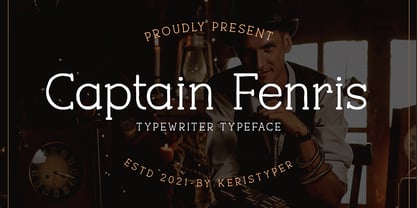 Captain Fenris is a custom handmade/handwritten Serif typeface with a simple and casual personality. This font is good for logo design, Social media, Movie Titles, Books Titles, short text even long text letters, and good for your secondary text font with sans or serif. Featured: OTF Standard Uppercase & Lowercase Numeral & Punctuation Multilingual : ä ö ü Ä Ö Ü ß ¿ ¡ Alternate & Ligature PUA encoded We recommend programs that support the OpenType feature and the Glyphs panel such as Adobe applications or Corel Draw. so you can use all the variations of the glyphs. Hope you enjoy our fonts!
 - Cristal Bendilar by Gian Studio,
$18.00 About Product Cristal Bendilar, Display Typography with Variable Weight and Width. Cristal Bendilar is an elegant modern variable font. It's basically Sans with a touch of serif to each letter. A Simplicity yet very legible with various widths and weights that you can explore, combine, create and help you design things. Font Styles on OTF files or even more if you use Single File Variables, you can shift weight and width in the sweetest places in Cristal Bendilar. What you get: Language Support: English, French, German, Indonesia, Ireland, Italy, Low German, Norwegian, Portuguese, Swedish, Swiss German. Thank You.
 - Gosford by Factory738,
$15.00 Gosford is a luxury and elegant serif font. It teases your eyes with its curves yet still able to maintain its classy composure. The variety of weights provide a range of choices that will help you find the best typographic colour. The available stylistic Ligature and Alternate offer a perfect font for anything your creativity takes you. 5 Weights (Light, Regular, Semibold, Bold, Black) Basic Latin A-Z and a-z Numerals & Punctuation Stylistic Alternates & Ligatures Multilingual Support for ä ö ü Ä Ö Ü ... OTF file format Free updates and feature additions Thanks for looking, and I hope you enjoy it.
 - Flanela by Gatype,
$12.00 Flanela is my new elegant serif font that will give your projects a touch of luxury and style. It's perfect for logotypes, branding, monograms and wedding invitations, blog headlines, and more. Browse through all the previews and get as inspired as I was when creating this font. What do you get? - Flanella (OTF,) -Uppercase Letters, Numbers, Punctuation & Symbols. Multilingual Support Important information: To access the alternatives, you must have access to an older version of Photoshop to copy/paste the glyphs from the included PSD, OR the Glyphs Panel, which can be found in Photoshop CC or any Version of Adobe Illustrator.
 - Ivoor by Cloveron Media,
$18.00 Meet Ivoor, a new sans serif typeface of the 21st century. It has distinct letter accents and comes with beautiful ligatures. It's a very versatile font that works as standalone or paired with other fonts. It is a great design choice for branding, logo, labels, packaging, magazine headers & so much more. Features: Weights - Regular & Bold Lowercase & Uppercase Classy Ligatures Numerals & Punctuation Multilingual Characters In .otf file Language Support: Western Europe Follow my shop for upcoming updates and new products that you might be interested in next time. Please message me for any suggestions and support. I would like to hear it. Thank you!
 - Phosphate Pro by Red Rooster Collection,
$60.00 Phosphate Pro is an all-caps sans serif font family with an inline weight, and was created by Steve Jackaman (ITF) and Ashley Muir in 2010. The original Phosphate was published by International TypeFounders, and the family was based on the ‘Phosphor’ typeface created by Jakob Erbar for Ludwig and Mayer, circa 1922-30. Jackaman created a condensed variant, 'Phosphate Condensed Pro,' in 2017. Phosphate Pro has incredible presence, and its power shines in display format. Apple, who is notoriously selective about their software choices, included Phosphate Pro in the system fonts for Apple’s OS X 10.10 Yosemite.
 - Hearth Stone by Mightype,
$15.00 Hearth Stone Script is a modern calligraphy font with the current handwriting style, this font is perfect for branding, wedding invites, magazines, mugs, business cards, quotes, posters, and more, you can try first if you want to buy this font. Hearth Stone Script is equipped with 309 glyphs. With so many glyphs, you can choose the letters according to your liking. There are many variations and options for each letter, so you can customize based on your design needs. This font contains: Hearth Stone Script OTF If you have any question, do not hesitate to contact me by email: mightype89@gmail.com
 - Elongated Roman by Red Rooster Collection,
$45.00 Elongated Roman is a Didone-style serif typeface. It was originally designed in 1950 by typographers at Stephenson Blake. After International TypeFounders, Inc. acquired exclusive licensing rights to the Stephenson Blake Collection, Steve Jackaman (ITF) digitally revived the typeface in 1997 for the Red Rooster Collection. Much like other Didone typefaces, Elongated Roman’s strong contrast between thick and thin strokes and hairline serif design strengthen its elegance as a “modern face.” Unlike other Didone typefaces in the Red Rooster Collection, Elongated Roman was designed with display size in mind thanks to its strong variance in stroke weight.
 - Keyboard by Red Rooster Collection,
$45.00 Keyboard is a condensed and elongated Egyptian font family with thin serifs and a large x-height. Its original design was created in 1951 by Stephenson Blake. International TypeFounders, Inc. gained exclusive licensing rights to the Stephenson Blake Collection, and then Paul Hickson (P&P Hickson) and Steve Jackaman (ITF) created its digital form in 1994. Keyboard excels in display and subhead sizes, and brings a formal feel to any project. Its condensed nature gives it great visual density in the bolder weights, and the lighter weights allow it to retain legibility at both small and massive sizes.
 - Valorica by Keristyper Studio,
$14.00 Valorica is a modern design with a vintage feel. A monoline display font that combines classic & modern styles. This font is good for logo design, Social media, Movie Titles, Books Titles, short text even long text letters, and good for your secondary text font with sans or serif. Featured: OTF Standard Uppercase & Lowercase Numeral & Punctuation Multilingual : ä ö ü Ä Ö Ü ß ¿ ¡ Alternate & Ligature PUA encoded We recommend programs that support the OpenType feature and the Glyphs panel such as Adobe applications or Corel Draw. so you can use all the variations of the glyphs. Hope you enjoy our fonts!
 - Ozzi Modo NF by Nick's Fonts,
$10.00This double-wide wonder is based on Oswald Cooper’s original drawings for the typeface Cooper Fullface. ATF rejected this offering because they felt that several of the letterforms, and particularly the numbers, were a little too wacky for the mainstream. By now, you know that such an accusation is a "Please don't throw me in the briar patch" plea to yours truly. So, here, proudly and true to their designer’s original intent, are two versions of a really fun font. Both versions of this font include the complete Unicode 1252 Latin and Unicode 1250 Central European character sets. - Auchentaller by HiH,
$12.00 Auchentaller was inspired by a travel poster by Josef Maria Auchentaller in 1906. To our knowledge, it was never cast in type. Grado lies on the northern Adriatic, between Venice and Trieste. At one time the port for the important Roman town of Aquileia. With the decline of the Roman Empire, the upper Adriatic region came under the rule of the Visigoths, the Ostrogoths, the Byzantines, the Lombards, the Franks, the Germans, the Venetians and finally, in 1796, the Austrian Hapsburgs. So it remained until the dissolution of the Austro-Hungarian Monarchy in 1919, following World War I, when the seaport of Trieste was awarded to Italy. With Trieste came Montefalcone, Aquileia and Grado. The area was marked by years of political tension between Italy and Yugoslavia, exemplified by the d'Annunzio expedition to capture Fiume (Rijeka) in September, 1919. Some basic discussion of the period from 1919 to 1939 may be found in Seton-Watson’s Eastern Europe Between The Wars (Cambridge 1945) and Rothschild’s East Central Europe Between The Two World Wars (Seattle 1974). In 1965 I was traveling by train from Venice to Vienna. Crossing the Alps, the train stopped for customs inspection at the rural Italian-Austrian border, just above Slovenia. We were warned not to get off the train because there were still shooting skirmishes in the area. Through all this, Grado remained literally an island of tranquility, connected to the mainland by a only causeway and lines on a map. Auchentaller not only painted the beach scene at Grado, he moved there, living out the rest of his life in this comfortable little island town. His travel illustration contains the text from which the design of our font Auchentaller is drawn. The text translates: "Seaside resort : Grado / Austrian coastal land". Please see our gallery images to see a map locating Grado, as well as Auchentaller’s painting of the resort. Auchentaller is a monoline all-cap font, light and open in design , with a lot of typically art nouveau letter forms. Included in our font are a number of ligatures. As is frequently seen in designs by German speakers, the umlaut is embedded in the O & U below the tops of the letters. This approach led to two whimsies: a happy umlauted O and a sad umlauted U. This font has a clean, crisp look that is very appealing and very distinctive. Auchentaller ML represents a major extension of the original release, with the following changes: 1. Added glyphs for the 1250 Central Europe, the 1252 Turkish and the 1257 Baltic Code Pages. Add glyphs to complete standard 1252 Western Europe Code Page. Special glyphs relocated and assigned Unicode codepoints, some in Private Use area. Total of 336 glyphs. 2. Added OpenType GSUB layout features: pnum, liga, salt & ornm. 3. Added 116 kerning pairs. 4. Revised vertical metrics for improved cross-platform line spacing. 5. Revised ‘J’. 6. Minor refinements to various glyph outlines. 7. Inclusion of both tabular & proportional numbers. 8. Inclusion of both standard acute and Polish kreska with choice of alternate accented glyphs for c,n,r,s & z. Please note that some older applications may only be able to access the Western Europe character set (approximately 221 glyphs). The zip package includes two versions of the font at no extra charge. There is an OTF version which is in Open PS (Post Script Type 1) format and a TTF version which is in Open TT (True Type)format. Use whichever works best for your applications.
 - Gold Rush by FontMesa,
$25.00This old classic font has an interesting history, it was originally cut with lowercase by the Bruce Type Foundry in 1865 and listed as Ornamented No. 1514. Around 1903 the Bruce foundry was bought by ATF, in 1933 this font was revived by ATF as Caps only and was given the Gold Rush name but was sometimes called Klondike. A similar version of this font with lowercase and radiused serifs was produced by the James Conner's Sons Type Foundry around 1888. In the past other foundries such as the Carroll foundry, Type Founders of Phoenix and the Los Angeles Type Foundry have produced an all caps version of this font. After examining several printed sources of this font from more recent books I found that the original from Bruce's 1882 book was by far the best in design quality, it was also the only printed source that included the lowercase. New open faced, ornamented and distressed versions have been added to this old classic font, there are also many extended characters for Western, Central and Eastern European countries. The Gold Rush Trail OpenType version has alternate double letter pairs included in the font and will automatically be substituted when used in Adobe CS products or other software that takes advantage of OpenType features. Also available is a spurred version of this font listed under the name Gold Spur. - ThreeDee by URW Type Foundry,
$99.99The idea for this completely new font design with overlapping characters came when Axel Stoltenberg, longtime IKARUS program developer at URW + +, visited a restaurant. As it can be seen quite often , the daily specials were offered handwritten with chalk on a blackboard applying a writing technique never been available before for digital fonts: each character is partly covered by its predecessor creating a three-dimensional effect. The implementation of this unusual notation for digital setting required a lot of programming and testing until all necessary character variants were produced and set properly always using the correct form. In order to achieve this, the OpenType Pro font ThreeDee contains about 12,400 characters and all the necessary OpenType features (GSUB ) for the automatic setting in OTF savvy application programs. The slightly playful basic design for ThreeDee was created by Anna Stoltenberg , the daughter of Axel, specially devised for the innovative representation and support of its special nature. The shadow generated with IKARUS even intensifies the 3D effect. As is well-known, making use of the embedded OTF features, i.e. the automatic access to all the 12,400 character variants , a corresponding text / layout program ( InDesign, Quark Xpress, current Open / LibreOffice or MS Word etc. ) is required. ThreeDee is a headline font that will unveil all its charisma and exceptional quality at appropriate, larger sizes. - Imaginary Cash by PizzaDude.dk,
$15.00 Here's Imaginary Cash - it features a full set of crusty upper- and lowercase letters, as well as ligatures for the most common double-letters (bb, cc, dd, ee, ff, gg, hh, kk, ll, mm, nn, oo, pp, rr, ss, tt, ww, xx and zz) Included is also multilingual support
 - Zoelander by Locomotype,
$15.00 Zoelander is an experimental geometric font. The distinctive feature of this font is having an irregular x-height. This will look unusual, but if you are looking for something unique and looks different, Zoelander can be an alternative to making an attractive typography. Zoelander comes in two versions, Zoelander Regular and Zoelander TF. Each has a bold and rounded style. Zoelander Regular is a sans serif font with irregular x-height but if you want the same x-height size, the stylistic alternates feature allows you to do it. While Zoelander TF is the development of a regular version where each letter is connected in a line at the baseline. Some of the other opentype features make it easier for you to explore more interesting typographic designs.
 - Crete by TypeTogether,
$35.00 A typeface originally inspired by a wall lettering in a small chapel on Crete, Greece. Despite its experimental character it works nicely in a text environment. Crete is perfect for display use where a feminine and elegant touch is desired. The unusual serifs and terminals add to the graceful appearance in the Thin and provide a more robust feel in the Thick. Both weights are metrically interchangeable, so text will not reflow when mixed. The accompanying Italics have several different lettershapes and therefore have, in some cases, their own widths. However, they sit comfortably next to the uprights. The style names refer to the change in serif weight instead of increasing vertical stem widths. Crete features our Basic Extended character set including four sets of numerals, ligatures. fractions, superior/inferior numerals and language support for over 40 languages that use the Latin script. Crete was selected as winner of the Granshan competition 2008 in the display type category.
 - Sinkwitz Gotisch by preussTYPE,
$29.00 Sinkwitz Gotisch is a new release of the font of the same name originally designed by Paul Sinkwitz in 1942. The Sinkwitz Gotisch was 1942 by Schriftguss AG Dresden font cast first cast and later supplied by the East German firm VEB Typoart. Paul Sinkwitz (1899-1981) has created them. This font displays not the characteristics of a chunky Gothic, which have influenced the image of national socialism. Paul Sinkwitz was a painter, graphic artist, wood engraver, was interested in religious topics, which he had presented in numerous graphics. But also his interpretation of his Gothic font is modern, without having the font this is ugly. In addition to the GOTISCH he created Roman Uppercase letters, which perfectly harmonize with the lowercase letters. This extra font is called BASTARD. The digital version of Sinkwitz is a beneficial addition to a Gothic with calligraphic character and should be in any historically interested graphic design.
 - The Best We Could Do by Chank,
$39.00 The new font “The Best We Could Do” was created by artist and author Thi Bui who used the font in the graphic novel by the same name. The font is brush-script handwriting font which displays human personality rendered with bold confident strokes full of passion and expression. Chank’s work on this font captured Bui’s distinctive textual style and also saved her a ton of headache and time in inking. A debut memoir that tells the story of one family’s journey from their war-torn home in Vietnam in the 1970s to their new lives in America, the autobiographical book is lauded for its heart-breaking exploration of identity, family, and home. Bui ties her modern life with the multi-generational experiences of her family, weaving together the emotional threads of their relationships to find clarity in her current day. “The Best We Could Do” graphic novel is published by Abrams ComicArts and is available wherever fine books are sold.
 - Megabeat by Invasi Studio,
$17.00 Megabeat Font is a new and exciting typeface that is inspired by the robotic and mecha poster movies of the past. The font references the science-fiction visual of the retro-futurism mindset, making it perfect for any project that requires a futuristic and technologically advanced design. This font is perfect for creating sci-fi movie posters, serials, technology-based branding, posters, logos, vintage illustrations, packaging, snacks, event and festival materials, album and cover artwork, books, toys, games, arcades, cards, automotive designs, and many more. The font features bold and chunky letterforms with sharp angles and mechanical elements, giving it a futuristic and robotic feel. The font is easy to read and legible, making it perfect for headlines, titles, and other design elements that need to be easily understood. The font is perfect for any project that requires a futuristic and technologically advanced design that is inspired by the iconic visual of retro-futurism.
 - Imperial Tea by Hanoded,
$15.00 I am a coffee person, but two years ago, just before the whole Covid-thing happened, I came down with what I assumed to be the flu. It was a really nasty flu as well: I was down for 10 days or so and when I sort of recovered, nothing tasted the same. Coffee tasted like cardboard and I couldn't stand the taste of it, so I decided to drink tea instead. The 'supermarket tea' we have in Holland is quite bad and tasteless, so I ordered some proper strong English tea online and I have been drinking it ever since. Of course I was thinking of this when I created Imperial Tea font. Imperial Tea font was made with... yes, you've guessed it: Chinese ink and a brush. Imperial Tea is a nice, 'oriental-ish' looking font that comes with a set of alternate glyphs and an impressive language support, including Vietnamese and Greek.
 - Semikolon by URW Type Foundry,
$35.00 SemikolonPlus: Optimal readability by reduced, distinct letter forms. Appropriate for early readers of any age in schools and other educational institutions. SemikolonPlus minimizes the risk of confusing similar characters and therefore is predestinated for the use in text blocks, work sheets, educational games et cetera. Furthermore, with its accented characters, currency signs, true fractions and other special characters, SemikolonPlus is suited for numerous typographic tasks and – thanks to its distinct letter forms - offers great readability, even in lower point sizes. SemikolonPlus is recommended by the German association of alphabetization and basic education, which uses it for adult education, reading magazines, teaching material and the own YouTube-channel. SemikolonClassic: Is the familiar font with alternative character forms. E.g. it contains the lower case double level a and g, as well as glyphs harmonically formed to the typeface. The SemikolonClassic is suitable for diverse uses in various sectors. Together or in combination SemikolonPlus and SemikolonClassic offer extensive possibilities for the layout of text material with their heavy font weights.
 - CA Normal Serif by Cape Arcona Type Foundry,
$40.00 CA Normal Serif is the perfect companion to its grotesque brother CA Normal. But it is not just a serifed equivalent. It has a character of its own while preserving the principal proportions and the idea of quirkiness. It was not the aim to build a typeface that can immediately be identified as a relative of CA Normal. The intention was to create a matching typeface in aspects of aesthetic and concept. Whereas commonly serif-companions to grotesques are old-style or slab-serif, CA Normal Serif is situated between modern and slab-serif typefaces. CA Normal Serif is a little bit of an uncomfortable typeface. Nothing is smooth and cozy. It picks up elements of classic newspaper type as brought to us by Chauncey H. Griffith's legibility group, sharing the flavor of abrasive details and "slabbish" serifs. But the proportions are more condensed than the ones of its predecessors giving it a bit more elegance, which moves it closer to the aesthetic of "Scotch Romans".
 - Core Narae Pro by S-Core,
$25.00 Core Narae Pro is an improved version of Core Narae released in 2012. This type family has improved a lot. First of all, we have rearranged a rhythmic text line to make it work well both as a headline and a text font. And this new version has more OpenType features, including Proportional Figures, Tabular Figures, Numerators, Denominators, Superscript, Scientific Inferiors, Subscript, Fractions and Standard Ligatures. We have also added one more weight and improved kerning for using this type family effieciently. Finally, we exclude MS Windows 949 Korean consisting of 11,172 Korean letters and Symbols except Chinese to reduce the file size and price but added more glyphs that support latin,cyrillic,greek. Now, Core Narae Pro Family consists of 2 weights (Regular & Bold) and it supports WGL4, which provides a wide range of character sets(CE, Greek, Cyrillic and Eastern European characters). Its bending strokes and rhythmic feeling of this typeface make your works more friendly.
 - M Lady PRC by Monotype HK,
$523.99 M Lady is a design inspired by Agfa Waddy’s rather elegant design comes with narrow proportion. M Lady is a rare condensed design in world of Chinese typefaces. Entry and finial points of strokes are squarish, with a sharp but small symmetric serif. It has a medium contrast to improve character recognition. Its thin stems (豎) make it suitable for fine print with minimal conglutination. Dots (點) are straight, reversely curved or round. Downstrokes (撇、捺), ticks (剔) and hooks (勾) are highly regular and consistent. Dots (點), downstrokes (撇、捺) and ticks (剔) are long, smooth, monolinear and curved with small symmetric serif and sometimes angled entry and finial points of strokes to create subtle sharpness in the midst of its softness and elegance, which is better for larger text print. Its features and construction create subtle sharpness in the midst of softness and slim elegance. It is best suited for casual subheading or display, set upright (non-slanted), non-condensed (naturally condensed).
 - Gummies by Heyfonts,
$15.00 Gummies - The fat bubble font is a stylish and playful typeface that features rounded and inflated letterforms, resembling bubbles. The letters are often chunky, with exaggerated curves and soft edges, giving them a plump and rounded appearance. This type of font is popular for its fun and whimsical nature, making it suitable for designs targeting a young audience or those looking to create a lighthearted and energetic atmosphere. The thick and rounded letterforms give a sense of friendliness and approachability, adding a touch of playfulness to any text. The fat bubble font is versatile and can be used in various design applications, such as logos, headlines, posters, invitations, stickers, or website headers. It adds a touch of personality and uniqueness to designs, helping them stand out and grab attention. Overall, Gummies font is an eye-catching and cheerful typeface that captures the joy and energy of bubbles, making it a popular choice for designs that want to exude a sense of fun and playfulness.
 - Ghitta Bodoni Cancellaresca by Spurnej Type Foundry,
$39.00 Giambattista Bodoni was an Italian engraver, printer, and publisher who was one of the best typographers of the 18th century and became known worldwide for his iconic serif typeface. In the posthumous edition of Bodoni’s “Manual of Typography” published in 1818 by his widow Margherita “Ghitta” Dall’Aglio may also be found, among the other treasures, the Cancellaresca (Chancery). Ghitta is a redesign of this typeface in its finest form. With strong stroke contrast in 4 optical grades, 850 glyphs with wide range of language support, accented ligatures, oldstyle figures, 8 stylistic sets, and unique way of letter connection, Ghitta Bodoni Cancellaresca follows and builds on the best of Bodoni’s historical prototype and shifts further to a contemporary script typeface full of grace, neatness, and beauty. *** This font is powered by OpenType feature “Ligatures”, so it is necessary to have this function turned on. If you need support or more information, please kindly contact me: spurnej@email.cz
 - Impending Distaster by Hanoded,
$15.00 There's nothing really disastrous (impending or not) going on in my life right now, but I have always liked the expression. I thought about it when I watched a news item about the recent storm we had in Europe. The news showed footage of a person narrowly escaping a huge falling tree. Impending Disaster font is certainly no disaster. I created it using my fantastic Chinese ink and a broken tapas skewer (I seemed to have run out of my regular satay skewers). The result is a slightly rough, comic book kinda font. It comes with two sets of alternates for the lower case letters (which cycle as you type), one set of stylistic alternates for the 'O' glyph (and all accented O's), an alternate ampersand, asterisk, question mark and exclamation mark and a set of alternate numerals. Impending Disaster comes with extensive language support, including Vietnamese, Greek and Sami - so don't come running and say you didn't have any options! ;-)
 - M Lady HK by Monotype HK,
$523.99 M Lady is a design inspired by Agfa Waddy’s rather elegant design comes with narrow proportion. M Lady is a rare condensed design in world of Chinese typefaces. Entry and finial points of strokes are squarish, with a sharp but small symmetric serif. It has a medium contrast to improve character recognition. Its thin stems (豎) make it suitable for fine print with minimal conglutination. Dots (點) are straight, reversely curved or round. Downstrokes (撇、捺), ticks (剔) and hooks (勾) are highly regular and consistent. Dots (點), downstrokes (撇、捺) and ticks (剔) are long, smooth, monolinear and curved with small symmetric serif and sometimes angled entry and finial points of strokes to create subtle sharpness in the midst of its softness and elegance, which is better for larger text print. Its features and construction create subtle sharpness in the midst of softness and slim elegance. It is best suited for casual subheading or display, set upright (non-slanted), non-condensed (naturally condensed).
 - Seol Sans by Monotype,
$187.99 The Seol Sans design offers a fresh palette for designers working with the Korean alphabet, particularly those looking to pair Latin and Korean alphabet (or Hangul) forms without creating typographic friction. The choices for Hangul fonts that work well with humanist Latin typefaces are limited. As Monotype’s first original Korean design, the Seol Sans typeface is a humanist take on the traditional rigid and hard designs of Hangul characters. The Seol Sans design more closely resembles the natural curve of hand-written characters. Seol Sans features Neue Frutiger for its Latin glyphs, and works harmoniously with Neue Frutiger World and Monotype’s CJK typefaces: Tazugane Gothic (Japanese) and M XiangHe Hei (Chinese). Seol Sans is a great choice for global brands using a Sans Serif design looking to maintain their visual identity, and communicate with a consistent tone of voice in the Korean market. Seol Sans has over 18,000 glyphs, and supports the Adobe-Korea1-2 and KS X 1001:2004 character sets.
 - Ceciliany by Brenners Template,
$19.00 Ceciliany is a classy font family that adds calligraphic touches to the basic structure of the display serif. Italic styles share a language set and OpenType Features compared to static styles, but have a completely different metrics In addition, an elaborate and detailed kerning system is also operated separately. 9 weights and 18 unique styles offer designers the amazing creativity of the serif font family. It offers a variety of options for editorial design as well as typography work for various channels. Features 9weights, 18styles Optimized Kernings Stylistic Set Fractions Oldstyle Figures Discretionary Ligatures : AM, AR, BA, BR, CA, CH, CR, DE, EA, El, FR, GA, GH, HR, IL, IM, JA, KA, KR, Ki, LA, LE, LO, MA, Ma, Me, NA, NE, NT, Nu, PS, RA, RE, RO, Ro, SA, ST, TH, UB, Ze, Zo, ft, li. Standard Ligatures : ff, fi, fl. * In particular, ligatures displayed in preview images can be easily applied to Adobe apps. Check out the ligature features of the software you are using.
 - Moving Headlines JNL by Jeff Levine,
$29.00 For decades, visitors to Times Square could look up and read the up-to-the-minute news flashes that moved across a giant electric sign on the face of the old New York Times Building (now known simply as One Times Square). According to Wikipedia's article on OneTimes Square: "On November 6, 1928, an electronic news ticker known as the Motograph News Bulletin (colloquially known as the "zipper") was introduced near the base of the building. The zipper originally consisted of 14,800 light bulbs and a chain conveyor system; individual letter elements (a form of movable type) were loaded into frames to spell out news headlines. As the frames moved along the conveyor, the letters themselves triggered electrical contacts which lit the external bulbs (the zipper has since been upgraded to use modern LED technology)." An example of this was seen in the 1933 Warner Bothers film "Picture Snatcher" starring James Cagney. This example inspired Moving Headlines JNL.
 - Cheria by Ahmad Jamaludin,
$15.00 Say hello to our new Retro font, Cheria! Cheria - A chunky serif texture with a bit of humanist touch. With its good readability, Cheria is perfect for both displays as well as body text. Inspired by all the retro aesthetics making a comeback, Cheria is perfectly suitable for creating thoughtful yet still contemporary designs such as logos, packaging, editorial, and more. Cheria - Has a unique shape, where all uppercase letters have alternates so you can combine them to make your text and header look more interesting! What you get : Regular and Bold family Alternate and Ligature Instructions ( Access special characters, even in circuit design ) Letters, numbers, symbols, and punctuation Use in many programs even in Canva Multilingual Support Language Support: Danish, English, Estonian, Filipino, Finnish, French, Friulian, Galician, German, Gusii, Indonesian, Irish, Italian, Luxembourgish, Norwegian Bokmål, Norwegian Nynorsk, Nyankole, Oromo, Portuguese, Romansh, Rombo, Spanish, Swedish, Swiss-German, Uzbek (Latin) Come and say hello over on Instagram! https://www.instagram.com/dharmas.studio/ Dharmas Studio