441 search results
(0.016 seconds)
- Loo Snoo Roman NF by Nick's Fonts,
$10.00Here's a fresh version of an old favorite, Loose New Roman, from the Schaedler Studio of New York. Easy, breezy and carefree, it's a natural for happy headlines. Both versions of the font contain the complete Unicode Latin 1252 and Central European 1250 character sets. - Poesie_Noire_DEMO - Unknown license

- Mercury Blob - Unknown license

- Chaleum by Sronstudio,
$20.00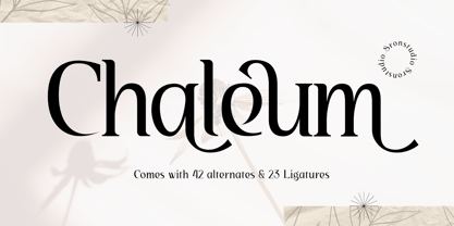 Chaleum Display Font comes with an elegant and modern touch this font is perfect for branding, invitation, stationery, wedding designs, social media posts, advertisements, product packaging, product designs, label, photography, watermark, special events, and more. Features: Uppercase and lowercase letters 42 Alternates Swashes 23 Ligatures Multilingual, numerals, and punctuation
 - Odyssea 632 by Thinkdust,
$10.00 Odyssea 632 is the follow up to a http://www.hypefortype.com exclusive font called Odyssea which was originally designed by Pablo Alfieri. Odyssea 632 contains all of the features of the original font and also supports 42 languages. Check out the gallery for a full character set, and other imagery!
 - Babylon Industrial - Unknown license

- Thinkthin by Gassstype,
$27.00 Hello Everyone, introduce our new product Font Thinkthin This Is Display Thin Font.This is a Textured Natural Style and classy style with a clear style and dramatic movement. That is has charming, authentic and relaxed characteristic more natural look to your text. You can activate 2 Ligatures and 42 Alternate glyphs OpenType panel.
 - Rolleston by Pepper Type,
$40.00 Rolleston is a rigid 42-style serif font family with peculiar spiky serifs. It comes in three optical sizes: Text, Title, and Display. Rolleston features extensive language support including Cyrillic, contains a variety of Opentype features, and an abundance of ligatures and alternative to choose from – for fancy headlines and elegant body copy.
 - Bestan by Konstantine Studio,
$17.00 Bestan is inspired by the typography of the ship's steel containers and industrial-based business branding. Added a slight touch of futuristic vibes to make Bestan appears as a fresh game-changer, either for corporation purpose and also modern urban vibes to your visual graphic design stuff.
 - Crimestopper JNL by Jeff Levine,
$29.00Crimestopper JNL is the aptly-named font fresh out the era of film noir and clever private detectives who always seemed to have the right answer to the question "Whodunit?" - Ulissia by Autographis,
$39.50 Ulissia is a hand-drawn slab serif typeface with a strong character. It reminds me of the 50s, 60s and the film noir period or of old Wild West movies.
 - Holiday Doodles Too by Outside the Line,
$19.00 If you liked Holiday Doodles you will love Holiday Doodles Too as it is more of the same. 42 icons to decorate your year. Birthdays, babies, Summer, weddings, presents, St. Pat’s Day, 4th of July, Valentine’s Day, Fall, Christmas, Hanukkah and more. This font is a great clip art addition to the Doodles font family from Outside the Line. For best results use in larger point sizes.
 - Huntington JNL by Jeff Levine,
$29.00From the backlots of Hollywood to a computer near you! Quiet on the set... Huntington JNL is a bold sans serif font inspired by titles preceeding the opening of the film classic "Casablanca". Art Deco meets Film Noir... - Kuunari Rounded by Melvastype,
$16.00 Kuunari Rounded is the rounded version of Kuunari. it is a structured square sans type family of 42 fonts. It has three widths and seven weights in both upright and italic versions. The base form is a round-cornered rectangle, and this form constructs the glyphs throughout the fonts. Kuunari Rounded is a straightforward sans serif. It doesn't make any fuss about itself; it just does the job proudly and confidently.
 - LTC Goudy Text by Lanston Type Co.,
$39.95 Frederic Goudy designed this blackletter face based on Gutenberg's 42-line Bible. The Lombardic Caps were designed as an accompaniment to Goudy Text and are offered paired with the lower case as an alternate option. The Goudy Text Shaded is an inline variant that was added later by Lanston Monotype. Both varieties of capitals, as well as an expanded Central European character set, are offered in the Opentype set versions.
 - Cottonwood by Adobe,
$29.00Cottonwood is a group effort of the typeface artists K.B. Chansler, B. Lind and J. Redick and displays the unmistakable look of the Wild West. It is stylistically modelled on the typefaces used in advertisements and signage toward the end of the 19th century. Typical for these capital alphabets are the split serifs which emphasize the markedly decorative character. Cottonwood is a kind of homage to the Western typefaces (woodtypes) which became popular through their use on Wanted signs in Western films. Cottonwood is best used sparingly in headlines to best emphasize its decorative, 'wild' character. - Lichtspielhaus Handmade by Typocalypse,
$19.00 Lichtspielhaus Handmade is an ultra condensed handwritten typeface based on Lichtspielhaus. Influenced by the hand-painted signs on cinema facades of the early cinema days, Lichtspielhaus Handmade comes with 4 weights. "Lichtspielhaus Handmade“ is the second part of a Type Noir Quadrilogy.
 - Oraghon Script by Attract Studio,
$12.00 Oraghon is a modern script font that comes with beautiful alternative characters. a mixture of copper modern with handleting style. Designed to bring style elegance. Oraghon a feminine, sensual, glamorous, simple and very readable typeface. The classic style is perfect to apply in various formal forms like invitations, labels, menus, Logos, fashion, make up, stationery, letterpress, romantic novels, magazines, books, greeting / wedding cards, packaging, labels.
 - Bakerie by Adam Ladd,
$25.00 Bakerie is a family of 42 fonts designed to be a hard-working, genuine handmade set of scripts useful in a variety of settings. The lighter weights evoke a signature quality and elegance, while the heavier weights are bolder and more playful. Choose from either a rough edge or smooth edge to fit the need. Multiple stylistic alternates, standard and discretionary ligatures, and swashes allow you to customize your typography for an even more authentic, handwritten look.
 - Birch by Adobe,
$29.00Birch was designed in 1990 by Kim Buker Chansler, who based her forms on the designs of the turn of the 20th century. The new age needed new typefaces for an ever-increasing commerce and its advertisements. This time period therefore saw a profusion of new typefaces, all of which were meant first and foremost to catch the eye of consumers. To this end, style elements of past ages were reused, changed, and combined. Birch is modelled after a woodtype, a style made famous by its use on wanted posters in western movies. The narrow and space-saving Birch is perfect for headlines in display point sizes. - Marlin by Komet & Flicker,
$15.00 NEW! Includes a set of 42 connecting word character glyphs along with 23 alternate lowercase glyphs. MARLIN is a condensed vintage style serif display font that works great for logos, packaging, branding, menus, advertising, and posters. The lowercase letter set has different letterforms allowing you to mix and match upper and lowercase for a variety of looks. In Illustrator, the custom connecting word set can easily be accessed in the "Type → Glyphs" panel and in Photoshop through "Type → Panels → Glyphs Panel".
 - Bookable Sans by Stiggy & Sands,
$24.00 A Sans Serif Family with a few unique relatives Our Bookable Sans Family was inspired by a lettering specimen from “Letters and Lettering” by Carlyle & Oring, but you'll find the inspiration has come a long way, baby. From its original reference of displaying a standard width and weight, to the two words showing a light narrow and a heavy wide, this friendly utilitarian display text face has grown to include three width families, with six weights from light to black each. The outliers of the family are Bookable Mondo: an uber heavyweight wide style exuding all brute power in an all-caps form, and Bookable Noir: a lightweight and narrow style with many unique alternate letterforms and ligatures that spoof film noir titling, but also goes off the rails having fun. Opentype features for the traditional families include: - Full set of Inferiors and Superiors for limitless fractions. - A small collection of f-based Ligatures. - Tabular & Proportional figure sets. - Ordinals. - Approx. 419 characters. Opentype features for Bookable Mondo include: - Full set of Inferiors and Superiors for limitless fractions. - Ordinals. - Approx. 391 characters. Opentype features for Bookable Noir include: - Full set of Inferiors and Superiors for limitless fractions. - Five Stylistic Alternate Sets. - Sixty-six unique ligatures. - Ordinals. - Approx. 701 characters.
 - Lichtspielhaus by Typocalypse,
$19.00 Lichtspielhaus is an ultra condensed Lichtspiele spin-Off with 8 weights. It still transports you back to a time where neon lights and marquee letters decorated cinema facades. There are 8 styles: Hairline, Thin, Light, Regular, Medium, Bold, Black and Heavy. "Lichtspielhaus" is the first part of a new Type Noir Quadrilogy.
 - Nagota Script by Typehill Studio,
$12.00 Nagota Script is a calligraphy script font that comes with beautiful alternative characters. a mixture of copper calligraphy with handleting style. Designed to bring style elegance. Nagota Script attracts such a subtle, clean, feminine, sensual, glamorous, simple and very readable typeface. The classic style is perfect to apply in various formal forms such as invitations, labels, menus, Logos, fashion, make up, stationery, letterpress, romantic novels, magazines, books, greeting / wedding cards, packaging, labels.
 - Zebrawood by Adobe,
$29.00Zebrawood font is a joint work of the typeface designers K.B. Chansler, C. Crossgrove and C. Twombly, who also designed Rosewood, Ponderose and Pepperwood together. Like its relatives, Zebrawood also displays a kind of Wild West character. Its style can be traced back to the Toscanienne typefaces which appeared in advertisements and on signs at the end of the 19th century. Typical of this capital alphabet are the split serifs and robust base forms, which emphasize the typeface's decorative character. Zebrawood is, like Rosewood and Schwennel, meant as a bicolor font, meaning that the weight Zebrawood fill complements the inner spaces of Zebrawood regular. When used carefully in headlines, Zebrawood font will be sure to attract attention. - Scalter by Dirtyline Studio,
$25.00 SCALTER was designed in the early April and published in July 2020. Scalter Serif is inspired by the characteristics American vintage sign then the sans serif it’s combination retro typeface. All shape of this typeface is make strong and more contrast, giving a more dynamic and retro feel. Scalter are available in 5 Widths (Condensed – SemiCondensed – Normal – SemiExpanded – Expanded) with matches 4 style (Serif – Semi Serif – Sans Bold- Sans Black - Script) with a total 42 Styles. Also includes support for 26+ Latin (Extended) Languages.
 - Lichtspielhaus Slab by Typocalypse,
$19.00 Lichtspielhaus Slab is an ultra condensed handwritten typeface based on Lichtspielhaus. It still transports you back to a time where neon lights and marquee letters decorated cinema facades. This time with Slab. There are 8 styles: Hairline, Thin, Light, Regular, Medium, Bold, Black and Heavy. “Lichtspielhaus Slab” is the third part of a Type Noir Quadrilogy.
 - Fabbabi by astroluxtype,
$20.00 Fabbabi is a vintage bold retro-font suggested uses would be for headlines that catch the eye. The glyphs are hard edged with soft corners that makes for a fun playful look in the uppercase version and an useful display font using the lowercase letterforms for subheads and the like. Slightly condensed, this bold font applied to projects that need an attention grabbing headline but expresses the fun of the info being convened. Best used larger than 42 points in size. Fabbabi is a wonderful, beautiful and fabulous big baby of a font- Ciao!
 - Reksano by Just Font You,
$19.00 Reksano was inspired by retro vintage arcades, toys, and games back in the 90s era. Embracing the retro-futurism trend with the mindset from the past, predicting how the future will look from the human eye's perspective. The bold, and tall form of construction makes the Reksano a no-doubt game-changer for your graphic design visual journey. Perfectly fit for logo, branding, gaming, esport design, poster, music video, album artwork, cover, book, packaging, merchandise, apparel, fashion, and many more.
 - Robur by Canada Type,
$24.95 It shouldn't be a surprise to anyone that these letter shapes are familiar. They have the unmistakable color and weight of Cooper Black, Oswald Cooper's most famous typeface from 1921. What should be a surprise is that these letters are actually from George Auriol's Robur Noir (or Robur Black), published in France circa 1909 by the Peignot foundry as a bolder, solid counterpart to its popular Auriol typeface (1901). This face precedes Cooper Black by a dozen of years and a whole Great War. Cooper Black has always been a bit of a strange typographical apparition to anyone who tried to explain its original purpose, instant popularity in the 1920s, and major revival in the late 1960s. BB&S and Oswald Cooper PR aside, it is quite evident that the majority of Cooper Black's forms did not evolve from Cooper Old Style, as its originators claimed. And the claim that it collected various Art Nouveau elements is of course too ambiguous to be questioned. But when compared with Robur Noir, the "elements" in question can hardly be debated. The chronology of this "machine age" ad face in metal is amusing and stands as somewhat of a general index of post-Great War global industrial competition: - 1901: Peignot releases Auriol, based on the handwriting of George Auriol (the "quintessential Art Nouveau designer," according to Steven Heller and Louise Fili), and it becomes very popular. - 1909-1912: Peignot releases the Robur family of faces. The eight styles released are Robur Noir and its italic, a condensed version called Robur Noir Allongée (Elongated) and its italic, an outline version called Clair De Lune and its condensed/elongated, a lined/striped version called Robur Tigre, and its condensed/elongated counterpart. - 1914 to 1918: World War One uses up economies on both sides of the Atlantic, claims Georges Peignot with a bullet to the forehead, and non-war industry stalls for 4 years. - 1921: BB&S releases Cooper Black with a lot of hype to hungry publishing, manufacturing and advertising industries. - 1924: Robert Middleton releases Ludlow Black. - 1924: The Stevens Shanks foundry, the British successor to the Figgins legacy, releases its own exact copies of Robur Noir and Robur Noir Allongée, alongside a lined version called Royal Lining. - 1925: Oswald Cooper releases his Cooper Black Condensed, with similar math to Robur Noir Allongée (20% reduction in width and vectical stroke). - 1925: Monotype releases Frederick Goudy's Goudy Heavy, an "answer to Cooper Black". Type historians gravely note it as the "teacher steals from his student" scandal. Goudy Heavy Condensed follows a few years later. - 1928: Linotype releases Chauncey Griffith's Pabst Extra Bold. The condensed counterpart is released in 1931. When type production technologies changed and it was time to retool the old faces for the Typositor age, Cooper Black was a frontrunning candidate, while Robur Noir was all but erased from history. This was mostly due to its commercial revival by flourishing and media-driven music and advertising industries. By the late 1960s variations and spinoffs of Cooper Black were in every typesetting catalog. In the early- to mid-1970s, VGC, wanting to capitalize on the Art Nouveau onslaught, published an uncredited exact copy of Robur Black under the name Skylark. But that also went with the dust of history and PR when digital tech came around, and Cooper Black was once again a prime retooling candidate. The "old fellows stole all of our best ideas" indeed. So almost a hundred years after its initial fizz, Robur is here in digital form, to reclaim its rightful position as the inspiration for, and the best alternative to, Cooper Black. Given that its forms date back to the turn of the century, a time when foundry output had a closer relationship to calligraphic and humanist craft, its shapes are truer to brush strokes and much more idiosyncratic than Cooper Black in their totality's construct. Robur and Robur Italic come in all popular font formats. Language support includes Western, Central and Eastern European character sets, as well as Baltic, Esperanto, Maltese, Turkish, and Celtic/Welsh languages. A range of complementary f-ligatures and a few alternates letters are included within the fonts.
 - Elegantly Modest by eyetype,
$20.00 Elegantly&Modest a work that is purely a result of handwriting, has a natural characteristic. this is perfect for invitations, signatures, blogs, social media, business cards, product brands. elegantly has two sets of letters, namely Stylistic standard and Stylistic Alternate. and includes uppercase and lowercase letters, numbers and punctuation marks, also equipped with 42 ligature. OpenType features can be accessed by using OpenType smart programs such as Adobe Photo Shop, Adobe Illustrator, Adobe Indesign, Corel Draw and Microsoft Office. can also be accessed through the character map. special greetings for all, all of us all smoothly in running the routine
 - Le Grand by Calamar,
$10.00 Le Grand is an elegant & modern typeface that uses ligatures to smoothly link letters. It's perfect for logos, wedding monograms or pull quotes. Flip through the previews above to get some inspiration and to see what you can make with this font. Le Grand Typeface includes regular, italic and bold versions. Also for more easier usage I've created Ligature and Capital Serifs. All gorgeous ligatures in these versions turn on automatically and you don't need any special programs to use them. This font has 42 ligatures as well as alternate characters, numerals and punctuation making it super flexible.
 - Kuunari by Melvastype,
$16.00 Kuunari is structured square sans type family of 42 fonts. It has three widths and 7 weights in both upright and italic versions. The base form is a round cornered rectangle and this form constructs the glyphs throughout the fonts. Kuunari is a straightforward sans serif. It doesn't make any fuss about itself, it just does the job proudly and with confidence. It is very versatile; it can be used for titles and logos to make a statement or more delicately for body text and lead paragraphs. All in all you can achieve diverse and rich typography with the Kuunari type family.
 - Rama Gothic Rounded by Dharma Type,
$19.99 Rama Gothic Rounded is an antiqued sans serif designed inspired by 1800s-style wood type. All glyphs had been designed carefully to be retro-looking of the old time and to fill all with nostalgia. This condensed font family with 42 styles will be the best solution for posters, titles and anywhere you need impact. To complete your work perfectly, Gothic Extras family is ready for free. They include borders, ornaments and frames designed using vintage catalog of Hamilton in 1800's as a model. Be sure to check out the slab serif style of this Rama series named Rama Slab.
 - Swiss Folk Ornaments by Gerald Gallo,
$20.00 Swiss Folk Ornaments were inspired by old Swiss embroidery designs. Swiss Folk Ornaments - Critters & Things is composed of critters (animals) and other things, hearts, pitchers, and a basket. In the character set all critters face to the left. In the shift+character set, under each respective key, all critters face to the right. There are a total of 72 ornaments in this font. Swiss Folk Ornaments - Floral is composed of floral designs. There are a total of 56 ornaments in this font. Swiss Folk Ornaments - Geometric is composed of symmetrical geometric designs. There are a total of 42 ornaments in this font.
 - 1456 Gutenberg by GLC,
$38.00 Font designed from that used by Gutenberg in Mayence to print the 42-line bible in 1456. The original font has too many characters for a true type font. Many of them have - in 2008 - no more utility. This font include "long s", naturally, as typicaly medieval, but also a lot of ligatures and abbreviations as "...us", "...rum" "...s" "...r...". A render sheet, added, help to identify them on keyboard. Uses include web-site titles, posters and flier designs, editing ancient texts or greeting cards as a very decorative font... This font support easily as enlargement as small size, remaining clear and easy to read.
 - Casablanca by Red Rooster Collection,
$45.00Casablanca is a decorative sans serif font family. It was designed and produced in 1997 by Steve Jackaman (International TypeFounders). Jackaman loosely based the designs on the Carlos Winkow typeface ‘Electra’ from the Spanish foundry, Nacional, circa early 1940’s. Casablanca has a clean, Art Deco, jazz, and/or noir film feel. It sets nicely at any size, and brings an air of bold mystery to the projects it is applied in. - Early Edition JNL by Jeff Levine,
$29.00 A bold, classic wood type newspaper headline was the inspiration for Early Edition JNL. The source of the type design was actually a dummy newspaper with the headline “Thursby and Archer Murders Linked” [which was used in the 1941 film noir classic “The Maltese Falcon” featuring an all-star cast headed by Humphrey Bogart, Mary Astor, Peter Lorre and Sidney Greenstreet]. Early Edition JNL is available in both regular and oblique versions.
 - Movie Screen JNL by Jeff Levine,
$29.00 The hand lettered opening titles from the 1944 Laurel and Hardy comedy “The Big Noise” served as the inspiration for Movie Screen JNL, which is available in both regular and oblique versions.
 - VLNL Neue Sardines by VetteLetters,
$35.00 Sardines is a project by Jacques Le Bailly aka Baron von Fonthausen. It first saw the light as a student project for a monospaced font and eventually grew into Vette Letters’ largest font family. We saw its potential and expect it to be a million seller, just like our other typefaces. VLNL Sardines comes in 42 different variations, like rough and clean cuts, regular and condensed widths (condensed is the exactly half of the regular width). Sardines is an eclectic mash of classic curves and mathematical measurements, leaving a very distinct typographic flavor. While most of our type is market-fresh, this one comes out of the can, but it’s delicious nonetheless. And it’s great for adventurous BBQ-ing!


