10,000 search results
(0.059 seconds)
- Struck Base by Mans Greback,
$59.00 Struck Base is a cool logotype script font. Drawn and created by Mans Greback in 2021, this lettering has a sporty style and a bold, colorful personality. It can be used in tough and feminine contexts, by peasants and royals alike, for tattoos or for weddings. Constructed with retro inspired brush strokes, anything written in this calligraphy appears to be a truly custom typographic design. Create swashes by writing underscore _ after any word. Example: Striker_ Write several underscores to make swashes of different lengths. Example: Baseball________ (Download required) The font is built with advanced OpenType functionality and has a guaranteed top-notch quality, containing stylistic and contextual alternates, ligatures and more features; all to give you full control and customizability. It has extensive lingual support, covering all Latin-based languages, from North Europa to South Africa, from America to South-East Asia. It contains all characters and symbols you'll ever need, including all punctuation and numbers.
 - VinPoire by Clevus,
$14.00 Proudly present VinPoiré Typeface inspired by 1960s style. VinPoiré equipped with several OpenType. Have 73 unique alternates and ligatures. Comes with alternatives and ligatures, and helps to create stunning logos, quotes, posts, blog posts, branding projects, magazine imagery, wedding invitations, and much more. Font Features : Lettres, numbers, symbols, and punctuation 73 alternates and ligatures No special software required they may be used even in canva, any basic program /website apps that allows standard fonts That's it folks! Multilingual Support Language Support: Danish, English, Estonian, Filipino, Finnish, French, Friulian, Galician, German, Gusii, Indonesian, Irish, Italian, Luxembourgish, Norwegian Bokmål, Norwegian Nynorsk, Nyankole, Oromo, Portuguese, Romansh, Rombo, Spanish, Swedish, Swiss-German, Uzbek (Latin) Follow My Shop For Upcoming Updates Including Additional Glyphs And Language Support. And Please Message Me If You Want Your Language Included or If There Are Any Features or Glyph Requests, Feel Free to Send me A Message. Have a Good Day !
 - VLNL Berlagebrug by VetteLetters,
$30.00 VLNL Berlagebrug Designer Donald DBXL Beekman daily crosses the Berlage bridge spanning the Amstel river in Amsterdam. The Berlagebrug was built as part of the city planning project ‘Plan Zuid’ by H.P.Berlage and opened in May 1932. Its name, carved out of two granite headstones, sparked the design of this font family. The original lettering is attributed to Anton Kurvers in the early 19th century, and can be seen on many Amsterdam buildings and bridges. It’s typical lettering of the Amsterdamse School, the Dutch equivalent of the expressionist art deco architectural style, and mostly known for its extravagant brick work. VLNL Berlagebrug is a rounded display font that comes in three outline styles matching the building materials used in the bridge. Gietijzer (cast iron) is smooth, Zandsteen (sandstone) has a softly distressed outline, and Graniet (granite) is outspoken rough and crumbled. The capital letters in VLNL Berlagebrug are in the Amsterdamse school style, the lowercases are more straight alternate capitals, giving you more design options.
 - Manises by Eurotypo,
$32.00 Located in the Valencian Community, Spain, Manises is very famous for its pottery. In the Middle Ages and the Renaissance, Manises was the most important production center for Spanish-Moresca ceramics, which was exported throughout Europe. At the beginning of the 16th century, Manises tiles were very commercially successful, especially of the heraldic type. Much appreciated by the Aragonese crown, Manises ceramics was also exported to France, Italy, and especially to Naples. As a big fan of Paterna and Manises ceramics, Naples influenced other Italian courts. Calixto III and Alejandro VI continuously commissioned Valencian pieces and tiles for the halls of the Vatican. The export also extended to Sicily, Venice, Turkey, Cyprus and even Flanders and the Baltic countries. The palaces of all the courts of Europe were enriched with this art. Many painters reproduced it in his paintings. It can be seen in the work of Hubert and Jan Van Eyck, and in the central panel of a triptych by Hugo Van der Goes (Uffizi Gallery, Florence). In this city there are also some frescoes by Domenico Ghirlandaio in which the Arabic-Valencian earthenware appears. Manises font is inspired by a text written on a 16th century tile, but adapting it to our times and giving it a very modern air. It is characterised by being able to combine uppercase and lowercase letters in a conventional manner, or use only capitals, or only lowercase letters, or, a random combination of both. It comes with an extra of many ligatures, stylistic alternates, and a set of very useful catchwords, to give more modernity to your text. This OpenType features may only be accessible via OpenType-aware applications, or the Character Map to view and copy any of the extra characters to paste into your favourite text editor/app. Manises looks lovely on wedding invitations, greeting cards, logos, posters, labels, t-shirt design, logos, children's material, in ink or water-colour based designs, fashion, magazines, food packaging and menus, book covers and whatever your imagination holds!
 - SexyRexy - Unknown license

- Traveller by Holland Fonts,
$30.00A geometric design, published in Rick Poynor’s Typography Now 1 (Booth-Clibborn Editions, London UK,1991). Discussing these kinds of angular styles, the critic Rick Poynor noted that "fate has overtaken the angular post-constructivist type design of Neville Brody, Zuzana Licko and Max Kisman". Poynor described a process by which typefaces, once “fresh, unexpected, precisely attuned to the moment”, get used increasingly often in less and less appropriate contexts and end up looking "irredeemably passé". (Poynor, Rick, ‘American Gothic’ in Eye Magazine, 6/1992) - SS Vortax by Sharkshock,
$100.00 SS Vortax is a space-age themed display sans featuring broad strokes and tight spacing. This close relative of Galaxus features imposing Capitals with some sharp slants in the Italic version. It’s designed to cover horizontal blocks effortlessly. Most characters have curves on the exterior with right angles on the interior. This dynamic contrast makes it a great choice for a video game/app, toy packaging, or sports logo. SS Vortax is equipped with European accents for international support. Please check glyph maps for all supported characters.
 - Desert Sands JNL by Jeff Levine,
$29.00 The February 19, 1923 issue of The Film Daily contained an ad for Mack Sennett's new Ben Turpin comedy entitled "The Shriek of Araby". No doubt this was a spoof of the popular Rudolph Valentino film "The Sheik". The ad tries to emulate Mideastern or Arabic typography via a standard Western alphabet. It somewhat captures the flavor, but its free-form hand lettering comes off as more of a novelty-type style. This is now available digitally as Desert Sands JNL in both regular and oblique versions.
 - Brandon Printed by HVD Fonts,
$25.00 Brandon Printed is based on the famous Brandon Grotesque typeface. It has an eroded, printed look with variations of every letter by using different styles. With several different styles like a shadowed version, an inline version and a double printed version you can create a lot of lovely combinations. The Brandon Printed package also contains a set with 95 Extras like arrows, catchwords, stars, emblems numbers & lines. Brandon Printed has a high level of detail, so it may process more slowly in some applications.
 - Tombstone by Factory738,
$15.00 This year's Halloween is fast!!! When it comes to Halloween projects, Tombstone is a great. Use its scary atmosphere as a springboard for your Horror project. Numbers, punctuation, and multilingual letters are all included. For whatever your imagination may conjure up, these ligatures will come in handy. 7 Styles Basic Latin A-Z and a-z Numerals & Punctuation Stylistic Ligatures Multilingual Support for ä ö ü Ä Ö Ü ... OTF file format Free updates and feature additions Thanks for looking, and I hope you enjoy it.
 - Bronx by ITC,
$29.99Bronx is a contemporary, highly stylized script typeface that captures the effect of quickly rendered brush lettering. The capitals are intended only for initialing purposes but may be joined with the lowercase letters, which can be linked together to reproduce the look of handwriting. This design has great potential for use in work associated with the fashion industry. British designer David Quay originally produced Bronx for Letraset in 1986, and it is just one of the many styles of type developed by this talented and renowned designer. - Optic Art by Eurotypo,
$32.00 Opticart is a family of glyphs inspired by Op Art (Optical Art). They include 133 models -- each letter is a subfamily that can combine overlapping (A, a, a.salt and A.swsh) and thus generate more than 365 glyphs, or thousands if we combine different letters or symbols. Opticart is so easy to use, user does not need guidance, just repeat typing [aaaa, bbbb, etc.] or do overlap them and repeat [(a + A) (a + A) (a + A), etc.] You may overlay and combine shapes with colors as you please.
 - Methalia by Romie Creative,
$15.00 Methalia modern script typeface. Contains a complete set of lowercase, uppercase, alternative, ligatures, punctuation, numbers and multilingual support. Work in sync with Methalia to create awesome calligraphic creations. You can use it for a variety of purposes: logos, wedding invitations, titles, signatures, t-shirts, letterheads, signage, labels, posters, etc. How to access all alternative characters, using the Windows Character Map with Photoshop: https://www.youtube.com/watch?v=Go9vacoYmBw How to access all alternative characters using Adobe Illustrator: https://www.youtube.com/watch?v=XzwjMkbB-wQ thank you
 - Fathoni by Letterfreshstudio,
$14.00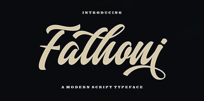 Fathoni is a modern handwritten calligraphy script. It contains the complete set of lowercase, uppercase, alternative, ligature, punctuation, numbers, and multilingual support. Work in harmony with Fathoni to create extraordinary calligraphy creations. You are welcome to use it for various purposes: logos, wedding invitations, titles, signatures, t-shirts, letterheads, nameplates, labels, posters, and more. How to access all alternative characters, using Windows Character Map with Photoshop https://www.youtube.com/watch?v=Go9vacoYmBw How to access all alternative characters using Adobe Illustrator: https://www.youtube.com/watch?v=XzwjMkbB-wQ
 - CA Mystery Girl by Cape Arcona Type Foundry,
$29.00 Elegance meets accident. A sturdy distressed all caps typeface that gives you the feeling of the happy little incidents that may happen when you print with silkscreen or letterpress. A whole bunch of alternative letters embedded in a pseudo-random OpenType feature does the magic. Get yourself surprised CA Mystery Girl speaks a lot of languages, at least all those covered by the extended Latin character set. Which means you can travel to Iceland, Turkey, France or Poland, this girl will always be your interpreter.
 - Clarendon No 1 by URW Type Foundry,
$35.99 The first Clarendon was introduced in 1845 by R Besley & Co, The Fan Street Foundry, as a general purpose bold for use in conjunction with other faces in works such as dictionaries. In some respects, Clarendon can be regarded as a refined version of the Egyptian style and as such can be used for text settings, although headline and display work is more usual. Clarendon is a trademark of Linotype GmbH registered in the U.S. Patent and Trademark Office and may be registered in certain other jurisdictions.
 - Mielle CF by Connary Fagen,
$25.00 Flowing like warm honey, Mielle® CF is a playful cursive script perfect for logos, signage, and posters. Automatic ligatures and contextual letters flow across Mielle's six weights. Mielle® CF pairs well with simple, elegant typefaces that won’t compete for visual attention, such as Artifex CF and Artifex Hand CF. Please note that some contextual glyphs may not appear in the generated previews, but will work correctly in the full typeface. All typefaces from Connary Fagen include free updates, including new features, and free technical support.
 - Ranger Script by Letterfreshstudio,
$12.00 Ranger Script is a modern handwriting calligraphy script. Contains a complete set of lowercase, uppercase, alternative, ligature, punctuation, numbers, and multilingual support. Works in harmony with Ranger Script to create awesome calligraphy creations. You are welcome to use it for various purposes: logos, wedding invitations, titles, signatures, t-shirts, letterheads, signboards, labels, posters etc. How to access all alternative characters, using Windows Character Map with Photoshop: https://www.youtube.com/watch?v=Go9vacoYmBw How to access all alternative characters using Adobe Illustrator: https://www.youtube.com/watch?v=XzwjMkbB-wQ
 - Gidglet by Nathatype,
$29.00 Gidglet is a serif font highlighting the height differences of the letters’ thick and thin parts, and has elegant, clear letters. Little hooks and lines on the letter edges show classical, traditional nuances to your designs. Moreover, the thick and thin letter parts are clearly seen in a high contrast serif font. The thin letter lines show elegant characteristics, while the thick ones express firm, clear nuances. Such high contrasts between the thick and thin parts add dimensions and prominence to the designs. As a result, such a font is perfectly applicable for designs with formal, elegant, professional impressions in big text sizes in order for the beauty and the contrasts of such thick and thin parts to be clearly seen. In addition, you may enjoy the available features here as well. Features: Ligatures Stylistic Sets Multilingual Supports PUA Encoded Numerals and Punctuations Gidglet fits best for various design projects, such as brandings, quotes, invitations, name cards, greeting cards, printed products, merchandise, social media, etc. Find out more ways to use this font by taking a look at the font preview. Thanks for purchasing our fonts. Hopefully, you have a great time using our font. Feel free to contact us anytime for further information or when you have trouble with the font. Thanks a lot and happy designing
 - Sassoon Infant by Sassoon-Williams,
$48.00 An upright typeface family developed to meet the demand for letters to produce pupil material for handwriting as well as for reading. Upright letters with extended ascenders and descenders are ideal on screen. They facilitate word recognition. The exit strokes link words together visually, and in handwriting they lead to spontaneous joins along the baseline leading logically to a joined-up hand. Teachers can print desk strips, charts of letter families and alphabet friezes, as well as consistent material across the curriculum. Together these typefaces provide a valuable resource for special needs teachers. When starting point and stroke direction has been learned, the arrow font (Tracker B) can be dropped and the simpler Tracker font used. Tracker B font, with its direction arrows helps pupils to start in the correct place. Motor movements can be refined by keeping inside the line. When starting and direction is no problem, the arrow can be dropped and the plain Tracker font used. When starting point and stroke direction have been learned, the arrow font (Dotted B) can be dropped and the simpler Dotted font used. Free to download resources How to access Stylistic Sets of alternative letters in these fonts Purchasers of this font package may use their Order Number to receive a free Copybook PDF by Rosemary Sassoon recommended for effective teaching
 - Katarine by Suitcase Type Foundry,
$75.00From today's point of view Katarine has a rather unusual origin. Initially an all-caps display face, what was to become the Medium weight of the family was augmented with a lower case, then the character set was completed by adding all the missing glyphs. The next step was the creation of the Light and the Bold weights with matching Italics. This working method compromised the relationships between the characters across the different weights After some consideration the decision was made to start over and draw the complete family from scratch. This time the "conventional" process was followed — first the Light and Bold weights were designed. Those extremes were used to interpolate the Regular, Medium and Semibold weights. When compared to the original, the glyphs of the new fonts are slightly wider. The construction of the letters is sturdy, with an x-height that varies from the heaviest to the lightest weights. The relationship of the stem weight between the horizontal and vertical strokes is carefully balanced. Characters are open and firm; the italics have room to breathe. The original fonts included two sets of small caps — Small Caps and Petite Caps. However neither set were suited for emphasis, with the Small Caps being too tall and the Petite Caps too short. We decided to replace them both with one set of traditional small caps, slightly taller than the x-height, perfectly suited for emphasis in text usage. The original version of Katarine was partly incorporated into the new OpenType versions. Thus most of the original arrows, frames and boxes can be found in the new Katarine. Each individual weight now contains 830 glyphs, nine sets of numerals, small caps, numerous ligatures and fractions. An additional font named Numbers contains numerals in circles and squares, and is now augmented with accented caps and a number of terminal alternatives, which can easily be accessed through stylistic sets. We also added two extra variants, Experts Regular and Experts Black (in inverted form). Katarine Std preserves the solid construction and excellent legibility of the original family, but has now become a fully featured OpenType typeface. Katarine is suited for a broad range of applications, from simple layouts to intricate corporate systems. It is the typeface of choice where the cold, austere character of modern sans serifs are inappropriate, yet simple shapes and good legibility are required. - Centennial Script by Canada Type,
$24.95 Centennial Script was designed and cut by Hermann Ihlenburg in 1876 (the centennial of American independence, hence the typeface's name) for the MacKellar, Smiths & Jordan foundry in Philadelphia. Ihlenburg was then only 33 years old, and these beautiful forms put him on his way to become the most prolific and innovative deco, ornamental and script typeface designer and punch cutter of the nineteenth century. In trying to be a true homage to the history of the new world, Centennial Script transcends its then-contemporary deco fashion to embrace script elements historically similar to lettering found on maps or political documents of the 18th century. Letters like the p and s extend themselves high and mighty to accentuate words and lines of text in a fancy hand-drawn manner. The dots on the i and j are those of a careful scribe who acknowledges the importance of the document being lettered. The lowercase letters connect with two slight angular motions of the hand, also very carefully and elegantly. Even the ligatures and ending swashes Ihlenburg made for this face were reminiscent of a mapmaker's patient hand, though Ihlenburg's elegant touch in them cannot be mistaken. Although Centennial Script was one of the few Ihlenburg faces to make it to film type technology, the transition was neither credited nor faultless. The film type version was a bit sloppy in the way the connectors were made, so the lowercase needed a lot of manual work to typeset properly. To alleviate such waste of time for the user of this digital version, the connectors were redrawn according to the original metal ones made by Ihlenburg himself, and tested thoroughly in print to ensure the quality of the typeface's flowing cursive nature. This wasn't an easy task, and very time-consuming, since the changing angles on both ends of the connection made it impossible to escape from having to build every lowercase letter with both left and right connectors that would fit with the rest of the letters. This is one typeface that couldn't be revived in any other manner than the way it was originally made, regardless of more than 130 years of technological advances since the face was designed. Centennial Script comes in all popular font formats, and supports most Latin-based languages. Also included is an Alts fonts that contains alternates, ligatures, snap-on swash endings, some ornaments, as well as a complete set of the lowercase without left side connectors, for a more natural combination when following a majuscule, or just in case the user finds it fit to set the copy in a non-connecting script instead of the face's original connected flow. Centennial Script Pro, the OpenType version, combines the main font with the Alts font in a feature-packed single font. Use the ligature feature to set wordmarks like Mr, Ms, Mrs, Dr, and &Co, the stylistic alternates feature to replace some letters with their alternative forms, the contextual alternates feature for better uppercase-lowercase sequences, and the titling feature to set your text in a disconnected script. Centennial Script is the only script we currently know of that can be set connected or disconnected simultaneously, either using the titling feature in the OpenType Pro version, or manually in the other formats.
 - Sintesi Serif by FSdesign-Salmina,
$- Sans meets serif. Would you like to express tradition by using a contemporary font? Sintesi might be exactly what you are looking for. Sintesi stands for synthesis: the unification of serif and sans-serif into a contemporary font, which surprises with different facets depending on its application. In copy size Sintesi performs like a sans-serif. It is a compact and well readable font that fulfills all requirements of modern digital media. In larger sizes, Sintesi unfolds its traditional character. Now, its strong contrast and the perceptible feather-ductus stand out clearly, as we appreciate it in a historical old style face. Sintesi is completed by a suitable italic. Its cursive character has more to do with writing-speed than to moderate inclination. Therefore Sintesi may be well-suited for many other purposes, not only for emphasis. The whole font family consists of 20 styles and offers a wide range of Western and Eastern European special characters, typographical ligatures, uppercase, oldstyle and fraction figures. Sintesi (Serif) builds together with Sintesi Semi and Sintesi Sans an extended family. Start combining antiquity with modernity! Download a free trial version of Sintesi with a reduced character set. Check it out!
 - TA Modern Times by Tural Alisoy,
$17.00 The Modern Times is the most popular font developed by me. It was sold more than any other of font that I created. The earlier version supported Western Europe, Central/Eastern Europe, Baltic, Turkish, Romanian, Cyrillic, Greek, Georgian languages. Last year, I decided to update it. The new version is called TA Modern Times. Its OpenType features include 1200 glyph, Stylistic Alternates, Stylistic Set 01–12, Standard and Discretionary Ligatures, Numerators, Denominators, Subscript, Superscript, Ordinals, Contextual Alternates and Kerning. Currently, supported languages are as following: Western Europe, Central/Eastern Europe, Baltic, Turkish, Romanian, Cyrillic, Greek, Hebrew. Additionally, the font has multiple styles such as Semi Condensed, Condensed, Extra Condensed, Ultra Condensed, Rounded, Inline, Outline, Semi Expanded, Expanded, Extra Expanded, Ultra Expanded. 6 previous versions of the font are FREE. You may download and enjoy it. Latin Plus languages supported 95% Latin Plus diacritics included 88% TA Modern Times OpenType features list: aalt, calt, case, dlig, dnom, frac, kern, liga, locl, numr, ordn, salt, sinf, ss01, ss02, ss03, ss04, ss05, ss06, ss07, ss08, ss09, ss10, ss11, ss12, subs, sups TA Modern Times graphic presentation at Behance
 - Relost Brush by Colllab Studio,
$15.00 Presenting Relost Brush! An All-caps Brush Font with Texture. This font made with the perfect combination of each character. You can combine with Extra to get a unique combination. It looks original and can be used for all your project needs. Each glyph has its own uniqueness and when meeting with others will provide dynamic and pleasing proximity. This font can be used at any time and in any project. You can see in the presentation picture above, Relost Brush looks strong and wild on design projects. So, Relost Brush Font can't wait to give its touch to all your design projects such as quotes, Adventure themes, poster design, personal branding, promotional materials, website, logotype, product packaging, etc. WHAT'S INCLUDED? Relost Brush • It comes with uppercase, lowercase (All-caps), ligatures, numeral, punctuation, symbols, Alternates, and Standard Latin Multilingual Support (Afrikaans, Albanian, Catalan, Danish, Dutch, English, French, German, Icelandic, Indonesian, Italian, Malay, Norwegian, Portuguese, Spanisch, Swedish, Zulu, and More). Extra Swashes • Included 9 Underline Swashes. You can feature all with typing c_1 until c_9 (Opentype Feature) or using Characters Map. A Million Thanks Colllab Studio
 - Augsburger by HiH,
$12.00 The Augsburger Family is a product of the Art Nouveau period in Germany and Austria, reflecting the darker, heavier Jugendstil approach typical of the Secession movement in these two countries. Originally released by H. Berthold AG of Berlin and Bauer & Co. of Stuttgart in 1902, Augsburger has been attributed to the designer Peter Schnorr. This current version represents a year-long revision of the Augsburger Family. All three fonts have been updated to eliminate duel encoding, harmonize metrics, and review all glyphs. In addition, the following features have been included in the individual fonts: Augsburger Schrift: a total of 249 glyphs have been added, for a total of 467 and an increase of 114%. New are Tabular Numbers, Small Caps, a variety of Ligatures and the refinement of all accents. Augsburger Initials: complete redesign of upper case, inclusion of upper case from Schrift instead of lower case, plus inclusion of small caps and a selection of appropriate ligature. Augsburger Ornamente: includes some additional glyphs. Augsburger may be purchased as a complete family or as individual fonts. Each font package includes both TTF and OTF versions to allow you to select what is most useful to you.
 - Thorowgood Sans by HiH,
$8.00 A three-dimensional all-cap font for title use, Thorowgood Sans Shaded was released by the Fann Street Foundry of W. Thorowgood & Co. in 1839. Interestingly, it more closely resembles Figgins' Four-Line Emerald Sans-Serif Shaded of 1833 than Fann Street’s own Grotesque Shaded of 1834 (with light and shadow reversed). The idea of a shaded font is of an outline font whose letters have each been extruded through a die and then viewed from the lower right to reveal the third dimension. That third dimension has also been referred to as a shadow. Vincent Figgins' 1815-release of a shaded serif typeface was the first known of many shaded faces, as the other foundries rushed to bring out their own versions. Thorowgood Sans Shaded may be gainfully used today as a eye-catching headline font, just as it was so popularly used in the early nineteenth century. To assist with the usual all-cap letter-spacing problem, the following pre-kerned pairs are included: AT, AV, AW and AY. Be sure to download the Type Specimen showing the full character set, as well as a sample text. Live large - use it boldly.
 - Heirloom Artcraft by Baseline Fonts,
$29.00 Presenting Heirloom Artcraft-- by Baseline Fonts within the Grit History B series. Like an auntie who insists on baking cookies from scratch every time you visit, Heirloom Artcraft is a beacon of tradition and consistent delight with every letterform. Gentleness and subtlety keep this font far away from kitsch. This font sincerely says "ma'am" and "sir" and is perfect for business cards, custom stamps, coffeetable books, letterhead, invitations and anywhere you or your client wish to make an extremely well mannered and charming statement. There are many alternate ligatures available within the font including capital alternates for T, A, P, B, D, and N. It also boasts a full symbol set and the most darling little swashes scattered tastefully throughout the character map you ever did key. Heirloom Artcraft is available in Thin, Thin Italic, Book, Book Italic, Demi Italic, Black, and Black Italic. It also features Metrics and Optical kerning - metrics displays characters with letterpress-traditional spacing that is pleasantly askew, or more rigid optical kerning which displays characters at identical distances for times when the importance of readability exceeds that of stylistic merit.
 - Meler by Clevus,
$16.00 Proudly present Meler a modern ligature serif font with a touch of elegant. Meler a modern ligature serif font that draws inspiration from the iconic style of the era. Its regular and edgy lines make it the perfect choice for creating retro-inspired logos, fashion brand, magazine, clothes, lettering, quotes, and other design materials. With Meler, you can effortlessly infuse your work with a touch of nostalgia and capture the essence of the 90s in your designs. Font Features : Lettres, numbers, symbols, and punctuation 33 alternates and ligatures No special software required they may be used even in canva, any basic program /website apps that allows standard fonts That's it folks! Multilingual Support Language Support: Danish, English, Estonian, Filipino, Finnish, French, Friulian, Galician, German, Gusii, Indonesian, Irish, Italian, Luxembourgish, Norwegian Bokmål, Norwegian Nynorsk, Nyankole, Oromo, Portuguese, Romansh, Rombo, Spanish, Swedish, Swiss-German, Uzbek (Latin) Follow My Shop For Upcoming Updates Including Additional Glyphs And Language Support. And Please Message Me If You Want Your Language Included or If There Are Any Features or Glyph Requests, Feel Free to Send me A Message. Kindly check over on Instagram! https://www.instagram.com/clevustudio/ Have a Good Day !
 - Kamane by Naghi Naghachian,
$108.00 Kamane is a new font family, designed by Naghi Naghashian. It is based on classic calligraphic “Naskh” with the modern typographic metric. It is a Font family, in 3 weights, Light, Regular and Bold. This font is a contribution to modernisation of Arabic typography, gives the font design of Arabic letters real typographic arrangement und provides more typographic flexibility. Kamane supports Arabic, Persian and Urdu. It also includes proportional and tabular numerals for the supported languages. Kamane design fulfils the following needs: A Explicitly crafted for use in electronic media fulfills the demands of electronic communication. B Suitability for multiple applications. Gives the widest potential acceptability. C Extreme legibility not only in small sizes, but also when the type is filtered or skewed, e.g., in Photoshop or Illustrator. Nima’s simplified forms may be artificial obliqued in InDesign or Illustrator, without any loss in quality for the effected text. D An attractive typographic image. Kamane was developed for multiple languages and writing conventions. Kamane supports Arabic, Persian and Urdu. It also includes proportional and tabular numerals for the supported languages. E The highest degree of calligraphic grace and the clarity of geometric typography.
 - Moodboard by Mans Greback,
$59.00 Moodboard is a unique blend of hand-drawn and AI-generated design, bringing a fresh twist to the retro serif font. With bold rounded letterforms and a funky vibe, Moodboard is perfect for young-at-heart audiences. Its combination of sketch and machine learning makes it usable and versatile, while still retaining its cool new-retro feel. Use Moodboard in logotypes, headlines, and graphics for a standout, youthful look. Its designer Mans Greback has created an exceptional mix of vintage and modern design elements in Moodboard font. Choose Moodboard for your next project to add a touch of fun and boldness to your designs! The Moodboard family consists of six high-quality fonts: Regular, Italic, Light, Light Italic, Bold and Bold Italic The font is built with advanced OpenType functionality and has a guaranteed top-notch quality, containing stylistic and contextual alternates, ligatures and more features; all to give you full control and customizability. It has extensive lingual support, covering all Latin-based languages, from Northern Europe to South Africa, from America to South-East Asia. It contains all characters and symbols you'll ever need, including all punctuation and numbers.
 - Bradley Gratis - Unknown license

- Along Sans Rasoe by Brenners Template,
$19.00 Along Sans Rasoe is a pretty unique font family. It only tried to connect with lines, and it didn't use curves at all. And the equalization of stems was arranged irregularly. Various attempts have been applied to the glyphs to showcase the designer's feeling more sensibly. 9 Weights, 18 Styles Discretionary ligatures (Ac, Ad, Ae, Am, At, Ca, Ce, Ch, Co, Cr, Ra, Re, Ro, cc, ee, ll, mm, nn, oo, pp, rr, ss) Stylistic Sets Circled Glyphs. Multilingual support And various OpenType Features.
 - Rainbow Night by Nathatype,
$29.00You may want your designs to look sharp, professional, and interesting without exaggerations, but how would you do it amid the abundance of font options available to choose? Rainbow Night is a perfect answer to your design needs. Rainbow Night is an elegant, prominent display serif font to attract everyone who sees it. A serif font is a font with hooks and tiny scratches attached to the letters’ edges. The huge serif size adjacent to each other in such a font makes the letters look heavier. Moreover, this font is deliberately created in thick lines and strong contrasts as the characters of a display font to produce strong visual displays. Generally, such a display serif font can show elegant, classy nuances to assign a strong identity to the brand, to stand the desired messages out, and to get the messages easily recognized by readers. You can apply this font for various text sizes due to its great legibility. In addition, you can make use of the available features here as well. Features: Stylistic Sets Ligatures Multilingual Supports PUA Encoded Numerals and Punctuations Rainbow Night fits best for various design projects, such as brandings, posters, banners, headings, magazine covers, quotes, printed products, merchandise, social media, etc. Find out more ways to use this font by taking a look at the font preview. Thanks for purchasing our fonts. Hopefully, you have a great time using our font. Feel free to contact us anytime for further information or when you have trouble with the font. Thanks a lot and happy designing. - Sublime by Coniglio Type,
$19.95 Sublime45-Regular Sublime Revised for 2021. One font in Opentype format as Sublime45. Families and all TT Truetype versions eliminated in this wonderful stand alone. The Spring 1997 original release of Sublime —borne an organic creature of black water soluble ink & digitized by Coniglio Type. Sublime is a fun font to use in commercial layouts. It is soft and fluid as ink. Like the wrinkles of time, it is imperfect. That in itself makes it incredibly attractive, warm and “human factor”. Sublime offers legibility so sorely missed in the current recreational font market. Sublime was inspired by World War II US fighter pilot Donald Alling. He flew missions over Nazi Germany. His squadron also dropped food, medicine and relief supplies over the Netherlands. Known as “the Colonel” to his friends. Don as a civic engineer ruled literally miles of ink letter callout’s with a template device called a LeRoy in peacetime on vellum and mylar across his career as a technical illustrator. You didn't want to screw up inking into a template with wet black permanent ink. You really had to have a steady hand and it was all done by hand. You can say Don worked “unplugged”. And that is cool! He was part of the broad stroke of postwar industrial expansion that helped keep America strong, rendering exploded views on top secret projects. Many of us were not even born yet when all this was going on. Today at over 80 years young Don is like a national treasure, savvy and bright—and the ladies love him! The Colonel remains a dedicated master airbrush man, stand–up man, caricature artist and letterman all without use of a computer! He was lucky enough to retire before a desktop cathode tube was put in his face. Today the Colonel enjoys restoring VW’s, flying and freelance consulting when not being called to supper by his lovely wife Rea.
 - Bonhomme Richard by Three Islands Press,
$39.00 Bonhomme Richard evokes the cursive penmanship of Chevalier John Paul Jones (1747–1792), celebrated Continental Navy commander during the American Revolution, in letters from the late 18th century. The font’s name comes from Jones’s famous frigate, lost during his victorious engagement with the British in the Battle of Flamborough Head in 1779. During this battle Jones is said to have exclaimed, when urged to surrender, “I have not yet begun to fight!” (In fact, his likely words were, “I may sink, but I’ll be damned if I strike!” – i.e., surrender.) A legible script, Bonhomme Richard has an elegance about it while also conjuring the colonial era of its source material. Use to simulate historical handwriting in film props, games, formal invitations, product labels, and the like.
 - Eutaw Stencil JNL by Jeff Levine,
$29.00 A hand lettered emulation of a Roman stencil type face on the cover of the folio for the Stenso School Set was the basis for Eutaw Stencil JNL, which is available in both regular and oblique versions. The Stenso School Set (circa 1940-41) was comprised of three stencils – two lettering guides and a map of the [then] 48 United States. Developed and patented by Baltimore school teacher Ruth Libauer Hormats, her stencils were the first to offer a system for accurate letter spacing and ease of use. “Eutaw” (as part of the font’s name) is taken from Eutaw Place, the street where Ruth and her husband lived at the time of Stenso’s inception. To the Cherokee, the name means “Creek Indian”.
 - Arquitecta by Latinotype,
$26.00 Arquitecta. The humanist typography as a rational project. Since the experimentation from the Bauhaus through modern sans history we looked for a new mix to construct a rational geometric typeface with humanist proportions suitable for text layout and continuous reading. Inspired by American & European hand lettering from the first half of the past century, Arquitecta finds his own space as a great alternative for paragraphs in front of classics like Futura, Kabel or Avant Garde. The family contains 8 upright romans and 8 italics with the following features: - European accents, Old Style Numbers, Numerators & Fractions. - Ink traps to avoid press impressing spots & hinting optimized. - Small X-height with accentuated ascenders y descenders. Upgrade Mar 2023: Contours were corrected and the set was extended to the current Latinotype.
 - SST Japanese by Monotype,
$236.99 Designed for global branding and supporting 93 languages, the SST® typefaces blend the organic readability and controlled structure of modern sans serif designs. In combining these attributes, the SST family is understated, versatile – and sure to be a timeless design. The SST Japanese Pro family has 6 fonts in total. It spans four weights from ultra light to bold, and has two condensed weights to further expand the family’s vast range of uses. SST’s subtle design traits provide a quietly handsome and consistently friendly typographic presence that can be used for just about any typographic application. Broad range branding applicability, combined with coverage for almost a hundred languages, makes SST one of the most widely accessible and usable typefaces available. Originally designed in partnership with the global consumer brand, Sony, the SST family is one of the most comprehensive type families available. Since extensive multi-lingual support was a critical design goal from the beginning, Akira Kobayashi, Monotype type director and primary designer on the project, turned to a network of local designers around the world for their individual language expertise. As a result, the details – which could be as subtle as stroke curvature and width – are consistent across Latin, Greek, Cyrillic, Arabic and multiple Asian languages. SST performs equally well in print and on-screen and the designs can be used at very small sizes in packaging and catalogs; while massive print headlines – even complicated wayfinding projects — pose no stumbling blocks to the family’s typographic dexterity.
 - This Notes by Afkari Studio,
$13.00 Introducing This Notes - Handwritten Marker Note Font is a delightful testament to the artistry of handwriting, meticulously crafted to infuse your designs with an authentic, hand-drawn aesthetic. With a distinctive yet versatile style, This Note is poised to enhance a diverse array of design projects, serving as a conduit for creativity and expression. At its core, This Note embodies the charm of handwritten notes, capturing the nuances and imperfections that make each stroke unique. It's a natural flow and effortless elegance make it an ideal choice for a multitude of graphic endeavors, ensuring its relevance across various platforms and applications. Highlighted Features: - Complete set of uppercase and lowercase letters, numerals, and punctuation marks - Unique alternates and ligatures for added character variation - Compatible with both PC and Mac platforms - Hassle-free installation process - Seamless integration with Adobe Illustrator, Adobe Photoshop, Adobe InDesign, and Microsoft Word - No additional design software is required for full accessibility - Multilingual support encompassing characters such as ä, ö, ü, Ä, Ö, Ü, ß, ¿, and ¡ This Note transcends mere functionality; it becomes a catalyst for innovation and inspiration. Its versatility knows no bounds, seamlessly integrating into digital notes, quote designs, book covers, logos, posters, menu layouts, apparel designs, scrapbooks, comic illustrations, magazine headers, and numerous other creative avenues. The font’s adaptability is matched only by its ability to breathe life into every project it graces. Whether adorning a playful children's illustration or adding a touch of personality to a sophisticated magazine title, This Note lends an air of authenticity that captivates audiences. In conclusion, This Note Handwritten Marker Note Font isn’t merely a font; it's a conduit for creativity, a bridge between imagination and realization, poised to elevate your projects to new heights. Embrace its charm, leverage its versatility, and allow it to become the catalyst for your creative journey. Unlock the boundless potential of This Note, where each stroke tells a story and every design bears the mark of authenticity.

