8,469 search results
(0.01 seconds)
- KR For Baby B - Unknown license

- spanky's b blanco italico - Unknown license

- D3 DigiBitMapism type B - Unknown license

- Lucid Type B (BRK) - Unknown license

- Lucid Type B BRK - Unknown license

- ASTYPE Ornaments Christmas B by astype,
$29.00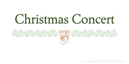
- Ongunkan Linear B Syllabary by Runic World Tamgacı,
$100.00
- OCR-B Letterpress M by URW Type Foundry,
$35.00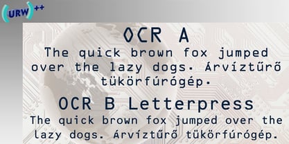
- ASTYPE Ornaments Accolades B by astype,
$28.00
- PF DIN Stencil B by Parachute,
$43.00
- Lucid Type B Outline (BRK) - Unknown license

- Lucid Type B Outline BRK - Unknown license

- D3 DigiBitMapism type B wide - Unknown license

- Cloister Old Style B EF by Elsner+Flake,
$35.00 - OL Raleigh Gothic B Display by Dennis Ortiz-Lopez,
$40.00 - Modern LED Board-7 - Personal use only

- Advanced LED Board-7 - Personal use only

- Radios in Motion Hard - Unknown license

- Three the Hard way - Unknown license

- 101 In My Yard - Unknown license

- Pleasant Show Card JNL by Jeff Levine,
$29.00
- Show Card Casual JNL by Jeff Levine,
$29.00
- Show Card Freehand JNL by Jeff Levine,
$29.00
- Show Card Roman JNL by Jeff Levine,
$29.00
- ITC Avant Garde Gothic by ITC,
$42.99
- Cinnci Card Ornaments NF by Nick's Fonts,
$10.00
- Show Card Sans JNL by Jeff Levine,
$29.00
- Eckhardt Poster Board JNL by Jeff Levine,
$29.00
- Show Card Pen JNL by Jeff Levine,
$29.00
- Fancy Show Card JNL by Jeff Levine,
$29.00
- Show Card Deco JNL by Jeff Levine,
$29.00
- Hard Lines Display Font by Sipanji21,
$16.00
- Show Card Stencil JNL by Jeff Levine,
$29.00
- Show Card Elite JNL by Jeff Levine,
$29.00
- Antique Show Card JNL by Jeff Levine,
$29.00
- Show Card Brush JNL by Jeff Levine,
$29.00
- Pea Jamie*B* Wake Up Fishy! - Unknown license

- Three the Hard way shadowed - Unknown license

- 3 The Hard Way RMX by Fenotype,
$29.95
- ITC Avant Garde Gothic Paneuropean by ITC,
$49.00


