6,801 search results
(0.022 seconds)
- Candice by ITC,
$29.99Alan Meeks designed the Candice typeface in 1976. A groovy swirl of a font, Candice looks like an ice cream sundae topped with whipped cream. Candace is often seen on album covers, and has come to be associated with innumerable party hits from the 1970s. One thing is for sure: Candice is a child of it's times - flashy, lively, and fun! - Honeybutter by Zansari,
$12.00 Honeybutter is a modern-vintage inspired hand lettered font. This refreshing take on a the vintage sans serif style is perfect just on its own or for pairing with other similar vintage inspired fonts. Highly recommended for digital lettering, logos, marketing material, print, branding material, quotes, overlaying on photography, and much more. This font was carefully designed by hand in Auckland, New Zealand
 - Gaston by JBFoundry,
$5.00 Gaston is a complete solution for teachers and pupils. A wide choice of styles allows to create varied and homogeneous documents. Gaston uses a lot of contextual alternates so it's necessary to use friendly OpentType applications. Note: Previews don't render the font accurately (Contextual Alternate aren't shown). To have a fair idea of how it will appear, look at the presentation here.
 - Pebl by Formation Type Foundry,
$25.00 Pebl is inspired by the naturally simplified and smoothed shapes of beach pebbles. The result is a bold, super-rounded display typeface. It's pared back to just the most basic, smooth outlines without counters, for a friendly and organic look. It’s ideal for logos, branding, headlines or just abstract type shapes in print, in displays, on the web, on T-shirts, wherever. Enjoy.
 - Rattnugidari by Stringlabs Creative Studio,
$29.00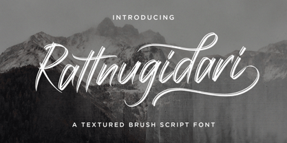 Rattnugidari is a stylish and incredibly elegant script font. It looks stunning on wedding invitations, thank you cards, quotes, greeting cards, logos, business cards and every other design which needs a handwritten touch. This font is PUA encoded which means you can access all of the glyphs and swashes with ease! It features a varying baseline, smooth lines, gorgeous glyphs and stunning alternates.
 - Saj JY by JY&A,
$39.00 Designed by Jure Stojan, JY Saj is a typeface family that successfully balances the artistic and the conventional. With 10 weights (UltraThin to ExtraBold, with italic complements), it works at a variety of sizes, in print and on screen. There are both oldstyle and lining figures, the rupee symbol is supported, and roughly 3,500 kerning pairs were added per font.
 - Cute Fire by Mvmet,
$15.00 Cute Fire is a cute display font with a fire decorative twist for your everything needs! You can use it for anything ranging from t-shirts and clothing, kid’s book designs, kid’s party needs, greeting cards, stickers, posters, banners, or anything that needs a decorative and fun touch. Try it to create fabulous designs and feel the fun and cheering vibes with it!
 - Brookside JNL by Jeff Levine,
$29.00 The 1920s were part of an era in songwriting where snappy wordplay and clever (if not long) titles prevailed. The lettering on one such piece of sheet music with the song title "In A Shady Nook by A Babbling Brook" offered up a bold, condensed sans serif design which is now available digitally as Brookside JNL. Available in both regular and oblique versions.
 - Derailer by Aerotype,
$29.00 Derailer’s eclectic character set is comprised mainly of disparate sans serif characters that claim to play well together. OpenType users also benefit from 52 ligature features that automatically substitute a unique pairing of letters when any upper or lower case character is keyed twice in a row. Derailer Pro extends the character set to support Eastern European Latin, Baltic, Greek and Turkish.
 - Sunset Waves by Epiclinez,
$18.00 Welcome to Sunset Waves, a fun display font that adds a playful touch to your project. This font is the right choice for creating graphics with an eye-catching and unique style. Whether you want a creative edge for your party invitations or looking to jazz up a logo design, this funky font is here to make a difference. Thank You
 - Hashiba Japanese Font by IbeyDesign,
$16.00 Hashiba Japanese Font is a cool, Japanese-inspired display font. It will look stunning on any food menu, poster flyer, or print. Use this font for your designs and explore its endless possibilities. Hashiba Japanese Font can pair with calligraphy Japanese font, Japanese font brush, Japanese calligraphy font, or Japanese brush font. Hope you enjoy, and happy designing :-) Thank You
 - Suomi Hand Script by Suomi,
$60.00 This script is made for mimicking handwriting with a fair amount of ligatures: there are more than 700 ligature pairs (or even more characters; I never really counted them) to help you to make very, very convincing lines of text without ever lifting a pen! It’s been a bestseller in FontShop for years, and now it’s available here as well!
 - Hybi14 Boldie by Hybi-Types,
$9.00 The Hybi14-Boldie is a bold Script in two styles. It’s lack of excessive details makes it appropriate for all oportunities of headlines, slogans and advertising. It’s friendly and charming character makes it pleasant to look at. The fonts are offering a huge character set for usage in many languages. Also thousands of kerning pairs within each style are obligatory.
 - Becka Script by ITC,
$29.00Becka Script was designed by David Harris in 1985 and is a wide running typeface with varying stroke contrasts. This font looks as though written with a broad tipped pen and its slight slant to the right makes clear its similarity to callipgraphy fonts. Becka Script is reminiscent of the 1950s and its strong strokes make it best for headlines or shorter texts. - Raeling by Volcano Type,
$19.00Raeling is a display font inspired by a visit to Luxembourg, capturing shadows falling intricately from park railings appearing as broken-script lettering. A mixture of manmade / natural, traditional / new, ugly / beautiful reflecting the paradox and contradictions of the city. A single curve and stroke developed into a grid block from which characters emerged and broke free of their barriers and conformity. - Delysian NF by Nick's Fonts,
$10.00If you wanted to send out a party invitation in 1923, Barnhart Brothers & Spindler recommended this typeface, which was originally called, simply, "Greeting Card". It also appears to be suitable for greetings from Mars. Available in two weights, regular and bold. Both versions of the font include the 1252 Latin and 1250 CE character sets (with localization for Romanian and Moldovan). - Hjem by Hanoded,
$15.00 Hjem, in Danish, means ‘at home’ or ‘home’. I made this font ‘hjem’, so I thought the name was quite appropriate! Hjem is a rounded, handmade display font that comes with extensive language support and cute swashes. Use this versatile font for your packaging designs, book covers, party posters or whatever you want. I am sure this font will feel right hjem!
 - Precious Serif by G-Type,
$60.00 Precious Serif is a distinctive, modern slab serif typeface, first released in 2003 and now refreshed in 2017. This contemporary, chunky gem is the sister typeface to our Precious Sans family, both sets designed with similar metrics and characteristics to ensure they pair together seamlessly in print & digital applications. Mix Precious Sans & Serif together in a block of text to wonderful effect!
 - Angelissa by Rockboys Studio,
$28.00 Angelissa. This beautiful script is for those who are needing of elegance and stylish for their designs and particularly well suited for wedding invitations, save the date cards and feminine branding. This font is PUA encoded which means you can access all of the glyphs and swashes with ease! It features a varying baseline, smooth lines, gorgeous glyphs and stunning alternates.
 - Nexomuki by Java Pep,
$17.00 Proudly present the fresh from the oven, modern bold sans serif font. Nexomuki made with rising feel modern, bold, but still looks elegant too. Perfect pairing among uppercase and lowercase characters is suitable for your project design such as logotype, branding, headline text, advertising, slogan, qoute, magazine, publishing, and more. This font is already with multilingual support more than 20 leanguanges too.
 - Charme Script by Supfonts,
$15.00 My new font is beautiful and smooth modern calligraphy with a floating baseline. Charme Script will look beautiful on Christmas and holiday invitations, wedding invites and stationery, logos, and more. I love using it for emphasis words and pairing it with serifs Includes: Charme OTF & TTF Uppercase and lowercase Numbers and punctuation Foreign language support Check out my blog: www.instagram.com/dmitriychirkov pinterest.com/dmitriychirkov7
 - Garp Miska by madeDeduk,
$11.00 Gary Miska is a cute font with two style neu and regular fun happiness look and will makes this font suitable for your any project design. Feature Uppercase & Lowercase Number & Symbol International Glyphs Multilingual support ligature Feel free to drop us a message any time and follow my shop for upcoming updates Shoot me on email at: dedukvic@gmail.com Hope you enjoy it.
 - Hybi15 Ronja by Hybi-Types,
$9.00 The Hybi15-Ronja is a characterful 4-style font family. It’s high recognition factor makes it appropriate for all oportunities of headlines, slogans and advertising. Though, it’s straight-line and well-balanced look makes it friendly and charming. The fonts are offering a huge character set for usage in many languages. Also thousands of kerning pairs within each style are obligatory.
 - Monem by Wiescher Design,
$39.50 Monem is the word for the smallest significance-carrying part of a language. I thought that was a good name for a clean, straightforward Sans typeface. Monem is very sturdy and usable for lots of occasions. I am using this font myself for those of my clients that want to convey a clean unobtrusive image. Your very restrained Gert Wiescher
 - Rose Avenue by Set Sail Studios,
$26.00 Introducing Rose Avenue, an extra bold serif font with soft, charming rounded edges and curves. Rose Avenue brings chunky retro typography to the modern era, and includes 70 additional special characters with additional flair and flourishes - providing you with a variety of captivating custom text arrangements. Whether it's a fancy retro-inspired logo, or engaging bold header text - Rose Avenue is able to deliver. Accessing Alternate Characters • Many letters of this font have multiple alternate versions (see final image). In order to access each one, simply make sure 'Standard Ligatures' are enabled, and follow your letter with a number. For example, typing 'A1, A2, A3, A4, A5' will generate the 5 alternate versions shown for capital A. Accessing Ligatures • There are 10 lowercase ligatures (double letters) included. In order to access these, simply make sure 'Standard Ligatures' are enabled, and the ligatures will automatically generate as you type. All special characters can also be accessed via a Glyphs panel. Language Support • Rose Avenue supports the following languages; English, French, Italian, Spanish, Portuguese, German, Swedish, Norwegian, Danish, Dutch, Finnish, Indonesian, Malay, Hungarian, Polish, Croatian, Turkish, Romanian, Czech, Latvian, Lithuanian, Slovak, Slovenian
 - Caride Script by Krafted,
$10.00 Look back to learn how to look forward - Joe Girard Find yourself and share your purpose with the Caride Script. With its bold vintage script type, sometimes you need to remind others that we must look to the past to pave a better way for our future. It’s time for you to unleash the old school retro trend again. Leather jackets? Making a comeback. Pompadour hairdos? Definitely cool. 70s music? They’re sampled in the music all over our radio stations! The magnificence of the past will surely help you give a new and fresh breath of life to your projects. This font was designed for you to use in any kind of projects that you might have! They were specifically designed to fit in anywhere you want them to be. We assure you that there will be no awkwardness in the relationship between your text and your designs, they’ll get along well like old-timey partners! The Caride Script is the perfect addition to bring your perspective to the world. Have the world see you and your encompassing view of the human experience with your creations!
 - Enchante Script by Designova,
$20.00 Enchante is the handwritten masterpiece typeface for luxury / branding / logotype / wedding invites / greeting cards / promotional graphics. Enchante typeface is completely handmade with more than 300 hours of artistic craftsmanship bringing perfection and aesthetics at its level best. The typeface comes with the following features: OpenType Features & Stylistic Sets The typeface contains 400 glyphs beautifully handcrafted with perfection. 122 stylistic alternatives with 70 lowercase and 52 uppercase letters. 61 unique Swashes & Lines arranged in separate font file to enhance ease of use and efficiency. Powerful OpenType features including multi-set stylistic alternatives and ornaments. Includes extended language support including Western European & Central European sets. What You Get The typeface comes with 2 fonts (Normal, Swashes) so you can easily add decorative elements by simply choosing the Swashes version of the font. The stylistic alternatives and ornaments can be selected via character options within any editing software such as Illustrator, Photoshop, Inkscape etc. The pack contains Desktop fonts (OTF, TTF) and Web Fonts (all EOT, SVG, WOFF, WOFF2) as licensing options. Advanced Kerning & Essential Ligatures: We have performed advanced, in-depth kerning to make sure the font looks amazing on all possible letter combinations.
 - Neue Reman Gt by Propertype,
$49.00 Neue Reman Grotesk It has 70 font styles in total family + 1 Variable. This typeface is designed to be used very practically. Each style can be changed easily. Has a variety of alternative letters that can be selected to make typography designs more attractive. The family comes in 7 weights with matching italics + Variable Font File and includes multilingual latin pro characters. 1. Extra Light - Condensed - Expanded - Slanted Italic 2. Light - Condensed - Expanded - Slanted Italic 3. Regular - Condensed - Expanded - Slanted Italic 4. Medium - Condensed - Expanded - Slanted Italic 5. Semi Bold - Condensed - Expanded - Slanted Italic 6. Bold - Condensed - Expanded - Slanted Italic 7. Heavy - Condensed - Expanded - Slanted Italic Neue Reman Grotesk contains 750 glyphs, a Latin Pro Fonts. This is the second version of Neue Reman Family. Complete with Stylistic Alternates, Stylistic Set, Caps Swashes Letter, Standard Ligatures, Discretionary Ligatures, Tabular Figures, Proportional Figures, Superscript, Subscript, Scientific Inferiors, Fractions, Ordinals, Arrows and a variety of figures and fractions. Neue Reman typeface suitable to use in multipurpose projects such as on websites, systems, printing, embedding, servers, screens, display, digital-ads, branding, logos, titles, headlines, teks, and everything else. Need something else? Get in touch with us on propertype.foundry@gmail.com Thank you
 - Gutta Percha by HiH,
$8.00 Gutta Percha is a font for golfers. It takers its name from a hard, resilient natural substance that comes from the sap of trees grown in southeast Asia and which was used for the hard core of golf balls well into the twentieth century, when it was gradually replaced with synthetic material. It therefore seemed an appropriate name for a font using the image of a golfer of the 1920s. The letters are from our font Besley Clarendon, reduced to 70%. That means that Gutta Percha set at 40 points will have the same size letters as Besley Clarendon set at 28 points. However, it should be noted that the two fonts have different baselines. If you use them together you will have to manually adjust the vertical alignment. Gutta Percha is obviously a very specialized font, both because of the subject matter and because the uppercase is designed for use as dropped caps. There may not be many uses for it, but when it is right, it will be really right. Whether you are publishing a book about the history of golf or a clubhouse bulletin, Gutta Percha will surely be noticed.
 - Thermal by TipoType,
$35.00 Thermal is an exploration of balance and contrast. Combining the elegance of classical typography with the sharpness of contemporary design. It was conceived to be a variable font with two axes: weight & optical size, providing a wide range of options for texts & display applications. The regular and italic text weights breathe a warm atmosphere, their design inspiration is a relaxed interpretation of the work of 16th-century French type designer Robert Granjon, evoking a comforting rhythm and a sense of familiarity that makes reading enjoyable. On the other end of Thermal's design spectrum lie the extreme weights – thin and heavy –, specifically designed for larger sizes. These weights borrow stylistic cues from several distinct influences: the characteristic woodtype from the 19th century, the sharp lettering styles from the 70s, and the bold work of Oscar Ogg. One of Thermal's disctint features is its italic's 20° inclination, an significant inclination by all standards, this design choice finds its roots in the "Ascendonica Cursive" of 1571, but is a contemporary interpretation that generates a captivating contrast with the regular version. Thermal studies the past and analyzes the present to create a unique blend, bringing a dictint dichotomic identity.
 - Various by Ahmad Jamaludin,
$17.00 Say hello to VARIOUS! Completely unique and custom font with a 00s style, inspired by vintage and hand-painted retro signs :D Various is a font with a delightful retro touch perfect for capturing the essence of the 60s, 70s, 80s, 90s, and even Y2K designs! Its unique characteristics will transport you to those iconic eras, adding a nostalgic vibe to your creative projects. Various come in two versions - Regular and Outline. With two different style fonts, you can easily create eye-catching designs without any extra effort This font is perfect for a retro 00s theme and can be used for cover magazines, brochures, logos, headlines or quotes, stand-alone displays, and short paragraphs or content. Each font in the family is dynamic and authoritative on its own, making it perfect for any display project. What do you get? Various Various Outline Alternates and Ligatures Instructions ( Access special characters, even in circuit design ) Letters, numbers, symbols, and punctuation No special software is required to use this typeface even work in Canva Multilingual Support Let Various take you on a journey through time Enjoy your day! Dharmas Studio
 - Lemon Squish by Mans Greback,
$59.00 Lemon Squish is a fun and funky sans-serif font that is perfect for adding a touch of humor and whimsy to any design. This font is inspired by the 70s hippie culture and has a retro feel that is reminiscent of comic books and graffiti. Lemon Squish comes in ten different styles, including Bold, Bold Italic, Italic, Light, Light Italic, Regular, and four Outline variations. These various styles provide versatility and allow you to create dynamic and eye-catching designs. The playful and lighthearted nature of Lemon Squish makes it ideal for anything from branding and logos to social media posts and advertisements. Its fun and quirky design will add a touch of humor and personality to your projects and bring a smile to your audience's face. The font is built with advanced OpenType functionality and has a guaranteed top-notch quality, containing stylistic and contextual alternates, ligatures and more features; all to give you full control and customizability. It has extensive lingual support, covering all Latin-based languages, from Northern Europe to South Africa, from America to South-East Asia. It contains all characters and symbols you'll ever need, including all punctuation and numbers.
 - P22 Glaser Babyteeth by P22 Type Foundry,
$24.95 In 2019, P22 Type Foundry met with Milton Glaser (1929–2020) to initiate the official digital series of typefaces designed by Glaser in the 1960s and 70s. P22 Glaser Babyteeth is the first family released in the series. According to Glaser: “The inspiration for my Babyteeth type face came from this sign I photographed in Mexico City. It’s an advertisement for a tailor. The E was drawn as only someone unfamiliar with the alphabet could have conceived. Yet it is completely legible. I tried to invent the rest of the alphabet consistent with this model.” P22 Glaser Babyteeth was based on original drawings and phototype proofs from the Milton Glaser Studios archives. Over the years there have been many typefaces that borrowed heavily from the Glaser designs, but these are the only official Babyteeth fonts approved by Milton Glaser Studio and the Estate of Milton Glaser. The solid and open versions are designed to overlap for two-color font effects and can even be mixed and matched for multi layer chromatic treatments. Babyteeth includes an expanded character set to support the majority of Latin languages.
 - Rondana by Sudtipos,
$39.00 Crafted in the best tradition of the geometric sans-serif, Rondana is a typographic tribute to the the retro-futuristic aesthetics of the 1960s and 70s, as well as an exercise in purity of line. However, its spirit is decidedly non-bauhausian, since its strokes intentionally deviate from the dull, obvious, ruler-and-compass construction; its arcs and curves being much more complex, tending towards a slightly square shape, imbued with subtle modulations. This sums up to a more organic, flowing, extroverted personality than the one just expected from the use of plain, simple geometry. Another feature is the conscious use of non-standard shapes for many signs, that are quite legible but somewhat unexpected, such as the E, the g and the ampersand; making Rondana an excellent display face and also giving a particular flavor to the text composed in it, especially in its italic variants —which are, by the way, designer italics in their own right and not just an oblique version of the roman. Rondana comes in twelve variants comprising a wide spectrum of weights, allowing for an extremely diverse range of expression.
 - Milli by Hydric Design,
$30.00 Milli Typeface is a stylish luxury serif. It's clean and have the smooth, also playful and versatile serif family with 40+ ligatures and 100+ alternates that you can combine to get curves and beautiful shapes just in seconds. type the words, This font is suitable for use in many design forms, for example magazines, postcards, logos, DIY Projects, invitation card, quotes, vintage look design, old classic ,60s, 70s, 80s era, wedding projects and much more. We recommend using Adobe Illustrator or Photoshop. INCLUDED : The perfect font choice for - book, Brand , label & Logo project watermarks, craft product, logos, business cards, quotes, or gift card. Milli is a PUA encoded font (Private Use Areas - font specific code)- so that all the alternative characters, can be easily accessed in full through any program by using your Operating System’s utilities (CharacterMap for Windows and Font Book for Mac.), as well as Illustrator, Photoshop CC 2017, Cricut Design Space and SilhouetteStudio and several other applications. Multilingual Support : To access all OpenType Stylistic alternates, you need a program that supports OpenType features such as Adobe Illustrator, Adobe Photoshop. Corel draw & ms word Thank You, and have a nice day!
 - Digital Sans Now by Elsner+Flake,
$59.00 Digital Sans Now combines and completes the many diverse requests and requirements by users of the past years. By now, 36 versions for over 70 Latin and Cyrillic languages have become available, including Small Caps. Digital Sans Now is also available as a webfont and reflects, with its simplified and geometric construction and its consciously maintained poster-like forms as well as with its ornamental character, the spirit of the decorative serif-less headline typefaces of the 1970s. The basic severity of other grotesque typefaces is here repressed by means of targeted rounds. Exactly these formal breaks allow the impression that it could be used in a variety of visual applications. Short texts, headlines and logos of all descriptions are its domain. It is because of this versatility that the typeface has become a desirable stylistic element, especially in such design provinces as technology, games and sports, and that, for many years now, it appears to be timeless. Additional weights designed on the basis of the original, from Thin to Ultra, the Italics, Small Caps and alternative characters allow for differentiated “looks and feels”, and, with deliberate usage, give the “Digital Sans Now” expanded possibilities for expression. The basis for the design of Digital Sans Now is a headline typeface created in 1973 by Marty Goldstein and the Digital Sans family which has been available from Elsner+Flake since the mid-1990s under a license agreement. The four weights designed by Marty Goldstein, Thin, Plain, Heavy and Fat, were originally sold by the American company Visual Graphics Corporation (VGC) under the name of “Sol”. Similarly, the company Fotostar International offered film fonts for 2” phototypesetting machines, these however under the name “Sun”. The first digital adaptation had already been ordered in the mid 1970s in Germany by Walter Brendel for the phototypesetting system Unitype used by the TypeShop Group, in three widths and under the name “Digital Part of the Serial Collection.” Based on the versions by VGC, Thin, Plain, Heavy and Fat, new versions were then created with appropriate stroke and width adaptations for data sets for the fonts Light, Medium and Bold as well as for the corresponding italics
 - Raqmi Monoshape by Arabetics,
$39.00 Raqmi Monoshape is a simplified version of the Raqmi font family with unified (non-varying) shapes. This font family supports all Arabetic scripts covered by Unicode 6.1, and the latest Arabic Supplement and Extended-A Unicode blocks, including support for Quranic texts. It includes two weights: regular and light, each of which has normal and left-slanted Italic versions. The script design of this font family follows the Arabetics Mutamathil style utilizing varying x-heights. The Mutamathil type style utilizes only one glyph per Arabic Unicode character or letter, as defined by the Unicode Standards. Raqmi Monoshape includes the required Lam-Alif ligatures in addition to all vowel diacritic ligatures. Soft-vowel diacritic marks (harakat) are selectively positioned with most of them appearing on similar high and low levels—top left corner—, to clearly distinguish them from the letters. Tatweel is a zero-width glyph.
 - FranklinGothicHandLight by Wiescher Design,
$39.50 FranklinGothicHandLight is part of a series of hand-drawn fonts from way back in time – before computers changed the way we worked. When I was in advertising – before computers – a very time consuming part of my daily work was sketching headlines. I used to be able to sketch headlines in Franklin Gothic, Times, Futura, Helvetica and several scripts. We had a kind of huge inverted camera – which we called Lucy. We projected the alphabet onto a sheet of transparent paper, outlined the letters with a fineliner and then filled them in. It was very tedious work, but the resulting headline had its own charm and we had a permanent race going on who was best and fastest. I won most of the time! They used to call me the fastest "Magic Marker" this side of the Atlantic. Great days, just like today! Your sentimental type designer from the past Gert Wiescher
 - FranklinGothicHandDemi by Wiescher Design,
$39.50 FranklinGothicHandDemi is part of a series of hand-drawn fonts from way back in time – before computers changed the way we worked. When I was in advertising – before computers – a very time consuming part of my daily work was sketching headlines. I used to be able to sketch headlines in Franklin Gothic, Times, Futura, Helvetica and several scripts. We had a kind of huge inverted camera – which we called Lucy. We projected the alphabet onto a sheet of transparent paper, outlined the letters with a fineliner and then filled them in. It was very tedious work, but the resulting headline had its own charm and we had a permanent race going on who was best and fastest. I won most of the time! They used to call me the fastest "Magic Marker" this side of the Atlantic. Great days, just like today! Your sentimental type designer from the past Gert Wiescher
 - Pumpkin Island by Ardyanatypes,
$12.00 Be prepared, this Halloween party would be extraordinary . PUMPKIN ISLAND! A cute decorative Halloween theme Typeface, but still keeping the versatileness. Summoned for a Halloween theme look but doesn't lock the possibility to use in other attractive stuff. It fully pumps including ligatures & stylistic alternates in both capital or basic character, and the good news is . . PUMPKIN ISLAND also support multi-language within numbers and punctuations Glide through with every curve of each letter and be ready to rock pump your awesome needs! As how it looks, PUMPKIN ISLAND really fit for any needs such as horror books cover, posters, branding or any attractive design taste Here it goes! Have an awesome party ~ ----------- A guide to accessing all alternatives can be read at: http://adobe.ly/1m1fn4Y ---------- **Features:** - A-Z Character Set - a-z Characters set - Numerals & Punctuations (OpenType Standard) - Multilingual Thank you and have a nice day