3,824 search results
(0.146 seconds)
- Beeching by Greater Albion Typefounders,
$14.95 Beeching is a family of six typefaces designed to combine extreme legibility with a hint of retrospective character. It is inspired by the lettering used in the Leslie Green designed stations of the London Underground and is as up to date today as it was the day those stations opened. The Beeching faces (Regular, Bold, Small Capitals, Small Capitals Bold, Shadowed and Small Capitals Shadowed) are ideal for use in large scale signage that needs to be seen over long distances. We feel the family provides a clear demonstration that traditional details, such as serifs and ligatures serve to enhance legibility.
 - ITC Jiggery Pokery by ITC,
$29.99ITC Jiggery Pokery is the work of British freelance designer Carol Kemp. ITC Jiggery Pokery evolved from lettering for a project which needed to be quirky, wacky and fun," says Kemp. "The name came to me as the letters appear to jig along - it just seemed to fit. 'Jiggery Pokery' is London Cockney slang which has a variety of meanings. It's used to describe behavior such as 'ducking and diving', trickery, juggling (especially of financial matters!), or 'hanky panky'. My grandparents were Cockneys, and my uncle would use colourful rhyming slang which I loved to hear as a child."" - Mayayo by Type-Ø-Tones,
$40.00 We usually describe Mayayo as no good for condolence letters, nor for carving inscriptions, etc. Indeed, as we have seen, the designers who choose Mayayo used it in funny different ways.
 - FS Hackney by Fontsmith,
$80.00 Elliptical The squareness of curves. That was the elliptical – in more than one sense – notion being explored in the making of FS Hackney. The squareness of curves and vertical terminals to create a gentle, soft sans serif, with a little bit of magic. A momentary thought – “It doesn’t have to be like this” – provided the spur to explore the verticals and skeletons of letterforms beyond conventional type design limits. A 12-month gestation period gave rise to a font with a larger-than-usual character set, including non-lining figures, small caps and superior and inferior numbers. It’s a collection that speaks confidently for itself. Assertive It was the Hackney carriage – the black London cab – that gave this font its name, not the north London neighbourhood. Solid, dependable, effective and built to last, FS Hackney was honed to perform in all conditions. Cool, compelling lines and a satisfying overall simplicity lend FS Hackney its assertive air. Assured, versatile and effective; just like a black cab (but without the grumbling). Machined Over a string of meetings, Jason Smith and FS Hackney designer Nick Job worked out how to infuse Nick’s sketched letterforms with Fontsmith’s familiar geniality. “Nick is very meticulous and produces very clean design work,” says Jason. “Hackney is ideal for branding as it’s very clear and its quirks are sensible ones, not odd ones, that don’t distract from the message.”
 - Hebrew Classic Tanach by Samtype,
$125.00 This is a font to build an hebrew Bible (Tanach) or any Hebrew prayer book. Hebrew Classic Tanach has all unicode hebrew marks and others like, ShevaNa, Dagesh Chazak, Qamats Katan and Cholam Chaser. You can even hide marks You don't want to use. This font has a complex and exclusive programmation of opentype features.
 - Hebrew Kria Tanach VF by Samtype,
$360.00 This is a modern, wonderful, and beautiful font. This font is super readable and can be used from Posters to a Hebrew Bible. The readability of this font is amazing. This font has the modern Hebrew punctuation: Shevana, Kamatz Katan, Dagesh Hazak, and Cholam Chaser. The first Hebrew Variable font with all Trop and Nikud!
 - Grand Heist by Palmer Type Company,
$30.00 Grand Heist is a bold and unique display typeface, fully equipped with basic and Western European Latin characters, numbers, punctuation, some symbols and special characters. Now we don't condone robbing banks here, but if you do, we can't deny that you'll have way more street credibility if you have this font in your handy fontbook. Just sayin'. Aa-Zz Numbers Multi-language support Symbols Special Characters
 - Typo Upright by Bitstream,
$29.99A faithful reproduction of the common French Ronde of the nineteenth century; the design originates at the Inland Typefoundry in St. Louis as French Script and was revised by Morris Fuller Benton in 1905 and made popular by ATF under the name Typo Upright. Stephenson Blake also had a version available as Parisian Ronde. - Loulou by Wiescher Design,
$39.50 LouLou is a scriptlike typeface that looks as if it came right out of the sixties and seventies. Flowerpower! I enjoyed doing this one. Your swinging type designer Gert Wiescher
 - Autospec by Device,
$29.00 Designed as a companion to Autofont, this dingbat set was originally developed for What Car? magazine, the UK’s leading automotive consumer title. Use in charts and reviews to indicate metallic paint, shatterproof glass, number of airbags, manual or auto sunroof, etc.
 - Crimes Times Six by JSH creates,
$39.95 Crimes Times Six is a cool horror font, originally created with a chalk stick back in 2012, by Jonathan S Harris. The typeface design works very well in video games, movies and broadcasting, but also looks great on clothing and posters.
 - Night Delivery by Kitchen Table Type Foundry,
$15.00 Since I live in a hamlet without any facilities whatsoever, I order a lot online. Most deliveries are done during daytime, but some companies prefer to deliver my stuff at night. When I was drawing out the glyphs for this font (using my Chinese ink and a broken paint stirrer), the door bell rang. It was a Night Delivery…
 - Graphite Love by Mvmet,
$16.00 Graphite Love is a chalky handwritten font that you can use it for anything ranging from t-shirts, book designs, packaging, and greeting cards to stickers and posters, or anything that needs a casual touch, it will be your perfect font to pick. Fall in love with its incredibly versatile style, and use it to create lovely designs!
 - Hebrew Esther Tanach by Samtype,
$189.00 This is a font to build an hebrew Bible (Tanach) or any Hebrew prayer book. Hebrew Esther Tanach has all unicode hebrew marks and others like, ShevaNa, Dagesh Chazak, Qamats Katan and Cholam Chaser. This font has a complex and exclusive programmation of opentype features. This font is very good to read even in small texts
 - Hebrew Liane Std by Samtype,
$59.00 This is a modern, wonderful, and beautiful font. This font is super readable and can be used from Posters to a Hebrew Bible. The readability of this font is amazing. This font has the modern Hebrew punctuation: Shevana, Kamatz Katan, Dagesh Hazak, and Cholam Chaser. Designers: Sami Artur Mandelbaum Publisher: Samtype MyFonts debut: Jan 17, 2022
 - Gessetto by Resistenza,
$39.00 Gessetto is an extensive chalk font family, containing script, sans, roman, figures and ornaments. One of the things most charming about chalkboard lettering is the variation; in both texture and style. Our goal was to achieve a real chalk effect using the varied typographic genres in a digital format. With flexibility and control for the designer in mind, we built a digital chalk toolkit. The script is a fusion of Italic Roman and cursive, it contains swashy alternates for each capital letters with some long and extended flair on some ascendent and descendent letters. An all caps high contrast sans is in 5 complimentary styles. The Roman is precisely proportioned and maintains elegance while being bold. There is a set of Figures and ornaments. Gessetto is perfect to grab attention on signage, print advertising and editorial applications like book covers, but suits branding applications too. The diverse styles and subtle handcrafted textures in this display type family will well serve any designer looking for the authentic chalkboard aesthetic. We recommend to combine Timberline with: Turquoise
 - Falfurrias NF by Nick's Fonts,
$10.00Another in the Whiz-Bang Woodtype series, based on authentic xylographic designs from the late nineteenth century. Named after (surprise!) a small town in Texas. The net effect is a typeface which can add style and warmth to any project. Both versions of this font include the complete Unicode 1252 Latin and Unicode 1250 Central European character sets. - Hiroshige by Monotype,
$29.00 Hiroshige was designed in 1986 by Cynthia Hollandsworth (now Batty) of AlphaOmega Typography, Inc. The typeface was originally commissioned for a book of woodblock prints by the great nineteenth-century Japanese artist Ando Hiroshige, whose work influenced many Impressionist artists. The typeface has a gentle calligraphic flair that creates an interesting page of text as well as elegant headlines.
 - Cowboyslang by HVD Fonts,
$30.00 Typedesigner Hannes von Döhren created Cowboyslang, a display typefamily with a Wild West flair. It consists of three widths plus fitting ornaments. Although it is based on the slab serif typefaces from the nineteenth century Von Döhren gave it a contemporary feeling. Cowboyslang has an extended character set to support also Central and Eastern European languages.
 - De Vinne by Bitstream,
$29.99 This revival of the Bruce Foundry’s No. 11 is typical of the nineteenth century types derived from the work of Didot and Bodoni; the face remains popular with lawyers and government printers. In fact, Theodore Low De Vinne opposed this kind of design as hard to print and read; he had Century designed to replace it.
 - Hiroshige Sans by Linotype,
$29.99Hiroshige was designed in 1986 by Cynthia Hollandsworth (now Batty) of AlphaOmega Typography, Inc. The typeface was originally commissioned for a book of woodblock prints by the great nineteenth-century Japanese artist Ando Hiroshige, whose work influenced many Impressionist artists. The typeface has a gentle calligraphic flair that creates an interesting page of text as well as elegant headlines. - Hiroshige by URW Type Foundry,
$35.99 Hiroshige was designed in 1986 by Cynthia Hollandsworth (now Batty) of AlphaOmega Typography, Inc. The typeface was originally commissioned for a book of woodblock prints by the great nineteenth-century Japanese artist Ando Hiroshige, whose work influenced many Impressionist artists. The typeface has a gentle calligraphic flair that creates an interesting page of text as well as elegant headlines.
 - Times Eighteen by Linotype,
$29.00In 1931, The Times of London commissioned a new text type design from Stanley Morison and the Monotype Corporation, after Morison had written an article criticizing The Times for being badly printed and typographically behind the times. The new design was supervised by Stanley Morison and drawn by Victor Lardent, an artist from the advertising department of The Times. Morison used an older typeface, Plantin, as the basis for his design, but made revisions for legibility and economy of space (always important concerns for newspapers). As the old type used by the newspaper had been called Times Old Roman," Morison's revision became "Times New Roman." The Times of London debuted the new typeface in October 1932, and after one year the design was released for commercial sale. The Linotype version, called simply "Times," was optimized for line-casting technology, though the differences in the basic design are subtle. The typeface was very successful for the Times of London, which used a higher grade of newsprint than most newspapers. The better, whiter paper enhanced the new typeface's high degree of contrast and sharp serifs, and created a sparkling, modern look. In 1972, Walter Tracy designed Times Europa for The Times of London. This was a sturdier version, and it was needed to hold up to the newest demands of newspaper printing: faster presses and cheaper paper. In the United States, the Times font family has enjoyed popularity as a magazine and book type since the 1940s. Times continues to be very popular around the world because of its versatility and readability. And because it is a standard font on most computers and digital printers, it has become universally familiar as the office workhorse. Times™, Times™ Europa, and Times New Roman™ are sure bets for proposals, annual reports, office correspondence, magazines, and newspapers. Linotype offers many versions of this font: Times™ is the universal version of Times, used formerly as the matrices for the Linotype hot metal line-casting machines. The basic four weights of roman, italic, bold and bold italic are standard fonts on most printers. There are also small caps, Old style Figures, phonetic characters, and Central European characters. Times™ Ten is the version specially designed for smaller text (12 point and below); its characters are wider and the hairlines are a little stronger. Times Ten has many weights for Latin typography, as well as several weights for Central European, Cyrillic, and Greek typesetting. Times™ Eighteen is the headline version, ideal for point sizes of 18 and larger. The characters are subtly condensed and the hairlines are finer. Times™ Europa is the Walter Tracy re-design of 1972, its sturdier characters and open counterspaces maintain readability in rougher printing conditions. Times New Roman™ is the historic font version first drawn by Victor Lardent and Stanley Morison for the Monotype hot metal caster." - Times Europa LT by Linotype,
$29.99In 1931, The Times of London commissioned a new text type design from Stanley Morison and the Monotype Corporation, after Morison had written an article criticizing The Times for being badly printed and typographically behind the times. The new design was supervised by Stanley Morison and drawn by Victor Lardent, an artist from the advertising department of The Times. Morison used an older typeface, Plantin, as the basis for his design, but made revisions for legibility and economy of space (always important concerns for newspapers). As the old type used by the newspaper had been called Times Old Roman," Morison's revision became "Times New Roman." The Times of London debuted the new typeface in October 1932, and after one year the design was released for commercial sale. The Linotype version, called simply "Times," was optimized for line-casting technology, though the differences in the basic design are subtle. The typeface was very successful for the Times of London, which used a higher grade of newsprint than most newspapers. The better, whiter paper enhanced the new typeface's high degree of contrast and sharp serifs, and created a sparkling, modern look. In 1972, Walter Tracy designed Times Europa for The Times of London. This was a sturdier version, and it was needed to hold up to the newest demands of newspaper printing: faster presses and cheaper paper. In the United States, the Times font family has enjoyed popularity as a magazine and book type since the 1940s. Times continues to be very popular around the world because of its versatility and readability. And because it is a standard font on most computers and digital printers, it has become universally familiar as the office workhorse. Times™, Times™ Europa, and Times New Roman™ are sure bets for proposals, annual reports, office correspondence, magazines, and newspapers. Linotype offers many versions of this font: Times™ is the universal version of Times, used formerly as the matrices for the Linotype hot metal line-casting machines. The basic four weights of roman, italic, bold and bold italic are standard fonts on most printers. There are also small caps, Old style Figures, phonetic characters, and Central European characters. Times™ Ten is the version specially designed for smaller text (12 point and below); its characters are wider and the hairlines are a little stronger. Times Ten has many weights for Latin typography, as well as several weights for Central European, Cyrillic, and Greek typesetting. Times™ Eighteen is the headline version, ideal for point sizes of 18 and larger. The characters are subtly condensed and the hairlines are finer. Times™ Europa is the Walter Tracy re-design of 1972, its sturdier characters and open counterspaces maintain readability in rougher printing conditions. Times New Roman™ is the historic font version first drawn by Victor Lardent and Stanley Morison for the Monotype hot metal caster." - Times Ten by Linotype,
$40.99In 1931, The Times of London commissioned a new text type design from Stanley Morison and the Monotype Corporation, after Morison had written an article criticizing The Times for being badly printed and typographically behind the times. The new design was supervised by Stanley Morison and drawn by Victor Lardent, an artist from the advertising department of The Times. Morison used an older typeface, Plantin, as the basis for his design, but made revisions for legibility and economy of space (always important concerns for newspapers). As the old type used by the newspaper had been called Times Old Roman," Morison's revision became "Times New Roman." The Times of London debuted the new typeface in October 1932, and after one year the design was released for commercial sale. The Linotype version, called simply "Times," was optimized for line-casting technology, though the differences in the basic design are subtle. The typeface was very successful for the Times of London, which used a higher grade of newsprint than most newspapers. The better, whiter paper enhanced the new typeface's high degree of contrast and sharp serifs, and created a sparkling, modern look. In 1972, Walter Tracy designed Times Europa for The Times of London. This was a sturdier version, and it was needed to hold up to the newest demands of newspaper printing: faster presses and cheaper paper. In the United States, the Times font family has enjoyed popularity as a magazine and book type since the 1940s. Times continues to be very popular around the world because of its versatility and readability. And because it is a standard font on most computers and digital printers, it has become universally familiar as the office workhorse. Times™, Times™ Europa, and Times New Roman™ are sure bets for proposals, annual reports, office correspondence, magazines, and newspapers. Linotype offers many versions of this font: Times™ is the universal version of Times, used formerly as the matrices for the Linotype hot metal line-casting machines. The basic four weights of roman, italic, bold and bold italic are standard fonts on most printers. There are also small caps, Old style Figures, phonetic characters, and Central European characters. Times™ Ten is the version specially designed for smaller text (12 point and below); its characters are wider and the hairlines are a little stronger. Times Ten has many weights for Latin typography, as well as several weights for Central European, Cyrillic, and Greek typesetting. Times™ Eighteen is the headline version, ideal for point sizes of 18 and larger. The characters are subtly condensed and the hairlines are finer. Times™ Europa is the Walter Tracy re-design of 1972, its sturdier characters and open counterspaces maintain readability in rougher printing conditions. Times New Roman™ is the historic font version first drawn by Victor Lardent and Stanley Morison for the Monotype hot metal caster." - Times Ten Paneuropean by Linotype,
$92.99In 1931, The Times of London commissioned a new text type design from Stanley Morison and the Monotype Corporation, after Morison had written an article criticizing The Times for being badly printed and typographically behind the times. The new design was supervised by Stanley Morison and drawn by Victor Lardent, an artist from the advertising department of The Times. Morison used an older typeface, Plantin, as the basis for his design, but made revisions for legibility and economy of space (always important concerns for newspapers). As the old type used by the newspaper had been called Times Old Roman," Morison's revision became "Times New Roman." The Times of London debuted the new typeface in October 1932, and after one year the design was released for commercial sale. The Linotype version, called simply "Times," was optimized for line-casting technology, though the differences in the basic design are subtle. The typeface was very successful for the Times of London, which used a higher grade of newsprint than most newspapers. The better, whiter paper enhanced the new typeface's high degree of contrast and sharp serifs, and created a sparkling, modern look. In 1972, Walter Tracy designed Times Europa for The Times of London. This was a sturdier version, and it was needed to hold up to the newest demands of newspaper printing: faster presses and cheaper paper. In the United States, the Times font family has enjoyed popularity as a magazine and book type since the 1940s. Times continues to be very popular around the world because of its versatility and readability. And because it is a standard font on most computers and digital printers, it has become universally familiar as the office workhorse. Times™, Times™ Europa, and Times New Roman™ are sure bets for proposals, annual reports, office correspondence, magazines, and newspapers. Linotype offers many versions of this font: Times™ is the universal version of Times, used formerly as the matrices for the Linotype hot metal line-casting machines. The basic four weights of roman, italic, bold and bold italic are standard fonts on most printers. There are also small caps, Old style Figures, phonetic characters, and Central European characters. Times™ Ten is the version specially designed for smaller text (12 point and below); its characters are wider and the hairlines are a little stronger. Times Ten has many weights for Latin typography, as well as several weights for Central European, Cyrillic, and Greek typesetting. Times™ Eighteen is the headline version, ideal for point sizes of 18 and larger. The characters are subtly condensed and the hairlines are finer. Times™ Europa is the Walter Tracy re-design of 1972, its sturdier characters and open counterspaces maintain readability in rougher printing conditions. Times New Roman™ is the historic font version first drawn by Victor Lardent and Stanley Morison for the Monotype hot metal caster." - Times by Linotype,
$40.99In 1931, The Times of London commissioned a new text type design from Stanley Morison and the Monotype Corporation, after Morison had written an article criticizing The Times for being badly printed and typographically behind the times. The new design was supervised by Stanley Morison and drawn by Victor Lardent, an artist from the advertising department of The Times. Morison used an older typeface, Plantin, as the basis for his design, but made revisions for legibility and economy of space (always important concerns for newspapers). As the old type used by the newspaper had been called Times Old Roman," Morison's revision became "Times New Roman." The Times of London debuted the new typeface in October 1932, and after one year the design was released for commercial sale. The Linotype version, called simply "Times," was optimized for line-casting technology, though the differences in the basic design are subtle. The typeface was very successful for the Times of London, which used a higher grade of newsprint than most newspapers. The better, whiter paper enhanced the new typeface's high degree of contrast and sharp serifs, and created a sparkling, modern look. In 1972, Walter Tracy designed Times Europa for The Times of London. This was a sturdier version, and it was needed to hold up to the newest demands of newspaper printing: faster presses and cheaper paper. In the United States, the Times font family has enjoyed popularity as a magazine and book type since the 1940s. Times continues to be very popular around the world because of its versatility and readability. And because it is a standard font on most computers and digital printers, it has become universally familiar as the office workhorse. Times™, Times™ Europa, and Times New Roman™ are sure bets for proposals, annual reports, office correspondence, magazines, and newspapers. Linotype offers many versions of this font: Times™ is the universal version of Times, used formerly as the matrices for the Linotype hot metal line-casting machines. The basic four weights of roman, italic, bold and bold italic are standard fonts on most printers. There are also small caps, Old style Figures, phonetic characters, and Central European characters. Times™ Ten is the version specially designed for smaller text (12 point and below); its characters are wider and the hairlines are a little stronger. Times Ten has many weights for Latin typography, as well as several weights for Central European, Cyrillic, and Greek typesetting. Times™ Eighteen is the headline version, ideal for point sizes of 18 and larger. The characters are subtly condensed and the hairlines are finer. Times™ Europa is the Walter Tracy re-design of 1972, its sturdier characters and open counterspaces maintain readability in rougher printing conditions. Times New Roman™ is the historic font version first drawn by Victor Lardent and Stanley Morison for the Monotype hot metal caster." - Punk Head by Ditatype,
$29.00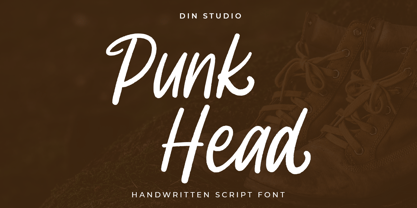 Punk Head is a handwritten font. With a natural and beautiful handwritten style, it brings a classy and chic typeface. Chalk Brush is best used for branding, logotype, and quotes. Includes: - Punk Head (OTF) Features: - Alternates - PUA Encoded - Multilingual Support - Numerals and Punctuation
 - HU Ketchup KR by Heummdesign,
$25.00 In HU Ketchup KR, the consonant and vowel strokes are naturally connected to add writing power to the thick headline, and the vowels are shaped like 'ㅅ', adding personality and cuteness at the same time.
 - VLNL Bon Bon by VetteLetters,
$35.00 Exuberantly delicious and lusciously sweet! VLNL Bon Bon embodies the perfect after dinner treat. Chocolate is a known aphrodisiac and bonbons are its most romantic carrier. Bonbon is not for nothing the French word for ‘good’ twice! You could definitely consider VLNL Bonbon the typographic equivalent of these exquisite chocolate sweets. Inspired by lettering on an Amsterdam church facade and a ladies clothing store window, Donald DBXL Beekman started drawing the first incarnation of Bon Bon already in 2004. The original idea was an alphabet design with slanted oval inner shapes and extremely long and striking serifs. This proved to be a quite demanding design job, so It took Bon Bon some time to get finished. But now it’s here in all its extravagant glory. Most recently a number of lowercase characters were added to make Bon Bon more versatile. Totally insane and over-top-the-top it has been called. But hey, we all love Bon Bon. Don't we?
 - Night Clown by Putracetol,
$20.00 Night Clown - Quirky Clown Font. With its quirky, decorative, and playful design, this font captures the essence of clowns, parties, and April Fools' festivities. Offering a delightful range of seven variations - regular, clown hat, mask, surprise, laughter, decorative, and funny face - Night Clown is a perfect fit for children-oriented projects, kids' events, posters, greeting cards, birthday invitations, and even logos.
 - Riquet by Lipton Letter Design,
$20.00 In the nineteen-twenties and early thirties, all display typography flourished in Europe. This was especially true in Germany, where poster design set a high creative standard, stimulating the design of a fantastic group of dramatic display letterforms. Richard Lipton designed Riquet after being inspired by a handful of freehand capital and lowercase letters on posters designed by lettering and poster artist Ludwig Hohlwein. He expanded this small group of display letterforms into a variable family with a weight axis. Riquet is a low contrast, delightfully casual typeface with 6 weights and the perfect selection of alternates. All of which gives an expressive look of precisely inked letters perfect for any packaging or branding project.
 - Birmingham New Street by Greater Albion Typefounders,
$12.50 Birmingham New Street is the latest updated development of a typeface family inspired by the hand lettered title on a 19th century railway map. The map, prepared by the London and North Western Railway was headed "Birmingham and environs". New Street, meanwhile is the great 19th century commercial road linking the city centre of Birmingham with the train station of the same name. So, in a spirit of 19th century enterprise, we present "Birmingham New Street", a fun family of three display faces, laden with open type features and late Victorian charm, ideal for posters, book covers and any other high flown design you might have in mind.
 - Carnaby Street by Mysterylab,
$19.00 Carnaby Street is a vintage style bold font that pairs strong rectangular framing with softer rounded elements. It has a cool, funky, and groovy vibe, while still retaining a strong sense of linearity and geometry. This lettering style conjures up the retro vibes of the 1960s swinging London scene, or the psychedelic poster art of posters and handbills for the Fillmore Auditorium and Avalon Ballroom in San Francisco in the mid to late '60s. It represents a new take on a classic array of hand lettered stylings that have their roots both in the Art Nouveau Movement and the hippie counterculture movement of the 1960s and early 1970s.
 - Project D by DM Founts,
$22.00 Project D is the fourth typeface released by DM Founts. It was inspired by the infamous graffiti atop the former Heygate Estate in South London, which I had passed by numerous times on the overground train years ago. Heygate Estate has since been replaced by soulless luxury flats, as per the gentrification agenda. The letters don't entirely match the graffiti as they were created from memory, but I thought such a profound statement should be honoured. Project D is best used for impact at large sizes, although it should scale well. Use it for computer interfaces, retro headings and anything involving defiance, espionage, infiltration and spy games.
 - Nylon and Draylon by Barnbrook Fonts,
$30.00 Nylon is an interpretation of pre-16th century letterforms, in particular those found in mediaeval portraits at the National Gallery, London. The source material contains many unusual and manic shapes—it appears as if these classical forms have, over time, become perverted, almost demonic. Draylon is the more restrained counterpart to Nylon; it is based on letterforms found on 18th century ceramics—some 200 years after the source material of Nylon. Nylon and Draylon have been designed so that they can be mixed together with ease. Both typefaces have been drawn with a kind of crude digital awkwardness—acknowledging the tool of the present moment, the computer, in the design process.
 - Hostetler Fette Ultfraktur Ornamental by Intellecta Design,
$18.90 I digitized and revitalize Hostetler Fette Ultfraktur Ornamental from the classical type specimen book from Rudolf Hostetler. He was a Swiss type designer, author of “The Printer’s Terms” designed by Jan Tschichold, of “Technical Terms of the Printing Industry” (5th edition was printed in 1995), and of "Type: eine Auswahl guter Drucktypen; 80 Alphabete klassischer und moderner Schriften" (Teufen, Ausser-Rhoden: Niggli, 1958). He also wrote "Type: A Selection of Types" (1949, fgm books, R. Hostettler, E. Kopley, H. Strehler Publ., St. Gallen and London) in which he highlights type made by European houses such as Haas, Enschedé, Deberny and Nebiolo. Jost Hochuli wrote his biography.
 - Whitenow by Proportional Lime,
$15.99 In the year 1528 Pierre Attaignant led a revolution in music printing. His method of once-press moveable type, greatly simplifying the original 3 impression process developed by Petrucci, remained in use till near the end of the 17th century. The method could only realize one line of music per staff, and the introduction of barlines as a common means of aligning multiple staves brought this method to a close after nearly two centuries of use. This font is meant to allow the printing of music using that method with the notation of that era. It is largely based on an exemplar printed by Snodham of London.
 - P22 Rakugaki by IHOF,
$24.95 Rakugaki means "scribble" in Japanese. This font expresses casual handwriting with warmth and simplicity. The bold weight of Rakugaki is harmoniously integrated in all three writing systems, Katakana, Hiragana and Latin. The enclosed key charts give instructions for character placement in Katakana and Hiragana.
 - Volage Display by Cecilia Gérard Type,
$16.00 Introducing Volage, a clean, elegant yet flighty display serif. Inspired by french literature masterpiece "Dangerous Liaisons" by Pierre Choderlos de Laclos, Volage is a drama typeface with stunning alternates. Sharp shapes marry tails and ligatures, which are chasing each other without never really meeting...