10,000 search results
(0.049 seconds)
- Hanya Wilde by madeDeduk,
$16.00 Really excited to introduce Hanya Wilde is a bold brush script! Hanya Wilde will be perfect for all your designs project. Hanya Wilde Included: Uppercase Lowercase Number & Symbol International Glyphs Alternative Ligature If you need anything else just shoot me on email at: dedukvic@gmail.com Hope you enjoy it.
 - Tufuli by NamelaType,
$17.00 Tufuli means "childish" in Arabic. In this font design I wanted to represent the characters as funny and flexible, just like childish characters can be. Tufuli has sloping terminal geometric shapes, giving it a playful feeling. Please also check out Tufuli's sibling Tufuli Arabic for more international fun.
 - Lugo Rockwell by madeDeduk,
$16.00 Introduce Lugo Rockwell is a brush vintage handwritten font to give an incredible impression for all your project design come with a lot ligatures and Alternative to make everything look realistic handmade handwritten. Included: Uppercase & Lowercase Number & Symbol International Glyphs Multilingual Support Ligature Alternative Hope you enjoy it.
 - Tinta Arabic by NamelaType,
$29.00 Tinta Arabic is the sibling of Tinta, with with additional Arabic glyphs for more international fun with the addition of Arabic glyphs; Arabic, Urdu, Kurdish Farsi and Jawi. Basic form for arabic font is refers to the arabic Naskhi style, with a cute shape to harmony with Latin.
 - Benso Yolmi by madeDeduk,
$16.00 Benso Yolmi is a clean and modern minimalist serif font designed for clarity and simplicity. With its sleek lines and balanced letterforms, it conveys a timeless elegance that suits a wide range of applications. Feature Uppercase & Lowercase Number & Symbol International Glyphs Multilingual support Alternative Ligature Hope you enjoy it.
 - Billow Twril by madeDeduk,
$16.00 Billow Twril is a retro display font comes with uppercase curly style with much alternative and ligature. This font perfect for poster design, book covers, merchandise, fashion brands, advertising, magazines, album covers, and more. Feature Uppercase & Lowercase Number & Symbol International Glyphs Multilingual support Alternative Ligature Hope you enjoy it.
 - KG Miss Speechy IPA by Kimberly Geswein,
$5.00 This font was created out of a desire to offer a kid-friendly, playful, legible font that works for my speech language pathologist friends who work with students every day. They wanted something that worked for little kids and allowed them to use the necessary international phonetic alphabet.
 - Lost City by Tigade Std,
$15.00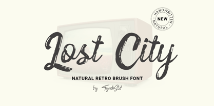 Lost City is a Natural Retro Brush Font. It is a handwritten which can beautifully enhance your design and product with the feel of retro. It's perfect for creating quotes, greeting cards, branding, promotion, advertisements (hello creative people!). This is a complete set comes with the International Characters. Enjoy!
 - Magma II by Stone Type Foundry,
$49.00 Magma is a rare sans serif typeface family designed explicitly for use in both text and display applications. Starting with this design foundation, Sumner Stone refined the design and added a large suite of international characters to create Magma II, a type family with even more depth and versatility.
 - Romanus by Zamjump,
$7.00 Romanus is a classic font with strong characters, ideal for logos, event titles, quotes, magazines, product packaging, or anything that requires a classic style boost. Romanus offers international languages and characters. Type a-z using this font, and you will get a unique font arrangement and strong characters.
 - Kids Book olst by Olexstudio,
$8.00 KIDS BOOK olstd Font will look gorgeous on all your designs, kids invitation, kids poster design, kids book design, branding materials, kids logo's, and all project design other. WHAT'S INCLUDED KIDS BOOK olstd Font contains standard characters, Uppercase, Lowercase, numbers, punctuation, ligatures and international glyphs. Happy Designed.! regard olexstudio
 - Nightype by madeDeduk,
$14.00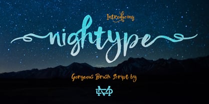 Nightype is a brush script and perfect for poster design, book covers, merchandise, fashion campaigns, newsletters, branding, advertising, magazines, greeting cards, album covers, and quote designs and more. Feature Uppercase Lowercase Number & Symbol International Glyphs Alternatives Ligatures Swashes If you need anything else just shoot me on email.
 - Frencos Olstd by Olexstudio,
$19.00 FRENCOS Olstd - Comic Font will look gorgeous on all your designs, kids invitation, kids poster design, kids book design, branding materials, kids logo's, and all project design other. WHAT'S INCLUDED FRENCOS Olstd - Comic Font contains standard characters, Uppercase, Uppercase Alternates, Lowercase, Lowercase Alternates, numbers, punctuation and international glyphs.
 - Rhoutte Ganol by madeDeduk,
$14.00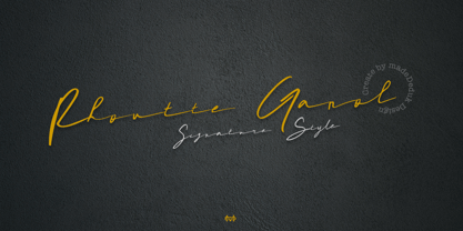 Really excited to introduce Rhoutte Ganol is a realistic signature to give a incredible impression for all your project design and come with more than 149 ligatures to make everything look realistic handmade signature. Included: Uppercase Lowercase Number & Symbol International Glyphs Multilingual Support Ligature Hope you enjoy it.
 - Coengkil Olstd by Olexstudio,
$19.00 COENGKIL Olstd Display Font will look gorgeous on all your designs, poster design, book design, branding materials, logo's, and all project design other. WHAT'S INCLUDED COENGKIL Olstd Display Font contains standard characters, All Chacacter is Uppercase, numbers, punctuation, Stalistic ALternates, ligatures and international glyphs Happy Designed.! regard olexstudio
 - Pristyne by Olexstudio,
$16.00 PRISTYNE script is a beautiful, modern, hand-lettered script. This font will look gorgeous on all your designs, wedding invites, branding materials, logos, t-shirts, posters, business cards, quotes and all other design projects. PRISTYNE script contains standard characters, lowercase, stylistic alternates, uppercase, numbers, punctuation, ligatures and international glyphs.
 - Bill Corporate Medium by OGJ Type Design,
$35.00 Bill Corporate is a geometric typeface with generous capitals. A modern classic, based on Max Bill’s lettering work, its straightforward and uncompromising construction can be both edgy and sublime. With minimalist letterforms, pointy apexes instead of flat ones, and archetypal proportions, this font family doesn’t follow any trends but strives to achieve a timeless formal vocabulary. The skeleton of its letters is based heavily on the famous primary shapes of the Bauhaus: square, circle, and triangle. This makes for quite wide uppercase and much narrower lowercase letters. The contrast between uppercase and lowercase benefits inexperienced users, who will be able to get appealing results quickly. At the same time, it’s a powerful tool for seasoned designers, who can employ either case selectively to set the desired typographic course. Bill Corporate Medium’s 16 styles (including a set of eight lighter-than-light fonts from “Two” to “ExtraLight”) are an excellent choice for editorial design, branding, headlines, and even short to mid-length copy in a wide range of applications and industries. The uppercase letters in particular—with their varied widths and lavish dimensions—are suitable for cosmopolitan and stylish logotypes and wordmarks. Whenever a timeless, staid, and classy look is demanded, choose Bill Corporate.
 - PowerUp by Grype,
$19.00 The gaming world is loaded with so many cool logotypes that never see the full font light of day. The PowerUp family finds its origins of inspiration in the Super Mario Bros. logotype, and been expanded upon to create its two unique styles and extruded shadow typefaces. PowerUp celebrates the geometric sans serif stylings of the original logotype, both in its condensed and heavyweight forms, and gives them the full character set they deserve. It's fun and functional. Each font includes a full standard character set with expansive international support of latin based languages, and 2 weight/width styles and three shadow styles. This highly stylized family is ready to electrify design urges, both digital and beyond. Here's what's included with the PowerUp Family: 480 glyphs per style - including Capitals, Lowercase, Numerals, Punctuation and an extensive character set that covers multilingual support of latin based languages. 5 styles: Regular, Black, Shadow, Black Shadow One, & Black Shadow Two. Layered Black & Black Shadow Two can be scaled down to 62% to match inspiration logotype. Here's why the PowerUp Family is for you: You're in need of a dynamic geometric font with extruded shadow layerable fonts You're a huge Super Mario Brothers fan You're a gamer, obsessed with all gaming related things You are looking for a techno style font family with Condensed AND Uber Black styles You just like to collect quality fonts to add to your design arsenal
 - Heroic Condensed by TypeTrust,
$30.00Heroic Condensed is an idealized narrow grotesque: a fusion of clean geometry and optical balance. Its constructed framework exudes technical refinement tempered by humanist curves across a family of eight weights. Heroic Condensed includes small caps, tabular figures, and stacked fractions. - Chinook by Unio Creative Solutions,
$9.00 Chinook has been designed as an homage to the iconic chunky look of the Italian movie titling from the 70s and 80s. Despite its vintage flair, our sturdy display font is perfectly adaptable for any contemporary context with its balanced and soft text typesetting. This project is obviously influenced by the everlasting classic "Cooper Black", but includes more modern letter shapes, with rounded serifs and a fluffy overall appearance. Chinook, includes a customized italic set, features an extended charset covering several languages based on the Latin Alphabet, and sports a complete set of Open type features. It's equipped with swashes, alternates as well as discretionary ligatures, old-style figures, subscript and superscript numerals, and even more special glyphs. The heavy appearance makes this font ideal for high-impact design, such as headlines, titling, branding, and logotype. Specifications: - Files included: Chinook, including Italic - Multi-language support (Central, Eastern, Western European languages) - OpenType Features (Superscript and Subscript Numerals, Fractions, Oldstyle figures, Stylistic Alternates, Discretionary Ligatures, Swashes) Thanks for viewing, Unio.
 - Casagrande by Italiantype,
$39.00 Casagrande Collection has been designed in 2020 by the Italiantype Team (Manuel Alvaro, Valentino Coppi and Mario De Libero), working in close collaboration with Italian lettering artist, illustrator and calligrapher Alberto Casagrande, with help from the Zetafonts Team (Francesco Canovaro, Andrea Tartarelli and Cosimo Lorenzo Pancini). The goal of the project was to use as inspiration Alberto's colorful, vintage themed digital illustration style to develop a suite of closely related typefaces that, used together, would allow designers to replicate the nostalgic charme of Italian poster and product design from the thirties and the forties. Two color overprints, coarse dithering, handmade calligraphy, reminiscences of art deco, hints of modernism and pop culture references: all this and more mixed in a exuberant and playful collection, created with illustrators, poster artists and book cover designers in mind. The final product is 24-font package with six display families with styles varying from the thirties-inspired Antifascista (3 weights + 3 dithering weights) and Deco (3 weights + 3 inline weights), to the modernist Casabau (5 weights), to the geometric Grind (4 widths), to the vintage elegance of the two script families, Reclame and Casatiello. The collection is complemented by a two-color icon set font, Casagrande Ornaments, allowing any designer to easily explore the creative possibilities of this incredibly powerful creative collection. Please Note: Casagrande Antifascista Ombra simulates fine dithering and may be processor intensive for some older computers. Use Casagrande Antifascista if it slows down your system.
 - Montarsi by insigne,
$32.00 Montarsi is a typeface designed by Jeremy Dooley, inspired by Arabic calligraphy and contemporary design trends. The letters are fluid and graceful, inspired by the curves and swirls of Arabic script. Montarsi is a bold, contemporary calligraphic face with broad strokes and high contrast. It has a variety of styles and weights to give you an extensive range of design options. This font family, which includes eight weights, is ideal for producing brief texts for editorial, fashion, branding, magazine, television, window displays, and other media applications. Small caps, old-style figures, and width variations are also included. It's ideal for writing brief sentences because of the increased x-height. Montarsi is a classic spirit reinvented in a modern language, influenced by the delicate curves of letters and the way ink glides across paper. We especially thank Lucas Azevedo and ikern.
 - Plumage by Wilton Foundry,
$29.00Plumage is somewhat unusual in that it has elements of calligraphy as well as script in a semi-loose form that gives it a pleasing appearance for both large and small sizes, and interesting flare finish strokes add to its unique character. As I read a dictionary description of "plumage", I realized that in many ways there is a parallel between a bird's plumage and how it is utilized in the context of writing: Plumage varies in pattern and arrangement for different purposes; what it expresses can of course be even more interesting. Plumage is disposable after a season, as new ones become available... imagine, a self-sustaining quill! - I guess that's equivalent to a refill or disposable pen. Historically, quill pens were made from feathers of a variety of birds, each chosen for its special characteristics. The sturdiest and most reliable feathers, however, come from turkeys, swans and geese. Feathers used to make pens are the stiff-spined flight feathers on the leading edge of the bird's wing. Pens for right-handed writers come from the left wing, and pens for left-handers, from the right! Each bird yields 10-12 good quills, and sometimes only 2 or 3 - so small a yield that the geese reared in England could not furnish nearly enough for local demand, and quills were imported from the Continent in large quantities. At one point St Petersburg in Russia was sending 27 million quills a year to the UK. It is said that geese were specially bred by US President Thomas Jefferson (1743-1826) to supply his own vast need for quills - in his lifetime he wrote almost 20,000 letters. The name "Plumage" was selected to pay homage to the noble birds that supplied countless quills for centuries of literary works. Plumage is recommended for any formal or informal invitation, decorations, awards, poetry, plaques, etc. We hope you will have the pleasure of using Plumage. - ITC Whiskey by ITC,
$29.99Jochen Schuss, the Biedenkopf, Germany, designer who was most recently responsible for ITC Vino Bianco, has created in ITC Whiskey a condensed display face that's both angular and soft at the same time. While the letterforms of Whiskey are clearly roman, there's a slight reminiscence of blackletter in the face's narrow proportions, its dark weight, and its persistent internal angle - not quite the 45 degrees common in a classic German textura, but a gentler angle of 25 or 30 degrees. And the counters are all rounded, as are the ends of all the strokes, giving Whiskey a comfortable friendliness despite its severe structure. The character set includes an alternate z" and an "ft" ligature." - Holy Mordigan by BlackLotus,
$10.00 Holy Mordigan is a modern script font that is inspired by luxury. Holy Mordigan font makes every design created has an elegant aura. so it has its own value for everyone who sees it. Holy Mordigan also has a variety of alternate options that can be used. What's included in this font pack : -- LARGE GLYPH SETS : There are 409 total glyphs in this font pack. Holy Mordigan comes with a large range of glyphs including punctuation, numerals, international language support, ligatures & additional extra glyphs for stylistic sets. It includes 182 Glyphs of Stylistic Sets to make your text looks natural and beautiful. -- NO SPECIAL SOFTWARE REQUIRED -- INTERNATIONAL LANGUAGE SUPPORT : This font supports English, French, Italian, Spanish, Portuguese, German, Swedish, Norweigen, Danish, Dutch, Finnish, Indonesian, Malay.
 - Diverge Variable by Vishnu Sathyan,
$2.90 Introducing Diverge, a dynamic variable font with two axes - Weight and x-height. Inspired by the sleek and modern design of driveways in apartment complexes, Diverge is a font that stands out with its contemporary, yet sophisticated look. The Weight axis of Diverge ranges from Thin to Black, offering designers a wide range of options to choose from. The Thin weight is perfect for delicate and refined designs, while the Black weight commands attention with its bold and impactful appearance. The x-height axis of Diverge ranges from 420 to 800, giving designers greater control over the font's legibility and versatility. Whether used in body text or headings, Diverge's x-height axis allows for greater flexibility in design, making it a valuable addition to any designer's toolkit. Diverge's variable design is perfect for a wide range of applications, from branding and advertising to editorial design and web development. Its unique look and feel will make any design project stand out from the crowd.
 - Zawiya by Eyad Al-Samman,
$3.00 The word Zawiya in Arabic language means Angle in English language. "Zawiya" is a Kufic modern square-shaped Arabic typeface. The typeface has only right-angled angles which makes it full of open and closed squares and free from any curves or arches. This font comes in two different weights. I am originally an engineer and I have liked to draw geometric shapes since my early childhood. I decided to design a typeface that embodies both of the technical and artistic human that I have inside me. The main characteristic of "Zawiya" Typeface is in its modern and attractive right-angled and square-shaped styles for its all-Arabic characters. The character "Faa" is one of its most distinguished characters that I myself adore it so much. "Zawiya" Typeface is suitable for books' covers, advertisement light boards, titles in magazines and newspapers, posters, greeting cards, cards, covers, satellite channels, exhibitions' signboards and external or internal walls of malls or metro's exits and entrances, geometric instruments and tools, technical devices, computers and laptops, IT and electric devices and also calculators. It is advisable to use the font in fields related to sciences such as geometry, mathematics, physics, chemistry, astronomy, industry, economy, and other fields. It can also decorate surfaces of calculators, geometric tools, rulers, pens, computers, cars, ships, trucks, and other related electric and electronic devices. It is sharp design qualifies it to be printed in public signs in streets, airports, hospitals, schools, malls, hotels, mosques, and other public places. It can also be used in titles for Arabic news and advertisements appeared in different Arabic and foreign satellite channels.
 - Broker by In-House International,
$5.00 Broker is an angular variable display type family that invites carefree experimentation, but is designed to make a statement. With twelve unique styles and variable controls for thickness, decoration, and shape, Broker is a versatile and expressive shape-shifter that adapts to fit your mood. It can go from slim, square mono-weight to edgy stressed angled styles, and full-on style with chunky serif heels. And because it’s drawn on a rectangular frame, it’s modular, making it particularly easy to lay out and stack. Inspired by DIY, cut paper lettering Broker isn’t delicate, elegant or precious—it’s a rough and tumble typeface to play with and make your own. Use the variable control to try different styles to give shape to your words. It’s perfect for creative projects, posters, funky packaging, flyers, cover art, motion displays, and fearless branding. The font family includes uppercase and lowercase alphabets, numbers, punctuation and latin diacritics—fully adaptable as a variable type (.ttf) for designers using compatible platforms. It’s also available as thirteen unique opentype (.otf) fonts that can be mixed and matched. Broker was designed by Alexander Wright and In-House International for the In-House International foundry and developed by Rodrigo Fuenzalida at FragType.
 - Berolina - 100% free

- The Oloron Tryout font by Match Software is a distinctive and eye-catching typeface designed to capture attention while maintaining readability. Created by the renowned Match Software, known for thei...
- PT Serif Pro by ParaType,
$50.00PT Serif Pro is an universal type family designed for use together with PT Sans Pro family released earlier. PT Serif Pro coordinates with PT Sans Pro on metrics, proportions, weights and design. It consists of 38 styles: 6 weights (from light to black) with corresponding italics of normal proportions; 6 weights (from light to black) with corresponding italics of narrow proportions; 6 weights (from light to black) with corresponding italics of extended proportions; and 2 caption styles (regular and italic) are for texts of small point sizes. The letterforms are distinguished by large x-height, modest stroke contrast, robust wedge-like serifs, and triangular terminals. Due to these features the face can be qualified as matched to modern trends of type design and of enhanced legibility. Mentioned characteristics beside conventional use in business applications and printed stuff made the fonts quite useable for advertising and display typography. Each font next to standard Latin and Cyrillic character sets contain alphabet glyphs of title languages of the national republics of Russian Federation and support the most of the languages of neighboring countries. The fonts were developed and released by ParaType in 2011 with financial support from Federal Agency of Print and Mass Communications of Russian Federation. PT Serif family together with PT Sans won the bronze in Original Typeface category of ED-Awards 2011. Design – Alexandra Korolkova with assistance of Olga Umpeleva and supervision of Vladimir Yefimov - Acre by Jonathan Ball,
$24.00 Acre is a geometric sans-serif type family of eight weights that's both inspired by and named after my great grandfather, Tex Acre. Tex was an artist and sign maker whose handcrafted signs illuminated the roadsides of the American Midwest and typified mid-century Americana. Acre is a tribute to him, his work, and many of my favorite early 20th century geometric typefaces. With eight weights ranging from Thin to Black, Acre is an extremely versatile family that can be used for display, text, or anything in between. Acre offers full European language support plus many OpenType features such as tabular and oldstyle figures.
 - Wholecar by Mans Greback,
$59.00 Wholecar is a train graffiti typeface. The letters are fun and friendly, with a happy personality and cartoonish quirkiness. A street style, Wholecar is drawn and created by Mans Greback, and is the perfect combination of cool and childish typography. This hip-hop styled comic typeface family comes in eight styles: Black, Inline, Invert, Regular and White. Additionally, the Wholecar Color, consisting of Noir, Pink and Silver, specifically created for Photoshop and Illustrator. Use characters [ ] { } ¤ # _ for train parts fitting the letters. Examples: [¤#¤_¤_¤#¤] [¤Graffiti¤] The font is built with advanced OpenType functionality and has a guaranteed top-notch quality, containing stylistic and contextual alternates, ligatures and more features; all to give you full control and customizability. It has extensive lingual support, covering all Latin-based languages, from North Europe to South Africa, from America to South-East Asia. It contains all characters and symbols you'll ever need, including all punctuation and numbers.
 - Continuo by Delve Fonts,
$39.00 Continuo is a fascinating, all-uppercase display typeface wherein the contour of each letterform is described with a single, continuous line. The challenges presented by that simple idea are similar to constructing letterforms with neon tubing. For example, when the strokes of a letterform need to be heavier than the width of the neon tube, two tubes are employed to create the outer contours, effectively leaving an unfilled void inside the stroke. Also, since neon tubes cannot be broken apart as they trace the contours, they must follow a path that, for reasons of economy and to avoid optical massing (or bright spots in neon), the tubes are not crossed. So too, the construction of Continuo follows. The newly updated Continuo now has alternate forms of letters A-Z available in the lowercase a-z and by extension those alternates are also present in the lowercase diacritics. The new Latin Plus glyph repertoire of Continuo contains almost 900 glyphs, supporting 224 languages, including Vietnamese and multiple African languages. A handy set of arrows and additional international currency symbols were added as well. The name is derived from the musical term “Basso Continuo” meaning an almost constant bass line, an integral part of most musical melodies. As an in-line display type, Continuo is ideal for headlines and most oversized applications and its unique appearance commands attention from viewers.
 - Kunstler Grotesk by HiH,
$12.00 Künstler Grotesk ML is one of a number of typeface designs that attempts to reconcile Germany’s blackletter tradition with the international familiarity of roman letterforms in a simple, robust design suitable for meeting the demands of a modern industrial economy, while rejecting the extraneous ornamentation of the departing Victorian era. It is an all-cap design with a number of playful ligatures. It has an appealing boldness that reverses well. Künstler means ‘artist’ in German. I had always assumed it was a person’s name until I came across the translation. Lesson: conjecture is not fact. Grotesk refers to a sans serif letterform tradition. Kunstler Grotesk was originally released by Bauer'sche Giesserei of Frankfurt am Main circa 1900. Künstler Grotesk ML represents a major extension of the original release, with the following changes: 1. Added glyphs for the 1250 Central Europe, the 1252 Turkish and the 1257 Baltic Code Pages. Added glyphs to complete standard 1252 Western Europe Code Page. Special glyphs relocated and assigned Unicode codepoints, some in Private Use area. Total of 350 glyphs, 260 kerning pairs. 2. Added OpenType GSUB layout features: pnum, salt, dlig (19) and hist. 3. Revised vertical metrics for improved cross-platform line spacing. 4. Redesigned mathematical operators. 5. Included tabular (std) & proportional (opt) numbers. 6. Refined various glyph outlines. 7. Made CcNnOoSsZz-kreska available (salt). 8. Incorporated alternate glyphs in lower case.
 - Seconda by Durotype,
$49.00 Wait a second... Seconda. A sans serif with its own individuality. A typeface which combines character with legibility. A typeface which combines business with pleasure. Its moderate contrast and narrowing terminals give this typeface a gentle and sophisticated nature. Use it for books, reports, magazines, business letters — and relax. Use it for brochures, posters, signs, corporate identity projects — and enjoy. Seconda has sixteen styles, extensive language support, eight different kinds of figures, sophisticated OpenType features — so it’s ready for advanced typographic projects. For text and display use. When using Seconda in small text sizes, it will be a reliable and legible text face. When using it in big display sizes, it will show its refined details. Seconda has the companion typefaces Seconda Soft, Seconda XtraSoft, and Seconda Round. For more information about Seconda, download the PDF Specimen Manual.
 - Compatil Fact by Linotype,
$50.99Compatil is the first comprehensive type system which enables all typographical elements to be used to full effect in order to reproduce the message conveyed by text information. Four different type styles with a total of 16 weights including italics have been merged into a unique typographical network. There are now no limits to the font user's creativity. The system is a product of technical innovation and constitutes a new design approach which meets the highest aesthetic standards. For almost two years, a team of experts from Linotype has been working with initiator Professor Olaf Leu under the direction of Silja Bilz, Erik Faulhaber and Reinhard Haus to create the Compatil type system. Despite the Internet and TV, it is essential today to be able to absorb information quickly by being able to read it with ease. A fact that is becoming increasingly important both on-screen and on paper. It is the role of the font to increase legibility and to ensure typographically perfect results for text design work. The new Compatil type system meets all these needs. The Compatil is a part of the Platinum Collection. The following four different styles are available: Compatil Exquisit, Compatil Fact, Compatil Letter and Compatil Text. Compatil is available in various font formats: 16 separate OT Pro fonts including the small caps and Adobe Central European character set for OpenType-supporting applications like Adobe InDesign, or as 32 separate OpenType Com fonts for office communication, with the following special features: 1. Optimized display capabilities for computer screens eXcellent Screen Fonts (XSF-quality). 2. An extended, international character set, which supports 48 different languages for Microsoft Office applications like MS Word or as 64 PostScript fonts, which can be used in non-OpenType-supporting applications like Quark XPress. - Compatil Fact Paneuropean by Linotype,
$103.99Compatil is the first comprehensive type system which enables all typographical elements to be used to full effect in order to reproduce the message conveyed by text information. Four different type styles with a total of 16 weights including italics have been merged into a unique typographical network. There are now no limits to the font user's creativity. The system is a product of technical innovation and constitutes a new design approach which meets the highest aesthetic standards. For almost two years, a team of experts from Linotype has been working with initiator Professor Olaf Leu under the direction of Silja Bilz, Erik Faulhaber and Reinhard Haus to create the Compatil type system. Despite the Internet and TV, it is essential today to be able to absorb information quickly by being able to read it with ease. A fact that is becoming increasingly important both on-screen and on paper. It is the role of the font to increase legibility and to ensure typographically perfect results for text design work. The new Compatil type system meets all these needs. The Compatil is a part of the Platinum Collection. The following four different styles are available: Compatil Exquisit, Compatil Fact, Compatil Letter and Compatil Text. Compatil is available in various font formats: 16 separate OT Pro fonts including the small caps and Adobe Central European character set for OpenType-supporting applications like Adobe InDesign, or as 32 separate OpenType Com fonts for office communication, with the following special features: 1. Optimized display capabilities for computer screens eXcellent Screen Fonts (XSF-quality). 2. An extended, international character set, which supports 48 different languages for Microsoft Office applications like MS Word or as 64 PostScript fonts, which can be used in non-OpenType-supporting applications like Quark XPress. - Compatil Letter by Linotype,
$50.99Compatil is the first comprehensive type system which enables all typographical elements to be used to full effect in order to reproduce the message conveyed by text information. Four different type styles with a total of 16 weights including italics have been merged into a unique typographical network. There are now no limits to the font user's creativity. The system is a product of technical innovation and constitutes a new design approach which meets the highest aesthetic standards. For almost two years, a team of experts from Linotype has been working with initiator Professor Olaf Leu under the direction of Silja Bilz, Erik Faulhaber and Reinhard Haus to create the Compatil type system. Despite the Internet and TV, it is essential today to be able to absorb information quickly by being able to read it with ease. A fact that is becoming increasingly important both on-screen and on paper. It is the role of the font to increase legibility and to ensure typographically perfect results for text design work. The new Compatil type system meets all these needs. The Compatil is a part of the Platinum Collection. The following four different styles are available: Compatil Exquisit, Compatil Fact, Compatil Letter and Compatil Text. Compatil is available in various font formats: 16 separate OT Pro fonts including the small caps and Adobe Central European character set for OpenType-supporting applications like Adobe InDesign, or as 32 separate OpenType Com fonts for office communication, with the following special features: 1. Optimized display capabilities for computer screens eXcellent Screen Fonts (XSF-quality). 2. An extended, international character set, which supports 48 different languages for Microsoft Office applications like MS Word or as 64 PostScript fonts, which can be used in non-OpenType-supporting applications like Quark XPress. - Compatil Text by Linotype,
$50.99Compatil is the first comprehensive type system which enables all typographical elements to be used to full effect in order to reproduce the message conveyed by text information. Four different type styles with a total of 16 weights including italics have been merged into a unique typographical network. There are now no limits to the font user's creativity. The system is a product of technical innovation and constitutes a new design approach which meets the highest aesthetic standards. For almost two years, a team of experts from Linotype has been working with initiator Professor Olaf Leu under the direction of Silja Bilz, Erik Faulhaber and Reinhard Haus to create the Compatil type system. Despite the Internet and TV, it is essential today to be able to absorb information quickly by being able to read it with ease. A fact that is becoming increasingly important both on-screen and on paper. It is the role of the font to increase legibility and to ensure typographically perfect results for text design work. The new Compatil type system meets all these needs. The Compatil is a part of the Platinum Collection. The following four different styles are available: Compatil Exquisit, Compatil Fact, Compatil Letter and Compatil Text. Compatil is available in various font formats: 16 separate OT Pro fonts including the small caps and Adobe Central European character set for OpenType-supporting applications like Adobe InDesign, or as 32 separate OpenType Com fonts for office communication, with the following special features: 1. Optimized display capabilities for computer screens eXcellent Screen Fonts (XSF-quality). 2. An extended, international character set, which supports 48 different languages for Microsoft Office applications like MS Word or as 64 PostScript fonts, which can be used in non-OpenType-supporting applications like Quark XPress.
