10,000 search results
(0.063 seconds)
- Zaragoza by ITC,
$29.99Zaragoza is the work of British designer Phill Grimshaw, a bold and beautifully rendered script which incorporated an internal zigzag decoration. Generous capitals harmonize with a lowercase that should be set close to reproduce the look of true handwriting. - Joopica by Okaycat,
$24.50 Joopica is cute & fun, bringing a friendly good nature to your communication. For the casual fresh look this font has lots of appeal. Joopica features extended characters, containing West European diacritics & ligatures, making it suitable for international environments & publications.
 - Sugar Candy by madeDeduk,
$14.00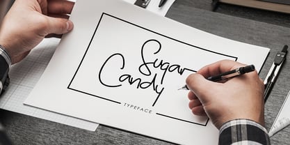 Sugar Candy is a signature typeface font inspired from classic handwriting style. Suitable to create any branding, product packaging, invitations, quotes, t-shirts, labels, posters and more. Feature UPPERCASE lowercase Number & Symbol International Glyphs Alternative Uppercase Alternative lowercase Ligatures
 - Violaceous by madeDeduk,
$15.00 Violaceous is a modern brush script and is perfect for poster design, book covers, merchandise, fashion campaigns, newsletters, branding, advertising, magazines, greeting cards, album covers, and quote designs and more. Feature Uppercase Lowercase Numbers & Symbols International Glyphs Alternatives Ligatures
 - Montells by Olexstudio,
$16.00 MONTELLS - Display Font will look gorgeous on all your designs, invitation, poster design, book design, branding materials, logo's and all project design other. MONTELLS - Display Font contains standard characters, character is Uppercase, Lowercase, numbers, punctuation, ligatures and international glyphs.
 - Musika by Lurinzu Studios,
$12.75 Musika" is a serene and elegant display typeface that is inspired by the vibe of soft jazz. Serene, elegant, soothing, somewhat sensual and at the same time feels like a warm hug. This typeface is made with the intention to be used in both titles and body text. The bold weight (even the light weight could also be used as a title card) holds really well as a title while the lighter weights (regular and light) can be used in body text. *This font includes letters, numbers, multi-language, and all essential marks needed. * Three (3) weights are currently available. (Light, Regular and Bold)
 - Katsudon by Hanoded,
$15.00 Katsudon is a Japanese crumbed and deep fried pork cutlet, typically served on rice with egg drizzled over it. There is also a chicken variety. I have been to Japan numerous times (it is my favourite country) and each time I revelled in the great variety of foods being served in street stalls and hole-in-the-wall eateries. I especially love the grandma-and-grandpa eateries that are tucked away in alleys behind the major shopping streets. They never speak English and my Japanese is shaky (to say the least), but the food is always good and we always seem to understand each other. This year, I couldn’t travel to Japan, because of the Covid outbreak, but I can tell you that I miss Japan a lot! Katsudon is a crumbed and deep fried font. It comes with a splash of authenticity, a sprinkling of cheekiness and a generous dose of oomph. Oh, yeah, and double letter ligatures, plus a few alternates as well.
 - Quire Sans by Monotype,
$155.99 My goal was to make a design that might fit in anywhere,” says Jim Ford about his Quire Sans™ typeface. “I wanted it to be highly functional and sexy at the same time.” With one foot comfortably in the realm of oldstyle design and traditional book typography, and the other in evolving electronic media, the Quire Sans family does, indeed, fit in just about anywhere. As for sexy, someone once quotably wrote, “A great figure or physique is nice, but it's self-confidence that makes someone really sexy.” Yes, Quire Sans is sexy, performing confidently in virtually any setting. 2014-06-26 00:00:00.000 57.9900 F43063-S193385 42831 Neue Frutiger World Monotype https://www.myfonts.com/collections/neue-frutiger-world-font-monotype-imaging https://cdn.myfonts.net/cdn-cgi/image/width=417,height=208,fit=contain,format=auto/images/pim/10000/279026_ed8c8093fe1ac59ebe9e3ee1d9262c8e.png Neue Frutiger World is designed for global use with an impressive range of 10 weights, from Ultra Light to Extra Black, with matching italics. It embodies the same warmth and clarity as Adrian Frutiger’s original design, but allows brands to maintain their visual identity, and communicate with a consistent tone of voice, regardless of the language. Neue Frutiger World supports more than 150 languages and scripts including Latin, Greek, Cyrillic, Georgian, Armenian, Hebrew, Arabic, Thai and Vietnamese. “Before Neue Frutiger World it was not an easy task for western brands to find families in Arabic, Hebrew, Thai and Vietnamese which match with their Latin,” says Monotype type director Akira Kobayashi, who led the Neue Frutiger World project. “They may find a type with closer expression, but there was no guarantee if the bold version in the non-Latin family matches the bold in their Latin. Neue Frutiger World offers a better solution.” In addition to Neue Frutiger World’s linguistic versatility, it works hard across environments – suited to branding and corporate identity, advertising, signage, wayfinding, print, and digital environments. The Neue Frutiger World fonts can be paired with Monotype’s CJK fonts: M XiangHe Hei (Chinese), Tazugane Gothic (Japanese), Tazugane Info (Japanese), and Seol Sans (Korean). These were all designed to address brands’ needs to expand into Asian cultures and solve for global typographic challenges.
 - Silver Linings by Clevus,
$14.00 Proudly present Silver Linings Typeface. Say hello to Silver Linings A classy eighties magazine inspired serif condensed - with a complementary lowercase version. In true Eighties style, they also come in varying degrees of Condensed form - mix and match them to create eye-catching effects. Don't forget to use all caps too in your mixing and matching - it adds contrast and impact to your type design. Design tips! : Tighten your letterspacing for larger titles to create a range of looks. Comes with alternatives and ligatures, and helps to create stunning magazine imagery, quotes, posts, blog posts, branding projects, logo, poster and much more. Font Features : Lettres, numbers, symbols, and punctuation 20+ alternates and ligatures No special software required they may be used even in canva, any basic program /website apps that allows standard fonts That's it folks! Multilingual Support Language Support: Danish, English, Estonian, Filipino, Finnish, French, Friulian, Galician, German, Gusii, Indonesian, Irish, Italian, Luxembourgish, Norwegian Bokmål, Norwegian Nynorsk, Nyankole, Oromo, Portuguese, Romansh, Rombo, Spanish, Swedish, Swiss-German, Uzbek (Latin). Follow My Shop For Upcoming Updates Including Additional Glyphs And Language Support. And Please Message Me If You Want Your Language Included or If There Are Any Features or Glyph Requests, Feel Free to Send me A Message. Have a Good Day !
 - Pinala by Typomancer,
$24.00 'Pinala', a playful script & sans fonts, contains light to bold weights for various designs.
 - Romina by Rosario Nocera,
$22.99 Romina is a neoclassical font family with a hight contrast, developed for numerous uses, ranging from news to magazine and catalogs to corporate design and web. The Romina family consists of 7 weights from extra light to extra bold with matching italics. Romina provides advanced typographical support with features such as ligatures, small capitals and case sensitive forms but also some dingbat, special glypfhs and the others opentype features.
 - Brocks by Par Défaut,
$9.00Square in appearance but with soft vertices, Brocks is composed of more than 400 characters. From Latin Pro for multiple language usable. The latin alphabet is available, for uppercase and lowercase, in numerator, denominator and ordinal version. The same for the numbers with fraction features until 10 figures on each side. Exist in Light, Regular and Bold weights, in Right and Left slant version. All of this available in Variable version. - Kanzlei - Personal use only

- Destiny_Light - Unknown license

- Proda Sans by Nasir Udin,
$24.00 Meet Proda Sans, a humanist typeface with geometric construction inspired by the humanist-style sans serif faces that were popular in the mid 20th-century. Its calligraphic influenced letterforms have been adjusted to have geometric’s low-stroke-contrast for better legibility. The medium x-height give it a warm and delicate appearance, and keep your page bright. It's a family of nine weights plus matching italics. The thin and the black weights are great for display purposes. The light, book and regular weights are well suited for longer paragraphs and smaller texts. Proda Sans is developed for advanced typography needs. The OpenType fonts have an extended character set to support 200+ latin-based languages. For full presentation please visit my Behance post.
 - Carmel by Type Associates,
$24.95 This font has been on my drawing board since the late eighties. It was based on drawings provided to me by an old sign-painter family friend and we used it extensively as a caps-only font in the early 90s on a cellphone ad campaign. It loves to be tight set and stacked and provides real grunt when you need it. Small caps have been added and have been weight and proportion adjusted so as to complement the caps. At Type Associates we believe that a font is not complete until the spacing is optimal. Carmel is another example of quality through extensive experience, testing, adjusting and refining.
 - Childos Arabic by NamelaType,
$29.00 The sibling of Childos, with with additional Arabic glyphs for more international fun. Handwritten rough sans serifs style, as well as the development of free and attractive ligature to fill the space between letters and make playful children feel designs.
 - Abine by Olexstudio,
$16.00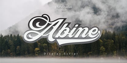 Abine - Display Script will look gorgeous on all your designs, invitation, poster design, book design, branding materials, logo's, t-shirt and all project design other. Abine - Display Script contains standard characters, Uppercase, Lowercase, Swashes, numbers, punctuation, ligatures and international glyphs
 - Decafe by Arendxstudio,
$14.00 Introducing Decafe: wrapped with texture ruling pen so that this font has its own characteristics compared to other fonts that carry a distinctly distinct style. Decafe is equipped with full simple Latin characters that meet the International character glyphs standard
 - Rodentia by Olexstudio,
$10.00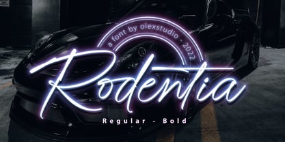 RODENTIA - Handwritten Brush Script Font will look gorgeous on all your designs, invitation, poster design, book design, branding materials, logo's, and all project design other. RODENTIA - Handwritten Font contains standard characters, Lowercase, alternates, Uppercase, numbers, punctuation, ligatures and international glyphs.
 - Antreg Slapoy by Gatype,
$12.00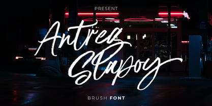 Introducing Antreg Slapoy - A handwritten brush font with authentic dry brush strokes drawn on paper. Perfect for logo design, poster design, social media, typography quotes over photos, book covers and packaging designs. International support for most Western Languages is included.
 - Reform School JNL by Jeff Levine,
$29.00 The extra bold sans serif stencil lettering on movie posters and lobby cards for “Reform School Girl” (a 1957 film by American International Pictures) was the basis of Reform School JNL, which is available in both regular and oblique versions.
 - Arshin by madeDeduk,
$16.00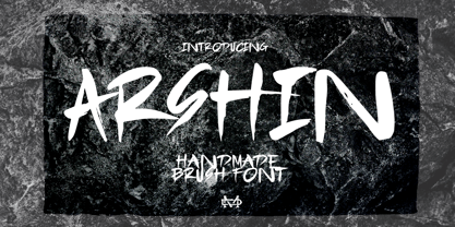 Arshin is a handmade brush font. This font is perfect for poster design, book covers, merchandise, fashion campaigns, newsletters, branding, advertising, magazines, greeting cards, album covers, and more. Features: - Uppercase & Lowercase - Numbers & Symbols - International Glyphs - Multilingual support - ligatures Enjoy it.
 - Pentastic by Okaycat,
$24.50 Pentastic is a natural hand printed font designed for the look of written by pen. Clear legible style yet cute and fun. Pentastic features extended characters, containing West European diacritics and ligatures, making it suitable for international environments and publications.
 - Jenthill by Katsia Jazwinska,
$15.00 Introducing Jenthill - a lovely font family which includes 4 font styles: - a wonderful script typeface Jenthill - Jenthill Light - a delicate version of Jenthill - 2 uppercase fonts Jetnthill Caps and Jenthill Light Caps which are perfect for headings. Each font consists of about 380 glyphs and includes basic punctuation, numbers, roman typeface and international characters, so the font can be used with most of the European languages. Each font in this family is amazing in itself and perfectly combined with each other. So, if you are looking for a font that simulates the soft-edged handwriting, the Jenthill is just for you! Every letter of this font has been carefully crafted to look wonderful and helps you to add a little fancy to your work.
 - Ares by Adam Jagosz,
$15.00 Ares is a crisp all-caps display typeface suitable for sci-fi logos and titles. It owes its peculiar futuristic vibe to angular, top-heavy letters that hang from the cap-height instead of sitting on the baseline. The typeface consists of six subfamilies available in 10 weights, as well as as two variable fonts of three axes: Weight [wght], ranging from 1 to 1000, Mid-height [MHGT], ranginf from 0 to 1000, Tracking [TRAK], ranging from 0 to -40. The mid-height axis affects the typeface's waistline, including crossbars, and divides the fonts into three subfamilies: Ares Lo, Ares, and Ares Hi. These three families are solid-stroked, and the other three families are their stencil-stylized counterparts: Ares Broken Hi, Ares Broken, and Ares Broken Lo. The tracking axis is only available in the variable versions, and proportionally affects the kerning, thus helping set the type more tightly without effort. Ares supports a wide range of Latin-based orthographies, including not only European, but also Vietnamese as well as major African languages like Hausa, Fula or Ewe.
 - ITC New Esprit by ITC,
$29.99Originally drawn in 1985, Jovica Veljović had intended to add a few kerning pairs and make some minor refinements to the letterforms. However, his work lead him to take a fresh look at the family. Veljović recalls, … I soon realized that some characters could benefit by more refined shapes and proportions. By the time I was done, I had worked on just about every character in the original design." In fact the end result is two systems: one optimized for extended texts; the other for display settings. The original elegance of the design is not lost, but the new design brings with it letterforms that are altogether more harmonious and balanced. The roman is dynamic and spirited, just oozing character. The italic by contrast is a little more restrained, but nonetheless an elegant and fitting accompaniment. The text-optimized fonts come with a generous x-height, and slightly less contrast; though its marginally wider proportions let in the light, making it very legible even at small sizes. ITC New Esprit ® is a versatile family, brought to you in four weights from regular to black. OpenType features like small caps, alternates, and a broad character set make this a welcome addition to everyone's font library. Whether you want elegant and legible text, or dynamic and personable headlines, then you'll want to click through to see more of ITC New Esprit. " - The Black Box - Personal use only

- Kristen Curly - Personal use only

- Balega by Linotype,
$29.99 Balega is stencil-like display font, created by German designer Jürgen Weltin in 2002. Balega's letters are very bold, and have a slight italic slant. While some of the uppercase forms appear somewhat sharp, the lowercase is definitively round and friendly. Text set in Balega has a very forward moving motion, as the slant makes all of the letters seem to be lunging toward the right. This gives the typeface a very dynamic feel. Because the counterforms in and between the letters are very narrow, we recommend using Balega in posters and other larger displays, where its design may be truly appreciated. Balega is part of the Take Type 5 collection, from Linotype GmbH."
 - Rare Bird Specimen II by Rare Bird Font Foundry,
$100.00 RARE BIRD SPECIMEN II Specimen II is an elegant hand by Karla Lim of Written Word Calligraphy. It floats across the page on gossamer wings. Specimen II pairs well with classic typefaces like Baskerville, Garamond and Bodoni. OBSERVATIONS Specimen II is exquisitely delicate but not fragile. Best suited for unforgettable affairs. DEFINING CHARACTERISTICS Opentype programming, formal title & preposition wordart, 7 alternate ëandí options, Roman numerals, in and out-stroked letterforms at beginning and end of words, multiple alternate lowercase t cross-strokes, realistic double-letter ligatures, seamlessly connecting calligraphic letters, alternate capital letters, old style numerals, basic Latin encoding. POTENTIAL SIGHTINGS Wedding stationery suites, logo design, luxury product packaging, fragrance, wine labels.
 - Toothpaste Two by Eclectotype,
$20.00 Toothpaste Two is a reworking of Toothpaste . The new font has all the features of the original Toothpaste, but is now even crazier, with the line twisting and turning over and under itself, making a tangled string of text bordering on the edge of legibility. As in Toothpaste, every letter and number connects and there are numerous contextual alternates and ligatures to keep it all running smoothly. This is a fun, decorative font. It would look good on kids' websites, scrapbooks, party invitations and the like. It works best in brighter colors on darker backgrounds, which give the characters a neon light quality. Also, try it with a stroke for a cool cartoony effect.
 - Old Miami Beach JNL by Jeff Levine,
$29.00 The grandeur of what was Miami Beach had its golden years peak in the 1940s. One of the grande dame hotels that stood at Collins Avenue and 23rd Street was the Roney Plaza; built in the 1920s and demolished around 1969. An online auction offered a pair of gummed labels provided by the hotel to be used by their guests for shipping souvenir packages back home, thus also giving the hotel a promotional plug. Jeff Levine not only created two typefaces from this hand-lettered label - Old Miami Beach JNL and Old Miami Beach Nights JNL (a solid black version), but painstakingly recreated the look of the label for the promotional flag and banner for the fonts.
 - Apricosa by SG Type,
$19.00 Apricosa – A beautiful bold serif with vintage swashes, alternate letters and ligatures. Apricosa is a delightful, modern take on a vintage font. Packed with plenty of alternates and ligatures to really bring it to life! Create stunning designs that are truly unique to your brand. Vary between a light and heavy vintage look based on how many letters you alter. Due to its large selection of alternate letters and ligatures, Apricosa is very versatile, covering a wide range of project types, from unique branding, to bold magazine design, to vintage wedding invitations, and so much more. FEATURES Uppercase alphabet Lowercase alphabet 41 alternate glyphs 36 ligatures big range of numbers, symbols & punctuation comprehensive language support
 - Aspire Narrow by Grype,
$18.00 While the Aspire family finds its roots of inspiration in the ACURA automotive company logo, with its wider base, the Aspire Narrow family condenses those styles into something more suitable for larger bodies of text in a more standardized width. Aspire pays homage the techno display styling of the inspiration logotype, further evolving beyond its brand inspired origin to give birth to a font family that pulls on modern and historical styles. It adopts a sturdy yet approachable style with its uniform stroke forms and curves, and goes on to include a lowercase, numerals, and a comprehensive range of weights, creating a straightforward, uncompromising collection of typefaces that lend a solid foundation and a broad range of expression for designers. Here’s what’s included with the Aspire Narrow Family bundle: 477 glyphs per style - including Capitals, Lowercase, Numerals, Punctuation and an extensive character set that covers multilingual support of latin based languages. (see the 6th graphic for a preview of the characters included) Stylistic Alternates - alternate characters that remove the angled stencil cuts for a more standardized text look. 3 weights in the family: Light, Regular, & Black. 3 obliques in the family, one for each weight: Light, Regular, & Black. Fonts are available in TTF & OTF formats. The TTF format is the standard go to for most users, although the OTF and TTF function exactly the same. Here’s why the Aspire Narrow Family is for you: - You’re in need of a narrow automotive sans font family with a range of weights and obliques. - You’re love that ACURA letter styling, and want to design with a narrow font within that genre. - You’re looking for an alternative to Eurostile with more stylized letterforms. - You’re looking for a clean techno typeface for your starship console labelling. - You just like to collect quality fonts to add to your design arsenal.
 - Hops And Barley by Fenotype,
$25.00 Hops And Barley - a Vintage Font Collection. Hops And Barley includes following: • 6 fonts - a textured and clean version of each • Catchwords, textured and clean version • Ornaments, textured and clean version Hops And Barleys’ core is four font styles. Fonts are designed in the same proportions and they have the same soft edges so that they work great together. Here’s a short introduction to the fonts • Hops And Barley 1 -A Connected Script with Contextual, Swash, Stylistic and Titling Alternates • Hops And Barley 1b -A Bold version of Script • Hops And Barley 2 -A Serif vernacular Swash, Stylistic and Titling Alternates • Hops And Barley 3 -A sturdy Sans Serif with a wide character. • Hops And Barley 3b -A Bold version of Sans Serif • Hops And Barley 4 -A Condensed Sans Serif • Hops And Barley 5 -A set of 61 Catchwords • Hops And Barley 6 -A set of 71 Pictograms Hops and Barley fonts have rugged outline and eroded texture inside the letters. Hops And Barley C stands for Clean - they are an identical set of the styles but they come with straight and clean outlines and softened edges. Hops and Barley fonts work great together or on their own. They’re a fantastic choice for any display use and when paired they can cover the whole display part in any project from website to packaging and from poster to logo.
 - VLNL Gindicate by VetteLetters,
$30.00 The alcoholic beverage Gin is drunk around the world, as far back as the 13th century. Originally distilled as a medicine, it draws its main flavour from juniper berries. Gin is colourless itself but – due to its smooth taste – a major ingredient in a long list of famous colourful cocktails. Gimlet, Singapore Sling, Negroni, Charlie Chaplin, French 75, Vesper, Tom Collins, White Lady, Aviation, Monkey Gland, Southside, Gin Gin Mule and New Orleans Fizz are but a few of them. That made us decide it simply cannot be missing from the Vette Letters font collection. Vette Letters designer Henning Brehm originally designed VLNL Gindicate for the 2015 action movie Hitman: Agent 47. It was specifically used for the logo and signage of the maverick ‘Syndicate International’ organisation in the film. It lay dormant in a folder for a while, when it was reworked into this flashy 5 weight family. VLNL Gindicate is a rounded modern sans serif family, suitable for a multitide of applications, corporate or otherwise. It has somewhat of a warm sci-fy feel, without being overtly techno-ish. In the family are 3 regular weights (Light - Regular - Bold), but also an Inline and Multiline weight for extra design possibilities. Company logos, brand identities, music flyers or posters, you name it. VLNL Gindicate will spice up any design. Bottom’s up!
 - Runaway by PizzaDude.dk,
$20.00A heavy graffiti-inspired font! Don't drop it, 'cos it's weight might crush the floor! - FF Casus by FontFont,
$51.99 FF Casus was drawn for print – but is also as natural for textual content in interactive design. It brings warmth and a subtle, handcrafted quality to pages in books and periodicals as well as banners and informational copy on large and small screens. It pairs flawlessly with a wide range of sans serif typefaces to create inviting and easy to read text copy. Drawn by Eugene Yukechev, FF Casus is a fresh take on the robust serif typefaces produced early in the 18th century. The FF Casus™ typeface family takes advantage of slightly narrowed proportions, moderate contrast in stroke weight and an ample x-height to achieve high levels of legibility and efficient use of space. Born in Novosibirsk, Russia, in 1980, Yukechev earned degrees in philology in addition to editorial and graphic design. He also graduated from the British Higher School of Design in Moscow, studying type and typographic design. Yukechev now runs the Moscow-based studio “Schrift Publishers” and the online “Type Journal” with his colleagues. The six weights of FF Casus – each with an italic complement – are available as OpenType® Pro fonts with an extended character set supporting most Central European and many Eastern European languages. Looking for something new – with the panache and warmth of an old book face? FF Casus may be the perfect choice.
 - Revista by Latinotype,
$29.00 Revista is a typographic system that brings together all the features to undertake any fashion magazine-oriented project. The font harmoniously blends different styles into a single big family, which consists of a Didone uppercase and small caps family—including 4 variants ranging from a monolinear Thin to Black with matching italics—and an Inline Black variant that works as a decorative alternative to the Didone fonts. Revista Stencil, one of its versions, comes with the same number of variants. Revista also comes with a Script Family that includes 5 weights, ranging from Thin (monolinear) to Black, contrasting in a tidily untidy way with many ligatures and alternates. You can choose between using stylistic alternates—if you want to give your designs a different untidy look, in the style of the modern calligraphy—or switching between different options if you are looking for a hand-written style. We highly recommend using the default contextual alternates and discretionary ligatures in order to take more advantage of this great font family. Revista includes 2 sets of dingbats, varying from zodiac signs symbols to technology symbols, and complementary ornaments in 3 different weights: Thin (monolinear), Regular and Black. All these features make Revista an ideal typeface for users to design to their liking! Photo by Fervent-adepte-de-la-mode


