10,000 search results
(0.089 seconds)
- Suisside by MendozaVergara,
$19.00 Suisside is a sans-serif unicase font design inspired by international style and the new typography. Works great when set in simple, clean and minimal type layouts is recommended for short texts, logos and posters.
 - Khaollin by madeDeduk,
$16.00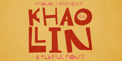 Introducing The Khaollin is a playful font and will be perfect for book, title branding, product packaging, invitation, quotes, t-shirt, label, poster, logo etc. Feature Uppercase & Lowercase Number & Symbol International Glyphs Multilingual support ligature
 - Jetlab by Swell Type,
$15.00 Jetlab is a typographic time machine that drops you squarely into the techno-futuristic optimism of the 1960s, 1970s and 1980s! While certain weights may conjure familiar space race-era logos from the sci-fi movies, board games, sports teams, new wave bands and sneaker brands of the late 20th century, the complete 45-weight Jetlab font family is loaded with modern features to power your retro-futuristic designs with near-infinite versatility. Features: 45 weights provide widths from squeezed to stretched and weights from light to heavy, plus reverse-stress (that's thick horizontal strokes with thin verticals) high, medium and low crossbar options upper and lowercase letters provide two distinct styles a four-axis variable font provides precise control of width, vertical & horizontal weight, and crossbar height 500 glyphs support 223 languages, including Western & Central Europe and Vietnamese
 - Gorod.Volgograd by FontCity,
$15.00The general idea: Can You imagine to yourself, what the hydroelectric power station is? The building of this electricity production foundry is half hidden under the water, but the visible above-water part astonishes your sense. It is a construction almost 1,5 km length dammed out the powerful river stream. Besides thousand of electricity conduction lines supports it bears also the highway and the railroad. From a faraway distance the train seems like a caterpillar that has climbed up the stout tree. There are also the navigable sluices, the flood channels and other erections. The idea of this typeface outlines arrived to the authors exactly on the viewing platform, under the impression of the waterfalls, which are escaping from the dam womb, falling from almost 50 meters altitude and becoming white-haired during this flight. Release: in the form of "gorod.Volgograd" font with the one style. We work with other styles now and sometime we will be very glad to introduce the Bold and Italic styles to You. We should explain the font name meaning. "Gorod" is "city of" in Russian and Volgograd is the old, big and famous Russian city. The Volga hydroelectric power station of a name of XXII congress of the CPSU caused the Volgograd sea formation. It expands of 14 km width and more than 600 km along the Volga river-bed. But HEPS isn't the sole Volgograd sight. There are many interesting places here. The most known tourist sight, the visit card of Volgograd is the Mamaev Hill. Being here You can see almost all 100 kilometers of city length. Due to its geographical position, Mamaev Hill has got a great importance during the Great Patriotic War (1941-1945). It became and still is the Main Height of Russia. Soviet people have built the huge stately memorial ensemble here. There are many other witnesses of the heroic past of Volgograd: the Alley of Heroes, the Perished Fighters Square, the Soldiers Field and others. The line of tank turrets is stretched out along all town not far from Volga bank. It marks the line, where fascist troops was stopped in 1943. It is very amazingly when You dive under the ground on a usual tram. Volgograders have built a few underground station for the high-speed tramway. The river tram need a quarter of an hour to get an island in the Volga. And You need the same time to walk across the river station. The Volga-Don navigable channel starts from Volgograd. There are planetarium, circus, some theatres, many museums in Volgograd. One of football matches of Euro-2004 qualifying round took a place in the "Rotor" stadium in Volgograd. Volgograd holds the longest - above 50 km - park in the world. Its avenues, squares, embankments are beautiful, Volgograd central districts are built in unique architecture style called the Stalin Empire. You can enjoy fountains, parks, attractions, water-pools and other Volgograd sights. If You visit Volgograd once You'll never forget it. You can read about the ancient history of Volgograd city on the Tsaritsyn font page. Also we plan to create the Stalingrad font and give You a short story about another period in Tsaritsyn-Stalingrad-Volgograd history. - Cushy by Jeff Kahn,
$- Cushy is a versatile san serif font that’s stuffed with numerous plush swashes and unique alternates. But it’s not limited to display use only. Cushy is well suited for text or display applications. Cushy’s large “x” height, square proportions, and generous even weight enhance its legibility in all point sizes. The font’s bold personality radiates friendliness and warmth. Clean classic proportions lend it authority and vigor. Cushy bends around corners and flows throughout. You won't find any sharp corners. The diagonal strokes possess a subtle arch and enhance its characteristics. Available in 8 styles with multiple weights: Thin, Light, Regular, Bold, including italics. Cushy includes stylistic sets, stylistic alternates, swashes, ligatures & discretionary ligatures, and foreign language diacritic glyph support. Cushy provides 40 distinctive swash options, 17 ligatures, and 13 alternates. Weights include Thin, Light, Regular, Bold, with italics. Cushy is suited for corporate ID, retail, magazines, books, brochures, websites, logotypes, etc.
 - Conthey by ROHH,
$29.00 Conthey™ is a highly customisable unicase sans serif family designed for headlines and display use. Its modern, sharp and friendly character will add a fresh, positive vibe to your projects. Conthey customization options include weight variants from hairline to extra bold, width variants from narrow to normal, as well as style variants - possibility to change the mood of the font - from normal unicase, which is already a little cheerful in character, to even more playful, neo-deco proportioned unicase. Conthey feels at home when used for modern branding, magazine layout, headlines and posters. Variable fonts, broad choice of styles and additional alternative stylistic set give the family a great versatility and uniqueness. Conthey consists of 126 fonts in 3 width variants and 3 style variants - 63 uprights and their corresponding italics. Conthey family contains also 2 variable 3-axis fonts, with axes: weight, width and style (that changes internal proportions of some letters, like A H a e g and more). The family has extended language support as well as broad number of OpenType features, such as alternative stylistic set, discretionary ligatures, titling alternates, contextual alternates, slashed zero, fractions, superscript and subscript, ordinals, currencies and symbols.
 - Zeitung Pro by Underware,
$50.00 Zeitung is a sans serif family which works equally well on print and web. First of all: Zeitung is a sans serif made according to contemporary standards: 8 weights, romans and italics, all equipped with small caps. Lots of OpenType features, like uppercase punctuation or 5 figure styles to make sure any of your mathematical or financial charts, tables and diagrams look cool. Zeitung’s typographic palette focuses on utility and legibility, but in the farthest corners you’ll discover a rich array of flavours: punchy black weights, fashionable thin styles, carefully hand crafted true italics, distinct small caps. But Zeitung has more to offer. Its optical sizes offer the best style for each size of your text. Zeitung fonts are devided to two optical families: Zeitung Standard and Zeitung Micro. Zeitung Standard works great in most sizes, while Zeitung Micro fonts are specially made for very small sizes in print and web. Zeitung Micro fonts are perfectly legible in web, where the same technical font styles have to survive in many environments, from older browsers to most up to date mobile screens. Next to that: the lightest weights also function as grades, because they share the same metrics. This can be very handy for selecting the optimal weight for your specific situation, especially on screens or when type is printed by a newspaper press. Letters are rendered in many various ways on different screens. Maybe the interface of your next app requires a different grade than your latest website? Zeitung allows you to change the weight of your text without any further consequence for the design. That is a welcome relief during the design process. Zeitung will help to bring your message across in many different circumstances, from large text in print to small type on screens.
 - Cosmic Turtle by Hanoded,
$10.00 Cosmic Turtle is the belief that the world is supported by a giant turtle. It is mostly found in Hindu and Chinese mythology and the mythologies of the indigenous peoples of the Americas. I had to think of this, as the idea of the Cosmic Turtle is referenced to in the 1982 book ‘A Wild Sheep Chase’ by Haruki Murakami - my favourite author. Cosmic Turtle is a font that I made using a broken chop stick and Chinese ink. I was actually trying to create something scary for Halloween, but this is what came out and I quite like it. Cosmic Turtle is a fat display font with rough edges, wobbly glyphs and a set of double letter ligatures for you to play with.
 - Memorandum SG by Spiece Graphics,
$39.00 Here is an extremely efficient and uncluttered typeface that you can use in a variety of situations. Memorandum’s orderly and methodical nature makes it a natural for long blocks of text, for captions, or for corporate slogans. Try using this typeface where space is limited and legibility is a big concern. And Memorandum is great for constructing tables and charts for business presentations, too. Memorandum is now available in the OpenType Std format. Expanded pre-built fractions, numerators, denominators, and stylistic alternates are now combined in each style. These advanced features work in current versions of Adobe Creative Suite InDesign, Creative Suite Illustrator, and Quark XPress. Check for OpenType advanced feature support in other applications as it gradually becomes available with upgrades.
 - Simpliciter Sans by Cercurius,
$19.95 Simpliciter Sans is a typeface based on the lettering used in the 20th century on technical drawings, either written by free hand or using templates. The lettering was made with a round pen, therefore all lines got rounded ends. All lines had the same thickness in uppercase, lowercase and small caps. The upright style was used on construction drawings and the italic style on machine drawings. The backslant style was used on maps for names of water bodies — seas, lakes, rivers etc. — and for water depth. Simpliciter Sans is primarily intended for texts on drawings, diagrams, charts and maps, but it can also be used for signs and labels. It also works surprisingly well as a body type in smaller sizes.
 - Arzachel by CAST,
$45.00 Arzachel is a humanistic sanserif with a big x-height and a specific organic look. Its design is scientifically sharp and efficient in small type sizes as well as rugged and dramatic in headlines. Arzachel’s essential feeling comes from several features: all the letters are slightly sloped, stem terminations are flared at the top, and the terminals in letters a, c, e, f… are widening with the inside parts completely flat. The stroke contrast is low in the regular weight while it increases in the black; finally the capitals have an inscriptional flavor. Despite being a sanserif (thus a product of recent typography) Arzachel’s roots stretch back to the Renaissance tradition: Olocco took inspiration from some of the early and rather weird types cut in Venice in the 15th century. Arzachel was conceived during Olocco’s MA in Reading to provide a companion for his Zenon for use in small type sizes. But instead of expanding the Zenon family with optical sizes, the designer decided on a sans with its own personality rather than a sanserif version of Zenon with chopped-off serifs.
 - Peridot Latin by Foundry5,
$8.00 Peridot is not just another typeface – it's a multifaceted sans serif type system crafted with passion and precision by Foundry5. Painstakingly developed through long hours and a keen focus on every minute detail, this typeface boasts a high-quality 10 weight family with matching italics in 6 widths, and the highly versatile variable format. Brimming with character, Peridot invites you to experiment with its various stylistic variants, allowing you to tailor the typographic tone to fit your creative vision perfectly. The diverse range of widths and styles in Peridot offers a dynamic typographic toolbox, ready to inspire and captivate even the most innovative designers. Peridot Latin covers over 320 languages, including Vietnamese. It includes all required localised variants, tabular numerals and currencies, fractions, clever discretionary ligatures and many more features. Peridot performs in varied environments – from branding, display, corporate use, editorial, advertising, poster, web, screen usage etc. Think of any other use case as well, and Peridot will perform. Peridot comprises 120 static fonts, family packages, and variable support. It is the gem you ought to have in your collection.
 - Gilam by Fontfabric,
$39.00 Gilam is a sans serif font with semi-condensed proportions. The typeface was based on the famous DIN but combines its popular neo-grotesque look with characteristics, such as the pointed edges in the “W” and “M” as well as the outward cut terminals, which gives a distinctive look to the modern geometric typeface. The complete set of 9 weights plus italics gives to designers the absolute freedom to create anything. Perfect layouts with blocks of text, headlines, motion graphics, logos, apps, and websites are just part of the intended usage of this versatile typeface. Features: • 765 glyphs in 18 styles; • Extended Latin, Cyrillic and Greek; • Geometric forms and low contrast; • Prominent x-height which makes it legible in a text; • Perfect for headlines and logos; • Suitable for web, print, motion graphics etc. • Semi-condensed proportion; • Advanced typographical support and OpenType features including case-sensitive forms, fractions, superscript and subscript characters, and stylistic alternates; • Complete set of figures - old style and lining figures, which come with proportional and tabular variation; Gilam means “joy of people” so that you can enjoy it!
 - Pragmatik by Christopher Stahl,
$24.90 Pragmatik is a carefully crafted Square Sans by Christopher Stahl, awarded with a Commendation at the Art Director's Club Germany Junior Competition 2011 and selected as Font of the Week 42.2011 by Typolution.de. The design is influenced by the heritage of German industrial typesets like DIN, yet the use of forms and proportions feels modern and fresh. The family consists of three weights with matching italics, thus making a total of six fonts. The high x-Height and the sturdy design provide a good legibility in body text, while in larger sizes the exciting details and alternates create headlines full of atmosphere. Features: - 350 glyphs supporting central and western European languages as of DIN 16518 - over 500 manually adjusted kerning classes and pairs - available in Open Type with a host of Open Type features, such as: - proportional lining, lining table and proportional oldstyle number figures - 7 default and 16 discretionary ligatures that especially cater the needs of the German and English language - a variety of stylistic alternate figures like a stencil like i and j or an old-style Eszett.
 - Verbatim by Monotype,
$25.99 This extensive 60-font type family was inspired by the best (and worst) of 1970s science fiction TV shows and movies. Verbatim aims to extract the essence of futuristic type from that era, add a dash of modern style and conjure a cinematic typeface for the 21st century. From the extremes of the thin condensed, all the way through to the black extended, Verbatim has the scope to add drama to your titles and headings, and finesse to your logo and branding projects. Distinguishing features include a large x-height and open counters that aid legibility. This typeface crosses a few boundaries of type specification in that it is both rounded and square, it is part geometric in construction with a touch of humanistic flair and stroke contrast – giving Verbatim a distinctive and confident air. Key features: • 6 weights in Roman and Oblique • 5 Styles – Condensed, Narrow, Regular, Wide, Extended • Small Caps and 7 Alternates • European Language Support (Latin) • 600 glyphs per font. See more detailed examples at the Verbatim microsite.
 - Sensation is a modern and highly versatile font family that captures the essence of simplicity and elegance in typographic design. It is not associated with a specific historical font but rather embo...
- ITC Stone Humanist by ITC,
$40.99 Type designers have been integrating the design of sans serifs with serifed forms since the 1920s. Early examples are Edward Johnston's design for the London Underground, and Eric Gill's Gill Sans. These were followed by Jan van Krimpen's Romulus Sans, Frederic Goudy's ITC Goudy Sans, Hermann Zapf's Optima, Hans Meier's Syntax and Adrian Frutiger's Frutiger. Now, ITC Stone Humanist joins this tradition. It is a careful blend of traditional sans serif shapes and classical serifed letterforms. ITC Stone Humanist grew out an experiment with the medium weight of ITC Stone Sans, a design that already showed a relationship to these sans serif-serif hybrids. ITC Stone Sans has proportions based on those of ITC Stone Serif, and its thick-and-thin stroke contrast suggests the bloodline of humanistic sans serif typefaces. But other aspects of ITC Stone Sans are more closely aligned to the gothics and grotesques, a tradition that accounts for the largest portion of sans serif designs. Enter ITC Stone Humanist. During his experiments with the earlier design, Sumner Stone recalls, I was actually quite surprised at how seemingly subtle changes transformed the face," moving the design firmly into the humanist tradition. "The form of the 'g,' 'l,' 'M,' 'W,' and more subtly the 'a' and 'e' are part of the restructuring of the family," he explains. The top endings of vertical lower case strokes have been cropped on an angle, as have the ascender and descender stroke endings. ITC Stone Humanist is a full-fledged member of the ITC Stone family. It has been produced with the same complement of weights, and the x-heights, proportions, and underlying character shapes are completely compatible with the three original designs. The original ITC Stone Sans is a popular typeface, in part because of its notable versatility. ITC Stone Humanist shares this virtue, and can be used successfully at very small sizes, in long passages of text copy, and even as billboard-sized display type."
 - Rockwell by Monotype,
$40.99 Whether you call them slab serif, square serif, or Egyptian, you know them when you see them – sturdy, nearly monoweight designs with blunt, straight-edged serifs and a no-nonsense attitude. The Rockwell® Nova family is a fine example of this appealing and eminently usable type style. This is a design that is both robust and adaptable. Marked by the flat top-serifs on the cap A, unusual Q tail and high-legibility two-storied lowercase a, Rockwell has a bit of handmade charm that distinguishes it from the cool, more modern interpretations of the slab serif style. The family is excellent for branding, headlines and other display uses. The simple shapes and hearty serifs also make it a good choice for short blocks of textual content in both print and on-screen environments. The light and bold weights are perfect for setting blocks of text copy, while the extra bold and condensed designs bring authority to display copy. Throw in a little color, and you amp up Rockwell’s messaging power. The regular and italic designs perform handsomely, in the most modest of screen resolutions. With four weights of normal proportions, each with a complementary italic, and three condensed designs, two with italics, the family is a commanding and versatile graphic communicator. Rockwell’s large x-height, simple character shapes and open counters, make for an exceptionally legible design. It should not, however, be set so tight that its serifs touch, as this will erode legibility and impair readability. A benefit to Rockwell’s slab serifs, however, is that the design combines beautifully with both sans serif typefaces and a variety of serif designs. Rockwell OpenType® Pro fonts have an extended character set supporting Greek, Cyrillic, most Central European and many Eastern European languages, in addition to providing for the automatic insertion of ligatures and fractions. Looking for its perfect pairing? Look no further than ITC Berkeley Old Style, Between™, ITC Franklin Gothic®, Harmonia Sans™, Metro® Nova or Frutiger® Serif.
 - Soul Lotion by TypoGraphicDesign,
$19.00 CONCEPT/CHARACTERISTICS The typeface “Soul Lotion” is a sans serif font for display sizes. Constructed, clear and simply with monoline character. The round and unadorned look is modern & simple. APPLICATION AREA The modern, clear and simply sans serif font “Soul lotion” would be happy as a display typeface in headline size on the following areas and there simply feel good: Logos/Wordmarks, party flyer, album covers, CD covers, Poster design, video game design, and much more as display typeface for print and digital magazines, books and websites. TECHNICAL SPECIFICATIONS Headline Font | Display Font | Sans Serif Font “Soul Lotion” OpenType Font (Mac + Win) with 6 styles (regular, bold, light + 3x italic) & 354 glyphs. Incl. accents, alternative letters, ligatures & €. Desktop Font (.otf) + Web Font (.svg, .eot, .woff) KONZEPT/BESONDERHEITEN Die Schrift »Soul Lotion« ist ein serifenloser Font für Headlinegrößen. Konstruiert, klar und einfach mit gleichbleibender Strichstärke. Die runden und schnörkellosen Formen wirken modern & schlicht. EINSATZGEBIETE Die moderne, klare und einfache Sans Serif Schrift »Soul Lotion«, würde sich als Auszeichnungsschrift in Headlinegröße über folgende Einsatzgebiete sehr freuen und sich dort schlicht wohlfühlen: Logos/Wortmarken, Flyer für fast jede Party, PlattenCover, CD-Cover, PlakatDesign, Videospiel Design, als Headlineschrift für print und digitale Magazine, Bücher und Webseiten u.v.m. TECHNISCHE INFORMATIONEN Headline Font | Display Font | Sans Serif Font »Soul Lotion« OpenType Font (Mac + Win) mit 6 Schriftschnitten (regular, bold, light + 3x italic) & 354 Glyphen. Inkl. diakritisches Zeichen, alternative Buchstaben, Ligaturen & €. Desktop Font (.otf) + Web Font (.svg, .eot, .woff)
 - Tamba Sans by Dharma Type,
$19.99 Tamba Sans has strong geometric frames. Somewhat condensed and somewhat squarish letterforms can create a powerful atmosphere. At the same time, the very clear, neutral and distinguishable letterforms make it legible and readable. With the spread of the internet, the digital world is overflowing with “designed” stuff. To survive this chaotic world as a designer, you should use a strong typeface to catch the eyes of an unspecified large number of visitors/customers. This is why it is so important to be strong and powerful. One more important thing is the legibility, but the eye-catching design has a tendency to be unusual. Those two things conflict with each other. Tamba Sans solved this problem with an exquisite balance. Tamba Sans consists of 7 weights and their matching Italics for a wide range of usages. Farther, Tamba Sans is supporting international Latin languages and basic Cyrillic languages including Basic Latin, Western Europe, Central and South-Eastern Europe. Also CSS covers Mac Roman, Windows1252, Adobe1 to 3. This wide range of international characters expands the capability of your works.
 - Amberday by Richarts,
$4.99 Amberday is a modern display serif typeface to be used more than just as a header font. When I was creating this typeface my first though was to create a light font but strong enough to stand as a header font. Amberday is a perfect typeface to use for logo design, webdesign, header design, typedesign, posters and many more. Amberday family includes eight weight starting with Thin and ending with a Heavy style. Each style includes kerning, ligatures and alternates.
 - PR8 London Ads - Unknown license

- Justine Garden by Attract Studio,
$12.00 -INTRODUCING- Justine Garden Script is a beautiful modern calligraphy typeface, I hope you will be interested in this font, if you want to use it for your work. This font can be used easily and simply because there are many features in it. contains a complete set of lowercase and uppercase letters, assorted punctuation, numbers, and multilingual support. Justine Garden is very suitable for market designs being developed today, this font has a stylish, trendy, natural and soft font, with this font you can take advantage of opportunities every moment is a great way to highlight the celebration of the best of the party, because this font will be an advocate for the purposes such as wedding invitations, branding, parties, graduations, birthdays, gatherings, etc. Thank you, Attract Studio
 - Artifex Hand CF by Connary Fagen,
$35.00 Artifex Hand is a humanist sans-serif with subtle calligraphic overtones. Designed for flowing, easy-to-read text, its softened details, moderate contrast, and subtle flare give the typeface a clean and warm tone. A near-upright italic adds emphasis and urgency with elegance. Artifex Hand also doubles as a handsome display typeface, scaling gracefully to any size with understated detail and charm. Artifex Hand CF pairs nicely with bold, clean sans-serifs, such as Greycliff CF and Visby CF. Artifex Hand also has a sibling typeface, Artifex CF, cut from the same cloth, but with a classically serifed design. All typefaces from Connary Fagen include free updates, including new features, and free technical support.Check out Visby Round CF which is a great pair for Artifex Hand CF.
 - Public Figure by Hanoded,
$15.00 During the Covid pandemic, I noticed that a lot of public figures (politicians, actors, influencers and even kings and princesses) had to apologise for not following the social distance rules, the lockdown rules or the 'stay at home' rules. They threw parties, went on holidays abroad and - in general - made a nuisance of themselves. When I finished this font, I decided to call it Public Figure! Public Figure is quite a neat, handmade font. It doesn't stick to the rules (but does like to keep up appearances), likes to party (but manages to stay safe) and brightens up your work (without being too gaudy). Public Figure comes with two alternate sets for the lower case glyphs (that cycle as you type) and a massive amount of diacritics, including Vietnamese.
 - Bolgifam by Alcode,
$23.00 Bolgifam Family is a luxury and elegant font pair that will bring a unique style and a trendy look to your designs. Comes with two style font sans modern regular - italic and one Classic Calligraphy Typeface with trending ligatures and special character, this will make Bolgifam family usable in all design projects and work perfectly to pair with any other font. With this family elegant styles you can create design such as wedding media, book covers, greeting cards, logos, branding, business cards and certificates, even for any design work that requires a classic, formal or luxurious look. Try Bolgifam Family, Enjoy the richness of OpenType features and let her fun and elegant excitement make you happy and enhance your creativity! You can use this font very easily. • Multilingual Support
 - Hastina by Warung Grafis 62,
$12.00 Hastina is a beautiful handwritten font with a flowing and elegant style. It features a varying baseline, smooth lines, and stunning alternates. Hastina is perfect for creating a personal and inviting touch to your designs, such as wedding invitations, thank you cards, quotes, greeting cards, logos, business cards, and more. Here are some of the key features of the Hastina font: Handwritten style with a flowing and elegant look Varying baseline Smooth lines Stunning alternates Versatile and can be used for a variety of purposes Hastina is a great choice for: Wedding invitations Thank you cards Quotes Greeting cards Logos Business cards Other designs that need a handwritten touch Overall, Hastina is a beautiful and versatile handwritten font that is perfect for creating a personal and inviting touch to your designs.
 - Ctoxina by FSdesign-Salmina,
$39.00 The Ctoxina family is growing. Due to the success the author decided to add an outline version of the font. The typeface is now available in 6 different styles: light, light italic, regular, italic, bold and bold italic. The Atoxina family is designed especially for the burgeoning market of starships and other space cruisers. The fonts are ideal for internal and external use (including zero-g and occasional bursts of cosmic rays), and with their simplified forms are expected to survive well in non-linear galaxies. With their unusual diagonal half-pixels the fonts are striking as abstract designs at astronomical sizes, where small text may be placed within the black holes formed inside the letters.
 - Chordette for Mandolin by Ukefarm,
$10.00 Chordette Mandolin Chord Fonts are tuned GDAE and support Mandolin, Irish Tenor Banjo and Irish Bouzouki. Create a Mandolin Chord Chart quickly and easily. Mandolin Chord Fonts Chordette contains high quality Mandolin chord fonts. Each mandolin chord is mapped to a specific key on the keyboard, so you can type out chords. It’s a lot easier than dealing with images to create a Mandolin chord chart and song sheets. It’s a favorite tool for teachers, music therapists, and musicians. What instruments are supported? Chordette for Mandolin is tuned GDAE and supports Mandolin, Irish Tenor Banjo, and Irish Bouzouki. Chordette is available in multiple tunings for most stringed instruments. Most versions of Chordette support multiple instruments. App / Instruments Supported / Tuning Chordette for Guitalele / Guitalele, Baritone Guitar / ADGCEA Chordette for Ukulele / Concert Ukulele, Banjolele / GCEA Chordette for Soprano Uke Soprano Ukulele ADF#B Chordette for Baritone Uke / Baritone Ukulele / DGBE Chordette for Mandolin / Mandolin, Irish Tenor Banjo, Irish Bouzouki / GDAE Chordette for Banjo / Banjo /gDGBD Chordette for Tenor Banjo / Tenor Banjo, Tenor Guitar, Mandola / CGDA Chordette for Guitar / Guitar / EADGBE Each version of the Chordette font uses the same chord sets and keyboard mappings. If you play multiple instruments, you can create a chord sheet for one, then use another Chordette font to transpose the song to another. For example, you can create a song for Mandolin, then instantly transpose it for Guitar and Ukulele. Simply by changing fonts! Chordette for Mandolin is priced at $10, which includes the Mandolin chord font sets for both Mac and Windows. For help and support, please visit https://ukefarm.com/chordette/help.html
 - Toisy by Letrizmo,
$21.00When the right late seventies / early eighties message is needed, Toisy comes to the rescue. Founded on a mix of references from letterforms of the time, this new original nods to a style that defined an era. A sexy theme font that conveys a clear image of what was truly chic thirty years ago, this alphabet is deeply rooted in sultry memories of soft, endless nights. Exaggerate contrast between strokes and angular lines combine with rounded corners to provide a unique character and a look that sharply differs when set in all caps or lower case, thanks to an uncommon treatment of density and proportions. Set it real tight, as was typographically in fashion circa 1981. Toisy and Toisy Greek include a set of 13 matching images inspired in leisure stuff and the clothing of the last days of disco. They are different from the set included with Toisy Alt. - GAU_font_modern - Unknown license

- Sagan by Associated Typographics,
$29.00 Sagan was designed as an alternate to Ramsey ; you could call them brothers. It was drawn, redrawn, and expanded on, to put it lightly. It boasts 770 glyphs in each weight, covering all European languages, and also contains an extended Cyrillic. Sagan provides advanced typographical support with features such as case-sensitive forms, old style numerals, fractions, and many alternate glyphs. Like all of our typefaces, Sagan is fun to use. Sagan has 7 weights, with accompanying italics for each weight, ranging from Extra Light to Black. It is ideally suited for branding, editorials, advertising, packaging, posters, billboards and digital screen design. Sagan will work hard for your brand or project. Make a statement that demands notice.
 - Jessie by Turtle Arts,
$20.00Jessie's Letter is based on an old typed letter by Kerrie's great step grandmother. This letter was undated, but we think it must have been from the 1920s or so. Jessie wasn't much for punctuation, so there aren't any of those pesky question marks and exclamation points. But, she did make mistakes in her typing, so we've included cross outs and strange resulting characters to make up for the lack of everyday punctuation. Maybe Jessie wanted to visit Paris, or maybe she secretly made paintings in her back yard, or maybe she dreamed of painting her house bright pink. Well, maybe not, but it's fun to dream... - Indoo BT by Bitstream,
$50.99Indoo is a modular geometric design that owes much to the typeface designs of Theo van Doesburg (1883-1931) and the De Stijl principles of abstraction, simplicity, clarity and harmony. That inspiration, combined with the lettering of signage often found in the Indian quarter of Paris, led to the connecting block letter motif of Indoo. The text fonts are joined by a common horizontal stroke positioned at the baseline. There is an accompanying Ornament font for building borders that includes various stylized fleurons and the like. Each font has a drop shadow companion that allows you to build three-dimensional and multi-colored lettering. - Sattler by astype,
$25.00 Joseph Kaspar Sattler, one of the great German art nouveau artists created these nice initials in 1897 for the famous royal monumental book project Die Nibelunge for the Reichsdruckerei Berlin. Only 200 exclusive signed masterpieces were printed in four years from 1900 till 1904. Joseph Sattler was the art director, typographer and designer in one person. The Reichsdruckerei showed samples of the unfinished work in 1900 at the world exhibition in Paris to advertise the high craftsmanship of the German presses. Style Initials A uses the OpenType features Superscript and Scientific Inferiors to change the fill layer. You can combine up to three different color inks.
 - La Parisienne by My Creative Land,
$24.99 La Parisienne is a collection of fonts inspired by Paris avenues and boulevards full of inimitable french charm. The family is a mix of handlettering and classic forms. All fonts in collection work well together and while they share some of the features each of the fonts has its own character. The main fonts in the collection are full of open type features such as stylistic and contextual alternates and swashes. Fully unicode mapped, the font collection has an extended character set to support Western, Central and Eastern European languages. It is best used in OpenType-aware software. You can also access all alternates via Characters Map or FontBook.
 - Brokson by Andrey Sharonov,
$25.00 This font pair was crafted by hand under inspiration of old-fashioned typography on different vintage labels, packages, sighs and others. It’s will be a godsend for those who want to add vintage mood to design project. Collection includes Script, Serif and it’s variations like Regular, Rough and Aged. This pair perfectly cooperating with each other. Brokson can be used in different purposes: lettering and logotype, labels, t-shirts, product packaging, advertising and many others. In addition to the basic set, Brokson Script has beautiful alternatives of Uppercase characters, variations of the end for Lowercase and some ligatures. Also, there are two types of end-swashes and eight lengths of each style. Brokson Serif was designed as a secondary and additional font after Script, but in the process of their use I realized it also look great as a priority. Quick combinations for Opentype features: Uppercase Alternates - just add for example «2, 3, or 4» after Uppercase; End-letter - just add «2» at the end of the word; End-swashes (tails) - just add _1, _2, _3… or /1, /2, /3…up to 8, where number is length of tail. This combinations works only with activated Standard Ligatures option in Opentype panel (Adobe Illustrator / Photoshop). Multilingual Support Danish, Dutch, English, Estonian, Faroese, Finnish, French, German, Hungarian, Icelandic, Italian, Norwegian, Polish, Portuguese, Slovene, Spanish, Swedish, Turkish.
 - Tornelsen Curkee by madeDeduk,
$16.00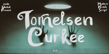 Really excited to introduce Tornelsen Curkee is a realistic brush script! Tornelsen Curkee will be perfect for all your designs project. Tornelsen Curkee Included: Uppercase Lowercase Number & Symbol International Glyphs Ligature Alternative Hope you enjoy it.
 - The Rounded Font by Sven Pels,
$15.00 the rounded font is a slight condensed and fun rounded typeface that comes in three weights: light, regular & bold. all letters are designed in the same line thickness. the fun way that the characters flow makes the font a useful but also unique typeface to use. it works great as both body text and headers. especially when you use the different weights in the right way. as graphic designer sven pels often deletes the dots of both the i’s en j’s to make it unique but also just to break some rules… svenpels.com instagram.com/svenpels
 - Hypop by Factory738,
$15.00 HYPOP is a strong and condensed sans serif font family with a nostalgic vibe. Combining retro and minimalist elements resulted in an elegant design. The different weights give you a lot of options when it comes to choosing the right typographic color for your project. 5 Weights (Thin, Light, Regular, Medium, Bold, Black) 2 Styles (Regular and Italic) Basic Latin A-Z and a-z Numerals & Punctuation Stylistic Ligatures glyphs Multilingual Support for ä ö ü Ä Ö Ü ... Free updates and feature additions Thanks for looking, and I hope you enjoy it.

