10,000 search results
(0.078 seconds)
- Hybrid by ParaType,
$30.00 Designed for ParaType in 1999-2003 by Manvel Shmavonyan. This is a low-contrast serif typeface with large x-height and small square cove serifs. For use for text and display typography. Due to its open letterforms and big number of styles the face is a good companion to open humanist Sans. Hybrid design was awarded special prize at Kyrillitsa'99 international type design competition.
 - Back to the Futurex - Unknown license

- Badhorse by Angga Mahardika,
$15.00 I created this font in 2016 with the name “Burtons”, and now here I am turning it into “Badhorse”. If you’re looking for the perfect touch of vintage flair for a design project, Badhorse is an exceptional choice. Pairing a rustic serif with a decorative handwritten script, Badhorse offers two distinct type designs that complement one another beautifully. This font duo is effective on product packaging, particularly for wares that prefer a handcrafted, artisan approach to their finished presentation. Badhorse is ideal for strong branding, identity, and logo design, as its letter forms effortlessly express a tone of familiarity, reliability, and timelessness. Advertising spreads and menu layouts will also take advantage of this modern classic, conjuring a sense of nostalgia and comfort in the viewer. Badhorse offers stylistic alternates and ligatures through OpenType, as well as symbols, punctuation, and international characters for additional language support.
 - Supra Mezzo by Wiescher Design,
$29.00 »Supra Mezzo« – designed by Gert Wiescher in 2012/13 – is an unusual addition to the Supra family, a weight in between the normal and the condensed width. This cut comes in very handy if you need to put lots of text into a relatively small space without loosing readability. The compactness with great legibility makes Supra Mezzo absolutely unique. The light and normal weights and the dominant x-height with its high ascenders make for easy reading of long copy. The heavy and x-light weights are great for elegant headlines. Supra is an OpenType family.
 - Tiffy - Unknown license

- Kappa Vol. 2 by W Type Foundry,
$25.00 Kappa Vol.2 is the serif version of our popular Kappa. Just as Kappa sans, this font has a slight narrowed structure and a prominent ascender height, therefore this font is suitable for a large range of platforms. Moreover, due to its serif Kappa Vol.2’s level of legibility is more accurate, so when you use it alongside Kappa sans the results will be extremely effective. Designed with powerful OpenType features in mind. Each weight includes alternate characters, ligatures, fractions, special numbers, arrows, extended language support, small caps and many more… Perfectly suited for graphic design and any display / text use. The 36 fonts are part of the larger Kappa super family. Learn about upcoming releases, work in progress and get to know us better! On Instagram W Foundry On facebook W Foundry wtypefoundry.com
 - Nominee by TypeUnion,
$59.00 Nominee is a cinematic font family made up of 11 weights, 3 widths, and matching italics, that equates to a substantial 66 font styles that feel individually crafted but also part of a larger structured system. The versatile font styles range from an elegant Hairline to a dominant Heavy, Condensed to Extended, which creates such an extensive range of uses and applications, from web and apps to editorial and branding, and everything in between. The increased x-height gives the font more readability at smaller sizes and the contemporary shapes mean the font likes to be shown off at large sizes. The font features details such as case sensitive characters, numerators and denominators, and support for Central and Eastern European along with Western European languages and Basic Cyrillic.
 - Ingrian Euroika by Ingrimayne Type,
$6.95 In the 1990s Adobe’s MultipleMaster technology introduced interpolation into font editing programs. Though the obvious use of interpolation was to create an unlimited number of weights for a font, interpolation could also be used to crossbreed two completely different typefaces. IngrianEuroikaH is a hybrid resulting from such crossbreeding of two very different parents. Euroika is a decorative font with high contrast and thin, square serifs while Ingriana is a relaxed, informal typeface. IngrianEuroikaH was constructed in 1995-6; updates in 2012 and 2020 cleaned up many of the remaining oddities that resulted when parts of the parent fonts clashed. The family retains some peculiarities from the method of its construction but is highly readable as text. The IngrianEuroikaH family has six styles: regular, semibold, bold, italic, semibold italic and bold italic.
 - und4 by URW Type Foundry,
$39.99 The rasterized square (clear, therefore 4 as part of the font name) was the constructive basis. The intention was to put all characters within this grid and produce a highly structured, yet lively, resting in itself, display font. Relaxed but exciting, just. An absolutely noteworthy detail are the classical construction principles (based on a typography book from the 50's for poster designers), the so-called optical weighting, derived and slightly exaggerated character elements: The characters are not purely symmetrical and the curve shapes do not close justified with the surrounding square. Loops and tongues slightly hang over; the upper bows are slightly less protruding than lower ones, etc. The kerning is tuned to fit these design details: the white space between the characters match the same filling space.
 - Carousel by ITC,
$40.99Carousel is a fat faces display type designed by Gary Gillot in 1966. Fat faces were offshoots of the modern, or Didone, typefaces that were de rigueur during the early 1800s. These fat faces were among the first typefaces to be used solely for advertising purposes. Naturally, they were always used in larger point sizes, in display functions. Carousel could be called an optimization of these old advertising typefaces. With high x-heights, ultra contrast between thick and thin strokes, and perfectly engineered drawing techniques, Carousel is a highly crafted typeface. Give it a spin in your next advertising campaign! Carousel's fine thin strokes are very graceful in their appearance, and lend a strong, yet soft, feminine feeling to anything they touch.If you like Carousel check out wearing Annlie, another fat face from 1966." - Katarine by Suitcase Type Foundry,
$75.00From today's point of view Katarine has a rather unusual origin. Initially an all-caps display face, what was to become the Medium weight of the family was augmented with a lower case, then the character set was completed by adding all the missing glyphs. The next step was the creation of the Light and the Bold weights with matching Italics. This working method compromised the relationships between the characters across the different weights After some consideration the decision was made to start over and draw the complete family from scratch. This time the "conventional" process was followed — first the Light and Bold weights were designed. Those extremes were used to interpolate the Regular, Medium and Semibold weights. When compared to the original, the glyphs of the new fonts are slightly wider. The construction of the letters is sturdy, with an x-height that varies from the heaviest to the lightest weights. The relationship of the stem weight between the horizontal and vertical strokes is carefully balanced. Characters are open and firm; the italics have room to breathe. The original fonts included two sets of small caps — Small Caps and Petite Caps. However neither set were suited for emphasis, with the Small Caps being too tall and the Petite Caps too short. We decided to replace them both with one set of traditional small caps, slightly taller than the x-height, perfectly suited for emphasis in text usage. The original version of Katarine was partly incorporated into the new OpenType versions. Thus most of the original arrows, frames and boxes can be found in the new Katarine. Each individual weight now contains 830 glyphs, nine sets of numerals, small caps, numerous ligatures and fractions. An additional font named Numbers contains numerals in circles and squares, and is now augmented with accented caps and a number of terminal alternatives, which can easily be accessed through stylistic sets. We also added two extra variants, Experts Regular and Experts Black (in inverted form). Katarine Std preserves the solid construction and excellent legibility of the original family, but has now become a fully featured OpenType typeface. Katarine is suited for a broad range of applications, from simple layouts to intricate corporate systems. It is the typeface of choice where the cold, austere character of modern sans serifs are inappropriate, yet simple shapes and good legibility are required. - ITC Officina Display by ITC,
$29.99When ITC Officina was first released in 1990, as a paired family of serif and sans serif faces in two weights with italics, it was intended as a workhorse typeface for business correspondence. But the typeface proved popular in many more areas than correspondence. Erik Spiekermann, ITC Officina's designer: Once ITC Officina got picked up by the trendsetters to denote 'coolness,' it had lost its innocence. No pretending anymore that it only needed two weights for office correspondence. As a face used in magazines and advertising, it needed proper headline weights and one more weight in between the original Book and Bold."" To add the new weights and small caps, Spiekermann collaborated with Ole Schaefer, director of typography and type design at MetaDesign. The extended ITC Officina family now includes Medium, Extra Bold, and Black weights with matching italics-all in both Sans and Serif -- as well as new small caps fonts for the original Book and Bold weights. - ITC Officina Sans by ITC,
$40.99When ITC Officina was first released in 1990, as a paired family of serif and sans serif faces in two weights with italics, it was intended as a workhorse typeface for business correspondence. But the typeface proved popular in many more areas than correspondence. Erik Spiekermann, ITC Officina's designer: Once ITC Officina got picked up by the trendsetters to denote 'coolness,' it had lost its innocence. No pretending anymore that it only needed two weights for office correspondence. As a face used in magazines and advertising, it needed proper headline weights and one more weight in between the original Book and Bold."" To add the new weights and small caps, Spiekermann collaborated with Ole Schaefer, director of typography and type design at MetaDesign. The extended ITC Officina family now includes Medium, Extra Bold, and Black weights with matching italics-all in both Sans and Serif -- as well as new small caps fonts for the original Book and Bold weights. - ITC Officina Serif by ITC,
$40.99 When ITC Officina was first released in 1990, as a paired family of serif and sans serif faces in two weights with italics, it was intended as a workhorse typeface for business correspondence. But the typeface proved popular in many more areas than correspondence. Erik Spiekermann, ITC Officina's designer: Once ITC Officina got picked up by the trendsetters to denote 'coolness,' it had lost its innocence. No pretending anymore that it only needed two weights for office correspondence. As a face used in magazines and advertising, it needed proper headline weights and one more weight in between the original Book and Bold." To add the new weights and small caps, Spiekermann collaborated with Ole Schaefer, director of typography and type design at MetaDesign. The extended ITC Officina family now includes Medium, Extra Bold, and Black weights with matching italics-all in both Sans and Serif -- as well as new small caps fonts for the original Book and Bold weights."
 - Casa Sans - 100% free

- VVDS Hickory Dickory by Vintage Voyage Design Supply,
$15.00 Glad to introducing you Hickory Dickory - a stylish serif with an eighties mood. I really love this old advertising from those magazines. It was a new era of minimalism in photography and typographic design. The playful, stylish and modern. This font will fit perfectly not only this type of design - you may use the alternates characters and get a really playful typography at your project. Hickory Dickory has a lot of alternates, some letters have them up to 17. More than 620 glyphs total! Also, there is a true italic for perfect pairing. Normal & True Italic A lot of stylistic alternates 620+ Glyphs total Decimal and fraction figures
 - 21 Kilobyte Salute - 100% free

- Tawattype II - Unknown license

- Sagebrush JNL by Jeff Levine,
$29.00 Sagebrush JNL was modeled from examples of a vintage French Clarendon wood type in which many of the characters had rounded parts rather than the traditional all-slab serif approach.
 - Stencille by Bogusky 2,
$34.50Stencille Une is that long-sought delicate and refined stencil font. Unique but not gimmicky, giving it the legibility often lost in most stencil fonts. Totally kerned pairs, including puncuation. - Wild Rhytm by Forberas Club,
$16.00 This new script font is written by our team, and ready to pop up your project by using this font for your party, event, invitation or at your wedding decor.
 - KD Diagona by Kassymkulov Design,
$9.95 KD Diagona is a display, geometrical face with 45 degree diagonal cut. Letter spacing along with almost 4000 kerning pairs were designed to match the diagonal progression of the font.
 - Athena Signature by Viswell,
$18.00 Athena Signature is an authentic and stylish script font. Not too thin and not too thick, balanced and varied, this font was designed to enhance the beauty of your projects.
 - Salways by Forberas Club,
$16.00 Salways is our new product , the handwritten font with playful and bouncy theme to match up your personal project like wedding invitation, your party or the cute moment you have.
 - Easter Fleurons by Greater Albion Typefounders,
$3.95 These Fleurons are a bit of Easter fun, with humorous cartoon rabbits, little chicks, and lots of lovely chocolate eggs! Just the thing for that Easter card or party invitation.
 - Owuro by Alexey Makarov,
$24.00 Presenting a professional designer font. Specially designed for the header, it will complement your collection. It contains standard ligatures. More than 1,500 kerning pairs. Standard Latin alphabet and European diacritics.
 - Snubnose by Bogstav,
$17.00 ALL CAPS font with lovely traces after the brushstrokes. With contextual alternates, which makes sure that your text varies between 5 different versions of each letter - and they cycle automatically!
 - Madine Style by Forberas Club,
$16.00 Introducing Madine Style. This font is our new born project, and ready to help pop up your project as a wedding invitation font, or party event, still playful but gorgeous.
 - Haigl Rapture by Viswell,
$26.00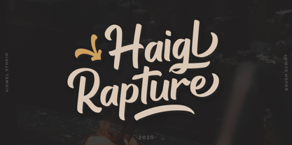 Haigl Rapture is a unconnected script with a varied brush style. This font is contains stylistic alternates, ligatures, and swashes. It is suitable for logos, branding, and another design projects.
 - Ps Snackbar Prn by Fontopia,
$12.99 Snackbar prn is a typeface with a humorous slant. The font has its origins in an art project. It is now made available for design around festifals, parties, invitations, etc.
 - Geometric Patterns JNL by Jeff Levine,
$29.00 Geometric Patterns JNL offers a large and varied assortment of interesting design variations in a 'tiled' (square) format that can be adapted to spot embellishments, running borders or repetitive patterns.
 - LD Christmas Carol by Illustration Ink,
$3.00Dress up your handmade holiday greeting cards, newsletters, programs, and party invitations with this vintage style true type font. It gives an old world feel to your Christmas paper creations. - Drac Tombstone by Forberas Club,
$16.00 This new Handwritten font is written by our team, and ready to pop up your project by using this font for your party, event, invitation or at your wedding decor.
 - Moftein Sough by Martype co,
$15.00 Moftein Sough Is a condensed serif font pairing with playful dingbat to make it satisfying, also suitable for minimalist, chic, branding, packaging and merch design to boost your design exploration.
 - Silver Streak by Swell Type,
$20.00 Inspired by the streamlined lettering of trains, cars and advertisements from the 1930s and 1940s, Silver Streak is a font family that combines Art Deco elegance with refined craftsmanship and modern features. Silver Streak's contrasting strokes and tastefully rounded corners conjure an era of refined, vintage elegance. An extravagant palette of 25 weights — from gracefully tall and thin to commandingly wide and heavy, along with a variable font for unlimited options between — provide unforgettable branding possibilities for luxury items ranging from jewelry, clothing and perfume to the sleek badges of high performance sports cars. Features: Five widths from Compressed to Extended Each with five weights from Light to Heavy Complete family includes a Variable font for precise control of weight and width Support for 223 languages, including Western & Central Europe, Russian Cyrillic, Serbian/Macedonian, Ukranian and Vietnamese Alternate hook-cornered capitals (accessible as Opentype Discretionary Ligatures) Alternate round-topped A in two versions, each with international accents (accessible as Stylistic Alternates)
 - Hand Stamped JNL by Jeff Levine,
$29.00Years before the many "modern" ways to creates signs and posters, the popular method was the rubber stamp printing set. Many of these sets used the classic DeVinne typeface, and were manufactured by at least a half dozen different companies. The "sign and chart printers" (as they were known) often consisted of both upper and lower case letters, numbers, punctuation, pointing hands and other symbols. "Hand Stamped JNL" puts all the fun of the rubber stamp printing set into an easy-to-use digital font with no messy ink spills or clean-up. - Roland Bryon by Luhop Creative,
$16.00 Roland Bryon Display Ligature Fashion Serif There's beauty in the plain version Roland Bryon, even without all the extras, for a clean and elegant minimal serif. Any version Roland Bryon brings a touch of luxury and bespoke custom typography to modern logos, websites, social media quotes, wedding branding, and more. Thank you so much for checking out my shop, and please get in touch if you have any questions! Roland Bryon Features Full Set of standard alphabet and punctuation Serif Ligatures alternates PUA Encoded Glyph Chart for easy access Multilingual Characters Luhop creative
 - Pleasant Valley Sundae JNL by Jeff Levine,
$29.00 It seems only fitting that Pleasant Valley Sundae JNL, a typeface re-drawn from hand lettering on a piece of vintage sheet music, should take its name as a pun on another song's title from a different era. "Pleasant Valley Sunday" was a 1967 hit for the Monkees and was written by the legendary songwriting team of Carole King and the late Gerry Goffin; inspired in turn by a street they'd lived on named Pleasant Valley Way, in West Orange, New Jersey. The record made it to #3 on the pop charts.
 - Bay Tavern by FontMesa,
$25.00 Bay Tavern is the first weathered version of our Tavern font that's based on Algerian. With three weights, open faced and outline versions to choose from you're sure to find the right style for your new project, restaurant menu, logo, t-shirt design or Pirate costume party. Bay Tavern includes all the same alternates as our regular Tavern font family. While our original Tavern font has been increased to include five weights additional weights for Bay Tavern will have to wait for now, adding the notched cut in's were all done by hand which causes a lot of cramping so a long break is needed before creating the extra weights. The Fill fonts in the Bay Tavern family are meant to be used with Bay Tavern Open fonts, if you're using Bay Tavern Open then select Bay Tavern Fill, if you're using Bay Tavern Open L then select Bay Tavern Fill L, if you're using Bay Tavern Open S then select Bay Tavern Fill S, if you're using Bay Tavern Open SL then select Bay Tavern Fill SL, the same rule goes for the Open X version.
 - Haunted House by HiH,
$8.00 Halloween lends itself to graphic images: witches, ghosts, bats, jack-o'lanterns and haunted houses. When we think of a haunted house, we generally think of a large, abandoned, derelict Victorian wood-frame house. The style is usually Second Empire or Queen Anne. There tends to be a lot of decoration. There is usually a porch or two with decorative spindle work. There is probably a tower, either square with a mansard roof such as one might see in Paris or round with a conical roof borrowed from a Loire Valley chateau. These houses were generally built in the United States between 1860 and 1900, products of the exuberance of a time before income tax. It took at least three servants to maintain such a house and was very expensive. Few can afford them today. That is why so many were converted to professional offices, multi-family dwellings or simply abandoned. HAUNTED HOUSE is our typographical contribution to Halloween. Based on our font PETRARKA ML, it features decorative capitol letters that utilize the silhouette of a Second Empire style house complete with a dead tree and a full moon. The font includes 8 ornaments suitable for flyers and party invitations. Revision 2.000 eliminates dual encoding, harmonizes metrics, adds new glyphs, and adds open type features. The zip package includes two versions of the font at no extra charge. There is an OTF version which is in Open PS (Post Script Type 1) format and a TTF version which is in Open TT (True Type)format. Use whichever works best for your applications.


