10,000 search results
(0.054 seconds)
- Olympukes 2012 by Barnbrook Fonts,
$30.00 Released on the occasion of the 2012 London Olympics, Olympukes 2012 was a new set of pictograms telling the ‘real’ story of the Olympics and extending the unofficial project that began in 2004. The occasion of the London games provided an opportunity to revisit the complex contradictions of the modern Olympics and to acknowledge the geopolitical shifts of the intervening eight years. The 2012 games arrived at a time of great economic and political uncertainty for the nation and Europe. Greece – the host of the 2004 games – was now located at Ground Zero of a disintegrating Eurozone and the United Kingdom was two years into a programme of austerity enacted by the coalition government of Conservatives and Liberal Democrats. Given that the previous London Olympics had been held in 1948, in a climate of recovery and austerity after a devastating World War (1948’s Olympiad was dubbed the ‘Austerity Games’) there was a sick irony to the 2012 games' arrival. The suppression of human rights in order to deliver the perfect games for PRoC’s Beijing games shocked no-one and yet, in London, the security measures seemed grossly excessive. Then again, in a country with an estimated 1.8 million cctv cameras, perhaps we shouldn’t have been so surprised. Another aspect of the Olympics that returned for 2012 was the unfettered commercialism – if you think the Games are about pure sport, about noble human endeavour, think again. Please note that Barnbrook Fonts is in no way affiliated with, or has received any endorsement from, the International Olympic Committee, the organising committees of the Olympic Games, or any national Olympic committee.
 - JH Flynn by JH Fonts,
$12.00 Jh Flynn is modern tall sans serif typeface; a variable type including eight weights: light / regular / medium / bold and the italics; Ideal for headlines, logo design, signage and short text paragraphs.
 - Chicago Doodles by Outside the Line,
$19.00 Armchair travel to the Windy City with Chicago Doodles. 31 illustrations of buildings, skylines, transportation, food, Chicago landmarks, signs and a script word Chicago. For other city, state and country doodles take a look at Paris, London, Waikiki and New Orleans Doodles. Also Cowboy and Lake Vacation Doodles too.
 - Pontiac by S&C Type,
$15.00 Pontiac is a sans serif OpenType font designed by Fanny Coulez and Julien Saurin in Paris. Pontiac is a functional font with something more, something warm, geometric but human, something distinctive, something French finally. We also designed an inline Art Deco version of this font, Pontiac Inline. Merci beaucoup!
 - Cinema Moderne by The Rivertown Inkery,
$5.00 Cinema Moderne is created to pay homage to he fabulous small town theaters from 1930's and 40's America. This unique font plays off of the Art Moderne and art deco style of the day. Art Moderne some times called Streamline Moderne design architecture emphasized curving forms, long horizontal lines, and sometimes nautical elements. Many of these masterpiece buildings have been lost forever. Some have managed to find new life with a new function. Cinema Moderne was created to preserve a small piece of that history forever. This font is to encourage the appreciation of the neighborhood theater culture as well as the grand style of the buildings. Comes in 9 different weights for one low price, or as individual fonts. Perfect for logo creation, or any art deco style project. Previous projects have included event flyers, Gatsby themed party invites and digital marketing content. Give your images a unique effect with this one of a kind font.
 - Florida Project Phase One - Unknown license

- Rabenau by Linotype,
$29.99 Rabenau (formerly Lucinde), the distinctly warm and legible type family For 30 years the graphic designer Axel Bertram worked at creating his typefaces: He developed complete new alphabets for magazines and typewriters as well as for the constant demand for typefaces for use by commercial artists. He has developed wall charts the size of advertising posters as teaching aids for training commercial and graphic artists to write in a clean, classic cursive script. In the eighties he used the American Chyron computer to design a screen font for television. In the mid-nineties he discovered for himself the fabulous possibilities offered by the Fontographer font software program and explored them playfully. From the results of these experiments, Axel Bertram selected a design for further development. From 2003 onwards the calligrapher and type designer Andreas Frohloff collaborated with him on the further development and production of the 16 fonts of the Rabenau™ typeface family.The Rabenau font was inspired by many factors: From the fonts used as book covers to typewriter fonts and even printed material from England dating from the beginning of the nineteenth century (e.g. those used by the skilled printer William Bulmer), Rabenau's relatively high contrast is offset by some organic tapers, subtley rounded bracketed serifs, and a fairly generous x-height. This makes for a typeface that looks especially good in print. Its broad repertoire of weights and styles - Condensed, Poster, and Shadow - give it added versatility, and make it ideal for setting both display and text in the same typeface. Throughout the heavier weights, the contrast is maintained. The Poster Italic sparkles, and will make a fine display type for dynamic headlines, or logotypes. This family of sixteen fonts works beautifully together. All Rabenau font styles have a large set of ligatures and thus cover typical letter combinations in many European languages. Besides the standard ligatures for ff, fi and fl, letter connections are also available for tt, th and fj or ffi, ffl and ffk. The range is completed with lovely arched transitions for the characters st, ck or ct. The latter gives the font that certain something, both in continuous text and above all in headlines.
 - Rondawe by Luhop Creative,
$18.00 If you've got style and love all the luxuries in life, you're Rondawe! Add a touch of luxury and style to your projects too, with the new Rondawe Font Collection. It's highly recommended to turn your Opentype features on while using the Rondawe font, to make use of it's best features - the multitude of OpenType ligatures and alternates. This font is designed to pair harmoniously, and lend themselves to high end branding, logo designs, product packaging & invitation designs.Creates a perfect pairing contrast with combining Rondawe Serif and all Script font. and one more font recommendation that you should apply in your work,(Kelimajaroe Display) Get Discont 45% Use Code [ KLMJR45 ]
 - Bouncer by Ingrimayne Type,
$6.95 The letters in Bouncer are round because they all begin as a ball and then have parts of the ball cut away. Bouncer was one of the earliest typefaces from Ingrimayne Type. Lower-case letters are smaller versions of the upper-case letters. BouncerTwo, designed twenty years after the original Bouncer, continues playing with the idea of making letters by cutting out parts of a circle, but in this case the circles are interlocking. All letters are upper-case but some of those on the lower-case keys differ from those on the upper-case keys. BouncerTwo is eye-catching but not highly legible.
 - Dinkle by Chank,
$30.00 The Dinkle fonts are the creation of a sketchbook artist who spent years refining her craft, Diana Hollingsworth Gessler. She created the Dinkle handwriting fonts for use in her book "Very New Orleans," and now you can use it in four convenient styles: Regular, Bold, Italic and Bold Italic. Each font in this family was drawn individually, capturing nuanced differences of natural penmanship when the weights are paired together. A hand-lettered journal style, the highly legible Dinkle fonts offer tidy text and clear captions. Use it for signage, quotations, or anywhere you need a personal touch in your designs.
 - Ribeye Pro by Stiggy & Sands,
$29.00 The Ribeye Pro Family is reminiscent of a cartoon tattoo style of lettering, but exhibits a playfulness that breaks traditional weight distribution across its letterforms. An edgy attitude, friendly syncopation, and highly legible letterforms makes these fonts a real pair of charmers. The SmallCaps and extensive figure sets give the Ribeye Pro Family a more diverse design voice, ranging from slightly serious to downright ludicrous. Opentype features include: - SmallCaps. - Full set of Inferiors and Superiors for limitless fractions. - Tabular, Proportional, and Oldstyle figure sets (along with SmallCaps versions of the figures). - Stylistic Alternates for Caps to SmallCaps conversion.
 - Harri by Blancoletters,
$39.00 Harri –“stone” in Basque language– is a display font based on the peculiar letter forms used in signs and fascias all over the Basque Country. This idiosyncratic lettering style, very often used as an identity signifier, evolved from ancient inscriptions carved on gravestones which can still be found in the French part of the Basque Country (Behe Nafarroa, Lapurdi and Zuberoa).Harri takes some of its more significant features from those engraved letter forms, but also from the current overemphasized shapes derived from them, while keeping in sight their antecessors: the Romanesque inscriptions and ultimately the Roman Capitals. Gerard Unger once said “the black version of a font is a caricature of the regular”. This may explain how the odd heavy shapes in use in the Basque Country today might have evolved from their engraved roots, which are already an interpretation of Romanesque and Roman letter forms. This evolution is echoed in Harri through its weights, from the clean formal Roman-inspired light to the extreme expressive Basque-style extra bold.
 - Griffiths by Attract Studio,
$20.00 Griffiths is a clean italic serif designed to be stylized and combined with a dynamic calligraphic font that is angled at twenty-three degrees. Griffiths is equipped with multilingual support and a set of OpenType features such as alternates and ligatures. Font Pairings : Bethany Elingston Including : 2 Weights Alternatives & Ligatures OpenType support Multilingual PUA encoded.
 - Radar.one by Srdjan Kuzmanovic,
$50.00I started creating this font at my university while studying graphic design. It's constructed using nails in different sizes and various parts of floppy-disks. It's a highly decorative font and the best way of using it is for posters, flyers and ads. It can also be used for your own website; see example below. - Castelan Hispane by Ixipcalli,
$35.00 La tipografía Castelan Hispane es una tipografía inspirada en documentos y textos antiguos históricos españoles del siglo XVI. Los trazos semi-medievales - cursivos, le dan una apariencia antigua pero también moderna para los proyectos en los que se desee utilizar la tipografía. Cuenta con seis estilos y tres pesos, ligera, regular y negrita. Cada peso contiene también su forma “itálica”. The Castelan Hispane typeface is a typeface inspired by ancient Spanish historical documents and texts from the 16th century. The semi-medieval - cursive strokes give it an ancient but also modern appearance for projects in which you want to use typography. It has six styles and three weights, light, regular and bold. Each weight also contains its “italic” form.
 - Linotype Gujarati by Monotype,
$103.99 The Linotype® Gujarati typeface was originally developed in 1983 by the Linotype letter-drawing studio under Fiona Ross’s art direction. This revival was designed by Gunnar Vilhjálmsson and Kalapi Gajjar with Fiona Ross as a consultant. The family has five weights from Light to Black. It is a traditional design, optimized for setting lengthy text copy for print projects or for use on screens. While faithful to the original design, Linotype Gujarati introduces many design improvements, additional weights, and an extended character set. This new Linotype Gujarati is part of a project to refresh the pivotal Linotype Bengali and Linotype Devanagari typefaces and make them available for the first time in the popular OpenType font format.
 - Las Palmas by Fenotype,
$20.00 Las Palmas is a vintage type collection with print texture. • Brush - Two weights of a connected Brush Script with Contextual and Swash Alternates • Pen - A connected monoline Script with Contextual and Swash Alternates • Slab - Two weights of a chunky Slab Serif with rounded corners, Bold has the same proportions but fuller texture. • Condensed - A bold and tight condensed Sans Serif with rounded corners. Las Palmas fonts are designed to work together - in pairs or more. Las Palmas is great for branding, posters or any display use. If you need a clean version of Las Palmas try Steak And Cheese by Fenotype. All fonts are PUA encoded and have a wide language support.
 - Andrea Handwriting II by StuArt,
$9.00 Since the release of the first Andrea Handwriting in 2008, requests have come in for additional weights of the four variants in the font family. Andrea Handwriting II includes 16 fonts featuring four weights of the four original styles in the first release which have been improved for a more polished look, but still with a personal and casual feel. Sixteen styles – what’s your type?
 - Kinship Sans by wearecolt,
$9.00 Introducing Kinship, a Grotesque 9 weight font family by We Are Colt. Kinship has been created to be your all-round go-to grotesque font that works well for copy and titles. With nine standard weights, this font is more flexible than a bungee rope. Kinship is a sans serif modern classic grotesque font, perfect for adding personality to logos and brochures. Pairs well with script and brush fonts: I recommend Stroom . Features: 9 separate font weights Western European, Central, South-eastern Upper and lowercase Numerals Free 300 font weight
 - Saffron_Cyr - 100% free

- Adoquin by Huy!Fonts,
$20.00 Adoquin is a clean and friendly semi serif family. It comes in seven weights with small caps, wich makes it a versatile typeface. The design is based on geometric sans serif typefaces and the calligraphic features of old school models, making Adoquin a functional and warm font family. Its informal but elegant look makes it the perfect display type fitted for logotypes, book design, packaging or magazines. Its wide range of weights and discreet alternates makes it very enjoyable to read, so its also perfectly fitted for longer texts. Adoquin has an extended character set for Central and Eastern European languages, and shows all its potential wit OpenType-savvy applications. Every font includes small caps, ligatures, old style figures, fractions, numerators and denominators and alternative characters without some calligraphic features suited for smaller or longer texts (in this case, the alternative charecters are less ornamented).
 - Groove Inktrap Display by Godbless Studio,
$30.00 BLANC GROOVE INKTRAP, a font with a futuristic and experimental concept created with a strong and charismatic character. following the current trend design style. BLANC GROOVE INKTRAP is made experimentally following a futuristic style recipe with alternate characters made with outstanding INKTRAP and display that makes this font more stylish and varied. BLANC GROOVE INKTRAP is a variable font that has 18 Font, 9 weights with 2 Variable from thin to black & Italic. also includes alternates that are more varied with variables. BLANC GROOVE INKTRAP is a versatile font system, designed primarily for display uses with a need of visual impact. What's Include : Thin & Italic Light & Italic ExtraLight & Italic Regular & Italic Medium & Italic SemiBold & Italic Bold & Italic ExtraBold & Italic Black & Italic Feature : Alternate Character Ligature Discretionary Ligature Multilingual Support Numeral & Punctuation Symbol etc Wish you enjoy our font and if you have a question, don't hesitate to drop message & I'm happy to help.
 - Brecksville by OzType.,
$15.00 Brecksville is a condensed grotesk typeface that takes inspiration from early German designs of the mid-19th century. It was designed as part of my current research into grotesk typefaces and different letterforms, as part of my dissertation research, “Perfected Letters: German Grotesk in the Nineteenth Century”, which focuses on the role of German design in typography. The Brecksville font family provides a wide range of weights, ranging from light to bold for both its rounded display style and more rugged sharp style. Both its styles feature the same horizontal proportions and metrics so they can freely be combined with no spacing issues. Brecksville's visually punchy condensed style and sharp edges, allows it to stand out on the screen – at almost any size. Its black composition also brings out the details needed in magazine and tabloid headlines, while maintaining readability throughout. The rounded display version is ideal for posters and other uses where you want something eye catching but not too hard on the eyes.
 - Scream - Unknown license

- Motel Xenia by Fenotype,
$19.95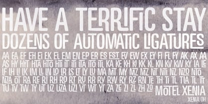 Motel Xenia is an OpenType font with dozens of automatic ligature pairs.
 - Pligo by Mans Greback,
$29.00 Pligo - a balloon, graffiti, liquorice, party and cartoon typeface by Måns Grebäck.
 - Quendel by URW Type Foundry,
$39.99 Quendel has been expanded to become Quendel Happy Family. Apart from the new Bold weight for easy distinction and emphasis, there are now four other very exciting variants, rendering different writing tools and writing materials. The basic form of Quendel was written with a Japanese bamboo tip and therefore embodies a form letter of natural flow. The new versions show other features that provide the feel of written scripts. While the styles Wood and Crayon include some alternate characters, Q Marking Pen and Q Fingertip, due to their apparently more complex enacted forms, do not need additional alternates without looking stiff or boring. The wood relief of Quendel Wood was created by a freehand wood relief drawn with oiled chalk. Quendel Marking Pen seems to be written with a felt-tip pen soon depleted. At the same time it is also reminiscent of the blooming effect, which we know from photography. The name of Quendel Fingertip suggests what can be seen - someone seems to have written with the finger in a grainy material. One would like to try it himself. The effect of broken lines which can be gained by writing with chalk as reflected in Quendel Crayon. Almost like parched sandy soil, the writing material seems to crumble.
 - ITC Goudy Sans by ITC,
$29.99 Frederic W. Goudy designed three weights of this friendly-looking sans serif font from 1922-1929 for Lanston Monotype in the United States. Goudy was attempting to impart freedom and personality to the sans serif form at a time when geometric sans serifs, such as Futura, were gaining rapid world-wide popularity. To achieve this challenging goal, he looked to lapidary inscriptions and manuscript writing for inspiration. He included elements such as slight swellings of terminal strokes, slab serifs on a few of the caps, alternate uncial forms, and a few swash strokes. The result is uniquely Goudy: charming, instinctive, and just right for adding warmth to magazine or advertising layouts. The design staff at ITC updated and filled out the family for a total of eight styles in ITC Goudy Sans. ITC Goudy Sans® font field guide including best practices, font pairings and alternatives.
 - Pincoya Black Pro by Latinotype,
$49.00 Pincoya Black Pro is a font based on lettering found on a poster from the Spanish Civil War, complemented with graphics developed in “La Unidad Popular” (Chilean political coalition) during the seventies. Pincoya has many alternate characters in Opentype format that provide multiple options when composing a text. It is an ideal font for high impact sentences, logotypes, magazine layouts, poster designs, etc. Languages include: Basic Latin, Western European, Euro, Catalan, Baltic, Turkish, Central European, Romanian and Pan Africa Latin.
 - Resistance Is by Comicraft,
$19.00 You will not move. You will not breathe. You will not think. You WILL buy this font. You are our prisoner. There is no escape... RESISTANCE IS FUTILE! Also Useless. RESISTANCE IS… was created for the voice of the evil robot Sentinels in X-MEN: AGE OF APOCALYPSE, and later used for the friendly robot in BATTLE CHASERS and robot police in ELEPHANTMEN. A font for all your robot needs! See the families related to Resistance Is Futile and Useless: Resistance is Lowered
 - ZionTrain by AndrijType,
$33.00 Originally ZionTrain was built as a Cyrillic typeface for public transport navigation system. We wanted comprehensible, distinctive letterforms, that can help everybody on the way from Babylon to Zion. Here, on MyFonts, we present the ZionTrain STD versions with western latin including smallcaps and oldstyle figures in some faces in TrueType format; also western, central, baltic and turkish latin charsets, smallcaps, oldstyle numerals, few alternates, some arrows and fractions in ZionTrain OT OpenType format. Look how people use it: http://use.type.org.ua/tagged/ziontrain
 - Rondalia by Scholtz Fonts,
$21.00Rondalia is a timeless yet modern font in which the strokes vary in thickness. It is highly readable yet has an informality combined with a quiet elegance. Above all else, Rondalia is well-behaved, ladylike, and can be expected to behave correctly and make the right impression in a wide range of situations. Rondalia is clean and rounded with a slightly Byzantine flavor. It is extremely versatile, equally effective for magazine design, movie posters and cosmetic ads, and for invitations, greeting cards and company profiles. The fact that there is very little difference in height between upper and lower case letters creates a calm, peaceful impression. The font is letterspaced and kerned and has a complete character set (all upper and lower case, numerals and mathematical symbols and a complete set of accented and special characters). - Raginy by Arterfak Project,
$29.00 Raginy is a sans serif in a stencil style. Made by paying attention to the distinctive elements of each letter, then eliminating the secondary parts and only highlighting the main elements of the letter so that it looks minimalist and elegant. Raginy has sweet characteristics, simple, luxurious, and classy so it is very suitable for displays, logos, logotypes, branding, titles, short quotes, and so on. This sans-stencil font is also equipped with alternates characters to sweeten your design, and also complete with unique ligatures. Add a touch of beauty to your designs with Raginy! What you will get: Uppercase Lowercase Numbers & punctuation Stylistic alternates Ligatures Accented characters Thank you for your visit and support. Ramz.
 - HS Alwajd by Hiba Studio,
$50.00 Hs Alwajd is an Arabic display typeface, under “titles” category. It is useful for book titles, creative designs and modern logos. Also, it is used when a contemporary and simple look is desired that can fit with the characteristics of Kufi fatmic where horizontal parts are equal than vertical ones. It is a new style based on HS Almajd but without swirling round forms terminating in ball. The font is based on Kufi Fatmic calligraphy along with some derived ideas of decorative fonts, maintaining the beauty of the Arabic font and its fixed rates. Undoubtedly, the insertion of curved ornament in some parts adds more beauty and fascinating diversity in the flow line between sharp, soft and curved parts. This font supports Arabic, Persian, Pashtu, Kurdish Sorani, Kurdish Kirmanji and Urdu, consisting only one weight which can add to the library of Arabic Kufic fonts contemporary models that meet with the purposes of various designs for all purposes and all tastes.
 - Rise of Beauty by Kereatype,
$9.00 Rise of Beauty - Modern Variable Paired Duo A classy, contemporary pair of Script Signature and Sans Serif fonts. With a stylish expressive script companion, Rise of Beauty offers beautiful typographic harmony for a diversity of design projects, including logos & branding, wedding designs, social media posts, advertisements & product designs.
 - Avionic by Grype,
$16.00 The aviation world contains loads of stylish logotypes, from handwritten scripts to geometric styles and so on. The Avionic Condensed family finds its origins of inspiration in the Air China company logotype, and from there has been expanded upon to create a large stylistic family of 40 fonts. Avionic celebrates the geometric sans serif styling of the original logotype, evolving beyond the condensed all capital set logo to include a lowercase designed in parity with the original design style, as well as many weights and widths to offer a fresh diversity. Each subfamily includes a full standard character set with expansive international support of latin based languages, and 5 weights jumping from book to black, along with 5 accompanying obliques. This family is ready to chart a course for your design destination, whatever it may be. Here's what's included with the Avionic Family bundle: 370 glyphs per style - including Capitals, Lowercase, Numerals, Punctuation and an extensive character set that covers multilingual support of latin based languages. 5 weights in each subfamily: Book, Regular, Bold, Heavy, & Black. • 4 widths in the collection: Condensed, Regular, Wide, and Extra Wide. Accompanying Obliques with each weight/width style. Fonts are provided in TTF & OTF formats. The TTF format is the standard go to for most users, although the OTF and TTF function exactly the same. Here's why the Avionic Collection is for you: You're in need of a dynamic geometric font with a variety of weights and widths for your designs You're an aviation junkie and have to have anything inspired by Air China You love the style of Bank Gothic, but really want something just a little different You are looking for a pseudo-techno style font family with versatility You just like to collect quality fonts to add to your design arsenal
 - Ragtag by In-House International,
$15.00 Ragtag is an adventurous display font that’s fun, graphic and loud. The font features three irreverent, geometric variations for each letterform, plus a few extra goodies like eñes and diacritics so it’s ready to use En Español. Ragtag creates harmonies from the fully interchangeable collection of letters. Each letter is unique and designed so it composes beautifully with all others — but can also stand on its own as an accent piece or as part of a design. Ragtag is inspired by the scattered crew of makers and designers from design studio In-House International--a fully remote creative home based in Austin, TX. The design of Ragtag was led by Alexander Wright and digitized by Rodrigo Fuenzalida.
 - Fille De Joie by Tension Type,
$10.00 Fille de Joie is a distressed typewriter font created from a vintage typewriter that a friend of mine bought in Paris. It’s pretty dirty and nasty. Included are open type ligatures for all of the double letters like “EE” “TT” “FF” etc. to give the font a more natural look.
 - La Obrige by Hishand Studio,
$15.00 La Obrige is serif font that inspired from the beauty, aesthetic, elegant and Paris. It is really good for water mark, logotype, advertisement, social media posts, product packaging, and more. complete with ligatures regular italic icon kerning multilingual support Shampoo mock up from https://www.graphicsfuel.com/2018/09/dispenser-bottle-psd-mockup/
 - Parisian Playboy JNL by Jeff Levine,
$29.00 Sheet music for the song "My Ideal" (from the 1930 Paramount picture "Playboy of Paris" starring Maurice Chevalier) had the name of the movie hand lettered in an Art Deco, Broadway-influenced type design. This became the inspiration for Parisian Playboy JNL, which is available in both regular and oblique versions.


