10,000 search results
(0.19 seconds)
- Basel Neue by Isaco Type,
$30.00 Basel Neue is the complete redesign of BaselSans ITD font, the first typeface of Isaco Type foundry, launched in 2009. As with the predecessor version, Basel Neue is a legible and discrete typeface, a sans serif with thickness variation and humanistic touch. The family consists of 8 styles, 4 weights plus their respective italic versions. Download the “OT Features” pdf to know and take advantage of all font features as best as possible (in OpenType-savvy applications)! You can also view all symbols in the glyph panel of your program, or in Character Map tool (Win) or Character Viewer/Palette (Mac). 1) Basel Neue has ligatures strategically chosen. Herbert S. Zim, in the book “Codes and secret writing”, elected the most common letter pairs of English, that in the Basel Neue became discretionary ligatures. And, of course, it also has standard ligatures. 2) It’s a fun typeface. Basel Neue has a set of emoticons and fun symbols that can be activated by discretionary ligatures. Type “:-)” and a smileface appears. Type “8-)” and a smiley with glasses appears. Type “ ”, “ ” and “ ” and a telephone, star and heart appears. Or “ ”... and a graceful corresponding symbol will appear. 3) Basel Neue contains lots of useful glyphs and features. All versions have 12 recycling symbols, 7 to different types of plastic, and over 30 currency symbols. It also has fractions, old style-, lining-, tabular numbers and other OpenType features. 4) It has an organized and large character set. The fonts have extended character set to support CE, Baltic, Turkish as well as Western European languages. If you work with languages like Catalan, German, Croatian, Romanian, Dutch, Turkish, for example, the font will use the correct ligatures or characters used in these languages. 5) It’s rigorously tested. Basel Neue is available in OpenType PS e TT flavors and each version undergoes a battery of tests, with a systematic review of nodes, curves, spacing and internal data. This eliminates the possibility of errors in the font.
 - Bicyclette by Kostic,
$40.00 The name “Bicyclette” was chosen because this typeface is all about balance and elegance. The idea was to create a highly contrasted sans-serif family carefully balanced between gentle curves and sharp angles, with large capitals opposing uncommonly short lower case, through six distinctive weights. The letters are wide, and the capitals pop up in headlines while the lower case leaves a lot of white space between the text lines because of its small x-height. The edges are rounded (but not so much for the family to be called rounded), just enough to make the text feel slightly softer, gentler, while retaining some of that technical sans sharpness. The Bicyclette character set supports Western and Central European languages, and includes an extended set of monetary symbols. Each weight includes small caps, ligatures, proportional lining and oldstyle numbers, tabular figures, fractions and scientific superior/inferior figures.
 - MV Bombay by ManVsType,
$40.00 Bombay is serif type family by ManVsType. It is ideal to use at larger sizes as a display font. The family comes in 5 weights in 2 styles (normal stem height and low stem height). This font is variable in its weight and "connection" heights in the letters a, b, d, h, m, n, p, q, r and u. The typeface has a number of ligature including an R+s ligature that automatically turns into the ₹ (rupee symbol) to solve a major problem in the Indian subcontinent where people don't know how to type it. Bombay is inspired by the colonial version of the city. The city being a melting pot of all kinds of people. Poets, writers, filmmakers enjoyed the city and it quickly became the cultural hub of the entire country.
 - Astralaga by SG Type,
$19.00 Elegant, graceful, and timeless. Astralaga is a versatile font family with a timeless, classic appeal, over 50 alternates & ligatures and multilingual support. Every letter has been hand-drawn and crafted with the upmost care. The variety of weights provide a range of choices that will help you find the best typographic character for your project. All 5 weights are well-suited for large display uses and high impact headlines. The available stylistic alternates and ligatures offer a number of different options that give your project a unique look. This high contrast serif typeface features a total of 1850 glyphs and offers comprehensive language support. THE 5 WEIGHTS OF ASTRALAGA Astralaga Light – very delicate and elegant Astralaga Regular – a classic beauty with gorgeous shapes Astralaga Medium – a great midground between lights and bolds Astralaga Semibold – high contrast and high impact Astralaga Bold – pure boldness and elegance FEATURES 5 weights High contrast 40 ligatures per weight 11 alternate glyphs per weight 1850 glyphs Comprehensive language support OpenType features: Access All Alternates, Discretionary Ligatures, Fractions, Kerning, Standard Ligatures, Stylistic Alternates, Stylistic Set 1, Superscript
 - Nalom by Afkari Studio,
$13.00 Nalom is a modern sans serif typeface font family . The family consist of 8 weights; light, regular, bold, rounded, italic, light italic, bold italic and rounded italic. It comes in uppercase and lowercase with special alternate and ligatures. This modern family font are great for user interfaces, logotypes, short text, long text, magazines etc. Features; 8 Weights; Nalom Light, Nalom Light Italic, Nalom Regular, Nalom Italic, Nalom Bold, Nalom Bold Italic, Nalom Rounded, Nalom Rounded Italic. Uppercase, Lowercase, Number and Punctuation Works on PC & Mac Simple installations Accessible in the Adobe Illustrator, Adobe Photoshop, Adobe InDesign, even work on Microsoft Word Fully accessible without additional design software. Mültîlíñgúãl Sùppört for; ä ö ü Ä Ö Ü ß ¿ ¡ Hope you enjoy with our font and this font usefull font your projets!
 - Brasley by Nicolas Deslé,
$6.00 Here's Brasley, a geometric sans. Brasley is available in six weights - bold, semibold, medium, regular, light and thin - each with matching italics. It also includes contextual alternates, ligatures, fractions, arrows and shapes.
 - Gillray Pro by RMU,
$40.00 Based upon H. Broedel's Hogarth Script, Gillray Pro, an RMU design, comes with two weights: Light and Medium. This formal script font is ideal for invitations, diplomas, certificates, book titles, ads etc.
 - Yanson by Younestype,
$99.00 This Arabic typeface family was created by Younes Alaboudi. Yanson proudly incorporates a timeless geometric style with humanistic nuances. Featuring three weights from Light to Bold, Yanson supports OpenType features for Arabic.
 - Albeit Grotesk Caps by Cloud9 Type Dept,
$40.00 Albeit Grotesk Caps is a graphic geometric all caps display font family of four weights (Light, Regular, Medium and Bold) with slightly exaggarated diacritics for better readability making it ideal for headlines.
 - Locke by North Type,
$- Locke is a stylish slab serif with a modern twist. Currently, it has 6 weights, ranging from ExtraLight to Bold. The presence of ball terminals on certain glyphs and its unusually high x-height give it a unique look, perfect for large titles or body copy. Locke has extensive multi-language support, counting over 390 glyphs per weight. Try out Locke Regular for free!
 - Packard New Style by Red Rooster Collection,
$60.00 Steve Jackaman & Ashley Muir. Packard New Style is a smooth version of the lettering drawn by Oswald Cooper for the Packard Motor Company (ATF 1913). The bold weight is credited to Morris Fuller Benton (ATF 1916), but it is highly probable that Benton did the adaptation for both weights. Packard New Style Pro contains all the high-end features expected in a quality OpenType Pro font.
 - Anarckhie by Ingrimayne Type,
$12.95 Anarckhie is a decorative slab-serifed typeface with a calligraphic origin. The horizontal elements of the upper-case letters are below their midpoint, and the x-height of the lower-case letters is unusually small. There is some variation in the weights of the horizontal, vertical, and diagonal elements. The small x-height makes this typeface appear smaller than its point size would indicate.
 - Rolphie by Aah Yes,
$9.95 Rolphie can be your go-to sans-serif, with 16 easy-to-read weights and 10 versions for each weight, and the subtlety of choice that represents. The versions contained in each weight are: Regular; Condensed; Half-Condensed; Expanded; Small Capitals: and their italic counterparts. (At heavier weights particularly it seemed to be justified to have two Condensed versions). Plus there's 20 funky versions with the letters all shook up (that would make a good title for a song), or jumbled around, plus some Shadow, Doubled-Up, College, and other FX versions. In total there's 180 variations, giving a comprehensive selection of both standard and funky fonts, and that subtle degree of choice of weight. To make things easier, the weights are put in ascending numerical order from 01 to 16, and the FX versions have been stuck in the 80s and 90s, (like two musicians I know). There are grouped packages available for certain weights (which have 10 fonts in them) and the complete family package (180 fonts) which represent better value than the individual fonts, and there's a basic package containing the Normal and Italic versions of all 16 weights (32 fonts). A limit of 5 sub-family packages has been imposed, unfortunately, which precludes a more comprehensive selection. To let you know what's in the font that you might otherwise never know about . . . With Discretionary Ligatures on, you get special characters if you type Mc St. Rd. Bd. Ave. c/o No. (p) (P) - include the full-stop/period. With Stylistic Alternates switched on, you get plenty of extra characters - including a WiFi symbol (type Wifi or WiFi) / bullet numbers instead of ordinary numbers / that different U-dieresis / special characters for c/o No. Mc / an upside down ~ / a huge bullet, and different forms for cent, dollar, percent, per-thousand. As you'd expect, there's all the accented characters for all Western European scripts using Latin letters, and standard ligatures, plus other Open Type features including Class Kerning, Slashed-Zero, Historical Forms, Sub- and Superscript numbers, fractions for halves, thirds and quarters, Ornamental forms giving bullet numbers, etc. There's also the main mathematical operators, symbols like card-suits and male/female signs and so on, and some more obscure stuff like schwa and O-horn, U-horn - and there's lots more if you can Access All Alternates. Much will depend on what your software recognises. The Small Caps versions have (intentionally) lost the ligatures for lower case ff, fi, fj, fl, fr, fu, ffi, ffj, ffl, ffr, ffu. The names for the weights are not absolute - we had to make up some names to make them stretch out to sixteen - so rather - see them as relative to each other, being in ascending numerical order by weight.
 - ATF Franklin Gothic by ATF Collection,
$59.00 ATF Franklin Gothic® A new take on an old favorite Franklin Gothic has been the quintessential American sans for more than a century. Designed by Morris Fuller Benton and released in 1905 by American Type Founders, Franklin Gothic quickly stood out in the crowded field of sans-serif types, gaining an enduring popularity. Benton’s original design was a display face in a single weight. It had a bold, direct solidity, yet conveyed plenty of character. A modern typeface in the tradition of 19th-century grotesques, Franklin Gothic was drawn with a distinctive contrast in stroke weight, giving it a unique personality among the more mono-linear appearance of later geometric and neo-grotesque sans-serif types. Franklin Gothic has been interpreted into a series of weights before, most notably with ITC Franklin Gothic. But as the original type was just a bold display face (later accompanied by a few similarly bold widths and italics), how Benton’s design is expanded to multiple weights and styles as a digital type family can vary significantly. Benton designed several gothic faces that harmonize with one another, including Franklin Gothic, News Gothic, and Monotone Gothic, that can serve as models for new interpretations of his work. With ATF Franklin Gothic, Mark van Bronkhorst looked to Benton’s Monotone Gothic—originally a single typeface in a regular weight, and similar to Franklin Gothic in its forms—as the basis for lighter styles. ATF Franklin Gothic may appear familiar given its heritage, but is a new design offering a fresh take on Benton’s work. The text weights are wider and more open than some previous Franklin Gothic interpretations, and as a result are quite legible as text, at very small sizes, and on screen. ATF Franklin Gothic maintains the warmth and the spirit of a Benton classic while offering a suite of fonts tuned precisely for contemporary appeal and utility. The 18-font family offers nine weights with true italics, a Latin-extended character set, and a suite of OpenType features. Download the PDF specimen for ATF Franklin Gothic.
 - The Bristers Sans by Letterhend,
$17.00 Bristers is a font duo package contain a hand drawn monoline script and sans serif which looks great to be paired especially for vintage and adventure theme! It also comes with extra illustration and premade logo! This font duo is purposely made for headline, display or logotype, and signature which need a standout appearing. This font is also suitable to be applied especially in logo, and the other various formal forms such as invitations, labels, logos, magazines, books, greeting / wedding cards, packaging, fashion, make up, stationery, novels, labels or any type of advertising purpose. Features : - Bristers Sans & Script - uppercase & lowercase - numbers and punctuation - multilingual - alternates & ligatures - PUA encoded We highly recommend using a program that supports OpenType features and Glyphs panels like many of Adobe apps and Corel Draw, so you can see and access all Glyph variations. How to access opentype feature : letterhend.com/tutorials/using-opentype-feature-in-any-software/ Email us to letterhend@gmail.com if you need something! Happy Designing!
 - Rastania Script by Straight.Co,
$12.00 Rastania Script is a calligraphy script font that comes with lovely alternates character. a mixture of from copperplate calligraphy with handlettering style. Designed to convey style elegance. Rastania is attractive like a smooth, clean, feminine, sensual, glamorous, simple and highly legible typeface. Its classic style is perfect to be applied in any type of formal pieces such invitations, labels, menus, Logos, fashion, make up, stationery, letterpress, romantic novels, magazines, books, greeting / wedding cards, packaging, labels. Rastania features 498 + glyphs and 283 + alternative characters. including multiple language support. With OpenType features with stylistic alternates, ligatures and swash characters, that allows you to mix and match pairs of letters to fit your design. To enable the OpenType Stylistic alternates, you need a program that supports OpenType features such as Adobe Illustrator CS, Adobe Indesign & CorelDraw X6-X7, Microsoft Word 2010 or later versions. (Windows), Font Book (Mac) or a software program such as PopChar (for Windows and Mac).
 - Artimas by Hackberry Font Foundry,
$24.95 The Artimas family is the new book design font family developed out of Aramus. These new serif typefaces are readable and graceful — part of my development of a series of book families. Aramus was very popular for a single font release of a text font. This new book font family retains the looseness of the original with radically different font metrics and many shape “corrections”. In fact, Artimas continues a genuine new path for this foundry This new font family for book design continues a turn toward more “traditional” x-heights of around a third of the point size.The Artimas print production font family is six new OpenType Pro fonts with Caps, lowercase, small caps, & figures to go with each of those character sets. There are many ligatures, a few swashes, fractions, numerators, denominators, and ordinals to infinity. This family of fonts is a joy to read and easy to use for text or display.
 - Supertuba by Tipos Pereira,
$10.00 Supertuba is a :) geometric sans vernacular humanist :) display type family with 6 weights. There's literally dozens of ligatures in this font so It works very well for flyers, package, stickers and posters, also you can use it as a text font if you're looking for something slightly bold. Supertuba has multilingual support and useful open type features. Letter boards that used to be seen in churches, dive bars and butcher shops are the main inspiration for this typeface. The name Supertuba came from an old supermarket that no longer exists in the city of Indaiatuba , I just believe this name is super fun (at least in Portuguese) and wanted to keep it alive. I was in Indaiatuba when I get started designing this typeface so this is fair enough. Supertuba the third piece of a particular trilogy of fonts that Stubby and Stubby Rough take part, from the lazy vernacular drawing to an unusual geometry. Enjoy!
 - Lovely Sunday by Asd Studio,
$15.00 Introducing the new font Lovely Sunday - Modern Calligraphy Font. This font suitable for use in a variety of design fields, such as event advertisements, vintage design, product promotions, mug design, book titles, activity titles, logos, and others. This font can when paired with serif font types will make your design project more beautiful and perfect. Features: - Uppercase - Lowercase - Number & punctuations - Multilingual Accents - 3 StylisticSet - Contextual Alternates - PUA encoded I highly recommend using a program that supports OpenType featuresand Glyphs panels such as Adobe Illustrator, Adobe Photoshop, or CorelDraw, so you can see and access all Glyph variations. This font is encoded with Unicode PUA, which allows full access toall additional characters without having special design software. Mac users can use Font Book, and Windows users can use Character Map to view and copy one of the extra characters to paste into your favorite text editor/ application. I hope you enjoy the font, thank you.
 - Adagio Sans by Borutta Group,
$25.00 The Adagio Family is a part of Mateusz Machalski's, Warsaw Academy of fine arts Master Degree Diploma in multimedia studio, conducted by Professor Stanisław Wieczorek and his brave PHD Jakub Wróblewski. Adagio is a modern type family. It consists of 3 main varieties: sans, serif and slab. Each one of them has it's own “true italic” set. All of the styles together have over 400 characters in 9 different thicknesses. The Adagio family was created mostly for company identities. The idea was to create a wide range of different varieties which are stylistically consistent. Adagio Sans - In its character, inspired by classical English typefaces. Sharp chamfers add a strong character. Thanks to delicate contrast and proportions of capitals, this variety has features of humanist grotesque. Thanks to large x length, and highly stretched descenders, it also works correct in longer text, while it’s strong detail is good for headlines. The Sans version is a great complement for Adagio Serif and Adagio Slab.
 - Amirtha by Asd Studio,
$12.00 Introducing the new font Amirtha - A Beauty Calligraphy. This font suitable for use in a variety of design fields, such as event advertisements, product promotions, book titles, activity titles, logos, adventure, and others. This font can when paired with serif font types will make your design project more beautiful and perfect. Features: - Uppercase - Lowercase - Number & punctuations - Multilingual - Ligatures, swashes and alternates character - PUA encoded I highly recommend using a program that supports OpenType featuresand Glyphs panels such as Adobe Illustrator, Adobe Photoshop CC, Adobe InDesign, or CorelDraw, so you can see and access all Glyph variations. This font is encoded with Unicode PUA, which allows full access toall additional characters without having special design software. Mac users can use Font Book, and Windows users can use Character Map to view and copy one of the extra characters to paste into your favorite text editor / application. I hope you enjoy the font, thank you.
 - Geogrotesque Condensed Series by Emtype Foundry,
$69.00 The popular Geogrotesque family becomes an extended system with the inclusion of three new members to the family; Geogrotesque Condensed, Geogrotesque Compressed and Geogrotesque Extra Compressed. The condensed series keep the spirit of the original one, and give way to a superfamily up to 56 styles. This new system fluidly varies between widths, ranging from the original width to a 55% of it in the narrower one. As their original partner, the new fonts are great headline families for publications, but will also work in text of intermediate length and point size. The Geogrotesque superfamily offers now one font for each design need. It is available in Open Type format and includes Ligatures, Tabular Figures, Fractions, Numerators, Denominators, Superiors and Inferiors. All of them with support for Central and Eastern European languages. This type family consists of 42 styles, 7 weights plus italics in 3 widths. For more details see the PDF.
 - Dossier by Tabular Type Foundry,
$29.99 Dossier is a monospaced serif face that originates in Dwiggins's designs for typewriter. It has a soft and casual personality and comes in 8 weights and matching italics, making it ideal for text typography, package and advertisement design. Dossier is an adaptation of William Addison Dwiggins's unfinished typewriter faces. He worked with multiple typewriter manufactures including Underwood, Remington Rand, and IBM, but none of them were finished. He left a number of intriguing drawings which are now kept at the Boston Public Library. You could see in the drawings that Dwiggins was also interested in exploring designs of varied width. Toshi Omagari decided to combine these materials to make a cohesive family: the upright was taken from a drawing of monospaced lowercase for an unknown client, and the italic was from the work he did for Underwood which he called "Aldine". Toshi added narrower and wider alternates in the same way Dwiggins devised.
 - Arista Sans by Dora Typefoundry,
$18.00 Arista Sans is a true sans serif typeface enhanced with bold, high-contrast geometric shapes. Arista is perfect if you want to try to make your presentation perfect for all purposes, social media graphics or other designs. And of course you can use this font and pair it well with a bold sans serif. Features: All Caps Font with different uppercase and lowercase Number & Symbol Supported Languages Alternates and Ligatures PUA Encoded What is included: Arista Sans Regular Arista Sans Outline We highly recommend using a program that supports OpenType features and Glyphs panels like Adobe apps and Corel Draw, so you can see and access all Glyph variations. This type of family has become the work of true love, making it as easy and fun as possible.I really hope you enjoy it! if you have any questions or problems please contact email:doratypefoundry@gmail.com Thank you Enjoy the font and go get creative :)
 - Sandy Antoniuss by Asd Studio,
$12.00 Introducing the new font Sandy Antoniuss - Natural Handwritten. I made by using a brush pen that makes the impression seem natural. This typeface is suitable for use in a variety of design fields, such as event advertisements, product promotions, book titles, activity titles, logos, adventure, and others. This font can when paired with serif font types will make your design project more beautiful and perfect. I highly recommend using a program that supports OpenType featuresand Glyphs panels such as Adobe Illustrator, Adobe Photoshop CC, Adobe InDesign, or CorelDraw, so you can see and access all Glyph variations. This font is encoded with Unicode PUA, which allows full access toall additional characters without having special design software. Mac users can use Font Book, and Windows users can use Character Map to view and copy one of the extra characters to paste into your favorite text editor / application. I hope you enjoy the font, thank you.
 - Showboat by Canada Type,
$25.00You are looking at the friendliest, happiest and most faithful of puppies. It comes to greet you as soon as your eyes see it, radiates its joy, wags its tail, jumps in circles, and begs to be played with. Showboat is a very unique bragger of a font. Its bouncy metrics and whimsical shapes are a sure formula for attention. People will soak it in and feel happy while they do. How can anyone greet such happy letters with anything other than a smile? No matter how many fonts your design box has, you can be sure that none of them is this radiant, lively or cute. This happy camper comes in four fonts: two weights and a large number of corresponding ligatures and alternates. Showboat can be used in a vast number of design applications; flyers and webs for parties, pre-teen and teen events, scrapbooking, candy branding, posters, children's publications and web sites, pet stores and products, toys, and many many other things. - Band of Brothers by Asd Studio,
$14.00 Introducing the new font Band of Brother, simple, natural, and natural handwritten font. This font suitable for use in a variety of design fields, such as event advertisements, product promotions, book titles, activity titles, logos, adventure, and others. This font can when paired with serif font types will make your design project more beautiful and perfect. Features: - Uppercase - Lowercase - Number & punctuations - Multilingual - Ligatures and alternates character - PUA encoded I highly recommend using a program that supports OpenType featuresand Glyphs panels such as Adobe Illustrator, Adobe Photoshop CC, Adobe InDesign, or CorelDraw, so you can see and access all Glyph variations. This font is encoded with Unicode PUA, which allows full access toall additional characters without having special design software. Mac users can use Font Book, and Windows users can use Character Map to view and copy one of the extra characters to paste into your favorite text editor / application. I hope you enjoy the font, thank you.
 - Annaberra by IbraCreative,
$17.00 Annaberra – A Natural Handwriten Script Font Annaberra, a natural handwritten script font, embodies the essence of organic and fluid penmanship. Crafted with meticulous attention to detail, each stroke of this font reflects the spontaneity and authenticity of hand writing, capturing the nuances of a personal touch. The gentle curves and varied weights of the letterforms lend Annaberra a graceful and inviting appearance, making it an ideal choice for projects seeking an approachable yet sophisticated aesthetic. Whether used for invitations, branding, or creative displays, Annaberra exudes a timeless charm, seamlessly blending the warmth of human expression with the convenience of digital typography. Annaberra is perfect for branding projects, logo, wedding designs, social media posts, advertisements, product packaging, product designs, label, photography, watermark, invitation, stationery, game, fashion and any projects. Fonts include multilingual support for; Afrikaans, Albanian, Czech, Danish, Dutch, English, Estonian, Finnish, French, German, Hungarian, Italian, Latvian, Lithuanian, Norwegian, Polish, Portuguese, Slovak, Slovenian, Spanish, Swedish.
 - The Imaginations by Asd Studio,
$14.00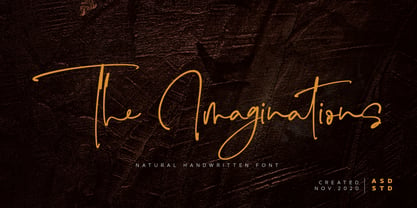 Introducing the new font The Imaginations, simple, natural, and natural handwritten font. This font suitable for use in a variety of design fields, such as event advertisements, product promotions, book titles, activity titles, logos, adventure, and others. This font can when paired with serif font types will make your design project more beautiful and perfect. Features: - Uppercase - Lowercase - Number & punctuations - Multilingual - Ligatures and alternates character - PUA encoded I highly recommend using a program that supports OpenType featuresand Glyphs panels such as Adobe Illustrator, Adobe Photoshop CC, Adobe InDesign, or CorelDraw, so you can see and access all Glyph variations. This font is encoded with Unicode PUA, which allows full access toall additional characters without having special design software. Mac users can use Font Book, and Windows users can use Character Map to view and copy one of the extra characters to paste into your favorite text editor / application. I hope you enjoy the font, thank you.
 - Isabel by Letritas,
$30.00 Isabel was made out of necessity to create a new font for children and teenagers, that could be enough friendly and versatile for text in words or even easy-to- read long texts. The purpose of Isabel is to combine all the nice and friendly features of the simple letters that the teachers teach to the pupils at primary school, as they starting to learn to read, together with the normal editorial fonts we read every day. In this way it generates a very joyful serif font, or even friendly font, with some conservative aspects. In other words, Isabel is a font that, despite of being a “classic features” typography, is proud to show its innocent and ingenuous elements, this gives to the font a new point of view. The family is composed of 3 parts: the regular version, the italic version and the unicase version. Each one of them has 5 weights, 551 characters and is composed of 208 languages.
 - Delight Muffin by Nathatype,
$29.00 Delight Muffin is a display serif font in thickly designed weights for modern, friendly, and stylish design purposes. Generally, every letter of this font is in rounded shapes with a few spaces given. The top and the bottom parts of the letter are the thinnest ones with hardly invisible differences between the thick and the thin lines, which contrast the low lines. With Delight Muffin’s legibility, it is possible to use the font in various text sizes. Features: Stylistic Sets Ligatures Multilingual Supports PUA Encoded Numerals and Punctuations Delight Muffin fits for various design projects, such as posters, banners, logos, magazine covers, quotes, headings, printed products, invitations, name cards, merchandise, social media, etc. Find out more ways to use this font by taking a look at the font preview. Thanks for purchasing our fonts. Hopefully, you have a great experience using our font. Feel free to contact us for further information when you have a problem using the font. Thank you. Happy designing.
 - Amanola by IbraCreative,
$17.00 Amanola – A Handmade Marker Script Font Amanola, a captivating handmade marker script font, seamlessly blends the warmth of handcrafted authenticity with modern design elements. This typeface exudes a distinctive charm, featuring fluid strokes and an organic flow that emulates the character of hand-drawn markers. Amanola’s letters dance across the page with an effortless grace, infusing any project with a sense of creativity and spontaneity. Its carefully crafted details, such as subtly varying line weights and playful letter connections, contribute to a uniquely personalized and inviting aesthetic. Whether used for branding, packaging, or design projects, Amanola stands as a testament to the beauty of imperfection and the artistry inherent in handmade creations. Amanola is perfect for branding projects, logo, wedding designs, social media posts, advertisements, product packaging, product designs, label, photography, watermark, invitation, stationery, game, fashion and any projects. Fonts include multilingual support for; Afrikaans, Albanian, Czech, Danish, Dutch, English, Estonian, Finnish, French, German, Hungarian, Italian, Latvian, Lithuanian, Norwegian, Polish, Portuguese, Slovak, Slovenian, Spanish, Swedish.
 - Durham Latin by Mayfield Type Foundry,
$25.00 Durham Latin brings the Latin style from the Industrial Revolution to the modern era. These letterforms could be seen painted on a road sign in France, engraved in a sign over a tavern door in London, or seen on a playbill in America. The rich and varied history of these forms inspired me to capture that personality, and interpret it in a way that fits the wide range of needs of modern designers. Condensed forms and strong serifs imbue Durham Latin with a presence that can’t be ignored yet doesn’t overwhelm. It shines as a powerful display font, and becomes affable when used at smaller sizes for subheadings. Durham thrives in spartan and ornate environments alike. Durham Latin features Outline and Fill variants that allow for more creative display elements. The lowercase are 80% height small caps. Each font contains 448 characters and has full Western European support. Advanced typographic features are built in, including tabular numbers, fractions, arrows, and more.
 - Cute Smile by Asd Studio,
$10.00 Introducing the new font Cute Smile, simple, natural, and cute font. This font suitable for use in a variety of design fields, such as event advertisements, product promotions, book titles, activity titles, logos, adventure, and others. This font can when paired with serif font types will make your design project more beautiful and perfect. Features: - Uppercase - Lowercase - Number & punctuations - Multilingual - Ligatures and alternates character - PUA encoded I highly recommend using a program that supports OpenType featuresand Glyphs panels such as Adobe Illustrator, Adobe Photoshop CC, Adobe InDesign, or CorelDraw, so you can see and access all Glyph variations. This font is encoded with Unicode PUA, which allows full access toall additional characters without having special design software. Mac users can use Font Book, and Windows users can use Character Map to view and copy one of the extra characters to paste into your favorite text editor / application. I hope you enjoy the font, thank you.
 - Beatrix Antiqua by Zetafonts,
$39.00 Beatrix Antiqua is a humanist sans-serif typeface designed by Francesco Canovaro. Beatrix Antiqua is part of the Beatrix Family that takes its inspiration from the classic Roman monumental capital model: its capitals are directly derived from the stone carvings in Florence Santa Croce Cathedral - where the serifs are often removed while keeping the variable width strokes. So, even if it’s basically a sans-serif, Beatrix keeps a subtle swelling at the terminals suggesting a glyphic serif - in the same vein as Herman Zapf classic Optima typeface. In the lowercase design, Beatrix references early humanist typefaces, keeping small calligraphic details (as the prolongation of the e nose) that are especially visible in the italics. While Beatrix Antiqua, the companion typeface to Florentia , slightly exaggerates its antique stylistical features, Florentia tries to mix those influence with a more robust & digital age ready design, featuring bigger X-height and an extended character set that covers over forty languages using the latin alphabet, as well as Greek and Russian Cyrillic.
 - Melon Script by Eurotypo,
$90.00 The melon (Cucumis melo) is an herbaceous plant monoecious trailing stems. It is known for its fruit, a berry summer season with a high water content and sweet taste. The Melon font, like the fruit in which has been inspired, is characterized by its organic shapes “soft” and heavy weight. Carefully traced and drawn by hand, offers the possibility to use linked or unlinked characters, and any combination of them, because the kerning pairs have been specifically regulated. Melon Script fonts are presented as family of four widths: Condensed, Regular, Expanded and Ultra-expanded. Each of them contains 623 glyphs, a full set of stylistic alternates, swashes, ligatures, ending letters, underlines and all diacritic signs support for Central European languages. We strongly recommend these fonts for use in packaging, web sites, advertising, magazines and logotypes. You may use these fonts when you must to generate visual impact with friendly seductive atmosphere and legibility.
 - Triplex Italic by Emigre,
$39.00 The drawings, for what is now Triplex Italic, were done in Iowa City in 1985 by John Downer. The italic was originally conceived as a companion for another typeface being drawn at the same time called Arcatext, which (like Triplex) could be described as a "humanist sans-serif" having simplified character shapes constructed mostly of geometric parts. At one stage, a certain customer was interested in Arcatext but wanted a different italic drawn for it, so the plan for the italic took another direction and the idea for this one was dropped. Five years later, Emigre decided to commission the abandoned italic as a digital typeface in three weights as companions to the Triplex Sans and Serif families designed by Zuzana Licko in early 1990. The ascenders and descenders have been shortened to match those of Triplex and the new capitals embody more of the features that distinguish the lower case, but otherwise the digital version closely follows the original drawings. See also Triplex OT.
 - Hi Ashoka by Asd Studio,
$9.00 Introducing the new font Hi Ashoka - Fancy and Sweety Display Font. This font suitable for use in a variety of design fields, such as event advertisements, product promotions, mug design, book titles, activity titles, logos, and others. This font can when paired with serif font types will make your design project more beautiful and perfect. Features: - Uppercase - Lowercase - Number & punctuations - Multilingual Accents - Regular and Italic version - PUA encoded I highly recommend using a program that supports OpenType featuresand Glyphs panels such as Adobe Illustrator, Adobe Photoshop, or CorelDraw, so you can see and access all Glyph variations. This font is encoded with Unicode PUA, which allows full access toall additional characters without having special design software. Mac users can use Font Book, and Windows users can use Character Map to view and copy one of the extra characters to paste into your favorite text editor/ application. I hope you enjoy the font, thank you.
 - Cumbre by Antipixel,
$22.00 Cumbre is a slanted display type with unorthodox anatomy, a dynamic rhythmic structure, movement expression, and intense visual language. An eccentric rebel with ribbon-like moves, a balanced extrovert that makes meticulous use of ink traps. Both the name and design got inspiration from mountain peaks. "Cumbre" in Spanish means summit, and that's the motive for the spiked design and the angular serrated structure. Cumbre is built by balancing sharp angles and venturous curves. The stems are spiky, and they vary in width. Cumbre is slanted and unicase. It has condensed proportions, moderate weight contrast, spacious counters, pointy terminals, and square ink traps. Cumbre is meant for large display settings to make the most out of the precise outlines and the clean intersections. The font styles: 'Sharp' has straight paths and precise intersections. 'Round' has the same outlines but with round corners. 'Stamp' has irregular wavy contours and heavy swelling at intersections.
 - Lesthary by Asd Studio,
$10.00 Introducing the new font lesthary - Sweet Handwritten Calligraphy. This font suitable for use in a variety of design fields, such as event advertisements, product promotions, book titles, activity titles, logos, adventure, and others. This font can when paired with serif font types will make your design project more beautiful and perfect. Features: - Uppercase - Lowercase - Number & punctuations - Multilingual - Ligatures, swashes and alternates character - PUA encoded I highly recommend using a program that supports OpenType featuresand Glyphs panels such as Adobe Illustrator, Adobe Photoshop CC, Adobe InDesign, or CorelDraw, so you can see and access all Glyph variations. This font is encoded with Unicode PUA, which allows full access toall additional characters without having special design software. Mac users can use Font Book, and Windows users can use Character Map to view and copy one of the extra characters to paste into your favorite text editor / application. I hope you enjoy the font, thank you.