6,604 search results
(0.036 seconds)
- Osiyo Dohitsu NF by Nick's Fonts,
$10.00This rugged typeface is based on letterforms in the Cherokee Syllabary, reputedly devised by a gentleman named Sequoyah in the early nineteenth century. In addition, Native American petroglyphs—some authentic Cherokee designs, some from other tribes—are included in several positions. The name of the typeface, however, is authentic Cherokee, and can be loosely translated as “Yo! Wuzzup?” Both versions of the font include 1252 Latin, 1250 CE (with localization for Romanian and Moldovan). - Blaq by Resistenza,
$39.00 Inspired by Henry W. Troy, BLAQ is a new version of Trojan Text not available as font. Is an ornamental blackletter alphabet. Works great in headlines and other ‘masculine’ like design settings. The Victorian Gothic or Neo-Gothic is an architectural movement that began in the 1740s in England. Its popularity grew rapidly in the early nineteenth century. The revived Gothic style was not limited to architecture. We recommend to combine Blaq with: Turquoise Nautica
 - Ghoulish - 100% free

- Some's Style - Unknown license

- Eli 5.0b - Unknown license

- Besley Clarendon by HiH,
$12.00 Besley Clarendon ML is our version of the Clarendon registered by Robert Besley and the Fann Street Foundry in 1845. Besley Clarendon ML represents a significant change from the slab-serif Antiques & Egyptians that had become so popular in the prior three decades. Like Caslon’s Ionic of 1844, it brackets the serifs and strongly differentiates between the thick and thin strokes. Besley Clarendon is also what today is considered a condensed face, as a comparison to the various contemporary Clarendons will show. Robert Besley’s Clarendon was so popular that many foundries quickly copied it, a fact that caused him to complain vigorously. The reason it was so widely copied is simple ó it was extremely useful. It provided the attention-getting boldness to highlight a word or phrase, yet at the same time was compact and easier to read than the fat faces and antiques of the period. It wasn't until sixty years later that the concept of a typeface family of different weights was developed with DeVinne and Cheltenham. Until then, Clarendon served as everyone’s all-purpose bold face. It can be used for ads, flyers, headers or even short text. Don't leave home without it. Besley Clarendon ML includes the following features: 1. Glyphs for the 1250 Central Europe, the 1252 Turkish and the 1257 Baltic Code Pages. Added glyphs to complete standard 1252 Western Europe Code Page. Special glyphs relocated and assigned Unicode codepoints, some in Private Use area. Total of 353 glyphs. 158 kerning pairs. 2. OpenType GSUB layout features: pnum, salt, liga, dlig, hist and ornm. 3. Inclusion of tabular (std) and proportional (opt) numbers. 4. Kreska-accented letters.
 - ITC Magnifico by ITC,
$29.99ITC Magnifico Daytime and ITC Magnifico Nighttime are inspired by nineteenth-century decorated types and letterings. “Although they are designed as display typefaces, their use is not limited to large headings. Usually three-dimensional types are employed in gigantic headings in large posters, but I thought it would be interesting if such decorative types were used as well in small sizes, say at 12 point,” says designer Akira Kobayashi. “There were a few examples of small three-dimensional types used in cards printed in the nineteenth-century. I studied their letterforms carefully and became more and more interested in those small three-dimensional types. The outlines of ITC Magnifico are robust enough to endure use at small sizes. Sometimes the angle or the shape of the 'shadow' had to be slightly modified or even illogical, because the letterforms ought to look as simple as possible. The resulting types are fairly easy to read at small sizes, and I hope that at large sizes those occasional oddities will appear charming.” - The Chave font, designed by the talented Juan Casco, stands out as a distinctive and versatile typeface that harmoniously blends classic charm with modern sensibilities. It's a font that caters to bo...
- Fat Ink by High Peak,
$20.00 This handwritten font is as juicy as the strokes from a fat marker! Unpredictable but harmonious, the lines and shapes give this font a fun, funky vibe. Perfect for creating logos, charts, pricing, and more. Full uppercase and lowercase, it supports several languages, lots of discretionary ligatures, and alternatives that combine with each other. Have fun! High Peak
 - Farmhouse Chalkboard by Allouse Studio,
$16.00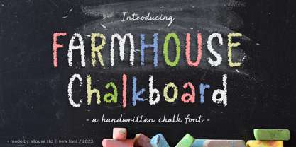 Proudly Presenting, Farmhouse Chalkboard A Decorative Chalk Font. Farmhouse Chalkboard is perfect for any titles, logo, product packaging, branding project, megazine, social media, wedding, or just used to express words above the background. Farmhouse Chalkboard also come with Multi-Lingual Support. Enjoy the font, feel free to comment or feedback, send me PM or email. Thank You!
 - Nautical Doodles by Outside the Line,
$19.00 Sail the seas with Nautical Doodles. This seaworthy font has 32 illustrations of water craft, anchors, star, compass, flags, whale, shark, birds, starfish, seahorse, rope etc. Even a mermaid... and the scripted word Ahoy! If you would like the character chart go to the Gallery Tab and print. (PDFs are no longer downloaded with the font.)
 - Uncertainty by Okaycat,
$25.50 Uncertainty 2010 Edition is an intensely textured typeface carefully rendered by hand. This font is faded with a chalk-like texture. Please be aware that working with this highly detailed font may slow some graphics software as it requires more memory. Uncertainty is extended, containing West European diacritics and ligatures, making it suitable for multilingual environments and publications.
 - P22 Hiromina 03 by IHOF,
$24.95 Hiromina03 is named after the wife of its designer, Hajime Kawakami. The three fonts in the set are based on Hiromi Kawakami's unique hand-lettering style. The distinctly feminine character of Hiromina03 is harmoniously integrated in all three writing systems, Katakana, Hiragana and Latin. The enclosed key charts give instructions for character placement in Katakana and Hiragana.
 - Okay Crayon by Okaycat,
$29.95 One waxy black crayon was used up, entirely down to the tiniest nub, by the making of this font. It’s fun! Perfect for creating crayon written text, or to get the look of chalk-board writing, conte, or charcoal. Okay Crayon is extended, containing West European diacritics & ligatures, making it also suitable for multilingual environments & publications.
 - Marrakesh Express NF by Nick's Fonts,
$10.00This unusual headline font is based on lettering found on a travel poster, advertising passage to Morocco on the Paris-Lyon-Méditerranée line, designer unknown, circa 1930. Both versions of this font include the complete Unicode Latin 1252 and Central European 1250 character sets. - Bodoniez by Huy!Fonts,
$19.00 Nice typographic experiment consisting of the progressive "bodonization" I have summarized in two steps, by a letter drawn with the same concentration and intensity with which Paris Hilton reading a book, to get something like the sketches that Mr. Gianbattista used to Wrap the sandwich.
 - Walls by Piñata,
$8.00 What do you use to write a price tag at a store or to design a wall menu in a cafe? What to choose – a marker or chalk? Now it makes no more sense to be torn apart by the choice – use both techniques for your design. Walls fontfamily allows to perfectly combine an eco-friendly style with contemporary motives. Walls fontfamily supports over 70 languages and consists of 10 typefaces in 5 popular weights (Thin, Light, Regular, Bold, Black). Initially we wanted to create a font that would imitate an inscription made by a square tip marker which is usually used to write price tags at supermarkets, shops and cafes. During the working process we've decided to extend the conceptual boundaries of the Walls fontfamily and added 5 rough typefaces that imitate the style of ecologic chalk writing
 - Ronde Script by GroupType,
$19.00 Ronde Script (Ronde meaning "A kind of script in which the heavy strokes are nearly upright, giving the characters when taken together a round look.") is based on the original design named Parisian Ronde released in 1878 by the Chappelle Foundry in Paris. Other versions of this script include Inland French Script, French Script, French Plate, and Typo Upright. Different type foundries tied to the releases of this design include Mayeur (Paris), Stephenson Blake (London), Bernhardt Brothers & Spindler (Chicago), and ATF (Elizabeth, NJ). This style of script has been a very popular choice in designing wedding invitations and so many other formal announcements for over 130 years. Its very readable, formal and elegant with an antique or retro feel.
 - Mulier Moderne by HiH,
$8.00 Even though the phrase Art Nouveau originated in Paris at the shop of Siegfried Bing, the French preferred to call it Le style moderne. This very sinuous, very Art Nouveau typeface was designed by an E. Mulier around 1894, probably also in Paris. The organic, vine-like curve forms are frequently seen in the art of the period. Examples include the architecture of Victor Horta, the furniture of Henry van de Velde and the jewelry of Max Gradl. Mulier Moderne is an all-cap font with a full Western European character set plus ST and TH ligatures, an alternate ‘E’ and two glyphs of period printer’s cuts. Warning: do not use for extended text. Duh!
 - EFCO Overhold by Ephemera Fonts,
$19.00 EFCO Overhold, a family of 25 fonts, block allcaps with spur serif accent, created as a font pair with other font collections. available with height and width axes which make a lot of possible layouts. and also available in variable font format for unlimited possible layouts. EFCO Overhold is a great typeface for typography logo composition, branding, packaging, signage, print, headline, pair with your illustration, or pair with other ephemera fonts collections, etc.
 - Tattersall by Elemeno,
$25.00Also available as part of the Zoot Suite collection. - English Monarchs by Celebrity Fontz,
$24.99 English Monarchs is a unique font collection with accurate digital replicas of 84 signatures of English and British monarchs from Richard II through Elizabeth II, including many of the royal consorts. Also included in this font are the Stuart pretenders and Mary Queen of Scots and her consort. A must-have for autograph collectors, desktop publishers, history buffs, fans, or anyone who has ever dreamed of sending a letter, card, or e-mail "signed" as if by one of these famous nobles. This font behaves exactly like any other font. Each signature is mapped to a regular character on your keyboard. Open any Windows application, select the installed font, and type a letter, and the signature will appear at that point on the page. Painstaking craftsmanship and an incredible collection of hard-to-find signatures go into this one-of-a-kind font. Comes with a character map. This font includes signatures from the following noble figures: Richard II, Henry IV, Henry V, Henry VI, Margaret of Anjou, Edward IV, Elizabeth Woodville, Edward V, Richard III, Henry VII, Elizabeth of York, Henry VIII, Catherine of Aragon, Anne Boleyn, Jane Seymour, Anne of Cleves, Catherine Howard, Catherine Parr, Edward VI, Lady Jane Grey, Mary I Tudor, Elizabeth I, James I, Charles I, Henrietta Maria of France, Oliver Cromwell, Richard Cromwell, Charles II, Catherine of Braganza, James II, William III, Mary II, Anne, Prince George of Denmark, George I, George II, George III, George IV, William IV, Victoria, Prince Albert, Edward VII, George V, Edward VIII, Wallis Warfield Simpson, George VI, Elizabeth II, Prince Philip, Prince Charles, Princess Diana, Camilla Duchess of Cornwall, Prince James Edward Stuart, Prince Charles Edward Stuart, Mary Queen of Scots, Henry Stuart Darnley, Francis II of France.
 - Calcis by Eurotypo,
$24.00 “Chalkís” or “Chalkida” was the capital of the Euboea island in old Greece. The name derived from the Greek and it means copper - bronze. Colonist from this area founded several important cities in the Magna Graecia, such as Cumae (coastal area of Southern Italy), where our alphabet come from. At the beginning, first scribes draw the signs in mono-line, but later on, the influence of materials, tools and the skill of calligraphers, developed the refinement of the lettering. “Calcis” is a family of sans serif fonts, characterized by its austere, functional and clear style, emerged from straight lines and primary shapes; but enriched by the contribution of countless anonymous calligraphers who have polished and embellished their forms over the years. “Calcis” is presented in five weights and italic style. It has good legibility in small sizes, elegance and strong visual impact in headlines as well. Each font of the family contain 377 glyphs with accurate kerning pairs careful controlled, and advanced typographical support with OpenType features such as: old style numerals, ligatures, discretional ligatures and case-sensitive forms. It also contain diacritics for Central European languages.
 - Thorowgood Sans by HiH,
$8.00 A three-dimensional all-cap font for title use, Thorowgood Sans Shaded was released by the Fann Street Foundry of W. Thorowgood & Co. in 1839. Interestingly, it more closely resembles Figgins' Four-Line Emerald Sans-Serif Shaded of 1833 than Fann Street’s own Grotesque Shaded of 1834 (with light and shadow reversed). The idea of a shaded font is of an outline font whose letters have each been extruded through a die and then viewed from the lower right to reveal the third dimension. That third dimension has also been referred to as a shadow. Vincent Figgins' 1815-release of a shaded serif typeface was the first known of many shaded faces, as the other foundries rushed to bring out their own versions. Thorowgood Sans Shaded may be gainfully used today as a eye-catching headline font, just as it was so popularly used in the early nineteenth century. To assist with the usual all-cap letter-spacing problem, the following pre-kerned pairs are included: AT, AV, AW and AY. Be sure to download the Type Specimen showing the full character set, as well as a sample text. Live large - use it boldly.
 - Personal Message JNL by Jeff Levine,
$29.00 Inspired by the calligraphic poster art of Santa Fe's Randall Hasson, Personal Message JNL is part calligraphic, part cartoon lettering. A light, casual and friendly design, Personal Message JNL can be applied to many different print or web projects with equally attractive results.
 - Pigalle Swing by Autographis,
$39.50 Pigalle Swing is a very elegant script from the 1950s which I found some time ago in a similar but not so elegant version on Place Pigalle in Paris. I designed lots of alternate capitals and lowercase letters to make the font more usable and interesting. Enjoy!
 - Paradiso AOE by Astigmatic,
$19.95 Inspired by logotype of the Paris Resort and Casino in Las Vegas comes the Paradiso typeface, complete with an unusual array of leaning and unusually large capitals versus a petite lowercase that have a loosely drawn feel. Definitely a typeface with capitals to be used in moderation!
 - Bogart by Zetafonts,
$39.00 All the nine weights of Bogart, as well the matching true italics forms, feature an extended charset of over 1600 glyphs, covering 219 languages using latin, cyrillic and greek alphabets, and sporting a complete set of Open type features. To add flexibility for editorial usage, a text-oriented Bogart Alternate set of nine weights was added to the family keeping the design more similar to its modern old style model and allowing for a heavy readable mid-weight range.
 - Graphic Stylin NF by Nick's Fonts,
$10.00The letterforms are based on Inserat Cursive, a bold script popular in the late nineteenth century; the treatment was suggested by cover artwork for Graphic Styles from Victorian to Post-Modern, written by Stephen Heller and designed by Seymour Chwast. Included in the font are several handy ink blots (section mark and superior numbers positions), a stylish tailpiece (florin position), and a couple of ink bottles patterned after those on the bookcover (bar and broken bar). - Ouachita Way NF by Nick's Fonts,
$10.00One in the series of fonts called Whiz-Bang Wood Type, intended to be set large and tight. Ouachita Way is an ultrabold and boxy caps and small caps font, especially well-suited for commadning headlines. Based on nineteenth-century “Grecian” fonts, the name comes from a forest and a river in Arkansas. Both versions of this font contain the Unicode 1252 Latin and Unicode 1250 Central European character sets, with localization for Romanian and Moldovan. - Gothic 13 by Linotype,
$29.99Gothic 13 is a bold condensed sans serif typeface. Originally designed in small sizes, Gothic 13 is very similar to Modern Gothic Condensed, which was a turn-of-the-20th-century modernization of a popular nineteenth century style. Until Linotype integrated it into their technology, it did not exist in sizes larger than 24 point. The design used for digitization was the 18-point. Gothic 13 is ideal for display work, especially where space is at a premium. - Grover by Sudtipos,
$35.00 The object of Grover was to join two distinctive typeface designs: the basic European gothic of the late nineteenth century and the ‘rounded’ style found in 1960s America. The result is a clear, friendly face with subtle yet unforgettable features. Named after Grover Washington, Jr., the jazz saxophone player, Grover is geometrically constructed and yet very human in appearance. Sans and slab serif variations, true italic weights, as well as small caps afford Grover versatility and unique display characteristics.
 - Grover Slab by Sudtipos,
$35.00 The object of Grover was to join two distinctive typeface designs: the basic European gothic of the late nineteenth century and the ‘rounded’ style found in 1960s America. The result is a clear, friendly face with subtle yet unforgettable features. Named after Grover Washington, Jr., the jazz saxophone player, Grover is geometrically constructed and yet very human in appearance. Sans and slab serif variations, true italic weights, as well as small caps afford Grover versatility and unique display characteristics.
 - Futurex Arthur - Unknown license

- Border Twins by Deniart Systems,
$15.00 Add flair to your designs with border-twins! The BorderTwins typeface offers a unique assortment of border elements - great for any project requiring decorative accents. The twin pairs can be used in repeated patterns on their own, paired with other complimentary twins or simply to surround your text with charms. The combination possibilities are endless so we've included a PDF guide showing many of the pairing options. Have fun and experiment to create your own unique designs!
 - 1742 Civilite by GLC,
$38.00 In the late medieval period appeared a "semi-cursive" writing, the French "écriture de civilité". Quickly, it is carved and melted down in lead for printing. It is a very elegant running font, with numerous variants, both final than initial characters, many of the accented small characters were present in the model I was inspired by, after “Fournier Le jeune ”, in his catalogue "Modèles des caractères de l'imprimerie et des autres choses nécessaires au dit art nouvellement gravés par Simon-Pierre Fournier le jeune" published in 1742 in Paris. A render sheet, included in the font file, makes all characters easy to identify on keyboard. This font, very attractive and decorative may be used for web-site titles, posters and flyer designs, editing ancient texts, labels, greeting cards... and anything you want! It supports as easily enlargement as small size, remaining elegant and pretty.
 - De Alandia by Dora Typefoundry,
$17.00 Introduce my new font De Alandia is a unique blend of classic and modern fonts with a variety of beginning and ending swashes, I hope you are drawn to a beautiful and aesthetic font to perfect your extraordinary project. It features varied baselines, smooth lines, gorgeous glyphs and stunning alternatives. De Alandia is suitable for today's growing market designs, this font has a trendy, natural and soft style, with this font you can use. opportunities at every moment of an extraordinary way to highlight your best party celebration, because this font will support needs such as weddings, events, invitations, side cards, table numbers, header menus, displays, logos, blog sliders, addresses specialty, stamps, packaging, greeting cards, etc. Please send a message if you have any questions.
 - Old Wood JNL by Jeff Levine,
$29.00 One of the charming features of vintage wood type is the unusual interplay of stroke widths or letter shapes that can vary from character to character. In today's world of digital perfection, a set of letters, numbers and punctuation marks must conform to rigid standards of uniform lines, balanced curves and other form-and-function rules that has often removed the human feel from the overall type design. While this is fine when applied to most text fonts and some modern display faces, Old Wood JNL is a simple throwback to an earlier time when type design was an artistic, not engineering endeavor. Modeled in part from vintage source material, this wood type design retains that charming imperfection of a time long passed.
 - Devil Story by Yoga Letter,
$14.00 "Devil Story" is a halloween themed font, decorated with "devil" letters. This font is perfect for Halloween party celebrations, party invitations, posters, prints, stickers, and more. This font is equipped with uppercase letters, lowercase letters, uppercase decorations, lowercase decorations, numerals, punctuations, and also multilingual support.
 - Baker Street by Kimmy Design,
$20.00 Baker Street was inspired by a recent trip to London, England where I happened upon a bustling pub with beautiful typographic signage. Early sketches created an array of specialized ligatures from which the font really took shape. The family is comprised of regular, italic, inline and a rustic textured style. Baker Street delivers a multitude of Opentype features, primarily including hundreds of discretionary ligatures that connect letter pairs through varying flourishes. These distinct ligatures are used in combinations between two capital letters, two lowercase letters, uppercase to lowercase pairs and specific number combinations. For a number of capital and lowercase letters, large swashes expand above and below the characters. Contextual swashes are also applied to some characters when placed at the beginning or end of a word. Stylistic Alternatives and Titling Alternatives offer distinct style variations to capital letters. Tabular Lining and Oldstyle Figures provide several numerical alternatives. Lastly, the family also includes two sets of ornaments created specially to work with Baker Street’s style. With all that, Baker Street provides each and every user the tools to solve their own case. The game is on!


