7,499 search results
(0.028 seconds)
- Xylograph by Cuda Wianki,
$30.00 This font is based on 17th - 19th century woodcuts. It has many varied alternate characters and over 25 ornaments that make this font unique.
 - Melody Cinta by Forberas Club,
$16.00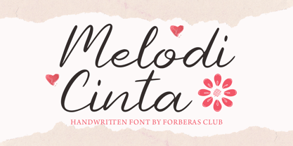 Melody Cinta is modern handwritten. Recommended to use this font for wedding party, invitation, memorable moment, love story and many more with special moment.
 - DoctorBob by JOEBOB graphics,
$- DoctorBob is a so-called stencil font. Notice the difference between upper- and lowercase; the lowercase has incomplete shapes to vary your text with.
 - Sweet Rolling by Forberas Club,
$16.00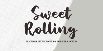 Sweet Rolling is modern handwritten. Recommended to use this font for wedding party, invitation, memorable moment, love story and many more with special moment.
 - Allerlei Zierat by Intellecta Design,
$14.90 Ornaments family with four different sets plus a decorative capitals font from the rare, valuable and amazing Allerlei Zierat book from Schelter & Gieseck (1902). A research and free interpretation by Intellecta Design. This encyclopedic specimen book of the Leipzig, Germany type foundry and printing supply house J.G. Schelter & Giesecke features, as the title indicates, all kinds of decoration for supplying printing of every type. On the title page, the firm boasts winning grand prize in 1900 in Paris (presumably at the Exposition Universelle). It is hard to do justice in a short description to the variety of styles (traditional, Jugenstil, etc.) and categories (certificates, letterheads, borders, ornaments, exotic motifs, flowers, animals, silhouettes, menus, greeting cards, vignettes humorous and otherwise, images of bicyclists, occupational symbols, portraits, Classical figures, religious art, heraldry, ships, trains, athletes, etc., etc.) offered in this volume. Some of the examples are printed in color, most are in black-and-white. The Jugenstil cover of this copy shows minor wear and soiling. The plate of “Gust. Carlsson & Co., Stockholm” is attached to the front pastedown. A small fraction of pages show minor soiling, a pencil notation or a short closed tear. Two of the fold-outs at the back have a little more damage-one is missing a 1x2 inch piece along the margin, the other has a 3-inch closed tear and an edge which is crumpled. A rare specimen from the Intellecta rare books library.
 - Aramis - Unknown license

- Helvetica Hebrew by Linotype,
$65.00Helvetica is one of the most famous and popular typefaces in the world. It lends an air of lucid efficiency to any typographic message with its clean, no-nonsense shapes. The original typeface was called Neue Haas Grotesk, and was designed in 1957 by Max Miedinger for the Haas'sche Schriftgiesserei (Haas Type Foundry) in Switzerland. In 1960 the name was changed to Helvetica (an adaptation of Helvetia", the Latin name for Switzerland). Over the years, the Helvetica family was expanded to include many different weights, but these were not as well coordinated with each other as they might have been. In 1983, D. Stempel AG and Linotype re-designed and digitized Neue Helvetica and updated it into a cohesive font family. At the beginning of the 21st Century, Linotype again released an updated design of Helvetica, the Helvetica World typeface family. This family is much smaller in terms of its number of fonts, but each font makes up for this in terms of language support. Helvetica World supports a number of languages and writing systems from all over the globe. Today, the original Helvetica family consists of 34 different font weights. 20 weights are available in Central European versions, supporting the languages of Central and Eastern Europe. 20 weights are also available in Cyrillic versions, and four are available in Greek versions. Many customers ask us what good non-Latin typefaces can be mixed with Helvetica. Fortunately, Helvetica already has Greek and Cyrillic versions, and Helvetica World includes a specially-designed Hebrew Helvetica in its OpenType character set. Helvetica has also been extende to Georgian and a special "eText" version has been designed with larger xheight and opened counters for the use in small point sizes and on E-reader devices. But Linotype also offers a number of CJK fonts that can be matched with Helvetica. Chinese fonts that pair well with Helvetica: DF Hei (Simplified Chinese) DF Hei (Traditional Chinese) DF Li Hei (Traditional Chinese) DFP Hei (Simplified Chinese) Japanese fonts that pair well with Helvetica: DF Gothic DF Gothic P DFHS Gothic Korean fonts that pair well with Helvetica: DFK Gothic" - Helvetica Thai by Linotype,
$149.00Helvetica is one of the most famous and popular typefaces in the world. It lends an air of lucid efficiency to any typographic message with its clean, no-nonsense shapes. The original typeface was called Neue Haas Grotesk, and was designed in 1957 by Max Miedinger for the Haas'sche Schriftgiesserei (Haas Type Foundry) in Switzerland. In 1960 the name was changed to Helvetica (an adaptation of Helvetia", the Latin name for Switzerland). Over the years, the Helvetica family was expanded to include many different weights, but these were not as well coordinated with each other as they might have been. In 1983, D. Stempel AG and Linotype re-designed and digitized Neue Helvetica and updated it into a cohesive font family. At the beginning of the 21st Century, Linotype again released an updated design of Helvetica, the Helvetica World typeface family. This family is much smaller in terms of its number of fonts, but each font makes up for this in terms of language support. Helvetica World supports a number of languages and writing systems from all over the globe. Today, the original Helvetica family consists of 34 different font weights. 20 weights are available in Central European versions, supporting the languages of Central and Eastern Europe. 20 weights are also available in Cyrillic versions, and four are available in Greek versions. Many customers ask us what good non-Latin typefaces can be mixed with Helvetica. Fortunately, Helvetica already has Greek and Cyrillic versions, and Helvetica World includes a specially-designed Hebrew Helvetica in its OpenType character set. Helvetica has also been extende to Georgian and a special "eText" version has been designed with larger xheight and opened counters for the use in small point sizes and on E-reader devices. But Linotype also offers a number of CJK fonts that can be matched with Helvetica. Chinese fonts that pair well with Helvetica: DF Hei (Simplified Chinese) DF Hei (Traditional Chinese) DF Li Hei (Traditional Chinese) DFP Hei (Simplified Chinese) Japanese fonts that pair well with Helvetica: DF Gothic DF Gothic P DFHS Gothic Korean fonts that pair well with Helvetica: DFK Gothic" - Helvetica Monospaced Paneuropean by Linotype,
$89.00Helvetica is one of the most famous and popular typefaces in the world. It lends an air of lucid efficiency to any typographic message with its clean, no-nonsense shapes. The original typeface was called Neue Haas Grotesk, and was designed in 1957 by Max Miedinger for the Haas'sche Schriftgiesserei (Haas Type Foundry) in Switzerland. In 1960 the name was changed to Helvetica (an adaptation of Helvetia", the Latin name for Switzerland). Over the years, the Helvetica family was expanded to include many different weights, but these were not as well coordinated with each other as they might have been. In 1983, D. Stempel AG and Linotype re-designed and digitized Neue Helvetica and updated it into a cohesive font family. At the beginning of the 21st Century, Linotype again released an updated design of Helvetica, the Helvetica World typeface family. This family is much smaller in terms of its number of fonts, but each font makes up for this in terms of language support. Helvetica World supports a number of languages and writing systems from all over the globe. Today, the original Helvetica family consists of 34 different font weights. 20 weights are available in Central European versions, supporting the languages of Central and Eastern Europe. 20 weights are also available in Cyrillic versions, and four are available in Greek versions. Many customers ask us what good non-Latin typefaces can be mixed with Helvetica. Fortunately, Helvetica already has Greek and Cyrillic versions, and Helvetica World includes a specially-designed Hebrew Helvetica in its OpenType character set. Helvetica has also been extende to Georgian and a special "eText" version has been designed with larger xheight and opened counters for the use in small point sizes and on E-reader devices. But Linotype also offers a number of CJK fonts that can be matched with Helvetica. Chinese fonts that pair well with Helvetica: DF Hei (Simplified Chinese) DF Hei (Traditional Chinese) DF Li Hei (Traditional Chinese) DFP Hei (Simplified Chinese) Japanese fonts that pair well with Helvetica: DF Gothic DF Gothic P DFHS Gothic Korean fonts that pair well with Helvetica: DFK Gothic" - Futurex Metal-gear Bold - Unknown license

- Disco Jaw by PizzaDude.dk,
$20.00 The beat is on, the piano plays the funky tunes and the rhythm guitars do their best to get the party started! The party starts with your design - use the Disco Jaw font if you are working with a theme that involves comic, kids, commercial, arts and crafts, posters ... anything that needs a fresh kick! Included are jumpy alternative letters, which makes your text look alive and kicking - and or course, there is multilingual support!
 - P22 Hieroglyphic by P22 Type Foundry,
$24.95Hieroglyphs were a pictorial alphabet used in Ancient Egypt from 3100 BC to approximately 300 AD. This font set features over 250 different phonetic and decorative hieroglyphics, complete with an extensive translation chart. P22’s Hieroglyphic font adapts one of the world’s most ancient forms of art and communication for today’s technology. Note: This is not an automatic word translator. It is a font set. It is used just like any other font and does not require special software skills. - Basecoat by Jonathan Ball,
$19.00 Basecoat is a handcrafted, geometric sans serif inspired by sign painting and influenced by modern gothics. It has a subtle organic feel without sacrificing legibility. The design of the uppercase began with chalk marker lettering for a side project and eventually grew into a small type family. Basecoat comes in three weights and includes more than 500 glyphs with European language support. It has popular OpenType features plus catchwords in multiple languages and arrows for all your sign making needs.
 - P22 GD&T Geometric Dimensioning and Tolerancing by P22 Type Foundry,
$24.95 Geometric dimensioning and tolerancing (GD&T) is a system for defining and communicating engineering tolerances. It uses a symbolic language on engineering drawings and computer-generated three-dimensional solid models that explicitly describe nominal geometry and its allowable variation. This highly specialized symbol font is designed specifically to be used by engineers to describe CAD produced outside the CAD environment. Included is a chart featuring character names and keyboard placement. Complies with ASME Y14.5M-1994. Updated to include 2009 addition of ‘unilateral’ symbol.
 - NorB Note by NorFonts,
$28.00 NorB Note is a handwritten text font with an angled fat marker lettering style. You can use this font with any word processing program for text and display use, print and web projects, apps and ePub, comic books, graphic identities, branding, editorial, advertising, scrapbooking, cards and invitations and any casual lettering purpose… or even just for fun! NorB Note comes with 3 weights, each with their matching Italics, Oblique and in a Light, Normal and Condensed version. (a Chalk version is also featured!)
 - Brand by Lián Types,
$37.00 Jam jars; Warhol’s “Tomato Soup”; chalk lettering and baseball. Those were the triggers to make this soft chancery cursive turned into a script font. Brand is thought mainly for packaging but can be used in magazines and invitations also. It can be easily converted into a logo when using it and its features. Pro styles are loaded with the most complete sets of alternates, ligatures and ornaments; while Std styles are smaller versions of the font, with no decorative alternates.
 - La Pejina ffp - Personal use only

- Sabandija ffp - Personal use only

- Zabatana Poster - 100% free

- Tabaiba wild ffp - Personal use only

- Contempo Elan by Poole,
$36.00Where's the party? Don't forget Contempo Elan! This stunning new font comes with it's own party ornaments. The right solution for any festive occasion, this super innovative face comes in two flavors. Contempo Elan Grand Script is a surprisingly elegant alternative to a more traditional formal script. Designed by Wesley Poole of Hawaii, this alphabet is definitely a hip script. Early reviews call this font "remarkable" and "a masterwork". Contempo Elan Ornamental is elegant and fun! Just perfect for those last minute Holiday announcements or any use that requires a classy, celebratory typeface, Contempo Elan Ornamental fits the bill. Equally at home on board the Enterprise or beckoning revelers at Mardi Gras, Contempo Elan belongs in every type library, just for fun. Party on. - Shangri La NF by Nick's Fonts,
$10.00An unusual handlettered alphabet from the 1922 chapbook Modern Show Card Writing, by Joseph Bertram Jowitt, provided the pattern for this whimsical face. Its letterforms, as well as its name, conjure up visions of faraway places, and is sure to add a unique charm to your next project. This font contains the complete Latin language character set (Unicode 1252) plus support for Central European (Unicode 1250) languages as well. - Haute Couture JNL by Jeff Levine,
$29.00A style of die-cut cardboard letters and numbers used for signs, displays and show cards was the basis for Haute Couture JNL, an Art-Deco flavored typeface from Jeff Levine. A direct cousin to Signboard JNL, this font shares some similar characteristics in letterforms. Both styles of die-cut lettering were manufactured by a number of companies, and were most popular from the 1940s through the mid-1960s. - Mezz by Adobe,
$29.00Clarinetist Milton ?Mezz? Mezzrow (1899-1972) was a remarkable jazz musician, as becomes evident upon reading his autobiography Really the Blues. His sharp tone and serpentine lines inspired English lettering artist and jazz lover Michael Harvey to create a condensed, oblique display typeface with the look of a chiseled alphabet in the musician's honor. Vertical formats such as book jackets and posters will be invigorated by Mezz as the display face. - Dance Number JNL by Jeff Levine,
$29.00 Vintage sheet music for the song "Just Once for All Time" (from the United Artists release "Congress Dances") provided the bold sans that served as the model for Dance Number JNL. This 1932 film was the English language version of the German comedy "Der Kongrefl tanzt" The movie's plot is based around the Congress of Vienna. There, an Austrian commoner is mistakenly thought to be the Tsar of Russia.
 - Pure Psychedelia by Mysterylab,
$19.00 For a versatile timeless look that's sure to bring any groovy graphic idea to life, we have dubbed this offering: Pure Psychedelia. This condensed font is shot through with twin strands of modernized Art Nouveau and reimagined 1960s psych. This classic stylistic mélange is distilled down to a heady mix of hippy-trippy lava lamp blobs and assertively pointy end tapers, for a unique vibe and a dynamic linear flow.
 - New Berolina MT by Monotype,
$29.99 Martin Wilke designed the dynamic calligraphic typeface New Berolina in 1965. The light line of the strokes and the strong stroke contrast lets New Berolina dance across the page. Broad, generous capitals complement beautifully the narrower lower case characters with their low x-height. The capitals can also be used as initials. Used carefully and with generous line spacing, New Berolina will lend any text a fresh, lively look.
 - Tinseltown NF by Nick's Fonts,
$10.00Suitable for headlines, subheads and short copy blocks, this decidedly Deco number is based on Willard T. Sniffin’s Hollywood, designed for American Type Founders in 1932. A few of the fussier details have been modified from the original to render a clean, streamlined and sophisticated face. All versions of this font include the Unicode 1250 Central European character set in addition to the standard Unicode 1252 Latin set. - Werbedeutsch by RMU,
$25.00 A blackletter font I could not resist to revive: Ernst Schneidler’s Buchdeutsch, released by Schelter & Giesecke in 1926 which I renamed as Werbedeutsch. This font contains the letter ‚long s‘ which can be reached in two ways. Either you use the OpenType feature ‚historical forms‘, or you type the integral sign on your keyboard. To achieve all ligatures, it is recommended to activate both standard and discretionary ligatures.
 - 64-SRC by ILOTT-TYPE,
$49.00 64-SRC is a condensed monospace font inspired by 1960s IBM Selectric type seen on HAL’s telemetric displays in 2001: A Space Odyssey. It is characterized by unique "double-space" alternates for the widest characters such as “w” and “m”. These alternates maximize legibility, improve the rhythm of readability and keep typographic color even. As a result 64-SRC is as well suited for extensive copy as it is display type.
 - Horizon by Bitstream,
$29.99Horizon was inspired by the style of the lettering used in the original Star Trek TV series. Quite fittingly, this font was used 21 years later in the film Star Trek: Into Darkness. In keeping with the digital experimentation of the 90s, Horizon has a space-age look—with sharp, unexpected angles that were achieved sharply with digital tools. It was designed in 1992 by Bitstream staff designers. - Cirulis Display by Asketic Design Studio,
$40.00 Cirulis is a display sans family of two weights. Inspired by the lettering of Ansis Cīrulus (1883-1942) one of the first Eastern European designers. The artist’s heritage is characterized by letters with asymmetric widths, sliced cuts and various intrinsic features. By carefully studying forms and origins of the letters Asketic designed a new typeface that in a contemporary fashion relives early 20th century national romanticism of Eastern Europe.
 - Throughway JNL by Jeff Levine,
$29.00 From the pages of a small book entitled “A Portfolio of Alphabet Designs for Artists, Architects, Designers & Craftsmen” [Irene K. Ames, 1938] comes a bold Art Deco sans poster display face. The digital version is called Throughway JNL, and is available in both regular and oblique versions. [To note, throughway (or sometimes spelled thruway) is a popular term from the 1950s and 1960s for a major road or highway.]
 - Leathercrafter JNL by Jeff Levine,
$29.00A popular hobby in the 1950s and 1960s was creating your own wallets, belts and other items from leather do-it-yourself kits. Stamped or carved initials, names or phrases were often added to the leather with special tools and templates - many featuring a Western-styled alphabet with a hand-lettered look. Leathercrafter JNL recreates that same look in a digital font format, complete with the unusual and contrasting letter shapes. - Aint Baroque NF by Nick's Fonts,
$10.00Here’s a not-often-seen variation of Milton Glaser’s 1968 creation Baby Teeth, distributed by Photo-Lettering Inc. as Baby Teeth Baroque. Actually, the sinuous swirls suggest, rather, an Art Nouveau influence, which is why this version has its name. Well, that, and the original design didn’t need any fixing. This font contains the complete Latin language character set (Unicode 1252) plus support for Central European (Unicode 1250) languages as well. - VLNL DBXLZX by VetteLetters,
$9.00 DBXLZX was inspired by the logo of the ZX Spectrum home computer, released in 1982 by Sinclair Research. For many designers the 8-bit pixel grid of the ZX Spectrum was one of the first steps into the realm of digital design. DBXLZX was initially developed by DBXL into a three weight family for use on the Armind record label of world famous trance deejay Armin van Buuren.
 - Chapeau by Milieu Grotesque,
$99.00 Chapeau is loosely inspired by a Johnny Cash letter written on an old IBM typewriter. The original typeface called “Doric” was a rare example of a proportionally aligned typewriter face, supplied by IBM in the late 1960s. Based on simple geometric shapes, Chapeau is a low contrast sans-serif with rounded endings. The letterforms have been carefully aligned to avoid exceeding width and to achieve an efficient, contemporary appearance.
 - Flanker Ruano by Flanker,
$18.00 The typeface Ruano was inspired from “Lettera cancelleresca formata” by the Vatican calligrapher Ferdinando Ruano, carved and cast in 1926 by Nebiolo of Turin on the advice of Raffaello Bertieri who designed the capital letters and numbers, missing in the original. The difficulty of the design of this chancery font lies in its original vertical layout, bending the calligraphic harmonies to the Gothic style, thus distinguishing it from contemporary cursive alphabets.
 - Pacific Atoll JNL by Jeff Levine,
$29.00 Pacific Atoll JNL is a stylized slab serif type design based on the movie title lettering for the 1942 wartime film “Pacific Rendezvous”, and is available in both regular and oblique versions. According to Wikipedia, “…an atoll (sometimes known as a coral atoll), is a ring-shaped coral reef, including a coral rim that encircles a lagoon partially or completely. There may be coral islands or cays on the rim.”
 - Drafting Class JNL by Jeff Levine,
$29.00 Within the pages of “The Essentials of Lettering” by Thomas E. French and Robert Meiklejohn (circa 1912) is an example for creating a sans serif alphabet and numerals. The lesson plate is entitled “Upright Single-Stroke Gothic”; a basic monoline font most useful for architectural and drafting plans because of its easy-to-read properties. This type design is now available as Drafting Class JNL, in both regular and oblique versions.


