7,499 search results
(0.024 seconds)
- Legal Brief JNL by Jeff Levine,
$29.00 The bold serif hand lettering found in the title and credits of the 1961 film “Judgement at Nuremberg” inspired Legal Brief JNL, which is available in both regular and oblique versions.
 - Opz Popz JNL by Jeff Levine,
$29.00 Opz Popz JNL is a collection of fifty-two designs based on geometric designs and pop art (reminiscent of the 1960s). These images are perfect embellishments for retro-themed work projects.
 - Pekora by Typoforge Studio,
$15.00 To design the font Pekora I was inspired by a You And Me Monthly published by National Magazines Publisher RSW Prasa that appeared from May 1960 till December 1973 in Poland.
 - Renaissant NF by Nick's Fonts,
$10.00 A classic late nineteenth-century face from the Dickinson Type Foundry of Boston. Both versions of this font support the Latin 1262, Central European 1250, Turkish 1254 and Baltic 1257 codepages.
 - Jigger Statz by Poole,
$32.00During the spring of 2006, while creating this typeface, I was reading Praying For Gil Hodges, by Tom Oliphant, who grew up a Brooklyn Dodgers fan. I grew up a Los Angeles Dodgers fan. My mother worked as secretary to the president of the old Triple A LA Angels Baseball Team. In 1952 when she was pregnant with me, she left the team. They gave her an autographed baseball and a puppy named Angel. That's the dog I grew up with. Toward the end of the book the author talks about Gil Hodges' favorite ballplayer, a slugger for the LA Angels, Jigger Statz. I thought, could it be? My mother died two years ago and I got the team baseball. Sure enough, the first name after the dedication to my mother was Jigger Statz. - Pardner by Stiggy & Sands,
$29.00 Our Pardner font finds its inspiration from the title screens of the 1965 film “West and Soda”, an animated Italian film that was a parody on American Westerns. Director Bruno Bozetto claimed in an interview that he was in fact the originator of the Spaghetti Western, not Sergio Leone. This offbeat and animated serif typeface has characters of varying width and weighting incorporated into opentype scripting as well as numerous alternates to give a lot of fun and frolicking play in typesetting. You can type with just as much diversity as the titling themselves. Opentype features include: - 6 Stylistic Alternate Sets. - A collection of ligatures as well as programming to automatically alternates between Caps and Lowercase. - Full set of Inferiors and Superiors for limitless fractions. - 731 characters of pure joy.
 - Electrostatic JNL by Jeff Levine,
$29.00 Electrostatic JNL was inspired by the 1930s lettering for radio station WMCA in New York City. It was found as part of an ad for the station in a 1932 radio broadcasting trade magazine. WMCA went on the air Feb. 6, 1925. According to Wikipedia, the "MCA" call letters stood for the Hotel McAlpin, where the station's original studio and transmitter were located. "W" is the call sign prefix for all broadcast stations East of the Mississippi River; with the exception of KDKA (Pittsburgh), which was the nation's first commercial radio station. This bold novelty typeface with lightning bolds intersecting the characters can be used to represent anything from electricity to stormy days; power generators to brute force and so forth. Electrostatic JNL is available in both regular and oblique versions.
 - Sabon by Linotype,
$45.99 In the early 1960s, the German Master Printers’ Association requested that a new typeface be designed and produced in identical form on both Linotype and Monotype machines so that text and technical composition would match. Walter Cunz at Stempel responded by commissioning Jan Tschichold to design a new version of Claude Garamond’s serene and classical Roman. Its bold, and particularly its italic styles are limited by the requirements of Linotype casting machines, forcing the character widths of a given letter to match between styles, giving the italic its characteristic narrow f. The family’s name is taken from Jacques Sabon, who introduced Garamond’s Romans to Frankfurt. Sabon has long been a favorite of typographers for setting book text, due to its smooth texture, and in large part because Tschichold’s book typography remains world famous.
 - My Puma Outlined - Unknown license

- Sweden Funkis StraightOutlined - Unknown license

- My Puma Oblique - Unknown license

- Sweden Funkis Outlined - Unknown license

- Sweden Funkis Regular - Unknown license

- Sweden Funkis StraightOblique - Unknown license

- Sweden Funkis RegularOblique - Unknown license

- Phoebus by Linotype,
$29.99Phoebus is one of Adrian Frutigers first typefaces which he made for the Deberny & Peignot foundry in Paris. The intention was to create a shadowed type with extra ordinary impression. - CAL Bodoni Ferrara by California Type Foundry,
$47.00 Bodoni Ferrara™ Fashionable, Luxury Heritage: The Original Bodoni Ferrara Sculpted from hi-res photos and scans of Bodoni's original Ferrara Font—his 1818 Manuale Tipografico and 1768 specimens. It has never before been available. This cut of Bodoni specially selected by Dave Lawrence from rare book specimens. Part of the California Type Foundry Origin Series. 3 Display Fonts in One!! And 6+ style mixes. Bodoni's 1st Draft - Transitional Serif Bodoni was often inspired by French type designs. His first draft of Ferrara was inspired by Pierre Simon Fournier. But Bodoni added his own Italian sensibilities. Bododni’s first, transitional style can pair with humanist sans, and transitional fonts. Bodoni's Rework - Modern Serif Later, Bodoni reworked Ferrara to match the later neo-classic style or modern serif of Firmin Didot¹. Bodoni’s modern style can pair with geometric sans, grotesque sans, neo-grotesque sans, gothic sans, copperplate script, . Informal On™ - Informal Mode by CAL Type Foundry This can pair with “infant” fonts. Geometric sans, and other sans or serifs with one-storied a’s. + Bodoni’s Tivoli a for another option! Works great with Fournier¹ fonts and grotesques, since the terminals will match. Font Pairing Guide This font includes a 78 page Ferrara Pairing Guide. This book shows you 131 pairings with text fonts. 47 pairings with subheader fonts! We want to help you get more out of your font collection. Design Features • Subtle forward angle (0.5-1.5°) makes Ferrara more lively and engaging than most Bodoni or Didot fonts. • Round curves make this font feel letter-pressed. • Bodoni's original tall x-height and slightly condensed proportions: great for headlines, where space is at a premium. • Better uppercase. Uppercase punctuation for design apps. • Proportional oldstyle and lining figures, both modern style and transitional numbers. Every pair of numbers is kerned for display sizes: no unsightly gaps! • Multiple special symbols for whenever you need a design to pop, including 3 of Bodoni’s amazing ampersands. Language Features Latin standard for western European and other languages. +Advanced support for: German, French, Spanish, Portuguese, Italian, and French. Special, uppercase umlauts for titles! Compare to metal Bauer¹ Bodoni! Special context kerning for French, Spanish, Portuguese, Italian, and French, to allow better better words like L'Angelique & “¿Nosotros?”. This kerning gets rid of unsightly gaps between “¿ and other combinations. Can’t Find the Pairing Guide? Can't find the pairing guide? Google “California Type Foundry” and grab the pairing guide. Get another free pro font while you’re there! Ferrara: many sizes, styles, moods and situations. It's a classic, fashionable font for display, headlines, and titles. Grab Ferrara today! ----------- ¹Trademarks of their respective owners. Ferrara™ is a trademark of the California Type Foundry.
 - PM Outpost by Paper Moon Type & Graphic Supply,
$17.00 Part pirate, part BBQ, all fun. Our new adventure inspired retro showcard font. Outpost was inspired by retro hand-lettered type used on vintage movie tiles, midnight movie posters, and pulp adventure magazines. But don't let that limit your creativity. Part pirate, part BBQ, all fun. Outpost is perfect for gaming titles, casual food packaging, and of course, Halloween projects.
 - Simoncini Garamond by Linotype,
$29.99Opinion varies regarding the role of Claude Garamond (ca. 1480–1561) in the development of the Old Face font, Garamond. What is accepted is the influence this font had on other typeface developments from the time of its creation to the present. Garamond, or Garamont, is related to the alphabet of Claude Garamond (1480–1561) as well as to the work of Jean Jannon (1580–1635 or 1658), much of which was attributed to Garamond. In comparison to the earlier Italian font forms, Garamond has finer serifs and a generally more elegant image. The Garamond of Jean Jannon was introduced at the Paris World’s Fair in 1900 as “Original Garamond”, whereafter many font foundries began to cast similar types. Simoncini Garamond was designed by Francesco Simoncini to be true to the Original. - My Puma Oblique Outlined - Unknown license

- Daliwood NF by Nick's Fonts,
$10.00This quirky charmer is based on a typeface called "Les Catalanes", designed in 1952 by Enric Crous-Vidal for Fonderie Typographique Française. Appropriately, it is named for the king of quirky Cataláns. - Personal Note JNL by Jeff Levine,
$29.00 Personal Note JNL gets its inspiration from a semi-calligraphic pen alphabet found in the 1960 edition of the Speedball® lettering textbook and is offered in both regular and oblique versions.
 - Polo by profonts,
$39.99Polo is one of Ralph M. Unger's original designs, a very beautiful non-slanted script font, quite lively despite its upright characters. Polo is reminiscent of the wild brush typefaces of 1960s. - Rocklidge Pro by Red Rooster Collection,
$60.00 Steve Jackaman & Ashley Muir. This design was inspired by the 1965 VGC typeface, Jana by Richard D. Juenger. Rocklidge contains all the high-end features expected in a quality OpenType Pro font.
 - Aura by Monotype,
$29.99Aura was designed by Jackson Burke for the Linotype foundry in 1960. Aura is a sans serif display font, very similar to Helvetica Inserat. Use the Aura font for headlines and posters. - LHF Birgitta by Letterhead Fonts,
$43.00 This beautiful roman style typeface is inspired from an E.C. Matthews book. Although the book we have is dated 1967, the style appears to have been created in the 1920s or 30s.
 - Bernhard by ParaType,
$30.00 The typeface was designed at ParaType (ParaGraph) in 1993 (by Tatiana Lyskova). Based on Bernhard Condensed typeface of the Bauer company, 1912 by Lucian Bernhard). For use in advertising and display typography.
 - Red Star Line NF by Nick's Fonts,
$10.00A 1926 travel brochure for a steamship line provided the basis for this darkly sparkly spritely font. Smooth curves and an off-center inline treatment gives this typeface a strong architectural feel. - Bentele-Unziale by ARTypes,
$25.00The Bentele-Unziale letters are transcribed from letters drawn by Prof. Ernst Bentele which are displayed in Hoffmanns Schriftatlas (1952). The size of the original is matched when set at 84 pt. - Goudy Handtooled by Bitstream,
$29.99Goudy Handtooled was done in 1922 and is a shaded version of Goudy Bold. Some authorities credit the design to Charles A. Becker and others to Morris Fuller Benton and Wadsworth Packer. - Overnight JNL by Jeff Levine,
$29.00 Hand lettering on the cover of the 1932 sheet music for "Sleep, Come On and Take Me" was the basis for Overnight JNL, which is available in both regular and oblique versions.
 - Gangfield by Slex Studio,
$18.00 Based on lettering with a sharp pen, Gangfield features a rather solid character and a measured rhythm. This is named after my nephew who has an optimistic and disciplined style. Gangfield is available in upright variants, with regular, italic and bold weights. Gangfield's bright and cheerful energy shines through either in the form of short blocks of text, or enhanced on display sizes with over 1,100 wildcards and swashes that vary in size and complexity. Gangfield includes 134 alternates with various variations plus several variants of ligatures which make it ideal for special dates such as weddings and parties.
 - Punk Head by Ditatype,
$29.00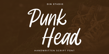 Punk Head is a handwritten font. With a natural and beautiful handwritten style, it brings a classy and chic typeface. Chalk Brush is best used for branding, logotype, and quotes. Includes: - Punk Head (OTF) Features: - Alternates - PUA Encoded - Multilingual Support - Numerals and Punctuation
 - Old Time Nouveau JNL by Jeff Levine,
$29.00 The 1914 sign lettering instruction book “Art Alphabets and Lettering” by J. M. Bergling showcased many hand lettered alphabets as an inspiration to both up-and-coming and established sign painters. One page in particular featured a classic free-form Art Nouveau style with rounded shapes. This style of lettering was emulated in the 1960s by designers of rock concert posters, so the style is reminiscent of the Art Nouveau period as well as the 1960s. Old Time Nouveau JNL is available in both regular and oblique versions.
 - Katz Pajamas JNL by Jeff Levine,
$29.00 According to Wiktionary, "the cat's pajamas" was a slang phrase coined by Thomas A. Dorgan, the well-known journalist, cartoonist and sportswriter of that era. The phrase became popular in the U.S. in the 1920s, as the word "cat" was used as a term to describe the unconventional flappers from the jazz era. This was combined with the word pyjamas (a relatively new women's fashion during that time) to form a phrase used to describe something that is the best at what it does, thus making it highly sought and desirable. Wikipedia adds that Dorgan was the first to use the terms "twenty-three, skidoo", and "yes, we have no bananas", "apple sauce" and "solid ivory", which also became part of the slang of the "Roaring Twenties". Katz Pajamas JNL is a condensed slab serif typeface based on the title lettering for the 1944 sheet music "Pretty Kitty Blue Eyes", hence the pun-laden font name paying homage to this bit of verbal Americana as well as making the pajamas a pair owned by Mr. Katz instead of the fashionable feline. Available in both regular and oblique versions.
 - Beatbox - 100% free

- Killer Ants Trial Version - Unknown license

- Lettering Lesson JNL by Jeff Levine,
$29.00 Lettering Lesson JNL is a bold serif alphabet found within the pages of the 1922 instructional booklet from the St. Louis Show Card School, and is available in both regular and oblique versions.
 - Adventuring by K-Type,
$20.00 Rock-steady and friendly, yet animated and exciting, Adventuring evolved from the hand drawn, uppercase title lettering used for the 1950s and 1960s dust jackets of Enid Blyton’s Famous Five series of books.
 - Talsmann NF by Nick's Fonts,
$10.00 Plain and simple, here's a faithful reproduction of the Advocate font for IBM Selectric typewriters from the 1960s. Both versions support the Latin 1252, Central European 1250, Turkish 1254 and Baltic 1257 codepages.


