9,013 search results
(0.025 seconds)
- Mooseheart by E-phemera,
$20.00 Mooseheart is derived from some hand lettering on a 1920s membership card for a fraternal organization. It is a slightly rough and casual sans serif at a gentle oblique angle, with a comic book feel. It has numerous alternate glyphs intended for use with OpenType features to help create the feel of hand lettering, and a robust international character set. The numerals are in a contrasting style, inspired by the original source material.
 - Black Crow by Fractal Font Factory,
$12.00 Black Crow is a display sans-serif type family includes eight weights. It is influenced by the geometric-style sans-serif faces that were popular during the 1920s and 30s. The styles are based on geometric forms that have been optically corrected for better legibility. Black Crow has a functional look with a hard touch. It is manually hinted and optimized for screens, so it will be a good choice for Websites, eBooks or Apps.
 - Vincenzo by CastleType,
$29.00 Vincenzo is based on a beautiful condensed typeface from the 1920s or earlier; original designer unknown. This is a "Modern" style with fine slab serifs, vertical stress between thick and thins, and high contrast. What is unique about this design is that the triangular serifs (e.g., E, F, L, T, etc.) do not gradually taper as they join the rest of the letter, as would be the case in Bodoni and similar designs. Uppercase only.
 - Operapolitan by E-phemera,
$20.00 Operapolitan is inspired by a hand-lettered list of board members to a major metropolitan opera company in the 1920s. The font features special ligatures and a complete alternative glyph set meant for use with OpenType contextual alternates to help create the feel of real hand lettering, along with a complete international character set and built-in small capitals. Elegant but not stuffy, the font has rough edges to capture a vintage, slightly-used vibe.
 - Funky Rundkopf NF by Nick's Fonts,
$10.00A 1990s-vintage Radiohead poster by Jermaine Rogers provided the go-by for this tight, trippy techno face. Jermaine's design, it turns out, was an adaptation of a Ray Larabie font, Dignity of Labour. This version cleverly combines stark geometry with Art Nouveau sensibilities to produce a kind of Digital DNA feel. This font contains the complete Latin language character set (Unicode 1252) plus support for Central European (Unicode 1250) languages as well. - Belmont JNL by Jeff Levine,
$29.00 Belmont JNL is named for an avenue in the Bronx, New York famous for once being the location of the Belmont Estate, which was the home of the Lorrillard tobacco family. The Art-Deco-era hand lettering from some vintage sheet music is the basis for this type design. During the 1950s a quartet of teenaged Italian-American singers took the street's name for their vocal group, naming themselves Dion and the Belmonts.
 - Monthly Adventures JNL by Jeff Levine,
$29.00 The cover lettering of a 1940s issue of a romance comic spotted in an auction online was the inspiration for Monthly Adventures JNL. Classic in its Art Deco look, this condensed outline font is evocative of the hand-lettered titles used during the Golden Age of the comic book. Available in both the original outline version and a thick, solid version with the outline removed, as well as oblique variations of both.
 - Luckiest Softie Pro by Stiggy & Sands,
$29.00 Our Luckiest Softie Pro is a softened variation of our Luckiest Guy Pro typeface, inspired by hand-lettered vintage 1950's advertisement. The charm of the original typeface is enhanced with softened corners to give the typeface a more cuddly charisma. Opentype features include: - SmallCaps. - Full set of Inferiors and Superiors for limitless fractions. - Tabular, Proportional, and Oldstyle figure sets (along with SmallCaps versions of the figures). - Stylistic Alternates for Caps to SmallCaps conversion.
 - Nouveau Auto JNL by Jeff Levine,
$29.00 “The Auto Show” is the title of an early 1900s pieces of sheet music proving that America has had a fascination with cars since the earliest days of the automotive industry. The song sheet’s title was hand lettered in a casual Art Nouveau style which has been re-drawn digitally as Nouveau Auto JNL, and is available in both regular and oblique versions… and what’s better than a nouveau auto (a new car)?
 - Raleigh by ParaType,
$30.00 Raleigh was produced in 1977 by Robert Norton based on Carl Dair’s Cartier typeface which was designed for the 1967 Montreal World's Fair. It was renamed after Dair’s death. Adrian Williams added three weights for a display series, and Robert Norton developed the text versions. A contemporary old style serif with calligraphic features. For use both in text and display typography. Cyrillic version was developed at ParaType in 2001 by Vladimir Yefimov.
 - 21 Kilobyte Salute - 100% free

- Tawattype II - Unknown license

- Sagebrush JNL by Jeff Levine,
$29.00 Sagebrush JNL was modeled from examples of a vintage French Clarendon wood type in which many of the characters had rounded parts rather than the traditional all-slab serif approach.
 - Stencille by Bogusky 2,
$34.50Stencille Une is that long-sought delicate and refined stencil font. Unique but not gimmicky, giving it the legibility often lost in most stencil fonts. Totally kerned pairs, including puncuation. - Wild Rhytm by Forberas Club,
$16.00 This new script font is written by our team, and ready to pop up your project by using this font for your party, event, invitation or at your wedding decor.
 - KD Diagona by Kassymkulov Design,
$9.95 KD Diagona is a display, geometrical face with 45 degree diagonal cut. Letter spacing along with almost 4000 kerning pairs were designed to match the diagonal progression of the font.
 - Athena Signature by Viswell,
$18.00 Athena Signature is an authentic and stylish script font. Not too thin and not too thick, balanced and varied, this font was designed to enhance the beauty of your projects.
 - Salways by Forberas Club,
$16.00 Salways is our new product , the handwritten font with playful and bouncy theme to match up your personal project like wedding invitation, your party or the cute moment you have.
 - Easter Fleurons by Greater Albion Typefounders,
$3.95 These Fleurons are a bit of Easter fun, with humorous cartoon rabbits, little chicks, and lots of lovely chocolate eggs! Just the thing for that Easter card or party invitation.
 - Owuro by Alexey Makarov,
$24.00 Presenting a professional designer font. Specially designed for the header, it will complement your collection. It contains standard ligatures. More than 1,500 kerning pairs. Standard Latin alphabet and European diacritics.
 - Snubnose by Bogstav,
$17.00 ALL CAPS font with lovely traces after the brushstrokes. With contextual alternates, which makes sure that your text varies between 5 different versions of each letter - and they cycle automatically!
 - Madine Style by Forberas Club,
$16.00 Introducing Madine Style. This font is our new born project, and ready to help pop up your project as a wedding invitation font, or party event, still playful but gorgeous.
 - Haigl Rapture by Viswell,
$26.00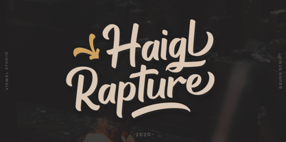 Haigl Rapture is a unconnected script with a varied brush style. This font is contains stylistic alternates, ligatures, and swashes. It is suitable for logos, branding, and another design projects.
 - Ps Snackbar Prn by Fontopia,
$12.99 Snackbar prn is a typeface with a humorous slant. The font has its origins in an art project. It is now made available for design around festifals, parties, invitations, etc.
 - Geometric Patterns JNL by Jeff Levine,
$29.00 Geometric Patterns JNL offers a large and varied assortment of interesting design variations in a 'tiled' (square) format that can be adapted to spot embellishments, running borders or repetitive patterns.
 - LD Christmas Carol by Illustration Ink,
$3.00Dress up your handmade holiday greeting cards, newsletters, programs, and party invitations with this vintage style true type font. It gives an old world feel to your Christmas paper creations. - Drac Tombstone by Forberas Club,
$16.00 This new Handwritten font is written by our team, and ready to pop up your project by using this font for your party, event, invitation or at your wedding decor.
 - Moftein Sough by Martype co,
$15.00 Moftein Sough Is a condensed serif font pairing with playful dingbat to make it satisfying, also suitable for minimalist, chic, branding, packaging and merch design to boost your design exploration.
 - HS Almajd by Hiba Studio,
$50.00 HS Almajd is an Arabic display typeface, under “titles” category. It is useful for book titles, creative designs and modern logos. Also, it is used when a contemporary and simple look is desired that can fit with the characteristics of Kufi fatmic where horizontal parts are equal than vertical ones. The font is based on Kufi Fatmic calligraphy along with some derived ideas of decorative fonts, maintaining the beauty of the Arabic font and its fixed rates. Undoubtedly, the insertion of curved ornament in some parts adds more beauty and fascinating diversity in the flow line between sharp, soft and curved parts. This font supports Arabic, Persian, Pashtu, Kurdish Sorani, Kurdish Kirmanji and Urdu, consisting only one weight which can add to the library of Arabic Kufic fonts contemporary models that meet with the purposes of various designs for all-purpose all tastes.
 - HS Alkitab by Hiba Studio,
$59.00 Hs Alkitab is an Arabic display typeface, under “titles” category. It is useful for book titles, creative designs and modern logos. Also, it is used when a contemporary and simple look is desired that can fit with the characteristics of Latin fonts where horizontal parts are thinner than vertical ones. The font is based on some modern lines of Kufi calligraphy along with some derived ideas of Latin fonts, maintaining the beauty of the Arabic font and its fixed rates. Undoubtedly, the insertion of curved ornament in the vertical parts adds more beauty and fascinating diversity in the flow line between sharp, soft and curved parts. This font supports Arabic, Persian, Urdu and Kurdish, consisting of two weights (regular and bold) which can add to the library of Arabic fonts contemporary models that meet with the purposes of various designs for all tastes.
 - Hand Stamped JNL by Jeff Levine,
$29.00Years before the many "modern" ways to creates signs and posters, the popular method was the rubber stamp printing set. Many of these sets used the classic DeVinne typeface, and were manufactured by at least a half dozen different companies. The "sign and chart printers" (as they were known) often consisted of both upper and lower case letters, numbers, punctuation, pointing hands and other symbols. "Hand Stamped JNL" puts all the fun of the rubber stamp printing set into an easy-to-use digital font with no messy ink spills or clean-up. - Roland Bryon by Luhop Creative,
$16.00 Roland Bryon Display Ligature Fashion Serif There's beauty in the plain version Roland Bryon, even without all the extras, for a clean and elegant minimal serif. Any version Roland Bryon brings a touch of luxury and bespoke custom typography to modern logos, websites, social media quotes, wedding branding, and more. Thank you so much for checking out my shop, and please get in touch if you have any questions! Roland Bryon Features Full Set of standard alphabet and punctuation Serif Ligatures alternates PUA Encoded Glyph Chart for easy access Multilingual Characters Luhop creative
 - Bonnycastle by Three Islands Press,
$39.00 Sir Richard Henry Bonnycastle (1791–1847) was an English officer and military engineer who served in the War of 1812 and ultimately settled in Canada. I stumbled upon copies of some of his charts and maps, became infatuated with the hand-lettered titles—and the result is the eponymous Bonnycastle. The font has a bold weight and an italic style but is intended as an eye-catching standalone, evocative of its period in history. Use as a titling face on branding materials, event posters, book covers, presentation graphics, historical illustrations, and the like.
 - Silent by Justi,
$20.00 Silent is a semi-serif typeface that combines readability with fluidity in a discreet and clean design. It works great on short texts such as captions, charts and graphs. The soft curves offer a calm rhythm. The design is smooth and bring silence and concentration while reading. Silent Alternates was born from the deconstruction of Silent Light, resulting in a most impressive typeface. Ideal for use in large sizes, such as posters and titles, it is an alternative to italics. It can be used to highlight some words in conjunction with Silent Light.
 - Robur by Canada Type,
$24.95 It shouldn't be a surprise to anyone that these letter shapes are familiar. They have the unmistakable color and weight of Cooper Black, Oswald Cooper's most famous typeface from 1921. What should be a surprise is that these letters are actually from George Auriol's Robur Noir (or Robur Black), published in France circa 1909 by the Peignot foundry as a bolder, solid counterpart to its popular Auriol typeface (1901). This face precedes Cooper Black by a dozen of years and a whole Great War. Cooper Black has always been a bit of a strange typographical apparition to anyone who tried to explain its original purpose, instant popularity in the 1920s, and major revival in the late 1960s. BB&S and Oswald Cooper PR aside, it is quite evident that the majority of Cooper Black's forms did not evolve from Cooper Old Style, as its originators claimed. And the claim that it collected various Art Nouveau elements is of course too ambiguous to be questioned. But when compared with Robur Noir, the "elements" in question can hardly be debated. The chronology of this "machine age" ad face in metal is amusing and stands as somewhat of a general index of post-Great War global industrial competition: - 1901: Peignot releases Auriol, based on the handwriting of George Auriol (the "quintessential Art Nouveau designer," according to Steven Heller and Louise Fili), and it becomes very popular. - 1909-1912: Peignot releases the Robur family of faces. The eight styles released are Robur Noir and its italic, a condensed version called Robur Noir Allongée (Elongated) and its italic, an outline version called Clair De Lune and its condensed/elongated, a lined/striped version called Robur Tigre, and its condensed/elongated counterpart. - 1914 to 1918: World War One uses up economies on both sides of the Atlantic, claims Georges Peignot with a bullet to the forehead, and non-war industry stalls for 4 years. - 1921: BB&S releases Cooper Black with a lot of hype to hungry publishing, manufacturing and advertising industries. - 1924: Robert Middleton releases Ludlow Black. - 1924: The Stevens Shanks foundry, the British successor to the Figgins legacy, releases its own exact copies of Robur Noir and Robur Noir Allongée, alongside a lined version called Royal Lining. - 1925: Oswald Cooper releases his Cooper Black Condensed, with similar math to Robur Noir Allongée (20% reduction in width and vectical stroke). - 1925: Monotype releases Frederick Goudy's Goudy Heavy, an "answer to Cooper Black". Type historians gravely note it as the "teacher steals from his student" scandal. Goudy Heavy Condensed follows a few years later. - 1928: Linotype releases Chauncey Griffith's Pabst Extra Bold. The condensed counterpart is released in 1931. When type production technologies changed and it was time to retool the old faces for the Typositor age, Cooper Black was a frontrunning candidate, while Robur Noir was all but erased from history. This was mostly due to its commercial revival by flourishing and media-driven music and advertising industries. By the late 1960s variations and spinoffs of Cooper Black were in every typesetting catalog. In the early- to mid-1970s, VGC, wanting to capitalize on the Art Nouveau onslaught, published an uncredited exact copy of Robur Black under the name Skylark. But that also went with the dust of history and PR when digital tech came around, and Cooper Black was once again a prime retooling candidate. The "old fellows stole all of our best ideas" indeed. So almost a hundred years after its initial fizz, Robur is here in digital form, to reclaim its rightful position as the inspiration for, and the best alternative to, Cooper Black. Given that its forms date back to the turn of the century, a time when foundry output had a closer relationship to calligraphic and humanist craft, its shapes are truer to brush strokes and much more idiosyncratic than Cooper Black in their totality's construct. Robur and Robur Italic come in all popular font formats. Language support includes Western, Central and Eastern European character sets, as well as Baltic, Esperanto, Maltese, Turkish, and Celtic/Welsh languages. A range of complementary f-ligatures and a few alternates letters are included within the fonts.
 - Retroparty by Putracetol,
$21.00 Introducing Retro Party - A Display Retro Script Font. In creating this font, I just wanted to combine classic style with modern retro style, so be this font. Hope you like it. Inspired by some retro fonts that I made before. Retro Party is perfect for vintage and retro design, badge, logos,t-shirt, poster, branding, packaging, signage, book coverand so much more! Come with Opentype feature with a lot of alternates, its help you to make great lettering. This font is also support multi language.
 - Afterkilly by Garisman Studio,
$17.00 New Blacletter is born. Afterkilly is made of brush specifically for Blackletter font types, so that it has a natural blackletter touch. Very suitable for use posters, headlines, branding, labels, logotype, and much more. In addition, Afterkilly is equipped with a Stylistic Alternate specifically for Uppercase. You can combine it with your great work. Also includes the style of Afterkilly Line for more perfect pairing (Note: Afterkilly Line cannot be combined with Afterkilly Regular. Only for pairing fonts) Make a great work with Afterkilly! Regards Garisman Studio
 - LTC Christmas Ornaments by Lanston Type Co.,
$24.95The Lanston Christmas Ornaments collection has a definite nostalgic feel for classic Christmas and Winter iconography. An indispensable set for the Christmas season, they are perfect for custom card creation or any other winter holiday graphics. LTC Christmas Ornaments One features over 80 images. LTC Christmas Ornaments Two-Part features over 30 of the same icons found in LTC Christmas One, but they are set up for two-color combinations. LTC Holly Leaves are available in one and two part for endless holly leaf combinations. - Point Made JNL by Jeff Levine,
$29.00 Point Made JNL is a varied assortment of pointing hands and arrows used for embellishing word copy, drawing attention to key points or simply adding some retro flair to your print or web project. Twenty six designs in varying styles offer a wide range of visual diversity. The images point to the right on the capital keys and to the left on the lower case keys. This font is a companion to Point Taken JNL, which offers twenty-six more pointing hands and arrows.
 - Quendel by URW Type Foundry,
$39.99 Quendel has been expanded to become Quendel Happy Family. Apart from the new Bold weight for easy distinction and emphasis, there are now four other very exciting variants, rendering different writing tools and writing materials. The basic form of Quendel was written with a Japanese bamboo tip and therefore embodies a form letter of natural flow. The new versions show other features that provide the feel of written scripts. While the styles Wood and Crayon include some alternate characters, Q Marking Pen and Q Fingertip, due to their apparently more complex enacted forms, do not need additional alternates without looking stiff or boring. The wood relief of Quendel Wood was created by a freehand wood relief drawn with oiled chalk. Quendel Marking Pen seems to be written with a felt-tip pen soon depleted. At the same time it is also reminiscent of the blooming effect, which we know from photography. The name of Quendel Fingertip suggests what can be seen - someone seems to have written with the finger in a grainy material. One would like to try it himself. The effect of broken lines which can be gained by writing with chalk as reflected in Quendel Crayon. Almost like parched sandy soil, the writing material seems to crumble.

