6,692 search results
(0.026 seconds)
- Phoebus by Linotype,
$29.99Phoebus is one of Adrian Frutigers first typefaces which he made for the Deberny & Peignot foundry in Paris. The intention was to create a shadowed type with extra ordinary impression. - CAL Bodoni Ferrara by California Type Foundry,
$47.00 Bodoni Ferrara™ Fashionable, Luxury Heritage: The Original Bodoni Ferrara Sculpted from hi-res photos and scans of Bodoni's original Ferrara Font—his 1818 Manuale Tipografico and 1768 specimens. It has never before been available. This cut of Bodoni specially selected by Dave Lawrence from rare book specimens. Part of the California Type Foundry Origin Series. 3 Display Fonts in One!! And 6+ style mixes. Bodoni's 1st Draft - Transitional Serif Bodoni was often inspired by French type designs. His first draft of Ferrara was inspired by Pierre Simon Fournier. But Bodoni added his own Italian sensibilities. Bododni’s first, transitional style can pair with humanist sans, and transitional fonts. Bodoni's Rework - Modern Serif Later, Bodoni reworked Ferrara to match the later neo-classic style or modern serif of Firmin Didot¹. Bodoni’s modern style can pair with geometric sans, grotesque sans, neo-grotesque sans, gothic sans, copperplate script, . Informal On™ - Informal Mode by CAL Type Foundry This can pair with “infant” fonts. Geometric sans, and other sans or serifs with one-storied a’s. + Bodoni’s Tivoli a for another option! Works great with Fournier¹ fonts and grotesques, since the terminals will match. Font Pairing Guide This font includes a 78 page Ferrara Pairing Guide. This book shows you 131 pairings with text fonts. 47 pairings with subheader fonts! We want to help you get more out of your font collection. Design Features • Subtle forward angle (0.5-1.5°) makes Ferrara more lively and engaging than most Bodoni or Didot fonts. • Round curves make this font feel letter-pressed. • Bodoni's original tall x-height and slightly condensed proportions: great for headlines, where space is at a premium. • Better uppercase. Uppercase punctuation for design apps. • Proportional oldstyle and lining figures, both modern style and transitional numbers. Every pair of numbers is kerned for display sizes: no unsightly gaps! • Multiple special symbols for whenever you need a design to pop, including 3 of Bodoni’s amazing ampersands. Language Features Latin standard for western European and other languages. +Advanced support for: German, French, Spanish, Portuguese, Italian, and French. Special, uppercase umlauts for titles! Compare to metal Bauer¹ Bodoni! Special context kerning for French, Spanish, Portuguese, Italian, and French, to allow better better words like L'Angelique & “¿Nosotros?”. This kerning gets rid of unsightly gaps between “¿ and other combinations. Can’t Find the Pairing Guide? Can't find the pairing guide? Google “California Type Foundry” and grab the pairing guide. Get another free pro font while you’re there! Ferrara: many sizes, styles, moods and situations. It's a classic, fashionable font for display, headlines, and titles. Grab Ferrara today! ----------- ¹Trademarks of their respective owners. Ferrara™ is a trademark of the California Type Foundry.
 - PM Outpost by Paper Moon Type & Graphic Supply,
$17.00 Part pirate, part BBQ, all fun. Our new adventure inspired retro showcard font. Outpost was inspired by retro hand-lettered type used on vintage movie tiles, midnight movie posters, and pulp adventure magazines. But don't let that limit your creativity. Part pirate, part BBQ, all fun. Outpost is perfect for gaming titles, casual food packaging, and of course, Halloween projects.
 - Bolda Display by The Infamous Foundry,
$29.00 Bolda Display is a a-z lowercase display font in two styles; regular and outline. Lowercase is regular and uppercase is outline. Inspired by the 1970’s tennis, dart and ping pong fashion. Perfect for headlines, logos and everything above the body.
 - Beverage Stencil JNL by Jeff Levine,
$29.00 The brand marking on a vintage wooden shipping case for bottles of Mission Naturally Good Orange Soda inspired Beverage Stencil JNL, which is available in both regular and oblique versions. Mission was a popular soda in California from about 1929 through 1970.
 - PM Eckmore by Paper Moon Type & Graphic Supply,
$15.00 Eckmore is a modern psychedelic variation of the Art Nouveau font Eckmann. It is inspired by 1970s concert posters of The Filmore in the San Francisco Bay Area. Its casual vibe is perfect for everything from retro fashion marketing to toy packaging.
 - Advertisers Gothic by Monotype,
$29.99AdvertiserÆs Gothic Light, from a volume of headline fonts, was designed by Robert Wiebking in 1917. Wiebking was a skilled type engraver from Chicago who created his own pantographic machine, used to cut punches drawn by other successful type designers, including Frederic Goudy. - Heckel by Hanoded,
$15.00 Erich Heckel (1883 - 1970) was a German painter and printmaker. He was a founding member of Die Brücke (The Bridge), a group of German expressionists. Heckel font somewhat resembles the loose (and messy) handwriting Erich Heckel used in some of his drafts.
 - Nouveau Romance JNL by Jeff Levine,
$29.00 The hand lettered title on the sheet music for 1917's "If They'd Never Take You from Me" was the basis for the Art Nouveau sans design of Nouveau Romance JNL. This elegant sans serif is available in both regular and oblique versions.
 - Olympik by The Northern Block,
$16.70 A multi-lined typeface digitally remastered from the 1970s Letraset font Optex. The font has gone through an exacting design program with over 100 hours in the production. Details include: three unique styles, a full character set, manually edited kerning and Euro symbol.
 - Simoncini Garamond by Linotype,
$29.99Opinion varies regarding the role of Claude Garamond (ca. 1480–1561) in the development of the Old Face font, Garamond. What is accepted is the influence this font had on other typeface developments from the time of its creation to the present. Garamond, or Garamont, is related to the alphabet of Claude Garamond (1480–1561) as well as to the work of Jean Jannon (1580–1635 or 1658), much of which was attributed to Garamond. In comparison to the earlier Italian font forms, Garamond has finer serifs and a generally more elegant image. The Garamond of Jean Jannon was introduced at the Paris World’s Fair in 1900 as “Original Garamond”, whereafter many font foundries began to cast similar types. Simoncini Garamond was designed by Francesco Simoncini to be true to the Original. - Bing by Pelavin Fonts,
$20.00 The sinuous, organic forms of Bing first came into being on a poster for a Smithsonian Institution exhibit on Siegfried Bing, a German art dealer in Paris who figured prominently in the development of Art Nouveau towards the end of the nineteenth century. Inspired by the natural forms of Antonio Gaudi, and the Paris Metro stations of Hector Guimard, Bing can be used effectively in the modernist style of Art Nouveau and is equally at home in the 1960s psychedelic rejuvenation of that genre.
 - My Puma Oblique Outlined - Unknown license

- Gangfield by Slex Studio,
$18.00 Based on lettering with a sharp pen, Gangfield features a rather solid character and a measured rhythm. This is named after my nephew who has an optimistic and disciplined style. Gangfield is available in upright variants, with regular, italic and bold weights. Gangfield's bright and cheerful energy shines through either in the form of short blocks of text, or enhanced on display sizes with over 1,100 wildcards and swashes that vary in size and complexity. Gangfield includes 134 alternates with various variations plus several variants of ligatures which make it ideal for special dates such as weddings and parties.
 - Punk Head by Ditatype,
$29.00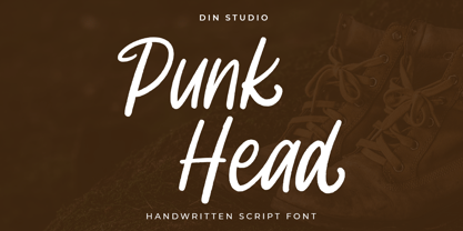 Punk Head is a handwritten font. With a natural and beautiful handwritten style, it brings a classy and chic typeface. Chalk Brush is best used for branding, logotype, and quotes. Includes: - Punk Head (OTF) Features: - Alternates - PUA Encoded - Multilingual Support - Numerals and Punctuation
 - Katz Pajamas JNL by Jeff Levine,
$29.00 According to Wiktionary, "the cat's pajamas" was a slang phrase coined by Thomas A. Dorgan, the well-known journalist, cartoonist and sportswriter of that era. The phrase became popular in the U.S. in the 1920s, as the word "cat" was used as a term to describe the unconventional flappers from the jazz era. This was combined with the word pyjamas (a relatively new women's fashion during that time) to form a phrase used to describe something that is the best at what it does, thus making it highly sought and desirable. Wikipedia adds that Dorgan was the first to use the terms "twenty-three, skidoo", and "yes, we have no bananas", "apple sauce" and "solid ivory", which also became part of the slang of the "Roaring Twenties". Katz Pajamas JNL is a condensed slab serif typeface based on the title lettering for the 1944 sheet music "Pretty Kitty Blue Eyes", hence the pun-laden font name paying homage to this bit of verbal Americana as well as making the pajamas a pair owned by Mr. Katz instead of the fashionable feline. Available in both regular and oblique versions.
 - Snorkel JNL by Jeff Levine,
$29.00 A package for a swim mask and snorkel was the basis for this decidedly unusual typeface with a wild 1970s-era design. There's no telling how to apply this font to a project, but think black light posters, psychedelic music and some cheap wine!
 - PL Bernhardt by Monotype,
$29.99Ed Benguiat drew the PL Bernhardt font which was released in 1970. PL Bernhardt was modeled after a 1930/1931 design by Lucian Bernhard. All terminals on non-vertical strokes are diagonal so that lower and uppercase X looks as though they are dancing. - False Idol by Barnbrook Fonts,
$30.00 False Idol is based on bad rub-down lettering from 1970s pornographic magazines and home-made religious leaflets. The letterforms were intended to mimic a feeling of cheap glamour but just became seedy. Somehow an alluring beauty emerges from this mix of sleaze and chic...
 - Fat Albert BT by Bitstream,
$50.99 Ray Cruz releases another typeface family, this time inspired by 1970's pop culture. Fat Albert Regular, Outline and Shadow are bold poster types that evoke the fun and funk of an era gone by. Go on bro, get Fat Albert and get down.
 - Matt Antique by Bitstream,
$29.99A solid calligraphic letter designed by John Matt in the middle 1960s. The typeface did not see use until Compugraphic copied a set of the sketches in the late 1970s, naming the result Garth Graphic in honor of Bill Garth, late president and founder. - Presidentes Portugueses by Pedro Teixeira,
$- This is a list of presidents of the Portuguese Republic, ordered chronologically from the establishment of the republican form of government on October 5, 1910 to the present. This work was built upon original images from this page: https://pt.wikipedia.org/wiki/Lista_de_presidentes_da_Rep%C3%BAblica_Portuguesa
 - News Crew JNL by Jeff Levine,
$29.00 It seems that after the 1960s, very few display typefaces were being produced that had the desirability to transcend generations, as did many type designs of the past. In 1970, a local television station embraced a lettering style for its logo that was a cross between round point pen nib lettering and the modular, techno look complete with squared characters in a futuristic "space age" style. News Crew JNL was inspired by the few examples found of this particular font [in use by the station at the time] and was pretty much created from scratch in order to capture the 1970s era of experimental typography. It is available in both regular and oblique versions.
 - Praline MCL by My Creative Land,
$29.00 The family contains two fonts - charged with OpenType features vintage soft serif and a sans serif with corresponding forms and softness. Serif: Grandma’s sweet and soft recipe with more than 1300 ingredients (lots of alternates, swashes, ligatures and design elements). This font takes it’s inspiration from Goudy, Windsor and Bookman typefaces. Watch the video showing the font stylistic alternates and swashes in action https://youtu.be/_MHNizwq1bM Sans serif: Soft and friendly, it is a simple 1970s inspired geometric grotesque to use as a support font with Praliné Serif or any other serif or script font of your choice. Both fonts fully unicode mapped so can be used in any application. Get your designs look 1970s!
 - Electric Eden by Hipfonts,
$17.00 Electric Eden is a strikingly retro font that oozes nostalgia and vintage vibes. This font is reminiscent of the 1970s and 1980s, with its bold and vibrant curves that exude an electric energy. The font's name is derived from the famous rock festival of the 1970s, and its design is a tribute to that era. The letters have a hand-drawn feel, giving it a touch of personality and uniqueness. The Electric Eden font is perfect for designing posters, album covers, and other creative projects that require a bit of edginess and flair. With its vibrant colors and eye-catching design, this font is sure to transport you back in time to the heyday of rock and roll.
 - Play Day Stencil JNL by Jeff Levine,
$29.00 The typography on a 1964 children’s activity book published by Whitman entitled “Build with Stencils” was in a bold, condensed design. The only problem was that the ‘rails’ [the parts that divide a letter into stencil pieces] were too narrow and would disappear at smaller point sizes. Widening the ‘rails’ just a bit greatly improved the appearance of the stencil characters. Play Day Stencil JNL is now available in both regular and oblique versions. In its day, the Whitman Publishing Company of Racine, Wisconsin published dozens of activity books for children, including a number of them with stencils. The company was a division of Western Publishers from the early 1900s through the 1970s, but went through a number of sales and name changes. Currently [as Whitman once again] it is owned by Anderson Press, and is known for its line of coin folders and books on coin collecting.
 - P22 Rakugaki by IHOF,
$24.95 Rakugaki means "scribble" in Japanese. This font expresses casual handwriting with warmth and simplicity. The bold weight of Rakugaki is harmoniously integrated in all three writing systems, Katakana, Hiragana and Latin. The enclosed key charts give instructions for character placement in Katakana and Hiragana.
 - Volage Display by Cecilia Gérard Type,
$16.00 Introducing Volage, a clean, elegant yet flighty display serif. Inspired by french literature masterpiece "Dangerous Liaisons" by Pierre Choderlos de Laclos, Volage is a drama typeface with stunning alternates. Sharp shapes marry tails and ligatures, which are chasing each other without never really meeting...
 - Morningstar JNL by Jeff Levine,
$29.00 Her father named her Estella Dawn, or morning star. She truly shines bright, for as the owner of Stella Roberts Fonts, she has dedicated part of her net profits to helping her siblings pay for their medication; they both suffer from Cystic Fibrosis and diabetes. Calm in spirit, loyal to friends and family, nurturing and caring-- Stella has been a friend of Jeff Levine's for years. His Estella JNL font was dedicated to her, as is this other namesake font, Morningstar JNL. The design is a cross between retro-techno and a slight calligraphic touch.
 - 1820 Modern by GLC,
$38.00 This family was inspired mainly (Normal and Italic style ) by a Didot pattern font used in Rennes (France, Britanny) by Cousin-Danelle, printers, for Antiquités historiques et monumentales ‡ visiter de Montfort ‡ Corseul, par Dinan... Saint Malo... etc. an historic guidebook for a journey through a part of (French) Brittany in 1820, and many other books. The present version contains 1820 Modern Normal and Italic, 1820 Modern Large Normal and 1820 Modern Narrow Normal, each style with small caps. This font may be used together with 1906 French News and/or 1906 Titrage.
 - Gingersans by Sryga,
$22.00 Introducing Gingersans, the typeface that's basically a font party in 12 different weights! Imagine a font that's not just a font but a personality chameleon, smoothly transitioning from easygoing and polite in the regular weights to downright wild and fun in the bolds. It's like having multiple distinct characters living in one seamless universe. The design? Oh, it's calligraphy meets sans serif – the rebel child of fonts. The curves are having a party of their own; they go wild on the Black, get too cute on the Hairline, and throw in some artsy politeness on the Regulars. It's a typographic adventure that keeps the vibe consistent, whether you're going Hairline, Regular or Black. And here's the best part – Gingersans is not just a font; it's a variable font too, with a weight axis to cater to your every design mood swing. Get ready to fall in love with the font that's as versatile as your ever-changing design whims! 🎉✨ #Gingersans #TypefaceMagic
 - Rileno Sans by Degarism Studio,
$40.00 Rileno Sans is sharp with geometric forms and strong personality. It is constructed in a geometric manner and inspired by the constructivist typefaces of the 1920s with a humanistic quality. It comes in 6 weights, 6 uprights and their matching italics. Rileno Sans is equipped with opentype features like Alternate charates, Fractions, Monospace Numbers, Superscript/subscript, Arrow, Roman Numbers, Ligatures and More.
 - Hebrew Text Tanach by Samtype,
$125.00 This is a font to build a Hebrew Bible (Tanach) or any Hebrew prayer book. Magalith Tanach Pro has all Unicode Hebrew marks and others like ShevaNa, Dagesh Chazak, Qamats Katan, and Cholam Chaser. You can even hide marks You don't want to use. This font has a complex and exclusive Programmation of Opentype features. Adobe InDesign is the best program to use.
 - Hebrew Moses Std VF by Samtype,
$120.00 his is a beautiful, modern, and super readable font. You can use it in any kind of text, from folders to prayer books. This font is especially good for school and kid's books. This font also has modern punctuation: shevana, kamats katan, dagesh hazak, and holam chaser. This is a Variable font! One font with 5 styles (Regular, Medium, SemiBold, Bold, Heavy)
 - Nana by Autographis,
$39.50 Nana is a classic joining script with long ascenders and descenders, that is based on a set of unique but forgotten initials that were designed in the roaring 20s and 30s in Paris.
 - Freak out, Go bananas - Unknown license

- CORPOREA - Unknown license

- Cognac by Solotype,
$19.95Many years ago, we bought a bunch of proofs that had apparently come from the defunct Van Loey-Nouri foundry in Belgium. Cognac was an incomplete alphabet among them, which we completed. Just a guess, but 1910 seems like a probable date for this art nouveau design. - Athan by Thinkdust,
$10.00 Athan is an uppercase geometric sans-serif typeface designed by Dani Montesinos in 2009. Inspired by one piece of lettering from the 1970s, Athan offers something a little different in terms of typography. With strong geometric forms, and highly distinctive characters, it's sure to catch your eye.
 - Clearface Gothic by URW Type Foundry,
$35.99 Clearface Gothic was designed by Morris Fuller Benton for American Typefounders. The design was released between 1907 and 1910 for text and display use. Since then, many variations have been released. An interesting typeface, Clearface Gothic is useful in advertising for display and small quantities of text.


