7,348 search results
(0.023 seconds)
- Scream - Unknown license

- Motel Xenia by Fenotype,
$19.95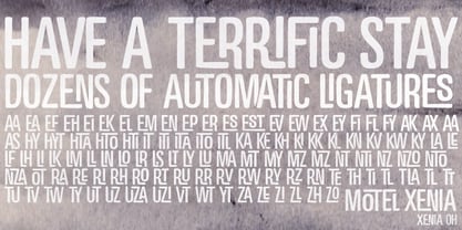 Motel Xenia is an OpenType font with dozens of automatic ligature pairs.
 - Pligo by Mans Greback,
$29.00 Pligo - a balloon, graffiti, liquorice, party and cartoon typeface by Måns Grebäck.
 - Posterama by Monotype,
$40.99 The Posterama™ typeface family contains 63 fonts and is a true journey through space and time. Designed by Jim Ford, each Posterama family contains 7 weights from Thin to Ultra Black, in 9 distinct families. What makes Posterama so unique and versatile are the eight alternative display families. By making use of a collection of alternative glyphs, Posterama sets an evocative flavor to visualize an entire century of futuristic reference points from art, architecture, poster design and science fiction into one family. Posterama Text is the base family. It has the most robust character set including upper and lowercase glyphs and pan-European language support (including Greek and Cyrillic). Note: all the other Posterama variants described below do not have lowercase letters or Greek and Cyrillic support. Posterama 1901 recalls the decoratively geometric style of Art Nouveau from the turn of the 20th century. Letterforms such as the slender, snaking ‘S’, the high-waisted ‘E’ and the underlined ‘O’ revive the spirit of Charles Rennie Mackintosh and the designers of the Viennese Secession. Posterama 1913 pays homage to the Armory Show, or 1913 Exhibition of Modern Art, which brought the revolutionary work of European artists such as Picasso, Duchamp and Kandinsky to the US for the first time to the shock and astonishment of press and public. Near-abstract, angular characters such as the ‘A’, ‘E’ and ‘N’ hint at cubism’s jagged and clashing planes. Posterama 1919 uses a small, but important, variation to set a tone when the Bauhaus was founded, and the surge in radical European typography that followed. The straight-sided, roundheaded ‘A’ adds a flavor of 1919 – this style of ‘A’ can still be seen in the Braun logo, designed in 1934. Posterama 1927 captures the year of Metropolis, The Jazz Singer and Paul Renner’s pioneering, geometric Futura typeface from 1927, which had a profound influence on design in the US and Europe. Posterama 1933 – With its low-waisted, sinuous designs, the Posterama 1933 typeface family echoes lettering of the Art Deco period, which in turn had its roots in Art Nouveau, the key influence on Posterama 1901. The two fonts make a great team and can be used interchangeably. Posterama 1945 features a few Cyrillic characters to conjure up an era when Russian art and political posters made their mark in cold war propaganda, espionage and also giant aliens and monsters. Posterama 1984 takes its typographic influences from George Orwell’s classic novel, publicity for the dystopian action and sci-fi movies (Blade Runner, Videodrome and Terminator) and games like Space Invaders and Pac-Man that made an impact at that time. Posterama 2001 was inspired by Stanley Kubrick’s science fiction masterpiece, which made extensive use of the Futura typeface. Posterama 2001 finds its cosmic orbit with its nosecone-style ‘A’ from NASA’s much-missed ‘worm’ logotype. There’s an echo, too, in Bauhaus designs from as early as 1920, whose minimalist, geometric lettering also featured a crossbar-less ‘A’.
 - Pincoya Black Pro by Latinotype,
$49.00 Pincoya Black Pro is a font based on lettering found on a poster from the Spanish Civil War, complemented with graphics developed in “La Unidad Popular” (Chilean political coalition) during the seventies. Pincoya has many alternate characters in Opentype format that provide multiple options when composing a text. It is an ideal font for high impact sentences, logotypes, magazine layouts, poster designs, etc. Languages include: Basic Latin, Western European, Euro, Catalan, Baltic, Turkish, Central European, Romanian and Pan Africa Latin.
 - Resistance Is by Comicraft,
$19.00 You will not move. You will not breathe. You will not think. You WILL buy this font. You are our prisoner. There is no escape... RESISTANCE IS FUTILE! Also Useless. RESISTANCE IS… was created for the voice of the evil robot Sentinels in X-MEN: AGE OF APOCALYPSE, and later used for the friendly robot in BATTLE CHASERS and robot police in ELEPHANTMEN. A font for all your robot needs! See the families related to Resistance Is Futile and Useless: Resistance is Lowered
 - ZionTrain by AndrijType,
$33.00 Originally ZionTrain was built as a Cyrillic typeface for public transport navigation system. We wanted comprehensible, distinctive letterforms, that can help everybody on the way from Babylon to Zion. Here, on MyFonts, we present the ZionTrain STD versions with western latin including smallcaps and oldstyle figures in some faces in TrueType format; also western, central, baltic and turkish latin charsets, smallcaps, oldstyle numerals, few alternates, some arrows and fractions in ZionTrain OT OpenType format. Look how people use it: http://use.type.org.ua/tagged/ziontrain
 - Raginy by Arterfak Project,
$29.00 Raginy is a sans serif in a stencil style. Made by paying attention to the distinctive elements of each letter, then eliminating the secondary parts and only highlighting the main elements of the letter so that it looks minimalist and elegant. Raginy has sweet characteristics, simple, luxurious, and classy so it is very suitable for displays, logos, logotypes, branding, titles, short quotes, and so on. This sans-stencil font is also equipped with alternates characters to sweeten your design, and also complete with unique ligatures. Add a touch of beauty to your designs with Raginy! What you will get: Uppercase Lowercase Numbers & punctuation Stylistic alternates Ligatures Accented characters Thank you for your visit and support. Ramz.
 - Rise of Beauty by Kereatype,
$9.00 Rise of Beauty - Modern Variable Paired Duo A classy, contemporary pair of Script Signature and Sans Serif fonts. With a stylish expressive script companion, Rise of Beauty offers beautiful typographic harmony for a diversity of design projects, including logos & branding, wedding designs, social media posts, advertisements & product designs.
 - FS Sammy by Fontsmith,
$80.00 Chalky Spritely and full of personality, FS Sammy is a hand-drawn font with a chalky texture, available in one weight only. Give Sammy a run in branding, packaging or billboard advertising for a fresh, informal, honest personality. Calligraphic Too many script fonts have a rushed and thrown-together feel about them. It’s a deceptively complex feat to achieve forms that hold together neatly in text yet still have the breezy, natural air of real handwriting. That’s FS Sammy: considered and crafted. Pencil FS Sammy was originally drawn for a drinks manufacturer by Fontsmith’s calligrapher, Sehmi Satwinder, who made handwritten impressions with a large soft pencil on textured watercolour paper. The digital interpretation of Sehmi’s letters was pushed to its limits and, after a lot of experimentation, a balanced alphabet was achieved. Texture and spirit FS Sammy’s success and uniqueness within the script font category is down to its versatility. In the large text of billboard advertising or headlines, all of its texture comes to life, and small, on menus or booklets, it conveys all of the spirit and personality of a considered piece of handwriting.
 - Fille De Joie by Tension Type,
$10.00 Fille de Joie is a distressed typewriter font created from a vintage typewriter that a friend of mine bought in Paris. It’s pretty dirty and nasty. Included are open type ligatures for all of the double letters like “EE” “TT” “FF” etc. to give the font a more natural look.
 - La Obrige by Hishand Studio,
$15.00 La Obrige is serif font that inspired from the beauty, aesthetic, elegant and Paris. It is really good for water mark, logotype, advertisement, social media posts, product packaging, and more. complete with ligatures regular italic icon kerning multilingual support Shampoo mock up from https://www.graphicsfuel.com/2018/09/dispenser-bottle-psd-mockup/
 - Parisian Playboy JNL by Jeff Levine,
$29.00 Sheet music for the song "My Ideal" (from the 1930 Paramount picture "Playboy of Paris" starring Maurice Chevalier) had the name of the movie hand lettered in an Art Deco, Broadway-influenced type design. This became the inspiration for Parisian Playboy JNL, which is available in both regular and oblique versions.
 - Impacted - Unknown license

- Butterfly Chromosome - Unknown license

- Schrill AOE - Unknown license

- AntiChrist SuperstarSW - Unknown license

- Scrawn AOE - Unknown license

- FATTIP - Unknown license

- ID SupernovaSW - Unknown license

- Rusted MachineSW - Unknown license

- Trump Deutsch by RMU,
$25.00 This rather modern versions of a Gothic style blackletter were originally drawn by Georg Trump in 1936 and 1937 respectively. To access all ligatures, I recommend to activate both OT features, standard and discretionary ligatures.
 - PL Modern by Monotype,
$29.99PL Modern Heavy Condensed is based on a design by R.H. Middleton (1936). It has Bodoni-style letterforms, typical of Modern Serif faces. Use the PL Modern Heavy Condensed font for headlines in narrow settings. - Nouveau Date JNL by Jeff Levine,
$29.00 The hand lettered title on the cover of the 1914 tune “I Want you to Meet My Mother” served as the inspiration for Nouveau Date JNL, which is available in both regular and oblique versions.
 - LoganFive by The Northern Block,
$16.70 A modern digital typeface inspired by the 1976 sci-fi film Logan's Run . The grid structure is re-worked from the out-of-use typeface OptiStabile Xtra Light with various new changes, refinements and additions.
 - Sightseeing Boat JNL by Jeff Levine,
$29.00 The free form hand lettering comprising the titles and credits for the 1966 romantic comedy “The Glass Bottom Boat” were the model for Sightseeing Boat JNL, which is available in both regular and oblique versions.
 - Silent Comedy JNL by Jeff Levine,
$29.00 A poster for the 1917 Charlie Chaplin comedy “Easy Street” had Chaplin’s name hand lettered in thick, round cornered block characters. This inspired Silent Comedy JNL, which is available in both regular and oblique versions.
 - Futurex Roughly Sliced - Unknown license

- Futurex Arthur - Unknown license

- Futurex - AlternatLC - Unknown license

- Futurex - AlternateTC - Unknown license

- Vacaciones - Personal use only

- Hyundai - Personal use only

- Encient German Gothic - Unknown license

- Cable Condensed Std by RMU,
$30.00 Three condensed styles which are part of the well-known Kabel font family.
 - Paper Candy by Forberas Club,
$16.00 Use this font for your party or cute moment. Do your magic ! :D
 - Dupla by Tipo Pèpel,
$22.00 When Dupla was designed, its DNA shown the best of the typographic heritage from the XIX century types, the oldest san serif known, also named as “Grotesk”, a soft synonym for bizarre, unnatural weird. XIX century Germans' eyes were surprised, astonished by the formal strangeness that provoked the mutilation of the well known serifed types. But the skeleton and DNA are barely perceptible, an invisible part of the nature of objects. We are interested in the epidermis, the outer, the visible, which directly speak to the eyes, and Dupla tells us with overwhelming presence, that is a formal, traditional type, covered with a childlike sweetness, with slight curves, epidermic, sweetening even ink’s traps up. Frutiger said that Latin alphabet letter’s minimum skeleton is like a lock where you should fit all the letters you see, but that skeleton allows many skins. We use a different skin for every specific use. And Dupla’s skin points to how generous, how friendly it is; the sweetness of the big and good-natured. They do not feel very comfortable in low-cost airplanes company’s seats, but in the proper location with enough room, they'll fill the atmosphere with kindness. Do not ask for narrow columns, or terse captions in squalid sizes; do not ask for ridiculous “small print” in dark contracts where «The party of the first part shall be known in this contract as the party of the first part …» That’s not for Dupla. Large headlines, generous width columns to cover, rude pullquotes half-breaking columns, loud exclamations, great sizes, with black weights. It’s in the insultingly generous, almost obscene use where Dupla is felt. And if you consider this a obscene, gargantuan, typographical feast, Dupla brings you everything to demonstrate that quantity does not mean less quality. Multi-language support, Latin plus full coverage, complete sets of small caps, fractions, old numerals, modern, tabular, bonds and all the “gourmet” paraphernalia that Patau has accustomed us, after many years of work. If you want to be obscene and pass the censorship, use Dupla. Hedonism is just a venial sin.
 - Tarnished Halo - Unknown license

- Bernur - Unknown license

- Broken Wing - Unknown license


