10,000 search results
(0.23 seconds)
- Brookside JNL by Jeff Levine,
$29.00 The 1920s were part of an era in songwriting where snappy wordplay and clever (if not long) titles prevailed. The lettering on one such piece of sheet music with the song title "In A Shady Nook by A Babbling Brook" offered up a bold, condensed sans serif design which is now available digitally as Brookside JNL. Available in both regular and oblique versions.
 - Oh Hex JNL by Jeff Levine,
$29.00 An Art Deco “thick and thin” novelty type design based on the hexagon shape was found within the pages of “La Lettre Dans le Decor & La Publicite Modernes” - a 1930s-era French alphabet collection. The title somewhat translates to “The Letter in Modern Decor and Advertising”). Named Oh Hex JNL, it is now available in both regular and oblique versions.
 - Movie Palace JNL by Jeff Levine,
$29.10 Decorative, Display, Headline, Sans Serif, 1930s, Hand Lettered, Monoline, Retro, Vintage, Nostalgic, Stylized, Elegant Some beautiful and stylized Art Deco hand lettering found in the Jan. 6, 1934 issue of the British movie fan publication Picturegoer Weekly inspired Movie Palace JNL, which is now available in both regular and oblique versions. This monoline design adds a touch of elegance to any retro projects.
 - Modesto Open by Parkinson,
$20.00 Modesto Open is now a Chromatic Font Family. The old font Modesto Open has been improved, renamed Modesto Open Primary and joined by four new fonts that ornament and augment the Primary font in many different ways. All Caps. Modesto is a loose-knit group of Font Families based on a signpainting lettering style popular in the late-19th and early-20th centuries. It evolved from the lettering I used for the Ringling Bros. and Barnum & Bailey Circus Logo. The Modesto family was not planned. It just happened, a few fonts at a time over about fifteen years. In 2014 seven new Italic fonts and two Chromatic families were added.
 - F2F Metamorfosi by Linotype,
$29.99The techno sound of the 1990s, a personal computer, font creation software, and some inspiration all came together to inspire the F2F (Face2Face) font series. Alessio Leonardi and his friends had the demand to create new unusual typefaces, which would be used in the leading German techno magazine of the day, Frontpage. Even typeset as small as 6-points, in nearly undecipherable layouts, it was a pleasure for the kids to read and try to decrypt the messages. Letterforms in F2F Metamorfosi are parts of other characters that have been rotated to take on new meaning. For instance, an upside down V has become an A, a German ß has become the B, and a left parenthesis has become the C, etc. - Liberta TA by Elsner+Flake,
$40.00 Between 1958 and 1961, Herbert Thannhaeuser developed the typeface Liberta for Typoart as a broadly conceived newspaper type which established itself quickly. Its positive adaptation by publishing houses and printing companies was based, next to its agreeable and reader-friendly general impression, also on a relatively robust typeface character which does not sacrifice its power of impression and elegance even when confronted with poor paper and printing qualities. In the 1970s, a bullish and robust design style took over the area of consumer goods which then required a corresponding advertising face. Harald Brödel re-worked the Liberta Ultra for phototypesetting, and, with great sensitivity, designed a matching cursive variation. Both types work especially well as an attention getter for advertising and for emphasis purposes.
 - Arioso by Linotype,
$40.99Arioso was a part of the 1990 program Type before Gutenberg, which included the work of twelve contemporary font designers and represented styles from across the ages. The calligraphic style of Arioso stems from an early form of Old Face developed in the 14th and 15th centureis in Italy. It is a mixture of Roman capitals and Carolingian lower case. - Jazz by ITC,
$29.00Jazz font is the work of British designer Alan Meeks and brilliantly captures the sophisticated elegance of the 1920s and 30s. The bold roman style is enhanced with an interior design almost like a piano keyboard or the lit windows of a skyscraper. Jazz font is a good choice for any headline or display which should have a refined, Art Deco look. - Junge Holiday Cuts NF by Nick's Fonts,
$10.00A charming series of 26 holiday “type warmers” based on the works of Carl S. Junge for the Barnhart Brothers & Spindler type foundry in the 1920s. Single-color cuts are in the uppercase positions, while 13 of the cuts suitable for two-color usage occupy the lowercase in adjacent pairs; e.g., a and b, c and d, and so on. - Clairvaux by Linotype,
$29.99Clairvaux is a part of the 1990 program Type before Gutenberg, which included the work of twelve contemporary font designers and represented styles from across the ages. Linotype offers a package including all these fonts on its web page, www.fonts.de. Herbert Maring developed his Clairvaux based on early Gothic typefaces. Its clever design resulted in highly stylized yet legible characters. - Luscombe by Greater Albion Typefounders,
$9.50 Luscombe is a boisterous and lively display face, recalling the shaded and outlined faced much beloved of 1920s poster and advertising artists, while offering a regularity of outline that those faces often did not achieve. Itís ideal for poster and display work, or for signage with a subtle period feel. Mix the two faces to add emphasis where it's needed.
 - Deco Metro by Greater Albion Typefounders,
$20.00 Deco Metro is a 1920s and 30s inspired display family, ideal for posters, banners, book covers and other promotional work. Two weights, regular (with an incised centre line) and bold (without the centre line) are offered. The family has an extensive range of features including discretionary ligatures, old-style numerals, Swash Letter and numeral forms, small capitals, Roman numerals and fractions.
 - Town And Country JNL by Jeff Levine,
$29.00 Town and Country JNL features a mix of block-style characters along with rounded ones found so often in the Art Deco fonts of the 1940s. Modeled from the hand-lettered title on a piece of sheet music from that era, this unusual coupling of two distinct design styles works despite it breaking all of the obvious rules of typography.
 - Nikita by Autographis,
$39.50Nikita is a very lively upright script with lots of 1950s flair. - Vineta by Bitstream,
$29.99An inline shadowed Clarendon designed in 1973 for VGC by Ernst Volker. - Aquarius by Red Rooster Collection,
$45.00Based on the popular VGC typeface designed by Ronald Arnholm in 1972. - Parakalein by FSD,
$50.00Outlined techno font designed on the 1990s. Perfect for true expressive artworks - Rosemary by Chank,
$99.00Here is a nice sign-painterly display font inspired by the 1920s. - Cowboy Serenade by FontMesa,
$22.00 Cowboy Serenade is an old classic Western font from about the 1870s.
 - Saint Louis by Red Rooster Collection,
$45.00Based on ‘Players,’ a typeface from English designer Adrian Williams, circa 1976. - Benchmark2 by Alphabet Agency,
$30.00 Benchmark2 is a super cool serif font developed from the popular original Benchmark font. This version has been remastered in the latest font developing software and now the new version includes a lot of additional characters that are not available in the original. The original font has been used worldwide, used in Hollywood films and in products in popular clothing lines. The font works well in a variety of themes including tattoo, rebellious, street, western and vintage, to name some. The font was initially designed for use on Baseball jerseys in an effort to developed ways of creating new looks in the field of sports related graphic design.
 - Mesa by FontMesa,
$29.00 Mesa is a revival of an old pointed Tuscan font from the MacKellar Smiths and Jordan type foundry called Broad Gauge circa 1874. This new version offers a few alternates including half slab and full slab uppercase A's. Opentype case sensitive forms are also included in the Mesa font family. We started production on this font in 2009 but set it aside to work on other projects, we're pleased to have finally finished it. If you're a Grillmaster or Pitmaster you're going to love this font for your new business logo t-shirts and other merch. To all you Grillmaster's and Pitmaster's out there, Keep On Smokin'
 - Bellanovie by Nurf Designs,
$16.00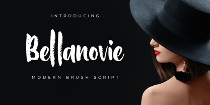 Bellanovie is a handwritten font with a chalk texture. It is suitable for promotional designs, labels, packaging, branding, logotypes and much more.
 - Schoolroom JNL by Jeff Levine,
$29.00 Based on the type style used for the Superior Sign and Chart Printer No. 929, this simple and clean sans serif font was perfectly suited for use by teachers in the classroom and for businesses and organizations that needed to make signs, price cards, charts and notices. Digitally redrawn as Schoolroom JNL, it is available in both regular and oblique versions. The Superior Marking Equipment Company [formerly of Chicago] was not only a major supplier of materials for the rubber stamp industry, but for most of its existence manufactured date and numbering stamps, sign and chart printers (such as the one used for this font), and a line of children’s printing toys (amongst other items).
 - Minsky by Solotype,
$19.95The Bruce Foundry in New York gave this Italian Clarendon the catchy name of Ornamented No. 1529. The original had a top right white shadow which we eliminated. Additionally we improved the color of several of the characters. - Standing Stones by Solotype,
$19.95Redrawn from a strange type originally made about 1850, and sold by the Connors Foundry, New York. We cannot guarantee that Connors originated it, since they were among the first to have facilities for pirating other foundries' types. - Tagline by Robert Petrick,
$19.95 Tagline is a Fun, Bold casual font that was born from the New York graffiti style. Good for all your entertainment projects. Though "Tagline" is radical in style it's still very readable and calls attention to your message.
 - TT Neoris by TypeType,
$39.00 The future of Neo-Grotesques is now! Introducing TT Neoris—a new ambitious font from TypeType. TT Neoris is an ideal sans with: 21 font styles: 10 upright, 10 italics, and 1 variable font; 1832 characters; 41 OpenType features; 14 stylistic sets with Soft character and Upright cursive in Latin and Cyrillic character sets; 230+ languages support; Special condensed italics designed to create a 'highlighting' effect when used in specific text segments.
 - Estimo by Karandash,
$28.00 Estimo is an unusual, yet elegant type family of three styles in five weights. Originally developed as upper-case-only family, Estimo was inspired by the works of Bulgarian type and graphic designers in 1980’s. It is characterized by its lack of diagonal strokes (wherever possible), thus experimenting with letterforms without losing legibility. This unique typeface is suitable for all kinds of creative and editorial works, creating impact for headlines of all sizes, as well as readability for text blocks.
 - Hebrew Sevilha Tanach by Samtype,
$149.00 This is Classic Hebrew Sefardi Font. This is a beautiful typeface to invitations, posters, cover books and small texts. All diacritic marks for vocalization are present (Nikud), including shevana, kamats katan, cholam chaser and dagesh hazak.
 - Hebrew Sevilha Std by Samtype,
$49.00 This is Classic Hebrew Sefardi Font. This is a beautiful typeface to invitations, posters, cover books and small texts. All diacritic marks for vocalization are present (Nikud), including shevana, kamats katan, cholam chaser and dagesh hazak.
 - The Fright House by IKIIKOWRK,
$17.00 Proudly Present The Fright House - Classic Horror Type, created by ikiiko. Inspired by classic horror movie posters, The Fright House, with its retro appeal and traditional serif styling, revives the spirit of horror from the 1970s. The nostalgia and appeal of a past of dread is captured by this typeface, which pays homage to the typefaces that covered horror novels, movie posters, and spooky magazines during that time. The Fright House is a classic elongated condensed serif typeface with a timeless elegance inspired by 1970s fonts. With a precisely defined serif that gives it a sharp and unsettling feel. Each character has graceful contours and precise proportions, seamlessly blending vintage design with the thrilling charm of suspense. This typeface is perfect for an vintage poster, movie title, classic stuff, magazine layout, book cover, and also good for quotes, or simply as a stylish text overlay to any background image. What's included? Uppercase & Lowercase Number & Punctuation Ligature (Bonus) Multilingual Support Works on PC & Mac Get also a good offer & FREEBIE at our site : www.ikiiko.com Enjoy our font and if you have any questions, you can contact us by email : ikiikowrk@gmail.com
 - Valjean by Solotype,
$19.95Here is a wood type from Tubbs & Co., about 1900. Its lack of decoration reflects the changes that were rapidly occurring in the design of printed pieces at the beginning of the 1900s. There were several similar types in metal in the first decade of the 20th century. - Spiffily NF by Nick's Fonts,
$10.00Here's a workmanlike interpretation of John Pistilli's eponymous extreme Didone, originally designed for VGC in the 1970s. The typeface's strong contrasts and graceful nuances guarantee that your headlines will get noticed. Both versions of this font include the complete Unicode Latin 1252, Central European 1250 and Turkish 1254 character sets. - Club - Personal use only

- Anderson Thunderbirds Are GO! - Unknown license

- 57-nao by ILOTT-TYPE,
$49.00 Designed in 1950s Japan by Okanao & Kushiro, the perfect partnership until artistic temperaments drove them apart. The duo spent years crafting the font with the working title “Messenjā”, Okanao bringing technical expertise to craft letterforms, while Kushiro made it his life, obsessively working late into the night to check pages for errors. For him the project was never about making money, it was an artistic endeavor to reprint the great Western works of literature. When he found out Okanao had secretly sold the rights to the font for use as a logo for a major Japanese manufacturer, Kushiro burned all evidence of the designs in a fit of passionate fury. The two reportedly never spoke again. “Messenjā” was thought lost forever until a type specimen was discovered in a vintage typewriter box bought on eBay. Now redrawn and available as 57-nao, a faithful and beautifully crafted monospace characterized by what is considered Okanao’s defining moment, the angular loop on the lowercase ‘a’.
 - Krul by Re-Type,
$99.00 ‘Krul’ is a typographic interpretation of the lettering style created by Dutch letter painter Jan Willem Joseph Visser at the end of the 1940s, which decorated the traditional brown bars of Amsterdam. In the beginning, these letters were strongly associated with the pubs connected to the Amstel brewery, given that Visser was the company’s official painter. As the years passed, the style became increasingly popular, and various business owners in Amsterdam and other Dutch and Belgian cities also commissioned its use. In the 1970s and 1980s, Leo Beukeboom, another talented letter painter, continued and expanded this lettering tradition while employed under the Heineken brand. Much of his work can still be found in the Jordaan and De Pijp neighborhoods in Amsterdam. The Amsterdamse Krulletter, or Amsterdam’s curly letter, is strongly inspired by the calligraphic works of the 17th century Dutch writing masters, of which Jan van den Velde was a central figure. However, distinct characteristics of this style, for example, its unusual and beautiful ‘g’, originate from a model that was published by Johannes Heuvelman in 1659, which J. W. J. Visser referenced. Typographic circles have somehow overlooked the Amsterdamse Krulletter and its heritage. The Dutch calligraphic hands preceded and influenced the formal English penmanship which has inspired numerous typefaces in the Copperplate style. In contrast, the models from van den Velde, Heuvelman, and Jean de la Chambre, among others, are a missing chapter in Dutch typographic history, and had never been turned into typefaces until now. Conscious of the cultural and identity issues that arise in reviving a unique style, and concerned about the speed with which the lettering style was disappearing, Ramiro Espinoza focused the project of designing ‘Krul’ on digitally recreating the calligraphic complexity of these beautiful letters. Created through several years of research, ‘Krul’ is not a direct digitization of the Amsterdamse Krulletter, but instead, an interpretation that incorporates numerous alternative characters absent in the original model, and improves upon details where necessary, resulting in an optimal performance on the printed page. The typeface is presented in Open Type format, with an abundance of intricate ligatures, fleurons, and swashes, which permit the creation of numerous calligraphic effects. The very high contrast and rhythm of the strokes in this typeface make it especially suited for media applications conveying a sense of elegance and sophistication. Designers of feminine magazines, advertisements, and corporate identities within the fragrance and fashion industries will find in this typeface to be an extremely useful and appropriate resource.The great Amsterdamse Krulletter is finally back, and we are proud to make it available to you.
 - Zauberer by Scriptorium,
$24.00The Scriptorium got its start in the early days of personal computers with a few font designs for the Commodore 64, and the very first font which we did back then in the early 1980s was a gothic calligraphy font. That style of fonts - the medieval, gothic and black letter genre - has always been the backbone of our collection, but with recent releases we've stayed away from them to introduce a bit more variety. Well, with our new Zauberer font the antique, medieval and gothic look is back with a vengeance. Zauberer isn't a true medieval calligraphy style. It's based on early printed type from Germany which combines calligraphic elements with decorative embellishments from the woodcut printing era. The result is decorative and antique looking and rather appealing. The name comes from the German word for a magician or illusionist. - Blaq by Resistenza,
$39.00 Inspired by Henry W. Troy, BLAQ is a new version of Trojan Text not available as font. Is an ornamental blackletter alphabet. Works great in headlines and other ‘masculine’ like design settings. The Victorian Gothic or Neo-Gothic is an architectural movement that began in the 1740s in England. Its popularity grew rapidly in the early nineteenth century. The revived Gothic style was not limited to architecture. We recommend to combine Blaq with: Turquoise Nautica

