2,891 search results
(0.039 seconds)
- FS Shepton by Fontsmith,
$80.00 Handy Andy Andy Lethbridge had only just completed his graphic design BA at the University of Portsmouth when he was spotted by Jason, who’d seen Andy’s exquisite hand lettering at his degree show and on Instagram. Keen to push the handwritten theme further, having recently launched a digitally-created, chalky script font (FS Sammy), Jason offered Andy a job and the chance to develop a suite of more stylised, truly hand-drawn fonts. Andy duly got out his pads, pencils and pens, and started experimenting with styles and textures. Magic followed. Imperfection perfected Most ‘handwritten’ typefaces are created entirely digitally. Not FS Shepton. From the start, the intention was to create a collection of alphabets of similar character but different texture and style – 100% hand-drawn and purposely imperfect, with the kind of inconsistent, organic shapes and textures of market stall signs, dashed off in chalk or paint. FS Shepton Regular, drawn with a wet brush pen, is solid with a rough outer edge and a casual but controlled feel. The dry brush used to create FS Shepton Light gives it more inner texture and a more formal, slanted, calligraphic style. FS Shepton Bold, drawn using a wider, looser dry brush pen, has a woody grain in the middle of its broad strokes and greater solidity where the brush moves more slowly. Fresh as a daisy Think of FS Shepton not as a family of three weights of the same font so much as a collection of three fonts penned by the same author. All of them – the light, regular and bold – were created independently as display fonts that offer something different to labelling, packaging, point-of-sale and advertising. Lovingly crafted by hand, they’re a good match for products and settings that share the same artisinal qualities: organic foods, drinks and healthcare products, as well as premium chocolate, coffee and condiments.
 - Button Grinder by FHFont,
$19.00 Button Grinder is display font with handwritten dry brush style, ispired by halloween event and grunge rock style, with opentype feature include of the font. Suitable for design, element design, wedding, event, t-shirt, logo, badges, sticker, and awesome work. Caps Only Fonts.
 - Bommer Slab Rounded by dooType,
$- Bommer Slab Rounded designed by Eduilson Coan is the softer sister of Bommer Slab released in April 2014. This family includes 14 weights: seven uprights and seven italics and opentype features such as: all caps, ligatures, ordinal, fractions, numerator, denominator, superscript and subscript.
 - Pointe by Wilton Foundry,
$29.00It is the point that creates the expression from the writer via the pen unto the paper. The artist guides the point in unique ways to not only communicate, but also to make the resulting expression unique. The point can take the form of a quill or a marker or a pencil or chalk or a fountain pen or a chisel or a brush. What's so funny about that? Maybe that's the point:) Pointe is loose, fun and informal lending itself ideally to Advertising, Packaging design, Invitations and Scrapbooking. Pointe is available in Postscript, Truetype and Opentype for Macs and PCs - Hush Hush by Comicraft,
$49.00 If you thought you heard someone callin' your name just now, you might have caught the firm but soft spoken tones of Comicraft's classy balloon lettering font, HushHush. Created in the style of the newspaper strips of the 30s and 40s, HushHush captures the slick movements of the skilled hand letterers of that era. Gracing the pages of Jeph Loeb and Jim Lee's chart-topping BATMAN storyline -- which by a staggering coincidence was also called "Hush" -- these characters have brought to life the words of Two Face, The Joker, Scarecrow, Catwoman, Batman and Robin -- from every whisper to every scream.
 - Dot To Dot by A New Machine,
$9.00 This font is for parents and educators that want to easily be able to print out the alphabet in order to have their child or student then trace them. This eliminates the need for creating the dotted lines by hand and lets the user type out exactly what letters they need instead of relying on pre-made charts. The font is upper and lowercase letters and numbers only - no punctuation. Comes in Regular and Guides (get both for the same price as one) which draws guidelines with the letters. Best when used at a large point size.
 - Letter Gothic 12 Pitch by ParaType,
$30.00 The Bitstream version of Letter Gothic designed by Roger Robertson in 1956-62 for IBM electric typewriter. It is a condensed, monospaced font resembling a typewriter face, suitable for tabular material. Primarily used for slide presentations and for word processing applications, Letter Gothic is very helpful for printing out software source listing, for informal office communications and for tabular charts where alignment of columns is important. Besides, being a clear and easy-to-read font, Letter Gothic is popular now for display and advertising matters. Cyrillic version was developed for ParaType in 2000 by Gayaneh Bagdasaryan.
 - You Suckin' Thief - Unknown license

- Kalix by Linotype,
$29.99I have a notation that the summer of 1994, when I worked with Kalix, was a warm one. I had no special typeface in mind when drawing the characters of Kalix, but many typefaces contributed to it, e.g. my own Omnibus from which I borrowed the looks of the smal case g. I think it is a lovely typeface whose use is mainly for books and magazines. Kalix is the name of a northern Swedish town situated along a river called Kalixälven. Its name is of sami origin, *káles, meaning cold. There comes the connection to the warm summer of 1994! But even the Latin word for chalice, calix, has something to do with my choice of name. Kalix was released in 1994. - Niobium - Unknown license

- Le chant des Albatros by Octotype is a typeface that seems to gracefully dance between modern flair and timeless elegance. The name itself, French for "The Song of the Albatross," evokes an image of ...
- Grumpy by Suomi,
$40.00 An extreme headline font with six optical variants. Black 24 is loosely based on ITC Grouch (1970) by Tom Carnase. It has some 2000 hand-adjusted kerning pairs for TNT (that’s Tight, Not Touching), a very popular type treatment from the seventies and eighties. Take your pick, or get them all, so you don’t have to buy another one later on.
 - Taste by Suomi,
$25.00 Taste, with seven weights, is versatile enough for use in headlines and text.
 - Surf And Turf JNL by Jeff Levine,
$29.00 Surf and Turf JNL was redrawn from hand-lettering on a souvenir folder for an event believed to be sponsored by Miami Beach's exclusive Surf Club on March 19, 1938. Entitled "Steeplechase Pier March 19 Surf Club Stroller", it's now lost to time whether the event recreated some of the fun and games of Atlantic City's famed Steeplechase Pier at the Surf Club, or if this was a special event trip to the New Jersey venue. It's also highly possible that the Steeplechase Pier referred to in the title was the one at Coney Island.
 - Sassoon Sans US by Sassoon-Williams,
$48.00 North American version for teaching children’s first letterforms With dots and arrows these print script fonts have no ‘exit stroke’ found in the European version. An upright typeface family developed to meet the demand for letters to produce pupil material for handwriting as well as for reading. Upright letters with extended ascenders and descenders are ideal on screen. They facilitate word recognition. Teachers can print desk strips, charts of letter families and alphabet friezes, as well as consistent material across the curriculum. Together these typefaces provide a valuable resource for special needs teachers. Free to download resources How to access Stylistic Sets of alternative letters in these fonts
 - Akkordeon by Emtype Foundry,
$69.00 Akkordeon is a display font family roughly inspired by grotesques from the XIX and XX centuries. It is not conceived as a family of constant width but has a variable breadth from narrow to expanded, offering a wide gradation of weights. Akkordeon is designed to be used in short texts such as magazine titles, banners, cover books, charts, advertising, branding and any situation where a compact, solid and powerful font is required. The type family consist of 14 weights and support for Central and Eastern European languages. Learn more about the Akkordeon design process at the Emtype’s Blog Check out Akkordeon Slab which is a great pair for Akkordeon.
 - East India Company NF by Nick's Fonts,
$10.00Put the kettle on and break out the biscuits. This no-nonsense stencil face is a faithful recreation of Tea Chest, released by the Stephenson Blake Type Foundry in 1939. Its bold strokes and slender profile retain their freshness, even seventy-plus years on. Both versions include the complete Latin 1252, Central European 1250 and Turkish 1254 character sets, as well as localization for Moldovan and Romanian. - Frieze by Fine Fonts,
$29.00 The origin of this font was a frieze in the RAF Chapel in Westminster Abbey which Michael Harvey was commissioned to design and create. It was comprised of the names of the top brass in wartime Bomber Command, namely Dowding, Harris, Newall, Tedder, Portal and Douglas. The Brief was to cut the letters in bronze and gild them. Instead, they were cut in perspex and gilded. To sit comfortably within the long and narrow vertical space available beneath the chapel’s stained glass window, extended letterforms were used with many vertical serifs omitted and with lengthened horizontal serifs. Some twenty years later, the missing upper-case letters were drawn together with the lowercase letters and Frieze, the font, was born. Subsequently, additional weights and styles were added to create a font family of six styles.
 - Bommer Slab by dooType,
$15.00 Bommer project started in January of 2014 and I am happy to announce the first family - Bommer Slab - is now ready for release. This family includes 14 weights - being seven uprights and seven italics. This font has a strong personality, that makes it perfect for use in headline sizes but means it also works gracefully within text blocks.
 - Moki by FaceType,
$25.00 The seven ways of Moki. Moki comes in seven different styles: Base, Cut, Dust, Lean, Mono, Soft and Uni. Moki is a display expert – with a wide range of languages covered, the family offers a style for every purpose. You are a SciFi movie director and are looking for an alternative to the inevitable Eurostile? Now you have!
 - Halloween Party by Yoga Letter,
$14.00 This font is named "Halloween Party". This font was intentionally made to add to the excitement of the Hallowen event that will soon arrive. This "Halloween Party" font is very scary because there is blood on it. This font is perfect for adding to the excitement and mysticism of your Halloween event. In addition to Halloween events, this font can also be used as a movie title, book title or something else that is horror, can also be used to write quote words, tell mystical things, or as a horror and mystical pickle invitation card, and others.
 - Comicrazy by Comicraft,
$99.00 Originally created for exclusive use in Image's wildly successful GEN-13 title, Comicrazy was eventually made commercially available in response to inquiries from comic book creators all around the world!
 - Will&Grace - Unknown license

- Our Pal Hal NF by Nick's Fonts,
$10.00Of the many lettering gurus who published chapbooks on handlettering during its heyday, one of the most prolific was H. C. Martin. This quirky poster face was offered in one of his many Idea Books, and it remains as fresh and frolicsome today, some seventy years later, as when it first appeared. Both versions of this font include the complete Unicode Latin 1252 and Central European 1250 character sets. - Economica Next by Underground,
$19.90 Economica Next is a redesign and expansion of the classic Economica typeface celebrating its tenth anniversary. This new version has a wider range of weights and was adapted to work in new digital environments. It was carefully designed to save space without loosing its legibility, it is used in several publications around the world and many important websites. It includes sixteen weights and a comprehensive set of characters that allows you to write in several languages. Economica Next is a typeface especially developed for web and app design in complex situations. It has been tested successfully for use in small sizes improving legibility. It is an ideal font for menus, tables, charts, etc.
 - Water Brush by TypeSETit,
$24.95 A Dry Brush script with lots of bounce and fun. Great for casual uses as well as sophisticated events.
 - Chordette for Guitar by Ukefarm,
$10.00 Description Chordette for Guitar Chord Fonts are tuned EADGBE. Create a guitar chord chart or chord sheets quickly and easily. Guitar Chord Fonts Chordette contains high quality guitar chord fonts. Each guitar chord is mapped to a specific key on the keyboard, so you can type out chords. It’s a lot easier than dealing with images to create a guitar chord chart or song sheet. It’s a favorite tool for teachers, music therapists, and musicians. What instruments are supported? Chordette for Guitar is tuned EADGBE and supports Guitar. Chordette is available in multiple tunings for most stringed instruments. Most versions of Chordette support multiple instruments. App / Instruments Supported / Tuning Chordette for Guitalele / Guitalele, Baritone Guitar / ADGCEA Chordette for Ukulele / Concert Ukulele, Banjolele / GCEA Chordette for Soprano Uke Soprano Ukulele ADF#B Chordette for Baritone Uke / Baritone Ukulele / DGBE Chordette for Mandolin / Mandolin, Irish Tenor Banjo, Irish Bouzouki / GDAE Chordette for Banjo / Banjo /gDGBD Chordette for Tenor Banjo / Tenor Banjo, Tenor Guitar, Mandola / CGDA Chordette for Guitar / Guitar / EADGBE Each version of the Chordette font uses the same chord sets and keyboard mappings. If you play multiple instruments, you can create a chord sheet for one, then use another Chordette font to transpose the song to another. For example, you can create a song for Mandolin, then instantly transpose it for Guitar and Ukulele - just by changing fonts! Chordette for Guitar is priced at $10, which includes the guitar chord font sets for both Mac and Windows. For help and support, please visit http://ukefarm.com/chordette/help.html
 - Coconut Kids by Sronstudio,
$23.00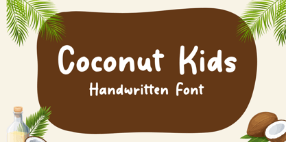 Coconut Kids – Handwritten Font, this font Is perfect for product packaging, product designs, label, photography, watermark, special events, or anything.
 - Paris Mountain by Sronstudio,
$23.00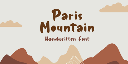 Paris Mountain – Handwritten Font, this font Is perfect for product packaging, product designs, label, photography, watermark, special events, or anything.
 - Rude ExtraWide by DSType,
$50.00 Rude was designed as a dichotomy between the Grotesque and Humanistic typographic shapes: a no-nonsense Sans and a very muscular Slab Serif companion. Showing the historically demanded consistency for such kind of typefaces, this is one of DSType's most wide-ranging and flexible type systems, introducing seven weights across seven widths, from Thin to Black and ExtraCondensed to ExtraWide, along with a wonderful set of Icons.
 - Rude Condensed by DSType,
$50.00 Rude was designed as a dichotomy between the Grotesque and Humanistic typographic shapes: a no-nonsense Sans and a very muscular Slab Serif companion. Showing the historically demanded consistency for such kind of typefaces, this is one of DSType's most wide-ranging and flexible type systems, introducing seven weights across seven widths, from Thin to Black and ExtraCondensed to ExtraWide, along with a wonderful set of Icons.
 - Rude Slab by DSType,
$50.00 Rude was designed as a dichotomy between the Grotesque and Humanistic typographic shapes: a no-nonsense Sans and a very muscular Slab Serif companion. Showing the historically demanded consistency for such kind of typefaces, this is one of DSType's most wide-ranging and flexible type systems, introducing seven weights across seven widths, from Thin to Black and ExtraCondensed to ExtraWide, along with a wonderful set of Icons.
 - Rude Slab ExtraWide by DSType,
$50.00 Rude was designed as a dichotomy between the Grotesque and Humanistic typographic shapes: a no-nonsense Sans and a very muscular Slab Serif companion. Showing the historically demanded consistency for such kind of typefaces, this is one of DSType's most wide-ranging and flexible type systems, introducing seven weights across seven widths, from Thin to Black and ExtraCondensed to ExtraWide, along with a wonderful set of Icons.
 - Rude Slab SemiCondensed by DSType,
$50.00 Rude was designed as a dichotomy between the Grotesque and Humanistic typographic shapes: a no-nonsense Sans and a very muscular Slab Serif companion. Showing the historically demanded consistency for such kind of typefaces, this is one of DSType's most wide-ranging and flexible type systems, introducing seven weights across seven widths, from Thin to Black and ExtraCondensed to ExtraWide, along with a wonderful set of Icons.
 - Rude Wide by DSType,
$50.00 Rude was designed as a dichotomy between the Grotesque and Humanistic typographic shapes: a no-nonsense Sans and a very muscular Slab Serif companion. Showing the historically demanded consistency for such kind of typefaces, this is one of DSType's most wide-ranging and flexible type systems, introducing seven weights across seven widths, from Thin to Black and ExtraCondensed to ExtraWide, along with a wonderful set of Icons.
 - Rude by DSType,
$50.00 Rude was designed as a dichotomy between the Grotesque and Humanistic typographic shapes: a no-nonsense Sans and a very muscular Slab Serif companion. Showing the historically demanded consistency for such kind of typefaces, this is one of DSType's most wide-ranging and flexible type systems, introducing seven weights across seven widths, from Thin to Black and ExtraCondensed to ExtraWide, along with a wonderful set of Icons.
 - Rude Slab Condensed by DSType,
$50.00 Rude was designed as a dichotomy between the Grotesque and Humanistic typographic shapes: a no-nonsense Sans and a very muscular Slab Serif companion. Showing the historically demanded consistency for such kind of typefaces, this is one of DSType's most wide-ranging and flexible type systems, introducing seven weights across seven widths, from Thin to Black and ExtraCondensed to ExtraWide, along with a wonderful set of Icons.
 - Rude Slab ExtraCondensed by DSType,
$50.00 Rude was designed as a dichotomy between the Grotesque and Humanistic typographic shapes: a no-nonsense Sans and a very muscular Slab Serif companion. Showing the historically demanded consistency for such kind of typefaces, this is one of DSType's most wide-ranging and flexible type systems, introducing seven weights across seven widths, from Thin to Black and ExtraCondensed to ExtraWide, along with a wonderful set of Icons.
 - Rude ExtraCondensed by DSType,
$50.00 Rude was designed as a dichotomy between the Grotesque and Humanistic typographic shapes: a no-nonsense Sans and a very muscular Slab Serif companion. Showing the historically demanded consistency for such kind of typefaces, this is one of DSType's most wide-ranging and flexible type systems, introducing seven weights across seven widths, from Thin to Black and ExtraCondensed to ExtraWide, along with a wonderful set of Icons.
 - Rude Icons by DSType,
$50.00 Rude was designed as a dichotomy between the Grotesque and Humanistic typographic shapes: a no-nonsense Sans and a very muscular Slab Serif companion. Showing the historically demanded consistency for such kind of typefaces, this is one of DSType's most wide-ranging and flexible type systems, introducing seven weights across seven widths, from Thin to Black and ExtraCondensed to ExtraWide, along with a wonderful set of Icons.


