3,765 search results
(0.029 seconds)
- Melina BT by Bitstream,
$50.99Melina Plain and Melina Fancy are characterized by graceful lines, strong contrast and nostalgic overtones. These typefaces are patterned after two members of a type family named Greco, released by Fundición Tipográfica Richard Gans of Madrid, Spain, in the 1920s. Melina Plain is a refined version of Greco Bold, and Melina Fancy is based on Greco Adornado, with the notable addition of a lowercase, which was not a part of the original design. Melina is based on two typefaces (ca. 1920) from the Fundición Tipográfica Richard Gans in Madrid, Spain. Nick Curtis first found Greco Adornado in a type specimen at the Library of Congress. It was a cap only design. He made a cut of the original (Melina Fancy) and created his own lowercase, and many other characters to support contemporary character sets. Later he came across Greco Bold, which had a lowercase, but he chose not to use it and instead, adapted his Melina Fancy to create Melina Plain. - Scala Sans Pro by Martin Majoor,
$49.00 The award-winning Scala family (1990-1993) is a worldwide bestseller and has established itself as a ‘classic’ among digital fonts. It was one of the first serious digital text fonts to support small caps, ligatures and different set of numbers. In fact Scala and Scala Sans (1990-1993) are two workhorse-like typefaces sharing a common form principle: the skeletons of both Scala and Scala Sans are identical, therefore they can be combined perfectly. Where many of the modern sans serifs (like Helvetica and Univers) have rather ‘closed’ letter shapes, the same elements in Scala Sans are much more ‘open’. This greatly improves legibility, especially in the smaller point sizes. The italic of Scala Sans is not a slanted version of the roman, but rather a ‘real’ italic. Another part of Scala is very popular among its users: Scala Hands, containing more than one hundred decorative hands and pointers, is included in the Scala fonts and is a free bonus.
 - Anastas by Michael Brosnan,
$42.50 Anastas is a modern high-end serif. The font is ideally suited for editorial use in books, magazines, publishing, logo, branding and creative industries as well as poster and billboards. Anastas supports all most all European Languages. It equally includes a series of Opentype features of standard ligatures, discretionary ligatures and stylistic sets. Anastas is a modern, sophisticated and stylish typeface that boarders on the edge of a classic font. It draws inspiration from modern structural grids that are responsible for our rigid movement with in our cosmopolitan landscapes. The constant redevelopment and revitalisation of London’s metropolis excited me to develop Anastas. Anastas is greek in origin coming from the word “Anastasi” which means “resurrection” or “revitalisation”.
 - P22 Nudgewink Pro by IHOF,
$39.95 P22 Nudgewink is a funky font family with humorous retro 1960s attitude and crazy bouncy baseline now in four weights (That is one louder!) Each character in the Pro fonts has four different variations accessible with any OpenType friendly application. The "P22 Randomizer" feature makes sure that variations of each letter keep the look of hand lettering with slight variations of up to four versions of the same letter appearing automatically. Along with stylistic alternates, Pro versions include automatic fractions, ligatures, superiors, inferiors, ordinals and a whole bunch of groovy graphic dingbats. With all these options at your disposal, dynamic handcrafted effects can be achieved with just a little bit of goofing around. So check it out, load it up and turn it on!
 - Rhino by Canada Type,
$24.95This is Canada Type's second Helmut Matheis revival. Rhino is what Matheis did under the name Mobil for the Ludwig & Mayer foundry in 1960. It's an informal text face with some attractive irregularities relating to the traits of handwriting. The influence of the human hand can be clearly seen in letters like the A, J, Q, R, T and pretty much all of the lowercase. Though obviously inspired by and tooled after the human touch, Rhino's functionality extends to even a page or two of text setting. Aside from its functionality, Rhino gives short paragraphs what the classic immersive-reading fonts are not built for: immediate friendliness and natural humility. A few alternates and ligatures are included within the font. - PF Fusion Sans Pro by Parachute,
$79.00 Fusion Sans is an amalgamation of traditional early nineteenth-century sans-serif letters. Despite its monotone structure it retains certain features common to roman. For instance lowercase ‘a’ and the two-storey ‘g’ are normal roman characters, while most letters are designed with a thinning of stroke at the junction of rounds to stems. Other letters are borrowed from earlier gothics, like lowercase ‘t’ which was first seen on a typeface that was developed by Paul Rand for Westinghouse in 1960. Fusion Sans is a tall family of 4 weights which is suitable for long headlines. The new ‘Pro’ version developed in 2006, provides support for all European languages including Greek and Cyrillic while it comes loaded with 19 special OpenType features.
 - Cervo Neue Condensed by Typoforge Studio,
$29.00 Cervo Neue Condensed is the new perfected and Condensed version of Cervo Neue, containing 18 variants. It differs from the previous version of Cervo with the higher accents over glyphs, enlarged punctuation, old-style numerals and the newly added varieties Semi Bold, Bold, Extra Bold and Black. Additionally, there is the variety of grotesque. Font Cervo is inspired by a “You And Me Monthly” published by National Magazines Publisher RSW „Prasa” that appeared from Mai 1960 till December 1973 in Poland. Recently, Cervo Neue Condensed has started being used as a display text in „Przekrój Magazine” which was published in years 1945–2013 in Krakow (2002–2009 in Warsaw) as a weekly and again from 2016 as a quarterly journal in Warsaw.
 - Hippie Mods by Jolicia Type,
$19.00 Hippie Mods is a font that takes you back to the psychedelic era of the 1960s and 70s. This fun and retro typeface is a true embodiment of the free-spirited movement, peace and love, capturing the essence of the countercultural revolution in its design. It is the perfect choice for projects that demand a touch of nostalgia and strong individuality. The font's flowing curves, hand-drawn feel, and vintage details evoke the spirit of a bygone era. With a natural color palette and versatile design, Hippie Mods are the perfect choice for adding a touch of nostalgia and whimsy to your creative projects. This typeface will also make your projects radiate the strong spirit of the Hippie era, whether you are creating art, posters, or branding.
 - Merlo Neue by Typoforge Studio,
$29.00 Merlo Neue is the younger brother of Merlo. New family received refreshed, more square proportions and a new shape of many glyphs. However, what is the most important in new Merlo, is the wide range of instances – nine new weights, from Hairline to super dark Black – which allows to use the family in a complex way, depending on the user’s needs. Italic version has narrower and lighter proportions. Font has a glyph set for latin script and old-style figures. Merlo Neue would be a great choice for display use as well as for the longer texts. Font Merlo Neue is inspired by a “You And Me Monthly” published by National Magazines Publisher RSW "Prasa” from May 1960 till December 1973 in Poland.
 - Merlo Neue Round by Typoforge Studio,
$29.00 Merlo Neue Round is the younger brother of Merlo Round and cousin of Merlo Neue. This new family received a refreshed, rounded style and a new shape of many glyphs. New Merlo consist of a wide range of instances' seven new weights with italics, from Hairline to Bold allows to use the family in a complex way, depending on the users' needs. The font has a glyph set for latin and cyrylic script, small caps and old-style figures. Merlo Neue Round would be a great choice for display use as well as for the longer texts. This family is inspired by a "You And Me Monthly" published by National Magazines Publisher RSW "Prasa" from May 1960 till December 1973 in Poland.
 - Elizabeth by ParaType,
$30.00 The hand composition typeface was developed at the Ossip Lehmann type foundry (St. Petersburg) in 1904-07 (after designs by Alexander Leo?). It was redeveloped at Polygraphmash in 1960s for slugcasting composition. Named after Russian Empress Elizabeth I (1709-61). Based on typefaces of George Revillon type foundry of 1840s, though some characters’ shapes were redrawn similar to Russian Academy of Sciences typefaces (mid-18th century). Sharp contrast, strong weight Modern Serif with archaic flavor. The typeface is useful in text and display composition, in fiction, historical, and art books, especially connected to the 18th or 19th centuries. It looks great in Russian classical literature such as Pushkin and Gogol works. The revised, improved and completed digital version was designed at ParaType in 2001 by Lyubov Kuznetsova.
 - Portmeirion No.6 by Greater Albion Typefounders,
$14.50 Portmeirion No.6 started life as an experiment by our designer, who was exploring the possibilities of a completely 'over-the-top' display Roman face, bringing in elements of Tuscan and 'Circus' design, along with anything else he felt like. He's instilled a little more discipline in the finished result...but just ever so little. We have Fred Stevens, a regular reader of our website to thank for the name. He's comment on seeing a preview of the design was 'Over the top, Italianesque decorative and intriguing. add some 60's TV and voila Portmeirion.' Why No.6-well you'd need to know a bit about 1960s television to understand that, but we'll give you a hint..."Where am I?"..."In the village".
 - Asheboro by Parker Creative,
$18.00 Introducing Asheboro, a groovy retro font with modern style! Asheboro pairs the elements of groovy psychedelic lettering of the 1960's and 70's with the clean lines found in a modern geometric sans-serif. This combination creates a completely new aesthetic without losing the familiarity of the iconic typography of the past. With its iconic retro look, Asheboro is a great typeface selection for special branding projects, themed events, websites, even comic books and graphic novels. The Asheboro font family includes nine font weight variations for the ultimate font styling versatility. Each font weight is meticulously balanced and well-kerned for the optimal look. In addition, Asheboro includes a beautifully crafted number set, an expanded symbols set, and a large library of multilingual characters.
 - Nutcake CatchWords by Andinistas,
$49.00 INSPIRED BY THE LOVERS OF LETTERS AND ANCIENT ANIMATED DRAWINGS: We present one of our most desired typographical tools of 2019: NUTCAKE CATCH-WORDS! Designed and produced by #carlosfabiancg and #a_freitez at different times and places in Venezuela and Colombia. Each word design was like “travel to the old school of hand lettering of 1930” due to the number of options and alternatives we discarded to solidify meticulous researches and Bezier drawings, based on analysis and synthesis of empty and full calligraphy, first done with a round brush and then perfected with pencil and paper. For this reason, each NUTCAKE CATCH-WORDS design contains a high dose of cursive expressiveness, apparently handwritten, and that is why our customers can take advantage of more than 160 words compiled in a single OTF file. NOTE: if you need any new word with the NUTCAKE CATCH-WORDS style, please write us and we will gladly design it to include it in your file. Below the list of 160 catch words: and, An, All, As, After, Ante, Avec, Break, Bright, Big, Back, Both, Best, Body, Butter, Breakfast, By, Bajo, Coffe, Café, Closet, Can, Cocktail, Cookies, Custom, Cabe, Con, Contra, Could, Crisp, Candy, City, Chocolate, Chocolat, Come, Del, Don't, Deliver, Desde, Di, Durante, Enjoy, Eat, Example, El, En, Entre, Front, Fire, Free, Fashion, For, Fresh, Friday, Family, Going, Great, Go, Heres, Here, Hand, Hacia, Hasta, Have, I'm, It’s, Imagine, It, Join, Just, Jam, Kitchen, Kiss, Know, Keep, Like, Life, Lady, La, Las, Les, Los, Le, Love, Money, More, Master, My, Mediante, Now, now, New, new, next, nuevo, nueva, Off, out, ofertas, oferta, offer, offers, Please, Para, Per, Page, Quality, Queen, Question, Valley, Queso, Right, Road, Save, See, Show, Something, So, Según, Sin, So, Sobre, Sale, Shop, Style, Styles, Sweet, Special, To, the, The, Theres, There, To, This, Three, They, That, Tras, Think, Time, Take, Transfer, Until, Vacation, Value, Vote, What, Hats, With, Welcome, Which, You, Y, You're, you, Zip, Zoom, Zombie.
 - P22 Hieroglyphic by P22 Type Foundry,
$24.95Hieroglyphs were a pictorial alphabet used in Ancient Egypt from 3100 BC to approximately 300 AD. This font set features over 250 different phonetic and decorative hieroglyphics, complete with an extensive translation chart. P22’s Hieroglyphic font adapts one of the world’s most ancient forms of art and communication for today’s technology. Note: This is not an automatic word translator. It is a font set. It is used just like any other font and does not require special software skills. - Basecoat by Jonathan Ball,
$19.00 Basecoat is a handcrafted, geometric sans serif inspired by sign painting and influenced by modern gothics. It has a subtle organic feel without sacrificing legibility. The design of the uppercase began with chalk marker lettering for a side project and eventually grew into a small type family. Basecoat comes in three weights and includes more than 500 glyphs with European language support. It has popular OpenType features plus catchwords in multiple languages and arrows for all your sign making needs.
 - P22 GD&T Geometric Dimensioning and Tolerancing by P22 Type Foundry,
$24.95 Geometric dimensioning and tolerancing (GD&T) is a system for defining and communicating engineering tolerances. It uses a symbolic language on engineering drawings and computer-generated three-dimensional solid models that explicitly describe nominal geometry and its allowable variation. This highly specialized symbol font is designed specifically to be used by engineers to describe CAD produced outside the CAD environment. Included is a chart featuring character names and keyboard placement. Complies with ASME Y14.5M-1994. Updated to include 2009 addition of ‘unilateral’ symbol.
 - NorB Note by NorFonts,
$28.00 NorB Note is a handwritten text font with an angled fat marker lettering style. You can use this font with any word processing program for text and display use, print and web projects, apps and ePub, comic books, graphic identities, branding, editorial, advertising, scrapbooking, cards and invitations and any casual lettering purpose… or even just for fun! NorB Note comes with 3 weights, each with their matching Italics, Oblique and in a Light, Normal and Condensed version. (a Chalk version is also featured!)
 - Brand by Lián Types,
$37.00 Jam jars; Warhol’s “Tomato Soup”; chalk lettering and baseball. Those were the triggers to make this soft chancery cursive turned into a script font. Brand is thought mainly for packaging but can be used in magazines and invitations also. It can be easily converted into a logo when using it and its features. Pro styles are loaded with the most complete sets of alternates, ligatures and ornaments; while Std styles are smaller versions of the font, with no decorative alternates.
 - Hope Sans by Monotype,
$50.99 Hope Sans™ takes the jaunty style of 1950s and 60s lettering and melds it with the jubilant 1970s swashes of Bookman. The result is a sans serif family that is lively, inviting and deeply customizable. Its basic sans serif forms create engaging text, while a roaring collection of swash designs, alternate characters and ligatures make it a natural for attention-grabbing display typography. Hope Sans has been selected by the judges of the 22nd Annual TDC Typeface Design Competition to receive the Certificate of Typographic Excellence. The middle weights of the family are easy on the eyes and shine at smaller sizes and in blocks of text copy. Their friendly vibe also translates well to web and interactive design projects. Spacing is open, counters are large and Hope Sans’ range of six weights can provide just the right design for virtually any need. Headlines, subheads, banners and navigational links are naturals for its lightest and boldest weights – either with, or without, the swash letters. “Hope Sans is a paint box,” says its designer, Charles Nix. “In its basic form, it’s a sturdy grotesque, capable of setting text in a cool and relaxed way. But a bit of accenting with the alternate forms easily creates an entirely different mood and meaning. And for those that are willing to really mix with it, the variety of alternate characters can build truly unique typographic statements.”
 - Technotyp by URW Type Foundry,
$39.99 The digital font Technotyp is based on the hot metal typeface created by the German typographer and type designer Herbert Thannhaeuser (1898-1963) for the former East German type foundry Typoart in Dresden. In the typography book ‘Der Schriftsetzer’ (Fachbuchverlag, Leipzig, 1952), by Paul Fritzsche, this absolutely beautiful slab serif design is presented in all its variations. Fritzsche remarked that – because of its rather condensed form and its relatively long ascenders – the 'Werkschrift' of the Technotyp (comparable with our 'Regular') seemed to be very well suited to serve as a text face, and recommended for this purpose that the face be cut for the composing machine. However, this never happened and the entire Technotyp family was made available for hand composition only. This is finally changing and being remedied for good now: URW++ proudly presents the new digital version of this really charming font family with its distinct flavor of the 1950s, adding it to the other digital renditions of Herbert Thannhaeuser fonts at URW++, namely Garamond No. 4 and Magna. The original Typoart family had an italic style for the light version only. The new digital version of Technotyp includes italic styles for the regular, medium and bold weights as well, enhancing the family to meet today’s standards and requirements for professional type setting. To further increase its usefulness, Cyrillic faces were created, too. True to the standard for all digital fonts at URW++, the character set for Technotyp covers all West- and East European languages.
 - Bixbite Stone by Lemonthe,
$17.00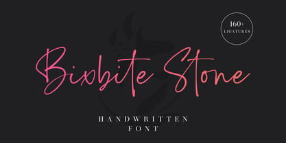 Bixbite Stone is a elegant and flowing handwritten font. 160+ ligatures are included in this font. It is the best choice for creating eye catching logos, branding, wedding design, product packaging and quotes. Every letter has a unique and beautiful touch, which will make your design come alive!
 - HU Sansans KR by Heummdesign,
$25.00 HU Sansans KR is a San-serif Korean fonts. It is a solid and trendy full square typeface that contains powerful and bright energy. I created a young and bright feeling by making a blank at the bottom of the first consonant of the initial letter, and the curve of the first part continued the bright feeling of the font. By configuring 4 types of font families, the usability of typefaces has been increased.
 - Core Bori by S-Core,
$59.00 CoreBori is a soft Serif font. The Korean alphabet is designed into ovals, and it is also reflected in English alphabets. With oval shape and condensed width of initial and final consonants are distinguishing factors in hangul. Supported codepages are MS Windows 1252 Latin1 and MS Windows 949 Korean consisting of 11,172 Korean letters and Symbols except Chinese. We Suggest to use this font to fairy tale books, t-shirts, posters, logos and other items.
 - HU Sansans by Heummdesign,
$15.00 HU Sansans is a San-serif latin alphabet font. It is a solid and trendy full square typeface that contains powerful and bright energy. I created a young and bright feeling by making a blank at the bottom of the first consonant of the initial letter, and the curve of the first part continued the bright feeling of the font. By configuring 4 types of font families, the usability of typefaces has been increased.
 - Flexion Pro by Red Rooster Collection,
$60.00 Flexion developed out of design philosophy and ambigramatic artwork of John Langdon. Based on the contents in John’s book Wordplay, author Dan Brown hired John to create ambigrams for his forthcoming novel Angels & Demons. Mr. Brown was so impressed with his work he even named the main character Robert Langdon after John. After the success of Angels & Demons, Dan Brown wrote The Da Vinci Code. When the movie adaptation of that book was in the works, Dan suggested that John create titles for the movie based on ambigrams. John contacted Hal Taylor to create a font based on the lettering treatment to be used for the credits at the end of the movie. Unfortunately, it was decided that the film was running long and the original title concept was scrapped. By this time, Hal was well into developing a full type family, including small caps, alternate characters, lining and ranging figures. John was impressed with the way the design was turning out and decided that it had enough merit to be released as Flexion.
 - The "Joe DiMaggio" font, conceptualized by an artist named Chloe, embodies the swift, elegant essence of its namesake, the legendary American baseball player Joe DiMaggio. Reflecting DiMaggio's smoot...
- DecoTech is an evocative font that takes its inspiration from the Art Deco movement, which spanned from the 1920s through the 1940s. This period was renowned for its embrace of modernity and style, f...
- Fairlady by Studio Indigo,
$17.00 Fairlady is a somewhat chunky script font that is developed from my own handlettered brush letters. My idea was to design a bold cursive script font with a strong 1950's vintage feeling to it. Fairlady is a decorative and quite tightly spaced font with preserved legibility which makes it perfect for vintage cards, labels, posters, logos, packaging and more. It has multilingual support for most European countries.
 - American Signer by Dikas Studio,
$19.00 American Signer is a script brush font that inspired from traditional 1980’s Sign Painting. Made directly based on brush lettering and through a comprehensive digitization process, an American Signer was created that is suitable to help you get a sense of sign painting letter. American Signer comes with many ligature, alternate character and swashes that very suitable for makes logo, badge, label, packaging, certificate and other vintage design.
 - Technerd JNL by Jeff Levine,
$29.00 The quest for an identity in the 1980s world of personal computers is the best way to describe Technerd JNL, a retro-style monoline font with clinically mechanical letter structure and a personality only a dot matrix could love. Picture if you will columned reports, interoffice memos and other paper ephemera of the day with this perfect form-and-function typeface, simply reeking of early 80s know-how!
 - Temporal by E-phemera,
$20.00Temporal is one in a series of fonts designed for use in creating replica vintage newspapers. It is inspired by the nameplates of major metropolitan newspapers from the 1920s. Its rough character is apparent at headline sizes, and it remains nicely legible at small sizes. In addition to a complete international character set, it contains east and west coast variations for some letters, along with extra ligatures traditional for blackletter typesetting. - De Arloy by Storictype,
$16.00 De Arloy Typeface was inspired by art nouveau style from 1890-1910 which combining classic typography with awesome features bring classic touch on this decade :), it works well with normal size text but it works even better for large displays or short words. this is suit for : wine packaging, labeling, logo, classic shop, coffee shop, movie title, etc De Arloy Features Uppercase Lowercase Numerals & Punctuations Open Type featuring Ligatures
 - P22 Cigno by IHOF,
$24.95 P22 Cigno is a new digitization of the 1950s Italian typeface by Aldo Novarese for the Nebiolo foundry. This semi-formal script has a definite mid-century European flavor suitable for menus, invitations and poster work. Along with the accurate rendition of the regular weight, designer Colin Kahn has added a lighter companion font for another variation on Cigno. Both fonts feature a full Western European character set.
 - BLT Norfolk by Black Lab Type,
$12.00 Norfolk is a vintage-inspired font based on the styles found on packaging from the early 1900's. It evokes a genuine and timelessly crafted look from this period. Three styles are included in this family: Fill, Inline and Outline. The styles can be used together or layered to create a variety of vintage looks for any project. Norfolk works well as a header or title for branding, packaging or publications.
 - F2F HogRoach by Linotype,
$29.99The Techno sound of the 1990s, a personal computer, a font creation software and some inspiration had been the sources to the F2F (Face2Face) font series. Thomas Nagel and his friends had the demand to create new unusual faces that should be used in the leading german techno magazine Frontpage". Even typeset in 6 point to nearly unreadability it was a pleasure for the kids to read and decrypt the messages." - Braxia by Greater Albion Typefounders,
$8.95 Braxia is a pure and joyful piece of Art Deco Fun. It is a new face that is overflowing with the character of 1930s advertising, lively and yet with impact all at once, its idea for theater handbills and posters, parties or anything else where you want to encourage people to enjoy themselves. Braxia is offered in two faces, regular and embossed, and is a face to really have fun with!
 - Stenographer JNL by Jeff Levine,
$29.00 Sheet music for the song “The Little Thing You Used to Do” (from the 1935 motion picture “Go into your Dance” starring Al Jolson and Ruby Keeler) had its title set in what closely resembled Bank Gothic Condensed. [Bank Gothic was originally designed by Morris Fuller Benton for American Type Founders circa 1930.] This reinterpreted version is now known as Stenographer JNL, and is available in both regular and oblique versions.
 - Luxus Brut Sparkling by phospho,
$25.00 Luxus Brut Sparkling developed from sketches for a bolder version of Luxus Brut that I made for a poster design. Interventions like slightly tightening the (still generous) spacing and amplifying the contrast between thick and thin strokes ended in a complete rework of the original font. All the shapes have been redrawn in respect of their distinctive origin in mid 1900’s signage lettering. It has now even more timeless elegance!
 - Durable JNL by Jeff Levine,
$29.00 The front page of a late-1940s sales catalog for the [now defunct] Duro Decal Company of Chicago had its company name hand-lettered in a tall, condensed chamfered sans serif type design. Although chamfered lettering had been popular for decades, the way the "R" was shaped gave the letters a bit of an Art Deco influence, and this influence was carried through in the creation of Durable JNL.