158 search results
(0.013 seconds)
- Liberation Serif - 100% free

- Liberation Sans - 100% free

- Ex Libris by Fenotype,
$25.00 Ex Libris is a high contrasted Flared Serif font family in two weights. Ex Libris is a display type and it’s at its best in headlines, branding, packaging or as a logotype. Try adding some extra flair with Swash, Stylistic or Titling Alternates or wield any of Ex Libris’s 33 Discretionary Ligatures when typing in caps.
 - Fullfox Liberalism by Antonio Iaconesso,
$4.00 Liberalism is a sans-serif, grotesque and hybrid typeface that I created during the lockdown. Born as a pure design exercise, it has turned into something more.
 - PF Libera Pro by Parachute,
$79.00 PF Libera was designed at a time of leisure with no particular intention for commercial use. In fact it was offered in the beginning as a freeware. In 2001, designer Charis Tsevis was convinced that it may have some commercial value, so Parachute obtained the rights to sell this typeface. At that time, we did not even imagine what would follow. Since then, PF Libera is one of our most successful typefaces. We have seen it being used in very diverse applications. From publishing to advertising to banking, to transportation, to retail applications. Food, beverages, fashion, automobiles, tourism, the list goes on and on. In any way, this typeface is very personal, modern and provocative. It stays with you and definitely it brings along the message. PF Libera comes in 3 styles. One of them, 'Liberissima', was added later and is more loose than the other two. The new 'Pro' version is powered with 7 OpenType features and is carefully designed to include all languages that are based on Latin, Greek and Cyrillic.
 - Statue Of Liberty's Underwear by Vic Fieger,
$6.99Inspired by a handwritten Cyrillic placard seen in a book about the Soviet Union, Statue of Liberty's Underwear was envisioned as having been written with a very thick pen with a flat tip held horizontally. Additionally, the letterforms were sculpted to resemble lettering common in early 20th-century Russian constructivism pieces. A Cyrillic alphabet, or "azbuka", set was included in the font. - Gras Vibert Handtooled Capitals by Intellecta Design,
$34.95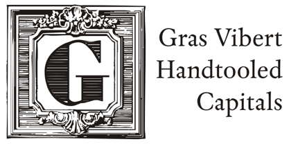
- Scriptelle by Jonahfonts,
$39.95 A script that has a freedom-ring to it, inspired by my personal feeling of liberty.
 - Lafleur by Resistenza,
$45.00 Inspired by the iconic Fenoglio-Lafleur Liberty building in the city of Turin, in an area with significant Stile Liberty buildings and New Gothic architecture. Lafleur is a decorative face with a remarkable art nouveau flair from 19th century. Perfect for creative contemporary uses in print and on screen. We recommend it for book covers, packaging, branding, editorial, web, advertising, apparel, purposes are endless.
 - Archibald BA by Bannigan Artworks,
$19.95 This typeface is inspired by the lettering of Archibald Knox (1864 – 1933), a designer for Liberty & Co. from the Isle of Man.
 - Caeli AT by Arctype,
$18.99 A typeface that invokes the beauty, strength and liberty of nature. Plant life is honoured with curves flowing from strong stems along with subtle references to Art Nouveau letter-shapes.
 - Groupie by Resistenza,
$39.00 The idea was to mix liberty lettering with 70’s psychedelic posters and dedicate a font to Groupies. Check out the alternative glyphs and icons included. Have fun and be a Groupie
 - Manifesto Bold by Solotype,
$19.95In digitizing this old font, we took great liberties with the design, removing some jarring elements. The result reads much more smoothly than the original, retaining the overall character of the original. Hope you don't mind, Mr. Beeler. - Trocadero JNL by Jeff Levine,
$29.00Trocadero JNL was inspired by an early 1950s photo showing the signage for the Trocadero Restaurant located on Liberty Avenue and 23rd Street in Miami Beach. Highly stylized and classically Art Deco in design, it is best used in short one- or two-word titles. - Trybuna by RMU,
$30.00 Inspired by Thannhaeuser's Liberta, completely fresh drawn and designed, Trybuna is a pronounced, freestyle serif font family, intended for body texts in print and for the web.
 - French Calligraphic JNL by Jeff Levine,
$29.00 French Calligraphic JNL is actually more semi-calligraphic in nature. Its name takes a descriptive liberty because of the sharp, angled pen strokes of the original hand lettered example found in the 1930s publication "100 Alphabets Publicitaires" by M. Moullet. The design is available in both regular and oblique versions.
 - Chronic by PintassilgoPrints,
$24.00 Chronically strong, yet pacific. Chronically bold, yet friendly. This font was at first inspired by a HAP Grieshaber work and soon incorporated elements from pieces by Willem Sandberg, two astonishing artists who lived through two world wars. They had to struggle for freedom and consistently manifested, with words, works and actions, their absolute love of liberty. Both were chronically free. As this font intends to be.
 - Belly Laugh by Comicraft,
$19.00 When we asked Dave Gibbons to name the typestyle he created for the sound effects in GIVE ME LIBERTY, he must've thought we were kidding. So we humored him, and now you can get in on the joke when you order BELLY LAUGH and Dave's signature font for just $99. It's a rib-tickler alright, and it's also available separately for those of you who like to laugh alone.
 - Stateside by Studio K,
$45.00 Stateside is a bold condensed serif with a vintage feel. It has an urban and, I like to think, urbane character which puts me in mind of classic Thirties architecture like the Rockefeller Centre or the Empire State Building. I did consider calling it Rockefeller, but the family might think it a bit of a liberty, and I can’t afford to get into a copyright battle with them!
 - BM Breitfette Unziale by Biliktu Foundry,
$42.00 I was immediately fascinated with the font, Breitfette Unziale, used for Erol Büyükburç's Hop Dedik album cover when I discovered this album. I designed a completely brand new typeface that is inspired by it called Erol Unziale but I also wanted to digitize and revive this typeface since I couldn’t find a digital version of it anywhere online. I took some liberties with the original font and customized it to my liking. Here is my interpretation of Walter Haettenschweiler's font through digitization.
 - Swanstone by Zetafonts,
$51.00 Mario De Libero designed Swanstone while investigating XIX Century Old Style typefaces. Designs like Theophile Beaudoire’s Romana (1860) or Miller & Richard’s Modernized Old Style, that re-imagined the classical “Venetian” letterforms adding flared serifs and early Art Nouveau influences. In Italy, one of these fonts was Raffaello Bertieri’s Raffaello, which De Libero used as the starting point of his research in a contemporary retelling of these exuberant and sexily unsettling letterforms.
 - Silent Drama JNL by Jeff Levine,
$29.00 An ad in the April 19, 1919 edition of Motion Picture News for the (now lost) silent drama "Josselyn's Wife" featured some wonderfully stylized Art Nouveau hand lettering. Primarily a condensed character set with rounded serifs, there are a number of letters that take liberties in both width and character shape. Adding to this, [mostly vertical] parallel lines are cut through the characters to create a "striped' type of "double engraved' effect. Silent Drama JNL is available in both regular and oblique versions. **Uppercase
 - Ceres by Wilton Foundry,
$29.00 Ceres is has its roots in Cyan, our other font family. Like Cyan, Ceres has a complementary lowercase that provides more versatility than a classic Roman. It is arguably more elegant than Cyan with its accentuated serifs. The lowercase "e" and "g" give Ceres a distinct calligraphic personality. Ceres, the font, derived its name from Ceres the Roman goddess. In Roman mythology, Ceres is the goddess of growing plants (particularly cereals) and of motherly love. Ceres was usually equated with the Greek goddess Demeter. Ceres was the daughter of Saturn and Ops, wife-sister of Jupiter, mother of Proserpina by Jupiter and sister of Juno, Vesta, Neptune and Pluto. Ceres made up a trinity with Liber and Libera, who were two other agricultural gods. She also had twelve minor gods who assisted her, and they were in charge of specific aspects of farming.
 - Thima by Rosario Nocera,
$14.00 Thima is a display font inspired by the liberty style revisited to the present day, hence it is free from the canonical compositional standards that make up the majority of fonts. Its elegant shapes are available in two versions: solid and outline. Thima’s unique features are enhanced by the perfect fusion between irregular and fluid shapes that coexist with right angles. Despite being a display font, the lowercase version is suitable for short and long paragraphs of text, while for large titles the uppercase shows off all its potential.
 - JY Shapa by JY&A,
$45.00 Designed by Jure Stojan, JY Shapa—his first serif family for JY&A Fonts—has a wide-pen, calligraphic feel, with the upper half of the letters reasonably conservative to aid recognition, but the lower half more decorative and dynamic to achieve a specific rhythm. The italics are more dynamic, with the upper halves more flowing, with Stojan taking greater liberties with the design. Ligatures such as ct and st are included, as well as small caps for all weights. The JY Shapa fonts come with over 5,000 kerning pairs each.
 - Sidenty by Lady Rose,
$10.00 Sidenty is a wild calligraphy script. The typeface was drawn and created by Lady Rose between 2020 and 2021. Its open shapes are inspired by mid-century advertising, is full of life and emits liberty and optimism. The handwritten family consists of two weights: It is completed with a full alternate alphabet and a big set of ligatures, which together give the handwriting genuine dynamics and a natural flow. It has extensive lingual support, covering all European Latin scripts and contains all characters you'll ever need, including all punctuation and numbers.
 - Odaiba Script by Hanoded,
$15.00 I have been to Japan many times, but I have to admit that I have not (yet) been to Odaiba, so this font is a reminder that I should go there one day. Odaiba is a large artificial Island in the bay of Tokyo. It is a popular shopping and sightseeing destination and its sights include a copy of the Statue of Liberty and a mega-sized Gundam Robot. Odaiba Script is a handwritten font. I used a Sharpie pen on paper, so it is nice and thick. It comes with double letter ligatures and all diacritics.
 - Nacinth by Mans Greback,
$29.00 Nacinth is a wild calligraphy script. The typeface was drawn and created by Måns Grebäck between 2018 and 2020. Its open shapes are inspired by mid-century advertising, is full of life and emits liberty and optimism. The handwritten family consists of three weights: Nacinth Thin, Nacinth Medium and Nacinth Bold. Its multiple alternate alphabets gives the font a true handwritten feeling. Use it for a logotype, a greeting card or as a headline. The font contains all characters you'll ever need, including all punctuation and numbers. It has an extensive lingual support, covering all European Latin-based scripts.
 - ITC Peter's Miro by ITC,
$29.99ITC Peter's Miro is the work of New York designer John Peter. It was inspired by the letters used by Joan Miro in his paintings. No one used letterforms more frequently in his work than Joan Miro," says Peter. For his typeface, however, "considerable liberty has been taken with his [Miro's] original letters and missing characters have been added." The letters are a simple script, irregularly and almost crudely written, but bursting with energy. To give designers free rein with their creativity, Peter designed two complete versions of the alphabet in both upper- and lowercase, Peter's Miro and Peter's Miro Too." - Venis by Chank,
$99.00 On first impression, Venis is a traditional text typeface: clean, simple and elegant with nice contrast. On closer inspection, you'll notice nuances that add charm and wonder, much like its name (rhymes with "tennis"). Is this font a serif or sans serif? Hmmmm, it never really commits. Further design liberties were taken to create unique qualities in its characters, which are best exemplified by the signature lowercase y. This font family is optimized for print, and has worked beautifully for letterpress projects including wedding invitations and birth announcements. Venis will also work well in newsletters, brochures, proposals, magazines, books, and other text-heavy paper products, bringing creative elegance to your designs.
 - NewLibris by Hubert Jocham Type,
$39.00 The first version of Libris I designed in London in 1997 when I worked for Frank Magazine. Later Libris was used in the magazine for text and display. In 1999 Libris was chosen as the corporate typeface of Bally Switzerland. I also was involved in the design of the entire branding. NewLibris is the version that was published in my own shop. - What was the inspiration for designing the font? NewLibris is an elegant contemporary easy to read sans serif. It has a wide variety of weights and proportions that are easy to use in corporate branding and magazines. - What are its main characteristics and features? contemporary humanist legible sans serif - Usage recommendations: corporate branding and magazines and other publications
 - Bodoni Classic Free Style by Wiescher Design,
$39.50 Bodoni Classic Free Style is my really fat, high contrast free flowing, liberated designed, script-like non-script extension to my ever expanding Bodoni Classic family.
 - Duktus by Eurotypo,
$49.00 Duktus is a script typeface with a 1940’s flavour. It is a delicate script with letters not quite connected, having large, flourished capitals and small lowercase with long ascenders and descenders. It has a crisp, precise appearance, but is not rigidly formal. The design was inspired by the typeface Donatello by Wagner & Schmidt in 1935 and published by Società Nebiolo, Torino. Some other Influences: 1927 Trobadour by Wagner & Schmidt 1927 Liberty Script by Willard T. Sniffin 1933 Trafton Script by Howard Allen Trafton, 1937 Coronet designed by Robert Hunter Middleton Duktus fonts come with plenty of alternates small caps, old style numerals, ornaments and swashes. They include also CE language support.
 - Lockwood by Haiku Monkey,
$10.00 Lockwood is an all-caps display font that scales well to all sizes. Use it liberally on your posters, headlines, and anything else that needs some character, class, and flare.
 - Islander BT by Bitstream,
$50.99The hand-hewn Islander looks like it could have been liberated from granite blocks.These demonstrative letter forms leave no doubt when it comes to conveying your message, yet they remain playful. - Possible by K-Type,
$20.00 POSSIBLE is both sans and serif, either is possible. The typeface is a sans-serif impersonating a spur serif, or it’s a glyphic with the look and feel of a sans. This clean, contemporary family is inspired by Percy J Smith’s ’Petit Serif’ from 1928, and similarly takes inspiration from Johnston’s Underground, though more recent influences provide geometric and humanist elements that, together with the tiny micro-serifs, improve clarity and legibility. Spur serifs such as Petit Serif, Copperplate and Liberty are often caps-only fonts, but Possible contains a lowercase, as well as a full Latin Extended-A character set. Possible is available in five weights – Thin, Light, Regular, Medium and Bold – each supplied with a corresponding, optically-corrected italic.
 - Montecatini Pro by Louise Fili Ltd,
$35.00 Montecatini takes its cues from the elegant Stile Liberty travel posters of Italy in the early 1900s. In its successful first release by Louise Fili Ltd in 2017, the typeface introduced distinctive ligatures typical of the time when Art Nouveau emerged as a worldwide phenomenon. Now Montecatini has been expanded into 24 alluring styles, spanning 6 weights and 4 widths. With the addition of these new styles, Montecatini has a dynamic capacity for comprehensive use and pairing. Everything looks better in Montecatini, from book jackets to monograms to packaging and logos—and the wide selection of ligatures, weights, and widths makes copyfitting a delight. Montecatini Pro’s ligatures are setup as contextual alternates. If you would like to try out Montecatini Pro’s ligatures or learn more about the font, please visit: https://www.louisefili.com/montecatini-pro
 - P22 FLW Exhibition by P22 Type Foundry,
$29.95 This font set is the second in a series from P22 Type Foundry based on the lettering styles of Frank Lloyd Wright. Created in 1931, the Exhibition lettering was intended primarily to accompany Frank Lloyd Wright's exhibition drawings and models. Many of the 72 Extras were designed to form continuous linking borders. Combinations of these geometric forms can provide endless variations of decorative elements in the style of Frank Lloyd Wright. Many of these images were based on Mr Wright's "Saguaro Forms and Cactus Flowers" illustration for an unused Liberty magazine cover of 1926. Other imagery in this set was derived from assorted geometric designs by Wright. Exhibition Regular, Light, and Bold have been remastered and now contain almost 400 characters including support for Western and Central European languages.
 - Cut Sans Serif by Aksharasarovara,
$25.00The thought behind this font was not to join vertical, horizontal and diagonal stems. Each stem is designed separately and arranged in a good manner to create glyphs. Something different from tradition; liberal, but in the limit. - Svolta by Stefano Giliberti,
$15.00 SVOLTA is a font family designed by Stefano Giliberti — each character handwritten on paper to form something truly unreplicable, a reinterpretation and celebration of blackletter Germanic typefaces. But its uniqueness goes beyond form: SVOLTA integrates in its styles PARTITA 1990, a pixel typeface aiming in the opposite direction of time, the present and future, resulting in a duo that adds personality and depth to your designs.

