3,473 search results
(0.015 seconds)
- Hand Real by Alit Design,
$15.00 Hand Real This font is inspired by the signature that makes writing cool and unique. The limp and natural monoline script style is perfect for a young, bold and cool design. Hand Real font is perfect for designs with a girly, love and relaxed concept. Very well applied to wedding invitation card designs, logotypes, business card designs and so on.
 - Lighthouse Treasure by Letterhanna Studio,
$19.00 "Lighthouse Treasure" is an enchanting handwritten sans-serif font designed with a playful and informal touch, making it an ideal choice for projects with a kids' theme. This font combines the relaxed charm of informal handwriting with a touch of whimsy, perfect for capturing the imagination of young audiences. Whether you're working on children's book covers, playful posters, or vibrant educational materials
 - Antiokhia by Allouse Studio,
$16.00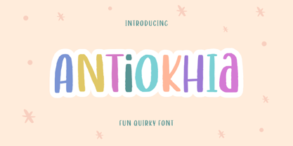 Antiokhia a Playful Quirky Font that will give you an playful, lovely and young impression. Antiokhia is perfect for any tittles, logo, product packaging, branding project, megazine, social media, wedding, or just used to express words above the background. Antiokhia also come with Multi-Lingual Support. Enjoy the font, feel free to comment or feedback, send me PM or email. Thank You!
 - Nouveau Nights JNL by Jeff Levine,
$29.00 The deep well of creativity that is the era of the hand lettered sheet music title page brings forth Nouveau Nights JNL. Re-drawn from a period example of the 1920s, this titling font perfectly captures the warm "human" look of pen and ink lettering, long before the advent of "perfect" digital type.
 - Elegeion Script by Patricia Lillie,
$29.00Built of all straight lines, Elegeion Script -- inspired by retro printers' scripts with a dash of calligraphy and handwriting thrown in -- mimics the imperfections and irregularities of old letterpress printing. Even better, it comes with lots and lots of swashy alternate characters and ligatures, including a full set of "long s" ligatures. - Oksana Sans Narrow by AndrijType,
$33.00 Oksana Sans Narrow is a space-saving addition for Oksana Sans Roman faces. In six weights from Thin to Heavy it works well in long as in short texts. Supports Western, Central, Baltic Latin and European Cyrillic codepages. Old-style digits, some ligatures, alternative characters and Ukrainian hryvnia sign are also included.
 - Fichte Fraktur by RMU,
$25.00 Walter Tiemann’s Fichte-Fraktur, released by Klingspor in 1934, has come to life again. This font contains the traditional long s which can be accessed by either the OT feature historical alternatives or by typing [alt] + b. Two framing elements can be reached by typing [alt] + shift + p and [alt] + p respectively.
 - Andralis ND by Neufville Digital,
$45.25 Andralis was designed by Ruben Fontana in tribute to the designer Juan Andralis. Its handcrafted, strong and robust appearance, maintains at the same time a friendly and human tone. It was specifically designed to perform well in long texts, also offering excellent results in headlines. Andralis is a Trademark of BauerTypes SL
 - Rambla by TipoType,
$31.90 Rambla is a humanist sans for medium-long texts. It’s slightly condensed, with a generous x-height and short ascender/descenders. Its proportions have as objective to gain space in height and width. It’s elegant at large sizes and legible at the same time, with a lot of rhythm in small sizes.
 - RMU Trifels by RMU,
$35.00 RMU Trifels is a revival of Heinrich Wieynck’s great design which was released by Bauer in 1905. This beautiful Art Nouveau font comes with a long s and a historical form of the letter H. Border and adorning elements were added which you can reach by typing [alt] + P and [alt] + p.
 - Marky Marker NF by Nick's Fonts,
$10.00Here's a nifty single-stroke marker font based on the work of Mike Stevens, long-time contributor to Signcraft magazine. Clean, crisp and stylish, it's the perfect choice for appealing subheads. This font contains the complete Latin language character set (Unicode 1252) plus support for Central European (Unicode 1250) languages as well. - Aldo Manuzio by RMU,
$30.00 This 1897 Schelter & Giesecke in-house design was carefully redrawn, extended and redesigned for modern usage. It is a remarkable font for book covers, film and video titles, ads and much more. This font contains a 'long s' and its ligatures which can be reached by the OTF historical feature and ligatures.
 - Calling Card JNL by Jeff Levine,
$29.00In today's day and age, the term "calling card" refers to a prepaid means of making long distance phone calls. In a more gentler time, the calling card (similar to a business card) was what a gentleman presented to a housekeeper or butler when visiting (calling) on a friend or business contact. - Scrivano by Outras Fontes,
$19.95 The Scrivano family was designed by Ricardo Esteves Gomes, inspired by some handwritings from the Middle Ages and Renaissance period. There are four elegant organic font styles (Regular, Italic, Bold & Bold Italic) that can be very useful to compose long or short texts in graphic standards that need some 'old style' feeling.
 - Calling Cards by Ana's Fonts,
$12.00 Calling Cards is simple and clear, slightly condensed sans serif font family in 3 styles: Regular, Italic and Bold. Each font includes ligatures and stylistic alternates. Calling Cards looks great in quotes, logos, print, and social media, and is perfect for both short and long texts, at small and large font sizes.
 - Concordia by RMU,
$30.00 In 1915 the Leipzig based foundry Heinrich Hoffmeister released the bold condensed version of its Sensation font family which is the most outstanding. The letters f, l and the long s have stylistic alternatives. To get access to all ligatures it is recommended to activate both OT features Standard and Discretionary Ligatures.
 - Dining Menu JNL by Jeff Levine,
$29.00 A 1930s menu from a restaurant with locations in both Long Island and Miami Beach called the “Roadside Rest” sported on its cover some very unusual Art Deco outline lettering. Adapted and slightly modified for typographic purposes, the font is now available as Dining Menu JNL in both regular and oblique versions.
 - Anca by DizajnDesign,
$49.00 Anca typeface started as a comission work for Fest Anca, an international animation festival. They needed something to complement the corporate identity of the festival. Inspiration came from a sketch made by my friend long time ago, which had a tremendous potential. As letters were digitized and the basic alphabet was completed, a very practical and universal typeface resulted. The whole type family has a playful and simple look with rounded stroke endings as well as long ascenders. The construction skeleton uses the minimum number of strokes and as a consequence, some original letter shapes (Q, w, j, &, A, §) were produced. Despite the fact that most letter shapes are based on geometry, some strokes are intentionally irregular, which creates a very natural feeling. Anca is appropriate for setting short paragraphs, headings and big inscriptions.
 - Utily Sans by Latinotype,
$39.00 Utily Sans emerges from the question: "What would the world be like if Paul Renner had had greater inclination towards humanism rather than geometry?" Utily Sans glyph proportions and shapes make it suitable for long-form text. This typeface shows geometric simplicity with humanist shapes. It looks like Futura, but has a feel closer to Garamond. Utily Sans is composed of 6 weights with their matching italics, an alternate character set that brings it back to its geometric origin, uppercase discretionary ligatures for expressive titles, as well as small caps, lining figures and old style numbers. These features make the font well-suited for large and small sized compositions, for short or long text. Utily Sans is the first Latinotype font with Cyrillic support, additional to the usual support for over 200 Latin-based languages.
 - Magnetic Pro by Mostardesign,
$25.00 Magnetic Pro is a typeface inspired by typewriter characters with a mechanical aspect. Equipped for professional typography, this font family has many OpenType features such as small caps, case sensitive forms, tabular and old style figures, pro kerning, circled numerals, ligatures, and extra graphics. It comes in 8 weights with corresponding italics and it's suited for multiple purposes including display and editorial use, especially for advertising, long text, packaging and branding. Magnetic Pro has true italics with a 'mechanical script' aspect to give more style in long texts. It has also an extended character set to support Central and Eastern European as well as Western European languages. Magnetic Pro has also an extra graphics style for those who wants to add catchwords, special titles, arrows and geometric shapes to their creative projects.
 - Marlon Pro by Mostardesign,
$25.00 Marlon Pro is a soft sans serif font family characterized by its contemporary aspect and its warm touch. It provides advanced typographical support with features such as case sensitive forms, small caps, ligatures, alternate characters, fractions, slashed zero, circled gures, pro kerning...It comes with a complete range of gure set options – oldstyle and lining gures, each in tabular and proportional widths. It comes in 9 weights with corresponding italics and it's suited for multiple purposes including editorial use, web font, apps, digital ads, ebook, and also for advertising, long text, packaging and branding. As a modern sans serif font family, Marlon Pro Sans has true italics to give more style in long texts. It has also an extended character set to support Central and Eastern European as well as Western European languages.
 - Montauk by profonts,
$51.99 Montauk Pro is named after a small village in Suffolk County, New York on the South Shore of Long Island. It is the easternmost area in Long Island, and thus the easternmost area in New York State. It is home to Montauk Point State Park, site of the Montauk Point Lighthouse. It is named after the Montauk Indians. Montauk Pro is a casual, jaunty and quite beautiful handwriting script. It comes with six styles as light, light italic, regular, regular italic, bold and bold italic, each style with about 1.000 characters covering the complete Latin glyph set for West and East including Baltic and Turkish, including a large selection of ligatures, character combinations and alternates to make this beautiful script design a perfect font for OTF-savvy applications like e.g. InDesign or Quark Xpress 7.
 - Overnight Oats by Hanoded,
$11.00 I recently walked part of the South West Coast Path in the UK. A couple of days in the hike, I came across a small cafe and I decided to have an oat latte (I am lactose intolerant). Since it was early in the morning, the breakfast menu was out and one of the items I noticed was ‘Overnight Oats’. I normally cook my oats with some lactose free milk and water, but apparently you can soak them overnight, add fruit and nuts and eat it like that. I tried it, it’s ok, but I think I prefer the cooked version. Overnight Oats is a bit of an odd font: it is very higgledy piggledy, yet legible and unique. If you want something out of the ordinary, then this may be your font!
 - Montecatini Pro by Louise Fili Ltd,
$35.00 Montecatini takes its cues from the elegant Stile Liberty travel posters of Italy in the early 1900s. In its successful first release by Louise Fili Ltd in 2017, the typeface introduced distinctive ligatures typical of the time when Art Nouveau emerged as a worldwide phenomenon. Now Montecatini has been expanded into 24 alluring styles, spanning 6 weights and 4 widths. With the addition of these new styles, Montecatini has a dynamic capacity for comprehensive use and pairing. Everything looks better in Montecatini, from book jackets to monograms to packaging and logos—and the wide selection of ligatures, weights, and widths makes copyfitting a delight. Montecatini Pro’s ligatures are setup as contextual alternates. If you would like to try out Montecatini Pro’s ligatures or learn more about the font, please visit: https://www.louisefili.com/montecatini-pro
 - Grand Hotel Pro by Stiggy & Sands,
$39.00 Our Grand Hotel Pro finds its inspiration from the title screen of the 1937 film “Cafe Metropole” starring Tyrone Power. This condensed upright connecting script has a classic flair and weight to it that feels subtly tied to Holiday and Bakery themed designs, even though it can work outside that genre. Stylistic Alternates offer a non-swash set of Capitals, and a SmallCaps feature gives this upright script an exciting visual twist. Elegant, reserved, sophisticated, and yet festive all at once. Grand Hotel Pro is a style revival that still finds a strong visual appeal today. Opentype features include: - SmallCaps. - Full set of Inferiors and Superiors for limitless fractions. - Tabular, Proportional, and Oldstyle figure sets. - Stylistic Alternates for less stylized traditional Capitals. - Contextual Alternates for some initial and final forms.
 - Salo by Borutta Group,
$39.00 SALO – is a hybrid of two Italian typographic worlds. The serif version refers to the beautiful and sophisticated typefaces found on the signs of cafes, restaurants, and fashionable boutiques. Its complemented by the sans variant, inspired by Italian modernism and road signage. All styles are based on the same core but with a totally different expressions. The biggest challenge during the project was designing all of the glyphs compatible to work as a 100% variable font. In the OTF version, SALO has 4 varieties: Serif, Semi Serif, Semi Sans and Sans. The family of these typefaces is suitable both for posters, magazine headlines, and branding purposes where the character will count. It is worth experimenting and combining different varieties with each other. (This font cannot be used to create a logo with the phrase "FRANCO").
 - WildSong by Scholtz Fonts,
$19.00 WildSong was inspired by the exuberant flight and beautiful song of birds. While most brush scripts take their cue from mid-twentieth century samples, WildSong is a fresh, contemporary alternative. WildSong reflects a dynamic interplay between dark and light, creating a sense of drama while hinting at a calligraphic background. Words suggest a baseline, yet are not bound by it. Letters interweave in a seemingly random dance, sometimes connecting smoothly, then breaking that connection as a calligraphic scribe does intuitively. Exuberant swash alternatives to uppercase letters, as well as ligatures can be accessed through both the type and glyph palettes. The font contains over 235 characters - (upper and lower case characters, punctuation, numerals, symbols and accented characters are present). It has all the accented characters used in the major European languages.
 - Di Mare by Ksenia Belobrova,
$49.00 Di Mare is a layered script inspired by Italian restaurant and cafe signs. It’s about delicious food and the joyful atmosphere of traveling: freedom, sea, fresh wind and warm sun. This font family has three styles: Regular, Line, Shadow. You can combine and overlay them to get different effects. Di Mare works well for menu, packaging, clothes, signs, magazines, and as a starting point for lettering and logos. Di Mare is designed with hundreds of contextual alternates and ligatures. It makes all connections look natural and harmonious. Di Mare supports most European languages, has small capitals, numbers, fractions, currency and mathematical signs. All contextual alternates are built into the “Liga” feature that is turned on by default. However, when your work with typeface, please make sure that “Liga” is turned on.
 - Ah, Berlin Email by Peter Wiegel, a font that dons its typographic trench coat and stylishly strides through the digital streets of Berlin, casting an air of retro-yet-futuristic sophistication. Craf...
- Chemin De Fer NF by Nick's Fonts,
$10.00The basic letterforms for this typeface were found on a 1920s French poster for Les Arts de Feu by an unnamed artist. The stark geometric forms have been dressed up with an outline treatment, a drop-up shadow and a non-traditional small cap arrangement to make it even more striking, in a spooky kind of way. Both versions of the font include 1252 Latin, 1250 CE (with localization for Romanian and Moldovan). - Tiddly Winks NF by Nick's Fonts,
$10.00This dotty delight, with its exceptional x-height, is based on handlettering presented in one of Hal Martin’s many Idea Books for Signmen, Artists and Displaymen, published in the 1930s. The ball terminals on several letters in the original alphabet have been enlarged to punctuate the page with dancing dots, suggesting the game which gives this typeface its name. Both versions of the font include 1252 Latin, 1250 CE (with localization for Romanian and Moldovan). - Plus De Vagues NF by Nick's Fonts,
$10.00The original release notes from England’s Stephenson Blake Type Foundry say it all: “a type of some waywardness in design, judged from any typographical standard…a type that seems unable to decide whether to be a roman or a script." Stephenson Blake called their release "Recherché"— sought after or in great demand, which seems quite appropriate. Both versions of the font include 1252 Latin, 1250 CE (with localization for Romanian and Moldovan). - Gasa Script Reg by Gasarian,
$19.00 Gasa Script est une police "faite main", d'après ma propre écriture manuscrite. Elle permet d'ajouter une touche manuscrite à n'importe quel projet. On peut associer la police avec des Dingbats, pour créer des rébus par exemple. N'hésitez pas à vectoriser les 89 dingbats (très imagés) pour jouer avec, et un conseil, gardez toujours la palette "glyphes" ouverte. Et si vous ne trouvez pas votre bonheur parmi ces Dingbats, je peux en dessiner sur commande !
 - Saxo by Eurotypo,
$35.00 The Saxo family is based on the typefaces of the twenties and thirties, where through the Art Deco and Futurism were built the foundations of the modern movement. Designed from basic geometric shapes (triangle, circle and square). This font transmits his solid character and modern spirit, through 470 glyphs, including Opentype features like ligatures, stylistic alternates and borders based on the geometry of the typeface. All Saxo fonts come with CE languages support.
 - Deux Chasses NF by Nick's Fonts,
$10.00American Type Founders released the pattern for this typeface under the name "Thermotype". In the days of cast-metal foundry type, copyfitting headlines could prove problemmatic at times; this typeface, with a wide uppercase and narrower lowercase of exactly the same “color”, allowed stacked lines of type to be composed with uniform width. Clean, crisp and practical. Both versions of the font include 1252 Latin, 1250 CE (with localization for Romanian and Moldovan). - Fiscal by Hackberry Font Foundry,
$24.95 This is a squared sans serif font family developed out of a taller Bank Gothic model plus a true lower case with many OpenType features and over 600 characters: Caps, lower case, small caps, ligatures, discretionary ligatures, swashes, small cap figures, old style figures, numerators, denominators, accent characters (including CE), ordinal numbers (1st-infinity: lining and oldstyle), and so on. It is designed for text use in body copy. For display tighten the tracking.
 - Osiyo Dohitsu NF by Nick's Fonts,
$10.00This rugged typeface is based on letterforms in the Cherokee Syllabary, reputedly devised by a gentleman named Sequoyah in the early nineteenth century. In addition, Native American petroglyphs—some authentic Cherokee designs, some from other tribes—are included in several positions. The name of the typeface, however, is authentic Cherokee, and can be loosely translated as “Yo! Wuzzup?” Both versions of the font include 1252 Latin, 1250 CE (with localization for Romanian and Moldovan). - Funky Tut NF by Nick's Fonts,
$10.00Two handlettered typefaces from J. M. Bergling’s 1914 classic, Art Alphabets and Lettering collided to produce this lively and unusual combination. The caps were originally called "Morocco", and the lowercase are taken from his Keramic Text. The result suggested more of an Egyptian flair, in an offbeat kind of way, and so it got its name. Both versions of the font include 1252 Latin, 1250 CE (with localization for Romanian and Moldovan). - Yum Yum NF by Nick's Fonts,
$10.00The Cleveland Type Foundry strikes again, with this delightful little number from their 1893 specimen book, originally named "Mikado". This version takes its name from one of the characters in the Gilbert and Sullivan operetta of the same name, and the name aptly describes the tasty nature of this frolicking face. Both versions of this font include the complete Latin 1252 and CE 1250 character sets, with localization for Romanian and Moldovan. - Lateral Incised NF by Nick's Fonts,
$10.00Gravure was designed by Morris F. Benton in 1927 for American Type Founders and was also released in 1929 by the London foundry of C. W. Shortt. This luminous face has a slightly naïve charm seldom found in incised typefaces. Ornamental and engaging, it’s a perfect choice for headlines with warmth and grace. Both versions of the font include 1252 Latin and 1250 CE (with localization for Romanian and Moldovan) character sets.