10,000 search results
(0.198 seconds)
- GirderSuper by Wooden Type Fonts,
$15.00 A heavy slab serif font very useful for display.
 - Antique 7 by Wooden Type Fonts,
$15.00 An Egyptian unbracketed heavy serif font, largely for display.
 - Pantext by Jonahfonts,
$25.00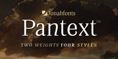 An unusual serif font with a slightly unconventional atmosfere.
 - Gyant by Typotheticals,
$8.00Developed from an earlier sans serif font called Mechanihan. - Looking Glass by SoftMaker,
$9.99 Looking Glass is a serif typeface published by SoftMaker.
 - Dooddle by Gerald Gallo,
$20.00 Dooddle is a casual hand-lettered serif outline font.
 - BF Fiona Script by BrassFonts,
$36.00See also BF Fiona Serif and BF Fiona Slab. - Nagato by Ezequiel Filoni,
$10.00 Nagato, simple, clean and elegant sans serif, pseudo-stencil.
 - Happyjamas by PizzaDude.dk,
$20.00Happyjamas is a playful serif font - the pizzadude way! :) - Mikraot MF by Masterfont,
$59.00 Serif super classic font, high legibility and subtle contrast.
 - DrumagStudioNF, a font crafted by Nick Curtis, is a true representation of vintage charm meeting modern design sensibilities. This typeface stands out for its bold and distinctive character shapes th...
- Corpid by LucasFonts,
$49.00 The name Corpid derives from “Corporate Identity” — which is what this family of low-contrast sans-serifs was made for. Corpid was originally commissioned by Studio Dumbar in the Netherlands as a corporate typeface for the Dutch Ministry of Agriculture, Nature Management and Fishing. The font was designed to replace the existing standard typeface (a well-known business-like sans-serif) to provide the organization with a unique and strong identity. Although it was designed to fit strict technical requirements, Corpid has a personality all of its own. This was in part a result of what Luc(as) calls “creating tension” between the inner and outer curves of each character. “I tend to put a little more diagonal contrast into fonts than is the case in most neutral sans serif fonts. This brings a certain humanistic touch to the typeface. Much more subtle here than in Thesis – but although it is almost invisible, it is still palpable.” Corpid was gradually expanded into a five-weight, three-width family. The new Corpid SemiCondensed has double functionality. It is a no-frills, compact headline font that offers optimum legibility in sizes from small to huge. It is also a great space-saving text typeface for magazines, newsletters or annual reports: economic, versatile, and provided with several different numeral sets. In this OpenType type version, all weights come with Small Caps. With its wealth of numeral styles and complete character sets (including Central European) the Corpid family is now well equipped to tackle the most complex of typographic tasks.
 - Optima Cyrillic by Linotype,
$65.00Many typefaces are distinctive or attractive at the expense of legibility and versatility. Not so the Optima® family. Simultaneously standing out and fitting in, there are few projects or imaging environments outside of its range. Although Optima is almost always grouped with sans serif typefaces, it should be considered a serifless roman. True to its Roman heritage, Optima has wide, full-bodied characters – especially in the capitals. Only the E, F and L deviate with narrow forms. Consistent with other Zapf designs, the cap S in Optima appears slightly top-heavy with a slight tilt to the right. The M is splayed, and the N, like a serif design, has light vertical strokes. The lowercase a and g in Optima are high-legibility two-storied designs. Optima can be set within a wide choice of line spacing values – from very tight to very open. In fact, there are few limits to the amount of white space that can be added between lines of text. Optima also benefits from a wide range of letter spacing capability. It can be set quite tight, or even slightly open – especially the capitals. If there are any guidelines, Optima should be set more open than tight. It’s not that readability is affected that much when Optima is set on the snug side; it’s just that the unhurried elegance and light gray typographic color created by the face are disrupted when letters are set too tight. Optima is also about as gregarious as a typeface can be. It mixes well with virtually any serif design and a surprisingly large number of sans serif faces. The Optima family is available in six weights, from roman to extra black, each with an italic counterpart. In addition, the family is available as a suite of OpenType® Pro fonts, providing for the automatic insertion of small caps, ligatures and alternate characters, in addition to offering an extended character set supporting most Central European and many Eastern European languages. When you’re ready to find its perfect pairing, browse these fantastic matches: Monotype Century Old Style™, Dante®, Frutiger® Serif, Joanna® Nova, Malabar™, and Soho®. - Optima by Linotype,
$45.99 Many typefaces are distinctive or attractive at the expense of legibility and versatility. Not so the Optima® family. Simultaneously standing out and fitting in, there are few projects or imaging environments outside of its range. Although Optima is almost always grouped with sans serif typefaces, it should be considered a serifless roman. True to its Roman heritage, Optima has wide, full-bodied characters – especially in the capitals. Only the E, F and L deviate with narrow forms. Consistent with other Zapf designs, the cap S in Optima appears slightly top-heavy with a slight tilt to the right. The M is splayed, and the N, like a serif design, has light vertical strokes. The lowercase a and g in Optima are high-legibility two-storied designs. Optima can be set within a wide choice of line spacing values – from very tight to very open. In fact, there are few limits to the amount of white space that can be added between lines of text. Optima also benefits from a wide range of letter spacing capability. It can be set quite tight, or even slightly open – especially the capitals. If there are any guidelines, Optima should be set more open than tight. It’s not that readability is affected that much when Optima is set on the snug side; it’s just that the unhurried elegance and light gray typographic color created by the face are disrupted when letters are set too tight. Optima is also about as gregarious as a typeface can be. It mixes well with virtually any serif design and a surprisingly large number of sans serif faces. The Optima family is available in six weights, from roman to extra black, each with an italic counterpart. In addition, the family is available as a suite of OpenType® Pro fonts, providing for the automatic insertion of small caps, ligatures and alternate characters, in addition to offering an extended character set supporting most Central European and many Eastern European languages. When you’re ready to find its perfect pairing, browse these fantastic matches: Monotype Century Old Style™, Dante®, Frutiger® Serif, Joanna® Nova, Malabar™ and Soho®.
 - Brown Chunkers by Letterhend,
$19.00 Brown Chunkers is an unique serif based display typeface containing many alternates, swashes, ligatures that can make your lettering/logotype become more interesting. The clean and neat of a serif combined with the swirl swashes makes this font one of a kind.
 - IC Havolane by Ironbird Creative,
$7.00 Havolane, A display serif font with a modern vintage twist, ideal for branding, headlines, and packaging. Havolane offers two styles, "Regular" and "Inked," to add versatility and depth to your designs. Perfectly complements sans-serif fonts, making your creations stand out effortlessly.
 - Ronsten by Fontron,
$35.00I know there are already quite a few Stencil type fonts but maybe this fills a niche. A very chunky serif stencil where the serifs are closely aligned and help form the the curves of the letters. An Italic is also available. - SK Reykjavik by Salih Kizilkaya,
$12.99 SK Reykjavik is a modern geometric font family with sans serif and slab serif characters. Supports all typographic elements you will need in Latin, Cyrillic, Greek, Turkish and Baltic alphabets. It contains 32 fonts and 26,208 glyphs and offers full support for ligatures.
 - Gurland by Sans And Sons,
$19.00 Meet our Gurland - Bold Retro Elegant Serif Font A captivating blend of boldness and timeless charm. This font exudes an elegant, vintage vibe with its strong, distinctive serifs and bold strokes. Perfect for making a statement with a touch of retro sophistication.
 - Eingrantch Mono by Harmnessless Type,
$30.00 Eingrantch Monospaced is a monospaced sans serif based typeface, inspired by an old Continental typewriter in sans serif version. Available in 7 weights from thin to black. Well suited for modern logotypes, branding, editorial design as well as web and screen design.
 - Nünooska by Okaycat,
$29.00 Nünooska is a sans serif type designed by Luke Turvey in 2014. The minimalist charm of Nünooska offers a soft unique style while remaining legible and clean. This rounded geometric sans serif is designed to look excellent for display or printed publication.
 - Town Meeting JNL by Jeff Levine,
$29.00 Town Meeting JNL (available in both regular and oblique versions) is a modified version of Mud Creek JNL (which was based on Tuscan Egyptian – a classic wood type). The side spurs were removed and the split serifs were replaced by slab serifs.
 - Roble by Latinotype,
$26.00 Roble is a Slab Serif Font, from a mix between Andes and Sanchez, following a harmony with both fonts one sans and one serif with a fresh and dynamic result. Roble is a family of 16 display fonts 8 weights plus italics.
 - Canabi by Avchi,
$12.00 CANABI - A classic serif font designed for logo, headline, and suitable for classic design. Combination between serif and condensed style! This is our first product and we will give you the best experience! Multilinguals Numbers & Punctuactions Ligatures Thank you for supporting us!
 - Master Script by Solotype,
$19.95An unusual angular vertical script. In late Victorian times it was seen mostly in advertising work, seldom in social stationery and announcements. - Reynard by Scriptorium,
$12.00Reynard is an arts and crafts period font with a bit of a Celtic inclination. Very well suited to formal, elegant titles. - Gothic Nesbitt by Wooden Type Fonts,
$20.00 An early gothic heavy sans serif font, largely for display.
 - Jamboks by PizzaDude.dk,
$20.00Jamboks is a grafitti and comic-inspired sans serif font. - Century PS Pro by SoftMaker,
$14.99 Century PS Pro is a serif typeface published by SoftMaker.
 - Maza by Gaslight,
$25.00 Clean, modern san-serif font for display and text application.
 - Pergamon by SoftMaker,
$9.99 Pergamon is a sans serif decorative typeface published by SoftMaker.
 - Meruba MF by Masterfont,
$59.00 Square and serif font - perfect for heavy headlines and signage.
 - Century Schoolbook Pro by SoftMaker,
$14.99 Century Schoolbook Pro is a serif typeface published by SoftMaker.
 - Taxi MF by Masterfont,
$59.00 A tender serif font with a round and soft look.
 - Openface No2 by SoftMaker,
$9.99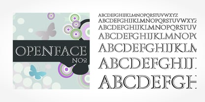 Openface No2 is a decorative serif typeface published by SoftMaker.
 - Broggitto by Letterara,
$16.00 Broggitto is a beautiful incredibly versatile serif font duo. It perfectly combines a beautiful serif with an elegant brush sans serif. This font was created with care and given a lot of features to make it look very attractive. These styles are ready to be used together and give your designs a modern and unique look! Broggitto font suitable for all design projects. This font is PUA encoded which means you can access all of the glyphs.
 - Rum Soft Sans by Trine Rask,
$30.00 Rum Soft Sans is a soft version of Rum Sans with softly rounded outer corners. Rum Soft Sans is a text & display family suitable for any purpose, any media, any size. A humanistic modular sans serif in five weights containing small caps, italic, swashes, alternative characters, old style, lining, tabular & proportional figures. Design date: 2001-2021 The complete family consists of Sans Serif & Serif in both sharp and soft version + the display fonts Rum Plakat & Rum Silhouette.
 - Abiah by Creativetacos,
$15.00 Abiah Sans Serif Typeface is a minimal sans serif font, which contains 5 weights and It features unique and modern sans serif look and feel. Perfect for gorgeous logos, titles, web layouts and branding. It looks gorgeous in all caps with a wide-set spacing if you want to try a classy look, or beautiful on its own in capital and lowercase letters for something completely timeless. Included Features: Font Weight: Regular, Thin, Light, Bold and Distorted
 - UUeirdie by Ingrimayne Type,
$7.95UUeirdie is weird. The Condensed-Light style was derived from the star-serifed font Asterx by replacing the star serifs with a rounded flare serif. Widening that style resulted in UUeirdie-Regular and the bold was then constructed to complement it. The warped version was a result of play with a font distortion program. Although the glyphs have sharp corners, they do not have straight lines. The UUeirdie faces are rough, irregular, and maybe a bit creepy. - Beona Display by Josstype,
$12.00 Boena Serif. Boena Serif.is a Serif Display Font with a modern, classy, fun, unique and versatile style. It looks amazing at display size and is easy to read in text size. This font also has lots of unique alternatives and binders that will make for stunning design projects. Marselid Serif. works well for branding projects, logos, wedding designs, social media posts, advertisements, product packaging, product designs, labels, photography, watermarks, invitations, or any project you are working on.