10,000 search results
(0.029 seconds)
- Bahlull by Alit Design,
$17.00 Presenting 🕌Bahlull Arabic Typeface🕌 by alitdesign. Bahlull Arabic Typeface is a beautifully crafted font product with a unique style that is perfect for religious and Islamic designs. This font is specifically designed to cater to the design needs of the Ramadan promotion, and it has a distinctively Islamic and religious vibe that is sure to impress your audience. One of the standout features of Bahlull Arabic Typeface is its support for PUA Unicode, which ensures that users can easily access all of the font's characters without any issues. The font also supports multilingual characters, making it perfect for use in various languages. With 861 glyphs characters, Bahlull Arabic Typeface offers a wide range of characters, allowing users to create stunning designs with various styles and options. The font's characters are well-crafted and easily readable, making it an ideal choice for any design that requires an Arabic font. As a bonus, Bahlull Arabic Typeface comes with Bahlull Dingbats font, which includes a collection of beautifully crafted Islamic symbols and ornaments. These extra glyphs can be used to add a unique and personal touch to your designs, making them stand out even more. In summary, Bahlull Arabic Typeface is a versatile and elegant font product that is perfect for Ramadan promotions and other religious and Islamic design projects. With PUA Unicode support, multilingual characters, 861 glyphs characters, and a bonus Bahlull Dingbats font, this product is sure to meet all of your design needs. Language Support : Latin, Basic, Western European, Central European, South European,Vietnamese. In order to use the beautiful swashes, you need a program that supports OpenType features such as Adobe Illustrator CS, Adobe Photoshop CC, Adobe Indesign and Corel Draw. but if your software doesn't have Glyphs panel, you can install additional swashes font files.
 - Aquus by phospho,
$39.00 Aquus is a contemporary all-caps display font that refines the elegance of a classic Didone with experimental interventions. Geometric elements and subtle details are found in its letters, many of which connect to ligatures. Most alternate glyphs can be switched automatically by use of the Stylistic Set function in OpenType-supporting applications, others you can access manually via the glyphs palette. You may try Aquus Linearis as a fashionable outline variant, which reveals its beauty especially when combined with imagery. Use them best for concise strings of characters, such as logotypes, packaging or magazine titles. Aquus Simplex is their sober companion, based on the same letterforms, minus the geometric ornaments and conjunctions.
 - Alana by Laura Worthington,
$49.00 Alana is a connected script that glows with casual elegance. Its inviting letterforms work well in settings such as letter-writing and menu details; even at small sizes. Set at display sizes, Alana’s strokes reveal rough edges evocative of ink on textured paper. Alana includes over 300 alternates, including swash capitals and ornamented forms to customize titles, headlines, packaging, and wordmarks. Alana includes 62 matching ornaments: botanical fleurons, birds, and cute lil’ bugs. See what’s included! http://bit.ly/2bXTLvP *NOTE* Basic versions DO NOT include swashes, alternates or ornaments These fonts have been specially coded for access of all the swashes, alternates and ornaments without the need for professional design software! Info and instructions here: http://lauraworthingtontype.com/faqs/
 - Piolin by JVB,
$13.00 Piolin So new. So different. Piolin is a memorable display font inspired by the circus universe. This typeface, which has the same name of the most renowned brazilian clown, is full of magical tricks like several characters alternates, swashes and discretionary ligatures. Please, explore the opentype features included in this typeface at their best and go deep inside the circus imaginary. Piolin is suitable for brand identities, book design, editorial design, campaigns, exhibitions and other promotional materials that seek a special flavour to stand out an astonishing message. If used in big sizes, Piolin reveals its marvellous details which make us feel bewitched by how carefully it is designed. Feel the magic up close!
 - Linotype Sansara by Linotype,
$29.99Linotype Sansara, from Swiss designer Grégoire Poget, is part of the TakeType Library, chosen from the entries of the Linotype-sponsored International Digital Type Design Contest 1999 for inclusion on the TakeType 3 CD. This fun font is a type experiment behind whose oriental facade hide Arabic letters, recognizable only at second glance. This font displays generous, pointed ascenders and descenders as well as a bar-like emphasis on the upper third of the figures which connects lines and words and gives them a decorative look. Linotype Sansara reveals an astounding variety of details which bring to mind 1001 Arabian Nights, flowing gowns and snake charmers. This font is best for display in point sizes of 14 or larger. - Nomos Sans by Identity Letters,
$45.00 What is a brutalist typeface? The exact definition is anyone’s guess. Regardless, the Nomos superfamily is our take on the genre. Like the eponymous architectural style, Nomos is raw, direct, and honest. Its unrefined aesthetics reveal an orderly construction that is as firmly rooted in classic modernism as in the internet age—with simple, functional letterforms and the blunt convergence of diagonal and vertical stems. The Nomos Sans subfamily is a low-contrast neogrotesk with 18 styles and a set of 1000+ characters. A confident choice for fashion and finance, for apps and advertising: humble and expedient in body text, vigorous in display sizes. Has extra poise when paired with Nomos Slab.
 - TA Bankslab by Tural Alisoy,
$33.00 The building of the Northern Bank of St. Petersburg's Baku branch was built in 1903-1905. It was the first Art Nouveau-style building in Baku, Azerbaijan. Later the bank was transformed into the Russian-Asian Bank. After the oil boom in Baku in the 19th century, branches of many banks and new banks were opened in the city. The branch of the Northern Bank of St. Petersburg was among the first banks that was opened in Baku. N.Bayev was the architect of the building for the branch of the Northern Bank of St. Petersburg located at Gorchakovskaya 3 in 1903-1905. The building currently houses the Central Branch of the International Bank of Azerbaijan. My purpose in writing this is not to copy and paste the information from Wikipedia. What attracted me to the building was the word "Банкъ" (Bank) written in Cyrillic letters, which was also used in Azerbaijan during the Soviet era. The exact date of the writing is not known. Every time I pass by this building, I always thought of creating a font of this writing someday. I had taken a photo of the building and saved it on my phone. I did a lot of research on the font and asked a lot of people. However, some did not provide information at all and some said they did not have any information. I was interested in the history of this font but I do not know if this font really existed or it was created by the architect out of nowhere. If there was such a history of this font, I wanted to recreate this font and make it available. If not, I had to create it from scratch in the same way, using only existing letters on the building. Finally, I made up my mind and decided to develop the font with all letters I have got. It was difficult to create a font based on the word, Банкъ. Because in the appearance of the letters, the midline of the letters on A, H, K was very distinct, both in the form of inclination and in more precise degrees. The serif part of the letters, the height of the upper and lower sides, differed from each other. I don't know whether it was done this way when the building was constructed or it happened over time. I prepared and kept the initial version of the font. I took a break for a while. I started digging on the story of the font again. Meanwhile, I was researching and got inspired by similar fonts. Unfortunately, my research on the font's history did not yield any results. I decided to continue finishing up the font. After developing the demo, I created the font by keeping certain parts of these differences in the letters. In addition, I had to consider the development of letters in the Cyrillic, as well as the Latin alphabet, over the past period. Thus, I began to look at the appearance of slab-serif or serif fonts of that time. In general, as I gain more experience in developing fonts, I try to focus on the precision of the design for each font. In recent years, I specifically paid attention to this matter. YouTube channel and articles by Alexandra K.'s of ParaType, as well as, information and samples from TypeType and Fontfabric studios on the Cyrillic alphabet were quite useful. I gathered data regarding the Latin alphabet from various credible sources. I do not know if I could accomplish what I aimed at but I know one thing that I could develop the font. Maybe someday I'll have to revise this font. For now, I share it with you. I created the font in 10 styles. 7 weight from Thin to Extra Black, an Outline, Shadow, and Art Nouveau. The Art Nouveau style was inspired by the texture in the background used for the text on the building. The texture I applied to capital letters adds beauty to the font. If you like the font feel free to use it or simply let me know if your current alphabet doesn't support this font.
 - TA Bankslab Art Nouveau by Tural Alisoy,
$40.00 TA Bankslab graphic presentation at Behance The building of the Northern Bank of St. Petersburg's Baku branch was built in 1903-1905. It was the first Art Nouveau-style building in Baku, Azerbaijan. Later the bank was transformed into the Russian-Asian Bank. After the oil boom in Baku in the 19th century, branches of many banks and new banks were opened in the city. The branch of the Northern Bank of St. Petersburg was among the first banks that was opened in Baku. N.Bayev was the architect of the building for the branch of the Northern Bank of St. Petersburg located at Gorchakovskaya 3 in 1903-1905. The building currently houses the Central Branch of the International Bank of Azerbaijan. My purpose in writing this is not to copy and paste the information from Wikipedia. What attracted me to the building was the word "Банкъ" (Bank) written in Cyrillic letters, which was also used in Azerbaijan during the Soviet era. The exact date of the writing is not known. Every time I pass by this building, I always thought of creating a font of this writing someday. I had taken a photo of the building and saved it on my phone. I did a lot of research on the font and asked a lot of people. However, some did not provide information at all and some said they did not have any information. I was interested in the history of this font but I do not know if this font really existed or it was created by the architect out of nowhere. If there was such a history of this font, I wanted to recreate this font and make it available. If not, I had to create it from scratch in the same way, using only existing letters on the building. Finally, I made up my mind and decided to develop the font with all letters I have got. It was difficult to create a font based on the word, Банкъ. Because in the appearance of the letters, the midline of the letters on A, H, K was very distinct, both in the form of inclination and in more precise degrees. The serif part of the letters, the height of the upper and lower sides, differed from each other. I don't know whether it was done this way when the building was constructed or it happened over time. I prepared and kept the initial version of the font. I took a break for a while. I started digging on the story of the font again. Meanwhile, I was researching and got inspired by similar fonts. Unfortunately, my research on the font's history did not yield any results. I decided to continue finishing up the font. After developing the demo, I created the font by keeping certain parts of these differences in the letters. In addition, I had to consider the development of letters in the Cyrillic, as well as the Latin alphabet, over the past period. Thus, I began to look at the appearance of slab-serif or serif fonts of that time. In general, as I gain more experience in developing fonts, I try to focus on the precision of the design for each font. In recent years, I specifically paid attention to this matter. YouTube channel and articles by Alexandra K.'s of ParaType, as well as, information and samples from TypeType and Fontfabric studios on the Cyrillic alphabet were quite useful. I gathered data regarding the Latin alphabet from various credible sources. I do not know if I could accomplish what I aimed at but I know one thing that I could develop the font. Maybe someday I'll have to revise this font. For now, I share it with you. I created the font in 10 styles. 7 weight from Thin to Extra Black, an Outline, Shadow, and Art Nouveau. The Art Nouveau style was inspired by the texture in the background used for the text on the building. The texture I applied to capital letters adds beauty to the font. If you like the font feel free to use it or simply let me know if your current alphabet doesn't support this font.
 - Jorgey by Gatype,
$12.00 Jorgey's casual brush script has a nice texture and flow. Jorgey has many alternatives to make it look like real handwriting; four sets of lowercase and two sets of uppercase. suitable for design projects; logos, branding, posters, quotes, beautiful wedding invitations, beautiful stationery art, eye-catching social media posts, and cute greeting cards and other designs. It is unique, very natural and attractive
 - Stop by Linotype,
$29.99Stop is a heavy futuristic sans serif display font, designed by the famed Italian type designer Aldo Novarese. Stop's forms are vaguely stencil-like, and some of them only read as letters when used in combination with each other. Nevertheless, Stop has a real computer-technology" feel to its design. It should be used exclusively for headlines or logo work." - Sail Royals by Mas Anis Studio,
$17.00 Sail Royals! Handwritten font with a personal charm. Each letters was made with brushpen on real paper, then scanned and crafted to vector carefully to add strong characteristic. With quick dry strokes and signature style, Sail Royals is perfect for branding projects, homeware designs, product packaging - or simply as a stylish text overlay to any background image like quote images.
 - Knucklehead by Big Typephoon,
$20.00Once I ate a knuckle sandwich after saying some things about some guy's pregnant girlfriend. It turns out she wasn't pregnant at all. I felt like a real knucklehead. So I made this font. Use the font where ever you like. Just be sure you know what you are talking about, or you too could end up with knuckles flying at your head. - Seluas Handmade by Siwox Studios,
$10.00 Seluas Handmade is a bold and beautiful brush lettered font. It's perfect for using in ink or watercolour based designs or on its own as bold hand brushed lettering. Use it for websites, branding, weddings, social media, product design, stationery and advertising, etc. Seluas Handmade is versatile enough to add that natural nuance to any project where you need that to look real.
 - Kashima Brush by Abo Daniel,
$15.00 Kashima is brush font with Japanese style that made using the real brush pen. It looks very natural. This font is great for apparel, branding, logo, magazine, quotes, packaging, advertising, and more, that need a styling of a Japanese brush feel. Kashima is all capital font and includes punctuation, symbols, and numerals. It also has multilingual support. Thank you abo daniel
 - Relate by Panritype Studio,
$20.00 Relate is modern, elegant, beautiful script. it is made by real pen brush, and shaping carefully. It's perfect for logotype project, wedding invitation, social media headlines, birthday card, quotes, t-shirt and also match with other design project. Relate comes with natural handwriting ligatures and extra final word alternates and swashes that can make your project more beautiful and elegant.
 - Brushlie by Abo Daniel,
$13.00 Brushlie is urban font family that made with real brush and is ideal for logos, apparel, quotes, product packaging, or anything which needs a font with a natural brush taste. There are available 2 version - Brush - Solid and the swash make it compete Even though Brushlie is an uppercase font, the lowercase characters will give alternate for uppercase characters. Thank You Abo Daniel
 - Vtg Stencil Marsh by astype,
$36.00 The Vtg Stencil fonts from astype are based on real world stencils from several countries. The Vtg Stencil Marsh design was derived from 1 inch stencils, cut by a Marsh R machine. Marsh produced stencil machines since 1922 and was one of the most important manufacturers for such marking machines. The design is part of the American industrial heritage. PDF Specimen
 - White Sign by Ergibi Studio,
$20.00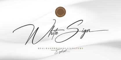 White Sign is Real Handwritting font presentation from Ergibi Studio. Inspired by beautiful writing that has a luxurious feel with additional swash lines perfect for branding, photography, invitations, quotes, watermarks, advertisements, product designs, social media posts, stationery, labels, and more! I hope you enjoy this font. If you have any questions please don't hesitate to drop me a message :) Big Thanks ~ Ergibi Studio
 - Murbia by PizzaDude.dk,
$20.00Murbia was written with a glimmer-pen which has left the letters with a grungy look. What's even better is that the font comes with loads of ligatures for both double letters/numbers and the most common letter combinations...just to make the font look more like real scribbled handwriting! You will need to use OpenType supporting applications to use the autoligatures. - Handmade Caslon JNL by Jeff Levine,
$29.00 Handmade Caslon JNL is a somewhat imperfect version of one of the many Caslon faces in use during the late 19th and early 20th centuries. Based on vintage source material, Handmade Caslon JNL is the right typeface for projects reflecting antiquity, a hand-made look or where slightly imperfect lettering adds a bit of the "real world" to the message.
 - Greatest Holiday by Abo Daniel,
$15.00 GREATEST HOLIDAY - the pencil font - is amazing natural font. It made based on real handwriting. It can be used for cafe or coffee shop menu lists on board, branding, photography, invitations, watermarks, advertisements, product designs, labels, product packaging, book content, quotes and more. It came with number & punctuation, multilingual support, and PUA encode Hope you like this product. Regards Abo Daniel
 - Khadash by NamelaType,
$19.00 Khadash is a slick Handwriting Brush Latin and Arabic font, made with natural strokes that resemble real handwriting. Khadash Arabic font is a separate with Latin characters as subfamily to reduce font size. There are two sets of Latin character choices in the form of letters, regular and alternate, Khadash is perfect for branding projects, product packaging, merchandise, advertising, quotes and more
 - dearJoe 3 by JOEBOB graphics,
$39.00 Finally it’s done! The DearJoe 3 ‘Ultimate handwriting’ font, composed of scanned handwriting which makes it look quite convincingly real. It contains over 500 characters, 200 of them ligatures. Typing your text with this font feels like old-school writing with a pen, especially since every word will be constructed of different letter combinations. Give it a try and you’ll probably be surprised…
 - TE Thuluth Golden 2 by Tharwat Emara,
$85.00 Amazing Font of THARWAT which is similar to calligraphy of THULUTH of a real calligrapher. I added many glyphs to get this feature and it becomes easier to a graphic designer to write with Arabic THULUTH font without real calligrapher. Golden2 is beautiful in Headlines of Arabic books and photos. Thuluth font (THARWAT EMARA THULUTH GOLDEN 2) distinguished by its beautiful artistic structures and ready-made sentences to help you design the designer designs and paintings easily. It also retains the beauty of its original Arabic calligraphy. This font can be used in titles of books, magazines and Quranic verses. Also for printing on clothes, Najaf and antiques. It is the first font that you can write complete sentences and Ayat of Quran with beautiful artistic structure like those written by the calligrapher. It also simulates the handwriting and no need to calligraphy it when you have this font.
 - Remora Sans by G-Type,
$39.00 Remora is an extensive new humanist sans serif which comes in 2 style variations, the effervescent Remora Sans and its corporate business partner Remora Corp . Both styles include 5 individual width sets ranging from the condensed W1 to the extra-wide W5. Furthermore, with an impressive 7 weights (Thin to Ultra) and true matching italics in each pack Remora is an ultra versatile super family comprising 140 individual fonts, perfect for any typographic assignment or design brief. Remora was designed by G-Type founder Nick Cooke. Both the Sans and Corp families share the same proportions, with the exception of certain key characters that change the overall appearance. Remora Sans is an exuberant and characterful typeface while Remora Corp, as its name suggests, is a businesslike typeface more suited to corporate typography. Quite early on in the design process Nick decided to give Remora Corp equal billing instead of incorporating these glyphs as alternates or a stylistic set that may get overlooked. “I created two separate families after learning a valuable lesson with one of my earlier typefaces, Houschka”, says Nick. “Houschka contained distinctive rounded A’s W’s and w’s, with ‘straight’ styles as character alternates. Even though style sets and alternates are easy to activate they are rarely used, so after many requests for customised versions of the fonts with the straight characters as defaults it was decided to create the separate ‘Alt’ family. So I cut straight to the chase with the two Remora variants and created two complementary families.” Both sets contain many shared letterforms, but it is the alternate characters that significantly alter the appearance of each font. Remora has been carefully designed for optimum legibility at large and very small sizes. Although fairly monolinear in appearance, especially in the lighter weights, particular attention has been paid to optical correction like the overshoots of the curved characters. Open counters and painstaking attention to detail (e.g. weight contrast between horizontal and vertical strokes, junctions of shoulders and stems etc) all boost readability and make Remora a great choice across all media. Remora Sans and Corp are ‘humanist’ rather than ‘geometric’ in style, meaning they’re not strictly based on rectangles and circles, resulting in a warm and friendlier feel. The slightly ’super-elliptical’ rounded forms create generously attractive curves. Remora has very distinctive italics in that they are only inclined by 8 degrees, but are not just based on slanted uprights. The italic styles are very alluring when used for display at large sizes and the good news is they come bundled free with their respective uprights. Each family also contains many OpenType features including proportional and tabular numbers, small caps, discretionary ligatures, plus five stylistic sets for ultra versatile typography.
 - Remora Corp by G-Type,
$39.00 Remora is an extensive new humanist sans serif which comes in 2 style variations, the effervescent Remora Sans and its corporate business partner Remora Corp. Both styles include 5 individual width sets ranging from the condensed W1 to the extra-wide W5. Furthermore, with an impressive 7 weights (Thin to Ultra) and true matching italics in each pack Remora is an ultra versatile super family comprising 140 individual fonts, perfect for any typographic assignment or design brief. Remora was designed by G-Type founder Nick Cooke. Both the Sans and Corp families share the same proportions, with the exception of certain key characters that change the overall appearance. Remora Sans is an exuberant and characterful typeface while Remora Corp, as its name suggests, is a businesslike typeface more suited to corporate typography. Quite early on in the design process Nick decided to give Remora Corp equal billing instead of incorporating these glyphs as alternates or a stylistic set that may get overlooked. “I created two separate families after learning a valuable lesson with one of my earlier typefaces, Houschka”, says Nick. “Houschka contained distinctive rounded A’s W’s and w’s, with ‘straight’ styles as character alternates. Even though style sets and alternates are easy to activate they are rarely used, so after many requests for customised versions of the fonts with the straight characters as defaults it was decided to create the separate ‘Alt’ family. So I cut straight to the chase with the two Remora variants and created two complementary families.” Both sets contain many shared letterforms, but it is the alternate characters that significantly alter the appearance of each font. Remora has been carefully designed for optimum legibility at large and very small sizes. Although fairly monolinear in appearance, especially in the lighter weights, particular attention has been paid to optical correction like the overshoots of the curved characters. Open counters and painstaking attention to detail (e.g. weight contrast between horizontal and vertical strokes, junctions of shoulders and stems etc) all boost readability and make Remora a great choice across all media. Remora Sans and Corp are ‘humanist’ rather than ‘geometric’ in style, meaning they’re not strictly based on rectangles and circles, resulting in a warm and friendlier feel. The slightly ’super-elliptical’ rounded forms create generously attractive curves. Remora has very distinctive italics in that they are only inclined by 8 degrees, but are not just based on slanted uprights. The italic styles are very alluring when used for display at large sizes and the good news is they come bundled free with their respective uprights. Each family also contains many OpenType features including proportional and tabular numbers, small caps, discretionary ligatures, plus five stylistic sets for ultra versatile typography.
 - Tropicane by Heyfonts,
$18.00 Tropicane - Stylish Typeface refers to a font that possesses a distinct and attractive aesthetic, often characterized by unique design elements, creative flair, and an overall fashionable or contemporary look. Stylish typefaces are crafted to make a visual impact and are frequently chosen for design projects where the typography plays a crucial role in conveying a specific mood, personality, or brand identity. Here's an in-depth explanation of the characteristics and significance of a stylish typeface: - Distinctive Design Elements: Stylish typefaces stand out due to their distinctive design features. This may include unique letterforms, creative ligatures, elegant serifs, or modern sans-serif shapes. The goal is to create a visually appealing and memorable set of characters. - Contemporary Aesthetic: The term "stylish" implies a modern and fashionable design. Stylish typefaces often incorporate contemporary design trends, keeping up with current aesthetics to ensure that they remain visually relevant and appealing. - Versatility: Stylish typefaces are often versatile, suitable for a variety of design applications. Whether used for branding, editorial design, websites, or marketing materials, these typefaces maintain their stylish appeal across different contexts. - Attention to Detail: A stylish typeface is characterized by meticulous attention to detail. Designers pay close attention to the shapes, proportions, and spacing of individual characters to create a harmonious and visually pleasing overall appearance. - Expressive Characters: Stylish typefaces can convey a sense of expressiveness and personality. This expressiveness can be achieved through unique letter shapes, playful elements, or the incorporation of design features that evoke a particular mood or emotion. Applicability to Branding: Brands often use stylish typefaces to create a distinctive visual identity. A stylish font can contribute to the overall brand image, helping to communicate the brand's values, tone, and style to the target audience. - Innovative Typography: Stylish typefaces are often at the forefront of typographic innovation. They may push the boundaries of traditional letterforms, experimenting with new shapes, styles, and arrangements to create a sense of novelty and creativity. - Readability and Functionality: Despite their emphasis on style, these typefaces generally maintain a balance between visual appeal and readability. Clear and legible letterforms are crucial, ensuring that the text remains accessible while still making a stylish statement. - Adaptability to Trends: Stylish typefaces are often designed with an awareness of design trends. This adaptability allows them to stay relevant over time, making them a popular choice for designers who want their projects to reflect a contemporary and stylish aesthetic. - Customization Options: Some stylish typefaces come with additional features, such as alternative characters, ligatures, or stylistic sets, offering designers the flexibility to customize the appearance of the text for specific design needs. In summary, a stylish typeface is a carefully crafted font that goes beyond mere functionality, aiming to enhance the visual appeal and expressiveness of the text.
 - Dom Loves Mary by Correspondence Ink,
$39.99 Dom Loves Mary has a baby brother! Check out Fratello Nick here: http://www.myfonts.com/fonts/correspondence-ink/fratello-nick/ The DomLovesMary font family has all you need to create unique, custom stationery products. THE INSPIRATION BEHIND THE DOMLOVESMARY FONT FAMILY: DomLovesMary is named in memory of Dominic and Mary Sementelli, Debi’s in-laws. Dom and Mary were opposites who were truly “made for each other”. A snazzy dresser, Mary was feisty, loved to dance, sing, and be the life of the party. Dom was cool, calm and collected and was happy to shine the spotlight on the love of his life. They balanced each other out in a really great way. Going through some of her in-laws old photos, Debi found their wedding album. She was struck by the beautiful look on their faces as they got ready to start their life together. She saw the excitement, joy and anticipation of them envisioning “Una Bella Vita!” (A beautiful life!) She decided to create a hand-lettered font with them in mind represented by two totally different lettering styles that were, like Dom and Mary, “made for each other”. It’s her way of honoring them and sharing their beautiful life with all of the couples just starting theirs together. They truly had “Una Bella Vita” and we hope you do too. WHAT'S UNIQUE ABOUT THE DOMLOVESMARY FONT FAMILY: The SCRIPT & TEXT FONTS are lettering styles that were made to compliment each other. With a vintage, classic feel, they will add elegance to your design, while the TEXT serves to offer support with easy to read simplicity. In addition to the standard character set, each of the uniquely styled script fonts includes a collection of flourished ornaments. Use them to create corners, headers or other embellishments to complete the look. And if you really want to fancy things up, we offer two sets of 72 additional flourishes that were specifically made to add to upper and lower case letters for easy customization. Dress them up with one, two or more. It’s like choosing simple pearls or piling on the glitz! Or combine several to create unique flourished ornaments of your own. To add even more panache, we're pleased to present our ready made set of most frequently used ADD-ON WORDS. Created with the wedding client in mind, this set of 66 includes envelope friendly titles: Mr and Mrs, Mr, Mrs, Miss, Ms, Doctor, the Doctors, as well as words to fill out your invitation suite: RSVP, Respond, Save the Date, Accommodations, Directions and more! Easily create Bride and Groom signs or Thank You cards or tags with the click of a key. Or use angled words like “and, at, to, on, for, from and of” to add a special touch to your large groups of copy. PACKAGES: We are pleased to have a variety of customers. From professional invitation designers to DIY brides, publishing companies and website / blog designers among others. So we've created packages to help fit their diverse needs. Purchase just one of our beautiful DomLovesMary SCRIPT fonts, each with its collection of included flourishes or the PRO VERSION complete with ALL THREE script fonts and a combined total of over 100 flourished ornaments. Add our TEXT font, a set of FLOURISHES or ADD-ON WORDS. Love the idea of customizing your letters with all the possible combinations? We offer a special price when you purchase both sets of flourishes. Or choose our Accoutrements Package containing both sets of FLOURISHES for letter customization as well as our ADD-ON WORDS. Want to have it all? The “DomLovesMary Total Design” package is for you. Each of these packages are offered at a 25% savings. WHAT PROGRAM WILL YOU USE?: All of the font options come in both Pro and Standard format fonts. For those with programs that can take advantage of OpenType features (click on the link to see if the program your using is one of them) the Pro fonts are for you. http://www.typotheque.com/fonts/opentype_feature_support/ For others without the ability to use Open Type features, we provide all of the script fonts that comprise the Pro Version as separate versions (Regular, Contextual and Stylistic). If you are using a program like Microsoft Word, and want all three script fonts, you can still purchase the Pro Version (a $50.00 savings), and install the individual fonts bundled in the Standard Fonts folder. We have set it up so they will appear separately as DomLovesMary, DomLovesMary Contextual and DomLovesMary Stylistic in your fonts list. Exciting news! In an effort to help our customers access all the goodies that are normally only available in Open Type Capable programs (like the flourished ornaments that come with our script fonts), we have found a simple application that allows you to do just that. For this reason, we've made sure to unicode all of our characters and glyphs so that they will work in this type of program. There may be others, but we checked this one out and found that it works. Check out PopChar
 - Adelphi PE by Rosetta,
$70.00 Adelphi is a geometric sans, redefined for the northern side of the English Channel. Typographic modernism was a late arrival in Britain — due partly to the Second World War and to the strong local type tradition. This delay provided for fruitful divergence, thus modernism was not adored in quite the same way as it had been in Germany and central Europe. It was instead rethought and repurposed against the backdrop of the bleak British weather and postwar social reform – a continental fashion statement reshaped into a more humanist variant. Likewise, when crafting Adelphi, Nick Job reimagined the constraints that defined the geometric sans as a genre. Whereas other typefaces seem overly bound by the rules, Adelphi feels relaxed and approachable. Elementary square and circular shapes are merely implied. A keen observer may notice that the uncomplicated letterforms occasionally reveal a subtle naïveté associated with early Grotesques. Brunel’s bridges and Harry Beck’s tube map spring to mind alongside the Bauhaus and Futura. But Adelphi is by no means nostalgic! It is a contemporary, comprehensive, and durable system with a pragmatic set of features. These include a wide array of weights, ‘uniwidth italics’, and variable extenders that go from tall and flat in Adelphi Text to short and sharp in Adelphi Display, with default Adelphi standing midway between these two extremes. You can set the extenders to your preference in the all-inclusive variable font or use one of the three static fonts that come packed together, priced as a single font. The pan-European support for Latin, Cyrillic and Greek scripts already makes for a vast character set, but Adelphi takes things a step further by including alternate glyphs to satisfy the DIN1450 legibility norm, a range of ordinals that can be used to create specialist compositions in all three scripts and two kinds of fractions and arrows. Play with the alternates or use it as-is. Either way, this understated beauty will carry you through.
 - Frutiger Symbols by Linotype,
$29.00In Adrian Frutiger, the discipline of a mathematically exact mind is joined with an unmistakable artistic sense. His independent work possesses the controllable language of letterforms. Personal and intensive, this work is the manifestation of his expressive will. Frutiger's precise sense of outline reveals itself two- or three-dimensionally in wood, stone, or bronze, on printing plates and in the form of reliefs. However, even his independent work can be understood as objectivized signs; in their symbolism, they are embedded in the fundamental questions of human existance. They might have developed in the spirit of playfulness, but their nature is always conceptual, directed towards a complex, yet harmonic, whole. Following function, form also necessarily follows the content of the language. The entire spiritual world becomes readable through letters. Essentially, Adrian Frutiger attempts to fathom the basic, central truth which defines our lives: change, growth, division - beginning and end. In a virtual synthesis, he seems to close the circle in which the world reflects itself in symbolic forms. Frutiger Stones is for Adrian Frutiger the example of his formal artistic sensibility par excellence. Searching for the fundamental elements in nature, he has discovered the pebble, rounded and polished over innumerable years by gently flowing water. And out of this, he has created his complete system, a ruralistic typeface of letters and symbols. It depicts animals and plants, as well as astrological and mythical signs. Because of its unique aura, Frutiger Stones is particularly well-suited to different purposes - in headlines and prominent pictograms, as symbol faces, illustrations, and more. Frutiger Symbols is a symbol font of plants, animals and stars as well as religious and mythological symbols. Together with Frutiger Stones this typeface builds a complete design system, which offers endless possibilities. It can be used for illustrations or a symbol type with its distinctive pictograms. Frutiger Symbols is available in the weights regular, positive and negative. - Sargento Gorila - Personal use only

- Glotona Black - Personal use only

- Lemondrop - Personal use only

- Malache Crunch - Unknown license

- Somn by Mix Fonts,
$13.00 Mix Somn is the perfect font for adding charm to your children’s products. Its thin, tall, and dainty style is both stylish and legible, making it perfect for labeling baby clothes, toys, and other items. The digitally handwritten sans serif font was created with an iPad Pro and Apple Pencil, using the Poppy Brush from my Procreate Brush Bundle. Its delicate strokes and sweet, soft appearance make it the perfect choice for any project you might find in your little bundle of joy’s nursery. Mix Somn includes the following characters: ABCDEFGHIJKLMNOPQRSTUVWXYZ abcdefghijklmnopqrstuvwxyz 0123456789 !@$#%^&*() `~♥M• ÷+=[]:;’”,.\|/?{}<>“”‘’-–—_…©®™«»°¡¿₱¢€£¥ ÁÀÂÄÃÅĂĄÆĆČÇÐÉÈÊËĘÍÌÎÏŁŃÑÓÒÔÖÕØŐŒŚŠȘȚÚÙÛÜŰÝŸŹŽŻÞ áàâäãåăąæćčçðéèêëęíìîïłńñóòôöõøőœśšșțúùûüűýÿźžżþ
 - Planet Adventure by Putracetol,
$28.00 Introducing PLANET ADVENTURE - SCIFI FONT. This font is inspired by techno circuit boards, combined with the scifi font type. PLANET ADVENTURE is great for any kind of display purpose from logos, Tshirt, apparel, product packaging, tittle header, poster, merchandise, social media, labels, branding. The alternative characters were divided into several Open Type features such as Swash, Stylistic Sets, Stylistic Alternates, Contextual Alternates, and Ligature. The Open Type features can be accessed by using Open Type savvy programs such as Adobe Illustrator, Adobe InDesign, Adobe Photoshop Corel Draw X version, And Microsoft Word. This font is also support multi language.
 - Rasheda by Keristyper Studio,
$14.00 Rasheda is a beautiful italic font. Inspired by classic cursive calligraphy from the Renaissance era in the 8th Century. This font is good for logo design, Social media, Movie Titles, Books Titles, short text even long text letters, and good for your secondary text font with script, sans, or serif. **Featured:** * Standard Uppercase & Lowercase * Numeral & Punctuation * Multilingual : ä ö ü Ä Ö Ü ß ¿ ¡ * Alternate & Ligature * PUA encoded We recommend programs that support the OpenType feature and the Glyphs panel such as Adobe applications or Corel Draw. so you can use all the variations of the glyphs. Hope you enjoy our fonts!
 - Bakihara by Ekahermawan,
$20.00 Introducing Bakihara is an attractive blackletter family with a full set of uppercase and lowercase characters, alternates characters, ligatures characters, multilingual support, currency figures, numerals and punctuation. Bakihara comes with 4 weights from Thin to Bold that will support your creativity in creating perfect designs for various projects such as logo design, branding, posters, magazines, labels, merchandise, invitations, advertisements, tattoos, clothing, music events, and many more project with a Gothic theme. If you need support or more information about this item please contact me: ekahermawanputu@gmail.com Thank you very much I really hope you enjoy using it!
 - Deltras by Abbasy Studio,
$17.00 Deltras is handmade modern vintage display typefaces, which is combining the style of classic typography with an modern handlettering style. The font have smooth edges to make vintage printing, so it will bring a handdrawn classic look feels. It easily cooperating together and perfect for creating the traditional style logos, labels, package design, lettering for t-shirts and much others. There are more than 355 glyphs in the font including Stylistic sets, Contextual Alternates etc. OpenType features with Stylistic Alternates, Contextual Alternate in some characters that allows you to mix and match pairs of letters to fit your design.
 - Othello by Monotype,
$29.99 Othello's dense graphic demeanor delivers a straightforward, no-nonsense message. This versatile revival has a direct, experiential quality that suggests action and the outdoors. Originally released by Monotype in 1928, Othello was offered as competition to Rudolf Koch's Neuland typeface. This new digital version includes a wide variety of previously unavailable characters. Small caps, alternate letters, ligatures, and special joined logotype" characters add to the versatility of this powerful communications tool. These many letter variants create new possibilities for headlines and short text blocks in advertisements, signage, and packaging, suggesting the immediacy of woodcuts or hand-drawn lettering."


