3,625 search results (0.026 seconds)
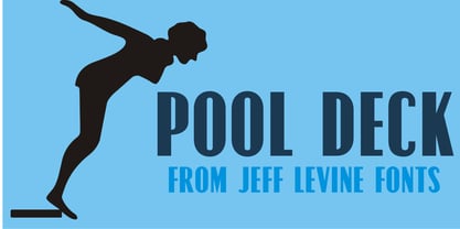
  1. Pool Deck JNL by Jeff Levine, $29.00
    There's nothing too fancy about Pool Deck JNL, which is based on an older typeface design. It's your basic sans serif condensed type style with a few unconventional letter shapes.
  2. Concave Tuscan X by Wooden Type Fonts, $20.00
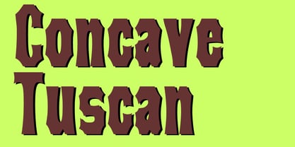
    A revival of one of the popular wooden type fonts of the 19th century, condensed, bold, a very useful design for display.
  3. Latin Extra Condensed by Bitstream, $29.99
    The American nineteenth century display form as handed down through ATF and the composing machine companies, largely for use in newspaper headlines.
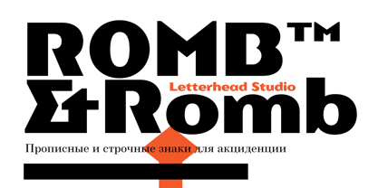
  4. Romb by Letterhead Studio-VG, $35.00
    Romb is the display font based on feeling of the retro typefaces of the early 20th century. Good for posters, magazines, packaging.
  5. Gothic No.13 by Bitstream, $29.99
    A dark, condensed, nineteenth century sanserif made popular by Linotype, the capitals deriving from Barnhart Brothers and Spindler, the lowercase from Farmer.
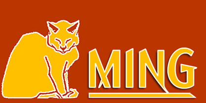
  6. Ming by K-Type, $20.00
    A sans serif with the futuristic retro, Art Deco feel of mid 20th century science fiction, particularly the early Flash Gordon serials.
  7. Industrial Gothic by Monotype, $29.99
    Industrial Gothic recalls the Industrial Revolution of the 19th century. There are four styles: Single-Line, Double-Line, Banner, and Small Caps.
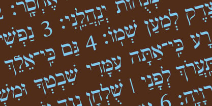
  8. Hebrew Modern by Samtype, $49.00
    This is a classic design from the beginning of the 20th century. This font can be used in many kinds of books
  9. Slab Four Rounded Bold by Wooden Type Fonts, $15.00
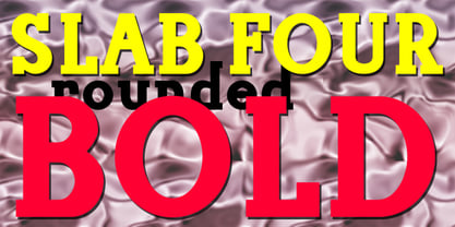
    An original slab serif design inspired by the slab serif designs of the 19th century, with a modern geometric look, bold version.
  10. Slab Four Rounded Super by Wooden Type Fonts, $15.00
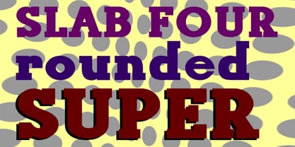
    An original slab serif design inspired by the slab serif designs of the 19th century, with a modern geometric look, extra bold.
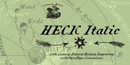
  11. Heck Italic by E-phemera, $20.00
    Heck Italic is based on captions, labels and legends appearing on 19th-century maps and natural history engravings by J. G. Heck.
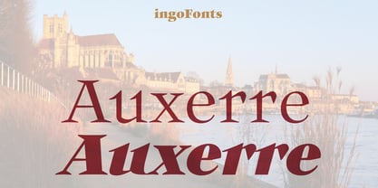
  12. Auxerre by Ingo, $33.00
    A Roman typeface with emphasized triangular serifs. A font like this one could have been designed in 18th century France. To some extent, Auxerre is a precursor of “Etienne,” which later became popular as an advertising typeface of the 19th century. Auxerre is available in five font weights: light, regular, semibold, bold and black. Auxerre supports Western and Central European languages including Scandinavian languages. Plus, the font includes lots of ligatures, tabular figures as well as a “Capital German Double S.” Auxerre fits perfectly with any topic related to the past two centuries. It also works amazingly well on technical issues. And of course it fits very well with topics of fine art and art history.
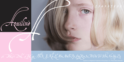
  13. Aquiline by GroupType, $24.95
    Handsome, adventurous, legible and elegant, this script has the feel of practical handwriting from past centuries. Aquiline is based on a cursive italic style influenced by the 16th century European writing masters. The Aquiline design team turned to Ludovico degli Arrighi, the great 16th century writing master, for period ideas on how to improve, strengthen and add grace to the font. Aquiline has strokes and gestures that seem very like the writing of Arrighi and Mercator, such as the flamboyant balloon of a flourish on the cap A; the graceful flourishes on the cap B, D, and L; and the compact lowercase with tall ascenders. Aquiline has a strong personality and is historically correct.
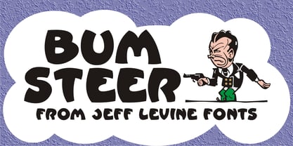
  14. Bum Steer JNL by Jeff Levine, $29.00
    In older American slang, a "bum steer" is a bad tip, some bad advice or being sent in the wrong direction (to name a few examples). Bum Steer JNL was modeled from some playful hand lettering found on a piece of early 20th Century sheet music entitled "When Uncle Joe Plays a Rag on His Old Banjo". It's very possible that "Hobo" (a popular type design of the time) was a strong influence on the sheet music's style of title lettering. It seems that songwriters in those bygone days were prone to cramming as many words from a line of their song into the title itself. Another such example of a wordy song title which coincidently is in keeping with the theme of a "bum steer" (pun intended) is a novelty number from 1915: "Cows May Come and Cows May Go but the Bull Goes on Forever" (words by Vincent Bryan, music by Harry Von Tilzer). [It's kind of self-descriptive, don't you think?]
  15. Craw Modern by GroupType, $19.00
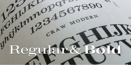
    Craw Modern was designed by Freeman Craw in 1958 and first released by The American Typefounders Company, (ATF). In typography, 'Modern' is a style of typeface (classification) developed in the late 18th century that continued through much of the 19th century. Characterized by high contrast between thick and thin strokes and flat serifs. Bodoni is among the most popular of the Moderns. Moderns are also known as Didone and New Antiqua.
  16. Linoscript by Linotype, $29.99
    Linoscript was designed in 1905 by Morris Fuller Benton and displays the strong stroke contrasts of broken letter and the flowing quality of handwriting fonts of the 17th and 18th centuries. The font suggests a school book typeface common at the turn of the 20th century. Linoscript is suited for middle length texts and headlines, while its capitals can also be used as initials mixed with other alphabets.
  17. Texas Hero by Three Islands Press, $39.00
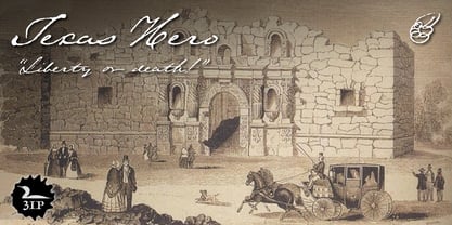
    It occurred to me years ago that the graphic arts community might find useful a digital typeface that mimicked the classic look of nineteenth-century handwriting. Conveniently, my mother then still volunteered at the Center for American History at the University of Texas at Austin, my hometown. She made copies of the letters of a few famous Texans -- Houston, Austin, Travis, Burnet, Rusk. Thomas J. Rusk’s penmanship caught my eye as the most accessible of the bunch. I hadn't realized at the time what a challenge it'd be to render a realistic-looking script face, but the result has, in fact, filled a niche.
  18. Caslon Openface by Bitstream, $29.99
    A small x-height typeface, originating with engravers near the start of the twentieth century, appearing in type in the 1923 ATF specimen.
  19. Peerless 131 Bold by Wooden Type Fonts, $15.00
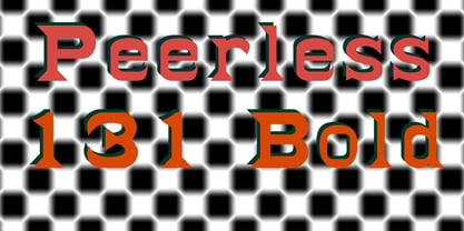
    A revival of one of the popular wooden type fonts of the 19th century, suitable for display, or text, closely related to Latin.
  20. Della Robbia by Bitstream, $29.99
    Thomas Maitland Cleland’s careful and scholarly creation of a typeface from 15th Century Florentine inscriptional capitals; designed for the Bruce division of ATF.
  21. Antique Condensed by Wooden Type Fonts, $15.00
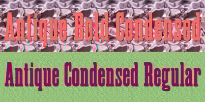
    A revival of one of the popular wooden type fonts of the 19th century, suitable for text or display, medium and bold weights.
  22. Peerless by Wooden Type Fonts, $15.00
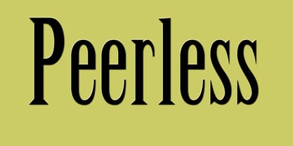
    A revival of one of the popular wooden type fonts of the 19th century, suitable for display, or text, closely related to Latin.
  23. Antique Sans by Wooden Type Fonts, $15.00
    A modified remake of one of the popular wooden type fonts of the 19th century. An extra bold sans serif suitable for display.
  24. Slab Four Rounded Ext by Wooden Type Fonts, $15.00
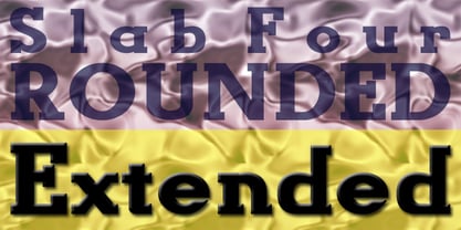
    An original slab serif design inspired by the slab serif designs of the 19th century, with a modern geometric look, bold version, extended.
  25. Tuscan Italian Round by Wooden Type Fonts, $20.00
    A revival of one of the popular wooden type fonts of the 19th century, for large display. Lowercase not designed for this type.
  26. Henry8 by Wundes, $12.50
    Henry8 is a historical caps font originally penned in the 16th century. I have extended it to include numbers and a few symbols.
  27. Arte Critique JNL by Jeff Levine, $29.00
    Arte Critique JNL was modeled after an alphabet in an early 20th Century French lettering book spotted online at an image sharing site.
  28. Nono by Wiescher Design, $39.50
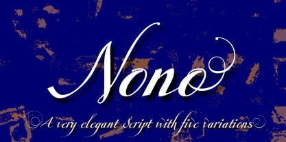
    Nono is the nickname of my oldest son, Konstantin. His little brother could not really speak yet, but he was always looking for him and said something to the tune of, "wea is a nono". From that time on I call Konstantin Nono. I designed a handwritten script with his real name, that i named Konstantin. Now I made this slick version of that script – hence – Nono! I made three basic sets of characters plus a smallcaps version. To top things off, I designed a set of endletters that I throw in for free. Everything can be mixed! I sell single cuts but the best deal would be the entire packet, it goes for a very fair price. Your generous typedesigner, Gert Wiescher
  29. Monotype Italian Old Style by Monotype, $41.99
    Italian Old Style™ was designed by Frederic W. Goudy for the Lanston Monotype Company in the USA. Goudy was asked by Monotype to copy Cloister Oldstyle, a successful font that belonged to a competing foundry (it was designed by Morris Fuller Benton, see Cloister Open Face). Goudy refused on grounds of ethics, and instead talked Monotype into producing a new face. This he based freely on fifteenth century Venetian types, which were the same historical models used by Benton for Cloister and later by Bruce Rogers for Centaur. Goudy's result was Italian Old Style, released by Monotype in 1924, and considered by many to be one of Goudy's best fonts for book typography."
  30. Gallatin Light by Wooden Type Fonts, $15.00
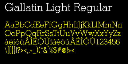
    A light weight slab serif font, useful for posters and large ads, based as it is on wooden fonts designed in the 19th century.
  31. Antique Tuscan Condensed by Wooden Type Fonts, $20.00
    A revival of one of the popular wooden type fonts of the 19th century, condensed, bold, curved serifs, a very useful design for display.
  32. Fancy Flowers by Gerald Gallo, $20.00
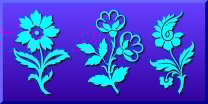
    Fancy Flowers was inspired by textile designs from the nineteenth century. There is an assortment of 47 flowers located under the character set keys.
  33. Hotel by Parkinson, $25.00
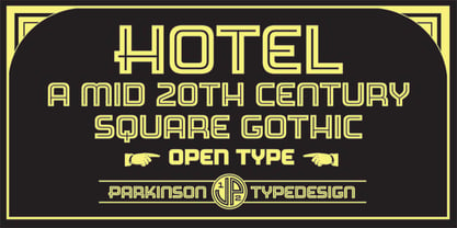
    An inline gothic display font based in mid-twentieth century showcard and signpainting styles. All caps with some alternates in lower case keyboard positions.
  34. Grecian Bold Expanded by Wooden Type Fonts, $15.00
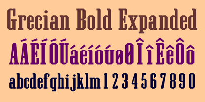
    A revival of one of the popular wooden type fonts of the 19th century, suitable for display, geometric slab serifs unbracketed, short descenders,condensed.
  35. Egyptian Wide by Wooden Type Fonts, $15.00
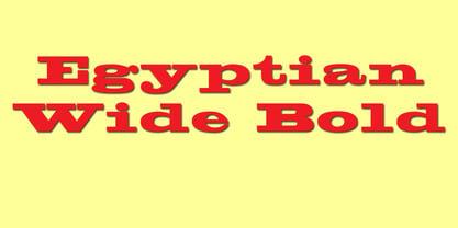
    A revival of one of the popular wooden type fonts of the 19th century, suitable for display, short ascenders and descenders, pronounced slab serifs.
  36. Poltrone by TeGeType, $29.00
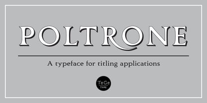
    The Poltrone typefaces family was inspired by the public inscriptions of the 19th century and was designed to be used for titling, headlines, etc.
  37. Xylograph by Cuda Wianki, $30.00
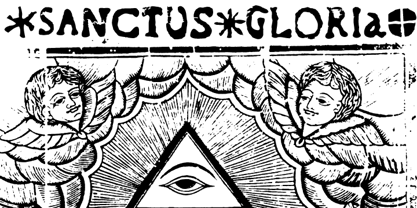
    This font is based on 17th - 19th century woodcuts. It has many varied alternate characters and over 25 ornaments that make this font unique.
  38. Dot.com - Unknown license
  39. Gibson Girl JF by Jukebox Collection, $32.99
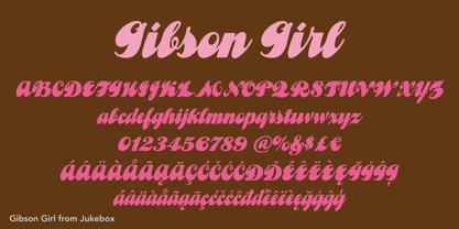
    Based on a hand lettered sample from the early 20th Century, Gibson Girl is a heavy script font with a vintage flair. During the end of the 19th Century, the “Gibson Girl” created by illustrator Charles Gibson, was considered the ideal of feminine beauty and poise in that time period. The term has become associated with the Gilded Age in America. The design of the Gibson Girl font reflects both femininity and self confidence.
  40. Prince Of Darkness by Comicraft, $19.00
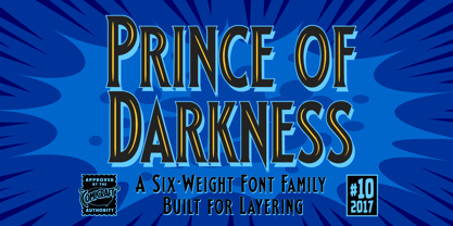
    The 52 characters assembled by this Gothic font, Prince of Darkness, were once interred in coffins onboard the Russian cargo ship Demeter, when it set sail for the sleepy shores of Whitby, Northern England ages ago. Hunted down by Vampire Hunters for century after century, this noble Transylvanian set has hidden for years in England and Eastern Europe. Now, Prince of Darkness is available as a font with more Layers than Dracula has Lairs.
Looking for more fonts? Check out our New, Sans, Script, Handwriting fonts or Categories
abstract fontscontact usprivacy policyweb font generator
Processing