10,000 search results
(0.033 seconds)
- Grand Stylus - Unknown license

- Roman Stylus by URW Type Foundry,
$35.00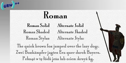
- Styla Pro by URW Type Foundry,
$39.99 Styla is a refined romantic sans, in the best tradition of Didot and Bodoni. The combination between Styla’s feminine grace and sharp endings creates an air of seduction, ideal for magazines, ads and books on fashion, fine arts, philosophy, luxury goods, women and love. A typographic jewel, Styla brings romantic sensuality and refinement to the world of sans-serifs.
 - Retro Styla by Nirmana Visual,
$15.00 Retro Styla , Inspired by 70s Design Era , With 2 Style : Regular & Shadow, Retro Styla offers beautiful typographic harmony for a diversity of design projects, including logos & branding, social media posts, advertisements & product designs.
 - ITC Stylus by ITC,
$29.99ITC Stylus is the work of American designer Dennis Pasternak, who based its forms on those of freehand architectural lettering from historical and contemporary sources. Pasternak points out that while the typeface emulates hand lettering, no pencil drawings or scanned art were used in its creation. The letters bounce slightly across the baseline, giving the typeface the look of true handwriting. ITC Stylus emanates warmth when used for extended text and a fresh quality in display sizes. - Stylo Standard by Fonts of Chaos,
$10.00 With this font, you sure have the flow! Standard hand writing easy to apply in your designs and layouts. UPPERCASE lowercase Numerals Punctuation 198 characters
 - Olis by Roman Polishchuk,
$34.00 Olis is a stylish, fresh new handwritten script. Olis comes with two weights, numerals, punctuations, and some variations on character including OpenType alternates, and common ligatures. It helps set your designs apart by adding a custom-lettered look. You will also find that its initial and terminal letters can enhance your designs in new and creative ways. Hand-drawn leaves, plants, flowers, as well as large and small snowflakes add original detail while complementing the font perfectly. If you like this font you might also like an aesthetic text generator by the same author.
 - Odds by DearType,
$30.00 Say hello to Odds - a versatile, chunky casual sans with lots of personality! It’s fresh, friendly and easy to read. It is also a great mix of boldness and cuteness, so it definitely captures attention. The Odds family comes in five distinct fonts styles : - Odds - an artistic handwritten-style sans - Odds Sans - a typical neat and clean sans (caps and small caps which you can mix & match) - Odds Narrow - a cute handwritten narrow sans (uppercase and lowercase), and two awesome sets of goodies: - Odds Extras - borders, arrows, speech bubbles, etc. - Odds Symbols - palm leaves, plants, fruits and other useful objects. Odds works great on a variety of mediums from web to print, but you can find it particularly useful if you're designing food packaging (actually any packaging) and clothes. Other awesome usages include posters, signage, ads, printed and personalized cards, t-shirts, sale banners, everything kids related - merchandise, toys, you name it. Its quirky character and fat letters make up for bold and friendly presentation while the slender letters of the Odds Sans and Odds Narrow are perfect for plain text. And yes, all fonts have Cyrillic! They also have some neat ligatures and alternates to spice up your designs and create more interest!
 - Alpha Sentry - Unknown license

- Omega Sentry - Unknown license

- Gamma Sentry - Unknown license

- Enthra Centro by Akrtype Studio,
$19.00 Enthra Centro script is an elegant combination of a script . It is slender, feminine and classy, while still maintaining a friendly feel. Enthra Centro script is versatile and will work perfectly for e-commerce brands, wedding boutiques, initial name cards or any business that wants to appear upscale and chic. With its many varian stylistic character Enthra Centro script is perfect for creating original and functional designs. It has extensive language support and alternates, stylistic sets that add visual interest to every letter. You can use the Enthra Centro script for high-end logotypes and magazine headlines, but let’s not forget greeting cards, invitations, posters, ads and the various web and screen usages. The overall feel of the font is elegant, sophisticated with a touch of informal and it is ideal if you want to convey a sense of class and style.
 - XXII Centar by Doubletwo Studios,
$19.00 Centar Sans is a simple, modern, universal, powerful, invisible but not characterless, sans serif family. The family is designed for identities & corporate projects. Its wide range of styles covers lots of possibilities of use, from headlines to texts. It supports a lot of languages including cyrillic and comes along with 19 OpenType features - Small Caps, ligatures, alternates and many more. Regular styles are FREE! Extended detail here. or here.
 - Venture Point by Maulana Creative,
$14.00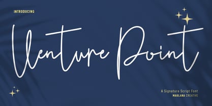 Venture Point is a modern signature script font. With upright consist mono-line stroke, fun character. To give you an extra creative work. Venture Point font support multilingual more than 100+ language. This font is good for logo design, Social media, Movie Titles, Books Titles, a short text even a long text letter and good for your secondary text font with sans or serif. Make a stunning work with Venture Point font. Cheers, Maulana Creative
 - Conture Script by Mans Greback,
$59.00 Conture Script is a classic script typeface with a thin contour. This high-quality font is drawn and created by Måns Grebäck during 2017. With its hundreds of glyphs, Conture Script supports a very wide range of languages.
 - Center Voyage by Letterhend,
$19.00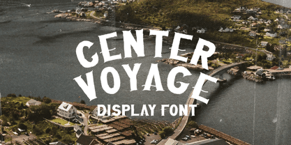 Introducing, Center Voyage - a Sans Serif typeface. This type of font perfectly made to be applied especially in headlines which is need a standout font, and the other various formal forms such as invitations, labels, logos, magazines, books, greeting / wedding cards, packaging, fashion, make up, stationery, novels, labels or any type of advertising purpose. Features : numbers and punctuation multilingual ligatures PUA encoded We highly recommend using a program that supports OpenType features and Glyphs panels like many of Adobe apps and Corel Draw, so you can see and access all Glyph variations.
 - Artistic Venture by Storictype,
$19.00 Artistic Venture Typeface, Inspirated those bold wide letters you see on. computer screen, movie futureistic with combine classic , Well, some of them have these strong or hooks on the ends of the letters. But, there's also this new style of font that's super cool and futuristic. It's called a Artistic Venture Typeface. There Include : All Caps Opentype Feature Alternate Character Ligature Multilanguage Thank You
 - Center Screen by Peterland,
$44.00 Center Screen is a universal font dedicated to making office documents in popular text editors. Due to the interesting disign it is also used for making websites and advertising for films and posters. Center Screen font also allows to create images of work in many forms of marketing due to its versatility and adaptability to many languages of the world. Creating images and text with Center Font Screen allows you to gain competitive edge by highlighting your brand and by bringing attention to the originality of the presentation and the readability of the message.
 - Romance Fatal Serif Std - Personal use only

- Le Monde Courrier Std by Typofonderie,
$59.00 A rounded slab in 4 styles In our age, since the arrival of microcomputing, the majority of professional letters have been composed in quality typefaces. Typewriters & the typestyles they used have become antiques. A letter set in Times or Helvetica & printed with a laser printer at 600 dpi or more are of such quality that one can no longer distinguish it with a document produced by offset printing. But letters composed in this way appear overly institutional when a bit of informality is needed. Le Monde Courrier, designed by Jean François Porchez, attempts to re-establish a style halfway between writing and printing. Informal neo-tech style This rounded slab serif returns the informal character of “typewritten” fonts to letters and suit well all bad conditions, from inkjet printed memos to webfonts use. With a unique typographic colour, it integrate itself with the rest of the Le Monde family with effective contrast. The verticals metrics and proportions of Le Monde Courrier are calibrated to match perfectly others Typofonderie families. Bukva:raz 2001 Type Directors Club .44 1998 European Design Awards 1998
 - Hebrew Caligraphic Stam Std by Samtype,
$49.00 Beautiful font, good for posters and small books and folders. This is a complete font with all diacritic marks (Nikud and Taamim) and also shevana, kamatz katan, dagesh hazak and holam chaser.
 - Preto Serif OT Std by DizajnDesign,
$50.00 Preto is an extensive type family, which explores the function of serifs on readability and legibility. Preto consist of three subfamilies: Sans, Semi and Serif. Preto is designed for multilingual typesetting. All of the subfamilies have equal gray value but different texture which can be use to differentiate languages. Preto sub-families have two text weights and two bold styles (Regular -> Bold, Medium -> Black). Every weight has a companion Italic style as well. The serif version has been designed to work best at small point sizes (around 8, 9 points). You will not achieve calm, boring or invisible look of your text with Preto Serif. Its long, spiky and sharp serifs contribute to give the typeface a distinct and energetic character. It is very suitable for magazines, corporate identity, brochures or other print materials where a typeface for continuous reading is required. The ligatures in Preto Serif are very special. You can set them in different tracking values and spacing will increase/decrease consistently in the ligatures as well. Alternative characters in the font files allow you to change the feeling of the text from typical to more special (J, Q, g , &). Each font contains a full set of small caps and many alternative characters for complex typesetting.
 - Le Monde Journal Std by Typofonderie,
$59.00 A highly legible typeface in 4 series Le Monde Journal by definition is intended for newspaper use & at small sizes. It’s an economical and workshorse typeface adapted to any extrem condition of uses. Even though it has the same colour as Times, it appears more open. The reading flow has been made more fluent & less abrupt. The glyphs counters are bigger, as if they were “alluminating the interior.” The form, characterized by its serifs, remains embedded in our visual memory. Intermediate weights like Book can be considered as a grade supplement of the Regular. Italics accompany Le Monde Journal. With a more delicate design & a distinctive rhythm, they remain noticeable when used with the romans. Its companion, Le Monde Sans can extend your typographic palette. For beautiful page layout, use it in conjunction with Le Monde Livre for titling sizes. The verticals metrics and proportions of Le Monde Journal are calibrated to match perfectly others Typofonderie families. This family was designed in 1994 as bespoke typeface family for the French newspaper Le Monde. The family is not used any more by this newspaper from November 2005. Bukva:raz 2001 Type Directors Club .44 1998 European Design Awards 1998
 - Iwata News Mincho Std by IWATA,
$199.00 数多くの新聞社で使われてきた伝統ある「岩田新聞明朝体」を再現した「イワタ新聞明朝体」と、かなを現代風にアレンジした「イワタ新聞明朝体新がな」があります。
 - TT Norms Std Condensed by TypeType,
$35.00 TT Norms® Std Condensed useful links: Specimen | Graphic presentation | Customization options TT Norms® Std Condensed is the logical development of our bestselling TT Norms®. Since the release of TT Norms®, we received a bunch of requests to create its narrow version and even managed to make several custom projects of the narrow TT Norms® before we decided to start creating a full-fledged commercial version of the typeface. At the very beginning of the project, we did some research and tested several options for the possible width of the typeface. Despite the fact that TT Norms® Std Condensed has narrower proportions than the original family, it inherited the classic proportions of characters, attention to detail and meticulous elaboration of each character in the typeface. The TT Norms® Std Condensed font family consists of 18 faces (9 upright and 9 italics). Each style includes a sufficient set of characters that allow you to solve most of the problems that arise in the field of graphic design, branding, packaging design or website design.
 - PF Bague Sans Std by Parachute,
$39.00 Bague Sans is an award-winning monoline typeface with a distinct and eye-catching personality. Despite its inspiration from early 20th century geometrics, it diverts from the mechanical rigidity of those typefaces by incorporating humanist characteristics, such as subtle variations in stroke width and open counter shapes with vertical endings. This is a very clean and legible typeface with a warm and well-balanced texture which is ideal for intense editorial use in magazines and newspapers. The most remarkable feature of Bague Sans is its vast array of uppercase alternates and ligatures which truly shine when set at display sizes. This typeface is automatically transformed into a flexible, charming and stylish typeface with strong modern aesthetics. Explore its dual personality, switch from Humanist to Geometric and vice versa by using alternate characters such as the single-storey a and single-storey g. From classic to modern, from excessive to neutral, Bague Sans is a multipurpose typeface which offers enormous possibilities and variations for editorial design, branding and corporate identity while it performs amazingly well on web. This superfamily includes 18 weights from Hairline to Ultra Black with a consistent and well-refined structure. It supports extended Latin such as Central European, Baltic, Turkish, Romanian and includes numerous alternates and ligatures for unlimited text variations. You may also want to check out Bague Sans Pro which supports Cyrillic and Greek as well.
 - AW Conqueror Std Slab by Typofonderie,
$59.00 Slab serif with a 70’s aesthetic A version of AW Conqueror Sans, AW Conqueror Slab draws inspiration from geometrical slab serifs of the 1930s, of which Rockwell is a perfect example. Lubalin Graph, a reworking of the genre, came out in the wake of the Avant Garde wave of the early 70s. In recent years, ‘slabs’ have made a comeback in the graphic design world. AW Conqueror Slab advances the cause quite happily. AW Conqueror superfamily AW Conqueror Didot is part of a larger family, who include 4 others subfamilies with great potential: They’re but based on same structure, with some connection between them (width for example), to offer a great & easy titling toolbox to any designers, from skillful to beginner. Each of the members try their best to be different from the others because of their features. They should work harmoniously in contrast. Club des directeurs artistiques Prix 2010 European Design Awards 2011
 - Preto Sans OT Std by DizajnDesign,
$50.00 Preto is an extensive type family, which explores the function of serifs on readability and legibility. Preto consist of three subfamilies: Sans, Semi and Serif. Preto is designed for multilingual typesetting. All of the subfamilies have equal gray value but different texture which can be use to differentiate languages. Preto subfamilies have two text weights and two bold styles (Regular --> Bold, Medium --> Black). Every weight has a companion Italic style as well. Preto Sans OT Std The Sans version of Preto forms the basic skeleton of the family, it is decidedly simpler than the other styles (Semi and Serif). Although you can find many distinctive and unique elements in the details. The most visible elements are the tapered upper part of the letters. The capital letters have uniform widths achieving very different texture than traditional roman proportions. There are two different options for ligatures and alternative characters (J, Q, g, &) gives more variability for different languages.
 - Le Monde Livre Std by Typofonderie,
$59.00 A text face in 4 styles Before the arrival of Phototypesetting, each font size had a specific design. Le Monde Livre, designed by Jean François Porchez, along with Le Monde Journal re-establishes this practice. When Le Monde Journal was developed specifically for use at small point sizes (below 10 points.) Le Monde Livre works beautifully for book typography, magazine settings. In comparison to the italics in Le Monde Journal, Le Monde Livre’s italics are of a totally different design, closer to the models of the Renaissance. The families match well together on the same page, Le Monde Journal for small sizes settings, Le Monde Livre for large settings. The verticals metrics and proportions of Le Monde Livre are calibrated to match perfectly others Typofonderie families.
 - Hebrew Pirkei Avot Std by Samtype,
$49.00 This is beautiful script font based in typeface of the Pirkei Avot book.
 - AW Conqueror Std Inline by Typofonderie,
$59.00 30s inspired geometric inline display typeface Several titling typefaces made their appearance at the start of the 20th century, notably Acier and Bifur, both created by French poster artist Cassandre. Later, in the Netherlands, S.H. de Roos designed a version of Inline for its Nobel family called, naturally, Nobel Inline. AW Conqueror Inline pays homage to this beautiful version. AW Conqueror superfamily AW Conqueror Didot is part of a larger family, who include 4 others subfamilies with great potential: They’re but based on same structure, with some connection between them (width for example), to offer a great & easy titling toolbox to any designers, from skillful to beginner. Each of the members try their best to be different from the others because of their features. They should work harmoniously in contrast. Club des directeurs artistiques Prix 2010 European Design Awards 2011
 - AW Conqueror Std Carved by Typofonderie,
$59.00 Engraving inspired typeface The AW Conqueror Carved encapsulates perfectly the lettering styles in fashion during the 19th century quite often in the frontispieces of books. It wasn’t rare to see these kinds of typefaces, with their variations in depth and relief effects, adorning boxes and other forms of packaging of the time. AW Conqueror superfamily AW Conqueror Didot is part of a larger family, who include 4 others subfamilies with great potential: They’re but based on same structure, with some connection between them (width for example), to offer a great & easy titling toolbox to any designers, from skilful to beginner. Each of the members try their best to be different from the others because of their features. They should work harmoniously in contrast. Club des directeurs artistiques Prix 2010 European Design Awards 2011
 - Preto Semi OT Std by DizajnDesign,
$- Preto Semi is an experiment. It is an attempt to create a readable type for text point sizes (other than sans-serif and serif). Preto Semi is not a Sans with added serifs or Serif with serifs removed. The use of the serifs is redefined and used for other purpose(s). The serifs became the extension of the stroke, they help to solve the spacing problem of sans-serif types and they use the primary function of serifs – keeping the eye on the baseline and emphasize the horizontal rhythm of the lines of text. Preto Semi is intended for magazines and editorial design, as other members of Preto family. Preto is an extensive type family, which explores the function of serifs on readability and legibility. Preto consist of three subfamilies: Sans, Semi and Serif. Preto is designed for multilingual typesetting. All of the subfamilies have equal gray value but different texture which can be use to differentiate languages. Preto sub-families have two text weights and two bold styles (Regular -> Bold, Medium -> Black). Every weight has a companion Italic style as well.
 - Le Monde Sans Std by Typofonderie,
$59.00 Humanist sans in 8 styles Designed by Jean François Porchez, Le Monde Sans is a sanserif based on Le Monde Journal — a practice that become commonplace from early nineties. Designed originally in 1994 for the Le Monde newspapers, it was expended over the years to the large family we know today. Le Monde Sans features a “traditional g” in addition to the usual 1994’s g. Le Monde Sans is offered in numerous weights — in roman, italic to meet all kinds of situations. It will help designers to select the best weights depending their needs, from glossy paper printing to high resolution screen. Superfamily The design of Le Monde Sans continues the basic common structure found in the members of the Le Monde family: its proportions, a relatively narrow width, a fairly oblique axis, etc. The typographer can, at all times, switch between Sans & Journal or Courrier without any disruption in the composition. The verticals metrics and proportions of Le Monde Sans are calibrated to match perfectly others Typofonderie families. This family was designed in 1994 as bespoke typeface family for the French newspaper Le Monde. The family is not used any more by this newspaper from November 2005. Type Directors Club .44 1998 European Design Awards 1998
 - Iwata News Gothic Std by IWATA,
$199.00 数多くの新聞社で使われてきた伝統ある「岩田新聞呉竹体」を再現した「イワタ新聞ゴシック体」と、かなを現代風にアレンジした「イワタ新聞ゴシック体新がな」があります。
 - Hebrew Moses Std VF by Samtype,
$120.00 his is a beautiful, modern, and super readable font. You can use it in any kind of text, from folders to prayer books. This font is especially good for school and kid's books. This font also has modern punctuation: shevana, kamats katan, dagesh hazak, and holam chaser. This is a Variable font! One font with 5 styles (Regular, Medium, SemiBold, Bold, Heavy)
 - Hebrew Le Be Std by Samtype,
$59.00 This typeface is based on Guillaume I Le Bé typeface. This font has all diacritic accents including the chanting diacritic (trop) and modern Nikud (Holam Chaser, Shevana, Kamatz Katan and Dagesh Hazak).
 - Iwata Maru Gothic Std by IWATA,
$149.00 書き文字のような柔らかみのある丸ゴシック体です。字面が大きくラインが揃うデザインです。あたたかさや優しさ、親しみやすさを表現しやすい書体です。
 - AW Conqueror Std Sans by Typofonderie,
$59.00 AW Conqueror Sans was born out of this desire to fuse geometric and humanistic sans. It remains a typeface fundamentally influenced by both Bauhaus spirit — with its simplified geometric forms — and Jan Tschichold’s attempts to link this modular spirit to Eric Gill’s humanist sans serif. AW Conqueror Sans is a claimed French synthesis of Germanic Modernism and English classical tradition. Spheres of influence The core set of capitals are based on the proportions of the Roman capitals like Futura, Erbar, Nobel, Johnston, Gill Sans. During the 1930s, the Futura was a true success. Since then, Monotype offered a geometric version of the Gill Sans, and Linotype added Futura-like variants to WA Dwiggins’ Metro. AW Conqueror Sans is kind of a “fusion” of this approach. The lower case “b, d, p, q” are also directly influenced by Eric Gill’s, while the “y” is influenced by some of Jan Tschichold’s alphabets. In italics, drawn narrower, AW Conqueror Sans reinterprets Gill’s idea: a rigorous italic like a roman but which sometimes reveals some aspects of a Renaissance italic. AW Conqueror Sans and its extensions AW Conqueror Sans is the initial reference point for an extended family, including AW Conqueror Inline, Slab, Carved, Didot. The potential of these mixed families is powerful. Because AW Conqueror typefaces are based on an identical structure, and compatible proportions.
 - Iwata New Reisho Std by IWATA,
$149.00 中国で古くから使用されていた伝統的な隷書を源流にする「イワタ隷書体」と、 新しい感覚の「イワタ新隷書体」の2種類があります。


