10,000 search results
(0.046 seconds)
- User Stencil by DSType,
$30.00 User is a monospaced type family with 30 styles, from Hairline to Bold, divided in Regular, Upright and Stencil, with five weights (Hairline, ExtraLight, Light, Medium and Bold) all with Cameo versions. Complexity and versatility are the keywords for this type family. Despite being a monospaced font, which means there's no kerning, all the glyphs were designed in order to sit comfortably in the 600 points width, a hard task because some glyphs are too narrow ('i' and 'l'), while others are too wide ('m' and 'w'), but they must fit the same width. The desire for keeping a comfortable readability in User was one of the key elements, therefore we designed several ligatures that fit both single and double space width, allowing to maintain a certain idea of proportional design. In this digital booklet you will find a detailed vision of the anatomy of the typefaces, the amount of characters available, the styles and weights, along with a series of features, specially designed to make User a very versatile and usable type system.
 - User Upright by DSType,
$30.00 User is a monospaced type family with 30 styles, from Hairline to Bold, divided in Regular, Upright and Stencil, with five weights (Hairline, ExtraLight, Light, Medium and Bold) all with Cameo versions. Complexity and versatility are the keywords for this type family. Despite being a monospaced font, which means there's no kerning, all the glyphs were designed in order to sit comfortably in the 600 points width, a hard task because some glyphs are too narrow ('i' and 'l'), while others are too wide ('m' and 'w'), but they must fit the same width. The desire for keeping a comfortable readability in User was one of the key elements, therefore we designed several ligatures that fit both single and double space width, allowing to maintain a certain idea of proportional design. In this digital booklet you will find a detailed vision of the anatomy of the typefaces, the amount of characters available, the styles and weights, along with a series of features, specially designed to make User a very versatile and usable type system.
 - Marzano by FontMesa,
$35.00 Marzano is a geometric sans serif font that's ideal for headlines, logos, text and advertising, the name comes from the ever so sweet and wonderful San Marzano plum tomato grown in Italy. Marzano includes stylistic alternates, small caps, swash caps, case sensitive forms, old style figures, tabular figures, small caps figures, small caps old style figures, small caps question mark and exclamation point. Since a lot of people today like to type in code using the copyright and trademark symbols in place of a C or R we've decided, the first time to offer two registered trademark symbols, one that's the same size as the copyright symbol and an alternate version that's reduced in size and sits at the caps height. Marzano Slant is set at 6 degrees and is perfect for when you want the look of an italic but don't have the horizontal space in your page design for a full 12 degree italic. At FontMesa all of our italic fonts are cleaned up placing all nodes at extremas.
 - Mi Casa by FontMesa,
$25.00 Mi Casa is a new condensed version of our Home Style font which is a revival of an old 1800's classic ornate French font. This new 2021 condensed version takes this old classic to an all new level by adding small caps, italics and a new black version. Mi Casa is perfect for headlines and logos from advertising to product labels, t-shirt lettering and restaurant menus. Fill fonts are also part of this family, new to this font style is the half fill font for creating a two color effect on the letters, you'll need an application that works in layers to use the fill fonts in Mi Casa. The regular fill font for Mi Casa isn't meant to be used as a stand alone font so we've created a solid black version with thicker serifs on top and adjusted outlines throughout for a better appearance as a solo font. We hope you enjoy Mi Casa as much as we did making it. Mi Casa is a trademark of FontMesa LLC
 - Kalista by Great Studio,
$18.00 Kalista Font Duo is a luxury font. which comes with a combination of modern and elegant fonts, namely serif and signature style. You can combine them to create beautiful typography. This handcrafted style makes it perfect for use in all your design projects be it logos, labels, packaging designs, blog titles, posters, wedding designs, social media posts, Instagram designs, invitation cards, art quotes, home decor, book / title covers, etc. This is what includes: Kalista Script Regular / Bold • Thin and realistic signature font containing 40+ ligatures and alternates, lowercase, uppercase, all punctuation & numbers. Kalista Serif Light / Regular / Bold • Serif Fonts with upper and lowercase letters, all punctuation, numbers and Language support 8 BONUS Logo Templates that you can edit and customize in Adobe Photoshop and Adobe Illustrator. Language Support • Kalista supports the following languages; English, French, Italian, Spanish, Portuguese, German, Swedish, Norwegian, Danish, Dutch, Finnish, Indonesian, Malay, Hungarian, Polish, Croatian, Turkish, Romanian, Czech, Latvian, Lithuanian, Slovak, Slovenian. I hope you enjoy this font. If you have questions, don't hesitate to give me a message :)
 - User by DSType,
$30.00 User is a monospaced type family with 30 styles, from Hairline to Bold, divided in Regular, Upright and Stencil, with five weights (Hairline, ExtraLight, Light, Medium and Bold) all with Cameo versions. Complexity and versatility are the keywords for this type family. Despite being a monospaced font, which means there's no kerning, all the glyphs were designed in order to sit comfortably in the 600 points width, a hard task because some glyphs are too narrow ('i' and 'l'), while others are too wide ('m' and 'w'), but they must fit the same width. The desire for keeping a comfortable readability in User was one of the key elements, therefore we designed several ligatures that fit both single and double space width, allowing to maintain a certain idea of proportional design. In this digital booklet you will find a detailed vision of the anatomy of the typefaces, the amount of characters available, the styles and weights, along with a series of features, specially designed to make User a very versatile and usable type system.
 - Preto Semi by DizajnDesign,
$24.00 Preto Semi is an experiment. It is an attempt to create a readable type for text point sizes (other than sans-serif and serif). Preto Semi is not a Sans with added serifs or Serif with serifs removed. The use of the serifs is redefined and used for other purpose(s). The serifs became the extension of the stroke, they help to solve the spacing problem of sans-serif types and they use the primary function of serifs – keeping the eye on the baseline and emphasize the horizontal rhythm of the lines of text. Preto Semi is intended for magazines and editorial design, as other members of Preto family. Preto is an extensive type family, which explores the function of serifs on readability and legibility. Preto consist of three subfamilies: Sans, Semi and Serif. Preto is designed for multilingual typesetting. All of the subfamilies have equal gray value but different texture which can be use to differentiate languages. Preto sub-families have two text weights and two bold styles (Regular -> Bold, Medium -> Black). Every weight has a companion Italic style as well.
 - Centerpiece by Heyfonts,
$18.00 Centerpiece is Psychedelic typeface refers to a style of typography that emerged in the 1960s during the height of the counterculture movement. It is characterized by its bold, vibrant colors, and graphic designs that incorporate abstract shapes, curves, and patterns. The psychedelic typeface is often associated with the mystical and surreal since it draws inspiration from altered states of consciousness experienced through the use of psychedelic drugs. It also incorporates a variety of lettering techniques such as bending, twisting, and outlining. The typefaces have a distinctive look that evokes a sense of free-spirited creativity and experimentation. Psychedelic typefaces can be used for various purposes, including posters, album covers, and promotional materials. To sum it up, psychedelic typeface is a unique style of typography that was popularized during the 1960s and is still relevant today. It incorporates bold colors, graphic designs, and a range of lettering techniques that create an eye-catching and trippy aesthetic. It is a testament to the counterculture movement and the power of artistic expression.
 - Goodrich by Hendra Pratama,
$15.00 WARNING! Roughed version is quite heavy to open. Highly recommended to install the font without previewing it first. GOODRICH come in 2 different styles, with same character; Bold & Strong, and can evoke a different emotions. It comes in both clean and rough styles in only Uppercase Latin characters. When choosing a font, it’s important to consider the visual theme of your design. A clean bold fonts can lend a more stronger tone to your design, making it a great choice for Logo or Title. On the other hand, a textured fonts can lend a more natural printed-looks, making them perfect for designing 70s-80s themed parties. It can be used for various design purposes ; Posters, Logos, Packaging, Books or Movie Titles. In summary, these fonts are versatile and can add a unique look to any design project. If you want to add a touch of nostalgia and elegance to your designs, these fonts were timeless asset. With plenty of vintage and retro design resources available, it’s easy to find the perfect ideas for your next project.
 - Camden by Geoffrey Lee,
$18.00Camden is based on the types used in Camden's 'Remaines concerning Britaine' published in London in 1638. The object was to avoid the contradiction inherent in most 'distressed' typefaces made to give the effect of the imperfections in old print. This means that apparently worn characters are perfectly repeated throughout a setting. The makeup of the Camden fonts means that, with a little extra keying time, alternate characters may be brought in which overcome this. Also many characters are provided which have 'period identities' such as the long s with ligatures, tied sorts ct, sp and st, swash characters in the italic and the double vv, all of which can add a specific age identity. - Journal Hand by Typadelic,
$9.95 Journal Hand was inspired by a 45-year-old travel diary I bought at an estate sale. The carefully constructed all-uppercase letters indicated that this traveler cared about style and legibility. Each picture, postcard and brochure that was glued into the diary had a neatly written caption and I admired the care this day tripper took to record his European trek. While the pages are now yellowed and falling apart, the handwriting is still legible and stylish. Because his handwriting totally suits today's uses, I re-created it in modern journalistic style that looks like it was written with a technical pen. Use this typeface when you need a neatly handwritten style. Uppercase only!
 - Janek by Pawel Fonts,
$35.00 Janek is a semi-serif typeface inspired by old Polish signage. Rather then mimic specific style, it synthesises various inspirations. It is named after an Author of a classic Polish manual, that kickstarted this project, „Techniques of Lettering“ by Jan Wojeński. Large character set and style selection allows for richness of expression. Pointy upright and slightly decorative italic bring unique blend of aesthetics. It works well in rich text and as a striking display. Janek consists of seven italic and seven upright styles ranging from Light, to Black. With extensive language support and wide selection of features, it is suited for range of latin use cases. Janek is a contemporary throwback to the past.
 - TG Minagi Sans by Tegami Type,
$30.00TG Minagi Sans is a neo-humanist sans serif that takes inspiration from some calligraphy and blackletter letterforms providing sharp details and a little stiffness in some parts of the typeface. By combining these things with the modern form of the sans serif letter, TG Minagi Sans has a forceful and distinct character. Super terrific when used at massive sizes for display purposes and headlines, but reliable enough for small text sizes. TG Minagi Sans comes with 7 weights, 2 axes & 14 Styles, including a variable font file. Has several OpenType features such as various ligatures, lining figures (proportional, old styles, superior, inferior, denominator, numerator & fraction), stylistic styles 01-04 & covered more than 100 languages Latin based. - Quat by Ani Dimitrova,
$29.00 Quat is a sans serif type family designed by Ani Dimitrova. The family comes in 22 weights, ranging from Hairline to Black with extra drawn italics and small caps versions, and each style contains more than 700 glyphs. The Regular and Medium weights are perfect for body text while the extra drawn Italic gives an interesting texture to the text. The lightest weights work well in subtle headlines while the heaviest ones are perfect for posters, short texts, web, branding and screen design. All weights contain ligatures, proportional figures, tabular figures, old style figure, numerals and arrows, matching currency symbols and fraction. The range of styles give a good flexibility to this family.
 - Alamia by Ani Dimitrova,
$29.00 The Alamia type family is a sans serif in 20 weights, ranging from Hair Line to Black with matching italics. Each style contains more than 900 glyphs. Alamia comes with an extended coverage of the Latin and Cyrillic Script. All weights of this family are equipped for complex, professional typography with OpenType Features including: Small Caps, Ligatures, Discretionary Ligatures, Superscript, Subscript, Tabular Figures, Old-Style Figures, Circled Figures, Arrows, Matching currency symbols and fraction.The construction of the characters combines clean grotesque style with modern, that gives the font an organic, warm and friendly touch. The Alamia font family is a perfect choice for body text, branding design, web design, editorial design and more.
 - Nur Hidayah by Anomali Creative,
$10.00 Introducing Nur Hidayah Arabic Calligraphic Font this is an Arabic display style font that weaves intellect with imagination in a harmonious flow of letterforms. Nur Hidayah Arabic Calligraphic Font demonstrates a mysterious beauty of Arabic typography which is found to be essential for narrative content titling. The font is also suitable for branding and visual advertising. in the Arabic Language, Nur Hidayah refers to the Holy Enlightment. It also indicates the person who’s allready get a clear bright enlightment in their spiritual journey. The font features a unique writing style with a solid geometric structure which suits titling and creative heading. Nur Hidayah Arabic Calligraphic Font consists of three (3) style; Regular, dotted and Bold.
 - Stormbreak by Scratch Design,
$12.00 Introducing STORM BREAK! A graffiti handwritten font with a unique style. This font has a very strong character, bold, and natural and has a youth energetic street style! STORM BREAK will be the perfect font for your logo, branding projects, social media posts, product packaging, product designs, label, photography, watermark, invitation, advertisements, stationery, the headline of the magazine, website, t-shirts, hoodies, and any projects that need a strong font and raw, street style characteristic of the design. This font comes with upper and lowercase characters, Numerals, Marks, Punctuation, alternates, swashes, ligatures and multi-language support. Hope you enjoy our font and we believe this font will give you the best for your design!
 - P22 Eaglefeather by P22 Type Foundry,
$29.95 This font family is based on the alphabet designed by Frank Lloyd Wright for the "Eaglerock" project in 1922. The Eaglefeather Pro family features expanded OpenType font options. It contains 15 pro styles and 20 basic styles in 5 weights- Hairline, Light, Regular, Bold, and Black. In addition to small caps, italics, and a unique "informal" version (an upright italic.) There is coverage for Cyrllic, Greek and European Latin languages. Opentype features include automatic fractions, optimized kerning, and localized language features. Alternate forms of capitals A,H,N, & S are also included for added flexibility. The full range of weights and styles allows for expanded typographic possibilities in a wide variety of uses.
 - Lucky Lady by JVB Fonts,
$39.00 Lucky Lady was inspired by the old, classic art and craft of brush script lettering usually applied in ads of the WWII era and 1940s. The name of the font family refers to one of the most emblematic combat units of the US air force in WWII that were decisive in the victory of the allied forces. Lucky Lady can be mainly used in titles and display texts. It supports East Europe languages. It's highly recommend to use the combined shadow styles under the main regular basic style layer. Lucky Lady includes standard and discretionary ligatures, alternative style for uppercase, fractions, numerators and denominators, end and/or terminal forms and other OpenType features.
 - Aila by TipoType,
$30.00 Aila is a surprising slab serif built on the structure of a realistic Roman, but with unique organic features that make this typeface an exercise in tension between structure and rhythm. This expressive tension is displayed in heavier styles (Aila Bold and Aila Black), and is strongly evident in the italic forms. Aila's italics offer an interesting re-interpretation of the cursive ductus of classic italic forms, to offer rhythmic and swift variants, which are the ideal counterpoint to the regular set in body text. Each style of the Aila family offers an extended character set specially designed for editorial design projects.
 - Bonedigger by Hanoded,
$15.00 For some reason I had Paul Simon’s song ‘You Can Call Me All’ in my head when I was busy working on this font, so I just had to call it Bonedigger. Bonedigger does not dig bones, but it does have ‘heavy bones’, as it is quite big. Bonedigger is seriously eroded and would look great on book covers and product packaging. It comes in a lovely regular and italic style and a seriously twisted inline style (with, of course, its own italic). As the song goes: With a knick-knack paddywhack, give the dog a bone, this old font came rolling home.
 - Racing by Sensatype Studio,
$15.00 Racing is a Modern Ultra Sport font that created special for Branding, Title and more stand out typography for sport and action. It's so perfect to add your style and headline overview for sport, technology, actions, and fighting theme. And specially for this font, we crafted for bold action style and modern feels so enjoy to create any project that will show your main idea out. Racing Modern Ultra Sport font ready with: Creative characters prepared to get best results Preview as a inspirations that you can do with Racing font Ready with All Uppercase characters Wish you enjoy our font. :)
 - Wonder by Fenotype,
$20.00 Do you sometimes have an appetite for a bit more wholesome typography? Do you find the ubiquitous sans serifs too industrial and bland in taste? Opt for something more organic: Wonder – a rootsy yet contemporary type family. With a deliciously juicy approach to serifs and a chunky texture, Wonder is a real treat among typefaces. Despite its rustic flair, Wonder is perfectly adaptable for contemporary contexts from branding to packaging, mobile apps and beyond. Savvy features such as multiple numeral styles (old style figures, tabular figures, subscript and superscript numerals), small capitals and swashes are included in all Wonder fonts. Enjoy!
 - Neogrotesk by Los Andes,
$39.00 Not of the Alps but from Los Andes. It tastes a lot more like wine than cheese. Neogrotesk is a versatile and functional workhorse typeface with a neutral look and Latin flavor. The font includes multiple typographic features such as alternates, ligatures, small caps, case-sensitive punctuation, arrows as well as lining, old style and tabular figures. Neogrotesk is the perfect choice for editorial, corporate and advertising design. This 40-style type comes in 5 weights with matching italics and contains 770 glyphs. The complete set consists of 4 sub-families: Essential, Essential Alt, Pro and Small Caps.
 - Enlisted Stencil JNL by Jeff Levine,
$29.00 An unsold 1973 TV pilot for the series “Catch 22” (based on Joseph Heller’s 1961 book and the subsequent 1970 movie) had its title hand lettered in an extra bold stencil type style. Heller coined the phrase as a satire on absurd military rules and bureaucracy. Although the show’s title provided only five characters to work with, there was enough inspiration there to create the military styled Enlisted Stencil JNL, which is available in both regular and oblique versions. According to Wikipedia: “A catch-22 is a paradoxical situation from which an individual cannot escape because of contradictory rules or limitations.”
 - Teenage Gonabe by Teenage Foundry,
$19.00 Teenage Gonabe – Groovy Display Font By Teenage Foundry Introducing our latest font creation – a groovy typeface that’s sure to transport you back to the funky, psychedelic era of the 60s and 70s! With its bold, playful style and unique character, this font is perfect for adding a retro feel to your design projects. This font is incredibly versatile and can be used for a range of design projects, including posters, album covers, branding, and more. Its groovy style gives it a unique character that’s sure to make an impact. Features: Uppercase, Lowercase, Numeral, Punctuation & Multilingual. For any questions please contact me 🙂 Thanks!
 - Surf Serif Pro by Apostrof,
$50.00 Surf Serif is the font that retains some features and proportions of the old-style antiqua, but is adapted for modern conditions, mainly screen ones. Its uncompromising hard lines and corners create an expressive contemporary image being used in larger point sizes accidents. In the text sizes the font proportions, its triangular serifs and the displaced stresses cause some associations with the early Renaissance and even a gothic style. It makes the text useful where brutal modernity must be combined with historical allusions. For example the font seems to be suitable for decoration and advertising of modern Gothic fashion.
 - Debira by Nasir Udin,
$25.00 Debira is a contemporary display wedge-serif typeface. Its sharp and longer serif makes Debira a versatile type family that can be used in many different themes of design projects, from classic style to modern. It comes in seven weights from thin to bold with matching italics. Its mixture of weights provide a wide range of styles that will help you find the best vibe for your projects, for headlines or a short paragraph. The set of special ligatures can be perfect mates for your brand. It is well suited for book covers, editorial, branding, advertising and more.
 - Cralter by Edignwn Type,
$18.00 The Cralter Font is inspired by authentic typefaces in old posters. These font collections contain serif and sans serif fonts. Every font comes with 4 style typefaces (regular, rounded, rough and stamp). Cralter gives more extras 1 pack illustrations. The Cralter matches apply in some designs such as the logo, poster, label, badge, packaging, t-shirt, branding, quotes and more custom design. Cralter features : 4 style typefaces (regular, rounded, rough and stamp) All-caps, numeral, symbol and punctuation Multilingual PUA Encoded Cralter includes : 9 fonts (serif, sans serif and dingbat) 13 hand-drawn illustrations in dingbat
 - Moue by VP Creative Shop,
$12.00 Introducing Moue - display typeface - 3 styles Moue is bold and weird typeface with 3 fonts and multilingual support. It's a very versatile font that works great in large and small sizes. This font is perfect for branding projects, home-ware designs, product packaging, magazine headers - or simply as a stylish text overlay to any background image. FEATURES Uppercase, lowercase, numeral, punctuation & Symbol 3 styles Multilingual support No special software is required to type out the standard characters of the Typeface. Canva friendly Feel free to contact me if you have any questions! Mock ups and backgrounds used are not included. Thank you! Enjoy!
 - Saint Regus by Sonar Hubermann,
$22.00 The story begin from Condensed, Standard & Expanded style. Saint Regus built and designed with a super family typeface in mind. Its still growing and growing by uniquely bold charismatic persona. The family itself have total 8148 glyphs with a standard glyphs and multilingual context.The possibilities are have a huge prospect in various design project, digital and print. Saint Regus development tried to explore the impact by its proportional display form. The project started from a Standard weights (Roman) and then it become a big families with 21 styles that you can use for a large design assets in any kind of design works.
 - Mekanis by Sensatype Studio,
$1.00 Mekanis is a Modern Racing Sport font that created special for Branding, Title and more stand out typography for sport and action. It's so perfect to add your style and headline overview for sport, technology, actions, and fighting theme. And specially for this font, we crafted for bold action style and modern feels so enjoy to create any project that will show your main idea out. Mekanis Modern Racing Sport font ready with: Creative characters prepared to get best results Preview as a inspirations that you can do with Mekanis font Ready with All Uppercase characters Wish you enjoy our font. :)
 - Kleader by Edignwn Type,
$18.00 The Kleader Font is inspired by authentic typefaces in old posters. These font collections contain serif and sans serif fonts. Every font comes with 3 style typefaces (regular, rough and stamp). Kleader gives more extras 1 pack illustrations. This font includes some ligatures. The Kleader matches apply in some designs such as the logo, poster, label, badge, packaging, t-shirt, branding, quotes and more custom design. Kleader features : 3 style typefaces (regular, rough and stamp) All-caps, numeral, symbol and punctuation Ligatures Multilingual PUA Encoded Kleader includes : 7 fonts (serif, sans serif and dingbat) 13 hand-drawn illustrations in dingbat
 - Cherston by Larin Type Co,
$15.00 Cherston this is a beautiful font family that includes 10 styles. Display Sans with sharp corners, rounded and rough style, made in three weights, light, regular and bold. This family also includes handwritten script fonts, it fits perfectly with this family, you can use it as an additional or main one. In this font, all the letters are uppercase, you will find a variety of ligatures and alternates that will help you create a unique design for your project, try to change the ligatures and alternatives and you will see how many options you can choose.
 - UT Laurelle by Uniontype,
$20.00 Laurelle is a polished and smooth script family. The family consists of light, regular, bold and press styles. Laurelle provides advanced typographical support with contextual alternates, final forms, ligatures and swashes. This font also includes Cyrillic, with all OpenType features. It is most suitable for the headlines of all sizes, as well as for the text blocks. Laurelle is versatile and can be used on cards, posters, merchandise, book covers, websites, packaging, and basically anywhere you like. The overall feel of the font is warm, elegant and informal and it is perfect if you want to convey a sense of friendliness and style.
 - Chekos by Authentype,
$11.00 Chekos is a feminine type face designed to be elegant and modern. Its clean, simple style makes it perfect for any project. Chekos comes in 9 weights: Light, Regular, and Bold. Each weight has five different styles. Chekos was created by designer Ekayasa. She wanted to create something that would be both beautiful and functional. Her goal was to make a typeface that could be used for everything from headlines to logos. Chekos is available in OpenType format and includes stylistic alternates, ligatures, and swashes. It is free for personal use and commercial licensing options are available upon request.
 - Maracatu by Bruno de Aviz,
$5.00 The family of Tipografia Maracatu was born in 2020 when we could not leave the house because of the coronavirus epidemic. I had no idea how it would turn out. I just wanted to draw letters. When I finished the regular version, I thought it looked a lot like the art and music from the Northeast of Brazil, and that is why I came up with the name Maracatu. Maracatu is a musical-style original from the Northeast of Brazil. After I had the font style and the Regular version, I thought it would be nice to have Bold and Light.
 - Quenda by Marc Lohner,
$25.00 Quenda is a small sans-serif family comprising six weights: thin to heavy. Due to its rounded terminals and a slight handwritten look, Quenda has a friendly and warm appearance. Its main purposes are for advertising and branding projects. You will find lots of ligatures and a total of 593 glyphs in each style. With extensive language support, lining-, old-style- and tabular-figures, a slashed zero, self-building fractions, superscript and subscript digits, a set of arrows as well as thousands of kerning pairs, Quenda is ready to contribute to your next design project. Designed by Marc Lohner in 2015.
 - OTC New York by OTC,
$39.00 OTC New York is a geometric sans serif font family with support for Latin, Cyrillic and Greek. The display font comes in 18 styles, 9 weights (including italics) and as a variable font which supports two axis variability: weight and italic. It’s ideal for branding, logos, headlines, editorial design, packaging, web and television use. The font family is inspired by the Bauhaus school with its simplified geometric form, balanced layout, harmonious geometric shapes that are simple but strong. OpenType features contain stylistic alternates (for A, a, e & g); old style figures; fraction figures; subscript, superscript, numerator and denominator figure position and tabular figures.
 - Sugarless Coffee by Gassstype,
$23.00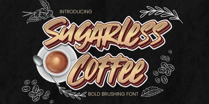 Hello Everyone, introduce our new product Sugarless Coffee - Bold Brushing Font Crafted Display, inspired by the title of the sports poster and We make it very energetically. Sugarless Coffee font with strong and challenging nuances. very suitable for the title, typography, Poster, magazines, brochures, packaging,Websites and much more for your design needs, making your designs more modern and professional. Inspired by Logo style and combination with Cute Craft style. that will fulfill your design needs for quotes,sporty theme, logotype, wordmark, etc. This has many opentype features and support multi language. You can activate Ligature OpenType panel design more interesting.