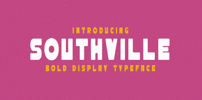
Introducing, Southville! a bold and fun display font. it's bold characteristic and round at the edges makes this font bold and brave but have soft and fun charm. this font is perfect for books, packaging, branding, make up, novel, label, etc. Features : uppercase & lowercase numbers and punctuation multilingual PUA encoded
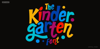
Vibrant, lively color font with a Mexican fiesta flair for joyful, child-centric designs. Celebrate the joy of childhood with this vibrant and colorful font. Perfect for creating a lively atmosphere in schools, kindergartens, and festive events. The playful, funny design captures the essence of a child's world, making it ideal for projects that speak to the hearts of both kids and adults. From birthday parties to school logos, this font adds a touch of joy to every design.
Metro-Retro is a distinctive font designed by Nick Curtis, which draws its inspiration from the art deco era, combining the past's aesthetic charm with modern design sensibilities. The font is charac...
Designed by Ashley Havinden, Ashley Inline is a monoweight all-capitals typeface with a hand-crafted look, suggesting European decorative wood-cut letters from the twenties and thirties. The term inline refers to the fine reversed-out line in the centre of the characters of the Ashley Inline font.
Algarabía Display was created for titles or to highlight a particular text. It includes a set of accented capitals and accented lowercases, almost one hundred ligatures, entry and exit capitals, symbols, punctuation and numerals, and almost 50 different kinds of dingbats. It is a typeface to have fun.
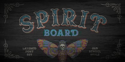
Hi, presenting a vintage "Spirit board" font set. It has decorative old-school look with four font layers (one font file for each layer). This combination allows easily to recolor lettering and create an interesting effects. Also one font file is availeble with all shapes in one. Thank you & have a great day!
Screenplay JNL was modeled from the signage seen in an old photo of the RKO movie studios building circa the 1930s. This multi-line lettering is so classic of the Art Deco period. For best effect and readability, use wider spacing between letters. For single words or initials, regular spacing should do fine.
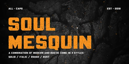
Mesquin is an all uppercase sans serif font with geometric shapes of characters. It is inspired by lettering from the industrial and good old past, but it still has a strong modern appearance. Its allows versatile design options and works perfectly for headlines, logos, posters, packaging, T-shirts, postcards and much more.
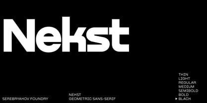
Nekst is geometric sans-serif. So it can only seem at first glance. Non-standard forms of some letters, behave unexpectedly and eccentric in a text line. It’s add notes of old grotesques and futuristic aesthetics to the modern-nordic image. Nekst font family includes seven weights supporting Cyrillic and extended Latin.
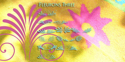
Fleurons are embellishments and here is my third and so far nicest round. I found some old ones in London and made them more modern ones. These go very well with my scripts Nadine and Ellida and a lot of my other scripts!!! Yours once more in a beautiful mood, Gert Wiescher
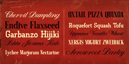
Built of all straight lines, Elegeion Script -- inspired by retro printers' scripts with a dash of calligraphy and handwriting thrown in -- mimics the imperfections and irregularities of old letterpress printing. Even better, it comes with lots and lots of swashy alternate characters and ligatures, including a full set of "long s" ligatures.
Cordel is the first digital typeface created by the founder of Tipos do aCASO in 1998. Its design refers to the unique woodcuts features used to illustrate the covers of old cordeis, pamphlets of Brazilian northeastern popular poetry. This unicase font presents irregular widths and spacing, a caricature of those woodcut graphics.
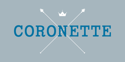
The exciting new typewriter font, Coronette, combines old-fashioned charm with modern typographic sensibilities. Originally commissioned as a custom font for Magnetic Poetry, this clean, medium-weight typewriter font is now available to the general font-lovin' public. Enjoy a new, multi-purpose workhorse font for all your labeling and page layout needs.
Eurasian Stencinitials JNL are modeled from a set of crudely die-cut Old English capital letter stencils that were made in Japan in the Early 1960s. The interesting treatment of the letters (with a slight hint of Japanese calligraphy) has some added bamboo plants for balance and decoration in this digital version.
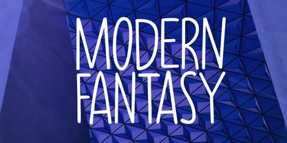
I have no idea why I named this font Modern Fantasy: it just popped up in my head and it stuck. I don’t consider myself to be ‘modern’ (but I’m certainly not old fashioned!), nor do I have particularly modern fantasies… Modern Fantasy is an elegant all caps font: thin, tall and lovely.
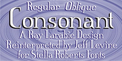
This imaginative and unusual serif text face was developed by Jeff Levine from an old Ray Larabie design. Improved and updated, it is exclusive to Stella Roberts Fonts. The net profits from my font sales help defer medical expenses for my siblings, who both suffer with Cystic Fibrosis and diabetes. Thank you.
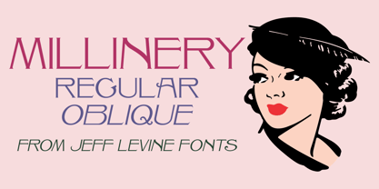
One of the type samples showcased in the 1907 Barnhart Brothers & Spindler specimen book was named “Sterling”; a spurred serif Art Nouveau design. This is now available digitally as Millinery JNL in both regular and oblique versions. An old fashioned term for a once plentiful business, ‘millinery’ is a women’s hat shop.
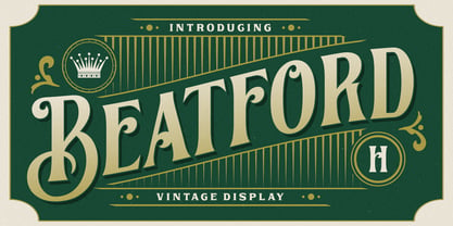
Beatford is a Vintage typeface font, it will add an old-rustic charm to any design project. It’s great also for Branding, Logo designs, Lettering, Logotype, Craft, Posters and much more. Features : Uppercase & Lowercase ( in All Caps ) Numbers & Punctuation Multilingual Alternate character & ornament How to access alternate / ornament ? : https://hanscostudio.com/tutorial/ Enjoy!
Livery Stable is a revival of an old classic font from the 1800s. Much research was done to recreate the original versions of Livery Stable which include regular, black, condensed and shadow lined versions of this font. Also look for the Horse Head symbol placed on the Less-Than and Greater-Than keys.
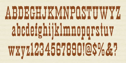
Egyptian Ornamented is a decorative font based on the shapes found in a French Clarendon. Serifs are chunky and bifurcated, and “spurs” have been added to the strokes. This font emits the feeling of Old West wanted posters, rodeo broadsides, etc. It was first introduced by William H. Page & Company in 1870.
Our old friend Carl Holmes, in another offering from his ABC of Lettering, takes the blacks to the max with this commanding face. A perfect choice for can't-miss headlines. Both versions of this font contain the Unicode 1252 (Latin) and Unicode 1250 (Central European) character sets, with localization for Romanian and Moldovan.
I've always been drawn to the beautiful typography of whiskey, gin, rum & bourbon bottle labels, as they enhanced the history that is behind this aged old spirits. A combination of elegant scripts and rugged serifs, these labels give sensibility to the slow process which these spirits go through in the distilling process.
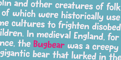
A Bugbear is a kind of hobgoblin, comparable to the Bogeyman. No tablets or gizmos were involved in the creation of this font. It was made entirely by hand, using an old-fashioned roller ball pen and a sheet of paper. Use Bugbear for your children’s book covers, party posters and product packaging.