10,000 search results
(0.056 seconds)
- Applied Sans by Monotype,
$57.99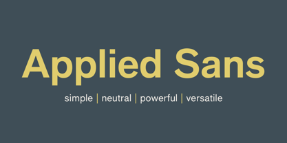 The Applied Sans™ family is a reinterpretation of the first sans serif typefaces used in what was then called, “jobbing or trade” work – typefaces like Venus and Ideal Grotesk. While built on the foundation of these late 19th and early 20th century designs, Applied Sans adds to it all the required features for modern typographic communication. The design benefits from a large x-height, open counters, generous apertures and a subtle modulation in stroke weight. These ensure character legibility and make for a design that is inviting and easy to read. Applied Sans family’s wide range, precise gradation of weights and extensive language support guarantees the design’s effectiveness in a wide and varied range of uses.
 - Train Of Thought by Pesic,
$29.00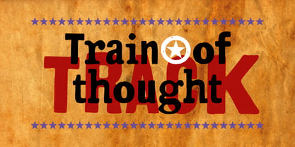 Train of thought is a decorative font based on vintage and retro posters of the 19th and 20th centuries. Contains all Latin and Cyrillic glyphs. It is very modern, and it is intended for the use of creating logos and T-shirt designs as well as highlighting the essential elements on billboards, magazines, etc. Today's digital designers can use these stencil patterns to embellish text set in other alphabet stencils or by themselves to evoke the feeling of rustic Americana. Train of the thought is extremely detailed, and looks good in both small and large dimensions. It also contains a set of symbols, which you can use to further emphasize the essential elements.
 - LCT Sbire by LCT,
$49.00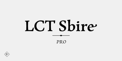 This Font is born basing itself on several standard typographic models. Inspired by our calligraphic drawings, the idea was to synthesize these many shapes into a unique font that can be used commonly. The slab base has been gradually humanized. The serifs have been carved, refined, rounded off, in order to galvanize the font and ease the task of reading in lower case. The angle of attack of the round letters is an echo of the 15 Century typographic heritage. It was important for us to create an expressive and humanized font, which could also be used for edition. The purpose was to confront the Ancient typographic canon of beauty with some funny and fancyful elements.
 - Frenchute by Tipo Pèpel,
$22.00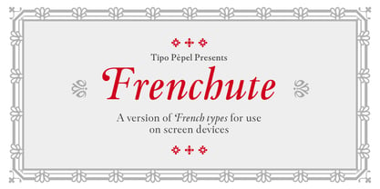 France 1727, the book Le chemin Royal de la Croix is published. Centuries later the historical publication comes into the hands of Josep Patau, who uses its printed pages as a reference for a new digital typeface. Previously created for printing, those shapes adapt now to the screen and show the sophistication and authenticity of true Garalde types. Frenchute is a multipurpose typeface with 3 optical sizes. All the shapes were modified to cover different typographic needs. The diagonal axis and the moderate stroke contrast are taken further in the italics letterforms, where the design is far more expressive. The character set includes decorative forms and italic capitals with swashes, so the text looks prettier.
 - 1859 Solferino by GLC,
$38.00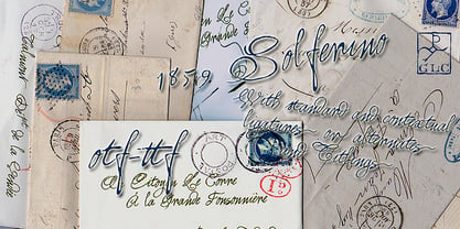 This font is a late 19th Century French script overview inspired by numerous French letters, from around years 1850-1860, during the second French empire, under Napoleon the third. Most of them were written with very tiny characters on light sheets of paper, as postage prices were calculated from the letter's weight. The TTF and OTF versions are enriched with more than 50 ligatures and/or alternate characters. We also offer a choice of two sorts of Capitals. Why "1859 Solferino"? It was the last battle of the Italian independence war, opposing the victorious Franco-Italian army to Austria in June 24, 1859. The Red Cross was inspired directly from the carnage remaining on the battle field.
 - Guillaume by George Tulloch,
$21.00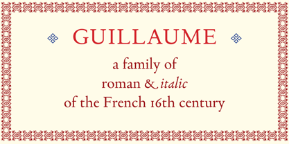 Guillaume is a small family of text fonts with its roots in the French sixteenth century. The roman is based on the types of Guillaume Le Bé (c.1525–1598), and the italic on those of Claude Garamont (Garamond) (d. 1561). Garamont’s romans have inspired countless modern interpretations, but his italics, despite their merit, have attracted much less attention. Guillaume offers extensive support for European languages, and is best suited for use in applications that support OpenType. Among its OpenType features are ligatures, small caps, several sets of numerals, contextual alternates, intelligent implementation of long ‘s’ and other period features, and fractions. For more detail, please see the pdf available in the Gallery.
 - Kristall Now Pro by Elsner+Flake,
$49.00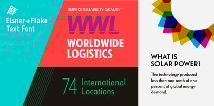 The design of Kristall Grotesk Now is based on a cut by Wagner & Schmidt, Leipzig, from the 30s of the last century as well as the digital version Kristall Grotesk MdK, created for the Stiftung Werkstattmuseum für Druckkunst. The implementation of the Kristall Grotesk MdK, a headline font, was deliberately created as a replica to create a faithful reproduction of the original. The design of the complete family Kristall Grotesk Now is based on the one cut Kristall Grotesk Buchschrift by Johannes Wagner GmbH, 1937, with its function as a text family. Designer: in parts Johannes Wagner GmbH, Redesign Elsner+Flake, Hamburg Designdate: 1937, 2009 Publisher: Elsner+Flake Design Owner: Elsner+Flake Original Foundry: in parts Johannes Wagner GmbH
 - Bolívar by César Puertas,
$39.95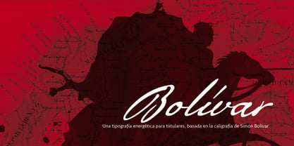 Bolívar is a contemporary display typeface inspired in the handwriting of one of the most prominent personalities of the Latin American 19th century: Simón Bolívar, “the liberator". The typeface intends to capture the passion of handwritten letterforms and to translate it into type. Among the characteristics that best contribute to its strong personality, are the impressive length of ascenders and descenders as well as the more than 45 degrees of slant. Bolívar mimics certain aspects of handwriting such as the slightly different baseline for each letter and ink clogs in the counters of some letters. Use Bolívar whenever you need to add passion to a piece of text, from logos or single words to sentences and captions.
 - Twelkmeyer by Popkern,
$18.00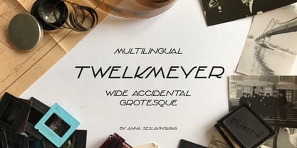 The multilingual accidental typeface was inspired by the pathos of the late revolutionary asceticism and architectural projects of V.F. Twelkmeyer. All story on twelkmeyer.com This typeface is a spring swallow. This typeface is a dawn and optimism of alumnus of Higher Art and Technical Institute in Leningrad. This typeface is a mirror of the Soviet architecture 30’s. It reflects the impressions from Vesnin brothers and Ginzburg’s works, a curiosity to Bauhaus, and the first test of the waters of socialist reconstructions. This wide, dynamic, angular, drawing typeface will be perfect for serious branding and architectural projects. So, give it a try! From innovative ideas of the 30s to innovative projects of the XXI century.
 - Westside by Linotype,
$29.99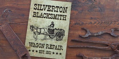 Westside was designed by Adrian Frutiger in 1989 and is a kind of wood type. It is reminiscent of dusty streets, Wild West heroes and swinging saloon doors. The origins of this kind of typeface can be found in the early 19th century. Called Italian or Italienne, these typefaces quickly became very popular. They are distinguished by square serifs whose width is larger than the stroke width of the characters. When the letters are set together, the heavy serifs build dark horizontal bands. Westside is a particularly decorative typeface which will have a marked effect when used expertly. It is perfect for headlines in larger point sizes, which will highlight its special character.
 - VLNL Wood Burger by VetteLetters,
$35.00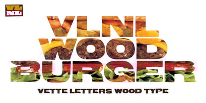 We all love a good burger here at Vette Letters. We also love to prepare them ourselves. Grilling the patties, cutting the tomatoes and cucumber, nothing beats a home made hamburger. And the best and tastiest way to grill a burger is on a wood charcoal grill. So all in all we can safely say that burgers and wood are a pretty darn good combination. This made Donald Roos decide to design VLNL Woodburger, obviously based on 19th century American wood type alphabets. Donald decided to add cyrillic characters, as he strongly believed that Russians would be equally partial to home made burgers. VLNL Woodburger is not really polished font, it will give any design a rough sturdy edge.
 - Isidora Sans by Latinotype,
$26.00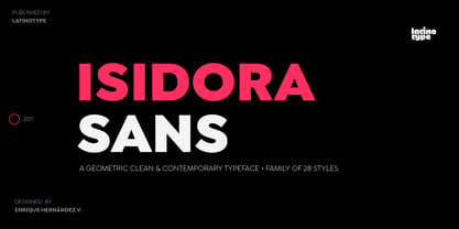 Isidora Sans is a new version of the bestselling font Isidora (released a year ago). The absence of terminals gives this new typeface a cleaner and more geometric look, keeping the essence and structure of the classic sans fonts of the early 20th Century yet with a fresh, clean and contemporary appearance. Isidora Sans consists of two subfamilies of 7 weights, ranging from Thin to Black, with matching italics, giving a total of 28 fonts. Isidora Sans is the perfect font for publishing, titles, books, magazines and corporate design. Its Alt version is ideal for logotypes, branding, packaging, and use on web and Tv. The family contains a set of 416 characters supporting 207 different languages.
 - Linotype Syntax Lapidar Text by Linotype,
$29.99Modeled on the writings chiseled in stone in the second century B.C., Syntax™ Lapidar is an energetic, spirited typeface designed by Hans Eduard Meier in 2000. Linotype Syntax Lapidar Text and Linotype Syntax Lapidar Serif Text have five weights each, with both cap and lowercase letterforms. Lapidar Display and Lapidar Serif Display also have five weights each, with mostly all cap letterforms and many alternates. It's a terrifically fun and inventive family, and if you look closely, you can see the resemblance to the more modern and restrained Syntax™ relatives. Great for menus, artist books, travelogues, or advertising - and if used very sparingly, it could add just the right element of lapidary significance to corporate documents. - Silver Archer by SilverStag,
$14.00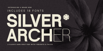 In a world of fleeting trends, Silver Archer stands as a testament to enduring elegance and timeless design. Inspired by the classic sans serif typefaces of the mid-20th century, Silver Archer exudes an air of sophistication and refinement, making it an ideal choice for a wide range of typographic applications. With its meticulously crafted proportions and harmonious stroke contrast, Silver Archer strikes a perfect balance between traditional aesthetics and contemporary sensibilities. Its open counters and generous x-height ensure exceptional legibility, both on screen and in print, while its nine weights, ranging from Thin to Black, with each weight complemented by its italic counterpart, provide ample flexibility to suit any design mood or hierarchy.
 - Triump by Latinotype,
$26.00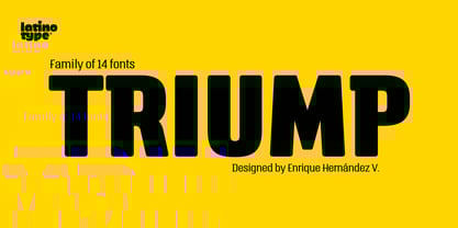 The typeface family Triump is a simple sans serif with 6 weights from Thin, ideal for use as an epigraph, to Black for head titles of special impact. Excellent for applying in graphic design as logos, trademarks, posters, editorial and web design. Inspired by the classic types of the late twentieth century with rounded corners that give the typography a smooth appearance with rounded ends, with a horizontal stroke that exceeds the vertical in the letters A, E, F, H, J and K which gives a distinct personality. Triump comes with a Black weight in normal and italic Line both upper and lowercase letters, especially to give a vintage look to the designs.
 - AI Wood by Alphabets,
$17.95These six faces are interpreted from examples shown in Rob Roy Kelly's "American Wood Types" They are not merely scanned copies, but have been redrawn from scratch with various optical adjustments. Kelly points out that the true glory of the American Wood Types are the negative spaces, which are, in their dynamic active forms, the antithesis of the anemic flimsy letters produced by type foundries in the 19th century. The Alphabets Wood Types are designed with digital manipulation in mind. Stretch, curve and distort at will! These designs were released prior to similar revivals from Adobe. Each font has two full alphabets (one full height, one smaller) and numerals. However, certain points and accents will not be found. - Tiblisi by Simeon out West,
$18.00Tiblisi is a font designed to emulate the feel of modern Georgian Script, which is called Mkhedruli. In earlier periods of her history, the Georgian language had several other alphabets, notably the Asomtavruli alphabet and the Nuskha-khucuri alphabet. The first printed material in the Georgian language, in the Mkhedruli alphabet, was published in 1669. Since then the alphabet has changed very little, though a few letters were added in the 18th century, and 5 letters were dropped in the 1860s. The font was named Tiblisi in honor of the nation's captial city. Tiblisi comes with full punctuation, a complete character set for most Western European languages that are based on the Latin Alphabet, and full kerning. - Modern MT for Dior JP by Monotype,
$29.99Cut by Monotype between 1900 and 1902, the Monotype Modern font family was based on Miller & Richards News 23 and 28; slightly condensed news text types of the 1890s. Monotype Modern is a lively typeface, with long, fine hairlines and well rounded letterforms, representing the best of nineteenth century modern face design. A classic text face, and typical of the moderns that were produced in the United Kingdom at that time, being less extreme in its rendering than some of the models of purer form being produced elsewhere. Monotype Modern is an excellent text face for magazines, newspapers and books, the heavier and more condensed versions are useful in headlines and display. - NS Lasttown by Novi Souldado,
$40.00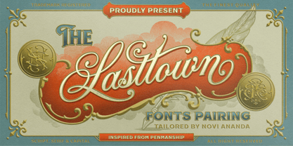 Inspired by the 18th - 19th century of Penmanship specimens archive from Europe and America, carefully crafted with precise mood, technique, and visual touch to bring back your design works into that specific era. It comes with a collection of 3 fonts that match well with each other. Also a set of wide features such as Ligatures and alternative swashes. Lasttown will be a great choice for your classy and formal visual looks such as certificate design, vintage label, commercial lettering works, sign painting, glass gilding, logo type projects, liquor store branding, wine packaging, anytime you need a classic visual touch, please, be our guest. What you get : Standard & Discretionary Ligatures Stylistic set Numerals & Punctuation
 - Eixample Villa by Type-Ø-Tones,
$55.00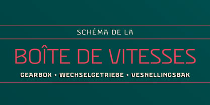 The Eixample project is inspired by modernist signage of various examples found in the Eixample neighbourhood in Barcelona. The name of each subfamily is related to its location or to specific elements of the original sign. Villa is the abbreviation for Carrer Villarroel (Villarroel Street), where the Villarroel Pharmacy has been displaying this sign since the first quarter of the twentieth century. The Eixample Villa typeface system consists of sturdy letters free of ornaments with an industrial aspect. Only the treatment of the curves borrows modernist features. Like the rest of the families in the Eixample series, Villa shows its origin as a display font, but it has been engineered to give good results at small sizes as well.
 - Joanna by Monotype,
$40.99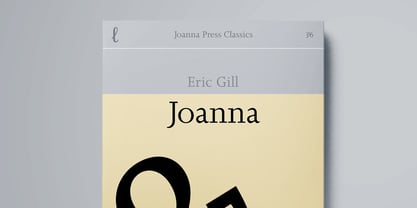 The English stone carver, artist, and typographer Eric Gill conceived the Joanna typeface as a personal design for use in books printed at his Joanna Press."" Gill saw his press work there as a continuation of the British Arts and Crafts Movement, pioneered in the 19th Century by William Morris. Joanna is notable for its almost vertical ""upright"" italics, and the unusally small size of its italic characters. Joanna is versatile and extremely legible. The letterforms are a bit narrow, so the face is very economic as well. A lot of text may be packed densely together onto a page with Joanna. Joanna mixes very well with other typefaces designed by Eric Gill; especially Gill Sans.
 - Modern MT for Dior KO by Monotype,
$29.99Cut by Monotype between 1900 and 1902, the Monotype Modern font family was based on Miller & Richards News 23 and 28; slightly condensed news text types of the 1890s. Monotype Modern is a lively typeface, with long, fine hairlines and well rounded letterforms, representing the best of nineteenth century modern face design. A classic text face, and typical of the moderns that were produced in the United Kingdom at that time, being less extreme in its rendering than some of the models of purer form being produced elsewhere. Monotype Modern is an excellent text face for magazines, newspapers and books, the heavier and more condensed versions are useful in headlines and display. - MonsterPie by Marc Lohner,
$28.00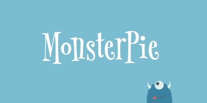 Say hello to MonsterPie. This font brings the funny appearance of irregular designed characters together with the classic look of the Didone typefaces from the 18th century – that makes it a good choice for theme parks, movie posters, games, greeting cards and kid’s products. A large database and plenty of alternate characters work in the contextual alternates feature to keep your headlines bouncing all the time. Other implemented Opentype features are case sensitive forms, ligatures, arbitrary fractions and many more. On top, MonsterPie has a set of nice arrows, two different ampersands and extensive support for south-eastern, central and western european languages, as well as for Pīnyīn to offer. Designed by Marc Lohner in 2016.
 - Callejera - Unknown license

- Cholla by Emigre,
$49.00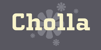 The Cholla typeface family was designed by Sibylle Hagmann in 1998-99 and named after a species of cactus she encountered in the Mojave Desert. Cholla was originally developed for the Art Center College of Design in Pasadena, California. There, art director Denise Gonzales Crisp and associate designer, Carla Figueroa, collaborated with Hagmann to create a series of fonts that would offer a great deal of variation. The variety was needed to echo the school's nine different departments, yet together the fonts had to exude a unified feel. It was first used in the radically designed 1999/2000 Art Center catalog which won a honorable mention in I.D. magazine and was featured in Eye No. 31. Originally Hagmann set out to design a typeface that, as she recalls, "I could feel comfortable making, first of all, and one that would serve a purpose and had a clear idea behind it, and something that I would want to use myself." Stylistically Hagmann set out to create "12 cuts with slightly different personalities, with different ideas applied. For example the bold weight isn't simply the Regular with weight gain, but has bold letterforms with their own peculiar details. What all weights share and what is the necessary unifying detail is the tapered curve - marked out, for example, in the lowercase b's left top and bottom of the bowl." Gonzales adds: "The forms seemed classical as well. This combination could have a long life, and be timely. I also saw - at least in the beginnings of Cholla - forms that connoted hybrid, of inter-connection, of human and machine growing together. These notions seem appropriate for a school that teaches design and art." Greek version by Panos Haratzopoulos.
 - Sprout by The Northern Block,
$25.99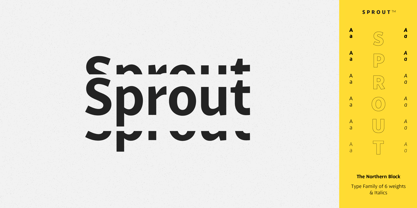 Sprout is a low-contrast sans serif, slightly condensed for economy of space, and complete with 6 weights in Roman and Italic. It has open apertures and a generous x-height for clarity of reading. It also comes with a weight balanced italic, which can be used for differentiation or as a standalone typeface in itself. The defining feature of the family is the taut curve, where the inner counter pushes out toward the outer contour, creating a feeling of tension in the curve. In the italic this shape language is pushed further, with a playful looped g and cursive form of the f. Sprout also comes with Old Style figures. Its range of weights makes for a versatile family suitable for branding, on-screen publishing and long-form reading.
 - Planc by Taner Ardali,
$39.00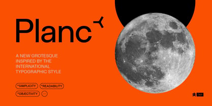 Planc has emerged as an approach to reconsider the grotesque font anatomy in a contemporary way. It is a new grotesque family with its subtle touches of details. Its relaxed proportional structure differentiates Planc from the usual grotesque anatomy, meeting the grotesque font requirement that can keep up with today. In addition to the solid grid structure on the horizontal axis, with its smoothed curves, Planc provides a comfortable reading flow and avoids being dull with its details. Its minimalist approach comes from Planc's reduced dysfunctional details. As a clean design principle, it contains innovative letterforms. Planc font family consists of 10 weights including matching italics with extended Latin character set. It is a designer-friendly typeface with extra symbols, standard-old style,tabular-proportional numbers, arrow sets, and stylistic alternates.
 - Utily Sans by Latinotype,
$39.00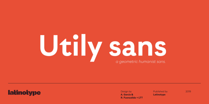 Utily Sans emerges from the question: "What would the world be like if Paul Renner had had greater inclination towards humanism rather than geometry?" Utily Sans glyph proportions and shapes make it suitable for long-form text. This typeface shows geometric simplicity with humanist shapes. It looks like Futura, but has a feel closer to Garamond. Utily Sans is composed of 6 weights with their matching italics, an alternate character set that brings it back to its geometric origin, uppercase discretionary ligatures for expressive titles, as well as small caps, lining figures and old style numbers. These features make the font well-suited for large and small sized compositions, for short or long text. Utily Sans is the first Latinotype font with Cyrillic support, additional to the usual support for over 200 Latin-based languages.
 - English Engravers Roman by Smith Hands,
$38.00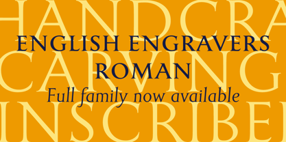 English Engravers Roman is inspired by the beauty and eccentric detailing of British stone carved lettering. After observing many beautiful inscriptions around London and southern England, Robbie Smith decided to create a font family in homage to this rich heritage. English Engravers Roman features a set of beautifully balanced uppercase Roman, and a characterful lowercase alphabet with some endearing quirks. Included in the each font are two forms of lowercase 'q', one very similar to an uppercase 'Q' with a tail, and a traditional 'q'. Each font in the family features a comprehensive character set with many ligatures, added to enhance letter spacing. The fonts all feature an additional set of old style numerals. Many extra characters and ligatures can be accessed via the 'insert glyph' functions in graphic design software.
 - Altra Two by Hackberry Font Foundry,
$24.95AltraTwo is a complete redraw of a family based on a tracing of a clip art font from an old printed book. The AltraTwo family adds italic, black, and black italic. I liked the gentle calligraphic look. Consider it a sans serif with style. This is a typical NuevoDeco OpenType pro font with caps, lowercase, small caps, lining, oldstyle, and small cap figures, numerators, denominators, fractions, swashes, and so on. There aren't many unusal ligatures for this one, though. It does have the Latin 2 character set or what Adobe calls CE, Central European characters. Altra has been my preferred header face for sevral years. it also works very well for body copy. I usually use it for my contrasting tip and quote paragraphs with Bergsland Pro as my normal body copy. - Branding by Latinotype,
$39.00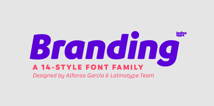 Branding, a modern typeface for modern needs! Branding, especially designed for meeting contemporary aesthetic and functional needs, is the interpretation of a modern typeface from the designer’s own perspective. This typeface encapsulates a wide range of nuances and combines, seemingly, opposite elements such as technology and friendly rounded shapes. In addition, alternative characters make Branding an ideal tool for both graphics designers and art directors. Branding is a sans-serif spurless typeface with a medium-large x-height, slightly wider horizontal proportions, straight curves and convex terminals. This font is well-suited for logotypes, isotypes, short text, etc. Branding comes in 7 weights—ranging from Thin to Black—with matching italics and includes a set of 544 characters that supports 128 different languages. European accents, old style numbers and multiple alternates are also included.
 - Serofina by insigne,
$24.99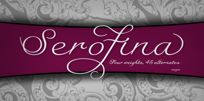 Serofina is an adaptable and fluid connected script with plenty of alternate flourish options. From clean and flowing to cute and frilly, Serofina can do it. The Serofina family comes with four weights, including a unique hairline, which makes it a versatile investment for a wide range of design possibilities. All weights include the OpenType programming to automatically and seamlessly swap out the default characters for 45 alternate forms and 18 auto-replacing ligatures. These alternates can make the face appear to be more simplified, restrained or frilly. Serofina also includes seven ornaments and old-style numbers. Check out the sample images to see these features in action. Serofina is a highly versatile script family and its range of weights make it perfect for whenever you need an expressive and original typeface.
 - Fuse by W Type Foundry,
$25.00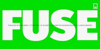 This font is inspired by two typographic styles, incorporating (both) geometry and humanism. It combines the rhythm of such typefaces as Meta Pro and The Sans, as well as terminations and structures from fonts like Din and Futura. This results in a font that plays with condensation and a parallel rhythm, simple and functional. Fuse is perfectly equipped with Opentype, it contains alternative glyphs, fractions, modern and old numbers, superscripts and subscripts, ligatures and Small Caps. We always kept the idea of having Fuse be humanistic, rational and universal, which makes it ideal for graphic design, printed publications, web design, motion graphics, interaction design and branding. Learn about upcoming releases, work in progress and get to know us better! On Instagram W Type Foundry On facebook W Type Foundry wtypefoundry.com
 - Hanleth by great19,
$14.00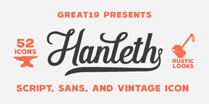 Hanleth family is a combination of script and all cap sans. This duo font was made and inspired by old vintage script and simple sans, polished with a little bit of modern style. This font family is a vintage, authentic and hand crafted piece of typeface. 1. Hanleth script : comes with clean and rough version. with some swash and alternates that make it looks unique and elegant. 2. Hanleth sans : comes with clean and vintage rustic version. a simple sans that generally good for tittle and body text. 3. Hanleth icon : comes with 52 vintage rustic icons is perfect to boost the vintage feel of this family. Hanleth family is perfect to make logotype, product packaging, tittle for poster or greeting card, promotional message, branding project and more.
 - Glaciar by TripleHely,
$16.00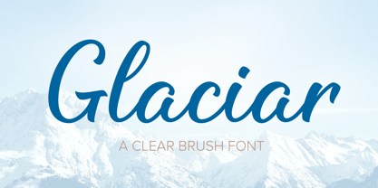 Glaciar is a script typeface based on brush handwriting and inspired by old-style bas-reliefs. All contours were carefully cleaned of brush roughness, but at the same time, minor imperfections were left to create the unique character of this font Glaciar has a built-in auto replacement for lowercase letters without connecting strokes (in the case of word ends) and for ligatures (in the case of letter pairs that do not fit well together). In addition, there are alternates glyphs with starting and ending swashes - the last ones can be used with any OpenType software. And finally, the font has wide multilingual support and can be used in texts in 195 languages Glaciar is a good choice for branding and design projects as well as a cute text overlay to any background image
 - Neubau Pro by TipografiaRamis,
$49.00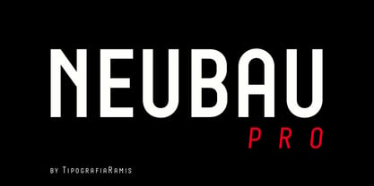 Neubau is a condensed geometric display typeface, designed in 2009. The inspiration for this face came from Joost Schmidt lowercase letters developed during 1925-28 in Bauhaus Dessau. Schmidt was one of the proponents of New Typography – a movement advocating the use of only lowercase letters which were constructed strictly geometrically using only ruler and compass. Neubau Pro is the new edition of Neubau fonts. The new typeface is an upgraded version of an old fonts (2009), with careful refinements to glyph shapes, and the extension of glyph amounts which enabled support of more Latin languages as well as Greek and Cyrillic languages. Neubau Pro is released in six styles with small caps, and true italics, and contains OpenType features. This typeface can be used for editorials and print designs.
 - Rare Bird Specimen III by Rare Bird Font Foundry,
$100.00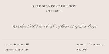 RARE BIRD SPECIMEN III Rare Bird Specimen III is a graceful hand by Karla Lim of Written Word Calligraphy. This all lowercase font feels both modern and feminine. While uppercase letters are still lowercase in shape, they are larger and read as caps. OBSERVATIONS Specimen III has a dancer-like form; supple and lithe. Willowy letters are nimble and lissome, content alone or paired with a stronger, more masculine specimen. DEFINING CHARACTERISTICS Opentype programming, formal title and preposition word art, 7 alternate lowercase t cross-strokes, Roman numerals, old-style numerals, seamlessly semi-connecting calligraphic letters, realistic double-letter ligatures, in and out-stroked letters at the beginning and end of words where appropriate, basic Latin encoding. POTENTIAL SIGHTINGS Bridal + baby shower stationery, logo design, gourmet food packaging, clothing labels.
 - Estragon Pro by Stabenfonts,
$45.00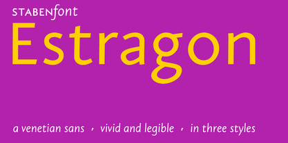 Estragon is a vivid sans-serif text face with venetian influences, suitable especially for books. It is remarkable for: its light slant, to the right, for most of the verticals, its small sized uppercase letters making it suitable for languages where they are often used (for example German,) and its just lightly inclined true italics. For a wide language support, Estragon contains a lot of accented characters including the polish kreska. It is generously equipped with ligatures, special and alternate characters as well as various kinds of numbers: besides the standard old-style figures to be set as part of text copy there are small-cap and tabular numbers as well as a set of fraction figures. Estragon comes with two weights, uprights and true italics, each with small-caps.
 - Edith by Dominik Krotscheck,
$12.00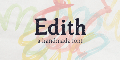 Edith is a handmade serif typeface that can be used for long texts. To make it even better suitable, it is equipped with all the major features you’d expect from a traditional text-font, such as case sensitive forms, old style figures (lining figures are accessible via an opentype feature), fractions and good kerning. To keep up the handwritten appearance, two versions of each letter (A-Z & a-z with diacritics) and number are available and substituted automatically if the same ones meet. Edith is also nice to look at in larger sizes and therefore a great fit for any packaging, advertisement or headline. Edith is for you, if you plan on doing childish things, DIY things, traditional things, illustrated things, nautical things, grungy things or any handmade related things.
 - ALS Meringue by Art. Lebedev Studio,
$63.00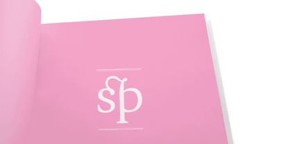 Meringue, a transitional serif face, is designed specially for modern glossy magazines. It is ideal for fashion photography, fashion publications and mag covers, and can be used for headings and captions, as well as for body copy. The italic version, with its wave-like vertical strokes, creates yet more stylishly expressive feel. Text set in Meringue has an elegant weightless look, and the strongest effect can be achieved with high-quality printing. The typeface includes old style figures, ligatures, and alternative characters that allow creating truly versatile design by means of typography. Designers may also find Meringue perfect for beautiful presentations, invitations and other special occasion papers. Meringue was designed during the Type and Typography course at the British Higher School of Art and Design, supervised by Ilya Ruderman.
