6,737 search results
(0.042 seconds)
- Prick by Burghal Design,
$29.00Sharper than a cactus patch, the thorny Prick is perfect for the Goth or Heavy Metal fan that lies dormant in us all. - Wappenbee by Kenn Munk,
$15.00Wappenbee is a 28 pixel bitmapped dingbat system for building crests for the modern, noble life. The dingbat allows you to build memorable crests like the skatepark crest, the smelly sock crest, the mixtape crest and many more. Vowels are mythical shield-holding creatures (upper- and lowercase are right- and leftfacing beasts), consonants are the various shields and numerals are 'crowns' above the crests. - Jackalope NF by Nick's Fonts,
$10.00This bouncy beauty was inspired by Walnetto Casual, designed by Dave West for Photo-Lettering, Inc. in the 1970s, and takes its name from a mythical West Texas beastie. This version has been thoughtfully designed to use Contextual Alternates to avoid unsightly serif collisions for best possible visual effect. Both versions of this font include the complete Latin 1252 and Central European 1250 character sets. - The "Gothic Alarm Clock" font by The Font Emporium stands as a distinctive and evocative piece within the world of typography. Designed with an artistic blend of gothic sensibilities and a playful no...
- Die Lara by Ingo,
$27.00 A girl’s handwriting written on the iPad Writing changes – throughout history over centuries, but also from generation to generation. Each new generation of students learns to write the basic forms of the letters a little differently than their predecessors. The role model is also changing. The cursive handwriting taught in school is getting closer and closer to printed type. The children no longer learn the forms of cursive handwriting required for connected writing, but first the “block letters”, only later should they develop their own individual handwriting from this, which many of them no longer do. And the writing tool is also changing. Of course, script looks different when children no longer learn to write on paper with a fountain pen, but on a tablet computer with the “pencil”. The writing experience is completely different, and the “material properties” are different too. There is practically no writing resistance that would make it difficult to move against the direction of writing. "Die Lara" was created based on the template by Lara Mörwald from the winter of 2023. The font version "Black" corresponds to the handwritten original, all thinner variants up to the wafer-thin "Hairline" are derived from it. In the variable font, the intermediate forms can be selected steplessly. In order to preserve the handwritten character of the font, "Die Lara" contains several alternates to most letters and numerals, so that different character forms alternate in the typeface. If the "ligatures" function is activated in the app (which is the default in most programs), these alternates appear automatically as you type. There is also an alternative "swashed" variant of some letters. So you can set somewhat livelier accents at the beginning or end of a word. "Die Lara" also contains fractions and tabular figures.
 - Tasmin - Unknown license

- P22 Elizabethan by IHOF,
$24.95 Elizabethan is part of the fonts designed by Ted Staunton for his historic novel centered around a family bible and the handwritten annotation through seven generations. The Elizabethan font is based on a style known as “secretary hand” circa 1610.
 - Ysobel by Monotype,
$29.99 The Ysobel™ typeface family is not only elegant; it is also exceptionally legible and space economical. A collaborative design effort between Robin Nicholas, as lead designer and project director, Delve Withrington and Alice Savoie of Monotype Imaging, the project had the primary design goal of creating a typeface family for setting text in newspapers and periodicals. The result, however, is also ideal for any application that requires quick and easy assimilation of text. According to Nicholas, “The idea for the design started when I was asked to develop a custom version of Century Schoolbook. I wanted to give the design a more contemporary feel, although the client ultimately decided to keep their typeface closer to the original. The project nevertheless gave me ideas for a new design. Since designing Nimrod, some 30 years ago, I had wanted to make a more modern typeface family for newspapers and magazines – this seemed the ideal candidate.” Ysobel (pronounced “Isabel”) has the soft, inviting letter shapes of Century Schoolbook but contrasts these with more incised serifs and terminals. Its capitals are also narrower than those of Century Schoolbook, and care was taken to ensure that they harmonize perfectly with the lowercase. Ysobel’s x-height is full-bodied without disrupting lowercase proportions. In addition, curved terminals, such as those in the “C,” “c” and “e,” were drawn more open as an aid to legibility and readability in text copy. Weight stress is near vertical, and hairlines are robust to ensure character fidelity in small point sizes. Development began with the text version of the family, which has four weights, each with an italic companion. All weights feature lining and old style numerals, fractions, superiors and extended Latin language coverage. Small caps are also available in the Roman Regular design. Ysobel Display is a completely redrawn version of the typeface; it is narrower, and has a slightly smaller x-height, thinner hairlines and subtle design changes to improve its appearance when set at large sizes. The Display Italic received particular attention to make it ideal for setting headlines, subheads and short blocks of copy. Changes include a slightly greater italic angle and more cursive treatment of some letter shapes. Alternative styles of capital “J” and “Q,” to provide variation, are available in all weights.
 - Prisma - Unknown license

- joeHand 1 - Unknown license

- Typographer Rotunda Alt - Personal use only

- brunoBook - Personal use only

- Ganz Grobe Gotisch - Personal use only

- Wood Poster Display JNL by Jeff Levine,
$29.00 Wood Poster Display JNL is a more casual sans wood type, with a bold and friendly appeal. This font offers a pleasant design which lends itself perfectly to titling, price cards, event notices and any print or web design that prefers a less formal structure to its typography.
 - Jourba by PizzaDude.dk,
$20.00 Jourba is my quick scribbled serif font. Here and there you can notice inkblobs and obvious clumbsy lines. Comes with alternate upper- and lowercase along with a lot of ligatures of the most used typical letter combinations! You will need to use OpenType supporting applications to use the ligatures.
 - Habone by Balevgraph Studio,
$12.00 Habone is a modern, sans serif font. It can easily be matched to an incredibly large set of projects, so add it to your creative ideas and notice how it makes them stand out! Features: Multilingual Ligatures Alternates PUA encoded Files Included: Habone Regular TTF Habone Italic TTF
 - Fergana by Hazztype,
$18.00 Fergana is a square display sans-serif typeface with an inverted or reverse contrast. It uses a very high contrast to be as loud, bold and noticeable as possible. Fergana is a powerful option at large sizes for use on headings, posters, billboards, magazines, advertisements, from casual to hipster.
 - Otis Condensed by Australian Type Foundry,
$30.00The name Otis arose from an incident in a shopping mall in which, realising my shoelace was undone while on an escalator, I bent down to tie it, became aware of the approaching end, panicked, fell over, and in the process happened to notice the escalator's brand name. - Trick or Bite by Sipanji21,
$16.00 Trick or Bite is an incredibly unique horror display font, with bite and spider webs in any characters. Add this font to your favorite Halloween themed ideas and notice how it makes them come alive. Trick or bite is perfect for posters, packaging, banners, advertising, apparel, and more.
 - Bodine by Balevgraph Studio,
$12.00 Bodine is a bold and geometric looking display font. It can easily be matched to an incredibly large set of projects, so add it to your creative ideas and notice how it makes them stand out! What's Included? Uppercase & Lowercase Numbers & Punctuation Alternate & Ligature Multilingual Support PUA Encoded
 - Underdoug by PizzaDude.dk,
$15.00 All caps font with squarish letters. At first sight, it may look a little bit ordinary, but watch it with massive text - then you will notice the bounciness and the contextual alternates that automatically switches between the 5 different versions of each letter! Comes with massive language support!
 - The Camping by Fox7,
$12.00 The Camping is an elegant and stylish vintage slab serif font. This typeface is perfect for elegant and vintage logos, book or movie title designs, fashion brands, magazines, clothes, lettering, quotes, etc. Add this font to your favorite creative ideas and notice how it makes them come alive!
 - Loco by Juraj Chrastina,
$39.00 Loco is an impacting display typeface playing with simple geometric forms perfect for posters, flyers, magazines and everything that needs to look bold, noticeable and up-to-date. Loco was created to perfectly match Ambassador Plus Sans Light. Their combination offers a flexible tool for your creative designs.
 - RoundCut by Fábio Mansos,
$23.00 RoundCut Bold is a geometric grotesque typeface, ideal for large sizes (display proposals and headlines). Its structure is modern, strong and bold, noticeable in its minimal and geometrically forms. Although visually simple, the construction of each letter form is complex allowing some expression and uniqueness to the typeface.
 - Enforcer by Tour De Force,
$25.00 Modern simple typeface expressing sharp and bright words without need for writing something really smart. Made by Dusan Jelesijevic one day when he left without anything smart to say or write, so he just grabbed a pencil and forced the paper to be cooperative. Someone said that this typeface looks like the ancient Greeks went in present future and used contemporary equipment for writing those letters. It is ideal for branding and avantgarde identities.
 - Pluckypot by Maulana Creative,
$12.00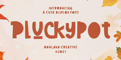 Pluckypot is a decorative handwritten display font. With pencil effect stroke, fun character with a bit of ligatures. To give you an extra creative work. Pluckypot font support multilingual more than 100+ language. This font is good for logo design, Social media, Movie Titles, Books Titles, a short text even a long text letter and good for your secondary text font with Script or Handwrittens. Make a stunning work with Pluckypot font. Cheers, MaulanaCreative
 - BoxyBlocks by d[esign],
$17.38 The laboriously hand drawn letters of the BoxyBlocks font family are something reminiscent of the letters and decorative elements which adorned our childhood artworks, posters, pencil cases and workbooks. The BoxyBlocks font family consists of three fonts; BoxyBlocks, BoxyBlocks Nero and BoxyBlocks Original. BoxyBlocks and BoxyBlocks Nero can be used together to fill in the sides of BoxyBlocks' letters, by layering BoxyBlocks above a differently coloured BoxyBlocks Nero in your image editor of choice.
 - Reclaim - Personal use only

- Mesquite by Adobe,
$29.00Mesquite is a narrow Tuscan-style typeface designed at Adobe in 1990. Like older Tuscans from the 19th Century, Mesquite has elaborate, creative serif treatments-although the serifs are so unique that it is difficult to call them serifs anymore, they are more like pointy finials. A convex-concave-convex ornamental feature appears on the middle of each vertical and diagonal stroke. Together with the serifs" at the tops and bottoms of each stroke, this feature creates a "tri-band" pattern over text set in Mesquite. Mesquite is not a text face. Aside from its narrowness and decorative qualities, Mesquite has no lowercase. The font's uppercase glyphs have been directly copied and placed in the lowercase range." - Linotype Syntax Lapidar Serif Text by Linotype,
$29.99Modeled on the writings chiseled in stone in the second century B.C., Syntax™ Lapidar is an energetic, spirited typeface designed by Hans Eduard Meier in 2000. Linotype Syntax Lapidar Text and Linotype Syntax Lapidar Serif Text have five weights each, with both cap and lowercase letterforms. Lapidar Display and Lapidar Serif Display also have five weights each, with mostly all cap letterforms and many alternates. It's a terrifically fun and inventive family, and if you look closely, you can see the resemblance to the more modern and restrained Syntax™ relatives. Great for menus, artist books, travelogues, or advertising - and if used very sparingly, it could add just the right element of lapidary significance to corporate documents. - Little Cecily by Olga Umpeleva,
$25.00 Little Cecily was designed on the base of a Russian calligraphy sample book for primary schools “Propisi pryamogo pis’ma” (Moscow, 1914). Such kind of scripts were implemented in school programs at the end of 19th-beginning of 20th century. There was an opinion that the straight writing is easier for learning and better for children from a medical point of view. The letterforms of the typeface are characterized by simplified constructions and upright design which distinguishes it from the list of typical school scripts and convey to it a naive charm and originality. The character set covers standard Western and Cyrillic code pages and it includes alternative letters and contextual forms for connected writing.
 - Modern MT for Dior CS by Monotype,
$29.99Cut by Monotype between 1900 and 1902, the Monotype Modern font family was based on Miller & Richards News 23 and 28; slightly condensed news text types of the 1890s. Monotype Modern is a lively typeface, with long, fine hairlines and well rounded letterforms, representing the best of nineteenth century modern face design. A classic text face, and typical of the moderns that were produced in the United Kingdom at that time, being less extreme in its rendering than some of the models of purer form being produced elsewhere. Monotype Modern is an excellent text face for magazines, newspapers and books, the heavier and more condensed versions are useful in headlines and display. - Castelan Hispane by Ixipcalli,
$35.00 La tipografía Castelan Hispane es una tipografía inspirada en documentos y textos antiguos históricos españoles del siglo XVI. Los trazos semi-medievales - cursivos, le dan una apariencia antigua pero también moderna para los proyectos en los que se desee utilizar la tipografía. Cuenta con seis estilos y tres pesos, ligera, regular y negrita. Cada peso contiene también su forma “itálica”. The Castelan Hispane typeface is a typeface inspired by ancient Spanish historical documents and texts from the 16th century. The semi-medieval - cursive strokes give it an ancient but also modern appearance for projects in which you want to use typography. It has six styles and three weights, light, regular and bold. Each weight also contains its “italic” form.
 - Figgins Sans by Shinntype,
$79.00 The first sans serif types were made in London in the early 19th century. They were severely modern, all caps and bold. The Figgins foundry, inventor of the term sans serif, showed a ?ne example in its specimen of 1836. The extra bold weight of Figgins Sans is a close revival of the original, with the addition of a lower case which retains its partly geometric, partly grotesque quality. The family is rounded out with other weights and an italic, and extended into Cyrillic and Greek, all executed in what is assumed to be as authentic a manner as possible, given the hypothetical nature of the exercise. Together with Scotch Modern, comprises The Modern Suite of matched fonts.
 - Imagist by Fenotype,
$35.00 The mystic sadness of the sight Of a far town seen in the night. Like the poetry movement of the early 20th century, from which the font takes its name, Imagist relies on the power of concrete images and brings an organic vibration to the words it forms. Imagist is a lively and decorative serif typeface with prominent features that appear especially in the letters K, R, M, N, W, V, k, w, v and y. Powerful ball terminals also bring recognizable attraction. Imagist contains six weights and corresponding Italics. Italics have a cursive-style letter s for as Stylistic Alternate. Old Style Numerals and Small Caps can be found in all cuts. Poem by T. E. Hulme.
 - Old Kharkiv by Bohdan Hdal,
$24.00 Old Kharkiv was inspired by the first half of the 20th century photo with a signage on the building of the Ivan Kotlyarevsky Kharkiv National University of Arts. During the development, the font has acquired unique features not from the original signage, for example, drops in uppercase were replaced with sharp serifs. This font contains the letters of all the main European languages, Cyrillic and basic special characters. Some uppercase letters (where allowed their form) have decorative elements (swashes) to use them as drop caps or initials. There are stylistic alternatives for some Ukrainian letters. Also, as a bonus, this font contains up to a dozen graphic elements that you can use in your layout.
 - StudioSans by BrightHead Studio,
$20.00 StudioSans — is a modern representative of the class of sans-serif fonts inspired by the traditional Swiss design and typography of the mid 20th century. This is a minimal, clean and open font family with friendly forms. Focuses on functionality, has a high x-height and short ascender and descender elements. This is combined with soft circles and high legibility of characters contributing to comfortable reading. The family contains six weights from ExtraLight to ExtraBold. Each of them has in its arsenal more than 450 glyphs and knows more than 50 languages. Support for OpenType Features focused on the Oldstyle Figures (including signs of currencies and interest), Case-Sensitive Forms, Standarts and Discretionary Ligatures, Slashed Zero and Etc.
 - PKG Roman Capitals by Posterizer KG,
$19.00 PKG Roman Capitals is one more of Posterizer KG calligraphic fonts, based on Roman Square Capitals letterforms, also called Capitalis Monumentalis, Inscriptional Capitals, Elegant Capitals and Capitalis Quadrata from (about) 2nd century A.D. All graphemes are taken from calligraphic pages written with brush on traditional calligraphic stile, inspired by epigraphic monuments from the Roman Pantheon, Trajan’s Column, and the Arch of Titus. PKG Roman Capitals font is good guides for any who want to study the beautiful proportions of Roman Capitals. In practice, it can be useful for calligraphic sketches and imitation of Roman (European) historical manuscripts. Font contains good stylistic, morphological and metrical balanced Capitals, Small Caps and all the Latin and Cyrillic glyphs.
 - Rusticana by Linotype,
$29.99Rusticana is a part of the 1990 program Type before Gutenberg, which included the work of twelve contemporary font designers and represented styles from across the ages. Linotype offers a package including all these fonts on its web page, www.fonts.de. Rusticana was designed by Adrian Frutiger and appeared with Linotype in 1993. Its historical roots go back to the Roman Capitalis, the all caps engraved writing of ancient Rome which reached its peak in the first century. From this style evolved other Roman forms, and one, Rustica, proved particularly good for text on bronze, as opposed to in stone. The Rusticana of Frutiger has open, seemingly irregular forms which lend a distinctive rhythm to text. - Departura by Nasir Udin,
$20.00 Departura is a sans-serif family inspired by art deco travel posters in early 20th century, fused with modern & geometric touch. It comes in 18 styles, 9 weights and its matching italics. With those style variatons, Departura offers many possibilities to be applied in many graphic or editorial projects.The modernized retro-look makes this family great to presents any contents related to travel, history & culture in the present/modern way. Also thanks to the extended latin character set so that Departura supports 200+ latin-based languages plus Cyrillic (including the Bulgarian and Serbian characters). P.s.: The Bold Italic & ExtraLight styles are free to download, so you can use them for any projects free of charge.


