10,000 search results
(0.048 seconds)
- Sunday Cake by Arendxstudio,
$13.00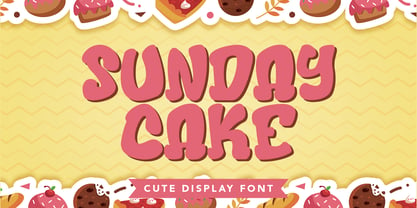 Sunday Cake - Cute Display Font is a font with distinctive handwritten characters perfect for branding projects, logos, wedding designs, media posts, advertisements, product packaging, product designs, labels, photography, watermarks, invitations, stationery, and any project who need handwritten dishes. Features : • Character Set A-Z • Numerals & Punctuations (OpenType Standard) • Accents (Multilingual characters) • Ligature Multilingual Support : Afrikaans, Albanian, Asu, Basque, Bemba, Bena, Catalan, Chiga, Cornish, Danish, English, Estonian, Faroese, Filipino, Finnish, French, Friulian, Galician, German, Gusii, Icelandic, Indonesian, Irish, Italian, Kabuverdianu, Kalenjin, Kinyarwanda, Low German, Luo, Luxembourgish, Luyia, Machame, Makhuwa-Meetto, Makonde, Malagasy, Malay, Manx, Morisyen, North Ndebele, Norwegian Bokmål, Norwegian Nynorsk, Nyankole, Oromo, Portuguese, Romansh, Rombo, Rundi, Rwa, Samburu, Sango, Sangu, Scottish Gaelic, Sena, Shambala, Shona, Soga, Somali, Spanish, Swahili, Swedish, Swiss German, Taita, Teso, Vunjo, Zulu
 - Treatment by Arendxstudio,
$13.00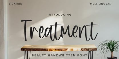 Treatment - Beauty Handwritten Font is a font with distinctive handwritten characters perfect for branding projects, logos, wedding designs, media posts, advertisements, product packaging, product designs, labels, photography, watermarks, invitations, stationery, and any project who need handwritten dishes. Features : • Character Set A-Z • Numerals & Punctuations (OpenType Standard) • Accents (Multilingual characters) • Ligature Multilingual Support : Afrikaans, Albanian, Asu, Basque, Bemba, Bena, Catalan, Chiga, Cornish, Danish, English, Estonian, Faroese, Filipino, Finnish, French, Friulian, Galician, German, Gusii, Icelandic, Indonesian, Irish, Italian, Kabuverdianu, Kalenjin, Kinyarwanda, Low German, Luo, Luxembourgish, Luyia, Machame, Makhuwa-Meetto, Makonde, Malagasy, Malay, Manx, Morisyen, North Ndebele, Norwegian Bokmål, Norwegian Nynorsk, Nyankole, Oromo, Portuguese, Romansh, Rombo, Rundi, Rwa, Samburu, Sango, Sangu, Scottish Gaelic, Sena, Shambala, Shona, Soga, Somali, Spanish, Swahili, Swedish, Swiss German, Taita, Teso, Vunjo, Zulu
 - Warkat by Wahyu and Sani Co.,
$29.00 Back in late 2019, Wahyu Wibowo designed a logotype for Wahyu and Sani Co., he decided to shorten the name to be WSCo. for the logo. Then by the end year of 2021, he got an idea to develop the typeface he did for the logo and start developing a font family which can be used for company branding. Now the typeface has come to life with the name "Warkat". The font family comes in two styles, upright and italic. It has 14 styles in total and additional two variable fonts. Each font has more than 580 glyphs including the alternates which covers Western and Eastern Europe Latin based languages and equipped with functional OpenType features like standard and discretionary ligatures, various format for numbers, ordinal, etc.
 - Meteor Fall by Arendxstudio,
$13.00 Meteor Fall - Comic Display Font is a font with distinctive handwritten characters perfect for branding projects, logos, wedding designs, media posts, advertisements, product packaging, product designs, labels, photography, watermarks, invitations, stationery, and any project who need handwritten dishes. Features : • Character Set A-Z • Numerals & Punctuations (OpenType Standard) • Accents (Multilingual characters) • Ligature Multilingual Support : Afrikaans, Albanian, Asu, Basque, Bemba, Bena, Catalan, Chiga, Cornish, Danish, English, Estonian, Faroese, Filipino, Finnish, French, Friulian, Galician, German, Gusii, Icelandic, Indonesian, Irish, Italian, Kabuverdianu, Kalenjin, Kinyarwanda, Low German, Luo, Luxembourgish, Luyia, Machame, Makhuwa-Meetto, Makonde, Malagasy, Malay, Manx, Morisyen, North Ndebele, Norwegian Bokmål, Norwegian Nynorsk, Nyankole, Oromo, Portuguese, Romansh, Rombo, Rundi, Rwa, Samburu, Sango, Sangu, Scottish Gaelic, Sena, Shambala, Shona, Soga, Somali, Spanish, Swahili, Swedish, Swiss German, Taita, Teso, Vunjo, Zulu
 - Emperatriz by Latinotype,
$19.00 Emperatriz—with deep roots in the Roman tradition—is an elegant font and, above all, firmly situated in the present, featuring monumental forms and a classical design yet with a contemporary twist. It is a refreshing, clean, modern display font, perfect for the editorial design of magazines and catalogs, for the creation of titles and short texts, on book covers and large format publications, or as part of a corporate identity, logos, packaging and labels. Every variant in the family has generous counter forms, with ligatures and alternative capitals (Q, R, P, O), as well as oldstyle and Roman numerals, manicules, and monetary and mathematical symbols, providing a complete set with language support for more than 200 Latin script languages.
 - Wild Plants by Arendxstudio,
$13.00 Wild Plants - Groovy Retro Display Font is a font with distinctive handwritten characters perfect for branding projects, logos, wedding designs, media posts, advertisements, product packaging, product designs, labels, photography, watermarks, invitations, stationery, and any project who need handwritten dishes. Features : • Character Set A-Z • Numerals & Punctuations (OpenType Standard) • Accents (Multilingual characters) • Ligature Multilingual Support : Afrikaans, Albanian, Asu, Basque, Bemba, Bena, Catalan, Chiga, Cornish, Danish, English, Estonian, Faroese, Filipino, Finnish, French, Friulian, Galician, German, Gusii, Icelandic, Indonesian, Irish, Italian, Kabuverdianu, Kalenjin, Kinyarwanda, Low German, Luo, Luxembourgish, Luyia, Machame, Makhuwa-Meetto, Makonde, Malagasy, Malay, Manx, Morisyen, North Ndebele, Norwegian Bokmål, Norwegian Nynorsk, Nyankole, Oromo, Portuguese, Romansh, Rombo, Rundi, Rwa, Samburu, Sango, Sangu, Scottish Gaelic, Sena, Shambala, Shona, Soga, Somali, Spanish, Swahili, Swedish, Swiss German, Taita, Teso, Vunjo, Zulu
 - Lucifer Sans by Daniel Brokstad,
$29.00 Lucifer Sans is a modern sans serif font rooted in Scandinavian geometry and minimalism, mixed with a healthy dose of black metal and irreverent attitude. Harsh vertical cuts and angles throughout the font creates a very strict and hard look, that can either be amplified or loosened up through its stylistic sets. Lucifer Sans family contains 162 font, 9 different weights and width, plus italics. In addition there are 3 different stylistic sets. This creates substantially diverse set of characters for contrasting against another and makes it a versatile font for different formats. Style 01 takes on an almost hand drawn style, while Style 02 enhances the geometric aspects of the font further. Style 03 uses only the rounded letter 01 without the hand drawn variations.
 - Bubble Dope by Arendxstudio,
$13.00 Bubble Dope - Groovy Display Font is a font with distinctive handwritten characters perfect for branding projects, logos, wedding designs, media posts, advertisements, product packaging, product designs, labels, photography, watermarks, invitations, stationery, and any project who need handwritten dishes. Features : • Character Set A-Z • Numerals & Punctuations (OpenType Standard) • Accents (Multilingual characters) • Ligature Multilingual Support : Afrikaans, Albanian, Asu, Basque, Bemba, Bena, Catalan, Chiga, Cornish, Danish, English, Estonian, Faroese, Filipino, Finnish, French, Friulian, Galician, German, Gusii, Icelandic, Indonesian, Irish, Italian, Kabuverdianu, Kalenjin, Kinyarwanda, Low German, Luo, Luxembourgish, Luyia, Machame, Makhuwa-Meetto, Makonde, Malagasy, Malay, Manx, Morisyen, North Ndebele, Norwegian Bokmål, Norwegian Nynorsk, Nyankole, Oromo, Portuguese, Romansh, Rombo, Rundi, Rwa, Samburu, Sango, Sangu, Scottish Gaelic, Sena, Shambala, Shona, Soga, Somali, Spanish, Swahili, Swedish, Swiss German, Taita, Teso, Vunjo, Zulu
 - Peaches Blessed by Prioritype,
$19.00 Peaches blessed is a great paired font because it has organic characteristics and is luxurious to look at. With the additional characters in these two fonts, it makes your display more enjoyable. Great for branding, logos, wedding invitations, quotes and more. Features: Uppercase, Lowercase, Numeral, Punctuation, Multilingual Ligatures & Alternates. Multilingual contained: Afrikaans, Albanian, Asu, Basque, Bemba, Bena, Breton, Catalan, Chiga, Cornish, Danish, Dutch, English, Estonian, Filipino, Finnish, French, Friulian, Galician, German, Gusii, Indonesian, Irish, Italian, Kabuverdianu, Kalenjin, Kinyarwanda, Luo, Luxembourgish, Luyia, Machame, Makhuwa-Meetto, Makonde, Malagasy, Manx, Morisyen, North Ndebele, Norwegian Bokmål, Norwegian Nynorsk, Nyankole, Oromo, Portuguese, Quechua, Romansh, Rombo, Rundi, Rwa, Samburu, Sango, Sangu, Scottish Gaelic, Sena, Shambala, Shona, Soga, Somali, Spanish, Swahili, Swedish, Swiss German, Taita, Teso, Uzbek (Latin), Volapük, Vunjo, Zulu. Thanks!
 - Absolute Inky by Arendxstudio,
$13.00 Absolute Inky - Funny Comic Display Font is a font with distinctive handwritten characters perfect for branding projects, logos, wedding designs, media posts, advertisements, product packaging, product designs, labels, photography, watermarks, invitations, stationery, and any project who need handwritten dishes. Features : • Character Set A-Z • Numerals & Punctuations (OpenType Standard) • Accents (Multilingual characters) • Ligature Multilingual Support : Afrikaans, Albanian, Asu, Basque, Bemba, Bena, Catalan, Chiga, Cornish, Danish, English, Estonian, Faroese, Filipino, Finnish, French, Friulian, Galician, German, Gusii, Icelandic, Indonesian, Irish, Italian, Kabuverdianu, Kalenjin, Kinyarwanda, Low German, Luo, Luxembourgish, Luyia, Machame, Makhuwa-Meetto, Makonde, Malagasy, Malay, Manx, Morisyen, North Ndebele, Norwegian Bokmål, Norwegian Nynorsk, Nyankole, Oromo, Portuguese, Romansh, Rombo, Rundi, Rwa, Samburu, Sango, Sangu, Scottish Gaelic, Sena, Shambala, Shona, Soga, Somali, Spanish, Swahili, Swedish, Swiss German, Taita, Teso, Vunjo, Zulu
 - Joyful Berlin by Arendxstudio,
$13.00 Joyful Berlin - Comic Display Font is a font with distinctive handwritten characters perfect for branding projects, logos, wedding designs, media posts, advertisements, product packaging, product designs, labels, photography, watermarks, invitations, stationery, and any project who need handwritten dishes. Features : • Character Set A-Z • Numerals & Punctuations (OpenType Standard) • Accents (Multilingual characters) • Ligature Multilingual Support : Afrikaans, Albanian, Asu, Basque, Bemba, Bena, Catalan, Chiga, Cornish, Danish, English, Estonian, Faroese, Filipino, Finnish, French, Friulian, Galician, German, Gusii, Icelandic, Indonesian, Irish, Italian, Kabuverdianu, Kalenjin, Kinyarwanda, Low German, Luo, Luxembourgish, Luyia, Machame, Makhuwa-Meetto, Makonde, Malagasy, Malay, Manx, Morisyen, North Ndebele, Norwegian Bokmål, Norwegian Nynorsk, Nyankole, Oromo, Portuguese, Romansh, Rombo, Rundi, Rwa, Samburu, Sango, Sangu, Scottish Gaelic, Sena, Shambala, Shona, Soga, Somali, Spanish, Swahili, Swedish, Swiss German, Taita, Teso, Vunjo, Zulu
 - Geogrotesque Stencil by Emtype Foundry,
$69.00 Geogrotesque Stencil is a member of the popular Geogrotesque family, and despite being thought as a display typeface, it goes one step further and tries to solve some of the typical problems with stencils fonts. Geogrotesque Stencil comes with 3 widths of cut (A, B and C). These cuts not only allow a better performance when printing at different sizes, you can also move across versions A, B or C in accordance to the rigidity of the material used. The family consists of 42 styles, 7 weights with 3 versions each plus italics, all of them in Open Type format including ligatures, tabular figures, fractions, numerators, denominators, superiors and inferiors with support for Central and Eastern European languages. For more details see the PDF.
 - Sunny Evening by Arendxstudio,
$13.00 Sunny Evening - Groovy Trendy Font is a font with distinctive handwritten characters perfect for branding projects, logos, wedding designs, media posts, advertisements, product packaging, product designs, labels, photography, watermarks, invitations, stationery, and any project who need handwritten dishes. Features : • Character Set A-Z • Numerals & Punctuations (OpenType Standard) • Accents (Multilingual characters) • Ligature Multilingual Support : Afrikaans, Albanian, Asu, Basque, Bemba, Bena, Catalan, Chiga, Cornish, Danish, English, Estonian, Faroese, Filipino, Finnish, French, Friulian, Galician, German, Gusii, Icelandic, Indonesian, Irish, Italian, Kabuverdianu, Kalenjin, Kinyarwanda, Low German, Luo, Luxembourgish, Luyia, Machame, Makhuwa-Meetto, Makonde, Malagasy, Malay, Manx, Morisyen, North Ndebele, Norwegian Bokmål, Norwegian Nynorsk, Nyankole, Oromo, Portuguese, Romansh, Rombo, Rundi, Rwa, Samburu, Sango, Sangu, Scottish Gaelic, Sena, Shambala, Shona, Soga, Somali, Spanish, Swahili, Swedish, Swiss German, Taita, Teso, Vunjo, Zulu
 - Asrog Genos by Product Type,
$19.00 Welcome to the future with Asrog Genos, a futuristic technology font that designs each letter with a modern, sophisticated touch. Every character in Asrog Genos exudes a future feel, giving the appearance of cutting-edge technology. Asrog Genos brings elements of technology into your designs, creating a font that is not only eye-catching but also embraces the essence of innovation. Asrog Genos is an ideal choice for projects that require a touch of futuristic technology. Whether you are designing user interfaces, technology promotional materials, or other futuristic design elements, this font brings an unmatched modern aura. Do not miss this opportunity! Get the Asrog Genos Futuristic Technology Font now and let each character be a portal to your design future. **Uppercase
 - Tropical Vibe by Arendxstudio,
$13.00 Tropical Vibe - Groovy Retro Font is a font with distinctive handwritten characters perfect for branding projects, logos, wedding designs, media posts, advertisements, product packaging, product designs, labels, photography, watermarks, invitations, stationery, and any project who need handwritten dishes. Features : • Character Set A-Z • Numerals & Punctuations (OpenType Standard) • Accents (Multilingual characters) • Ligature Multilingual Support : Afrikaans, Albanian, Asu, Basque, Bemba, Bena, Catalan, Chiga, Cornish, Danish, English, Estonian, Faroese, Filipino, Finnish, French, Friulian, Galician, German, Gusii, Icelandic, Indonesian, Irish, Italian, Kabuverdianu, Kalenjin, Kinyarwanda, Low German, Luo, Luxembourgish, Luyia, Machame, Makhuwa-Meetto, Makonde, Malagasy, Malay, Manx, Morisyen, North Ndebele, Norwegian Bokmål, Norwegian Nynorsk, Nyankole, Oromo, Portuguese, Romansh, Rombo, Rundi, Rwa, Samburu, Sango, Sangu, Scottish Gaelic, Sena, Shambala, Shona, Soga, Somali, Spanish, Swahili, Swedish, Swiss German, Taita, Teso, Vunjo, Zulu
 - Sansterdam by NREY,
$19.00 Sansterdam is a modern condenced grotesque font family. It's great for titles, posters, logos. Condensed font allows to include more information in one line. Sansterdam has special Deco version with circle uppercase letters and oldstyle numbers for more vintage feeling. Also Sansterdam has signature script font with many ligatures and alternates for more unforgettable combinations! Font looks amazing as alone words and as full text blocks. Also it good for bright captions and logos. Language support more than 30 languages: Afrikaans, Basque, Bosnian, Catalan, Croatian, Czech, Danish, Dutch, English, Estonian, Filipino, Finnish, French, Galician, German, Indonesian, Irish, Italian, Latvian, Lithuanian, Malay, Norwegian Bokmal, Portuguese, Romanian, Russian, Slovak, Slovenian, Spanish, Swahili, Swedish, Zulu etc. Download Sansterdam for your next project today! Thank you and have a great day!
 - Annifont is a testament to the creative prowess of Annie de la Vega, a testament to her imaginative prowess and keen eye for design. This font embodies a blend of artistic flair and practicality, mak...
- Upton by Halbfett,
$30.00Upton is a modern and condensed sans serif. The initial inspiration for its design came from lettering Wim Crouwel created for a poster design. It also takes some cues from neutral grotesks like Helvetica and Akzidenz. Because of its narrow letterforms, Upton is best applied to headlines and poster-sized typography. Upton’s italics were designed with high-quality compensation for all circles and strokes. Upton ships in two different formats. Depending on your preference, you can install the typeface as two Variable Fonts or use the family’s 14 static OpenType font files instead. Those weights run from Extralight to Extrabold. While the static-format fonts offer a good intermediary-step selection, users who install the Variable Font have vastly greater control over their text’s stroke width. The weight axes in Upton’s Variable Fonts allow users to differentiate between almost 1,000 possible font weights. That enables you to fine-tune your text’s exact appearance on-screen or in print. In its fonts, Upton has several ligatures. That includes optional “discretionary ligatures,” which bring a unique tone to display usage. For instance, the fonts include optional ligatures for the letter combinations “E-T”, “F-l”, “L-E-T-T-E”, “L-E-T-T”, “L-E-T”, “L-E-L-O”, “L-U”, “i-j”. and “m-m”. There are also many alternate glyphs. Stylistic Set 1 substitutes in new forms for “G”, “R”, “a”, “f”, “g”, “i”, “r”, “t”, and “y”. Six more Stylistic Sets have alternates for the “æ”, “g”, “k”, “o”, “K”, “O”, and “Q”. Additional OpenType features activate other useful features, such as fractions, numbers in circles, or symbols. - Charter BT by Bitstream,
$50.99 Originally released in 1987, Charter incorporates three important features: compact set width to give economical copyfit; generous x-height to give readability at small point sizes; and sturdy open letterforms to give reliable reproduction at both typesetter and laser printer resolutions. The design brings a clarity and freshness to everyday documents, such as newsletters, textbooks, directories and technical manuals, where the reader’s concentration must not be interrupted by unfamiliar letterforms but where typographic dullness can itself impair comprehension. The Italic has cursive letterforms - so is instantly distinguishable, while being readable enough in its own right for continuous text. The Charter BT Pro Pack features 6 fonts: roman, italic, bold, bold italic, black, and black italic. The fonts include characters originally developed for expert sets, such as ligatures, ornaments, old style figures, small caps, and superiors. The Pro Pack fonts support Western, Central European, and Eastern European languages. OpenType fonts are a cross-platform font format. The same OpenType font can be installed on Mac OS X, Windows, Linux, and Unix systems. Mac OS X and Windows 2000, XP, and Vista have built-in support for OpenType. OpenType fonts also work on Linux, Unix, and earlier versions of Windows, where they are recognized as TrueType fonts. OpenType includes many more features than the standard TrueType and PostScript formats, including the ability to install the same font on different platforms, crucial for document portability. OpenType fonts boost productivity because graphic designers and business professionals do not have to wrestle with many different fonts. With OpenType, customers have larger character sets to work with and fewer font files to deal with.
 - Grunge Serifia is not a canonical font widely recognized under this name as of my last update in early 2023. However, the conceptual idea of a "Grunge Serifia" font paints a vivid image that blends t...
- Hemingway's Shotgun by Burghal Design,
$29.00Once upon a time (a.ka. 1984), there was a Goth band who called themselves "Hemingway's Shotgun." As a symbol of his commitment to this band, the bass player acquired a tattoo of a shotgun on his forearm. Unfortunately, this tattoo wasn't very well drawn: the barrel was much too short, and was much thinner at one end than the other. The tattoo rather resembled a small, cordless, rechargeable hand-held vacuum cleaner. Thus, the band "Hemingway's Dustbuster" was born. - Moho by John Moore Type Foundry,
$40.00 Moho is a broad family of types inspired by the burgeoning modernism of the early twentieth century. Moho introduces an unconventional style in the form of his glyphs which aims to impregnate the text compounds thus a distinctive aesthetic sobriety and elegance while creating a flow of practical reading. The Moho family consists of a wide range of various weights. Thought for innovative text composition, Moho covers all shades of Medium, Regular, Light, ExtraLight to delicate Thin. Moho has a square shape letter style, provided with a competent OpenType programming for Moho OT family and basic functions for Moho Std family. Among the family characteristics OT has features such as small caps for letters and numbers, stylistics alternates, swash letters where "t" is extend over others, giving the typeface that particular style ideal for headlines, ligatures for pairs and triplets of letters, fractions and ordinals. In addition, each comes with its weight set italics. Moho has a character set to compose texts in European languages of east and west with over 600 glyphs. Moho is a letter in resonance for general topics like sports, art. technology trends, fashion, tourism and transport. There exist two groups of Moho Family OT = Full OpenType Features and full set of glyphs Std= Basic OpenType Features and less glyphs
 - Rationell by PeGGO Fonts,
$29.00 Download PDF Instructions from https://peggofonts.com/download/Rationell-Instructions_4.59.pdf Behance presentation https://www.behance.net/gallery/88695175/Rationell Rationell is a functional multipurpose corporate typeface, based on classic 1950's swiss rationalism, subtle tuned on a XIX century didonesque modernist structure, a contemporary interpretation with the eyes of the Latin idiosyncrasy. Designed in 12 upright weight with 12 matching Italic, from Hairline to ExtraBlack, average weights (Light to Bold) are easily read on text sizes, printed and digital media, while Hairline to ExtraLight and ExtraBold to ExtraBlack are especially suitable for big contexts like headlines, poster and higher sizes as big as storefronts, monumental billboards or building size printed mesh covers. 40 OpenType features: Standard and Discretionary Ligatures, Lining, Old Style and tabular numerals, scientific and fractional forms, slashed zero, stylistic and contextual alternates (rounded dots, "Il" readability, auto roman numbers, auto group enclosed numbers, slashed zero on alphanumeric contexts), sensitive case, localized forms, glyphs composition/decomposition, access to all alternates. Rationell has a serious but kind timeless look, an ideal voice for corporate publishing, branding, wayfinding and complex technical information systems. It Supports 222 Latin based languages, with +2200 glyphs Rationell is capable to solve the most advanced nowadays global design needs.
 - PF Bague Sans Pro by Parachute,
$79.00 PF Bague Sans Pro is a versatile monoline typeface with a distinct and eye-catching personality. Despite its inspiration from early 20th century geometrics, it diverts from the mechanical rigidity of those typefaces by incorporating humanist characteristics, such as subtle variations in stroke width and open counter shapes with vertical endings. This is a very clean and legible typeface with a warm and well-balanced texture which is ideal for intense editorial use in magazines and newspapers. Bague Sans’ most remarkable feature is its vast array of uppercase alternates and ligatures which truly shine when set at display sizes. This typeface is automatically transformed into a flexible, charming and stylish typeface with strong modern aesthetics. From classic to modern, from excessive to neutral. Bague Sans Pro is a multipurpose typeface which offers enormous possibilities and variations for editorial design, branding and corporate identity. Bague Sans Pro signifies freedom and personal style. This superfamily includes 18 weights from Hairline to Ultra Black with a consistent and well-refined structure. Each style consists of 1063 glyphs with more that 330 alternates and ligatures and an extended set of characters which support simultaneously Latin, Cyrillic and Greek. Download the complehensive PDF Specimen Manual to explore the unlimited text variations of Bague Sans Pro.
 - PB Carolingian Xc by Paweł Burgiel,
$32.00 PB Carolingian Xc is a font face designed for imitate Carolingian minuscule (from the region of the German southeastern scribal schools) found in 10th century manuscripts. All characters are handwritten by use ink and quill pen, scanned, digitized and optimized for best quality without lost its handwritten visual appearance. Character set support codepages: 1250 Central (Eastern) European, 1252 Western (ANSI), 1254 Turkish, 1257 Baltic. Include also additional characters for Cornish, Danish, Dutch and Welsh language, spaces (M/1, M/2, M/3, M/4, M/6, thin, hair, zero width space etc.), historical characters (overlined uppercase Roman numerals, many mediaeval abbreviations, d-rotunda, r-rotunda, I-longa, e-caudata, historical ligatures for “nomina sacra”) and wide range of ancient punctuation. OpenType TrueType TTF (.ttf) font file include installed OpenType features: Access All Alternates, Localized Forms, Fractions, Ordinals, Superscript, Tabular Figures, Proportional Figures, Case-Sensitive Forms, Stylistic Alternates, Contextual Alternates, Stylistic Set 1-11, Historical Forms, Historical Ligatures, Standard Ligatures. Include also kerning as single ‘kern’ table for maximum possible backwards compatibility with older software. Historical ligatures for additional glyphs are mapped to Private Use Area codepoints. OpenType features automatically exchange some default glyphs by stylistic alternates and create ligatures for better historical appearance.
 - Ionic No 5 by Monotype,
$51.99 Ionic No5 is a refresh of a classic Linotype Clarendon-style serif, another restored classic from the Monotype library, much like the recent updates to Walbaum and Helvetica Now. The original typeface was designed to be printed and read at small sizes, popular with newspapers in the 20th Century at its birth. The restoration and refinement of this typeface has bestowed a greater sense of clarity and directness, smartly stylish, and an utterly captivating appeal. Because these styles were so popular for books and newspapers for so long we associate them with being editorial or bookish, not dull, but thoughtful. Designers today can use that association to their advantage as a visual shortcut to convey similar meaning and tone. More attention was given on modernising the typeface with precious use and the introduction of sharp edges & finishes. The thinnest weights can give a dancing typewriter aesthetic, being low stroke contrast. The heavy weights have an unquestionable presence on the page. Overall, the typeface has a richness and almost illustrative quality about it. The true depth of Ionic No.5 could enable each weight to be a poster by itself. Ionic N°5™ font field guide including best practices, font pairings and alternatives.
 - Baskerville by Linotype,
$40.99John Baskerville (1706-1775) was an accomplished writing master and printer from Birmingham, England. He was the designer of several types, punchcut by John Handy, which are the basis for the fonts that bear the name Baskerville today. The excellent quality of his printing influenced such famous printers as Didot in France and Bodoni in Italy. Though he was known internationally as an innovator of technique and style, his high standards for paper and ink quality made it difficult for him to compete with local commercial printers. However, his fellow Englishmen imitated his types, and in 1768, Isaac Moore punchcut a version of Baskerville's letterforms for the Fry Foundry. Baskerville produced a masterpiece folio Bible for Cambridge University, and today, his types are considered to be fine representations of eighteenth century rationalism and neoclassicism. Legible and eminently dignified, Baskerville makes an excellent text typeface; and its sharp, high-contrast forms make it suitable for elegant advertising pieces as well. The Linotype portfolio offers many versions of this design: ITC New Baskerville® was designed by John Quaranda in 1978. Baskerville Cyrillic was designed by the Linotype Design Studio. Baskerville Greek was designed by Matthew Carter in 1978. Baskerville™ Classico was designed by Franko Luin in 1995." - HWT Borders One by Hamilton Wood Type Collection,
$24.95 Wood Type Catalogs of the 19th century often offered tools and accessories alongside alphabets of wood type. Probably the most closely related was wood type borders and ornaments. Decorative Borders were often sold by the foot and accompanied by corner pieces that matched the designs. These borders could be assembled in almost any size dimensions as needed. The digital version uses the same principals of modular assembly to create the exact size border that is needed. Along with the borders, included in this font are a selection of "streamers". These banners would have been made to order with the font designs reversed out along a horizontal banner with decorative end caps. The digital version allows for a modular assembly by selecting choice of end caps and then typing the = as many times as needed to achieve the desired length. 10 styles of 9 piece borders can be created in any size variations as well as 8 styles of streamers in any desired length. Some of the designs can be mixed and matched for unusual contemporary design interpretations of these historic styles. It is recommended that the line height (leading) is set to the same size as the point size setting, this will visually lock all elements together.
 - Momoiro by Underground,
$29.00 Momoiro is a feminine typeface family, designed for editorial use. "The first case in which appeared a fashion content in a magazine was in 1672 in the magazine Le Mercure Galant, which was a magazine of entertainment and varied content, including fashion. But the first illustrated and specialized magazine was Le Journal Des Dammes Et Des Modes, created in 1797. "(Fashion Trends, 2011). On the basis of this historical period, the creation of typography has characteristics of a Baroque type. "In this category we mainly include the types created in the Netherlands during the seventeenth century and whose protagonists are the punch makers Reinhard Voskens and Christoffel Van Dijck. Baroque typography stands out for its accentuated play of irregular axes and contrasts that permeate the text of great vividness. " Therefore it has contrast in the thick and thin strokes, Roman serifs, humanistic axis. With this typography, we are not looking for a re-reading of the baroque, but rather a current typeface with humanistic characteristics of the handwriting, with a brush as a differential. Momoiro comes in two weights plus italics to cover as much design needs as possible. It compliments from OpenType features such as ligatures, swashes, true fractions, old style numerals and stylistic sets.
 - Ongunkan Cypriot Linear C Sylla by Runic World Tamgacı,
$100.00 This font is an adaptation of the cyprus syllabic script to a Latin-based font. I tried to assign as many correct letters as possible, but there were too many characters so I had to fit them. Please review the alphabet table of Cypriot syllabic to use the Font. To see all the characters, you can see all the characters and add them to the text by selecting this font from the add character section on the word page. Cypriot syllabary The Cypriot syllabary was used in Cyprus from about 1500 and 300 BC and is thought to have developed from the Linear A. The earliest known inscriptions from between 1500 and 1200 BC are in an unknown language called 'Eteo-Cypriot', or 'True Cypriot', and the script in which they are written is called Cypro-Minoan. From around 1200 BC Cyprus began to be colonised by Mycenaean, Minoan and possibly Cretan Greek settlers, and they probably adapted the existing script to write their own language - the oldest known inscription in Greek dates from the 11th century BC. Cypriot Greek had much in common with Greek dialects of Arcadia and Pamphylia, which corresponds to the province of Antalya in Turkey.
 - Helsa Display by ParaType,
$39.00 Helsa is a slim and eccentric serif for headings and short texts. It’s a modern interpretation of the narrow Elseviers of the early 20th century. The letterforms are based on Dutch samples, and in the details there are references to both American type catalogs and letters from the foundries of Wolf and Herbeck. Due to the compact proportions of characters and the high contrast of strokes, Helsa doesn’t take up much space in the line and allows you to increase the type size freely, drawing the viewer's attention to the text. The typeface is suitable for branding museums and exhibitions, alternative music bands, independent clothing and perfume brands, and for any topic related to design or history. Helsa’s character set has more than 1600 characters. It supports hundreds of languages, including extended Cyrillic, Greek, and Vietnamese, as well as many OpenType features: fractions, ligatures, old style and tabular numerals, titular letter alternates, and more. There are variants of dashes and other punctuation marks specifically for uppercase typing. In addition to letters, the typeface contains arrows, numbers in circles (in fact, in ovals), symbols of various types of plastic, card suits and much more. Helsa typeface was made at Paratype in 2020-2022.
 - Carlton by ITC,
$29.99Carlton is based on a typeface designed by Prof. F. H. Ehmcke. In 1908, Ehmcke released his Ehmcke-Antiqua design through the Flinsch typefoundry in Germany. Ehmcke-Antiqua was later distributed by the Bauer typefoundry in Frankfurt am Main. The Caslon Letter Foundry in England discovered the design and released their own typeface based upon the model, which they named Carlton. Carlton entered the Stephenson Blake program after they acquired the Caslon Letter Foundry in the late 1930s. As hot and cold metal typesetting became outdated technologies, Carlton and Ehmcke-Antiqua fell out of general use. In the 1990s, Letraset revived this classic design, distributing it under its English name, Carlton. Carlton's clean and generous capitals, as well as its understated yet detailed lower case, have found popularity again in recent years. The elegance of Carlton is best used for displays with large letter and word spacing. Carlton shows all of the hallmarks of a delicate serif typeface design; its forms capture a distinct moment that was common within Central European type design during the first third of the 20th Century. Carlton is similar to several other expressive typefaces from the early 1900s, including Bernhard Modern, Koch Antiqua, Locarno, and Nicolas Cochin." - Clockmaker by Sudtipos,
$49.00 Sudtipos is proud to announce the release of Clockmaker, an 8-weight family that takes initial inspiration from typography around the turn of the twentieth century. Clockmaker takes aesthetic references from Victorian, Art Nouveau and Art Deco advertising and typography, taking special influence from John F. Cummings’ all-caps – and never digitized – type design Elandkay. Clockmaker is a robust multi-weight family that includes an array of ligatures as well as alternate characters and support for all latin languages. The design process began with developing and modernizing the uppercase letterforms, followed by designing the lowercase and additional weights. Creating a diverse and playful set of uppercase ligatures was an almost endlessly enjoyable task; they are one of Clockmaker’s most charming features. Clockmaker is an impeccable choice for designs requiring a vintage flair such as a luxury liquor labels, restaurant identities, lavish hotels and many other applications where elegance and grace are needed. In addition to its historical references, Clockmaker is an homage to my grandfather who was a master craftsman, repairing antique clocks and fine watches with great skill and mathematical precision. Watching him work was fascinating and it has been a joy to remember those quiet and curious moments from my childhood while designing this font.
 - Ongunkan Phrygian by Runic World Tamgacı,
$50.00 Phrygia is the Greek name of an ancient state in western-central Anatolia (modern Turkey), extending from the Eskişehir area east to (perhaps) Boğazköy and Alishar Hüyük within the Halys River bend. The Assyrians, a powerful state in northern Mesopotamia to the south, called the state Mushki; what its own people called it is unknown. We know from their inscriptions that the Phrygians spoke an Indo-European language. Judging from historical records supported by ceramic evidence, settlers migrating from the Balkans in Europe first settled here a hundred or more years following the destruction of the Hittite empire (ca. 1200 B.C.). Most of what is known about Phrygian archaeology and its language derives from excavations at the capital city Gordion, located about 60 miles southwest of the modern Turkish capital of Ankara (also a Phrygian site). Gustav and Alfred Körte first excavated Gordion in 1900. The excavators did not reach Phrygian levels, but they did reveal burials dated to the late eighth century B.C. with Phrygian ceramic, metal, and wooden artifacts. From 1950 to 1973, Rodney S. Young of the University of Pennsylvania led excavations at Gordion. Archaeological work at the site resumed in 1988 and continues to the present.
 - Bembo Book by Monotype,
$34.99The origins of Bembo go back to one of the most famous printers of the Italian Renaissance, Aldus Manutius. In 1496, he used a new roman typeface to print the book de Aetna, a travelogue by the popular writer Pietro Bembo. This type was designed by Francesco Griffo, a prolific punchcutter who was one of the first to depart from the heavier pen-drawn look of humanist calligraphy to develop the more stylized look we associate with roman types today. In 1929, Stanley Morison and the design staff at the Monotype Corporation used Griffo's roman as the model for a revival type design named Bembo. They made a number of changes to the fifteenth-century letters to make the font more adaptable to machine composition. The italic is based on letters cut by the Renaissance scribe Giovanni Tagliente. Because of their quiet presence and graceful stability, the lighter weights of Bembo are popular for book typography. The heavier weights impart a look of conservative dependability to advertising and packaging projects. With 31 weights, including small caps, Old style figures, expert characters, and an alternate cap R, Bembo makes an excellent all-purpose font family. Bembo® Book font field guide including best practices, font pairings and alternatives. - Dress by Typesenses,
$39.00 Influenced by the ornamented capitals found in late nineteenth century specimens, this layered font was designed to decorate publication covers, labels, stationery or any other piece that needs to be embellished. This family intends to dress any work. Started up by the author’s hand, Dress is a professional work, accurate, well spaced, with ligatures and alternates for uppercases, initials, endings and figures. Each variable contains more than 1200 glyphs with plenty of OpenType features and extensive Western, Central and Eastern European language support. Use professional software that widely support Open Type features. Otherwise, you may not have access to some glyphs. For further information about features and alternates, see the User Guide The main member of this family is the Base font which can be used alone or decorated with the layers: Shade One or Shade Two, Inline One or Inline Two and Outline. In this way, experienced designers will create their own combinations. On the other hand, there are multi-layered fonts that make Dress easier to use: Dress Combo One to Five. Additionally, Dress Deco adorns the beginning and the ending of the words, while the Ornaments decorates the whole design. The family package contains all this thirteen options. Dress matches very well with Limon Script Let’s Dress your work!
 - Neacademia by Rosetta,
$70.00 Neacademia is a Latin and Cyrillic type family inspired by the types cut by 15th century punchcutter Francesco Griffo for Venetian printer Aldus Manutius. Beyond the letterforms themselves, however, the digital fonts themselves are based on the techniques and methods Griffo employed. The family comprises four distinct variants optimised for specific point sizes, as was traditional in metal type. While the display sizes maintain a visual link to calligraphic roots, text sizes exhibit more typographic qualities, following the hand of the carver. Likewise, Neacademia maintains its even colour on the page by carefully employing alternative letterforms, rather than leaning on a multitude of kerning pairs. A geeky little detail you’ll likely need to point out with a magnifying glass to your type friends, but creating a neat texture that works in readers favour nonetheless. Neacademia’s historically sensitive eye is put to work for modern typographers’ needs. It incorporates Griffo’s italic capitals and harmonizes them with the lowercase and the romans — where the original Aldine italics had no capitals of their own and simply re-used the uprights. It was designed with specific allowances for letterpress photopolymer printing. Printed digitally, it can tolerate – and even benefit from – low resolution, rough paper, and low-grade presswork. In many ways, it feels like using metal type again!
 - Baskerville Classico by Linotype,
$29.99John Baskerville (1706-1775) was an accomplished writing master and printer from Birmingham, England. He was the designer of several types, punchcut by John Handy, which are the basis for the fonts that bear the name Baskerville today. The excellent quality of his printing influenced such famous printers as Didot in France and Bodoni in Italy. Though he was known internationally as an innovator of technique and style, his high standards for paper and ink quality made it difficult for him to compete with local commercial printers. However, his fellow Englishmen imitated his types, and in 1768, Isaac Moore punchcut a version of Baskerville's letterforms for the Fry Foundry. Baskerville produced a masterpiece folio Bible for Cambridge University, and today, his types are considered to be fine representations of eighteenth century rationalism and neoclassicism. Legible and eminently dignified, Baskerville makes an excellent text typeface; and its sharp, high-contrast forms make it suitable for elegant advertising pieces as well. The Linotype portfolio offers many versions of this design: ITC New Baskerville® was designed by John Quaranda in 1978. Baskerville Cyrillic was designed by the Linotype Design Studio. Baskerville Greek was designed by Matthew Carter in 1978. Baskerville™ Classico was designed by Franko Luin in 1995." - Univers Cyrillic by Linotype,
$55.00 The font family Univers is one of the greatest typographic achievements of the second half of the 20th century. The family has the advantage of having a variety of weights and styles, which, even when combined, give an impression of steadiness and homogeneity. The clear, objective forms of Univers make this a legible font suitable for almost any typographic need. In 1954 the French type foundry Deberny & Peignot wanted to add a linear sans serif type in several weights to the range of the Lumitype fonts. Adrian Frutiger, the foundry’s art director, suggested refraining from adapting an existing alphabet. He wanted to instead make a new font that would, above all, be suitable for the typesetting of longer texts — quite an exciting challenge for a sans-serif font at that time. Starting with his old sketches from his student days at the School for the Applied Arts in Zurich, he created the Univers type family. In 1957, the family was released by Deberny & Peignot, and afterwards, it was produced by Linotype. The Deberny & Peignot type library was acquired in 1972 by Haas, and the Haas’sche Schriftgiesserei (Haas Type Foundry) was folded into the D. Stempel AG/Linotype collection in 1985/1989.
 - Nurnberg Schwabacher by Intellecta Design,
$29.95"I digitized and to revitalize NurnbergSchwabacher by the extinct Haas'sche Schriftgiesserei, a German/Swiss foundry established in 1790 and based in Basel/Münchenstein. Many of its shares were acquired by D. Stempel in 1927. On the Luc Devroye site this foundry is listed on the Extinct Foundries of the 18th century page. This design is very similar to another Intellecta best seller: Hostetler Fette Ultfraktur Ornamental, both drawn from the classical type specimen book from Hostetler. The ornamental frame that completes the font is a fantastic baroque ornament that I found in another old book, unfortunately lost now. Luc Devroye, whose book is the source for all of my fonts, writes this about Rudolf Hostettler: He was a Swiss type designer, author of “The Printer’s Terms” designed by Jan Tschichold, of "Technical Terms of the Printing Industry" (5th edition was printed in 1995), and of "Type: eine Auswahl guter Drucktypen; 80 Alphabete klassischer und moderner Schriften" (Teufen, Ausser-Rhoden: Niggli, 1958). He also wrote "Type: A Selection of Types" (1949, fgm books, R. Hostettler, E. Kopley, H. Strehler Publ., St. Gallen and London) in which he highlights type made by European houses such as Haas, Enschedé, Deberny and Nebiolo. Jost Hochuli wrote his biography.