10,000 search results (0.051 seconds)
  1. Salad Bar JNL by Jeff Levine, $29.00
    Hand-cut wooden letters belonging to a long-defunct salad bar's signage were offered for sale in an online auction. The casual look of the lettering, the hand crafted feel and the rounded ends made for the perfect inspiration for designing Salad Bar JNL.
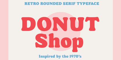
  2. Donut Shop by Surplus Type Co, $9.00
    Donut Shop is a chunky and fun retro rounded serif font. It features soft corners, multilingual support and a selection of ligature options. Inspired by the easy going 70's, this font is great for large display projects, branding elements, package designs & much more!
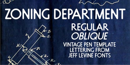
  3. Zoning Department JNL by Jeff Levine, $29.00
    A 1930s-era sign lettering template set manufactured for the National Carbon Company by Wrico (The Wright-Regan Instrument Company) yielded the familiar lettering that comprises Zoning Department JNL. This rounded-end typestyle was also widely used on architectural drawings, signage, blueprints and the like.
  4. Marketing Stencil by Jeff Levine, $29.00
    Vintage (circa 1960s) packaging for Parker Cartridge Pen Erasers had the product description printed in bold stencil lettering featuring a squared look with rounded corners. This design has been recreated digitally as Marketing Stencil JNL, which is available in both regular and oblique versions.
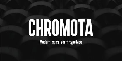
  5. Chromota by Kulturrrno, $7.00
    Chromota is a modern sans-serif typeface with asymmetric glyph design. The family consists of 2 styles, a regular and a rounded, each with matching italics. It contains an extended Latin glyphs set and a basic Cyrillic set. Chromota is great for logos, branding, headlines.
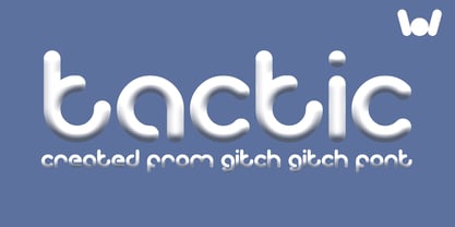
  6. Gitchgitch by Weknow, $5.00
    Give a simple rounded fun groovy, fancy, to any text project. Also good for a logotype or brand name. This is a gift to my graphic designer friend Gita from Indonesia, I call her gitch gitch, so I made it the name on this font.
  7. De Rigueur NF by Nick's Fonts, $10.00
    Alf Becker called this offering "Rounded Modern Bold." The geometric forms, strong contrasts and unexpected turns of this serious Art Deco typeface command attention. Both versions of the font include the 1252 Latin and 1250 CE character sets (with localization for Romanian and Moldovan).
  8. White Tie Affair NF by Nick's Fonts, $10.00
    Round, firm and fully packed, this unusual yet elegant headline font with its multiline treatment is best used in large sizes. Both versions of this font contain the Unicode 1252 Latin and Unicode 1250 Central European character sets, with localization for Romanian and Moldovan.
  9. Albany by Monotype, $29.99
    Albany, from Monotype Imaging, is a typeface family whose fonts have the same metrics as Arial. However, in contrast to Arial or Helvetica, Albany's letterforms are more open, with more generous apertures and counters. Also, punctuation is not square, as in Arial, but round
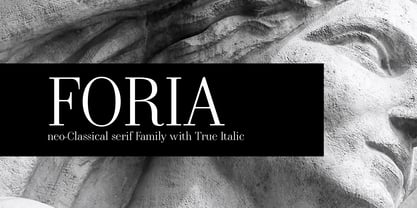
  10. Foria by Chromatype Studio, $20.00
    foria is a Neo-classic serif inspired by a combination of Baskerville and Bodoni with round corners to give a soft impression, looks feminine and classy so it is perfect for fashion, branding, menus, cooking, and female inspiration and is also suitable for neutral typography
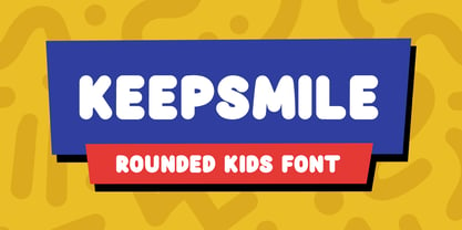
  11. Keepsmile by Almarkha Type, $29.00
    Keepsmile is a Rounded Playful Sans full of charm . It will take any DIY-project to the next level! Keepsmile is perfect for Craft , product packaging, product designs, label, branding projects, logo, wedding designs, social media posts, advertisements, watermark, invitation, stationery and any projects.
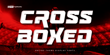
  12. Cross Boxed by Namara Creative Studio, $14.00
    Bold modern sport font with rounded corners in consistent angles. A strong and unique style instantly adds power of movement to your creative projects. It's perfect for logotypes, headlines, game covers, sports events, posters, magazine covers, branding, product design, labels, and other suitable projects.
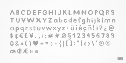
  13. Kind Type by Letters&Numbers, $28.00
    Kind Type is based on watercolor painted letters. Open, bold strokes with rounded terminals make it a very legible typeface even at small size. Kind Type has a soft, friendly character with a distressed edge. It is suitable for short paragraphs, captions or headings.
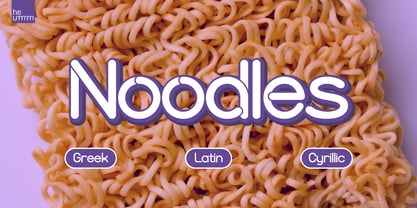
  14. HU Noodles by Heummdesign, $15.00
    HU Noodles is a latin alphabet font. This is a stencil-type font designed by drawing with one brush and following the stroke order. It is characterized by rounded strokes and a tight square shape. It is recommended to use it for characteristic titles.
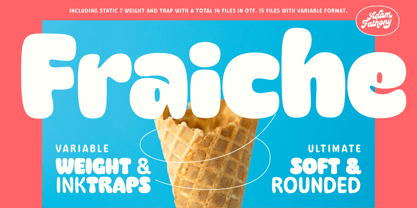
  15. Fraiche by Adam Fathony, $24.00
    Fraiche, is an adorable soft & rounded typefaces. Available with the Variable fonts in Weights and the Ink Trap. With the regular style you'll have the correct anatomy of the fonts. with the Ink Trap style, it added more extreme space on the ink trap.
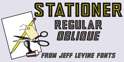
  16. Stationer JNL by Jeff Levine, $29.00
    The 1938 sheet music for the official Coast Guard Marching Song "Semper Paratus" "(Always Ready)" offered up a hand lettered title in a bold block style with rounded corners and an inline. This is now available as Stationer JNL, in both regular and oblique versions.
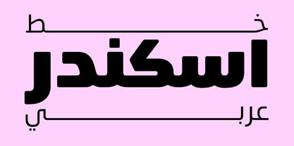
  17. Eskander Arabic by Protype, $40.00
    Eskander the first version designed at 2018, and re-designed at 2021. Eskander is Arabic typeface with rounded edges and friendly. For web, digital applications and prints, supported languages (Arabic, Persian and Urdu). Eskander is a trademark of Protype Foundry Ltd, Design by Ibrahim Hamdi.
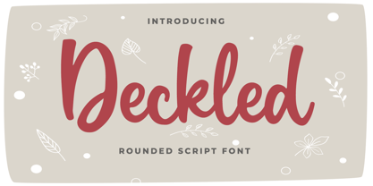
  18. Deckled by Blankids, $23.00
    Introducing of our new product the name is Deckled Rounded Script Font inspired by bouncy script style this font is a fun theme very good for display, tshirt design, craft, quote sign, logotype and etc FEATURES : Uppercase Lowercase Number Punctuation Multilingual PUA Encode Opentype
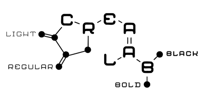
  19. Crealab by Cubo Fonts, $25.00
    This font was designed for CREALAB, a Shanghai-based Innovation Design Company. As the company’s slogan - "catalyzing ideas" - corporate identity focus on crossing technical expertise and personal creativity. It displays a solid square background - inspired by scientific symbols - and a fresh rounded creative attitude.
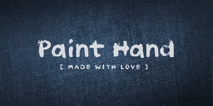
  20. Paint Hand by Letters&Numbers, $18.00
    Paint Hand is based on type drawn with an open acrylic paint tube. This bold vernacular typeface with rugged rounded edges will work well for headers and captions. Paint Hand is extended, containing West European diacritics making it suitable for multilingual environments and publications.
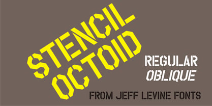
  21. Stencil Octoid JNL by Jeff Levine, $29.00
    Stencil Octoid JNL was inspired by a set of twelve inch tall stencil letters and numbers made by Duro Art Industries in Chicago. The bold type style with angled rather than rounded corners gives the font a strong feel of industry or military usage.
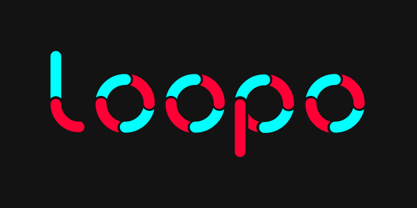
  22. Loopo Stencil by Little Fonts, $15.00
    Loopo was created as an experiment with rotating forms. The cut of the stencil shows the rotation and creates a reference to motion throughout the font. Characters are created by manipulating the rotations of the stencil which gives the font a round and fluid look.
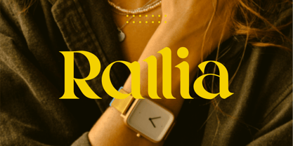
  23. Rallia by Jafar07, $20.00
    Rallia A modern classic serif style font with unique curves that combine straight, rounded, and sharp lines. Inspired by elegant and temporary characters. This font is suitable for use in many forms of design and pairs beautifully with sans-serif or light script fonts.
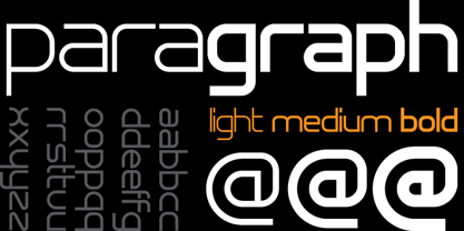
  24. Paragraph by Paragraph, $12.00
    This decorative, headline or logotype geometric font consists entirely of lowercase letters. The glyphs of uppercase are rounder than their lowercase counterparts, allowing playful interaction within words, contrasting round and square shapes. The font is the result of a new identity development for Paragraph.
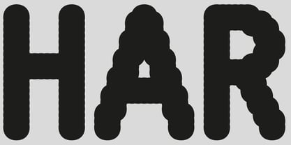
  25. HARBER by bb-bureau, $60.00
    The name ‘HARBER’ comes from the first letters drawn. It is a sans serif family designed of dots on a grid, that gives it this round and rhythmic aesthetic. Only dots grow, approaching or moving away, changing the aspect of letters but keeping its characteristics.
  26. Notebug by PizzaDude.dk, $15.00
    Notebug looks like there was a bug playing around with an inky pen. Notebook with a bug = Notebug! Made with a hefty inky pen and quick strokes. You got 3 layers to play around with: Regular (the outline) Fill (The "inside" of the Regular version and Layer (best used as a background layer for Regular)
  27. DarkPix - Personal use only
  28. Last Date JNL by Jeff Levine, $29.00
    A typographic conundrum presented itself with the hand lettered title on the cover of the 1919 song "I Am Always Building Castles in the Air". The capitalized portion ["Castles in the Air"] was a hybrid mix of a few Art Nouveau-influenced rounded letters, yet along with this were squared letters with rounded corners (reflecting the upcoming Art Deco movement to take place in about another decade). As a complete alphabet, it didnít mix as well as in those few short words. What to do? It was decided to go with the squared look and save the rounder characters for a future project. The end result became Last Date JNL; available in both regular and oblique versions.
  29. Nightales by Trim Studio, $15.00
    Introducing Nightales a simple, bold and light font style perfect for kids' books! With a playful and rounded design, this font is both whimsical and fun, making it perfect for capturing the imagination of young readers. The brush pressure adds a touch of creativity and charm, while still being easy to read and understand. The bold and light variations provide versatility for different design elements, and the rounded edges make it safe and friendly for kids. Let Nightales bring joy and excitement to your next kids' book project! even so contains All Standard glyphs and punctuations Thank you for let us be your design partner, If you have any questions please don't hesitate to drop me a message
  30. Genesa by Typogama, $19.00
    The Genesa typeface is a condensed, rounded sans serif typeface with a contemporary styling ideal for editorial or branding design. With it’s 4 weights and accompanying italics, this family can be used for large titles or display settings but is equally legible in small sizes for longer passages of text. Genesa combines a strong, vertical constructed style with a softer rounded approach that adds a humanist flavour. This typeface covers multiple languages through an extensive character set and a wide range of Opentype features that allow various character or numeral choices. A set of over 60 pictograms and arrows are equally features and through their carrying weights, can also be combined seamlessly with any style of the family.
  31. Las Palmas by Fenotype, $20.00
    Las Palmas is a vintage type collection with print texture. • Brush - Two weights of a connected Brush Script with Contextual and Swash Alternates • Pen - A connected monoline Script with Contextual and Swash Alternates • Slab - Two weights of a chunky Slab Serif with rounded corners, Bold has the same proportions but fuller texture. • Condensed - A bold and tight condensed Sans Serif with rounded corners. Las Palmas fonts are designed to work together - in pairs or more. Las Palmas is great for branding, posters or any display use. If you need a clean version of Las Palmas try Steak And Cheese by Fenotype. All fonts are PUA encoded and have a wide language support.
  32. Flax by Wilton Foundry, $29.00
    Flax Regular lives in a somewhat unusual space... it is not a normal “handwriting” font, nor is it a formal script, or a rounded italic. Flax is a slightly more formal handwriting script that is extremely legible and useful- it can stretch from invitations to packaging, to menus, to brochures to ads. The rough hand-drawn finish gives Flax some of its unique character. This is almost unnoticeable in smaller point sizes while clearly visible in display sizes. While Flax is slightly formal, it has a very friendly presence - mainly from the unpretentious rounded characters and rough finish. Flax is available in Postscript, Truetype and Opentype for Mac and Windows. You will enjoy putting Flax to work!
  33. Axion RND by Type Innovations, $39.00
    Axion RND is an original design by Alex Kaczun. Axion RND is a style variation based on his original Axion typeface family of fonts. It is a display font not intended for text use. It was designed specifically for display headlines, logotype, branding and similar applications. The entire font has an original look which has rounded corners throughout and is strong, dynamic, machine generated and can be widely used in publications and advertising. Axion RND is a futuristic, techno-looking and expressive typeface with an appearance of machined parts and rounded edges. This attractive display comes in roman with lower case and lining figures. The large Pro font character set supports most Central European and many Eastern European languages.
  34. Holgada by Graviton, $24.00
    Holgada font family has been designed for Graviton Font Foundry by Pablo Balcells in 2020. It is a geometric sans serif typeface with refined rounded endings that provide a soft and friendly appearance. Its generic shapes make it suitable for any kind of project, text length and size. Thanks to its clear legibility, it can be used in long body texts in very small sizes, in big size headlines and everything in between. The rounded endings not only provide a particular softness when used in body text, but also a distinctive touch when used in display situations such as logos and headlines. Holgada consists of 12 styles, each containing small caps and glyph coverage for several languages.
  35. Vendetta by Emigre, $69.00
    The famous roman type cut in Venice by Nicolas Jenson, and used in 1470 for his printing of the tract, De Evangelica Praeparatione, Eusebius, has usually been declared the seminal and definitive representative of a class of types known as Venetian Old Style. The Jenson type is thought to have been the primary model for types that immediately followed. Subsequent 15th-century Venetian Old Style types, cut by other punchcutters in Venice and elsewhere in Italy, are also worthy of study, but have been largely neglected by 20th-century type designers. There were many versions of Venetian Old Style types produced in the final quarter of the quattrocento. The exact number is unknown, but numerous printed examples survive, though the actual types, matrices, and punches are long gone. All these types are not, however, conspicuously Jensonian in character. Each shows a liberal amount of individuality, inconsistency, and eccentricity. My fascination with these historical types began in the 1970s and eventually led to the production of my first text typeface, Iowan Old Style (Bitstream, 1991). Sometime in the early 1990s, I started doodling letters for another Venetian typeface. The letters were pieced together from sections of circles and squares. The n, a standard lowercase control character in a text typeface, came first. Its most unusual feature was its head serif, a bisected quadrant of a circle. My aim was to see if its sharp beak would work with blunt, rectangular, foot serifs. Next, I wanted to see if I could construct a set of capital letters by following a similar design system. Rectangular serifs, or what we today call "slab serifs," were common in early roman printing types, particularly text types cut in Italy before 1500. Slab serifs are evident on both lowercase and uppercase characters in roman types of the Incunabula period, but they are seen mainly at the feet of the lowercase letters. The head serifs on lowercase letters of early roman types were usually angled. They were not arched, like mine. Oddly, there seems to be no actual historical precedent for my approach. Another characteristic of my arched serif is that the side opposite the arch is flat, not concave. Arched, concave serifs were used extensively in early italic types, a genre which first appeared more than a quarter century after roman types. Their forms followed humanistic cursive writing, common in Italy since before movable type was used there. Initially, italic characters were all lowercase, set with upright capitals (a practice I much admire and would like to see revived). Sloped italic capitals were not introduced until the middle of the sixteenth century, and they have very little to do with the evolution of humanist scripts. In contrast to the cursive writing on which italic types were based, formal book hands used by humanist scholars to transcribe classical texts served as a source of inspiration for the lowercase letters of the first roman types cut in Italy. While book hands were not as informal as cursive scripts, they still had features which could be said to be more calligraphic than geometric in detail. Over time, though, the copied vestiges of calligraphy virtually disappeared from roman fonts, and type became more rational. This profound change in the way type developed was also due in part to popular interest in the classical inscriptions of Roman antiquity. Imperial Roman letters, or majuscules, became models for the capital letters in nearly all early roman printing types. So it was, that the first letters in my typeface arose from pondering how shapes of lowercase letters and capital letters relate to one another in terms of classical ideals and geometric proportions, two pinnacles in a range of artistic notions which emerged during the Italian Renaissance. Indeed, such ideas are interesting to explore, but in the field of type design they often lead to dead ends. It is generally acknowledged, for instance, that pure geometry, as a strict approach to type design, has limitations. No roman alphabet, based solely on the circle and square, has ever been ideal for continuous reading. This much, I knew from the start. In the course of developing my typeface for text, innumerable compromises were made. Even though the finished letterforms retain a measure of geometric structure, they were modified again and again to improve their performance en masse. Each modification caused further deviation from my original scheme, and gave every font a slightly different direction. In the lower case letters especially, I made countless variations, and diverged significantly from my original plan. For example, not all the arcs remained radial, and they were designed to vary from font to font. Such variety added to the individuality of each style. The counters of many letters are described by intersecting arcs or angled facets, and the bowls are not round. In the capitals, angular bracketing was used practically everywhere stems and serifs meet, accentuating the terseness of the characters. As a result of all my tinkering, the entire family took on a kind of rich, familiar, coarseness - akin to roman types of the late 1400s. In his book, Printing Types D. B. Updike wrote: "Almost all Italian roman fonts in the last half of the fifteenth century had an air of "security" and generous ease extremely agreeable to the eye. Indeed, there is nothing better than fine Italian roman type in the whole history of typography." It does seem a shame that only in the 20th century have revivals of these beautiful types found acceptance in the English language. For four centuries (circa 1500 - circa 1900) Venetian Old Style faces were definitely not in favor in any living language. Recently, though, reinterpretations of early Italian printing types have been returning with a vengeance. The name Vendetta, which as an Italian sound I like, struck me as being a word that could be taken to signifiy a comeback of types designed in the Venetian style. In closing, I should add that a large measure of Vendetta's overall character comes from a synthesis of ideas, old and new. Hallmarks of roman type design from the Incunabula period are blended with contemporary concerns for the optimal display of letterforms on computer screens. Vendetta is thus not a historical revival. It is instead an indirect but personal digital homage to the roman types of punchcutters whose work was influenced by the example Jenson set in 1470. John Downer.
  36. Fibra One by Los Andes, $26.00
    Fibra One looks like a “soft” version of the Fibra font, but it is actually more than that—the second part of its name suggests that it is a reinterpretation of the original typeface. While this new version maintains the overall structure of Fibra and influence of the Avant Garde font, its shapes are different from those found in its predecessor—Fibra One features both soft corners and smooth transition between curved and straight sections. This gives the font a more dynamic and playful personality. Fibra One keeps the original contrast between curves and straight lines in glyphs such as ’n’ and ‘h’ (not found in rounded glyphs such as ‘a’ and ‘d’); details of display characters (e.g. three upper terminals in ‘W’ and projection off the stem in ‘A’); and exaggerated terminal in ‘R’. All these features give Fibra One a strong personality—a typeface that ‘gives you the chills’. Fibra One was specially designed for display use. The font has a very generous x-height that allows for use in corporate text, thanks to its good readability. Fibra One comes with 2 subfamilies—a more ’normal’ Basic family, with a smaller amount of stylistic features, for use in subheadings or any other type of text that requires formality, and an Alt family that shows off the true potential of the font, making it the perfect choice for magazine headlines, posters and logotypes.
  37. FS Matthew by Fontsmith, $80.00
    Developed for screen For not the first time, Fontsmith was commissioned to develop a font for one of the UK’s terrestrial TV channels. The product was a clearly-defined three-weight family. When italics were added, it became FS Matthew, a clean, stylish, structured sans serif with swooping, open curves and a bright, lively personality. Southbank Inspiration for many of the forms of FS Matthew came from details found within the modernist buildings and architecture of London’s Southbank, such as the Royal Festival Hall. During the font’s gestation, Jason had found himself at London Studios, a TV studio on Southbank, and a wander around the neighbouring arts buildings proved thought-provoking. The result was a font with a very British character: solid forms that provide the platform for innovation and distinctiveness. Feelgood efficiency FS Matthew’s trademark is efficiency with a feelgood factor: disciplined enough for corporate identities, websites and signing systems, and colourful enough for logotypes and advertising. Its versatility and excellent legibility are achieved via some unexpected details: the reaching curves of the “g” and “y”; the simple shape of the “u”; an off-kilter “k”; generous counters; and a slightly condensed aspect that makes FS Matthew a space-saver in text or title sizes.
  38. Indoctrine - Personal use only
  39. Liquid Hollow - Unknown license
  40. Lichtner Italic - Unknown license
Looking for more fonts? Check out our New, Sans, Script, Handwriting fonts or Categories
abstract fontscontact usprivacy policyweb font generator
Processing