9,623 search results
(0.043 seconds)
- Linja - Unknown license
- KG Skinny Latte - Personal use only
- stamPete - Unknown license
- Tighten Caps Light - Personal use only
- Kirshaw by Kirk Font Studio,
$24.00Kirshaw is not your grandfather's sans serif from the 1950s and 1960s. All those old classics like Helvetica, Futura, Franklin Gothic, and Univers are showing their age like an old Elvis Presley song. Kirshaw is a clean, rounded design with sharp contrasting edges. Like those classics, Kirshaw is easy to read in small body copy and captions, plus it's delightfully modern and stylish for headlines and logos. I designed Kirshaw and Kirkly while undergoing cancer treatment at Stanford Medical Center. Font design was always in the back of my mind and now I had extra time. Kirshaw is a distinctive, modern, easy-to-read sans serif family consists of 14 weights (including italics). It’s an Adobe Latin 3 Character Set containing 350 glyphs per style (including special characters). - Gibson Girl JF by Jukebox Collection,
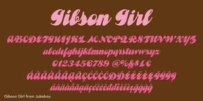
$32.99Based on a hand lettered sample from the early 20th Century, Gibson Girl is a heavy script font with a vintage flair. During the end of the 19th Century, the “Gibson Girl” created by illustrator Charles Gibson, was considered the ideal of feminine beauty and poise in that time period. The term has become associated with the Gilded Age in America. The design of the Gibson Girl font reflects both femininity and self confidence. - Maypole by Scholtz Fonts,
$19.00MayPole is a contemporary, 21st century, sans serif font, that contains an eclectic mix of elements from the 20th century. It combines gentle curves with base and caps-line transgressions but is substantially more rounded than in most commercial-style sans serif faces. Terminal strokes are slightly rounded and occasional elements are strongly rounded. MayPole is readable and can be successfully used for presentations, magazines etc, and for display use in newspapers, advertising and promotions. - 21 Cent by Letterhead Studio-YG,
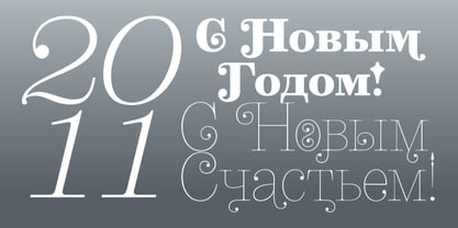
$45.0021 Cent - not Century or Clarendon. This is an original font family designed from scratch. 21 Cent is named after a magical coin that brings good luck. And well, in honor of the 21st century, of course. 21 cent family is used in the almanac of the State Hermitage Museum, St. Petersburg, Russia. All members of 21 Cent family include the expanded character set of with support of Cyrillics, Central European and Baltic languages. - Galena Pro SC by Typorium,
$45.00Galena Pro is an extended version of Galena, a typeface published for Bayer Corporation in 1996. Galena Pro is based on the open and organic forms imagined by the writers of humanist Italy, who designed the first so-called Roman characters. Humanist style fonts have moderate stroke contrast, uneven widths, and a classic, but soft and easy-to-read appearance. Galena Pro gives a new birth to the 15th century incunabula, a typographic drawing where the gestures of this standardized handwriting are not mechanical, but more fluid. The Galena Pro series can provide professional typography with OpenType features such as alternative sets of numbers, fractions and an extended character set to support Central and Eastern European as well as Western European Languages. The different styles of the Galena are enriched with a condensed variant to meet the need for space savings in titles and texts. - Cosmetiqa by Mysterylab,
$15.00Here's a posh serif typeface and its matching italic. Glowing with elegance, Cosmetiqa can go head to head with classic evergreens like Bodoni, Didot, or Century. And just like those go-to favorites, Cosmetiqa really shines at the huge, layout-dominating sizes which have been a staple of top-shelf fashion branding and magazine design since at least the mid-1980s. You'll also find this font to be a great workhorse at much smaller sizes and in extended text passages, as the hairline serifs don't disappear in the smaller size ranges. As its title suggests, Cosmetiqa's unique look works perfectly in cosmetics and fashion branding, but also try it with 1990s-style message forward ad headline applications if you're after a retro look with a hint of a modern twist. The semi-condensed proportions and tall x-height make it great for pull quotes, page banners, and logo design. - Gineso Soft by insigne,
$29.99Handcrafted signs line the stoned walkways of old Italy. Some a century old, these often forgotten works of unknown artists remain etched across cities and villages. But now, they make their inviting impressions once again as the inspiration for insigne design’s Gineso Soft typeface. Gineso Soft absorbs the personality of northern Italian posters, headlines and logotypes, providing a type especially nice for signs and titling with its condensed qualities. The font contains matching italics for the the eight weights and three widths. We’ve also included small features along with fractions and superior / inferior characters to broaden your options. Even more, Gineso Soft is ready for all applications and features a large character set for the languages and literature of Europe. So add a soft touch the next time you’re in a tight spot. Add Gineso Soft and make your project a work to be remembered. - Eurostile Next by Linotype,
$50.99Eurostile Next is Linotype's redrawn and expanded version of Aldo Novarese's 1962 design. This new version refers back to the original metal types and to its mid-century modern aesthetic of squarish characters and subtle curves. Eurostile Next brings back the gentle curves, which were lost in other digital versions, therefore regaining the spirit of the original design and its somewhat softer demeanor. The family has been greatly expanded, now consisting of five different weights: ultra light, light, regular, semibold, and bold. Along with the regular width, all weights also have extended and condensed versions. Stylistically, Eurostile Next is well suited for designs in the fashion of the 50's and 60's, yet it still has a remarkably new and contemporary feeling. Its numerous variations and typographic features are invaluable for projects ranging from extensive corporate branding to one-off posters and from large signage to small print text. - Eurostile Next Paneuropean by Linotype,
$50.99Eurostile Next is Linotype's redrawn and expanded version of Aldo Novarese's 1962 design. This new version refers back to the original metal types and to its mid-century modern aesthetic of squarish characters and subtle curves. Eurostile Next brings back the gentle curves, which were lost in other digital versions, therefore regaining the spirit of the original design and its somewhat softer demeanor. The family has been greatly expanded, now consisting of five different weights: ultra light, light, regular, semibold, and bold. Along with the regular width, all weights also have extended and condensed versions. Stylistically, Eurostile Next is well suited for designs in the fashion of the 50's and 60's, yet it still has a remarkably new and contemporary feeling. Its numerous variations and typographic features are invaluable for projects ranging from extensive corporate branding to one-off posters and from large signage to small print text. - ITC Migrate by ITC,
$29.99George Ryan's ITC Migrate is a highly condensed sans serif display face that effectively complements ITC Adderville. Migrate represents what Ryan calls a “more highly evolved version” of a typeface he designed for Bitstream in 1991 called Oz Handicraft. “Both faces,“ says Ryan, “are based on designs of the popular early 20th-century type designer Oswald Cooper.” His inspiration came from drawing samples found in the Book of Oz Cooper, published in 1949 by the Society of Typographic Arts in Chicago. “Oz worked extensively with the sans serif form long before it became popular in the States, eschewing a popular belief of the time that sans serifs were only skeletons of letters.” Where Oz Handicraft was informal and quirky, ITC Migrate has a more restrained feel. “The uppercase characters and figures, in particular, have been reworked,” says Ryan, ”resulting in a more formal and traditional, compressed sans serif typeface.” - Galena Pro by Typorium,
$45.00Galena Pro is an extended version of Galena, a typeface published for Bayer Corporation in 1996. Galena Pro is based on the open and organic forms imagined by the writers of humanist Italy, who designed the first so-called Roman characters. Humanist style fonts have moderate stroke contrast, uneven widths, and a classic, but soft and easy-to-read appearance. Galena Pro gives a new birth to the 15th century incunabula, a typographic drawing where the gestures of this standardized handwriting are not mechanical, but more fluid. The Galena Pro series can provide professional typography with OpenType features such as alternative sets of numbers, fractions and an extended character set to support Central and Eastern European as well as Western European Languages. The different styles of the Galena Pro are enriched with a condensed variant to meet the need for space savings in titles and texts. - Aristotle Punk - Personal use only
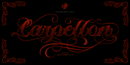
- Carpellon by Creativemedialab,
$16.00 - Vorvalla by Agny Hasya Studio,
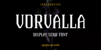
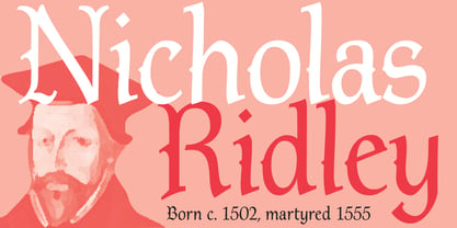
$9.00Vorvalla is a Gothic Decorative Display Serif Font Featured with Uppercase and Lowercase, Numerals, Punctuation, and OpenType Features. Perfect for your design projects like logos, branding, advertising, product designs, stationery, magazine designs, book/cover title designs, photography, art quotes, Special events, labels, product packaging, and more. - P22 Ridley by IHOF,
$24.95 - Fonce Sans Pro by Ryan Ford,
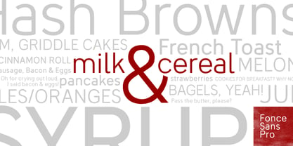
$10.95 - Hiragino Sans TC by SCREEN Graphic Solutions,
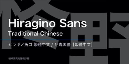
$200.00Hiragino Sans Traditional Chinese is a traditional Chinese font that inherits design characteristics from the Hiragino Sans (Kaku Gothic). The font satisfies the rising demand for a high-quality Big 5 embedded font for multilingual products, allowing it to be utilized in a wide range of applications. - Pueblo by Monotype,
$29.99Like many of Jim Parkinson's alphabets, Pueblo began as poster lettering. It shows a range of influences: turn-of-the-century sign painting, old Speedball lettering books, and a touch of art nouveau. While developing Pueblo, Parkinson debated whether to make the ends of the serifs rounded or square. Rounded looked more like the work of a Speedball lettering pen, but squared stroke endings made the letters more legible at small sizes. The finished design sports serifs that are just slightly rounded. According to Parkinson, the design feature is “enough to be noticed at large sizes, while going virtually unnoticed at smaller point sizes,” adding to the versatility of this distinctive typeface. - EmPower42 - Unknown license
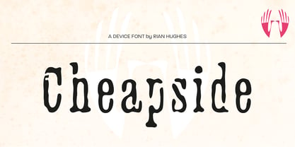
- Cheapside by Device,
$29.00 - Slim James JNL by Jeff Levine,
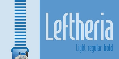
$29.00Tall, condensed and square in shape... Slim James JNL balances well against bolder Deco-style sans or novelty type faces. - Leftheria by Sea Types,
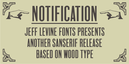
$19.00 - Notification JNL by Jeff Levine,
$29.00 - Herron by Fontron,
$35.00Herron is a monoline Sans face with all rounded ends in Condensed and Italic, Regular and Italic, Expanded and Italic. - Poem Script Pro by Sudtipos,
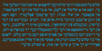
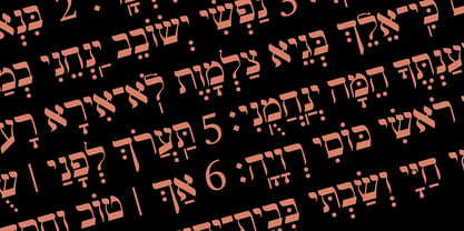
$79.00Poem Script is a mixed collection of interpretations conjuring a late nineteenth century American pen script style. Though not an actual Italian letterform, this style was called “Italian Alphabet” stemming from an old penman’s term for an alphabet where the stress or shades are opposite their normal placement. The American variant followed from the late eighteenth century British hand also confusingly called “Italian Hand,” which itself evolved from some seventeenth century French batarde scripts. It showcases the phenomenal control and mastery of hand skills required to create such ornamental and lively letters centuries ago. Producing the shaded strokes in reversed positions such as this required holding the pen in a position horizontal to the baseline, or the letterforms would have to be written backwards or by rotating the paper at peculiar and extreme angles to achieve the effect. Exotic, elaborate and very attractive, Poem Script contains plenty of variations on each letter and comes with hundreds of calligraphic ornaments. Poem Script received a Certificate of Excellence at the Type Directors Club NY and was selected at the Bienal Tipos Latinos 2012. - Hebrew Yiddish Std by Samtype,
$49.00 - Dutch Treat by Solotype,
$19.95Authentic rendering of the original font called Vanden Houten from the Keystone Foundry in Phaladelphia. Very popular among job printers of the early twentieth century. - Engravers' Old English BT by Bitstream,
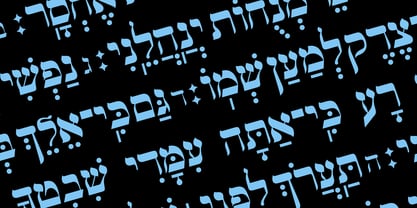
$29.99Designed by Morris Fuller Benton in 1907; an improved version of the familiar nineteenth century blackletter as he had executed it in his Wedding Text. - Hebrew Yiddish II by Samtype,
$59.00 - Hebrew Yiddish III by Samtype,
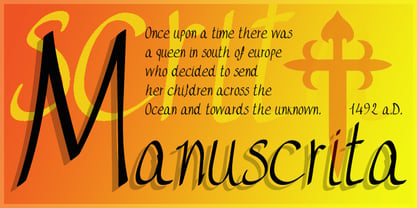
$39.00 - Manuscrita by Celtibérica,
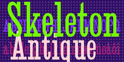
$19.00 - Skeleton Antique by Wooden Type Fonts,
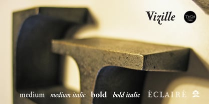
$15.00 - Vizille by TeGeType,
$29.00 - Medieval Caps BA by Bannigan Artworks,
$19.95This is a revival font from an Image of a plate made from Eleventh Century initial letters. The "numerals" are Roman numbers done as ligatures. - Latin by Wooden Type Fonts,
$15.00 - Kurilian by Wooden Type Fonts,
$15.00


