7,140 search results
(0.04 seconds)
- Blockage by Umka Type,
$19.00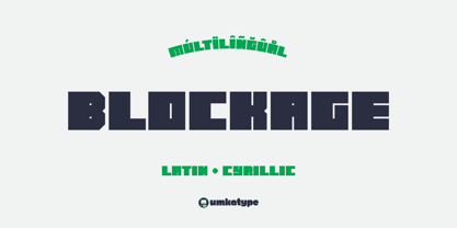 Blockage - A Display Font : Blockage is a carefully crafted display font. It has Extended Latin and Cyrillic characters. It created for poster, web, brand and social media designs. It supports 91 Languages: Belarusian, Russian, Afrikaans, Albanian, Asu, Basque, Bemba, Bena, Breton, Catalan, Chiga, Colognian, Cornish, Croatian, Czech, Danish, Dutch, Embu, English, Esperanto, Estonian, Faroese, Filipino, Finnish, French, Friulian, Galician, German, Gusii, Hungarian, Indonesian, Irish, Italian, Kabuverdianu, Kalenjin, Kamba, Kikuyu, Kinyarwanda, Latvian, Lithuanian, Lower Sorbian, Luo, Luxembourgish, Luyia, Machame, Makhuwa-Meetto, Makonde, Malagasy, Maltese, Manx, Meru, Morisyen, North Ndebele, Norwegian Bokmål, Norwegian Nynorsk, Nyankole, Oromo, Polish, Portuguese, Quechua, Romanian, Romansh, Rombo, Rundi, Rwa, Samburu, Sango, Sangu, Scottish Gaelic, Sena, Serbian, Shambala, Shona, Slovak, Soga, Somali, Spanish, Swahili, Swedish, Swiss German, Taita, Teso, Turkish, Upper Sorbian, Uzbek (Latin), Volapük, Vunjo, Walser, Welsh, Western Frisian, Zulu
 - Sinder by The Fontry,
$5.00 It's extended. Somewhat. It's got all the characters. There's a plus. It's fully kerned. That's awesome! And it is rubbed down to the nub. Whuh??? That means it's highly distressed, manually eroded on my work bench. Tortured further to open the wounds using my bitmap editor. Tweaked lovingly and built up to even higher standards of distortion in my vector program. The end result is a font called Sinder. I've even included an "ash" effect. Using the bracket or brace left gives you ashes from left to right as you type your text. Finish your text with ash terminals by typing the bracket or brace right. But be careful. This font is a heavy duty downloader. Make sure all your programs are up to the task, especially before you go converting to vectors.
 - Rig Solid by Jamie Clarke Type,
$20.00 Rig Solid extends your typography toolkit with a range of energetic 3D fonts. Add dynamism to headlines and logos 13 styles across four weights Solid and gradient 3D designs Clean ‘unbreakable’ geometric shapes Rig Solid follows the award-winning design of its big brother, Rig Shaded. Each style can be used individually, making it even easy to achieve eye-catching 3D effects in print and on the web. The striking halftone styles add texture to your typography, while the hardy solid styles give your designs a visual punch and remain prominent when used over photography and patterned backgrounds. The family includes the unshaded style, ‘Bold Solo’, to perfectly compliment the shaded styles or be used on its own. Rig Solid does not require professional design software to use and is compatible with Microsoft Word.
 - Baldufa Cyrillic Ltn by Letterjuice,
$93.00 Baldufa is a charming typeface with strong personality, which looks very comfortable in text. There is a search to obtain complicated curves and detailed features, which gives the typeface a touch of beauty and elegance. However, this is also a self-conscious design that claims through the rounded serifs and irregular vertical stems appreciation for quirkiness and human imperfection. The letterforms are inspired by the slight distortions and idiosyncrasies that came with old printing methods. It has distinct, features such as rounded serifs, irregular vertical streams, ink traps and extremely thin junctions. In the Italic, serifs have been removed to enhance movement and expressivity. These experiments in form have not come at the cost of legibility: The typeface remains suitable for both small and display text. Baldufa Cyrillic Latin contains Cyrillic Extended and Latin.
 - Legan by PeGGO Fonts,
$39.00 Legan, created by PeGGO Fonts, is a typeface with a large number of glyphs. The uppercase letters follow the classical Trajan pattern. It is designed with several geometrical proportions such as root five, divine proportion (Golden Ratio), regular square, and others, just like the Greek Trajan letters used on Trajan’s Column. The major innovation is a lowercase that is designed in accordance with the same Trajan rules. My concern for the global community is reflected by the large number of diacritics I have provided, first on the basic alphabet, then on extended latin languages, as well as ones for Cyrillic and Greek. Because it is OpenType, there are various setup possibilities including traditional ligatures, as well as various alternates. Altogether you will find this a very playful, fashionable, and elegant typeface.
 - Junglekong by Umka Type,
$19.00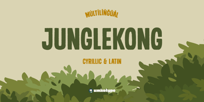 Junglekong - A Display Font : Junglekong is a carefully crafted display font. It has Extended Latin and Cyrillic characters. It created for poster, web, brand and social media designs. It supports 91 Languages: Belarusian, Russian, Afrikaans, Albanian, Asu, Basque, Bemba, Bena, Breton, Catalan, Chiga, Colognian, Cornish, Croatian, Czech, Danish, Dutch, Embu, English, Esperanto, Estonian, Faroese, Filipino, Finnish, French, Friulian, Galician, German, Gusii, Hungarian, Indonesian, Irish, Italian, Kabuverdianu, Kalenjin, Kamba, Kikuyu, Kinyarwanda, Latvian, Lithuanian, Lower Sorbian, Luo, Luxembourgish, Luyia, Machame, Makhuwa-Meetto, Makonde, Malagasy, Maltese, Manx, Meru, Morisyen, North Ndebele, Norwegian Bokmål, Norwegian Nynorsk, Nyankole, Oromo, Polish, Portuguese, Quechua, Romanian, Romansh, Rombo, Rundi, Rwa, Samburu, Sango, Sangu, Scottish Gaelic, Sena, Serbian, Shambala, Shona, Slovak, Soga, Somali, Spanish, Swahili, Swedish, Swiss German, Taita, Teso, Turkish, Upper Sorbian, Uzbek (Latin), Volapük, Vunjo, Walser, Welsh, Western Frisian, Zulu
 - Lucida Console by Monotype,
$50.99 Kris Holmes and Charles Bigelow designed Lucida Console in 1993 for on-screen console and terminal emulation windows that needed monospaced fonts with sturdy letter shapes. Lucida Console has simple, clear, robust letterforms, a big x-height, and economical fitting. It looks large on-screen and in print but takes up less space than traditional typewriter and monospaced fonts. Its short capitals were originally technical adaptations to user interfaces on computers, but its compact look and active italic appeals to typographers and designers for a wide variety of uses, including in games and digital devices. The Lucida Console family has 675 glyphs in each font, and supports the WGL and W1G character sets. This includes the Extended Latin, Greek, and Cyrillic alphabets along with a generous set of symbols, box-draw, and graphical characters.
 - Snowbro by Umka Type,
$19.00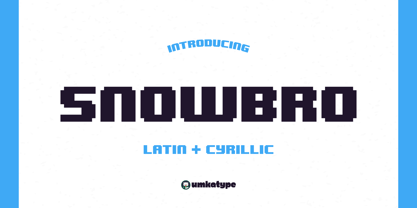 Snowbro - A Display Font : Snowbro is a carefully crafted display font. It has Extended Latin and Cyrillic characters. It created for poster, web, brand and social media designs. It supports 91 Languages: Belarusian, Russian, Afrikaans, Albanian, Asu, Basque, Bemba, Bena, Breton, Catalan, Chiga, Colognian, Cornish, Croatian, Czech, Danish, Dutch, Embu, English, Esperanto, Estonian, Faroese, Filipino, Finnish, French, Friulian, Galician, German, Gusii, Hungarian, Indonesian, Irish, Italian, Kabuverdianu, Kalenjin, Kamba, Kikuyu, Kinyarwanda, Latvian, Lithuanian, Lower Sorbian, Luo, Luxembourgish, Luyia, Machame, Makhuwa-Meetto, Makonde, Malagasy, Maltese, Manx, Meru, Morisyen, North Ndebele, Norwegian Bokmål, Norwegian Nynorsk, Nyankole, Oromo, Polish, Portuguese, Quechua, Romanian, Romansh, Rombo, Rundi, Rwa, Samburu, Sango, Sangu, Scottish Gaelic, Sena, Serbian, Shambala, Shona, Slovak, Soga, Somali, Spanish, Swahili, Swedish, Swiss German, Taita, Teso, Turkish, Upper Sorbian, Uzbek (Latin), Volapük, Vunjo, Walser, Welsh, Western Frisian, Zulu
 - Senlot by insigne,
$34.99 Steal the spotlight with Senlot. A high contrast sans serif, Senlot’s figure is perfect for enrapturing your audience. The font shows off a unique calligraphic stress, which--with the contrast--makes the face quite usable in luxury and high quality design work. The gorgeous appearance of Senlot is accompanied by a complete set of small capitals and a true italic. Dress your text in any of nine separate styles from Thin to Bold. Senlot also holds a full set of OpenType features, including titling capitals, superscripts and subscripts, and oldstyle figures and has an extended Latin cover with span for over 72 languages. A special thanks to Lucas Azevedo and ikern for production assistance on Senlot. Let Senlot’s beauty and simplicity carry the stage on your new text or webpage.
 - Marlon Pro by Mostardesign,
$25.00 Marlon Pro is a soft sans serif font family characterized by its contemporary aspect and its warm touch. It provides advanced typographical support with features such as case sensitive forms, small caps, ligatures, alternate characters, fractions, slashed zero, circled gures, pro kerning...It comes with a complete range of gure set options – oldstyle and lining gures, each in tabular and proportional widths. It comes in 9 weights with corresponding italics and it's suited for multiple purposes including editorial use, web font, apps, digital ads, ebook, and also for advertising, long text, packaging and branding. As a modern sans serif font family, Marlon Pro Sans has true italics to give more style in long texts. It has also an extended character set to support Central and Eastern European as well as Western European languages.
 - Whinstone by Umka Type,
$19.00 Whinstone is a carefully crafted display font. It has Extended Latin and Cyrillic characters. It created for poster, web, brand and social media designs. It supports 91 Languages: Belarusian, Russian, Afrikaans, Albanian, Asu, Basque, Bemba, Bena, Breton, Catalan, Chiga, Colognian, Cornish, Croatian, Czech, Danish, Dutch, Embu, English, Esperanto, Estonian, Faroese, Filipino, Finnish, French, Friulian, Galician, German, Gusii, Hungarian, Indonesian, Irish, Italian, Kabuverdianu, Kalenjin, Kamba, Kikuyu, Kinyarwanda, Latvian, Lithuanian, Lower Sorbian, Luo, Luxembourgish, Luyia, Machame, Makhuwa-Meetto, Makonde, Malagasy, Maltese, Manx, Meru, Morisyen, North Ndebele, Norwegian Bokmål, Norwegian Nynorsk, Nyankole, Oromo, Polish, Portuguese, Quechua, Romanian, Romansh, Rombo, Rundi, Rwa, Samburu, Sango, Sangu, Scottish Gaelic, Sena, Serbian, Shambala, Shona, Slovak, Soga, Somali, Spanish, Swahili, Swedish, Swiss German, Taita, Teso, Turkish, Upper Sorbian, Uzbek (Latin), Volapük, Vunjo, Walser, Welsh, Western Frisian, Zulu
 - Cruickshank ML by HiH,
$12.00 Cruickshank is a decorative typeface from the late Victorian period. The upper case includes several letters with swash strokes, extending well below the baseline, as found in the original design. Alternatives to the swash caps are provided. The lower case contains small caps of simpler design. The face was designed by William W. Jackson and released by MacKellar, Smiths and Jordan Type Foundry of Samson Street, Philadelphia, Pennsylvania in 1886. MS&J was founded originally as Binny & Ronaldson in 1796 and later known as The Johnson Type Foundry. Cruickshank has a strong late Victorian flavor without the extravagance of so many fonts of the period. In its simplicity and clarity, it may be seen as a precursor to the Art Nouveau style that would develop a decade later.
 - Prochamp by Umka Type,
$19.00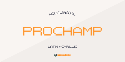 Prochamp - A Display Font : Prochamp is a carefully crafted display font. It has Extended Latin and Cyrillic characters. It created for poster, web, brand and social media designs. It supports 91 Languages: Belarusian, Russian, Afrikaans, Albanian, Asu, Basque, Bemba, Bena, Breton, Catalan, Chiga, Colognian, Cornish, Croatian, Czech, Danish, Dutch, Embu, English, Esperanto, Estonian, Faroese, Filipino, Finnish, French, Friulian, Galician, German, Gusii, Hungarian, Indonesian, Irish, Italian, Kabuverdianu, Kalenjin, Kamba, Kikuyu, Kinyarwanda, Latvian, Lithuanian, Lower Sorbian, Luo, Luxembourgish, Luyia, Machame, Makhuwa-Meetto, Makonde, Malagasy, Maltese, Manx, Meru, Morisyen, North Ndebele, Norwegian Bokmål, Norwegian Nynorsk, Nyankole, Oromo, Polish, Portuguese, Quechua, Romanian, Romansh, Rombo, Rundi, Rwa, Samburu, Sango, Sangu, Scottish Gaelic, Sena, Serbian, Shambala, Shona, Slovak, Soga, Somali, Spanish, Swahili, Swedish, Swiss German, Taita, Teso, Turkish, Upper Sorbian, Uzbek (Latin), Volapük, Vunjo, Walser, Welsh, Western Frisian, Zulu
 - Monogatari by Umka Type,
$19.00 Monogatari - A Display Font : Monogatari is a carefully crafted display font. It has Extended Latin and Cyrillic characters. It created for poster, web, brand and social media designs. It supports 91 Languages: Belarusian, Russian, Afrikaans, Albanian, Asu, Basque, Bemba, Bena, Breton, Catalan, Chiga, Colognian, Cornish, Croatian, Czech, Danish, Dutch, Embu, English, Esperanto, Estonian, Faroese, Filipino, Finnish, French, Friulian, Galician, German, Gusii, Hungarian, Indonesian, Irish, Italian, Kabuverdianu, Kalenjin, Kamba, Kikuyu, Kinyarwanda, Latvian, Lithuanian, Lower Sorbian, Luo, Luxembourgish, Luyia, Machame, Makhuwa-Meetto, Makonde, Malagasy, Maltese, Manx, Meru, Morisyen, North Ndebele, Norwegian Bokmål, Norwegian Nynorsk, Nyankole, Oromo, Polish, Portuguese, Quechua, Romanian, Romansh, Rombo, Rundi, Rwa, Samburu, Sango, Sangu, Scottish Gaelic, Sena, Serbian, Shambala, Shona, Slovak, Soga, Somali, Spanish, Swahili, Swedish, Swiss German, Taita, Teso, Turkish, Upper Sorbian, Uzbek (Latin), Volapük, Vunjo, Walser, Welsh, Western Frisian, Zulu
 - Neon Rounded by Joe Hewitt Design,
$12.99 Neon Rounded is a rounded monoline typeface inspired by retro neon light bulbs often used in signage. Neon bulbs were first seen back in 1910 in Paris. They later became popular in 1930s New York, especially on Broadway and the Las Vegas strip. Although Neon Rounded was designed with eye-catching signs in mind, its possible usage is vast. Clothing brands, road signs, logos and advertising. The heavier weights lend themselves to children's books and toys, while the lighter weights provide a more modern, futuristic feel. The typeface contains lower and uppercases in five weights: Light, Regular, Medium, Semi-bold and Bold. There are also alternatives for most letters and all numbers. The glyph set includes all languages covered in Basic Latin, Latin-1 Supplement and Latin Extended-A scripts.
 - Apium by Spilling Type,
$14.99 Apium is a non-trivial serif typeface. Inspired by the lettering of an old advert, it aims to add fun to a serif with distinctive features. It comes in five weights with matching italics. The typeface performs well in display environment: headings, stand out text, packaging, posters and so on. The regular and medium weights work well as body text. The typeface is suitable for print and digital. Apium has Latin Extended A and Latin Plus Multi-Lingual support. OpenType features include: Small capitals, Discretionary ligatures, Standard ligatures, Lining figures, Oldstyle figures, Proportional figures, Tabular figures, Ordinals, Denominators, Numerators, Scientific inferiors, Subscript, Superscript and Fractions. The word apium is Latin for parsley. The original advert was for a vegetable margarine and that got me on the road of a food theme.
 - Tusker Grotesk by Lewis McGuffie Type,
$35.00 Tusker Grotesk is a headline typeface designed for robust and high-impact use. The initial inspiration for Tusker came from postwar typefaces like Haettenschweiler, Impact and Helvetica Inserat which use very high x-heights. Other influences in the condensed end of the Tusker family are old grotesques like Folio Extra Condensed and Stephenson Blake Elongated Sans No.1 with their flat terminals and closed-up apertures. Then as the widths in Tusker grow, the lettering takes some more inspiration from gothic style sans such as Inland Type's Title Gothic No.8, while maintaining the optical weight established in the narrow end of the family. Each width set is duplexed, stackable and is ideal for headlines, logos and bold attention-grabbing editorial design. Tusker has extended latin coverage ideal for western, central and eastern European languages.
 - Titla Brus by ParaType,
$25.00 Font family Titla Brus was developed as an extension of Titla, released earlier in 2009. New slab serif family consists of 20 members the normal and condensed proportions that present 6 weights from Light to Ultra. The fonts can be used in combination with Titla or by itself in different display matters. Typefaces demonstrate original and catchy way of using serifs -- in some places there are traditional slab serifs, in other places -- one-sided and often there are no serifs in the places where they normally should be. This approach brings to the letter shapes an unusual appearance and peculiarity. Design was developed by Oleg Karpinsky. Released by ParaType in 2011--2013 at first as a set of ten condensed styles and later in extended version enhanced by ten normal styles.
 - Driver Gothic by Canada Type,
$29.95 Driver Gothic is based on the typeface used for Ontario license plates. Although unique among Canadian provincial license plates, this face is very similar to, if not outright identical with, the face used on car plates in 22 American states: Arizona, Connecticut, Florida, Illinois, Iowa, Kentucky, Louisiana, Maine, Michigan, Mississippi, Missouri, Montana, Nebraska, Nevada, New Hampshire, New Mexico, Ohio, Oklahoma, Vermont, Washington, and West Virginia. Driver Gothic is available in all popular font formats, and is comprised of a very extended character set (over 750 characters) covering a wide range of languages, including Central and Eastern European languages, Greek, Cyrillic, Esperanto, Turkish, Baltic and Celtic/Welsh. Driver Gothic Pro, the OpenType version, contains class-based kerning and push-button stylistic alternates for use with apps that support advanced typography. Buckle up!
 - Elyanor by Kereatype,
$14.00 Elyanor is a classic display serif font, drawing inspiration from French Renaissance type. It is available in both regular and italic styles, making it versatile for use in various design projects. Elyanor's serifs make it perfect for creating headlines and titles that grab attention. Additionally, its classic look lends itself well to editorial design, where it can add a touch of sophistication and elegance to text-heavy layouts. Elyanor is also suitable for use in monograms, logos, and branding materials, where its distinctive and memorable appearance can help establish a brand's identity. Its versatility extends to poster design, allowing it to create bold and eye-catching typography that stands out from the crowd. Elyanor is a versatile font that offers a unique and shabby-chic aesthetic, perfect for a wide range of design projects.
 - Point Soft by Ndiscover,
$29.00 Point™ Soft is more than the rounded edges version of Point™, it is a reinterpretation of what a geometric soft font should look like. Clean, simple, and above all: huggable. Point™ Soft conveys that warm and soft feeling. With 20 styles it gives you a lot of versatility (From Hairline to Black), plus it comes with two FREE styles for you to play with before commit yourself to buy it. It has Extended Latin and Cyrillic support, old style, lining and tabular figures and much more. It has a wide range of use possibilities. Since it is a very readable font in small font sizes and the details really pop out in display sizes. Be it on small or large font sizes, Point will make its point.
 - Monstrous by Umka Type,
$19.00 Monstrous - A Display Font : Monstrous is a carefully crafted display font. It has Extended Latin and Cyrillic characters. It created for poster, web, brand and social media designs. It supports 91 Languages: Belarusian, Russian, Afrikaans, Albanian, Asu, Basque, Bemba, Bena, Breton, Catalan, Chiga, Colognian, Cornish, Croatian, Czech, Danish, Dutch, Embu, English, Esperanto, Estonian, Faroese, Filipino, Finnish, French, Friulian, Galician, German, Gusii, Hungarian, Indonesian, Irish, Italian, Kabuverdianu, Kalenjin, Kamba, Kikuyu, Kinyarwanda, Latvian, Lithuanian, Lower Sorbian, Luo, Luxembourgish, Luyia, Machame, Makhuwa-Meetto, Makonde, Malagasy, Maltese, Manx, Meru, Morisyen, North Ndebele, Norwegian Bokmål, Norwegian Nynorsk, Nyankole, Oromo, Polish, Portuguese, Quechua, Romanian, Romansh, Rombo, Rundi, Rwa, Samburu, Sango, Sangu, Scottish Gaelic, Sena, Serbian, Shambala, Shona, Slovak, Soga, Somali, Spanish, Swahili, Swedish, Swiss German, Taita, Teso, Turkish, Upper Sorbian, Uzbek (Latin), Volapük, Vunjo, Walser, Welsh, Western Frisian, Zulu
 - Transform by Umka Type,
$19.00 Transform - A Display Font : Transform is a carefully crafted display font. It has Extended Latin and Cyrillic characters. It created for poster, web, brand and social media designs. It supports 91 Languages: Belarusian, Russian, Afrikaans, Albanian, Asu, Basque, Bemba, Bena, Breton, Catalan, Chiga, Colognian, Cornish, Croatian, Czech, Danish, Dutch, Embu, English, Esperanto, Estonian, Faroese, Filipino, Finnish, French, Friulian, Galician, German, Gusii, Hungarian, Indonesian, Irish, Italian, Kabuverdianu, Kalenjin, Kamba, Kikuyu, Kinyarwanda, Latvian, Lithuanian, Lower Sorbian, Luo, Luxembourgish, Luyia, Machame, Makhuwa-Meetto, Makonde, Malagasy, Maltese, Manx, Meru, Morisyen, North Ndebele, Norwegian Bokmål, Norwegian Nynorsk, Nyankole, Oromo, Polish, Portuguese, Quechua, Romanian, Romansh, Rombo, Rundi, Rwa, Samburu, Sango, Sangu, Scottish Gaelic, Sena, Serbian, Shambala, Shona, Slovak, Soga, Somali, Spanish, Swahili, Swedish, Swiss German, Taita, Teso, Turkish, Upper Sorbian, Uzbek (Latin), Volapük, Vunjo, Walser, Welsh, Western Frisian, Zulu
 - Fabrikat Mono by HVD Fonts,
$40.00 Fabrikat Mono is a type family designed by Christoph Koeberlin. The monospaced Sans Serif family is published by HVD Fonts and consists of seven weights plus matching italics. It is an addition to the popular Fabrikat type family that emphasises its engineering roots. Compared to Fabrikat, the Mono version evens out not only the characters’ variable widths but also its more subtle characteristics: Letters like B and R are counterbalanced, the height difference between caps, ascenders and even “t” are eliminated, while characters like the percent sign together with the stressed punctuation give a nod to typewriter typefaces. The type family is equipped for complex, professional typography with OpenType Features like alternate letters, arrows and an extended character set to support Central and Eastern European as well as Western European Languages.
 - Lumien by Craft Supply Co,
$20.00 Lumien – Display Serif: All-Caps Elegance Introduction to Lumien Meet Lumien, a captivating all-caps display serif font that exudes elegance and sophistication. Its timeless design makes it a versatile choice for various applications. Design and Style Lumien boasts a classic serif design with all-capital letters. Its clean lines and sharp edges give it a modern yet timeless appeal, making it suitable for a wide range of display projects. Versatility and Usage This font shines in display settings, making headlines, titles, and logos stand out. It’s an excellent choice for branding, editorial design, and high-impact graphics that demand attention. Distinctive Features Lumien’s all-caps characters ensure clarity and legibility, even at smaller sizes. Its versatility extends to both digital and print media, enhancing the visual impact of any project.
 - Bonna by Eurotypo,
$28.00 Bonna and Bonna Bold is a casual calligraphy family Font with an original textured appearance that will allow you to create an effect even more authentic. It’s an exclusively Open Type release with 815 glyphs, 93 ornaments to combine with letters and decorate your text. There are plenty of options to create something unique and special with lots of possibility an infinity of combinations: standard and discretionary ligatures, several swashes and stylistics alternates for each letter, catchwords, tails that can be added to the beginning or end of each letter, and much more. These ravishing fonts have already an extended character set to support Central and Eastern as well as Western European languages. Bonna was designed to help your projects look more creative, wonderful and fascinating! Have fun with it!
 - Henderson Sans by Sudtipos,
$39.00 The first thought that crosses a type designer’s mind upon seeing a slab serif is: I wonder what it would look if it was serifless. And so, after building Henderson Slab , I followed my instincts and gave it a sans serif companion. Henderson Sans comes in seven weights plus italics, each of which casting an eye on the crafty lettering origins of what is now the ubiquitous mode of corporate communication. This sans serif is a glyph-for-glyph match for Henderson Slab , inheriting pretty much all of its features and quirks, like the wealth of alternates and swashed variants — simple, endearing or otherwise. Henderson Sans is a family of seven weights plus italics, all full of open features and extended Latin language support. (Basic version do not include alternates, swashes, etc).
 - Monore by Umka Type,
$19.00 Monore - A Display Font : Monore is a carefully crafted display font. It has Extended Latin and Cyrillic characters. It created for poster, web, brand and social media designs. It supports 91 Languages: Belarusian, Russian, Afrikaans, Albanian, Asu, Basque, Bemba, Bena, Breton, Catalan, Chiga, Colognian, Cornish, Croatian, Czech, Danish, Dutch, Embu, English, Esperanto, Estonian, Faroese, Filipino, Finnish, French, Friulian, Galician, German, Gusii, Hungarian, Indonesian, Irish, Italian, Kabuverdianu, Kalenjin, Kamba, Kikuyu, Kinyarwanda, Latvian, Lithuanian, Lower Sorbian, Luo, Luxembourgish, Luyia, Machame, Makhuwa-Meetto, Makonde, Malagasy, Maltese, Manx, Meru, Morisyen, North Ndebele, Norwegian Bokmål, Norwegian Nynorsk, Nyankole, Oromo, Polish, Portuguese, Quechua, Romanian, Romansh, Rombo, Rundi, Rwa, Samburu, Sango, Sangu, Scottish Gaelic, Sena, Serbian, Shambala, Shona, Slovak, Soga, Somali, Spanish, Swahili, Swedish, Swiss German, Taita, Teso, Turkish, Upper Sorbian, Uzbek (Latin), Volapük, Vunjo, Walser, Welsh, Western Frisian, Zulu
 - Cardio by Umka Type,
$19.00 Cardio - A Display Font : Cardio is a carefully crafted display font. It has Extended Latin and Cyrillic characters. It created for poster, web, brand and social media designs. It supports 91 Languages: Belarusian, Russian, Afrikaans, Albanian, Asu, Basque, Bemba, Bena, Breton, Catalan, Chiga, Colognian, Cornish, Croatian, Czech, Danish, Dutch, Embu, English, Esperanto, Estonian, Faroese, Filipino, Finnish, French, Friulian, Galician, German, Gusii, Hungarian, Indonesian, Irish, Italian, Kabuverdianu, Kalenjin, Kamba, Kikuyu, Kinyarwanda, Latvian, Lithuanian, Lower Sorbian, Luo, Luxembourgish, Luyia, Machame, Makhuwa-Meetto, Makonde, Malagasy, Maltese, Manx, Meru, Morisyen, North Ndebele, Norwegian Bokmål, Norwegian Nynorsk, Nyankole, Oromo, Polish, Portuguese, Quechua, Romanian, Romansh, Rombo, Rundi, Rwa, Samburu, Sango, Sangu, Scottish Gaelic, Sena, Serbian, Shambala, Shona, Slovak, Soga, Somali, Spanish, Swahili, Swedish, Swiss German, Taita, Teso, Turkish, Upper Sorbian, Uzbek (Latin), Volapük, Vunjo, Walser, Welsh, Western Frisian, Zulu
 - Spectron by Umka Type,
$19.00 Spectron - A Display Font : Spectron is a carefully crafted display font. It has Extended Latin and Cyrillic characters. It created for poster, web, brand and social media designs. It supports 91 Languages: Belarusian, Russian, Afrikaans, Albanian, Asu, Basque, Bemba, Bena, Breton, Catalan, Chiga, Colognian, Cornish, Croatian, Czech, Danish, Dutch, Embu, English, Esperanto, Estonian, Faroese, Filipino, Finnish, French, Friulian, Galician, German, Gusii, Hungarian, Indonesian, Irish, Italian, Kabuverdianu, Kalenjin, Kamba, Kikuyu, Kinyarwanda, Latvian, Lithuanian, Lower Sorbian, Luo, Luxembourgish, Luyia, Machame, Makhuwa-Meetto, Makonde, Malagasy, Maltese, Manx, Meru, Morisyen, North Ndebele, Norwegian Bokmål, Norwegian Nynorsk, Nyankole, Oromo, Polish, Portuguese, Quechua, Romanian, Romansh, Rombo, Rundi, Rwa, Samburu, Sango, Sangu, Scottish Gaelic, Sena, Serbian, Shambala, Shona, Slovak, Soga, Somali, Spanish, Swahili, Swedish, Swiss German, Taita, Teso, Turkish, Upper Sorbian, Uzbek (Latin), Volapük, Vunjo, Walser, Welsh, Western Frisian, Zulu
 - Scendero by Umka Type,
$19.00 Scendero - A Display Font : Scendero is a carefully crafted display font. It has Extended Latin and Cyrillic characters. It created for poster, web, brand and social media designs. It supports 98 Languages. Belarusian, Russian, Afrikaans, Albanian, Asu, Basque, Bemba, Bena, Breton, Catalan, Chiga, Colognian, Cornish, Croatian, Czech, Danish, Dutch, Embu, English, Esperanto, Estonian, Faroese, Filipino, Finnish, French, Friulian, Galician, German, Gusii, Hungarian, Indonesian, Irish, Italian, Kabuverdianu, Kalenjin, Kamba, Kikuyu, Kinyarwanda, Latvian, Lithuanian, Lower Sorbian, Luo, Luxembourgish, Luyia, Machame, Makhuwa-Meetto, Makonde, Malagasy, Maltese, Manx, Meru, Morisyen, North Ndebele, Norwegian Bokmål, Norwegian Nynorsk, Nyankole, Oromo, Polish, Portuguese, Quechua, Romanian, Romansh, Rombo, Rundi, Rwa, Samburu, Sango, Sangu, Scottish Gaelic, Sena, Serbian, Shambala, Shona, Slovak, Soga, Somali, Spanish, Swahili, Swedish, Swiss German, Taita, Teso, Turkish, Upper Sorbian, Uzbek (Latin), Volapük, Vunjo, Walser, Welsh, Western Frisian, Zulu and more.
 - Hinauf by Umka Type,
$19.00 Hinauf - A Display Font : Hinauf is a carefully crafted display font. It has Extended Latin and Cyrillic characters. It created for poster, web, brand and social media designs. It supports 91 Languages: Belarusian, Russian, Afrikaans, Albanian, Asu, Basque, Bemba, Bena, Breton, Catalan, Chiga, Colognian, Cornish, Croatian, Czech, Danish, Dutch, Embu, English, Esperanto, Estonian, Faroese, Filipino, Finnish, French, Friulian, Galician, German, Gusii, Hungarian, Indonesian, Irish, Italian, Kabuverdianu, Kalenjin, Kamba, Kikuyu, Kinyarwanda, Latvian, Lithuanian, Lower Sorbian, Luo, Luxembourgish, Luyia, Machame, Makhuwa-Meetto, Makonde, Malagasy, Maltese, Manx, Meru, Morisyen, North Ndebele, Norwegian Bokmål, Norwegian Nynorsk, Nyankole, Oromo, Polish, Portuguese, Quechua, Romanian, Romansh, Rombo, Rundi, Rwa, Samburu, Sango, Sangu, Scottish Gaelic, Sena, Serbian, Shambala, Shona, Slovak, Soga, Somali, Spanish, Swahili, Swedish, Swiss German, Taita, Teso, Turkish, Upper Sorbian, Uzbek (Latin), Volapük, Vunjo, Walser, Welsh, Western Frisian, Zulu
 - Kapelka New by ParaType,
$30.00 Kapelka New is a soft and friendly display face based on the principles of writing with a soft pointed brush. Kapelka is suitable for packaging design, children's books headlines and any other domestic and informal purposes. The typeface was designed by Zakhar Yaschin and released by ParaType in 2015. Inspired by the sweetie paper and soft pointed brush writing Zahar Yaschin designed the first version of Kapelka in 2001. It wasn’t on the shelf all these years and even served some time as a corporate identity of “Domashniy” TV channel. But with the benefit of hindsight the author decided to improve, modernize and extend Kapelka. The result was even better than you would expect. The font became even more soft and gentle and also gained some inward nobility due to more evident calligraphic base.
 - Incidentia by Umka Type,
$15.00 Incidentia - A Display Font : Incidentia is a carefully crafted display font. It has Extended Latin and Cyrillic characters. It is created for poster, web, brand and social media designs. It supports 91 Languages: Belarusian, Russian, Afrikaans, Albanian, Asu, Basque, Bemba, Bena, Breton, Catalan, Chiga, Colognian, Cornish, Croatian, Czech, Danish, Dutch, Embu, English, Esperanto, Estonian, Faroese, Filipino, Finnish, French, Friulian, Galician, German, Gusii, Hungarian, Indonesian, Irish, Italian, Kabuverdianu, Kalenjin, Kamba, Kikuyu, Kinyarwanda, Latvian, Lithuanian, Lower Sorbian, Luo, Luxembourgish, Luyia, Machame, Makhuwa-Meetto, Makonde, Malagasy, Maltese, Manx, Meru, Morisyen, North Ndebele, Norwegian Bokmål, Norwegian Nynorsk, Nyankole, Oromo, Polish, Portuguese, Quechua, Romanian, Romansh, Rombo, Rundi, Rwa, Samburu, Sango, Sangu, Scottish Gaelic, Sena, Serbian, Shambala, Shona, Slovak, Soga, Somali, Spanish, Swahili, Swedish, Swiss German, Taita, Teso, Turkish, Upper Sorbian, Uzbek (Latin), Volapük, Vunjo, Walser, Welsh, Western Frisian, Zulu
 - ITC Johnston by ITC,
$29.00ITC Johnston is the result of the combined talents of Dave Farey and Richard Dawson, based on the work of Edward Johnston. In developing ITC Johnston, says London type designer Dave Farey, he did “lots of research on not only the face but the man.” Edward Johnston was something of an eccentric, “famous for sitting in a deck chair and carrying toast in his pockets.” (The deck chair was his preferred furniture in his own living room; the toast was so that he’d always have sustenance near at hand.) Johnston was also almost single-handedly responsible, early in this century, for the revival in Britain of the Renaissance calligraphic tradition of the chancery italic. His book Writing & Illuminating, & Lettering (with its peculiar extraneous comma in the title) is a classic on its subject, and his influence on his contemporaries was tremendous. He is perhaps best remembered, however, for the alphabet that he designed in 1916 for the London Underground Railway (now London Transport), which was based on his original “block letter” model. Johnston’s letters were constructed very carefully, based on his study of historical writing techniques at the British Museum. His capital letters took their form from the best classical Roman inscriptions. “He had serious rules for his sans serif style,” says Farey, “particularly the height-to-weight ratio of 1:7 for the construction of line weight, and therefore horizontals and verticals were to be the same thickness. Johnston’s O’s and C’s and G’s and even his S’s were constructions of perfect circles. This was a bit of a problem as far as text sizes were concerned, or in reality sizes smaller than half an inch. It also precluded any other weight but medium ‘ any weight lighter or heavier than his 1:7 relationship.” Johnston was famously slow at any project he undertook, says Farey. “He did eventually, under protest, create a bolder weight, in capitals only ‘ which took twenty years to complete.” Farey and his colleague Richard Dawson have based ITC Johnston on Edward Johnston’s original block letters, expanding them into a three-weight type family. Johnston himself never called his Underground lettering a typeface, according to Farey. It was an alphabet meant for signage and other display purposes, designed to be legible at a glance rather than readable in passages of text. Farey and Dawson’s adaptation retains the sparkling starkness of Johnston’s letters while combining comfortably into text. Johnston’s block letter bears an obvious resemblance to Gill Sans, the highly successful type family developed by Monotype in the 1920s. The young Eric Gill had studied under Johnston at the London College of Printing, worked on the Underground project with him, and followed many of the same principles in developing his own sans serif typeface. The Johnston letters gave a characteristic look to London’s transport system after the First World War, but it was Gill Sans that became the emblematic letter form of British graphic design for decades. (Johnston’s sans serif continued in use in the Underground until the early ‘80s, when a revised and modernized version, with a tighter fit and a larger x-height, was designed by the London design firm Banks and Miles.) Farey and Dawson, working from their studio in London’s Clerkenwell, wanted to create a type family that was neither a museum piece nor a bastardization, and that would “provide an alternative of the same school” to the omnipresent Gill Sans. “These alphabets,” says Farey, referring to the Johnston letters, “have never been developed as contemporary styles.” He and Dawson not only devised three weights of ITC Johnston but gave it a full set of small capitals in each weight ‘ something that neither the original Johnston face nor the Gill faces have ‘ as well as old-style figures and several alternate characters. - Sterling Script by Canada Type,
$54.95 Sterling Script was initially meant to a be digitization/reinterpretation of a copperplate script widely used during what effectively became the last decade of metal type: Stephenson Blake's Youthline, from 1952. The years from 1945 to 1960 saw a heightened demand for copperplate faces, due to post-war market optimism, as well as the banking and insurance industries booming like never before, which triggered the need for design elements that express formal elegance and luxury. The name Sterling Script is a tip of our hat to England, the Stephenson Blake foundry's country of origin. It is also a historical hint about copperplate scripts having been used mainly for banking and bonds in the 19th century. Originally we just wanted to resurrect a gorgeous metal type from the ashes of forgotten history. But after the main font was done we saw that the original s really needed an alternate. We made one. But we felt sorry for the original s and didn't want to see it dropped from use altogether, so we saved it by building a set of ligatures that solve the minor connection problem with the s at large sizes. Before the completion of the ligatures, a few different alternates were also drawn, and we were faced by the fact that the single font we set out to do was now a much larger set than we anticipated. While thinking about how to split up our unexpected bundle of large characters, we drew a few more alternates and some swashes. This abundance "problem" reached a certain point where there was no looking back, so we just decided to go all the way with this font. We added many more alternates, swashes, ligatures, and two full sets of each beginning and ending lowercase letter. The result is over 750 characters of sheer elegance. Sterling Script has many features that set it above and beyond other copperplate scripts: - It has 2 beginning and 2 ending alternates for every single lowercase character. The beginning and ending variants on the vowels are also available in accented form in the appropriate cells of the character map. - Sterling Script is the ultimate elegant font choice for luxury design. Very elegant, but not too soft. Its strong and confident shapes convey a message that is real, comforting and assuring. - One of the eventual purposes of expanding Sterling Script this extensively was to create a script that finds the middle ground between formal and informal without compromising either trait, a script where the degree of formality can be gauged, tweaked, cranked up or toned down depending on the layout's needs. Aside from beginnings and endings, there are multiple variations for the majority of the basic characters. This is a formal script on steroids, where twirls and swashes can be set to come out unexpectedly from any place in the word, which is great for reducing the inherent rigidity of words set in copperplate scripts and "humanizing" them whenever needed. This is especially useful for wedding, postcard and invitation design, where not every viewer of the collateral material has something to do with banking or insurance. - With such an extensive character set, a designer can easily set a word or a sentence in 10 or more different ways, and choose the perfect one for the task at hand. This is particularly useful for work where details are of utmost importance, like logos, slogans, or elegant engravings that consist of one to three words. Let those swashes and twirls intertwine for maximum elegance. The Sterling Script complete package consists of 7 fonts: Sterling Script, Alternates, Beginnings, Endings, Swashes, Swash Alternates, and Ligatures. Sterling Script is available in five different purchase options and price ranges. But with such a massive offering of variation, the Sterling Script complete package is definitely the most value-laden set in its class. Once you use Sterling Script, you will never want to go back to other copperplates.
 - Thwaites by Eyad Al-Samman,
$20.00 ‘Thwaites’ typeface is fully dedicated to one of my best Canadian friends who I do cherish and value highly. This great and industrious Canadian friend is ‘James Douglas Thwaites’ who lives along with his good-natured family in British Columbia, Canada. For me, James is like a source of inspiration and I do consider him as an ideal in my life. Our strong friendship has started since 1999 and I hope that it will endure just to the last moment of my life. Sometimes I see him as the writer and poet that I learn a lot from, sometimes I see him as a devoted religious minister that I try to understand more about his teachings, and other times I see him as the educator that I strive to imitate verbatim in my life. When I want to talk more about this Canadian friend, I will not be able to give him his due in full. Thus, I will instead mention some excerpts of his biography that he wrote himself saying that: “James D. Thwaites is a self-accomplished man. Having worked in various fields including restaurant management and cleaning, he has achieved his goals of being a full-time teacher, past-time writer, and volunteer religious minister for the Christian Congregation of Jehovah's Witnesses. His personal and academic pursuits have led him to be published in various magazines, newspapers, self-published books, and websites, including his now defunct ‘poetryofthemonth.com’ website. He continues to learn and augment the craft of writing while working primarily in early literacy and delayed literacy learners, teaching reading and literature to a wide age range of students. He views his religious endeavors as an extension of his academic ones. He teaches others both as a public speaker and in one-on-one situations, teaching about the benefits of submission to God and to His teachings. His future goals include expanding his ministry and continuing his writing.” The name ‘Thwaites’ itself comes from Great Britain and originated from the last Viking raids upon England, being an Anglicized version of a Scandinavian term meaning—depending on the source material—either "a place that is difficult to approach" or "a small thicket of trees." Another recitation mentions that ‘Thwaites’ can be described also as an English surname but one of pre 7th century Norse-Viking origins. It may be either topographical or locational, and is derived from the word "thveit", meaning a clearing or farm. As a locational surname it originates from any one of the various places called "Thwaite", found in several parts of Northern England and East Anglia to the south. The various modern spelling forms include Thwaite, Thwaites, Thwaytes, Thoytes, Twaite, Twatt, Twaites, Tweats and Twite. The name, although often appearing unique to outsiders, can often be found within other famous names like Braithwaite, Goldthwaites, or Misslethwaites. With various spellings, some families not including the ‘e’ or the ‘s’ at the end, Thwaites and its derivations—although not exceedingly common—is a name found worldwide. ‘Thwaites’ typeface is simply a sans-serif streamlined, stylish, and versatile font. It is designed using a combination of thick and thin strokes for its +585 characters. Its character set supports nearly most of the Central, Eastern, and Western European languages using Latin scripts including the Irish language. The typeface is appropriate for any type of typographic and graphic designs in web, print, and other media. It is also absolutely preferable to be used in the wide fields related to publication, press, services, and production industries. It can create a very impressive impact when used in headlines, posters, titles, products’ surfaces, logos, medical packages, product and corporate branding, and also signage. It has also both of lining and old-style numerals which makes it more suitable for any printing or designing purposes. ‘Thwaites’ typeface is really the cannot-miss choice for anyone who wants to possess unique artistic and modern designs produced using this streamlined typeface.
 - Fontleroy NF Pro by CheapProFonts,
$10.00 I have completely redone the spacing in this font, making the sidebearings more conventional. And after replacing the kerning with fresh pairs working together with the new spacing the font looks like a real gem. I love it! The inline version has a wider spacing after the letters CEK = no connecting words. Otherwise just as lovely and retro! Nick Curtis says: "Here’s a strange hybrid: I took the lower case from the formal script font Stuyvesant, straightened out its rather extreme 22° slant, and combined them with caps from the font Bellevue, again making them upright, and adding an inline effect. The result is a font that flows very nicely, with a nice balance between clean lowercase characters and swashy caps. Thanks to Deb Dunbar for naming this font. Fontleroy Brown is the solid version, produced at the request of the King of Ding, Jeff Levine." ALL fonts from CheapProFonts have very extensive language support: They contain some unusual diacritic letters (some of which are contained in the Latin Extended-B Unicode block) supporting: Cornish, Filipino (Tagalog), Guarani, Luxembourgian, Malagasy, Romanian, Ulithian and Welsh. They also contain all glyphs in the Latin Extended-A Unicode block (which among others cover the Central European and Baltic areas) supporting: Afrikaans, Belarusian (Lacinka), Bosnian, Catalan, Chichewa, Croatian, Czech, Dutch, Esperanto, Greenlandic, Hungarian, Kashubian, Kurdish (Kurmanji), Latvian, Lithuanian, Maltese, Maori, Polish, Saami (Inari), Saami (North), Serbian (latin), Slovak(ian), Slovene, Sorbian (Lower), Sorbian (Upper), Turkish and Turkmen. And they of course contain all the usual “western” glyphs supporting: Albanian, Basque, Breton, Chamorro, Danish, Estonian, Faroese, Finnish, French, Frisian, Galican, German, Icelandic, Indonesian, Irish (Gaelic), Italian, Northern Sotho, Norwegian, Occitan, Portuguese, Rhaeto-Romance, Sami (Lule), Sami (South), Scots (Gaelic), Spanish, Swedish, Tswana, Walloon and Yapese.
 - PF Nuyork Arabic by Parachute,
$79.00 Nuyork Arabic was designed to emphasize on the individual Arabic letter visual traditional characteristics. Including 5 weights, it was designed with both text and display applications in mind. This font is intended to produce virtually cursive texts without eliminating the clarity or look-and-feel of the individual Arabic letters. Offering glyphs for the full Extended Arabic Unicode Standards 6.1, including the latest Arabic Supplement and Extended-A Unicode blocks, Nuyork Arabic incorporates comprehensive support for Quranic texts and other Arabetic scripts, including African sub-Saharan scripts. Careful design considerations were given to make sure that composed Arabetic text is visually prominent and stands well next to Latin. To insure legibility in all sizes, vertical strokes are emphasized when possible, while utilizing multiple x-heights to give a traditional Arabic feel. The design of this font follows the general guidelines of the Mutamathil type style developed by the designer, a decade ago, to enrich and diversify user typographic options, and to address the Arabetic scripts challenges of literacy, education, economics, and technology. Based on this style, it uses one glyph for every basic Arabic Unicode character or letter, as defined by the latest Unicode Standards, and one additional final form glyph, for each freely-connecting letter in the traditional Arabic cursive text. Nuyork Arabic includes the required Lam-Alif ligatures in addition to all vowel diacritic ligatures. Soft-vowel diacritic marks (harakat) are selectively positioned, with most of them appearing on similar high and low levels to clearly distinguish them from the letters. Tatweel, or Kashidah, is a zero-width glyph. Arabetics Latte includes both Arabic and Arabic-Indic numerals. Available in Open Type format, the Nuyork Arabic font family includes regular, light, bold, extra bold, and black.
 - Geometry Soft Pro by CheapProFonts,
$10.00 The Geometry Pro family has been designed to be the final word in purely geometric fonts, and this rounded “Soft” sub-family is the ultimate web 2.0 style font collection. Even though it is strictly geometric (as drawn with a compass and a ruler fixed to 90 and 45 degree angles) it is not slavishly modular: letters have differing widths, and the sidebearings, spacing and kerning has been finely adjusted to create smooth text. The Soft family contains three weights each with 6 variants: A is the basic form and the starting point B has more dynamic and modern shapes C has open and swirly shapes X is the serious text version Y has a very horizontal look Z is a collection of all the remaining more funky shapes Mix and match to your heart’s desire! Please enjoy the free “Bold N” version - this “notched” variant lets you test out the quality of the outlines and the language support. ALL fonts from CheapProFonts have very extensive language support: They contain some unusual diacritic letters (some of which are contained in the Latin Extended-B Unicode block) supporting: Cornish, Filipino (Tagalog), Guarani, Luxembourgian, Malagasy, Romanian, Ulithian and Welsh. They also contain all glyphs in the Latin Extended-A Unicode block (which among others cover the Central European and Baltic areas) supporting: Afrikaans, Belarusian (Lacinka), Bosnian, Catalan, Chichewa, Croatian, Czech, Dutch, Esperanto, Greenlandic, Hungarian, Kashubian, Kurdish (Kurmanji), Latvian, Lithuanian, Maltese, Maori, Polish, Saami (Inari), Saami (North), Serbian (latin), Slovak(ian), Slovene, Sorbian (Lower), Sorbian (Upper), Turkish and Turkmen. And they of course contain all the usual “western” glyphs supporting: Albanian, Basque, Breton, Chamorro, Danish, Estonian, Faroese, Finnish, French, Frisian, Galican, German, Icelandic, Indonesian, Irish (Gaelic), Italian, Northern Sotho, Norwegian, Occitan, Portuguese, Rhaeto-Romance, Sami (Lule), Sami (South), Scots (Gaelic), Spanish, Swedish, Tswana, Walloon and Yapese.