10,000 search results
(0.035 seconds)
- Hard Rain by Scholtz Fonts,
$19.00 Hard Rain is named after the torrential thunderstorms that occur in the subtropical regions on the east coast of southern Africa -- the land of the Zulu. During the two-month long rainy season the steamy downpour usually lasts for a few days, and is then followed by the welcoming sun. The diagonal stripes represent the heavy drops of water that drench everything they touch. The resulting font has something of a grunge look to it. As with other grunge fonts, Hard Rain is best used for posters and display work. However, the crisp edges mean that it can be very readable even if used at a small size. Unlike most grunge fonts, Hard Rain has a full character set and this greatly extends its usability.
 - Trico Script by FlehaType,
$33.00 Trico Script is an attempt to create a script using a cut-out technique. Every basic glyph is made of three forms which gives the script a unique personality and a very distinctive appearance. In order to maintain an even script texture and to keep its character numerous advanced typographic features were created: contextual lowercase alternates, finial lowercase forms, two sets of uppercases, standard and discretionary ligatures etc. Trico Script can either be used as a regular script or as a typeface in three layers. Although the regular version is surprisingly legible in small sizes it’s distinctive character is suitable for the projects where a powerful wordmark is needed. This typically includes cases such as packaging, editorial design, digital use, social media and branding.
 - Cell by Type Minds,
$7.50 Cell is a sturdy, geometric typeface with many potential applications. Though it is best suited to display sizes, its construction is simple enough for use in smaller settings. Its octagonal, almost mechanical design is softened by rounded corners. The face is characterized by a single thick stroke in each letter, lending it a unique appearance. It also features an oblique counterpart with several italic-style glyphs. Both members of the family also include small capitals mapped to the Private Use Area. Cell was designed to be at once simple and unique. Its grid-based structure is enhanced by slight adjustments for optical consistency. Glyphs which are normally round instead have 45-degree angles at the corners, sticking to the grid system without losing legibility.
 - Allegroost by 38-lineart,
$14.00 Allegroost is a handwritten font that uses a large brush in a horizontal position, so that the brush strokes vertically make the size large, opposite the horizontal strokes the size becomes small. To add to the natural impression, we complete many ligatures that adjust handwriting such as: ob, oc, od, og, oh, oi, oj, ok, ol, om, on, oo, op, oq, or, os, ot, ou , ov, ow, ox, oy, oz, bo, bd, bg, bi, br, bu, by, ee, ii, ll, tt, th, tl, lt, it, ti, iti, ld, ts, st , mm, nn This unique handwriting is perfect for logos, quotes, posters, fun letters, for clothing, or any design project. Equipped with 28 language support makes your brand can appear in various parts of the world
 - Arcus by CarnokyType,
$- Arcus OpenType is a geometrically constructed font. The grounding principle is the round curve. The homogeneous character of this font is guaranteed by using this principle not only in drawings of particular letters but in the shaping of diacritical signs, too. The scope of the typeface weight is from Extra Light to Extra Bold while the complete font family includes 6 weights and their respective, well turned italics. This font contains a wide range of alternative signs, small capitals, lining and oldstyle numerals, fractions, superiors, inferiors, ligatures and discretionary ligatures; all this is within the frame of OpenType functions. This font type is not made for the typography of extensive texts. Best it can be used for headline display typeface or in creating logotypes and corporate identities.
 - RF Rufo by Russian Fonts,
$29.00 Rufo — condensed geometric sans serif with the closed forms. Contains 12 fonts. 6 regular and 6 italic. From thin to black. A rich palette gives full freedom for creativity and bright decisions. Extensive area of use. The versatility of the sans serif typeface covers various aspects of graphic design. Web, printed materials, clothing, logos, posters, labels and much more. Rufo is pragmatic typeface. Can save space and will accommodate a large amount of information in a limited space. The font was designed so that condensed letters remains readable even in small sizes. Opentype: alternate numbers, oldstyle numbers, arrows, fractions and automatic fractions, case sensitive forms, superscript and subscript, numerators and denominators. Support: cyrillic, cyrillic extended, latin, latin extended (Western European, Central European, South-East).
 - 1913 Typewriter by GLC,
$38.00 This font was patterned after a few characters on a genuine old 1913 small portable typewriter. It looks like those early typescripts, rough, irregular and eroded, suggestive of mythical famous authors, such as Hemingway, as well as “serie noire” movies or anonymous state employee working in a gloomy Kafkaesque office. It is a complete alphabetic full font. It can be used as web-site titles, poster design, or book editing. It may be preferable, if possible, when printing, to choose a pale color a little rather than condensed - dark grey instead of heavy black, for example - to give the best appearance and to benefit from the full details. The old typewriter character size is 11 to 12 points, but this font easily supports enlargement.
 - Vaccine Sans by ParaType,
$30.00 Vaccine Sans is a humanist sans-serif font family with soft terminals, but stem junctions on the contrary use hard constructions. Such combination of basic design features makes the font distinct and strong in setting and delicate and soft in appearance. This design peculiarity, together with very low contrast, produces a range of qualities needed for small sizes, low quality print and bad reading conditions. Vaccine Sans has a modern stylish design and takes its rightful place among popular faces. The family consists of 10 members — five weights with the corresponding italics. It can be used in a wide range of applications — magazines, advertising, corporate identity, urban navigation, packaging, children books, etc. Designed by Manvel Shmavonyan with the participation of Alexandra Korolkova and Gayaneh Bagdasaryan.
 - Chalobah by Natural Ink,
$17.00 Chalobah - a serif look with simple, clean and visual elegance with smooth curves and beautiful ligatures, A very versatile font that works in both large and small sizes. This font is suitable for a wide variety of projects such as: headlines, logos, labels, branding projects, magazines, homeware designs, product packaging, mugs, quotes, posters, and more. It can also be more expressive and fun, thanks to the many alternatives and binders that combine harmoniously in this font and make it more interesting and versatile. Try to change alternatives, binders and you will get many options for your project which will make it Smooth & beautiful. Features: Section • Full set of uppercase, lowercase • Ligatures • Alternative • A wide variety of numbers, symbols & punctuation • Characters with accents • Support Multiple Languages • PUA encoded
 - Zawiya by Eyad Al-Samman,
$3.00 The word Zawiya in Arabic language means Angle in English language. "Zawiya" is a Kufic modern square-shaped Arabic typeface. The typeface has only right-angled angles which makes it full of open and closed squares and free from any curves or arches. This font comes in two different weights. I am originally an engineer and I have liked to draw geometric shapes since my early childhood. I decided to design a typeface that embodies both of the technical and artistic human that I have inside me. The main characteristic of "Zawiya" Typeface is in its modern and attractive right-angled and square-shaped styles for its all-Arabic characters. The character "Faa" is one of its most distinguished characters that I myself adore it so much. "Zawiya" Typeface is suitable for books' covers, advertisement light boards, titles in magazines and newspapers, posters, greeting cards, cards, covers, satellite channels, exhibitions' signboards and external or internal walls of malls or metro's exits and entrances, geometric instruments and tools, technical devices, computers and laptops, IT and electric devices and also calculators. It is advisable to use the font in fields related to sciences such as geometry, mathematics, physics, chemistry, astronomy, industry, economy, and other fields. It can also decorate surfaces of calculators, geometric tools, rulers, pens, computers, cars, ships, trucks, and other related electric and electronic devices. It is sharp design qualifies it to be printed in public signs in streets, airports, hospitals, schools, malls, hotels, mosques, and other public places. It can also be used in titles for Arabic news and advertisements appeared in different Arabic and foreign satellite channels.
 - KG BLESS YOUR HEART by Kimberly Geswein,
$5.00 An all-caps font with blackout lettering perfect for stencils. Use alternating caps and lowercase for bouncy lettering.
 - Modesta by OhType!,
$25.00 Modesta Sans is a Neo Grotesque sans serif typefamily of seven weights plus matching italics. Inspired by Didone serif fonts and the first Sans serif types from the late 19th century and early 20th century, It reduces many of the eccentricities in order to make them more suitable to modern tastes. Every weight has more than 220 characters and includes uppercase, lowercase, numbers, special characters and a powerful opentype features. Perfectly suited for graphic design, headlines, advertisements, and any display use. It could easily work for editorial design, corporate, web, signage and many other uses in print and digital media.
 - Xylo Script by Wiescher Design,
$49.50 XyloScript is my first script with a woodcut look to it. Still, it is very elegant. Xylo is Greek and means “wood”. This script is another one I designed in the tradition of the 18th-century English calligrapher George Bickham and the 19th-century American calligrapher Platt Rogers Spencer. I like it, your very crafty Gert Wiescher BTW if your font manager tells you that the font is corrupted, just ignore that! This script is very complex and that’s causing some font managers to say the font is corrupted. I have tested it and it works fine!
 - Liberteen by ParaType,
$30.00 Liberteen is a display typeface combining contemporary sharpness of lettershapes and post-modern irony in details with historical roots. The typeface is based on slab-serif faces of the 19th century including famous Clarendon. Liberteen is not a revival but rather a free interpretation of traditional design. Its lightest and darkest styles work perfectly in extra large sizes and Regular is suitable for a short text setting. Liberteen is a proper typeface for putting together allusions to the 19th century type revolution and a contemporary layout. The typeface was designed by Alexander Lubovenko and released by ParaType in 2015.
 - Friar by Ascender,
$29.99 Friar Pro is a revival of Frederic W. Goudy's "Friar" typeface. Goudy described this typeface design as a 'typographic solecism' as it combines a lowercase of half-uncial forms from the 4th through 7th centuries with an uppercase of square capitals from the 4th century. Steve Matteson developed the font as a tribute to Goudy and his joy of typographic exploration. Steve created a complete character set with OpenType typographic enhancements to give the font an authentic appearance to the original. Friar Pro is a beautiful design which imparts a scribal appearance to any document including greeting cards, certificates and official papers.
 - Bannock Brae Gothic by Red Rooster Collection,
$45.00 Bannock Brae Gothic is a sans serif typeface. It is an original creation of Steve Jackaman (ITF) and was created for the Red Rooster Collection in 1999. The typeface was loosely inspired by a typeface from an old obscure wood type specimen book from the turn of the 20th century. Due to its turn-of-the-century roots, Bannock Brae Gothic has an informal 1920’s art deco look. It finds an ideal home in lighthearted projects concerning crafts, food, festivals, and music, but its alternates still give it the flexibility to showcase a classic and timeless feel in any project.
 - Bucintoro by Three Islands Press,
$24.00Bucintoro is a modern version of the rotunda blackletter, the Gothic book hand of Italy and Spain in the 14th, 15th, and 16th centuries. As the name implies, it's more "rotund" than the tall, angular Textur blackletter used in Germany that Gutenberg imitated. While the use of blackletter continued far into the 20th century in Germany and Scandinavia, the rotunda gave way to roman (and later also italic) letterforms in Italy, France, and Spain. It's less well known these days. Bucintoro has upper- and lowercase alphabets, numerals, punctuation, diacritics but lacks such modern characters as currency symbols. Has light, medium, and black weights. - La Patio by Nasir Udin,
$16.00 Say hello to La Patio Script, a monoline script font with fun vibes to spread happiness. A perfect choice to give a holiday vibe to any products, merchandise, restaurant or cafe. La Patio comes with several alternates and swashes for you to play with. Also the underline & border features help you to give a special character to your design. It's especially created for restaurant signs with outdoor/open air concept. That's why it's called La Patio. Beside that, it's also perfect for poster, business cards, magazines, blog, book, neon signage, badges, and many more happy things!
 - Leifa by Identity Letters,
$39.00 A flare-serif socialite. Elegant and affable at once. Leifa is a flare-serif typeface that strikes a balance between elegant and affable. It’s pleasant to read in text sizes yet takes center stage in headlines and display applications. With its higher-than-usual contrast, Leifa might evoke Didone typefaces at first. However, it differs from strictly Didone designs in the details: flattened serifs and deeply incised, tapered spurs provide an organic effect. These humanist elements are restrained and almost inconspicuous in body copy. It’s in display sizes that they realize their full potential. Set your message in Leifa, set it large, and it will get noticed. A true socialite, Leifa is a most welcome guest on any party. With its dual character and a range of weights that allow for fine-tuning the desired visual voice, it’s a brilliant choice for branding and editorial design. Its good-natured yet sophisticated character makes Leifa the perfect typeface for fashion, sports, lifestyle, social media, food and cooking, health, beauty, architecture, interior design, art, literature, theater, and travel. (And any other topic that you’d love to talk about at a dinner in good company.) The entire font family consists of eight weights. Each comes with an italic counterpart, totaling 16 styles. Leifa’s italics are oblique, optically corrected versions of the upright styles. Each style comprises a character set of 883 glyphs that includes small caps, a set of ligatures, tabular and old-style figures, case-sensitive forms, fractions, symbols, and many other features. Four stylistic sets allow you to adjust the appearance of the Leifa fonts: a single-story a (SS01), a simple f (SS02), a triple-story g (SS03), and thin punctuation marks (SS04) are at your disposal. If you’re looking for a typeface with some debonair spirit, look no further than Leifa.
 - ITC Stepp by ITC,
$29.99When Hal Taylor saw the 1930 logo for the Stetson Shoe Company of Weymouth, Massachusetts, he didn't run out and buy a pair of loafers. Instead, he seized on this striking example of an Art Deco logotype as the basis for a new typeface design. “I was impressed with the delicate and sophisticated letter forms,” Taylor recalls, “particularly the enlarged cap S -- in any other case it would have seemed unbalanced, but in the context of this logo, it worked perfectly.” All the letters in the original all-caps Stetson Shoe logo were rendered with condensed proportions except the O, which was a perfect circle. While the prominent O added visual interest to the logo, Taylor knew that such a character would limit his typeface to display applications. For versatility's sake, he drew his O for ITC Stepp with the same proportions as the rest of the alphabet. Taylor also gave the logotype's inverted S a more traditional design, but kept the original as an alternate character in the OpenType font. Taylor's toughest challenge during the design process was creating a lowercase. “A good type design tells you what it wants to be,” he says, “and after a little while the Stepp caps began to tell me what the lowercase should look like.” Taylor's lowercase is slightly more conventional than the caps. The jaunty g" and almost upside-down "s" add subtle charm, while the capital letters provide the broader gestures of Stepp's personality. Together, they create a versatile and distinctive typeface design. One of Hal Taylor's first jobs was as a photo-lettering typographer in Philadelphia, setting headlines and creating custom lettering. This was followed by a stint doing finished lettering for John Langdon, whose ambigrams appear in Dan Brown's best-selling novel, Angels & Demons. Today, Taylor works as a graphic designer in the publishing industry, but he still finds time to create an occasional hand-lettered book jacket, and draw handsome typeface designs. ITC Stepp is available in four weights, ranging from Light to Ultra Bold. All four weights have companion italics, and the lightest three weights also offer a suite of small caps." - Standard Request by Bogstav,
$18.00 Standard Request is 100% handmade, and was inspired by both grafitti and comic book lettering. When viewed at large sizes, the handmade look and feel really stands out - at the same time, Standard Request, is super legible even at really small sizes. I've added 5 slightly different versions of each letter, and they automatically cycle as you type!
 - Serid by Samuel Vicente Types,
$22.00 SERID is a display font condensed and regular designed for editorial applications. Inverted contrast, features a serif hybrid that gives a decorative character and personality to the font. Being a display type, intended for use in titles or in small blocks of text, from 24pt. The name SERID comes from the combination of words “SERif” and “hybrID”, resulting SERID.
 - Freight Micro Pro by Freight Collection,
$39.00 Created for captions and similar serif situations where small type is required, Freight Micro is amazingly illustrative for large type too. This half-wedge, half-slab design provides the firmest of foundations to build your design on. The abruptness of the sharply carved italics take emphasis to a higher form. Freight Micro is an exercise in whispering very loudly.
 - Gafata by Underground,
$24.00 Gafata is a font designed for small sizes in medium-long text, mixing elegance and readability causing it to have great applicability in books, magazines and web pages. In the process of finding the finest legibility, particular features emerged making this whimsical sans serif different from the rest, creating an original mark to the text its applied to.
 - Paragon by Greater Albion Typefounders,
$12.50 Paragon is a display Roman family of nine faces, combining elements of formality and fun. It embodies a high degree of contrast between near hairline horizontal strokes and bold vertical strokes. The family is offered in three widths and in regular, small capitals and title faces. Use Paragon to lend impact to your next design project.
 - Squire by ITC,
$29.00Squire font is the work of Austrian typographer Michael Neugebauer. Its characters are unusual sans serif forms which offer a blend of formal and informal construction. Its legibility in both large and small sizes makes this font particularly flexible and versatile. Squire is ideal for applications like greeting cards, menus, personal stationery, or anything needing a warm, familiar touch. - Martian B by Deltatype,
$49.00 Martian B is a sans-serif based typeface, inspired from industrial signs with semi-modular structure, suitable for using in wide ranged. Available in nine weights from Thin to ExtraBlack. Use well with sign into small print or web which support many languages with extended latin glyphs with standard of Adobe Latin 4 and world ready supported.
 - Rohyt by Typesketchbook,
$55.00 Rohyt is a contemporary Sans-serif typeface made up of 32 fonts across 8 weights with normal and slim options. It’s a unique and modern sans typeface, which is well suited for a variety of typographic applications such as headlines and small texts. The Brilk font family supports multiple languages and is available as both webfont and desktop font.
 - Sophia Laluna by Typehand Studio,
$18.00 Sophia Laluna is display serif that works beautifully for branding projects and quotes. Best used as a display for heading and logos, Sophia Laluna give any project a touch of luxury and class. Sophia laluna is beautifully upper and lowercase typeface that looks incredible in both large and small settings as a display and body text.
 - Comforting Sounds by PizzaDude.dk,
$17.00 Sometimes the way forward is simplicity. That goes for your personal life as well as designing. Sometimes what catches the eye is something simple. My Comforting Sounds font is a handmade sans serif font. It has a crunchy line, an organic look and legibility even at very small sizes. And in a charming way, it is quite simple!
 - Stylin by Typadelic,
$19.00Stylin is…stylin! It’s unique in that some of the letters join together where you wouldn’t expect (mostly at the top of the letters). Stylin is very legible at small sizes and is great for body copy, falling somewhere between a monoline sans serif and humanist. If you’re looking for something unique and very readable, Stylin is your font. - Unknow by Muksal Creatives,
$14.00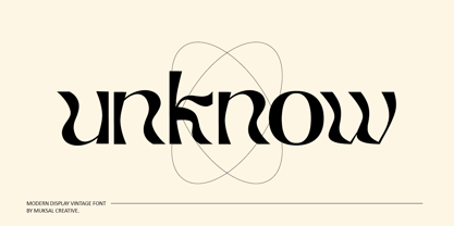 Unknow Modern Display Vintage Font, special glyphs, ornament and multilingual support. It's a very versatile font that works great in large and small sizes. Perfect for editorial projects, Logo design, Clothing Branding, product packaging, magazine headers, or simply as a stylish text overlay to any background image. Features: Lowercase and Uppercase Numerals & Punctuation, Accented characters Multiple Languages Supported
 - Qindom by Realtype,
$16.00 Qindom is inspired by natural brush typography. Written in rapid motion using a slightly dry brush pen. This will give you a fresh and modern design. Qindom comes with uppercase and lowercase letters, large sets and small sets, numbers, alternative styles for several lowercase characters are also available that make your text and design more attractive.
 - Caracas Stencil Pro by John Moore Type Foundry,
$25.00 Caracas Stencil Pro is a new family of stencil sans serif fonts, looking friendly, sweet and comfortable to read. Where text flow between straight lines and round by becoming transparent in the interest of readability. Caracas Stencil is ideal for working in small letters and texts of a technical nature. Caracas is a humanistic approach to reading sans forms.
 - Air Corps JNL by Jeff Levine,
$29.00 What started as a small project for Mike Humphrey of Chiltern Image Service in the UK ended up as Air Corps JNL, a typeface featuring retro letters and numbers from military aircraft. Expanded to a full character set with punctuation, foreign accents, monetary figures and the like, Air Corps JNL is also available in an oblique version.
 - Germalt by Typesketchbook,
$55.00 Germalt is a geometric typeface made up of 32 fonts across 8 weights with normal and alternate options. It’s a unique and modern sans typeface, which is well suited for a variety of typographic applications such as headlines and small texts. The Germalt font family supports multiple languages and is available as both webfont and desktop font.
 - Unisketch by Letters&Numbers,
$22.00 Unisketch is an homage to my favorite font Univers when I was at design college. Univers is a neo grotesk font by famous Swiss typeface designer Adrian Frutiger. Unisketch, with its worn, misaligned and slightly tilted characters, still retains some of the qualities that workhorse body copy requires: It is legible at small sizes and produces a compact ‘Schriftbild’.
 - Neue Einstellung by Hanken Design Co.,
$25.00 Neue Einstellung is a geometric typeface with simplicity and straightforwardness that stands out in small or large scale applications. Inspired by the Einstellung Effect, it embodies rigidity in the way it looks and the way it performs. It has been used by contemporary brands all over the world due to the clean and minimalistic feel that it promotes.
 - OL Hebrew Cursive by Dennis Ortiz-Lopez,
$30.00 This font contains every variant found in the Hebrew Bible such as the “mutilated” Waw in Numbers 25: verse 12, the small Heh in Genesis 2: verse 4 and the Nun Inversum before Numbers 10: verse 35 and after verse 36 and elsewhere as well as oversized consonants and various double-wide consonants used in inscriptions.
 - Trackpad by ITC,
$29.00Trackpad is the work of British designer Timothy Donaldson, an easy, free-spirited typeface. Don't let the undisciplined style fool you. Despite its casual appearance, it has been carefully worked to ensure legibility even in small sizes and retain its handwritten appearance. The jagged features of Trackpad give text a pleasing texture and produce an informal yet striking appearance.