10,000 search results
(0.038 seconds)
- VTF Charisma by VarsityType,
$15.00 Like traditional athletic block typefaces, VTF Charisma is built with chiseled cornersand a rigid skeleton. However, an underlying formula of fervor and functionality emerges in execution. The typeface features traditional block tendencies that are challenged by expressive angles and deviations in line weight that harken to penmanship. Uniquely tapered terminals seen in letters like "a", "c", and "s" demonstrate a strong visual energy while increasing legibility. The legs of angled letterforms like the "A", "v", and "y" are cropped in a way that further reinforces this motif. These stylistic cues are employed throughout the family’s 7 weights, ranging from Thin to Black with an accompanying Oblique variant for each. VTF Charisma is equipped with a hefty 970 glyphs that support Small Caps, fractions, extensive Latin characters, stylistic alternates and more. Paired with its dynamic charm and strong visual appearance, the family’s horizon of capabilities broadens.
 - Reserve by Positype,
$29.00 First and foremost, Reserve is a companion typeface developed to complement the Scotch Suite of typefaces. With a focus on producing simpler forms with less contrast, Reserve evolved into a fantastic serif typeface for long-form text settings, exceptional clarity at low resolutions—for print and screen. Friendly and functional, Reserve is replete with features intended to make you feel comfortable going back to again and again, and with a complete set of condensed fonts, this typeface becomes more of a surprise. Small Caps, 4 sets of numerals, Case-Sensitive forms, Stylistic, Swash and Titling Alternates, Fractions, language support, and more… it’s all there, ready for you to use. The term ‘Reserve’ as it applies to the words of wine and spirits is typically used to alert a consumer of a higher quality, exceptional vintage, or special production of wine or whisky… it’s no different for this typeface’s name. Cheers.
 - Robofan by César Puertas,
$12.00 Robofan is a vintage Open Type font based on the logo of reconfigurable robots (toys and characters) from the mid 1980s. The typeface was conceived when looking at the author’s own collection of Transformers, he noticed many basic drawing and spacing problems, missing characters, incorrect accent shapes and a lack of proper rhythm in the typeface used in the newest toy’s packaging, mistakes that didn't happen in the toys back in the 80s. These mistakes were so evident that the author decided to look back at the original lettering from the 80s to capture the original spirit of the Transformers. Robofan contains true small caps and has full support for Cyrillic scripts and Central European languages. The full character set consists of more than 700 glyphs. Robofan is ideal for computer & video games, merchandising and all kinds of products related to science fiction, robots, cyborgs, aliens and everything else.
 - ST Gaidar by ShimanovTypes,
$9.00 The font "Gaidar" named in the honour of Arkady Gaidar. He was a Soviet writer, whose stories were very popular among Soviet children, and a Red Army commander. He died in combat fighting with German nazis in 1941. Few generations of Soviet kids are raised on his books and a number of films were made based on his stories. This font inspired by posters, movie titles and book covers of this writer. The letterforms are bold and gnarly and comes in 2 styles: uppercase and small caps. It has LATIN and Extended Eastern Europe CYRILLIC letters. "ST-Gaidar" created for titles, poster design, web design, branding and packaging works, illustrations, badges and other typography works. Pls, don't use it for for typing large arrays of text. ST Gaidar supports 15+ languages: Belarusian, Bosnian, Bulgarian, Croatian, Dutch, English, German, Macedonian, Norwegian, Russian, Serbian, Swedish, Spanish, Slovenian, Ukrainian and probably others
 - Trenda by Latinotype,
$29.00 Designed by Daniel Hernández and Paula Nazal. Corrections and review by Alfonso García and Rodrigo Fuenzalida. Trenda is a geometric sans-serif typeface based on the uppercase of Trend —a Latinotype font, released in 2013, that was very well received. This new typeface comes with a wider character set that offers a complete family of uppercase and lowercase in different weights. Trenda is a versatile easy-to-use functional display font with a strong personality, especially its uppercase, which makes the designer’s work easier. Trenda’s lightest and heaviest variants are ideal for display use while its middle weights work well with short and mid-length texts. This typeface has been designed especially for corporate projects, logotypes and publishing. Trenda comes in 8 weights, ranging from Thin to Heavy, and includes matching italics as well as small caps and alternates. The family contains a 634-character set that supports 206 different languages.
 - Athelas by TypeTogether,
$65.00 An attempt to go back towards the beauty of fine book printing, inspired in Britain's literary classics. Athelas takes full advantage of the typographic silence, that white space in the margins, between the columns, the lines, the words, the lettershapes and finally, within the characters themselves. It is also intended to take advantage of the great advances and technical developments made in offset printing. Athelas shows its best side in finely crafted book editions and good printing conditions. Athelas has a large character set that covers most of the languages that use the Latin script. Although inspired in British literature, this typeface respects the cultural values behind different languages, where diacritic marks have an utterly important role. Athelas features four weights and about 800 characters per weight, including small caps, discretionary ligatures, fractions, a complete range of numerals for every use and a set of ornaments and arrows.
 - 1785 GLC Baskerville by GLC,
$42.00 This family was created/inspired from the well-known Baskerville Roman and Italic typefaces created by John Baskerville, the English font designer. We were inspired by the original family sent by Baskerville’s wife after his death. The full Baskerville collection was bought by the French editor and author Pierre-Augustin Caron de Beaumarchais who used it to print - in Switzerland - for the first time the complete works of Voltaire (known as the “Kehl edition” from the "Imprimerie de la société littéraire typographique"). We have used this edition, with copies from 1785, to reconstruct these two genuine historical styles. The font faces, kerning, and spacing are scrupulously identical to the original. This Pro font includes characters for Western, Eastern and Central European languages (including Celtic) and Turkish, with a complete set of small caps, standard and “long s” ligatures in each of the two styles.
 - Mountain by Volcano Type,
$29.00Mountain is a digital revival and extension of Teutonia, an old metal typeface released by the Roos & Junge type foundry (Offenbach am Main, Germany) in 1902. Teutonia’s design was popular during both the Art Nouveau and the Constructivist eras, where similar letterforms could be seen as far away as the Soviet Union. Although it slipped under the radar during the 1930s and 40s, this style feels extremely contemporary today. Mountain’s underlying geometric feeling is reminiscent of pixels and grids, suiting it for application with music and art, as well as history. Yet this typeface is not as static as it seems at first glance; playful diagonals—like those seen on the capitals D, L, P, and W—enliven the otherwise stern horizontal and vertical motion. Teutonia was a simple upper and lowercase display type. Mountain adds upon these by adding small caps and obliqued italic companions, rounding out this typographic toolkit. - Garibaldi by Harbor Type,
$50.00 🏆 Selected for Tipos Latinos 6. 🏆 Selected for the 12th Biennial of Brazilian Graphic Design. 🏆 Typographica Favorite Typefaces of 2015. Garibaldi is a text typeface based on humanist calligraphy. It has an organic look and feel, while preserves the traditional construction of roman typography. It all started with a desire to learn more about the origin of the strokes on humanist typefaces. To accomplish that, Garibaldi features a 20° axis, medium contrast based on translation and expansion, asymmetric serifs, and terminals related to the broad nib stroke. Garibaldi Regular was nominated for Tipos Latinos 2014. Since then, the family was expanded with more weights and matching italics, making it a solid choice for setting books, magazines and documents. Among many OpenType features, each font contains small caps, ligatures and contextual alternates, totalling more than 750 glyphs and supporting at least 80 languages.
 - Galak Pro by Luhop Creative,
$99.99 Galak Pro is a modern geometric sans serif family characterized by its simplicity and extensive functionality.consisting of 9 weights ranging from Hairline to Heavy with matching italics. It supports Extended Latin, Cyrillic and Greek. This blend produce a typeface of modern, clean and contemporary appearance that has implicit on its core a classic vibe, nourishing the text with a timeless elegance.In use, the form and function balance of its design allow it freely travel through a diverse range of fields and possibilities like short text settings, brands, headlines or signage systems with grace and naturality. Galak Pro is available in variable font format and in 18 different individual styles (9 weights), with a set of supports over 200 latin languages and including an extensive repertoire of opentype features like small caps, ligatures, stylistic alternates, proportional and tabular figures,and many other resources to please your typographic urges.
 - PF Bulletin Sans Pro by Parachute,
$79.00 This is a grotesque typeface which was derived from an older more simple version designed back in 2000. Bulletin Sans Pro is distinguished by its selective deep cuts which give this typeface a robust and contemporary look. These cuts become more apparent at larger sizes while they create a more subtle effect at smaller sizes. For intense titles try the black version. When space and legibility for long texts are critical, use the lighter versions. The family consists of 10 fonts—from black to light—including true italics. It supports 20 special OpenType features like small caps, fractions, ordinals, etc. and offers multilingual support for all European languages including Greek and Cyrillic. Finally, every font in this family has been completed with 270 copyright-free symbols, some of which have been proposed by several international organizations for packaging, public areas, environment, transportation, computers, fabric care and urban lifestyle.
 - Opal by Linotype,
$29.99 Opal Pro is a text family designed by Hannes von Döhren in 2008. It gives every text a noble character. The typeface has long ascenders that clearly rise above the capital letters and a low x-height. Opal’s letters sport inktraps at stroke junctions, which on one hand create a cutout feeling and on the other hand strengthens the image in larger point sizes. In total, the letterforms have clear emphasis on their verticals and horizontals; they do not fear the weight on their curves. In addition to the Italic and Bold, the Opal type family includes a Script face, whose letterforms include connections, similar to handwriting. On top of that, the typeface possesses swash letters for italic and script, small caps, many ligatures and borders & ornaments. With a little bit of care, designers will be able to create the finest of traditional, elegant work with this family.
 - PF Square Sans Condensed Pro by Parachute,
$79.00 Square Sans Pro is one of Parachute’s most popular typefaces. It has been used by the likes of companies such as Samsung and organizations like the European Commission. Now a new version has been released. Square Sans Condensed Pro is a square-shouldered, modern and self-assured text typeface which lends style to a variety of projects. With its generous x-height, full-bodied counters and uniform stroke weight, it provides high legibility and uniform typographic color at all sizes. This is an exceptionally warm and comprehensive type family -with slightly rounded edges and softened curves- which possesses a robust and friendly appearance. The family consists of 12 fonts -from extrablack to thin- including true italics. It supports opentype features like small caps, fractions, ordinals, etc. and offers multilingual support for all European languages including Latin, Greek and Cyrillic. Download its complehensive PDF Specimen Manual for further details.
 - Halogen Flare by Positype,
$29.00 When I released Halogen, I asked ‘Who doesn't want or need an expansive contemporary extended sans that has a sense of style and swagger… what if it had a lowercase, small caps and various numeral options… how could you say no?’ Go, click on the Halogen link and read on, if you're interested. Halogen was well-received, so I decided to take it further with Halogen Flare (the name kinda tips you off as to what kind of typeface it is, don't ya think?). As always, I prefer not to take short cuts and provide an anemic offering of glyphs — a modern typeface offered today must provide more than just the basics and this one does — lowercase, smallcaps, old style numerals, tabular forms, stylistic and titling alternates, fractions, case-sensitive features, and even an alternate uppercase ordinal set is included. Now, go make cool print and digital things with it.
 - Haboro Slab Soft by insigne,
$32.99 Haboro Slab Soft is a scion of the Haboro hyperfamily. This concept powers through with its well built, accommodating nature. Haboro Slab Soft’s serifs are rounded, giving it a softer look. The Haboro hyperfamily is a comprehensive design suite that provides solutions for many projects. The iconic angled wedge makes this family ideal for apparel, packaging, apps, corporate identities and advertising campaigns. Subfamilies in the hyperfamily include the original Haboro, a Didone face, Haboro Sans, Serif, Soft, and Slab. The Haboro hyperfamily is known for its ability to make your copy appear clear and simple. The Haboro typeface is built on a common underlying model. It has the same cap height, the same x-height, and the same basic character shape. This unification of shape and proportion results in a complementary set of typefaces. Haboro Slab Soft’s wide variety of ligatures and OpenType alternatives give your message the clarity it deserves. The Haboro Slab Soft family includes seven weights, from Thin to ExBold, three widths, and matching italics. There are over 550 glyphs per style and support for over 70 Latin-based languages. Haboro Slab Soft includes features such as small caps, ligatures, fractions, and alternatives. Haboro Slab Soft is there when you need to present information in a clear and friendly fashion.
 - Bendita by Rhythm 'n type,
$25.00 Bendita could evoke the didones of the 19th century. It has an extreme contrast that makes it only suitable as a display typeface, with its characteristic shapes. The fatty type par excellence.
 - Minormayor by Maulana Creative,
$11.00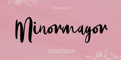 Give your designs an authentic handcrafted feel. Minormayor is perfectly suited to logo, stationery, branding, typography quotes, magazine or book cover, website header, clothing, branding, packaging design, restaurant and more. Cheers, MaulanaCreative
 - Mechanical Stencil JNL by Jeff Levine,
$29.00 For well over a century, stencil machines allowed manufacturers, shippers and even the military to quickly mark and identify objects. Mechanical Stencil JNL was created from examples from one of these machines.
 - Missiva by DSType,
$20.00The first inspiration for Missiva was a sixteen century letter from S. Francisco Xavier (St. Francis Xavier) but then I adapted my own handwriting in order to have the basic character set. - Fantan by Solotype,
$19.95From an early 20th century sign painter's copy book. We gave it a softer treatment than many of the faux-Asian faces have. We also added a lowercase, as is our wont. - Roadway by PintassilgoPrints,
$24.90 Roadway is an original typeface with an antique accent, inspired by Clarendon woodtypes from late 19th century. It comes in three matching varieties, with extended character sets and a lot of personality.
 - Frakturbo by Volcano Type,
$19.00 Frakturbo is a rounded modern blackletter for those who don't like the oldscool style of ancient blackletter-types. So Frakturbo is not a revival, but a new interpretation for the 21st century.
 - Tylbor by Typoforge Studio,
$29.00 Tylbor was inspired by vernacular German typography but mostly by handwritten signs found on the archive photographs from the late 40s of the 20th century. Tylbor contains 14 styles in 7 weights.
 - Stillhouse by Surplus Type Co,
$16.00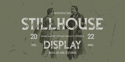 Stillhouse is a vintage serif font that features 2 styles - Textured & Solid. This typeface is great for achieving that rustic aesthetic which is popular in restaurant branding, apparel designs and product packaging.
 - Orange Leaves by Crumphand,
$9.50 Orange Leaves Fresh Fonts. This font is very unique shape. Comes with some ligature make your graphic looks fresh. Perfect Contour, Easy to read. What's Included ? Uppercase Lowercase Symbols Numerals Multilingual Support
 - Code Next by Fontfabric,
$39.00 10 years later, one of the first geometric typefaces in our portfolio and a popular favorite of yours is rising to a whole new level! We’re revealing the stand-alone type family Code Next—a staggering evolution from Code Pro in functionality, versatility, and application. The transformation includes 6 new weights, 10 new Italics, full support of Extended Cyrillic and Greek, full redesign and glyphs refinement, 2 variable fonts, to name but a few. Going back to 2011, the grotesque-inspired Code Pro was designed to complement memorable pieces that make a statement. Balancing between stylization and simplification, it was encoded with the distinct voice of basic organic shapes to stand the test of time. Little did we know, it would expand and live up to the potential of a “font from the future” as the new Code Next. Today, a type family of 22 styles, this geometric sans solidifies its relevance and carries a strong constructive aesthetic through simplified forms with a twist. These fit any modern design in print, web, and display visualization. Developed to go above and beyond, Code Next comes prepared for multi-script projects with Extended Latin, Extended Cyrillic, and Greek. Explore Code Next’s versatility and switch things up with the help of 2 variable fonts, more than 1280 glyphs, and an extensive OpenType features set including small caps, standard and discretionary ligatures, contextual and stylistic alternates, stylistic sets, case sensitive forms, and much more. Overview: • Font family of 22 fonts • 10 weights • Languages - Full support of Extended Latin; Extended Cyrillic; Greek • Entirely refined design and metrics • Glyph count - 1288 • Variable fonts - 2 fonts OpenType features: • Small Caps • Standard Ligatures • Discretionary Ligatures • Contextual Alternates • Stylistic Alternates • Stylistic Sets • Case-Sensitive Forms • Ordinals • Localized Forms • Lining Figures • Proportional Figures • Tabular Figures • Oldstyle Figures • Subscripts • Scientific Inferiors • Superscripts • Numerators and Denominators • Fractions • Roman figures • Extensive mathematical support • Navigation symbols
 - Archive Garamond by Archive Type,
$59.99Archive Garamond is a typeface roughly based on the designs of Claude Garamond (ca. 1480 – 1561), a French publisher and a leading typeface designer of that period. Garamond’s influence on type design is reflected in many typefaces that are today known under different commercial names. While the majority of contemporary digital interpretations of the “Garamond types” are cleaner and more polished versions of that genre, Archive Garamond tries to keep the rough nature which was typical in the early days of printing. Archive Garamond has a rather unique, distinctive temperament which is even more emphasised with the preserved non-uniformity, such as irregular glyph shapes or a variable baseline. Although Archive Garamond was clearly made to be used for display sizes it works surprisingly well in text. Archive Garamond is availale in three versions, each containing approximately 600 glyphs (in Pro versions). Archive Garamond Pro A Professional version of the typeface contains all glyphs, including the advanced typographic forms, such as different sets of figures, small caps, swashes, historical forms, etc. The font also enables full use of the OpenType features. It fully supports the languages listed in the language list. Archive Garamond Std A Standard version of the typeface is meant to be used for the basic typographic work. It typically contains the most common glyphs. The standard figures are proportional lining. Besides kerning this version does not contain any advanced OpenType features. A Standard file type fully supports the languages listed in the Language list. Archive Garamond Exp An Expert version contains glyphs that are supposed to be used in advanced typographic works. This type of file contains uppercase and small cap glyphs with the proportional oldstyle figures as the default set. Besides kerning this version does not contain any advanced OpenType features (all OTF features have to be replaced manually). An Expert file type fully supports the languages listed in the Language list. - Thalweg by Ani Dimitrova,
$35.00 Thalweg serif typeface is a project focused on the digitalization and development of the Thalweg font. The font was originally designed in 1993 by the Bulgarian artist Ivan Kyosev. In 2018 Ani Dimitrova began the revival of the Thalweg font and converted the drawings into a digital form. The existing set of characters required some necessary expansions such as the development of capital letters, alternative symbols and many other functions. Furthermore, some additional weights were developed which aimed to make the font more complete. Thalweg was completed in 2020 with 16 weights ranging from Thin to Black with extra drawn italics and small caps versions, each style containing more than 1100 glyphs. The font comes with an extended coverage of the Latin, Cyrillic and Greek Scripts. All of the weights are specifically equipped for complex, professional typography with Open Type Features. These features include: Small Caps, Ligatures, Discretionary Ligatures, Superscript, Subscript, Tabular Figures, Old-Style Figures, Circled Figures, Arrows, Matching currency symbols and fraction. The Thalweg serif typeface is a perfect choice for body text, branding design, web design, editorial design and more. Ivan Kyosev (1933-1994) was one of Bulgaria’s most famous artists whose work influenced several generations of bulgarian designers. He was born on February 5, 1933, in the city of Burgas. In 1957 he graduated in illustration at the National Academy of Art in Sofia led by Prof. Iliya Beshkov. Mr. Kyosev was a member in the management of the “Graphics and Illustration” section in the Union of Bulgarian Artists, member of the UBA board, artist in the publishing houses “September” and “World”. Together with Boris Angelushev, he worked on the layout design of the “Literary Front” newspaper. Furthermore, in 1963 - 1964 he was the main artist in the publishing house “Prosveta”. Ivan Kyosev excelled in the field of illustration, book design and library layouts in various genres (classics, children's literature, poetry, journalism, memoirs, etc.). He is also the author of many fonts.
 - Symposium Pro by Canada Type,
$49.95 Philip Bouwsma's Symposium Pro is a wide Carolingian script that can be set simply or with a wide range of flourishes. It takes its inspiration from the scriptoria of the twelfth century, particularly in Spain, where Christians, Muslims and Jews lived harmoniously in a brilliant culture for two centuries. As manuscripts were translated and copied to meet the Western demand for classical texts, calligraphic elements from Arabic and Hebrew spread throughout Europe, sparking a proliferation of new styles that brought the simple book hand to a higher level. Symposium Pro spans a broad range of time and space, from the court of Charlemagne to the Arabian nights and Renaissance Florence. Symposium Pro comes in four weights, ranging from Light to Bold, with each font containing over 1200 glyphs. Variations on every letter form, from swashes to subtle alterations, are plenty, with some even having up to 40 alternates. Also plenty are the embedded ornaments and flourishes, over a hundred of them. Keep that glyph palette handy for many pleasant surprises and easy setting solutions.
 - Battista by preussTYPE,
$29.00 The BATTISTA typeface stands in the long tradition of the designs developed by Giambattista Bodoni, who made his famous typefaces in the end of the eighteenth century. Similar designs can be found on various specimen books e.g. Alexander Wilson, John Bell, Edmund Fry and Alexander Thibaudeau. One of the best italics was available by Stephenson Blake & Co. foundry form Sheffield, England. In the end of the nineteenth century an unknown punch cutter at the German type foundry Schelter & Giesecke made an very bold cut of this Bodoni design. He brought both designs, the regular and the italic to an new level of harmony. Compared to the original Bodoni designs the new typeface was a lot bolder, which was well taken by the audience in this time. The BATTISTA typeface is an remarkable design, assembled of ultra bold and very fine shapes, but in all, the spirit of Bodonis design was well preserved. BATTISTA is a classic display design. The fine details are best shown on larger text sizes.
 - Wallington Pro by Zeune Type Foundry,
$24.00 Wallington Pro is a decorative-serif font embodying vintage and elegant curves with functional structure. Style is adopted from Old English cultures with their descendants around mid-12th century and Art nouveau in 19th century, it was inspired by natural forms and structures and the curved lines. Crafted with love and easy-to-read letter design. Wallington Pro consists of 721 glyphs including 268 unique ligatures, 30+ catchwords and 10 stylistic sets. All glyphs are divided into several OpenType features such as Ligatures, Contextual alternates, Old Style Numeric and some astonishing special characters that allows you to mix and match pairs of letters to fit your design. This variety encourages unusual and extroverted creation in lettering design. The typeface offers numerous combination possibilities between the basic glyph set and stylistic sets.The stylistic sets are alternate alphabets that you can access by using OpenType savvy programs such as Adobe Illustrator, Adobe Photoshop CC, Affinity Designer, CorelDraw or Adobe InDesign. Wallington is an experimental and versatile font. Suitable for digital lettering, prints, logo, poster, t-shirt, packaging and applicable for some type of graphic design.
 - Kaizena by MaxnorType,
$12.00 Kaizena is a modern script font with alternates, final form, stylistic sets, including front and back swashes. It can be used for various purposes, and suitable for logo design, branding, greeting cards, stationery, wedding invitations and much more. The design of Kaizena nuanced Japanese style, but it is very feasible to use in modern themed designs. Kaizena uses OpenType Features, so designers can access alternate glyphs easily with graphic design softwares. Besides that, these alternate glyphs are located in Private Use Area, so they can be accessed easily with Character Map, Babel Map, or font manager softwares.
 - Somersault by Fontforecast,
$15.00 Somersault is a nonchalant, rough edged, hand painted, brush font, with a spontaneous personality. With its natural charm it brings cheer and lightness to any design. Alternate characters for upper and lowercase letters and lots of ligatures enable you to avoid repetition of identical glyphs.They are managed by Opentype features such as stylistic alternates, swashes and discretionary ligatures. Somersault also comes with some fun extra's like strokes, hearts and splatters to play with. Somersault is PUA encoded, so no special design software is needed to access all glyphs. You can easily access all of them in Fontbook (Mac) or Character map (Windows). Somersault is paired with Somersault Tall, a complementary all caps font. The result is a versatile font duo. A perfect match.
 - Celticmd - Unknown license

- Knappast by Cercurius,
$19.95 Sans-serif reversed capitals in circles, resembling typewriter keys. The font can be used for logos, signs and labels, and for markings on maps and charts.
 - Local Eatery JNL by Jeff Levine,
$29.00 Here's yet another variation of the classic Futura Black Art Deco stencil form of display lettering. The inspiration for this typeface came from various images of the Blossom Dairy Co. restaurant, originally opened as an ice cream and sandwich shop located on Quarrier Street in Charleston, West Virginia. The restaurant first opened in 1938 as an outgrowth of the Blossom Dairy Co. itself, and existed under various ownerships until it permanently closed on Nov. 11, 2016. Digitally redrawn as Local Eatery JNL, it is available in both regular and oblique versions.
 - Deco Eccentrique JNL by Jeff Levine,
$29.00 The inspiration for Deco Eccentrique JNL was initially hand drawn contoured lettering from a mid-1920s piece of sheet music; the style of the letters showing influences of the upcoming Art Deco movement. This was made into a digital font entitled Poster Contoured JNL. Once all of the excess parts of the previous design were stripped away to only the inner letters, the pre-Art Deco influences remained along with characters of varying stroke widths and shapes. This non-conformist type face is available in both regular and oblique versions.
 - Nvma Titling by Stone Type Foundry,
$49.00 Nvma is based on Roman letterforms which appeared during the period from the earliest extant examples in the sixth or seventh century BC until the end of the third century BC. For Nvma the J, U and W had to be fantasies as they did not exist until much later, similar to the G, numerals and other non-alphabetic signs in the font. Thus not all of the archaic forms are represented in Nvma. Nvma was designed to work with Magma, as it matches the weights and heights for Magma Thin and Magma Titling Thin.
 - VLNL Kimchi by VetteLetters,
$35.00 The Kimchi font had its starting point in the making of the film "Cloud Atlas", based on the novel by David Mitchell and directed by Lana & Andy Wachowski and Tom Tykwer. A first version of Kimchi was created for "Papa Song" – an underground fast food restaurant in a futuristic Neo Seoul in the year 2144. It was used for the menus, advertisement and packaging. Kimchi was later further developed to become a useable typeface: it works for headlines, street art stencils and of course as logo font for korean fast food restaurants.
 - Cochin by Linotype,
$29.99 Georges Peignot designed Cochin based on copper engravings of the 18th century and Charles Malin cut the typeface in 1912 for the Paris foundry Deberny & Peignot. The font is named after the French engraver Charles Nicolas Cochin (1715–1790) although its style had little to do with that of the copper artist’s. The font displays a curious mix of style elements and could be placed as a part of the typographical Neorenaissance movement. Cochin is especially large and wide and was very popular at the beginning of the 20th century.
