10,000 search results
(0.322 seconds)
- Kinghorn 105 by Talbot Type,
$19.50 Kinghorn 105 is an Egyptian style slab-serif. The strokes are all of a roughly equal weight for an even, geometric look. Although original Egyptian slabs date from the early 19th century, the even look gives the font a balanced, contemporary look. It's intended mainly as a display font, but it's even strokes mean it remains legible even at smaller sizes. It's also available with some character variations as Kinghorn 205.
 - Calamity Jane NF by Nick's Fonts,
$10.00This typeface is an amalgam of Edwardian and Art Deco letterforms: the lowercase letters come from a turn-of-the-twentieth-century typeface named Amsterdam, and the uppercase letterforms come from a 1930s logotype for the Théâtre Moderne in Paris. Like its namesake, this typeface is not easily overlooked. This font contains the complete Latin language character set (Unicode 1252) plus support for Central European (Unicode 1250) languages as well. - Midorima by Wyarecreatype,
$13.00 Midorima is a japanese style font that we made with excellent taste. We combine ethnic and cultural elements in each of the glyphs. This Midorima font is suitable for those of you who like japanese culture, besides this font is also suitable for those of you who have a japanese restaurant, japanese clothing brand, japanese arts, and business purpose related with japanese culture. Midorima is perfect for your brand!
 - Madame by Linotype,
$40.99 The font, Madame, first appeared in a sample with similar fonts, presented by the Fonderie Typographique Française in the 19th century. The font consists of three cuts, letters, accents and numericals. The flamboyant Madame is meant for titles and headlines, emphasis in text or as initials. It combines well with both serif and sans serif fonts, but should be used sparsely to maximize the advantages of its ornate forms.
 - Spinosa BT by Bitstream,
$50.99Stephen Chick, of In Your Typeface Productions (IYTP) foundry, has created this rather prickly type design. Although for display, it is surprisingly legible at smaller point sizes. There is an Inline version, and also an Inline Extra version, which has only the inner contours of the Inline itself, which can be combined with the Regular to create cool two-color effects. The extended glyph set supports Central Europe. - Wood Rounded JNL by Jeff Levine,
$29.00 This reinterpretation of Caslon Rounded showcases one of the early attempts of type foundries to create a novelty ‘rounded’ typeface for general use. While the lettering might easily convey a more modern look of 1960s or 1970s pop typography, its roots definitely lay in the later part of the 19th Century and the heyday of wood type design. Wood Rounded JNL is available in both regular and oblique versions.
 - Business Letter JNL by Jeff Levine,
$29.00 One of the text fonts showcased within the pages of the John Ryan Foundry (Baltimore, MD) specimen book from 1894 is a squared type face with rounded corners called “Geometric”. The original design has been updated slightly by substituting straight lines for the inner corner curves to add a small contemporary touch to a classic alphabet from the 19th century. Business Letter JNL is available in both regular and oblique versions.
 - Donatello LP by LetterPerfect,
$39.00 Donatello is a classically proportioned design with subtly tapered strokes, inspired by the lettering on the fifteenth century cantoria by Luca della Robbia in the Museum of the Duomo, in Florence. The design, consisting of caps and small caps, also includes Donatello Alternates -- a compatible set of wider characters. It was designed by Paul Shaw and Garrett Boge in 1997. Donatello is part of the LetterPerfect Florentine Set.
 - Garstang Engraved by Greater Albion Typefounders,
$18.00 Garstang Engraved is the latest in Greater Albion's series of ‘wood type’ inspired fonts. Garstang Engraved is a hand-cut Roman, suggesting the late Victorian era, but the type of thing that continued in use well into the twentieth century. If you want a title face that has versatility and suggests a past history, as well as the art of finely cut wood type, then this is it!
 - DF Ariënne by Dutchfonts,
$33.00 The Etalage-script has been drawn for the first time in the year 2000, based on a early 20th century lettering stencil with what farmer Boelema at Lalleweer stenciled his grainsacks. Eventually the script letter was developed as a typeface with a wink to the ‘lost’ displaytypes for the ‘display window’ of graphic designer Ariënne Boelens, who in exchange made the website www.lalleweer.nl. What originated the Ariënne should be evident now.
 - Lazurski by ParaType,
$30.00 Designed at Polygraphmash type design bureau in 1984 by Vladimir Yefimov, with the addition of demi and demi italic. Based on a hot-metal typeface (1962) by Moscow book designer Vadim Lazurski (1909–1994), inspired by the early 16th century typefaces of Italian Renaissance. The typeface is useful for text and display composition, in fiction and art books. An 'expert set' was added by ParaType (ParaGraph) in 1997.
 - Pleasantwood JNL by Jeff Levine,
$29.00 Although wood types were at their peak of use during the letterpress era of the late 19th and early 20th centuries, there is a growing revival movement of "boutique" print shops who have embraced the look and texture of this form of printing. More modern in design that many of its counterparts, Pleasantwood JNL is still a nice addition to the wood type library re-drawn digitally by Jeff Levine Fonts.
 - Muralista by Los Andes,
$26.00 This typeface is inspired by 60s and 70s Chilean murals and posters artwork. On the walls, big and heavy letterforms were presented pictorially for political propaganda. Muralista is a low contrast condensed typeface, similar to classic forms of the early nineteenth century humanist grotesque. The sinuous, rounded and asymmetric terminations remind us the artist’s brush strokes. This typeface is ideal for editorial sentences and logo designs. Designed by Jorge Cisterna.
 - Faber Serif Pro by Ingo,
$42.00 Faber Serif is the Roman typeface which was born out of the sans serif design Faber Sans. The proportions are nearly identical to those of Faber Sans. In comparison, Faber Serif has heavy — although very short — serifs. The character of contrasting strokes is not very pronounced; therefore, this font is closely related to the first Roman typefaces from the 15th century. Faber Serif perfectly matches with Faber Sans!
 - Cirulis Display by Asketic Design Studio,
$40.00 Cirulis is a display sans family of two weights. Inspired by the lettering of Ansis Cīrulus (1883-1942) one of the first Eastern European designers. The artist’s heritage is characterized by letters with asymmetric widths, sliced cuts and various intrinsic features. By carefully studying forms and origins of the letters Asketic designed a new typeface that in a contemporary fashion relives early 20th century national romanticism of Eastern Europe.
 - Papyrus by ITC,
$40.99Papyrus is a roman calligraphic typeface with distinctive human touches like rough edges, irregular curves, and high horizontal strokes in the caps. It imparts a warm and friendly ambience to everything from restaurant menus to book covers. American Chris Costello created the popular font Papyrus in 1983 and counts it as one of his proudest accomplishments. In addition to designing type, Costello is a prolific graphic designer, illustrator, and web designer. - Zyklop NF by Nick's Fonts,
$10.00A random scan from a late nineteenth-century German type specimen book, encountered on the internet, provided the pattern for this surprisingly contemporary face. Although all of the characters are parallel to the baseline, the unusual dimensional treatment tends to give the impression that they slant upward to the right. Both versions of this font include the complete Unicode 1252 Latin and Unicode 1250 Central European character sets. - David And Sovhie by Silverdav,
$14.00 David and Sovhie is a formal script, and is ideal for wedding invitations, magazines, social media, restaurant menus, greeting cards, birthday invitations, feature headings and more. This font comes with a complete set of lowercase and uppercase letters, various punctuation marks, numbers and multilingual support. David and Sovhie includes 304 glyphs, uppercase and lowercase characters with ligature, numbers, many punctuation marks and up to 4 alternatives for each character.
 - Unicore by Halbfett,
$30.00 Unicore is a large family of geometric sans serif fonts. Design wise, it is inspired by classic 20th-century typefaces like Futura, Gill Sans, and Avenir. It fuses their aura with contemporary elements, like a unique harmonisation of width and height. You can see this in the lowercase letters especially and it helps support the fonts’ legibility. The regular weights in the family are optimised for body text.
 - Macbeth by Linotype,
$29.99 Macbeth is a heavy, condensed Art Deco-style typeface from Linotype. Macbeth includes some particularly noteworthy diagonal elements -- these enliven the design and give typeface its overall character. Macbeth should be used for music-oriented applications, or anything that is both reminiscent of the early 20th Century and a bit spooky. The letters in Macbeth are quite similar to display style found on Frankenstein posters, and those of other early films.
 - Kairos by Monotype,
$50.99 The Kairos™ family from Terrance Weinzierl is that rare form of typeface that successfully melds design distinction and ease of use. While based on 19th century Grecian wood type forms, it performs admirably in a variety of applications, both in print and on screen. Kairos Variables are font files which are featuring two axis and have a preset instance from Thin to Black and Condensed to Extended
 - Tuff by Stone Type Foundry,
$49.00 Tuff began with Magma. Set as text, they appear to be similar and are quite comfortable as typographic companions. The child-safe softness of Tuff owes something to the letterforms of the earliest extant Greek Manuscript, The Persae by Timotheos in the 4th Century BC. It is beholden to Morris Fuller Benton's original Souvenir, and its revival by Ed Benguiat. My own Stone Informal was also an influence.
 - Fonseca by Nasir Udin,
$10.00 Fonseca is a modern sans serif inspired by art deco and typography poster in early 20th century. The key of this all-caps family is simple straight geometric forms and modernized letterforms. This display family is perfect for headlines, posters, logos, branding projects, magazines, and packaging. The modernized retro-look makes this family great to presents any contents related to travel, history & culture in the present/modern way.
 - Payzant Pen NF by Nick's Fonts,
$10.00The inspiration for this exuberant exercise in penmanship was found in Frank H. Atkinson's A Show at Sho-Cards: Comprehensive, Complete, Concise, published in 1918, executed with the then-state-of-the-art Payzant Reservoir Pen. It retains its quaint charm, even after almost a century. Both versions of this font contain the complete Unicode 1252 (Latin) and Unicode 1250 (Central European) character sets, with localization for Romanian and Moldovan. - Hagalind by T4 Foundry,
$21.00 Hagalind is a beautiful new script with a natural flow from Swedish type designer Bo Berndal and the T4 font foundry. Hagalind is elegant and friendly with ligature style capital letters, inspired by 18th century writing. The name comes from Swedish national poet Carl Michael Bellman and his songs about the Haga castle in Stockholm and its beautiful surroundings. It is an OpenType creation, for both PC and Mac.
 - Flatmarker by Irina Kryvets,
$11.00 Flatmarker is the rough, marker-like, handwritten look of the handmade font. Grunge effect of the font gives the script a high recognition value and uniqueness. Flatmarker is very versatile and works great for almost any subject matter, including birthdays cards, weddings, coffee shops, restaurants and many more. Font have natural hand brushed strokes to give your project that natural and realistic look. I hope you enjoy it!
 - Magic Ivy by Anmark,
$18.00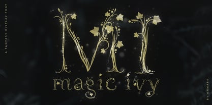 I’m pleased to introduce my decorative font Magic Ivy. Magic Ivy is a fantasy font to add a touch of magic to your designs! Unique uppercase letters are ideal for your wedding monograms and logos. Use this botanical font for wedding invitations, branding, packaging, magazines, florist shops, social media, restaurant menus, greeting cards, headers, poster, fabulous book cover and many more. Magic Ivy comes with uppercase, lowercase, numerals and punctuation.
 - Orion Radio NF by Nick's Fonts,
$10.00A 1930s ad for—believe it or not—Orion radios provided the inspiration for this ultrabold and slightly sassy face. The radio brand didn't make it into the twenty-first century, but its signature typeface has, ready and willing to add a little pizazz to your next project. This font contains the complete Latin language character set (Unicode 1252) plus support for Central European (Unicode 1250) languages as well. - Bleeding Ink by Mvmet,
$20.00 Bleeding Ink is a rough hand-drawn display font but still fun and playful in the same time. It works great for creating cool designs that scream for attention. It’s ideal for anything ranging from t-shirts, book designs, restaurant menu, blog writing, greeting cards to stickers, or anything that needs a casual touch. Fall in love with its incredibly cool style, and use it to create lovely designs!
 - Kinghorn 205 by Talbot Type,
$19.50 Kinghorn 205 is an Egyptian style slab-serif. The strokes are all of a roughly equal weight for an even, geometric look. Although original Egyptian slabs date from the early 19th century, the even look gives the font a balanced, contemporary look. It's intended mainly as a display font, but it's even strokes mean it remains legible even at smaller sizes. It's also available with some character variations as Kinghorn 105.
 - Bhilligod by Ridtype,
$100.00 Bhilligod is inspired by the flow of fine art, which seeks to present beautiful and fantastical paintings that are romantic in nature, such as history and tragedy. This style was popular worldwide in the 18th and 19th centuries and became an important part of European and Western culture. Therefore, we are very enthusiastic to show our best work in romantic artwork, which we apply in blackletter-style font work.
 - FF Carina by FontFont,
$68.99 Carina is based on the Modern serifs from the 18th and 19th centuries. With high contrast and proportions, the font has a pronounced feminine nature tailored by its stylish details and ornamental swashes and ligatures. The round letter shapes evoke the impression of pointed pen calligraphy. Carina s most striking feature is the Cyrillic glyph set (together with swashes and ligatures) that is created by a native Russian designer.
 - Air Factory by Khaito Gengo,
$22.00 Air Factory was originally designed for a merchandise company, and ordered to design iconic but plain forms. Air Factory is a very simple and modern sans-serif font inspired by early 1900’s typefaces, like Futura, and consisting of 5 weights and stencil type(free). This contemporary typeface would be good used for restaurant, retail, book, poster etc. Air Factory also features various ligatures, stylistic alternates, fractions, and languages as well.
 - Octoberfest by Aerotype,
$29.00 Based on a fifteenth century Textura Blackletter typeface, Octoberfest has a companion with Lombardic style capitals, Octoberfest Alternate. Both Octoberfest and Octoberfest Alternate use the OpenType ligature feature to automatically substitute a subtly unique pair of distressed characters when any lower case character is keyed twice in a row. The Pro versions of Octoberfest and Octoberfest Alternate extend the character set to support Eastern European and Baltic languages.
 - Brewski by Kaligra.co,
$19.00 Brewski is a vintage rustic typeface, with touch of many beautiful alternates character and ornament makes this font look stylist. Inspired by vintage Brewery packaging and Beer advertising from the early 20th century. It is perfect for vintage logo design, headlines or packaging design. Brewski designed with Stylistic Alternates and Contextual Alternate in some characters that allows you to mix and match pairs of letters to fit your design.
 - Lam Lagang 051 by Siwox Studios,
$23.00 LAM LAGANG 051 Is a sans serif contemporary with Mid-Century, Modern & Aesthetics style. Sans serif style combined with swash, some letters with shades of Blackletter complete with Ligatures and Alternative Letters to complete all your design explorations. It is suitable for use in any design style such as classic, retro, vintage and also perfect for modern or minimalist design styles. Features: Multilingual Alternates Ligatures Opentype Thank You
 - SK Primo by Shriftovik,
$16.00 SK Primo is a monumental geometric grotesque created to stand out. An unusual combination of smooth rounded contours and sharp square shapes creates a visual contrast that is noticeable. Carefully adjusted shape and attention to detail make this font a great help in the work of the designer. SK Primo is ideal for headlines, posters, banners, and text highlighting. Two styles, solid and outline, were developed to address all communication needs.
 - North Shore by Bruised Goods,
$18.00 NORTH SHORE – The ultimate Hawaiian surf spot typeface, both groovy and mid century inspired. Designed by Lauren Kilbane (on the other coast!) in sunny South Florida, USA. USE THIS FONT FOR: ads, album covers, apparel, cards, flyers, invitations, logos, menus, merchandise, packaging, signage, web, and more. 204 Glyphs Total: Uppercase ONLY, Numbers, Symbols, Punctuation, Emojis, & Language Support. Language Support: Danish, English, French, German, Irish, Italian, Portuguese, Spanish, Swedish, & Swiss German.
 - Bertie by ITC,
$29.99Bertie was designed by Alan Meeks in 1986, an ornamented typeface with a light and elegant look. Such typefaces were at their peak in the middle of the 19th century, when they were created for the advertisements of booming industries. The sophisticated Bertie is based on forms of the transitional period and is best used in headlines with point sizes of 18 or larger to highlight its unique details. - Etienne by ParaType,
$30.00 Designed for ParaType in 2002 by Tagir Safayev. Inspired by the letterforms of Antique No. 8 typeface and other similar fonts of the 19th century (Latin Antique, Wide Latin, Etienne Condensed, Wide Renaissance). A face of so-called Latin type has stout triangular serifs and rather unusual curls on several letters in the lower case. Nevertheless it is eminently suitable for a wide variety of settings in advertising and display typography.