10,000 search results
(0.034 seconds)
- Glaciar by TripleHely,
$16.00 Glaciar is a script typeface based on brush handwriting and inspired by old-style bas-reliefs. All contours were carefully cleaned of brush roughness, but at the same time, minor imperfections were left to create the unique character of this font Glaciar has a built-in auto replacement for lowercase letters without connecting strokes (in the case of word ends) and for ligatures (in the case of letter pairs that do not fit well together). In addition, there are alternates glyphs with starting and ending swashes - the last ones can be used with any OpenType software. And finally, the font has wide multilingual support and can be used in texts in 195 languages Glaciar is a good choice for branding and design projects as well as a cute text overlay to any background image
 - Bauer Bodoni by Linotype,
$45.99 Giambattista Bodoni (1740-1813) was called the King of Printers; he was a prolific type designer, a masterful engraver of punches and the most widely admired printer of his time. His books and typefaces were created during the 45 years he was the director of the fine press and publishing house of the Duke of Parma in Italy. He produced the best of what are known as "modern" style types, basing them on the finest writing of his time. Modern types represented the ultimate typographic development of the late eighteenth and early nineteenth centuries. They have characteristics quite different from the types that preceded them; such as extreme vertical stress, fine hairlines contrasted by bold main strokes, and very subtle, almost non-existent bracketing of sharply defined hairline serifs. Bodoni saw this style as beautiful and harmonious-the natural result of writing done with a well-cut pen, and the look was fashionable and admired. Other punchcutters, such as the Didot family (1689-1853) in France, and J. E. Walbaum (1768-1839) in Germany made their own versions of the modern faces. Even though some nineteenth century critics turned up their noses and called such types shattering and chilly, today the Bodoni moderns are seen in much the same light as they were in his own time. When used with care, the Bodoni types are both romantic and elegant, with a presence that adds tasteful sparkle to headlines and advertising. The Bauer Bodoni was done by Heinrich Jost for Bauer Typefoundry in 1927. This version has finer details of the original Bodoni types. It works well for headlines, logos, advertising.
 - Gather around, typography enthusiasts and history buffs, for a tale of a font that summons the spirit of centuries past with a modern twist. Plakat-Fraktur, created by the talented Dieter Steffmann, ...
- Birdman - Unknown license

- Electric Pickle - Unknown license

- Fun Zone by Sakha Design,
$12.00 Fun Zone is a fun, fun display font. With its modern and bold character, this typeface will be the right choice for you to use.
 - regularJoe by JOEBOB graphics,
$49.00 A handwritten but very clean and organized font that's a little bold and a little slanted. Soon to be followed by its evil twin: irregularJoe.
 - TOMO Ernest by TOMO Fonts,
$10.00 Ernest is a handmade typeface with an unique yet strong personality. Say it bold with this font. Punk & Wave styles. Ideal for type based designs.
 - Monopoint by Volcano Type,
$19.00Monopoint is the little brother of Doublepoint. By overlaying the single weights from light to bold you will get a nice outline-in-outline look. - Lygard by Tadiar,
$14.00 LYGARD Bold is modern stylish font good looking as header and text both. Good for Fashion, Games, Sports, Technology etc. Multilingual Latin symbols are included.
 - Phoenix Squad by Stringlabs Creative Studio,
$29.00 Phoenix Squad is a modern and bold display font. Add this font to your favorite creative ideas and notice how it makes them come alive!
 - Geffry by Rezastudio,
$9.00 Geffry is a retro inspired display typeface. It's fun and groovy with a bold personality. Perfect for masthead, logo, or anything your creativity takes you.
 - Utica JNL by Jeff Levine,
$29.00Utica JNL takes the basic components of Boat Decals JNL and reworks the characters into a bold, block font with thick-and-thin line variations. - NBAres by Nicola Burgarella,
$9.00 This new font family full fit all your comic balloons, onomatopoeia and... SCREAMS! Comes with Regular, Italic and Bold Italic with a great organic look.
 - Boheld by Graptail,
$21.00 Boheld comes with 6 different style variations such as Sans, Serif, Bold, Condensed, and Inline. It is inspired by classic labels, tickets, posters, and more.
 - General Merchant JNL by Jeff Levine,
$29.00 General Merchant JNL is a bold, compressed sans design in the 'Grotesk' fashion with varying character widths and flattened tops on the usually rounded characters.
 - Susa by Hubert Jocham Type,
$29.90 Susa is an elegant and flowing brush script typeface. Ideal for short text in the lighter weights and for headlines in bold and heavy weights.
 - Boa by Alien,
$30.00 Boa bold is a basic display font made for print. It was created for an Artbook about reptiles. It needed to be round and clear.
 - Architec by Monotype,
$29.99This caps only hand lettering could have come from an architect. Speedy written on a 45 degree slope with a bold felt pen or brush. - Rosianne by HandletterYean,
$10.00 Rosianne is a bold and unique handwritten font with a distorted and classic feel. It will effortlessly turn any creative idea into a stand out.
 - Battom Glory by Sealoung,
$10.00 Battom Glory is a bold and distinct blackletter font. Add this font to your creative ideas and notice how it will make them stand out!
 - Sign Letters JNL by Jeff Levine,
$29.00 A few scant examples of some condensed Roman style water-applied decals inspired Sign Letters JNL. The decals were once part of the gold and black "Signmaker" letters and numbers once manufactured by the Duro Decal Company of Chicago and were sold through hardware and variety stores across the country. The condensed letters (which were eight inches in height) did not sell as well as Duro's mainstay sizes of 1/2 inch to 3-1/2 inches and were discontinued long before the rest of the line was supplanted by self-adhesive lettering.
 - Divulge by Typodermic,
$11.95 Welcome to the world of Divulge—a modern grotesque that echoes the refined beauty of nineteenth and early twentieth-century sans-serif metal type. With its austere and nuanced voice, Divulge exudes an old-fashioned charm that feels both familiar and fresh. In a world of cookie-cutter fonts, Divulge is a standout. Its idiosyncrasies are generously peppered throughout, giving your message a unique and memorable character. But fear not—these quirks are not distracting. Rather, they add just the right touch of personality without overwhelming your reader. Divulge comes in three weights—light, regular, and bold—and two widths, allowing you to choose the perfect style for your message. And if you really want to make a statement, the elegant italics add a touch of class and sophistication. So whether you’re crafting a classic, old-fashioned design or looking to add warmth and personality to a modern project, Divulge has you covered. Try it out today and see how it elevates your message to new heights. Most Latin-based European writing systems are supported, including the following languages. Afaan Oromo, Afar, Afrikaans, Albanian, Alsatian, Aromanian, Aymara, Bashkir (Latin), Basque, Belarusian (Latin), Bemba, Bikol, Bosnian, Breton, Cape Verdean, Creole, Catalan, Cebuano, Chamorro, Chavacano, Chichewa, Crimean Tatar (Latin), Croatian, Czech, Danish, Dawan, Dholuo, Dutch, English, Estonian, Faroese, Fijian, Filipino, Finnish, French, Frisian, Friulian, Gagauz (Latin), Galician, Ganda, Genoese, German, Greenlandic, Guadeloupean Creole, Haitian Creole, Hawaiian, Hiligaynon, Hungarian, Icelandic, Ilocano, Indonesian, Irish, Italian, Jamaican, Kaqchikel, Karakalpak (Latin), Kashubian, Kikongo, Kinyarwanda, Kirundi, Kurdish (Latin), Latvian, Lithuanian, Lombard, Low Saxon, Luxembourgish, Maasai, Makhuwa, Malay, Maltese, Māori, Moldovan, Montenegrin, Ndebele, Neapolitan, Norwegian, Novial, Occitan, Ossetian (Latin), Papiamento, Piedmontese, Polish, Portuguese, Quechua, Rarotongan, Romanian, Romansh, Sami, Sango, Saramaccan, Sardinian, Scottish Gaelic, Serbian (Latin), Shona, Sicilian, Silesian, Slovak, Slovenian, Somali, Sorbian, Sotho, Spanish, Swahili, Swazi, Swedish, Tagalog, Tahitian, Tetum, Tongan, Tshiluba, Tsonga, Tswana, Tumbuka, Turkish, Turkmen (Latin), Tuvaluan, Uzbek (Latin), Venetian, Vepsian, Võro, Walloon, Waray-Waray, Wayuu, Welsh, Wolof, Xhosa, Yapese, Zapotec Zulu and Zuni.
 - Tolkien Aglab by Deniart Systems,
$10.00Based on a written pen-form of 'runes' (translation of Elvish Certar and Cirth), it was used by Dwarves to write their own secret tongue. NOTE: this font comes with an interpretation guide in pdf format. - Vincenza Display by The Rare Form,
$35.00 Vincenza Display is a modern high-contrast semi-sans with sharp edges and sleek curves. A distinctive typeface for exquisite headlines. Winner, Gold Award, Graphis 2018 Typography 4. http://www.graphis.com/entry/f6b469fe-c5d3-4bea-87e3-796c1d727b3c/ We felt there was a missing in the world of fashion-forward high-contrast typefaces, so we created Vincenza Display. Based loosely on the proportions of Bodoni, Vincenza features stylized curved descenders and unique semi-serifs, bringing a bold and distinct look to your headlines. The typeface has several alternates and ligatures, and is spaced for all caps as well as sentence case executions. It also contains a robust number of special characters. Vincenza Display is the debut typeface from the team at The Rare Form.
 - Scriptuale by Linotype,
$29.00The Scriptuale family, which contains eight styles, is a contemporary upright calligraphic face. Designed by German designer Renate Weise in 2003, this family of typefaces speaks to the present, while at the same time reflecting on a lyrical past. The letterforms of the Scriptuale family are romanticized, they reference German calligraphic styles from the 19th and early 20th Centuries. For instance the design of Scriptuale's uppercase strays from the canon of classical proportion into romantic idealism. While the C and O are drawn according to the ancient quadratic proportions - almost twice as wide, optically, as the E or the L - the letter A is wider than would be expected, and the D narrower. These subtle differences introduce a different rhythm into text set in Scriptuale than Italic styles of calligraphy may offer. Scriptuale's Gs merit special notice: both the upper and lower case G lunge slightly forward, further enhancing the dynamic quality of the text. Also unique in Scriptuale's design is the lowercase width: the letterforms appear slightly condensed; they have large x-heights to compensate for this. In a delightful twist, the number 2's beak has been closed by drawing it full-circle, back into the stem: this references a style of letter design that was practiced, among other places, by artists from the old Klingspor foundry in Offenbach Germany. Typefaces constructed there easily captured the zeitgeist of the romantic period, but are less calligraphic than Scriptuale (e.g., Rudolf Koch's Koch Antiqua). A semi-serif face (like Prof. Hermann Zapf's Optima or Otl Aicher's Rotis Semi), some of Scriptuale's letters have serifs (D), and some do not (A). And although both the B and the E normally have the same "structure" on their left side, Weise has drawn them differently in Scriptuale. These strengthen the calligraphic-like quality of the family. Traces of the pen are easy to see in Scriptuale's design; it is a thoroughly calligraphic face. The eight typefaces in the Scriptuale family include Light, Regular, Semi Bold, and Bold weights. Each weight has a companion italic. Scriptuale is similar to one other contemporary calligraphic family in the Linotype portfolio, Anasdair , from British designer - Tavern by FontMesa,
$25.00 Tavern is a super font family based on our Algerian Mesa design, with Tavern we've greatly expanded the usability by creating light and bold weights plus all new for 2020 with the introduction of extra bold and black weights Tavern is now a five weight family. The addition of the bold weight made it possible to go further with the design by adding open faced shadowed, outline and fill versions. Please note, the fill fonts are aligned to go with the open faced versions, they may work with the outline versions, however you will have to apply them one letter at a time. The Tavern Fill fonts may also be used a stand alone font, however, the spacing is much wider than the regular solid black weights of Tavern. In the old days of printing, fill fonts rarely lined up perfect with the open or outline font, this created a misprinted look that's much in style today. To create that misprinted look using two different colors, try layering the outline fonts offset over the top of the solid black versions. Next we come to the small caps and X versions, for a font that's mostly seen used in all caps we felt a small caps would come in handy. The X in Tavern X stands for higher X-height, we've taken our standard lowercase and raised it for greater visibility in small text and for signage where you want the look of a lowercase but it needs to be readable from the street. In August of 2016 I started the project of expanding this font into more weights after seeing the font in use where someone tried creating a bold version by adding a stroke fill around the letters. The result didn't look very good, the stroke fill also caused the shadow line to merge with the serifs on some letters. This lead me to experiment to see if a new bold weight was possible for this font and I'm pleased to say that it was. After the bold weight was finished I decided to type the regular and bold weights together in a first word thin second word bold combination, however the weight difference between the two wasn't enough contrast. This lead me to wonder if a lighter weight was possible for this font, as you can see yes it was, so now for the first time in the history of this old 1908 type design you can type a first word thin second word bold combination. So why the name change from Algerian to Tavern? Since the original font was designed in England by the Stephenson Blake type foundry I decided to give this font a name that reminded you of the country it came from, however, there were other more technical reasons. During the creation of the bold weight the engraved shadow line was sticking out too far horizontally on the bottom right of the serifs dramatically throwing the whole font off balance. The original font encountered this problem on the uppercase E, L and Z, their solution was a diagonal cut corner which was now needed across any glyph in the new bold weight with a serif on the bottom right side. In order to make the light and regular weights blend well with the bold weight diagonal cut offs were needed and added as well. This changed the look of the font from the original and why I decided to change the name, additional concerns were, if you're designing a period piece where the font needs to be authentic then this font would be too new. Regular vs. Alt version? The alternate version came about after seeing the regular version used as a logo and secondary text on a major product label. I felt that some of the features of the regular version didn't look good as smaller secondary text, this gave me the idea to create an alternate version that would work well for secondary text in an advertising layout. But don't stop there, the alternate version can be used as a logo too and feel free to exchange letters between both regular and alternate versions. Where are the original alternates from Algerian? Original alternates from Algerian are built into the regular versions of Tavern plus new alternates have been created. We're excited to introduce, for the first time, all new swash capitals for this classic font, you're going to love the way they look in your ad layout, sign or logo. The best way to access alternate letters in Tavern is with the glyph map in Adobe Illustrator and Adobe InDesign products, from Adobe Illustrator you can copy and paste into Photoshop as a smart object and take advantage of all the text layer style features Photoshop has to offer. There may be third party character maps available for accessing alternate glyphs but we can't advise you in that area. I know what you're thinking, will there be a Tavern Condensed? It takes a lot of hours to produce a large font family such as this, a future condensed version will depend on how popular this standard version is. If you love Tavern we're happy to introduce the first weathered edge version of this font called Bay Tavern available in February 2020.
 - Carolingian Majuscul by Kaer,
$28.00 I'm happy to present you my new Romanesque font from the Codex Gigas. The manuscript was created in the early 13th century in the Benedictine monastery of Podlažice in Bohemia. The codex was written in a handwriting atypical for the 13th century, which is actually a late version of the Carolingian minuscule. Texts about repentance and exorcism were written in large Majuscule (Square Capitals (Imperial Roman capitals written with a brush)). Majuscules first incised in stone more than two millennia ago, married to minuscule letterforms that evolved from manuscript hands of the eighth and ninth centuries. Majuscule font is the name given to a type of decorative upper-case letters used in inscriptions and, typically, at the start of a section of text in medieval manuscripts. They are characterized by their straight forms unlike rounded in Lombardic capitals with thick, curved stems. Majuscule capitals were also used to write words or entire phrases. The text is divided into words, punctuation marks are used consistently – periods indicate the end of a sentence and the middle of a phrase. You will get: * Uppercase glyphs * Numbers and symbols * Multilingual support * Ligatures * Free future updates Thank you!
 - Ephemera Sickles by Ephemera Fonts,
$35.00 A debut from the most anticipated vintage digital typefoundry by Gilang Purnama and Ilham Herry, who stucked their mind, body and soul back into the first era of 18th century. They build this intense visual-time machine that no one capable before. Started by the visual branding of the Ephemera Fonts, they bring every letters of it to the another level of journey. They called it Ephemera Sickles. Ephemera Sickles is a ornamented letterhead style typeface-inspired by the era of victorian (1800-1900) and this style was commonly used by engrossers at the turn of the century to embellish official documents, such as diplomas and other certificates. Carefully crafted for every single letters with the soul of Sickels Lettering, Spencerian, and some research from the Penmanship Journal book. The style is named after Charles Sickels, who headed the art department of Electro-Light Engraving Co. in New York City during the early 20th century. There’s no doubt that such a very strong presence typeface like Ephemera Sickles will bring a powerful identity to your visual project. Will be a perfect joint for a logo, visual branding, poster, beer label, packaging, classic bar decor, vintage hotel, et cetera.
 - Boxcase by Vishnu Sathyan,
$49.00 Boxcase is inspired by pixel fonts from the 20th century. Instead of having sharp corners, which was a limitation back then, Boxcase comes with soft touchable corners. Diagonally chopped pixels/boxes, merges smoothly with the rest of the shape, giving a slide like feel to the letterforms.
 - AT Orlando by Monotype,
$29.99Orlando is the work of British designer Freda Sack. It is an all capital, outline typeface including a complete set of swash initials and an array of stunning flourishes designed especially for this typeface. Orlando was inspired by and modelled upon 19th century antique type styles. - Bonlivet by Greater Albion Typefounders,
$12.00 Bonlivet is an all capitals display face, which starts from Roman letter forms and pushes them into wild decorative extravagance. There is a somewhat early 20th century feel to this, but really it’s just a bit of good fun, with a hint of elegance thrown in.
 - PR Mapping by PR Fonts,
$10.00 This font provides a variety of symbols for decorating maps simulating those of the sixteenth to nineteenth centuries. For fans of piracy, there is a range of skull and crossbones imagery. The font also includes cartouches, scrolls and symbols for mountains, hills and castles of various sizes.
 - Orlando by ITC,
$29.99Orlando is the work of British designer Freda Sack. It is an all capital, outline typeface including a complete set of swash initials and an array of stunning flourishes designed especially for this typeface. Orlando was inspired by and modelled upon 19th century antique type styles. - Fourteen64 by Grummedia,
$24.00Inspired by 15th century Venetian italic book texts and based on examples from volumes on the history of type. Fourteen64 has a rugged charm and lots of character featuring 'Roman' capitals with italic lowercase. Includes alternate characters, extra ligatures and a small selection of medieval ornaments. - Rina BT by Bitstream,
$50.99 Eduardo Manso has brought new meaning to the word distressed. The contours of Rina have been randomly inverted, spiked and split to create this agitated look. Surprisingly, Rina remains legible. And just to turn the screw a little more, Manso created an outline version, Rina Linea.
 - Sweet Titling No. 22 by Sweet,
$39.00 Sweet Titling No. 22 is part of the Sweet Collection of engraved lettering styles from the 20th Century, published by MVB Fonts. This obscure, art deco design would have been used for engraved letterhead, business cards, etc., and likely first appeared in the 1920s or ’30s.
 - Book& by Holland Fonts,
$30.00A design reminiscent to school script and handwriting, yet slightly off beat, with a gracious and elegant motion. Originally designed for invitations for a book store, the typeface likes to think it refers refers to book typography of the 40s and 50s of the last century. - Pomponianus by Scriptorium,
$18.00Pomponianus comes from a 4th century inscription found in North Africa. It is an attractive example of early uncial lettering. Uncial inscriptions are quite uncommon, because although the style was well suited for writing on vellum, the curved letters made it more difficult to carve in stone. - Astoylist by Maulana Creative,
$14.00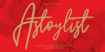 Astoylist Slanted Signature Script Font Give your designs an authentic handcrafted feel. Astoylist Slanted Signature Script Font is perfectly suited to logo, stationery, branding, typography quotes, magazine or book cover, website header, clothing, branding, packaging design, restaurant and more. Thanks for use this font. Maulana Creative

