3,429 search results
(0.032 seconds)
- Micromoon by Neoglyph Studio,
$15.00 Inspired by futuristic vehicle print designs like seen in Star Trek, Blade Runner, Altered Carbon and the Alien franchise. The goal was a clean, abstract design where horizontal, vertical and diagonal 45 degree lines are the primary guidelines. Features : uppercase and lowercase numbers and punctuation multilingual Ideal for: Logo design Movie promotion Book & magazine print Package design Vehicle print designs Game design
 - Pleroid by Adam B. Ford,
$14.00 Designed to be a square font that isn’t square, Pleroid takes its cues from the shape of a square when “bulged” outward like a balloon. The caps are all rounded, the verticals are straight, and it has the feel of an old cathode-ray tube monitor—just the kind of thing for a retro-futuristic view of science fiction. Your robot approves.
 - Telecomm NF by Nick's Fonts,
$10.00 This font is actually two different fonts. The uppercase mimics the typeface used once upon a time in Teletypes, and the lowercase is patterned after the face used during the first half of the twentieth century by Western Union for their telegrams. Both flavors of this font feature the 1252 Latin, 1250 Central European, 1254 Turkish and 1257 Baltic character sets.
 - Baltasar by GRIN3 (Nowak),
$22.00 Baltasar is a handwritten, brush script with ligatures and contextual alternates to help with flow and readability. Every lowercase letter has three variations. When the font is used in OpenType-savvy applications, the 3 variants of glyphs are automatically alternated to achieve a random-like effect. Language support includes Western, Central and Eastern European character sets, as well as Baltic and Turkish languages.
 - Derailer by Aerotype,
$29.00 Derailer’s eclectic character set is comprised mainly of disparate sans serif characters that claim to play well together. OpenType users also benefit from 52 ligature features that automatically substitute a unique pairing of letters when any upper or lower case character is keyed twice in a row. Derailer Pro extends the character set to support Eastern European Latin, Baltic, Greek and Turkish.
 - Diamond by Monotype,
$29.99The Diamond Negative and Diamond Positive fonts feature sans serif capitals and figures in a diamond shaped background, in positive and negative form. Diamond Negative and Diamond Positive are useful in labelling, on invitations and certificates and for short headlines and intros in advertising. Diamond Bodoni features condensed Bodoni-style capitals and figures reversed on to a diamond shaped background. - Jeremy by GRIN3 (Nowak),
$22.00 Jeremy is a handwritten, brush script with ligatures and contextual alternates to help with flow and readability. Every lowercase letter has three variations. When the font is used in OpenType-savvy applications, the 3 variants of glyphs are automatically alternated to achieve a random-like effect. Language support includes Western, Central and Eastern European character sets, as well as Baltic and Turkish languages.
 - Goat by Oliveira 37,
$30.00 Goat is a font display with extremely fine and sharp serifs, inspired by Gothic architecture, which brings a vertical elongation in extent and an allusion to the typical ogival vaults of the style. A font that not only carries a texture of writing with magnitude and elegance, but also causes some kind of strangeness for the subversion of some typographic laws.
 - Coronard by Greater Albion Typefounders,
$7.95 Coronard is another of Greater Albion's explorations of 'Evolutionary' type. In this case we imagine a transition from Blackletter to Roman forms. Coronard shows that posited transition in all its simple calligraphic splendor, providing a beautifully legible face for invitations and certificates, as well as for lettering and signage that needs to be readable but to have a gothic flair.
 - CF Cozyscript by CozyFonts,
$25.00 CF Cozyscript is an even weighted connecting script. Created in the spirit of the Old Grade School cursive chart seen above the blackboard in the front of the classroom. Giving students a constant visual reference of the smooth flow of Caps and Lower case script. Neither formal nor casual but a combination of both styles. Cozyscript is currently available in 3 styles: Light, Medium & Rounded. The Light & Medium styles are best suited for Invitations, Notes, Advertising, Personal Letters, and Sensitive Subjects such as Movie Titles, Biographies, Wedding paraphernalia, etc. The Light & Medium Glyphs finish in squared-off ends, whereas the Rounded version is slightly bolder than the Medium version with rounded ends resembling a tubular look. The Rounded version lends itself to effective use in Sports, Music, and Advertising, Graphics, Signage, Branding, Neon effects, Logos, Titles, and Packaging. With over 300 glyphs applicable in over 100 languages, Cozyscript is available for use! Cozyscript is CozyFonts Foundry's 17th Font Family released and 2nd script font by Tom (Cozy) Nikosey, California Designer.
 - Wien Pro by Wannatype,
$36.00 Wien Pro, the sans serif by Ekke Wolf. Typeface lovers looking for a modern, well-developed sans serif font with a touch of retro and warm, individual lettering will get excited about a new addition to the font market. The more than complete Wien Pro front comes in three styles and four different weights. In addition to the upright Wien Pro there is the Wien Pro Oblique with a moderate 6° slant and the Wien Pro Superoblique with an 18° slant. Available weights are light, regular, medium, bold and black. These fonts are equipped with extended Latin alphabet for Central and Eastern Europe and also Cyrillic and Greek alphabet. The set of characters includes nine different sets of numbers, plus its own set for the small caps, as well as alternative characters and groovy ligatures. In addition, all Wien Pro styles are also available as unicase with upper case and lower case x-height alignment. The style, metrics and proportions of Wien Pro combine perfectly with the Liebelei Pro and the script fonts of the Calafati Pro.
 - Haboro Sans by insigne,
$- Quit trudging through the thick with encumbering fonts, and spring to the front of the pack with the cutting edge sans serif, Haboro Sans. With nothing to clutter up your work, your editorial designs, websites, and software will be sharp and clear. While this hyperfamily is simple in character, it (like Haboro Slab and Haboro as well) provides you with plenty of options. Haboro Sans features simple geometric shapes to help you achieve that perfect effect wherever you use it. Enjoy the comforting reassurance that this multi-tool of a typeface family can work on most anything, including packaging, branding, web copy, and more. Take the simplicity of Haboro Sans a step farther with OpenType features, too. Haboro Sans contains special glyphs like Titling, Small Caps and Oldstyle figures that give your work just enough of a distinct touch. For even more options, use the entire Haboro hyperfamily to expand your capabilities. Put some simple class into your projects with the traditional look of Haboro Sans. Your layouts, websites, iPhone apps, advertising, and newspapers (to name just a few) will thank you.
 - Habana Deco ML by HiH,
$12.00 Habana Deco ML was inspired by a hand-lettered sign on the stucco exterior of a small pharmacy in modern-day city of Havana, Cuba. It, in turn, was based on the fat-faced Art Deco lettering of the late 20s and early 30s, especially the Futurismo posters out of Italy, as well as alphabets designed in The Netherlands, France, USA and even the Soviet Union. There are 24 stylistic alternate glyphs (SALT), many inspired by a variety of these sources, including a couple from the sign in the front of the Congress Hotel in South Beach, Miami. The others features of the Habana Deco include 363 glyphs, 184 kerning pairs (KERN), 14 ornaments and shapes (ORNM) and 15 discretionary ligatures (DLIG). This is a font with which you can have fun. The zip package includes two versions of the font at no extra charge. There is an OTF version which is in Open PS (Post Script Type 1) format and a TTF version which is in Open TT (True Type)format. Use whichever works best for your applications.
 - Special Forces by Typodermic,
$11.95 Special Forces is the commanding slab serif headline typeface that will put some backbone into your message. Its efficient and rugged letterforms will give your words the strength they need to succeed in any mission. With its robust slab serifs, this typeface means business. You won’t find any fancy curves or delicate strokes here—this font is built to withstand the toughest of conditions. Special Forces is ready to take on any challenge, just like our brave soldiers in the field. But this font isn’t just tough—it also commands authority. When you use Special Forces, your message will have the power of a commanding officer. Whether you’re calling your troops to action or announcing a new campaign, this typeface will give your words the weight they deserve. And the best part? Special Forces comes in both regular and oblique styles, so you can choose the right level of intensity for your message. So don’t settle for a weak font that won’t get the job done. Choose Special Forces and take your design to the front lines. Most Latin-based European writing systems are supported, including the following languages. Afaan Oromo, Afar, Afrikaans, Albanian, Alsatian, Aromanian, Aymara, Bashkir (Latin), Basque, Belarusian (Latin), Bemba, Bikol, Bosnian, Breton, Cape Verdean, Creole, Catalan, Cebuano, Chamorro, Chavacano, Chichewa, Crimean Tatar (Latin), Croatian, Czech, Danish, Dawan, Dholuo, Dutch, English, Estonian, Faroese, Fijian, Filipino, Finnish, French, Frisian, Friulian, Gagauz (Latin), Galician, Ganda, Genoese, German, Greenlandic, Guadeloupean Creole, Haitian Creole, Hawaiian, Hiligaynon, Hungarian, Icelandic, Ilocano, Indonesian, Irish, Italian, Jamaican, Kaqchikel, Karakalpak (Latin), Kashubian, Kikongo, Kinyarwanda, Kirundi, Kurdish (Latin), Latvian, Lithuanian, Lombard, Low Saxon, Luxembourgish, Maasai, Makhuwa, Malay, Maltese, Māori, Moldovan, Montenegrin, Ndebele, Neapolitan, Norwegian, Novial, Occitan, Ossetian (Latin), Papiamento, Piedmontese, Polish, Portuguese, Quechua, Rarotongan, Romanian, Romansh, Sami, Sango, Saramaccan, Sardinian, Scottish Gaelic, Serbian (Latin), Shona, Sicilian, Silesian, Slovak, Slovenian, Somali, Sorbian, Sotho, Spanish, Swahili, Swazi, Swedish, Tagalog, Tahitian, Tetum, Tongan, Tshiluba, Tsonga, Tswana, Tumbuka, Turkish, Turkmen (Latin), Tuvaluan, Uzbek (Latin), Venetian, Vepsian, Võro, Walloon, Waray-Waray, Wayuu, Welsh, Wolof, Xhosa, Yapese, Zapotec Zulu and Zuni.
 - Synerga Pro by Mint Type,
$- Synerga Pro is a contemporary slab-serif typeface with humanist features. In smaller text sizes it exposes the characteristics of its slab built, but as the size grows, lots of fine features become visible: rounded terminals, dynamic horizontal serifs, non-vertical endings of vertical serifs. Such details make Synerga Pro suitable for setting paragraph texts as well as large captions. Synerga Pro is equipped with many OpenType features including 4 sets of digits, small caps and ordinals. The extensive language coverage includes most of the Latin-based languages, as well as major languages that use Cyrillic script. Also be sure to try Synerga Pro as webfont to appreciate its accurate and rhythmic appearance at virtually any text size! Some of the styles of Synerga Pro can be found in Mint Type Editorial Bundle together with other fonts which make some great pairs. Check it out!
 - HGB Unik by HGB fonts,
$23.00 For many years I had repeatedly written names on certificates or designed texts for certificates of honor with a pen. I later digitized a font written with a broad pen from 1988 to make it easier to use. After the technical possibilities for this had developed, I made a PostScript font out of this document font. The "HGB-Unik" is a humanistic antiqua that arose from this written type. In 2009 Unik was chosen as the text font for a book. However, the book designers wanted to have an italic and a bold style as well. The cursive was developed from written texts that I also wrote for various occasions in the 1980s. The resulting font family was thoroughly revised several times until a usable text font with four weights was created. Although the Unik looks very idiosyncratic in display size, it shows a surprisingly balanced, pleasant typeface in read size.
 - Gothiks Round by Blackletra,
$50.00 Gothiks Round is the rounded version of Gothiks. It is a narrow 6-weight display sans-serif influenced by Texturas. The rhythm and verticality of Texturas can be easily identified on the letters with diagonal strokes like A N M K k V v W w X x Y y Z z: here they are all vertical. This kind of morphology was chosen because it accepts condensation in a very natural way, giving to this sans-serif a very unique personality. The intermediate weights can be used for short texts while extreme weights are excellent for big sizes. It has an extensive character set—with extensive language support—and many OpenType features like fractions, small capitals and different figure sets. Default figures align with lowercase. The typeface’s name refers to the plural of the word Gothic, which in turn can refer to both sans-serifs or Blackletter, depending on geographic location.
 - Woven by Ingrimayne Type,
$9.00 Woven is a geometrical typeface based on a simple tessellation or tiling pattern. The template for the letters has both vertical and horizontal symmetry and the tiling pattern has four-fold rotational symmetry. Variations of this pattern are popular with quilters and most have a woven look to them. To fit the letters into the template results in some distorted letters but it is the pattern that matters, not the individual elements of that pattern. With proper spacing, a block of text will fit together both horizontally and vertically. Woven is intended to be used with alternating letter sets and the OpenType feature of contextual alternatives does this automatically in applications that support it. The upper-case could be used alone but it unlikely that the lower-case characters could be used by themselves. The typeface is hard to read and would make a challenging font for word-search puzzles.
 - Midnight Romance by Rochart,
$25.00 Midnight Romance is a type of handwritten font that features an elegant and romantic handwriting style. This font is perfect for designs that require a personal and feminine touch, such as wedding invitations, greeting cards, or merchandise designs. The cursive strokes of Midnight Romance flow smoothly and gracefully, lending a touch of sophistication and charm to any design. The letters are delicately formed with an intricate attention to detail, making them ideal for designs that require a more refined and delicate look. Overall, Midnight Romance is a beautiful-handwritten font that exudes a sense of elegance and intimacy, making it a perfect choice for any project that requires a touch of personalization and romance.
 - Mencken Std by Typofonderie,
$59.00 An American Scotch remixed in 27 fonts Mencken has twenty seven styles, divided into three widths, three optical sizes, romans and italics. Generally, optical size typeface families belong to a same common construction. It falls into the same category of type classification, while presenting different x-heights or contrasts. Mencken is unique because it is designed according to different axis and optical sizes. Firstly, Mencken Text is a low-contrast transitional typeface, designed on an oblique axis, asserting horizontal with featuring open counters. Its capitals follow Didots to better harmonize the rest of the family. On the other side of the spectrum, Mencken Head (and narrow variations) is designed on a vertical axis, high contrast, in a contemporary Didot style. The Mencken is therefore a typeface answering to different sorts of uses, whose design is different according to its uses: from oblique axis in small size to vertical axis in large sizes. Vertical proportions (x-height, capitals height, etc.) were calibrated to be compatible with many Typofonderie typeface families. Lucie Lacava and I followed the idea launched by Matthew Carter few years ago for some of his typefaces intended for publications. From Baltimore Sun’s project to Typofonderie’s Mencken It is a bespoke typeface for American newspaper The Baltimore Sun started at the end of 2004 which marks the beginning of this project. The story started with a simple email exchange with Lucie Lacava then in charge of redesigning the American East Coast newspaper. As usual, she was looking for new typeface options in order to distinguish the redesign that she had started. At the time of its implementation, a survey of the newspaper’s readers has revealed that its previous typeface, drawn in the mid-1990s, was unsatisfactory. The Mencken was well received, some reader responses was particularly enjoyable: “It’s easier to read with the new type even though the type is designed by a French.” Why it is called Mencken? The name Mencken is a tribute to H. L. Mencken’s journalistic contributions to The Sun. According to the London Daily Mail, Mencken ventured beyond the typewriter into the world of typography. Because he felt Americans did not recognize irony when they read it, he proposed the creation of a special typeface to be called Ironics, with the text slanting in the opposite direction from italic types, to indicate the author’s humour. Affirming his irreverence, the Mencken typeface does not offer these typographic gadgets. Henry Louis Mencken (1880 — 1956) was an American journalist, satirist, cultural critic and scholar of American English. Known as the “Sage of Baltimore”, he is regarded as one of the most influential American writers and prose stylists of the first half of the twentieth century. He commented widely on the social scene, literature, music, prominent politicians and contemporary movements. Creative Review Type Annual 2006 Tokyo TDC 2018
 - Andyou by Sakha Design,
$12.00 Andyou is a lovely and delicate script font that exudes elegance and class. This font was particularly crafted for those who need a beautiful and refreshing look to their designs. Andyou is PUA encoded which means you can access all of the glyphs and swashes with ease!
 - Bride Style by Just Font You,
$18.00 Bride Style, A sweet beautiful delicate script font. Inspired from the wedding modern calligraphy style but presented in a fashion editorial way. Perfectly fit for branding, logo, wedding things, greeting cards, fashion, lookbook, moodboard, presentation, imagine the luxury, beautiful, stylish, and casual in the same time.
 - Mistyca Brush by Letterena Studios,
$9.00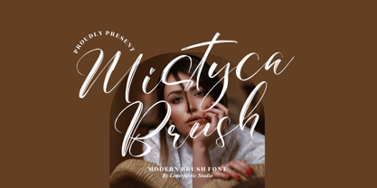 Mistyca Brush is a lovely and delicate script font that exudes elegance and class. This font was particularly crafted for those who need a beautiful and refreshing look to their designs. Mistyca Brush is PUA encoded which means you can access all glyphs and swashes with ease!
 - Bretanis by ahweproject,
$14.00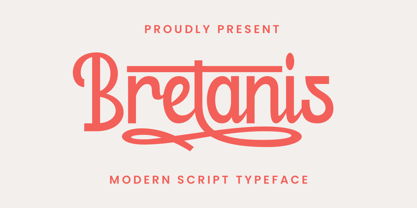 Bretanis a lovely and delicate script font that exudes elegance and class. This font was particularly crafted for those who need a beautiful and refreshing look to their designs. Bretanis is PUA encoded which means you can access all of the amazing glyphs and ligatures with ease!
 - Gerakona by Ws Studio,
$18.00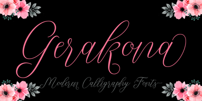 Gerakona is a lovely and delicate script font that exudes elegance and class. This font was particularly crafted for those who need a beautiful and refreshing look to their designs. Gerakona is PUA encoded which means you can access all of the glyphs and swashes with ease!
 - Dettina Girls by Letterena Studios,
$9.00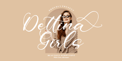 Dettina Girls is a lovely and delicate script font that exudes elegance and class. This font was particularly crafted for those who need a beautiful and refreshing look to their designs. Dettina Girls is PUA encoded which means you can access all glyphs and swashes with ease!
 - Barkeliy by Balpirick,
$15.00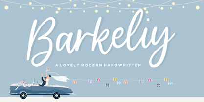 Barkeliy feels distinct and delicate. This flowing handwritten font is the perfect choice for a wide variety of designs. Fall in love with its incredibly versatile style and use it to create gorgeous wedding invitations, beautiful stationary art, eye-catching social media posts, and much more!
 - Christmas Bell by Sakha Design,
$14.00 Christmas Bell is a delicate, fresh, rich, and elegant handwritten font. It is ideal for holiday-themed greeting cards and for any crafting project that requires a warm touch. It is PUA encoded which means you can access all of the glyphs and swashes with ease!
 - Summer Calling by AEN Creative Studio,
$14.00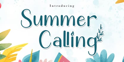 Summer Calling is a delicate, elegant and flowing handwritten font. It has beautiful and well balanced characters and as a result, it matches a wide pool of designs. Summer Calling is PUA encoded which means you can access all of the glyphs and swashes with ease!
 - Justin Feryina by Letter Muray,
$16.00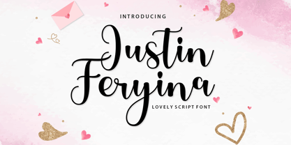 Justin Feryina is a lovely and delicate script font that exudes elegance and class. This font was particularly crafted for those who need a beautiful and refreshing look to their designs. Justin Feryina is PUA encoded which means you can access all glyphs and swashes with ease!
 - Dayana by Stefani Letter,
$14.00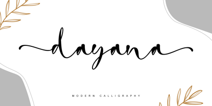 dayana is a lovely and delicate handwritten font. It looks gorgeous on wedding invitations, thank you cards, quotes, greeting cards, logos, business cards, and every other design which needs a handwritten touch, and much more! It features a varying baseline, smooth lines, gorgeous glyphs, and stunning alternates.
 - Maybelle by Monotype,
$15.99 Designed by calligrapher Rachel Yallop, Maybelle is pretty and proudly romantic, with delicate flourishes and a superbly handwritten, calligraphic sensibility. Drawn with a pointed pen and ink, this script boasts dainty loops and high contrast letterforms. Maybelle is available with some ligatures and alternate glyph shapes.
 - Demillina by AEN Creative Studio,
$12.00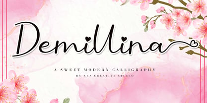 Demillina is a lovely and delicate script font that exudes elegance and class. This font was particularly crafted for those who need a beautiful and refreshing look to their designs. Demillina is PUA encoded which means you can access all of the glyphs and swashes with ease!
 - LGSH Davit by Edik Ghabuzyan,
$30.00 LGSH David has 7 upright weights and their Italics. The typeface supports Latin, Armenian and Cyrillic alphabet systems. It is an easily readable two side easily readable serif font. LGSH David is a contrast style font with very delicate lines which are quite bright and clear.
 - Summer Story by AEN Creative Studio,
$14.00 Summer Story is a delicate, elegant and flowing handwritten font. It has beautiful and well balanced characters and as a result, it matches a wide pool of designs. Summer Calling is PUA encoded which means you can access all of the glyphs and swashes with ease!
 - Relyagih by Letterena Studios,
$10.00 Relyagih is a thin lettered and delicate created by Storytype, A serif modern and classic typeface that has own unique style & modern look. This typeface is perfect for an elegant & luxury logo, book or movie title design, fashion brand, magazine, clothes, lettering, quotes, and so much more.
 - Orpheus by Scriptorium,
$18.00In response to many requests for Morpheus, an idea came to us. Why not make a font that looked a bit like Morpheus, but which had more attractive, more consistent character forms, was rendered cleanly and properly spaced and kerned? We took a look at Morpheus and decided to redo the concept from the ground up, replacing some of the amateurish characters, adding a bit of a Celtic look and feel, developing a set of alternate characters and making sure that the design elements were consistent from letter to letter. The result is Orpheus, a font which has the general look and feel of Morpheus, but is a much more complete and fully realized design. In addition, Orpheus is a fully developed font set, with not only regular and bold versions, but with a special customized italic style and a really neat looking heavy weight rough-outlined variant. - 1925 My Toy Print Deluxe Pro by GLC,
$42.00 This family was created inspired from two French (one so common and a very rare large one) "toy print" boxes, named Le petit imprimeur, with rubber stamp characters from the 1920's. The big difference from our 1920 My Toy print is that this font is complete, with upper and lower cases, accented, complete punctuation and some symbols. The doubly of each usual character in each style (A-Z/a-z and numerals) allow to give a rich and variously uneven appearance, looking like the results of the real use of those old rubber stamps, with bad kernings and alignement. The font is containing West (including Celtic), Central, East European, Turkish and Cyrillic characters. The bold style may be used as a reinforcement, mixed with normal style without disadvantage, allowing finally four choices for each usual letter... The original size is 6mm (about 17 pts).
 - Fulgora by Sudtipos,
$39.00 Fulgora is a sort of ‘calligraphic typography’ or ‘typographic calligraphy’, depending on the point of view. Inspired by late-medieval Bâtarde and Civilité blackletter styles, the Kannada and Sinhala writing systems from Southern India, Celtic uncials, and diverse vernacular Mexican scripts, Fulgora was created straight from pen on paper as a personal calligraphic style where fantasy in the chief ingredient. The idea to take it to the digital realm came later, as an extension of the creative process. To this end, originals for each character were made, directly traced with the nib with no retouching, then vectorized to be digitally assembled. Work has been done on spacing and kerning with the aim to digitally reproduce an utterly calligraphic outcome keeping the natural, imperfect, manual finish of all signs. Fulgora has two variants: Blanca (white) and Negra (black), executed with different nib widths but the same style and proportions.
 - 1785 GLC Baskerville by GLC,
$42.00 This family was created/inspired from the well-known Baskerville Roman and Italic typefaces created by John Baskerville, the English font designer. We were inspired by the original family sent by Baskerville’s wife after his death. The full Baskerville collection was bought by the French editor and author Pierre-Augustin Caron de Beaumarchais who used it to print - in Switzerland - for the first time the complete works of Voltaire (known as the “Kehl edition” from the "Imprimerie de la société littéraire typographique"). We have used this edition, with copies from 1785, to reconstruct these two genuine historical styles. The font faces, kerning, and spacing are scrupulously identical to the original. This Pro font includes characters for Western, Eastern and Central European languages (including Celtic) and Turkish, with a complete set of small caps, standard and “long s” ligatures in each of the two styles.