5,998 search results
(0.031 seconds)
- Quida by LetterMaker,
$25.00 Quida is a display family with three styles; Regular, Italic and script. The personality of the design comes from concave vertical shapes, which are consistent through all styles. This makes them work together seamlessly. Quida Script is packed with opentype goodness such as swash caps, stylistic alternates, ligatures and ending forms for lowercase letters. All styles have an extended language support for most European languages.
 - Vintage Fonts Collection by GRIN3 (Nowak),
$15.00 Vintage Fonts Collection is a set of 18 hand-drawn fonts inspired by vintage ads, old newspapers and retro sign painting. Every lowercase letter has three variations. When the font is used in OpenType-savvy applications, the 3 variants of glyphs are automatically alternated to achieve a random-like effect. Language support includes Western, Central and Eastern European character sets, as well as Baltic and Turkish languages.
 - M Zhi Ngai PRC by Monotype HK,
$523.99 Zhi series is inspired from vertical shop banners/signages from Japan, where each banners is attached to a slim simple structured skeleton. M Zhi Ngai™ takes reference from M Zhi Hei’s straightforwardness and masculinity but inserted plenty of ornaments and gentleness. Featuring a strong thick–thin contrast in the strokes, the typeface looks bright, smart and contemporary, suitable for promotional materials and more other media.
 - Koysan by Pesotsky Victor,
$10.00 Koysan is made for vivid headings, but it can also be used to type small paragraphs and texts. In a text set, it gives sharp, barbed textures, but compensates with half-ovals. The font combines the linear counteraction of thin vertical and horizontal lines with sharp and rigid strokes and smooth geometric ovals. Koysan supports Basic Latin, Extended latin and Cyrillic. Font designed by Victor Pesotsky.
 - Raspberry Sherbet by Hanoded,
$15.00 I have actually never had a sherbet. When I made this font family, I wish I had one, as it was a whopping 38 degrees (Celsius, not Fahrenheit…) outside. Raspberry Sherbet is a cute little font family, consisting of a rounded fat kids font and an inline version. Comes with all the bells & whistles, plus a super duper cooling effect when you use it!
 - Selma by Sea Types,
$25.00 Selma is a family of Sans Serif fonts with 492 Glyphs, 04 weight (Light, regular, medium and bold), with long stems, inspired by bar codes. Extremely condensed vertical emphasis, its bars positioned at the ends of the rods give a strong dose of personality and elegance to the design, has a height of x accented, giving strength and power of attraction for short texts and large sizes.
 - HGB Info by HGB fonts,
$21.00 HGB Info is a display typeface for my Linotype Nautilus Monoline. This came about while working on the corporate design for the municipality of Weissach im Tal. Shorter ascenders and descenders and a broader letter shape result in more compact word images. The ups and downs are cut vertically. This works particularly well in large degrees. This is the area of application on signage and information systems.
 - Steel Stencil JNL by Jeff Levine,
$29.00 A group of unique metal plates with stencil initials cut into them was spotted while browsing through online auctions for source material. What made these items even more interesting was how some of the stencil letters had been sectionally divided - not vertically or horizontally as in most stencils, but lines cut at angles. This is the basis for Steel Stencil JNL and Steel Stencil Oblique JNL.
 - Transaction SRF by Stella Roberts Fonts,
$25.00 Leave it to Ray Larabie to come up with an interesting typeface that looks as if it were printed straight out a store's register. Stella Roberts Fonts presents Transaction SRF, the perfect font for emulating cash register receipts and adding machine tapes. The net profits from my font sales help defer medical expenses for my siblings, who both suffer with Cystic Fibrosis and diabetes. Thank you.
 - Anglaise by Ladyfingers,
$39.00 Anglaise was designed for display and it likes to be big and present, filling the width of a whole spread. The repetition of vertical black and white space holds the typeface together and the contrasting straight and round shapes add the personality... for even more... use the OpenType features, and Anglaise will start merging and building new characters for you to play around with... Enjoy!
 - Imagine strapping on some roller skates, threading a floral headband through your hair, and gliding back into the era where disco and daisies ruled the world. That's the spirit captured within the wh...
- Mandarin Duck by Yasemin Varlik,
$10.00 Mandarin Duck is a very playful typeface where its design was inspired by the rare duck seen in New York once every year. The delicate tail of this duck creates the edges of the characters. It is bold and fun, a perfect typeface for children books and larger texts.
 - Qaugherty by Letterena Studios,
$9.00 Qaugherty is a delicate and stylish serif font. It is PUA encoded which means you can access all of the glyphs and swashes with ease! It is perfect for an elegant & luxurious logo, book or movie title design, fashion brand, magazine, clothes, lettering, quotes, and so much more.
 - Shivanya by Arkrist Letter,
$14.00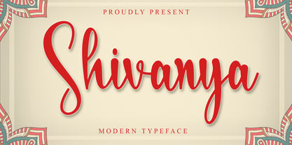 Shivanya is a lovely and delicate script font that exudes elegance and class. This font was particularly crafted for those who need a beautiful and refreshing look to their designs. Shivanya is PUA encoded which means you can access all of the amazing glyphs and ligatures with ease!
 - Extra C Variable by Tipastype,
$56.00 It is an Extra Condensed, Extra Light, Extra experimental and Extra display font. Extra C is a fun font that doesn't take itself too seriously. Ideal for those who need a font with great character and personality but at the same time a delicate touch in their graphic pieces.
 - Klee by ITC,
$29.99Klee is the work of British designer Timothy Donaldson, who was inspired by the work of the famous modern artist Paul Klee. The capitals can be used alone or with the lowercase letters. Klee is a unique, roman typeface whose fine line structure gives it a delicate, feminine appearance. - Viva Moira by Creativemedialab,
$22.00 Viva Moira is an experimental psychedelic display font inspired by the delicate and curled leaves of Monstera esqueleto. This font has an all-caps format with charmingly connected letters or ligatures, making it an ideal choice for posters, titles, and designs that require a distinctive and vibrant theme.
 - Kinghood by Rockboys Studio,
$19.00 Kinghood is a delicate and elegant serif font. You can use this modern serif font with ligature & stylistic set for fashion, magazines, cooking websites, quotes, social media posts, labels, and many more! Add it confidently to your favorite creations and let yourself be amazed by the outcome generated.
 - Maple Memories by Attype Studio,
$14.00 Maple Memories is a delicate and incredibly handwritten font. Fall in love with its incredibly versatile style and use it to create spectacular designs! What's Included : - Beginning & Ending Swash - Multilingual Support (Afrikaans, Albanian, Catalan, Danish, Dutch, English, Estonian, Finnish, French, German, Icelandic, Italian, Norwegian, Portugese, Spanisch, Swedish, Zulu)
 - White Stallion by ErlosDesign,
$19.00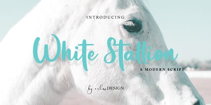 White Stallion is a lovely and delicate script font that exudes elegance and class. This font was particularly crafted for those who need a beautiful and refreshing look to their designs. White Stallion is PUA encoded which means you can access all of the glyphs and swashes with ease!
 - Gianmani Fillet by Gianmani,
$32.99 Gianmani Fillet is a sans serif type contemporary designed by Gianmani Yuttapum in 2022. Inspired by the simplicity of the geometric, it is sharp and easy to read, suited to branding and corporate identity, wayfinding, editorial, delicate headlines, digital environments, signage, print, advertising, packaging, text application, and logos.
 - Andalusia Felistica by Letterena Studios,
$9.00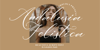 Andalusia Felistica is a lovely and delicate script font that exudes elegance and class. This font was particularly crafted for those who need a beautiful and refreshing look to their designs. Andalusia Felistica is PUA encoded which means you can access all of the glyphs and swashes with ease!
 - Eulalie NF by Nick's Fonts,
$10.00Here’s another happy camper based on the work of master penman Walter Heberling. Its quirky character and offset baseline make for interesting and enticing heads and subheads. All versions of this font include the Unicode 1250 Central European character set in addition to the standard Unicode 1252 Latin set. - Hello Hellen by Hrz Studio,
$14.00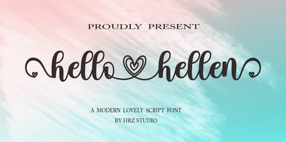 Hello Hellen is a lovely and delicate script font that exudes elegance and class. This font was particularly crafted for those who need a beautiful and refreshing look to their designs. Hello Hellen Script is PUA encoded which means you can access all glyphs and swashes with ease!
 - Balnuettes by ahweproject,
$14.00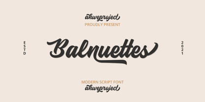 Balnuettes is a lovely and delicate script font that exudes elegance and class. This font was particularly crafted for those who need a beautiful and refreshing look to their designs. Balnuettes is PUA encoded which means you can access all of the amazing glyphs and ligatures with ease!
 - Croisan by Hishand Studio,
$16.00 The Croisan serif font stands out for its delicate and slender lettering, making it an ideal choice for conveying a sense of subtle luxury and elegant. Perfect logo, branding, invitations, stationery, wedding designs, social media posts, and much more. Complete with ligatures alternates regular hollow icon kerning multilingual support
 - Hylandia by Monotype,
$15.99 Delicate but spirited, Hylandia is a cursive script with gorgeous looping letterforms drawn with a light touch using a thin brush pen. This font has a sensitive sense of delicacy and care, with clear roots in calligraphy and tradition. Hylandia is available with some ligatures and alternate forms.
 - Visage LP by LetterPerfect,
$39.00 Visage is a contemporary text family designed by Garrett Boge in 1988. Its delicate serifs, subtly tapered stems, and generous proportions offer both distinction and readability to the text at any size. The family consists of five weights - Light, Book, Medium, Bold and Black, with corresponding oblique styles.
 - Qermola by Letterena Studios,
$9.00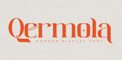 Qermola is a stylish and delicate serif font. It is perfect for an elegant & luxurious logo, book or movie title design, fashion brand, magazine, clothes, lettering, quotes, and so much more. This font is PUA encoded which means you can access all of the glyphs and swashes with ease!
 - Roundup by Ingrimayne Type,
$10.00 The Roundup family was inspired by fonts from the late 19th century, though it is not based on any one of them. Roundup-Caps was the first of the group to be constructed. It has two sets of upper-case letters that have minor differences. It has reverse contrast, that is, the verticals are thinner than the horizontals. Unlike most of the "Old-West" fonts with reverse contrast, the serifs are not square but have an odd, rounded shape. Roundup-Regular replaced the second set of caps with lower-case letters. A bold style strengthens the vertical elements so that it no longer has reverse contrast. Both the regular and bold styles have matching oblique styles. Finally, there is a hollow version with a shadow to the lower right. This shadowed style has had its inside taken out, creating RoundUp-ShadowInside. The spacing is the same as RoundUpShadowed so it can be layered over RoundUpShadowed to easily create two-colored lettering.
 - Sandwich by Suitcase Type Foundry,
$85.00The all-caps display face Sandwich was inspired by historic, hand lettered sans serif alphabets with slightly sloping terminals, as found in showcard lettering and on billboards. Besides a number of alternate glyphs located in the lowercase area of the font, the typeface features about forty 'ligatures'. These are not ligatures in the traditional sense of the word, but short two- or three-letter combinations — mostly prepositions, conjunctions, articles and so on — in different languages, which are positioned vertically, not horizontally. Since the number of such pre-fabricated ligatures in a font is limited and cannot possibly cover all the desired combinations, a special algorithm programmed into the OpenType font permits the user to compose any two- or three-letter words, provided no accented characters are used. This is why Sandwich includes five versions of each letter. Using the full possibilities offered by the OpenType format, the automatic vertical aligning of glyphs is based on a combination of optional ligatures, style sets, and modified kerning. - Squad by Fontfabric,
$- Squad is a humanist sans serif with semi condensed proportions. Inspired by Adrian Frutiger’s perfectionist style this typeface is a harmonious breed of humanist heritage and contemporary simplicity. The balanced characteristics, clear and legible silhouette and simultaneously vivid appearance of Squad makes it perfect for any design purpose. The figures are evident — it consists of 18 styles from Thin to Black; covers Extended Latin, Cyrillic and Greek with span for more than 130 languages; flawless functionality and supporting many OpenType features, such as localizations, tabular numerals, inferiors & superiors, numerators & denominators, fractions, discretionary liga- tures, case sensitivity etc. Designers: Svetlin Balezdrov, Svet Simov Features: • Over 780 glyphs in 18 styles (Thin to Black) • Extended Latin, Cyrillic and Greek scripts for more than 130 languages; • High x-height and Semi Condensed proportions; • Moderate contrast and vertical stress; • Humanistic characteristics and open vertical terminals; • True form of italics; • Coverage of multiple OpenType features; • Perfect for text, headlines and web;
 - Minuet by Canada Type,
$24.95 Minuet, an informal script with crossover deco elements giving it an unmistakable 1940s flavor, is a revival and expansion of the Rondo family, the last typeface drawn by Stefan Schlesinger before his death. This family was initially supposed to be a typeface based on the strong, flowing script Schlesinger liked to use in the ads he designed, particularly the ones he did for Van Houten’s cocoa products. But for technical reasons the Lettergieterij Amsterdam mandated the face to be made from unattached letters, rather than the original connected script. Schlesinger and Dooijes finished the lowercase and the first drawings of the uppercase just before Schlesinger was sent to a prison camp in 1942. Dooijes completed the design on his own, and drew the bold according to Schlesigner’s instructions. The typeface family was finished in February of 1944, and Schlesinger was killed in October of that same year. Though he did see and approve the final proofs, he never actually saw his letters in use. It took almost four more years for the Lettergieterij Amsterdam to produce the fonts. The typeface was officially announced in November of 1948, and immediately became a bestseller. By 1966, according to a memo from the foundry, the typeface had become “almost too popular”. This digital version of Schlesigner’s and Dooijes’s work greatly expands on the metal fonts. Both weights include a complete set of lowercase alternates — based on Schlesinger’s own drawings, as well as alternative variations for some of the capitals, a few ligatures, and extended language support covering Western, Eastern and Central European languages, plus Baltic, Celtic/Welsh, Esperanto, Maltese and Turkish. Minuet is available in all popular formats. The OpenType version, Minuet Pro, takes advantage of internal font programming to combine the main and alternate fonts into a single file per weight, making all alternates and ligatures automatically available at the push of a button in OpenType supporting programs.
 - HONKUS - Personal use only

- Convalescence - Unknown license

- Lightmorning - Unknown license

- Fleurs de Liane - Unknown license

- Orto by LetterPalette,
$20.00 Orto is a type family of sans serif fonts in eight weights. It's a humanist typeface with real cursive, containing both Roman and Italic styles. The letters are designed to look good on screen, they have a bit narrower proportions and simple shapes. Their structure is based on flat horizontal and vertical strokes, which are emphasized wherever possible. That’s where the name comes from: Orto is an abbreviation of the word orthogonal. Thanks to its narrow width, the typeface is less space-consuming and adapts well to the screens of smaller devices. It is legible in small sizes, thanks to the larger x-height. The characteristic details, like bent ends of diagonal strokes, stand out when used in larger sizes. Orto can be used equally good in print and its overall neutral look fits different contexts. However, its character is pretty recognizable. Orto contains Latin and Cyrillic script and covers six codepages: Latin 1, Latin 2, Cyrillic, Turkish, Windows Baltic and MacOS Roman. It has basic OpenType features like ligatures, oldstyle numerals, proportional and tabular lining figures, fractions, superiors, etc. Capital German sharp S shows up when the lowercase is typed between two uppercase letters, and the Contextual Alternates feature is turned on. The Stylistic Set 01 changes the shape of the Cyrillic b. The Stylistic Set 02 is a shortcut for using Serban Cyrillic alternatives that differ from Russian in cursive.
 - Jesus Saves by Breauhare,
$13.94 Jesus Saves is a font based on the familiar old logo that has “JESUS” hidden within a maze-like set of multi-branched vertical bars. The characters appear to be an alien, cryptic language at first sight, perhaps even a Japanese, Chinese, or Korean language, thanks to the unusual figures created by the combinations of various letters. It is a teaser for the eyes, as well as a visual feast of De Stijl-type art. It is an attention-getting font that is cool to look at, an eye puzzle that is enticing to decipher. It’s a great font to use for striking logos (see Gallery Images) by the judicious use of ligatures, where in word settings ligatures may be used at the beginnings of words, the middle or the endings of words. Jesus Heals is the missing spaces from the Jesus Saves font, sort of like a doughnut hole font! If you use this font to fill in the spaces in the Jesus Saves font, it becomes whole, or healed, thus the name. Jesus Lives is a raised block/3D or three dimensional version of Jesus Heals. For color combinations in apps that support layering, Jesus Lives synchs and has perfect kerning register with Jesus Heals, as Jesus Heals has with Jesus Saves. The digitization was done by fontmeister John Bomparte.
 - FS Lucas by Fontsmith,
$80.00 Pure and not-so-simple Maybe it’s the air of purity, openness and transparency that they transmit, but geometric typefaces are more popular than ever among leading brands. Based on near-perfect circles, triangles and squares, geometric letterforms look uncomplicated, even though making them readable is anything but – something the designers of the first wave of geometric fonts discovered nearly a century ago. Many of the world’s most recognisable brands in technology, retail, travel, food, manufacturing and other industries continue to be drawn to the straightforward, honest character that geometric fonts convey. Fontsmith set out in 2015 to develop a typeface in the same tradition, but optimised for the demands of modern brands – online and offline usage, readability and accessibility. And, of course, with the all-important Fontsmith x-factor built in. FS Lucas is the bold and deceptively simple result. Handle with care The letterforms of FS Lucas are round and generous, along the lines of Trajan Column lettering stripped of its serifs. But beware their thorns. Their designer, Stuart de Rozario, who also crafted the award-winning FS Millbank, wanted a contrast between spiky and soft, giving sharp apexes to the more angular letterforms, such as A, M, N, v, w and z. Among his inspirations were the colourful, geometric compositions of Frank Stella, the 1920s art deco poster designs of AM Cassandre, and the triangular cosmic element symbol, which led him to tackle the capital A first, instead of the usual H. The proportions and angles of the triangular form would set the template for many of the other characters. It was this form, and the light-scattering effects of triangular prisms, that lit the path to a name for the typeface: Lucas is derived from lux, the Latin word for light. Recommended reading Early geometric typefaces were accused of putting mathematical integrity before readability. FS Lucas achieves the trick of appearing geometric, while taking the edge off elements that make reading difficult. Perfectly circlular shapes don’t read well. The way around that is to slightly thicken the vertical strokes, and pull out the curves at the corners to compensate; the O and o of FS Lucas are optical illusions. Pointed apexes aren’t as sharp as they look; the flattened tips are an essential design feature. And distinctive details such as the open terminals of the c, e, f, g, j, r and s, and the x-height bar on the i and j, aid legibility, especially on-screen. These and many other features, the product of sketching the letterforms in the first instance by hand rather than mapping them out mechanically by computer, give FS Lucas the built-in humanity and character that make it a better, easier read all-round. Marks of distinction Unlike some of its more buttoned-up geometric bedfellows, FS Lucas can’t contain its natural personality and quirks: the flick of the foot of the l, for example, and the flattish tail on the g and j. The unusual bar on the J improves character recognition, and the G is circular, without a straight stem. There’s a touch of Fontsmith about the t, too, with the curve across the left cross section in the lighter weights, and the ampersand is one of a kind. There’s a lot to like about Lucas. With its 9 weights, perfect proportions and soft but spiky take on the classic geometric font, it’s a typeface that could light up any brand.


