6,385 search results
(0.02 seconds)
- Ruddy by Inhouse Type,
$33.32 Ruddy is a display sans serif type family. It has a playful and mischievous presence. Exaggerated geometry and varied vertical character stem placement contribute to its animated appearance. Ruddy comes in 4 weights with matching italics. OpenType features include Contextual Alternates, Tabular Figures, Fractions, Numerators and Denominators.
 - Nowie Vremena by ABSTRKT,
$30.00Nowie Vremena is a sequel to a previously released Vremena Grotesk, a sans serif typeface, inspired by Arial’s apalling combination of grubby tidiness. The sequel travels back in time and explores Arial’s elder brothers and some 19th century sans serifs, through initial concept of hectic neutrality. - Suarez by GRIN3 (Nowak),
$24.00 Suarez is a handwritten, fully connected script with ligatures to help with flow and readability. It can be used for invitations, greeting cards, posters, advertising, weddings, books, menus etc. Language support includes Western, Central and Eastern European character sets, as well as Baltic and Turkish languages.
 - Stay True by Aerotype,
$49.00 Express yourself in ink with tattoo-inspired Stay True™. Available as a set or individually, Stay True and companion font Stay True Open deliver your message with an edgy attitude. Pro versions of both fonts extend the character set to support Eastern European and Baltic languages.
 - Polina by GRIN3 (Nowak),
$16.00Polina (previously named Dobra) is a handmade, layered type family which includes several textures and shadows. Different font types can be created using various combinations of Polina fonts and colors. Language support includes Western, Central and Eastern European character sets, as well as Baltic and Turkish languages. - Millrich Grange NF by Nick's Fonts,
$10.00 Here's a refined version of Grange, released by Edinburgh's Miller & Richards foundry just around the turn of the twentieth century. A bit quirky with a lot of warmth. Both flavors of this font feature the 1252 Latin, 1250 Central European, 1254 Turkish and 1257 Baltic character sets.
 - Houschka Rounded by G-Type,
$72.00 Houschka Rounded is the companion family to Houschka Pro, featuring CE, Baltic, Turkish & Cyrillic language support plus small caps, stylistic sets, contextual alternates, ligatures and 4 sets of numerals. Houschka Rounded may be a softer & cuter sans serif than her big sister but she's equally versatile.
 - Procent by GRIN3 (Nowak),
$26.00 Procent is an all-caps, handwritten font with two variations for each letter. Procent can be used for scrapbooks, greeting cards, invitations, announcements, signs, menus, restaurant themes and more... Language support includes Western, Central and Eastern European character sets, as well as Baltic and Turkish languages.
 - Nefertiti by JAB,
$12.00As you can see, Nefertiti is a font based on ancient Egyptian hieroglyphs and could be classified as a fun-font. I've always been really interested in Egyptology and a couple of years ago I thought it would be great to be able to write in hieroglyphs. I started to study them but soon realized it would take me a long time to be able to do this. Still, I was determined to find a way around this problem. At some point I came up with the idea of rearranging and reforming the hieroglyphs so as to resemble the English alphabet. During this process I tried as much as possible to preserve their ethos and appearance. However, since they are designed to write in English with, it's obvious that they are not always going to look like the real thing. Despite this, I'm really happy with the final result and I think many Pharaohphiles who just want to have some fun will be also. The only difference in this font between lower and upper case characters, is that the latter are set between two parallel, horizontal lines. These are for use with brackets (motif ends) to form cartouches - elongated ovals for names and/or titles. Try typing the following using the upper case in the sample text box. e.g. (JOHN} The zigzagged vertical lines at each end, separate the motifs from the hieroglyphs. Note the three types of ends/brackets. These lines are also used to separated words from one another and to give a more authentic appearance. So pressing the space bar gives a zigzagged line - not a space. They can also be used at any point within a cartouche to separate first and last names or titles. e.g. ; (JOHN;BROWN} walked straight home after work. Notice the eye glyph (period/full stop) at the end of the sentence. This is the only punctuation mark which can be used within a cartouche, e.g. after Mr. or to add a more Egyptian appearance to a name or title. e.g. (MR>;JOHN;BROWN} Parallel lines dividing hieroglyphical inscriptions and writing into rows or columns are very common. To incorporate these in a body of text, simple use the underline U. e.g. (OSIRUS) and {ISIS} were important gods of the ancient Egyptians. (HORUS) {HATHOR} and [RA],the sun god, were also highly revered deities. The punctuation marks available are shown below. . , " " ' ! ? "where is the king?" The font also includes the numbers 0-9, the following mathematical symbols and the hash sign(Scarab beetle). Once again, I've tried to make them look as Egyptian as possible; whether I've succeeded or not is open to debate. e.g. + - x / = # This font is named after Akhenaten's beautiful wife, Nefertiti, who's image can be seen in the graphic on this page. - Halbrein by Mr. Typeman,
$14.00 Meet my new font Halbrein – a romantic delicate script font with its poetic flow, which simulates natural handwriting. Halbrein comes with uppercase, lowercase, standard punctuation and special letters for most European languages.
 - Medieval Knots by Kaer,
$21.00 Medieval Knots font family has Regular and Colored styles. It inspired by Celtic knots initials and lines. It's all you need to precisely imitate medieval style text. Use this font as a decorative element at the beginning of a paragraph or section, other part of the paragraph should be in regular black letter font. You’ll get Drop Caps & Numbers set. --- *You can use color fonts in PS CC 2017+, AI CC 2018+, ID CC 2019+, macOS 10.14 Mojave+ * *Please note that the Canva & Corel doesn't support color fonts!* *Please download this test file with only A letter ( https://www.dropbox.com/s/w6n0zmga231xng1/MedievalKnots-Test.otf?dl=0 ) to check your app & system.* --- Please feel free to request any help you need: kaer.pro@gmail.com Best, Roman. Thank you!
 - Kaushan Script - 100% free

- Drummer by Harvester Type,
$20.00 Drummer is a large futuristic font family inspired by the Expansion TV series, old science fiction book covers and Honda Prelude and Porsche logos. The family contains a large number of styles and a lot of language support. 54 styles, 6 in width (Ultra Condensed, Condensed, Normal, Expanded, Extra Expanded, Ultra Expanded) and 9 in weight (Thin, Extra Light, Light, Regular, Medium, Semi Bold, Bold, ExtraBold, Black). The font also has a variable version. 573 glyphs, including 40 alternate characters. A lot of work has been done on the font. The fillets on the symbols have been well worked out and tested for a better visual and practical experience. The font combines the monospacing of many characters combined with kerning, which makes it very convenient for many purposes, such as vertical typography. The font is good in all sizes, both small and large, which makes it possible to use it anywhere. Branding, logos, titles, posters, texts, covers, merch, prints, web, titles, banners, games and design in games and much more. In the near future, it is planned to add another axis of variability - the slant. Consequently, the family itself will increase. It is also planned to add a small case (capital). If you want to say something about the font or get a font in other formats, then write to the mail: bunineugene@gmail.com .
 - Shamrock - 100% free

- ITC Arecibo by ITC,
$29.99 In ITC Arecibo, Argentinean type designer Luis Siquot has created a typeface of subtle typographic turns. At first glance, ITC Arecibo has a sturdy 19th century wood type flavor, yet the delicate hairline shadow is decidedly Art Deco. Its condensed proportions and character shapes have been carefully modeled to ensure legibility. Siquot added uniqueness and versatility to the face by drawing two sets of small caps: one in which the central horizontal strokes share the same plane (ITC Arecibo) as those in the full-size letters, and another where the horizontal strokes are proportional with the small caps(ITC Arecibo Too). Another intriguing subtlety is what Siquot calls the “soul of the face,” the distinctive highlight/shadow. “This ambiguous line is an effect I have wanted to incorporate into a design for some time,” says Siquot. “Is it a black hairline that surrounds the letters, or a white line incised into the left and bottom of strokes?” ITC Arecibo and ITC Arecibo Too: distinctive, powerful and economical of space. What more could you ask from a headline face?
 - Spaceboy by Drewfonts,
$15.00Originally conceived from the basic sign writers brush stroke pattern and heavily influenced by the songs of David Bowie this style has developed into an organic Futurist face, kind of post modern retro, catch my drift? - Wavely JNL by Jeff Levine,
$29.00Wavely JNL is a font that could have been made by a child or a nervous writer. Squiggly, handmade lines form the characters and this font can also be used for spooky or horror-oriented themes. - Maree by Ashton,
$5.00 If you want to write something sincere and genuine but not too formal then this is the font for you. It is based on real handwriting, not some artificial calligraphy made to be either too haphazard or spiky or have loads of elegant flourishes but an ordinary person's writing, and designed to look as natural and as close to the original lettering as possible. Like any person's writing it is individual and distinctive, but so easy going on the eye those differences sit comfortably with you. It is friendly and open with easy to read glyphs both as lowercase and uppercase. The letters are relatively wide with clearly shaped distinct outlines. This font may be ideal for projects where you expect a wide readership with different reading abilities from young to old. When you are using this font a slightly bigger point size usually gives a better result so for a standard letter or similar you should size up to 15 points or more. Maree has been individually crafted to the smallest detail. To create a realistic handwriting font that looks relatively simple but works in a wide variety of languages requires a complexity and attention to detail most fonts will never require. This font in any ordinary business environment would never have been made, the effort required to make it too great, the length of time too long. There have been no shortcuts in this font, no automatic scanning or tracing, no automatic generation, no class kerning. Not only is each glyph individual but the width of letters, the height, the accents and the positions of the accents are all different. Even the line weight of the letters is designed to have natural variation but yet similar enough that the font appears as though it were written effortlessly in the same pen. And in order to keep the spacing consistent even though the letters have different widths, heights, lengths of descenders and so on, there are a vast number of kerning pairs, letter to letter, number to number, letter to number... All kerning has been individually assessed with an eye to proportionality taking in character shape, size and weight. For instance if you write a telephone number the numbers all sit close together but if you write a number before a letter such as in a UK post code or before a unit of measurement an extra little bit of space has been added which makes the number more distinct and therefore readable. That space is so natural to the eye that you don’t even know it is there. However even in the spacing allowance has been made for the fact it can’t be too perfect because when you write by hand the spacing is inconsistent. There have to be some letters which are too close or far apart otherwise the font would look artificial. For similar reasons if you are going to print out this font for a letter, etc, check the print version before you make any letter spacing changes because with the zoom functions in modern applications that uneven spacing and lettering can seem more pronounced than it actually is. When this font is printed out you will find it is surprisingly neat. This font is what it is, simple clear handwriting. You will not go wow. But if you want something unique and different and looks good on the page you won’t be disappointed. This font is not a work of art but it is a work of love. This font has a soul. How many fonts can you say that about?
 - My Beloved by Subectype,
$14.00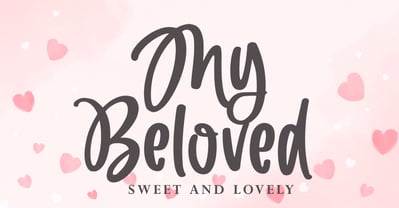 My Beloved is a delicate and flowing handwritten font. It looks stunning on wedding invitations, thank you cards, quotes, greeting cards, logos, business cards and every other design which needs a handwritten touch.
 - Lancet-Aken by Akenlee Type,
$39.00 I want the font to have a vitality of life, Visually, the details are beautiful, long and fashionable, low-key and elegant, quiet and delicate, with the aesthetic feeling of fashion, not aggressive.
 - Juliane by Just Lett,
$13.00 Juliane is a thin lettered and delicate script font. Fall for its ravishing style and use it to create gorgeous wedding invitations, beautiful stationary art, eye-catching social media posts, and much more!
 - Burlesk Queen JNL by Jeff Levine,
$29.00 Burlesk Queen JNL was inspired by the hand lettered title “Gypsy” on the sheet music for "Everything's Coming Up Roses" from the movie musical based on the autobiography of famed stripper Gypsy Rose Lee. With just four basic letters to work with [G,Y,P and S], a full character set was drawn from scratch. The design features bold spur serif characters on individual ‘marquees’ bordered with lights. Burlesk Queen One JNL is the original version with white characters on black panels, while Burlesk Queen Two JNL has those panels stripped away to provide black letters on a white background.
 - Advertiser JNL by Jeff Levine,
$29.00Advertiser JNL is a simple A-Z only font used to make retro-styled titles and names. Based on a popular style of retail signage from the 1950s and 1960s, alternating keystrokes will create a contrast of positive and negative letters. The capital letters have the alphabet in white on black boxes, the lower case have the black letters alone—with the white space conforming to the width of the black boxes. In a pinch, the boxed characters can also be used as initial caps. For a more complete character set with the same style of lettering, use DuBois Block JNL. - Crescendo by Canada Type,
$29.95 A year after the tremendous success of Memoriam in the "Lives They Lived" issue of the New York Times magazine at the end of 2008, Patrick Griffin and Nancy Harris Rouemy teamed up once more to tackle the same project for the 2009 issue. This time the magazine's design concept revolved around a typeface they created specifically for custom vertical malleability, and that can play just as well in single- or multi-color environments. The result was another iconic commemorative issue that shows exotic tri-line letters merging, swashing, extending and flourishing in stunning gold, silver and blue on black on the cover, and in black on white on the inside pages. Just like in the previous year, the issue won multiple publication design and typography awards. Crescendo is that typeface, finally issued for retail by public demand. Just turn your setting into outlines in your favorite vector program, grab single strands and extend away, and do your best alternating colours between strands. Crescendo comes with a limited punctuation set, but accented characters for Western Latin languages are included, and there many, many alternates and ligatures in there as well. This typeface is best used in large display sizes.
 - Type Tiles JNL by Jeff Levine,
$29.00 Type Tiles JNL is based on a ‘completed’ version of ‘Alpha-Blox’ by American Type Founders, circa 1944. The capitals, lower case and numerals shown in the sample sheet put out by ATF depicted type made with five-high blocks comprised of modular units spaced two points apart. These units could be combined in varying ways to create custom type of varying heights and widths and was available for purchase in both linear (multi-line) and reverse (white on black) formats. Using the 'reverse' model shown on the sample sheet, all of the characters were re-created digitally, and missing punctuation, foreign characters and other glyphs found in a basic computer font were drawn and added. The 'J' and 'T' in the type sample had truncations, so a more complete character was created for each of those letters. For those wanting an unbroken string of words or blank end caps, there is a double column space on the vertical bar key. A single column space is located on the broken bar key for shorter end caps. Type Tiles JNL is available in both regular and oblique versions
 - Senkron by Gurup Stüdyo,
$19.00 Senkron is composed of "normal" and a "blok" styles. Senkron ("normal") was designed as a pure and modern neo grotesk font. The anatomy of the letters are designed to achieve an equal text color. For this purpose, the legs of the letters “R” and "K" are designed with a vertical angle to prevent the white space that would occur in the middle of these letters. In the minuscule, the characteristic features of letters such as ‘a’, ‘l’, ‘t’ are concretized and legibility is supported in the text. Considerable attention has been paid to the harmony between the anatomical structures of the letters and the diacritical mark’s structure. Senkron Blok is arranged for situations which have diacritical marks overflow to leadings of the headline and headline typographical color is affected negatively from this situation. For this purpose, majuscule diacritical letters are resolved within the letter height. However, when this is done, new forms are obtained by integrated diacritical marks with letters instead of directly merging them. The idea behind this approach is to preserve the typographic value of diacritical marks and emphasize the semantic value of diacritical letters. 82 letters have been redesigned in this way.
 - VLNL Vondelpark by VetteLetters,
$35.00 The Vondelpark is the famous Amsterdam city park, 47 hectares stretching out from Leidseplein to the Amstelveenseweg. It was founded in 1864 when a group of well-to-do Amsterdam citizens got together and bought land at the (then) edge of the city centre in order to create a park ‘for riding and strolling’. Designed by architect J.D. Zocher, it opened officially in 1865. The park received its name two years later when a statue of Dutch writer Joost van den Vondel was placed in the park. In the 1960s and 1970s the Vondelpark became a symbol and epicenter of the hippie flower power era. The park was declared a state monument in 1996. Donald DBXL was intrigued by the handmade iron nameplate lettering on the park’s entrance gates, and decided to design VLNL Vondelpark in its glory. The somewhat clumsy iron letters were not revived as is but optimized to turn it into a useful typeface. The all-caps serif with a deliberate constructed feel, contains a Positional Open Type feature that places half circles on the vertical stems, at the beginning and end of a word, to enliven the rhythm.
 - Pacific Sans by Holland Fonts,
$30.00The Pacific Sans and the Pacific Serif originated from the Pacific Standard, a space effective type face, especially designed for poster lettering. The implementation of serif strokes in the Pacific Serif and the contrast in vertical and horizontal strokes in the Pacific Sans, gave these fonts a distinct elegance. - Pacific Serif by Holland Fonts,
$30.00The Pacific Sans and the Pacific Serif originated from the Pacific Standard, a space effective type face, especially designed for poster lettering. The implementation of serif strokes in the Pacific Serif and the contrast in vertical and horizontal strokes in the Pacific Sans, gave these fonts a distinct elegance. - Vivaldi by ITC,
$29.99Vivaldi was designed by Friedrich Peter. Generous, intricate initial caps combine with a more reserved lowercase to create a beautiful script font. Vivaldi's letterforms incorporate an elegant mixture of calligraphic and copperplate elements. It is ideal for invitations, announcements, certificates, or other work requiring a distinctive, formal appearance. - Lenbach by RMU,
$35.00 'Lenbach' is a revival which was inspired by a late-19th century German font design. It comes with both Western and Central European characters, as well as Baltic, Romanian and Turkish characters. To get access to all ligatures, it is recommended to activate both Standard and Discretionary Ligatures.
 - P22 Allyson by IHOF,
$39.95 P22 Allyson is based on an old metal font by Barnhart Bros. & Spindler named Hazel Script. This font is perfect for elegant invitations and certificates and has been expanded to meet the needs of today's computer user to include a full character set. Allyson Pro contains OpenType features.
 - Vanquish by Aboutype,
$24.99A traditional Sans serif with a modern flair and uniform consistent weight to the vertical and horizontal stokes. Vanquish was designed for all media and can be used in a wide range of point sizes. Vanquish was kerned for text point sizes but requires subjective display kerning and compensation. - HU Cheonggye by Heummdesign,
$15.00 HU Cheonggye is a typeface for titles with thick strokes and wide flats, mainly produced with a retro feel. In order to bring out the characteristics of the retro typeface, a difference in thickness between horizontal and vertical strokes was applied, and obtuse right-angled serifs were applied.
 - Hailgen by Akufadhl,
$29.00 Hailgen is a Serif typeface that explores the flexibility in contrast, with a thicker horizontal and thinner vertical contrast. Designed specially for short texts or quotes. Hailgen comes with 5 weights ranging from Thin to Black and is armed with several opentype features and Latin and Cyrillic language support.
 - Arbordale by Aerotype,
$49.00 OpenType users benefit from an array of alternate glyphs for lowercase characters including non-connecting contextual alternates for word endings. Other features include crossbar ligatures for common letter pairings, case-sensitive quotes and smart apostrophes. Arbordale Pro extends the character set to support Eastern European and Baltic languages.
 - Hulpy by Adam B. Ford,
$16.00 Hulpy is a relaxed font that won’t judge you. It was created with a combination of stocky rounded verticals and tapering curves. It could probably be used in comic strips or fun and happy headlines, but it also has enough regularity to be used in unpretentious body copy.
 - Judera by deFharo,
$11.00 Judera is an unicase and monospaced experimental typography of subtractive geometric construction with no diagonals with two styles plus italics which have a 13° inclination. • Flat: font of straight lines with all angles at 90° • Ring: Rounded in its external vertices with angles proportional to the constructive grid.
 - Versacrum NF by Nick's Fonts,
$10.00 This typeface finds its inspiration from hand-lettering by Albert Roller for Ver Sacrum magazine in 1903, made famous by its revival on many psychedelic posters of the 1960s. Both flavors of this font feature the 1252 Latin, 1250 Central European, 1254 Turkish and 1257 Baltic character sets.
 - Monosketch by GRIN3 (Nowak),
$20.00 Monosketch is a hand-drawn font inspired by monospaced fonts like Andale Mono. Monosketch Layer and Monosketch Black can be used together by layering Monosketch Layer above a differently colored Monosketch Black. Language support includes Western, Central and Eastern European character sets, as well as Baltic and Turkish languages.

