10,000 search results
(0.153 seconds)
- Wienerin by Sudtipos,
$49.00 The starter point of the Wienerin typeface is based on the work of Austrian designer and artist Carl Otto Czeschka who was part of The Wiener Werkstätte, an early twentieth century association of designers, architects, craftsmen, ceramists, jewelers and other graphic arts in his country. This collective of artists was influential for both Bauhaus, art deco and Scandinavian design. Wienerin is a revision and expansion of the Olympia typeface designed almost 100 years ago by Czeschka but adapted for contemporary use with the inclusion of numerous alternative signs and ligatures. Variable font technology allows a greater variety of weights to be achieved. One of the features of the original design was the inclusion of "eifassungen" or modules to create frames. Wienerin presents a repertoire of 500 in 3 weights. With an upward elongated design we have decided to also create a version of the typeface with a larger x-box that allows for a wider use of the typeface family. Because of its contrast it is ideal for use in delicate design pieces such as editorial design, elegant labels, stationery and fashion. All styles of the Wienerin typeface family cover most Latin languages.
 - Karela by Blancoletters,
$39.00 English description Karela is a humanist slab serif family. Karela is also the Basque word for gunwale, this is, the widened edge at the top of the side of a boat, where the edge is reinforced with wood or other material and to which the thwarts are attached. Gunwales resemble the way slab serifs reinforce vertical stems giving a more robust appearance to the letters. The sturdy, solid and often mechanical structure that is customary in slab serif or mechanistic typefaces is softened in Karela applying subtle tweaks as: humanist proportions, slightly curved endings in ascenders, and curved edges in serifs. The influence of calligraphy is noticeable all over the character set, especially in counters and letters with instrokes like “m”, “n” and “r”, and it becomes explicit in the italics. On the other hand, its low contrast, generous x-height and the constant width of characters across weights makes it very convenient for editorial uses when low resolution is a concern. Karela pursues to give a human touch to a strong and highly functional structure. It seeks for the ideal combination of strength, precision and warmth of the wooden parts painstackingly handcrafted by ancient boat builders. Besides its 12 standard styles, Karela offers also four additional fonts called "grades". Grades are subtle changes in stroke weight in order to compensate for differences in printing media or display conditions of text layouts. To minimize these subtle changes without a reflow of the text they have to be designed with the same character width of the base style. Karela offers 4 grades for its Regular weight: Grade Minus 5, Grade Minus 5 Italic, Grade Plus 5 and Grade Plus 5 Italic. This makes possible to counteract the effect of changes in paper, temperature, paper, background color… In addition, Karela takes this no‑reflowing idea from grades and extends it to the whole range of styles, allowing to play with any of its weights without undesirable text reflows. Enjoy the layout stability while you experiment and play with variations! Karela presents also a wide range of Opentype features for a professional text layout.
 - Holistic Duo by Letrasupply Typefoundry,
$15.00 Pure and natural hand drawn typeface, it's Holistic font! Comes with two casual yet delicate style (script and sans), then wrap in three different look (solid, textured and rough). Holistic Script includes alternative characters, you can play with it to get a bit messy but still pretty. Have fun with these fonts and make a lovely combination for logos, displays, posters and other project that needs natural handwritten work. All in one package to get an organic feeling.
 - Ravensara Sans by NaumType,
$19.00 Ravensara Sans — fashionable, high-contrast humanist sans. Ravensara family was born from the idea of taking the concept of Didone to weight extremes. Ravensara Sans is available in 7 weights, including Thin, Light, Regular, Medium, SemiBold, Bold and Black. Depending on weight, Ravensara Sans, like the other members of this font family, show quite different behavior. Heavy weights function above all as display fonts and work particularly great in all-caps. Medium weights of Ravensara Sans represent humanist grotesque, descended from the pages of fashion magazines. Thin weight perfectly complements the others if you need an especially wide choice of weights. Also, all the weights work great in all-caps. Ravensara Sans is a part of the Ravensara superfamily, united by the same anatomy, which currently also includes Ravensara Serif and Ravensara Stencil. If you need to achieve classic Haute Couture look — Ravensara Sans is a great choice. It’s a perfect choice for fashion logos, headlines, short texts, magazines, due to its simplicity looks great in oversize typography, branding, identity, website design, album art, covers, posters, advertising, etc. Ravensara Sans extends multilingual support to Basic Latin, Western European, Euro, Catalan, Baltic, Turkish, Central European, Pan African Latin and Afrikaans.
 - Palmona Plus by Ingo,
$46.00 A rustic black letter from the 1930ies — with stylistic alternates. The high degree of abstraction of this typeface allows it to appear modern, even though its shapes clearly show an origin from Fraktur and Gothic. The letters present the effect of woodcarving or silhouette cuttings as they are defined exclusively with straight lines and sharp corners. By doing without any bowls, the typeface becomes a stylistic entity with a decorative effect. Palmona is especially appealing in combination with bold illustrations. Some of the characters of Palmona are available in one or more alternate forms which can be accessed manually or automatically. Use of these alternates is most easily operated with OpenType-Functions Standard-Ligatures and Discretional Ligatures in the user program. With Standard Ligatures activated, problematic letter compositions are substituted with appropriate ligatures. Likewise, in certain letter combinations the alternates are inserted. The Discretional Ligatures include additional alternatives. Configuration of the characters of the Palmona font is according to Unicode ISO 8859-1 (Latin1). Consequently all characters for all European languages with Latin type are covered — including Turkish, the Baltic languages, East European and Scandinavian languages. Congruent with the time of its origin and typical for black letter typefaces, Palmona also includes a long s as well as — uncommon but definitely reasonable — a capital ß. Both characters are automatically applied with the activation of Discretional Ligatures, and the associated ligatures appear automatically as well. When using ”long s,“ you must ensure the correct use of the rules for the Fraktur font: ”round s“ is always at the end of the word, also in compound words. For those of you who want to be even more correct, read the corresponding >> article in Wikipedia.
 - VVDS Organum by Vintage Voyage Design Supply,
$10.00 Elegant and easy to use serif font family with contrast in vertical and horizontal strokes. Its variety of weights provides a range of choices that will help you to find the best typographic look. Use all caps to get the classic serif look, like Didones, or use it normally for a playful serif look. Normal and Medium widths are good for text blocks and Thin and Light, or Bold and Black are perfect for Headliners. Every letter in a word looks like as if written specially next to each other, as in hand lettering. You can use it in gentle and minimal projects, and also in projects with bold and heavy typographic base. Also, for more individuality, Organum comes with discretionary ligatures and few stylistic alternates for every caps and some lowercase letters.
 - Leroy by Andinistas,
$39.95 Leroy is a font family of 5 members designed from geometrizing Roman and Gothic skeletons. Its purpose is to provide optimal reading of titles and paragraphs with strong mechanical flavor. Because of this, its variables are designed to sort information in media such as labels, signs and industrial atmosphere packaging related with the Soviet Union’s fonts in 1920. This idea matured white horizontal lines superimposed on alphabets drawn with an ancient architectural team known as “Leroy K & E Controlled Lettering System”. Then that evolved into a family concept unifying its proportion to the same X height for its members, resulting in a versatile type system. Therefore, Regular and Bold variables have low contrast between thick and thin strokes. Its upstream and downstream are extremely short, generating a suitable interline that clogs the vertical area. Its overall width equal to its X height, supports its tight spacing that compacts the horizontal area. Therefore, the variant with black caliber has plenty of contrast between thick and thin strokes. The light variable has a “blind” effect radiating light halos, ideal to propose hierarchies and combinations with orthogonal projection. In that sense, Leroy’s modular character reminds constructivist ideology merged with typographical variants suitable for graphic design with geometric look. To achieve this, I studied the softening of forms and counter blocks into a typographical system specially designed for composing useful information to attract attention. In that sense, the dingbats were obtained through a careful process of research and testings done with drawings that provided full and empty visual strategies that with the passage of time helped to forge the major decisions of a metamorphosis from industrial tools, birds and humans from pictogram mixing various genres.
 - Mozer by Fontfabric,
$29.00 Mozer is a semi-condensed neo-grotesque type family of 16 styles ranging from Thin to Black matched with true italics. With a generous x-height, economical width, moderate contrast and overall solid appearance this typeface shows an uncompromising legibility merged with a contemporary spirit that has not lost its individuality, even in the small details like the discreet ink traps. Mozer covers Extended Latin, Cyrillic and Greek and is suited with plenty of OpenType features, such as localisations, ligatures; four type of numerals including figures and tabular; case-sensitive forms; alternatives etc. Mozer comes accessible and closer to all designer’s needs. Features: • Over 790 glyphs in 16 styles (Thin to Black); • Extended Latin, Cyrillic and Greek scripts for more than 130 languages; • Tall and balanced x-height; • Semi-condensed width proportions; • Moderate contrast and vertical stress; • Neo-grotesque characteristics and terminals with humanistic flavor. Designers: Ani Petrova, Mirela Belova, Nikolay Petroussenko
 - Skapa by Fontoura,
$24.00 Skapa is all about creation (translation from Old Norse: "to create"). It's simply the font I always needed and wanted. A well balanced, modern with delicate round corners sans serif, comprised of 5 weights with matching italics. Great for varied graphic design projects and perfect for logos and headlines, print art, billboards etc. Extended support for Central, Eastern and Western European languages. OpenType layout features: Fractions, oldstyle figures, ligatures, slashed zero, superscript, subscript, numerator, denominator and combining diacriticals (Mark Positioning) plus tabular figures for standard figures ,oldstyle figures & currency symbols. Think. Design. Create.
 - Hideout by Monotype,
$50.99 Jim Ford's Hideout typeface is definitely walking on the wrong side of the law. Inspired by the flared serif lettering of antique tobacco tins, its sturdy shapes are confident, eye-catching, and hark back to the Wild West. Large sizes bring Hideout's details to life, emphasising the delicate nicks in its Ks and Rs. For designers that need to soften some of its swagger, a set of decorative alternatives offer a little Art Deco elegance, adding some refinement to its chunky letterforms. With its 14 weights, Hideout is an adaptable design that works especially well when used for display – for example in book covers, packaging, posters, restaurant menus, or editorial. Don't miss the ghost weights, which hint at the kinds of weathered lettering found on faded and peeling Wanted posters.
 - Megans by Sealoung,
$17.00 Imagine a slender serif font that effortlessly combines classic elegance with modern sophistication. This font features delicate, fine lines that evoke a sense of refinement and grace. Its letters are meticulously crafted, and it comes with a range of ligatures and alternate characters that add a unique touch to your design projects. These ligatures and alternates seamlessly blend together, creating a harmonious and seamless flow of text. Whether you're working on a vintage-inspired poster or a contemporary wedding invitation, this font's ligatures and alternates will allow you to infuse a touch of artistic flair into your designs, making it the perfect choice for those seeking a balance of tradition and innovation. Included : Uppercase & Lowercase Numeral & Punctuation Ligatures & Alternates Multilingual Support PUA Encode Thank you for visiting our shop and happy designing.
 - Angel Light - Personal use only

- Lovevelyn two - Personal use only

- Fielding by AVP,
$25.00 Characterized by generous unstressed curves, subtley waisted stems and asymmetric serifs, Fielding is a great choice for sure-footed stylish text and elegant headlines. Its warm classical forms resolve into highly readable text at any size both on paper and on screen. Six weights and corresponding italics provide a choice of styles while small capitals, superscript, subscript, fractions, a range of ligatures and cameo capitals will add refinement to the most demanding of layouts. Default numerals are of uniform height, a little smaller than capitals and are proportional: not 'old style' in the traditional sense, they nevertheless sit comfortably in general text. Tabular numerals and lining numerals are also available. Italic styles are lighter in weight and freer in form, skipping alongside their upright counterparts to provide pleasing emphasis or variation. The comprehensive latin character set includes eastern European, Baltic and Turkish languages. First designed for a quarterly magazine, Fielding can be used wherever a modern interpretation of tradition is required including branding and packaging, websites, news media, books, general publicity and smart documentation.
 - Quercus 10 by Storm Type Foundry,
$69.00 Quercus is characterised by open, yet a little bit condensed drawing with sufficient spacing so that the neighbouring letters never touch. It has eight interpolated weights with respective italics. Their fine gradation allows to find an exact valeur for any kind of design, especially on the web. Quercus serif styles took inspiration from classicistic typefaces with vertical shadows, ball terminals and thin serifs. The italics have the same width proportion as upright styles. This “modern” attitude is applied to both families and calls for use on the same page, e g in dictionaries and cultural programmes. Serif styles marked by “10” are dedicated to textual point sizes and long reading. The sans-serif principle is rather minimalistic, with subtle shadows and thinned joints between curved shapes and stems. Quercus family comprises of the usual functionality such as Small Caps, Cyrillics, diacritics, ligatures, scientific and aesthetic variants, swashes, and other bells & whistles. It excels in informational and magazine design, corporate identity and branding, but it’s very well suited for book covers, catalogues and posters as well. When choosing a name for this typeface I've been staring out from my studio window, thinking helplessly without any idea in sight. Suddenly I realised that all I can see is a spectacular alley of oaks (Quercus in Latin) surrounding my house. These oaks were planted by the builders of local ponds under the leadership of Jakub Krčín in the fifteenth century.
 - Quercus Whiteline by Storm Type Foundry,
$69.00 Quercus is characterised by open, yet a little bit condensed drawing with sufficient spacing so that the neighbouring letters never touch. It has eight interpolated weights with respective italics. Their fine gradation allows to find an exact valeur for any kind of design, especially on the web. Quercus serif styles took inspiration from classicistic typefaces with vertical shadows, ball terminals and thin serifs. The italics have the same width proportion as upright styles. This “modern” attitude is applied to both families and calls for use on the same page, e g in dictionaries and cultural programmes. Serif styles marked by “10” are dedicated to textual point sizes and long reading. The sans-serif principle is rather minimalistic, with subtle shadows and thinned joints between curved shapes and stems. Quercus family comprises of the usual functionality such as Small Caps, Cyrillics, diacritics, ligatures, scientific and aesthetic variants, swashes, and other bells & whistles. It excels in informational and magazine design, corporate identity and branding, but it’s very well suited for book covers, catalogues and posters as well. When choosing a name for this typeface I've been staring out from my studio window, thinking helplessly without any idea in sight. Suddenly I realised that all I can see is a spectacular alley of oaks (Quercus in Latin) surrounding my house. These oaks were planted by the builders of local ponds under the leadership of Jakub Krčín in the fifteenth century.
 - Quercus Serif by Storm Type Foundry,
$69.00 Quercus is characterised by open, yet a little bit condensed drawing with sufficient spacing so that the neighbouring letters never touch. It has eight interpolated weights with respective italics. Their fine gradation allows to find an exact valeur for any kind of design, especially on the web. Quercus serif styles took inspiration from classicistic typefaces with vertical shadows, ball terminals and thin serifs. The italics have the same width proportion as upright styles. This “modern” attitude is applied to both families and calls for use on the same page, e g in dictionaries and cultural programmes. Serif styles marked by “10” are dedicated to textual point sizes and long reading. The sans-serif principle is rather minimalistic, with subtle shadows and thinned joints between curved shapes and stems. Quercus family comprises of the usual functionality such as Small Caps, Cyrillics, diacritics, ligatures, scientific and aesthetic variants, swashes, and other bells & whistles. It excels in informational and magazine design, corporate identity and branding, but it’s very well suited for book covers, catalogues and posters as well. When choosing a name for this typeface I've been staring out from my studio window, thinking helplessly without any idea in sight. Suddenly I realised that all I can see is a spectacular alley of oaks (Quercus in Latin) surrounding my house. These oaks were planted by the builders of local ponds under the leadership of Jakub Krčín in the fifteenth century.
 - Quercus Sans by Storm Type Foundry,
$69.00 “Quercus” is characterised by open, yet a little bit condensed drawing with sufficient spacing so that the neighbouring letters never touch. It has eight interpolated weights with respective italics. Their fine gradation allows to find an exact valeur for any kind of design, especially on the web. Quercus serif styles took inspiration from classicistic typefaces with vertical shadows, ball terminals and thin serifs. The italics have the same width proportion as upright styles. This “modern” attitude is applied to both families and calls for use on the same page, e g in dictionaries and cultural programmes. Serif styles marked by “10” are dedicated to textual point sizes and long reading. The sans-serif principle is rather minimalistic, with subtle shadows and thinned joints between curved shapes and stems. Quercus family comprises of the usual functionality such as Small Caps, Cyrillics, diacritics, ligatures, scientific and aesthetic variants, swashes, and other bells & whistles. It excels in informational and magazine design, corporate identity and branding, but it’s very well suited for book covers, catalogues and posters as well. When choosing a name for this typeface I've been staring out from my studio window, thinking helplessly without any idea in sight. Suddenly I realised that all I can see is a spectacular alley of oaks (Quercus in Latin) surrounding my house. These oaks were planted by the builders of local ponds under the leadership of Jakub Krčín in the fifteenth century.
 - Vin Sans Pro by Mint Type,
$35.00 Vin (translated from Ukrainian as “he”) is a superfamily consisting of three robust typefaces with pronounced vertical stems and rounded corners. All three typefaces feature very large x-height for even more expression and assertiveness. Vin Sans Pro is a quite narrow rigid sans-serif typeface with extra-large x-height and rounded corners. It is perfect for any kind of short copy with lots of attention guaranteed. Be sure to check other two typefaces of Vin superfamily: Vin Slab Pro and Vin Mono Pro .
 - Moliantha by Attype Studio,
$18.00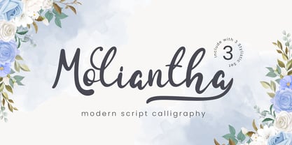 Moliantha is a delicate and incredibly distinct handwritten font with 3 stylistic set. Fall in love with its incredibly versatile style and use it to create spectacular designs! Moliantha is perfect for branding, logo, invitation, stationery, social media post, product packaging, merchandise, blog design, game titles, cute style design, Book/Cover Title and more. What's Included : - ligatures - Beginning & Ending Swash - Multilingual Support --- Hope you enjoy with our font! Attype Studio
 - Genotype BRK Pro by CheapProFonts,
$10.00 A stylistic and square outline font suitable for headlines and logos. The original font contained no diacritics at all, so I have designed these to match. I also made the descenders on "g/j/p/q/y" a bit longer - so they would balance better with the letters with diacritics below the letter... I redesigned the "t", but have included the original "t" as an alternate, available via your programs' glyph palette or using the OpenType functions "Stylistic Alternates"/"ss01". Genotype S BRK Pro is the perfect companion for Genotype H BRK Pro (The H stands for Hollow and the S stands for Solid). Can be used as a fill for its companion (using layers), but is also quite a usable font on its own. ALL fonts from CheapProFonts have very extensive language support: They contain some unusual diacritic letters (some of which are contained in the Latin Extended-B Unicode block) supporting: Cornish, Filipino (Tagalog), Guarani, Luxembourgian, Malagasy, Romanian, Ulithian and Welsh. They also contain all glyphs in the Latin Extended-A Unicode block (which among others cover the Central European and Baltic areas) supporting: Afrikaans, Belarusian (Lacinka), Bosnian, Catalan, Chichewa, Croatian, Czech, Dutch, Esperanto, Greenlandic, Hungarian, Kashubian, Kurdish (Kurmanji), Latvian, Lithuanian, Maltese, Maori, Polish, Saami (Inari), Saami (North), Serbian (latin), Slovak(ian), Slovene, Sorbian (Lower), Sorbian (Upper), Turkish and Turkmen. And they of course contain all the usual "western" glyphs supporting: Albanian, Basque, Breton, Chamorro, Danish, Estonian, Faroese, Finnish, French, Frisian, Galican, German, Icelandic, Indonesian, Irish (Gaelic), Italian, Northern Sotho, Norwegian, Occitan, Portuguese, Rhaeto-Romance, Sami (Lule), Sami (South), Scots (Gaelic), Spanish, Swedish, Tswana, Walloon and Yapese.
 - Walonka by TripleHely,
$18.00 Hello! Let me introduce Walonka – a modern calligraphy font. With its natural, elegant shapes Walonka is the perfect choice for logos, branding, web, blog headlines, invitations, magazine and book design, product packaging – or for any text on postcards and on your favorite photos. Walonka includes: a standard set of characters with wide multilingual support: Western-, Central- and Eastern-European, Baltic, Turkish, Latin-type Africans, and Asian (94 languages in total) two additional character sets: lowercase letters with alternates shapes and lowercase letters without a connection stroke - for the position at the end of a word another two additional lowercase character sets – initial and final swashed forms 75 ligatures for double letters and frequent combinations Walonka has a large number of embedded context-dependent auto-replacement features that give the text a natural, handwritten look and correct inharmonious combinations of letters. These features work well in many apps (even simple ones like Notepad/TextEdit), and if you need to customize their application – you could use programs that support OpenType features (for example, Adobe apps or CorelDraw). All these additional glyphs are PUA-encoded, so if your software does not support OpenType — you could access them through Character Map (Windows) or Font Book (Mac). I hope you will like Walonka and create great designs with it!
 - Monarcha by Isaco Type,
$45.00 Monarcha is a serifed type family, with a strong influence of the baroque style, for extended texts. Its roman versions are slightly skewed, in the sense of reading, and its italics have unusual calligraphic features. Moreover, the contrast between thick and thin strokes is relatively smaller than in conventional serif fonts. These characteristics, coupled with its rounded shapes, give Monarcha a delicious fluidity and texture. Monarcha innovates and brings an exclusive OpenType feature to convert Arabic to Roman numerals up to 3999. It also has several other professional features - small caps, fractions, old style-, lining-, tabular numbers, scientific superior/inferior figures, stylistic sets and more than 40 different ligatures (standard + discretionary). The family consists of 8 styles, 4 weights - Book, Regular, SemiBold and Bold - plus their respective italic versions. The fonts are available in OpenType PS format and have extended character set to support CE, Baltic, Turkish as well as Western European languages.
 - Cresci Exemplar Pro by California Type Foundry,
$47.00 Cresci Exemplar™ was originally designed by Giovanni Francesco Cresci, the 16th century Milanese writing master. These letters from his book Essemplare are some of the most elegant capitalis monumentalis ever produced and served as a model for later inscriptions on statues and monuments all throughout Italy. Painstakingly made from multiple high-resolution references, Cresci Exemplar™ Pro, accurately matches the master’s original lines. It can be used at large sizes without sacrificing elegance. Cresci’s attention to detail and delicate curves allow his titling capitals to stand out and elevate text. The numbers of Cresci Exemplar™ Pro have been professionally designed to match and complement the letterforms of Cresci’s original alphabet. Symbols have either been faithfully transcribed or thoughtfully designed both to be pleasing to today’s reader and congruent with classic lines. Released for the 450th anniversary of Cresci’s Il Perfetto Scrittore.
 - Le Havre Titling by insigne,
$24.00 Throughout time, history’s architects have incorporated some of the finest illustrations of type into their great works--cuneiform on Mesopotamian ziggurats; Greek etched into the temples of the gods; inscriptions marking the monuments of mighty Rome. From these Roman inscriptions specifically, we take our capital letters of today; and while we've lost the need for serifs over time, our current characters maintain the classical foundations, even after being distilled to their simplistic forms. Here’s where we have the basis for Le Havre Titling. This updated face is a carefully optimized version of Le Havre that uses purely capital lettering. Originally inspired by the golden period of the passenger ship and the French port that bid a rich bon voyage to so many famed, luxurious ocean liners of the Roaring Twenties and Thirties, the typeface includes an exciting array of ligatures that brings it into the present day and gives designers a tremendous amount of versatility in their work. With its seven weights, Titling looks equally at home on the side of a building as it does in a finely crafted invitation. With over five hundred glyphs, Le Havre Titling offers a multiplicity of options for your projects. Combine ligatures, play around with two sets of art deco forms, use original caps, and more; every one of these is obtainable with the OpenType functionality. The new design also shares five weights with the original Le Havre, allowing you to maximize your potential through its interchangeability. Titling’s Thin weights are delicate but not too fragile, and its geometric forms give each individual composition you create an exquisite and beautiful sense of emotion. Without a doubt, this fresh, fashionable take on the classical forms offers your reader refined, yet unanticipated approach as he or she travels through your text.
 - Juxta Sans Mono by NaumType,
$19.00 Juxta Sans Mono is an experimental monospace sans, an extension of the Juxta superfamily. During the creation of the Juxta script, I felt that the aesthetics and the main idea of the font had promising potential and I started thinking about a pair for it. So the idea of Juxta Sans Mono was formulated. Juxta has several style-forming elements: 45° beveled or cross out bowls, squared m and w arcs and other unobvious letter structures. Despite its unusual and sometimes odd (f, g, m) letterforms, Juxta Sans is fairly easy to read due to its monospace font nature and wide spacing. Juxta Sans Mono offers great customization potential. It has two sets of stylistic alternates — [salt] makes a letter underscored, but keep it in line, [ss01] replaces some of the glyphs with different letterforms. The [case] function automatically adjusts the height of the punctuation marks to the neighbor letter and [onum] is a set of old style numbers. Juxta Sans Mono also has subscript and superscript features, but they are utilized a bit unconventionally — if you want to customize your logo or headline, you can make a glyph superscript and the one next to it subscript and they automatically kern into one letter width. You can see examples of using these features in the presentation. Juxta Sans Mono is available in 8 weights, including Thin, Light, Regular, Medium, SemiBold, Bold, ExtraBold and Black. It extends multilingual support to Basic Latin, Western European, Euro, Catalan, Baltic, Turkish, Central European, Pan African Latin, Afrikaans, and Basic Cyrillic.
 - 3D Cursive by Okaycat,
$29.95 3D Cursive is an extruded cursive family with multiple styles. The 3D Cursive font is extruded in delicate outline. 3D Cursive Stencil is an alternate style in bold black. 3D Cursive Simple provides a perfectly matching, yet non-extruded style. 3D Cursive is extended, containing West European diacritics & ligatures, making it suitable for multilingual environments & publications.
 - PF Bague Round Pro by Parachute,
$79.00 Bague Round is a soft contemporary geometric typeface which blends distinct minimalist characteristics with mainstream details. It originates from Bague Universal, a superfamily with a warm well-balanced texture and a distinct personality. Usually, round sans letterforms tend to look rather organic and playful at heavier weights. This problem was avoided in Bague Round by applying all necessary optical corrections at the rounded corners in order to retain its robust qualities. Mechanical replacement of the stem endings with standard arcs was not implemented and each round form of the horizontal, vertical and diagonal strokes was treated differently from the other. Whilst the rounded endings at heavier weights become gradually more flat at acute corners, the round stems in letters such as A, b, m, p, s are perfectly matched with sharp diagonals in letters such as M, N, w, v, in a very distinct manner. A remarkable feature of Bague Round is its vast array of uppercase alternates and ligatures which truly shine when set at display sizes. Make your selection from 6 distinct groups of alternates as well as a rich set of discretionary ligatures and watch it transform into a flexible, charming and stylish typeface with strong modern aesthetics. This typeface offers enormous possibilities and variations for editorial design, branding and corporate identity. The Bague Round type family includes 14 weights from Thin to Ultra Black and matching true-italics with a consistent and well-refined structure. Each style consists of 1017 glyphs with more that 280 alternates and ligatures and an extended set of characters which supports Latin, Cyrillic and Greek. PDF Specimen Bague Round on Behance
 - Mimix by FSdesign-Salmina,
$39.00 Mimix is designed especially for comic fans and all typographers who like to play. It’s ideal to express spontaneity and the joy of life. Where Mimix is used, there’s life. The characters are lined in a row, a face looks out from the page. Big ears surround an oval head. A mouse moves without haste, but dynamic and modern through the lines. Mimix skillfully combines the elegance of a modern roman with the spontaneity of a casual handwriting. The mouse shows its versatile character in its broad range of use. Without exaggeration, it’s always delicate and elegant. The quiet form and good readability is a result of its moderate inclination. Well developed, Mimix includes ten weights from Ultrathin through Black. The free trial pack includes two weights with a reduced number of glyphs. If you like it you will be then be able to buy the fonts itself complete with ligatures, special characters for Eastern European languages, uppercase, lining and old style figures as well as fractions and different Opentype features. Declare war on desert lead – with Mimix, those with charm. Download a free trial version of Mimix with a reduced character set. Check it out!
 - November Starlight by Set Sail Studios,
$14.00 Thanks for checking out November Starlight! A lovingly hand-painted script font, fantastically elegant & eccentric with a sprinkle of carefree fun. November Starlight doesn't play by the rules - with extra bouncy characters, long vertical brush strokes and authentic hand-painted edges, it's bound to make a bold statement on anything from greeting cards and invitations, to personalised logos and handwritten quotes. November Starlight consists of 4 fonts; November Starlight • A cursive font containing upper & lowercase characters, numerals and a large range of punctuation. November Starlight Alt • This is a second version of November Starlight, with a completely new set of lowercase characters. If you wanted to avoid letters looking the same each time to recreate a custom-made style, or try a different word shape, simply switch to this font for an additional layout option. November Starlight Clean & Clean Alt • Totally clean versions of each of the November Starlight fonts, with all rough brush textures removed. Perfect for specialised printing techniques such as laser & vinyl cutting, or simply for a silky smooth finish to your text. Special Characters are also available for several lowercase letters, with added beginning & end swashes - please see the character map image for a full list. These characters are accessible via software with a glyphs panel, e.g. Photoshop CC, Adobe Illustrator.
 - Astralaga by SG Type,
$19.00 Elegant, graceful, and timeless. Astralaga is a versatile font family with a timeless, classic appeal, over 50 alternates & ligatures and multilingual support. Every letter has been hand-drawn and crafted with the upmost care. The variety of weights provide a range of choices that will help you find the best typographic character for your project. All 5 weights are well-suited for large display uses and high impact headlines. The available stylistic alternates and ligatures offer a number of different options that give your project a unique look. This high contrast serif typeface features a total of 1850 glyphs and offers comprehensive language support. THE 5 WEIGHTS OF ASTRALAGA Astralaga Light – very delicate and elegant Astralaga Regular – a classic beauty with gorgeous shapes Astralaga Medium – a great midground between lights and bolds Astralaga Semibold – high contrast and high impact Astralaga Bold – pure boldness and elegance FEATURES 5 weights High contrast 40 ligatures per weight 11 alternate glyphs per weight 1850 glyphs Comprehensive language support OpenType features: Access All Alternates, Discretionary Ligatures, Fractions, Kerning, Standard Ligatures, Stylistic Alternates, Stylistic Set 1, Superscript
 - Core Paint by S-Core,
$20.00 Core Paint is a texture type family inspired by the action painting created by Jackson Pollock. There are two sub-families named A and B. Core Paint A is a texture font family that has to be used together with others. Core Paint B is a textured font family that can be used solely or together with A family. By layering these different texture styles, you can create various combinations of textures. According to color variations, also you can create more complex textured typefaces and unique artworks. Core Paint Family supports complete Basic Latin, Cyrillic, Central European, Turkish, and Baltic character sets. Each font includes proportional figures, tabular figures, numerators, denominators, superscript, scientific inferiors, subscript, fractions and case features. This family is really nice for book titles, headlines, logotypes and any artworks.
 - Yellow Palette by Din Studio,
$29.00 Are you looking for a handwritten font? Do you dream of creating headings that stand out and inspire creativity, imagination, and endless fun? Wait no more, we will give you the best choice. Yellow Palette-A Handwritten Font Yellow Palette is a gorgeous font, designed with a modern vibe. This handwritten font is perfect for anything adventurous, and direct. Every stroke and curve was created to entice happiness and elegance. A real head-turner for your presentation, designs, branding, quotes, invitation, website illustrations, and much more. Our font always includes Multilingual Support to make your branding reach a global audience. Inspire your audience, clients, or guests with this beautiful, statement font. Features: Ligatures Stylistic Sets PUA Encoded Numerals and Punctuation Thank you for downloading premium fonts from Din Studio
 - Guildhall by Device,
$39.00 Class, with a punch. It's rare to find fonts that are refined without being too delicate, stylish while still being bold and impactful. Guildhall is a heavy rectangular flared serif in face widths with matching italics. Suitable for film posters, rock concerts and band logos, beer labels, packaging and magazine headlines.
 - Caballero by Fabio Godoy,
$29.95 Typographical Caballero is a family created by Fabio Eduardo Godoy Angel, the concept is inspired by a type with firm and clear, with perfect posture and personality to be used by Graphic Designers and Architects, in terms of print, TV Corporate Identity, Merchandising - Other Projects. Ideal for antetétulos, titles, subtitles, texts from 12 Pts. Caballero Outline and Caballero Outline Italic, are presented as an option for antetétulos, titles and subtitles as well as short texts from 20 Pts. Caballero in his presentation Outline, allows wide range of applications in regard to the use of color, and be combined with Caballero Regular and Caballero Italic. Font Project Caballero, is set with a vertical and horizontal logic calligraphic lines, amount of contrast medium, antlers mullet and its completions are straight.
 - Flashgude by RGB Studio,
$17.00 Flashgude is a lovely and delicate script font that exudes elegance and class. This font was particularly crafted for those who need a beautiful and refreshing look to their designs. Flashgude, A new fresh & modern calligraphy script with a deluxe calligraphy style. The impression is classy, yet modern, making Flashgude still catchy for all your creativity. A charming typeface and So beautiful on invitation like greeting cards, branding materials, business cards, quotes, posters, and more! Files Include : Basic Latin A-Z and a-z Numbers Symbols PUA Encode Multilanguage Support The Open Type features can be accessed by using Open Type savvy programs such as Adobe Illustrator, Adobe InDesign, Adobe Photoshop Corel Draw X version, And Microsoft Word. Thanks and have a wonderful day, If you have any questions, please get in touch with us Don't forget to check out our other products.
 - Geliat by Wahyu and Sani Co.,
$99.99 Geliat would be the youngest brother of Creo, retaining the letterform and proportion but has more geometric looks. This font family comes in two versions which has some different default glyphs. Geliat family has similar letterform with Creo, while the Alt version has common geometric letterform. Italic styles of Geliat were designed using semi-rotalic method. The round parts have 5 degrees italic angle, while the vertical strokes were made in 10 italic degrees. The result gives the styles look more circular than most geometric typefaces with the same 10 degrees italic angle. Each version of Geliat has 2 variable fonts along with 10 different predefined weights from Thin to Heavy with matching italics. Each family member of Geliat also equipped with useful OpenType features such as Ordinals, Superscripts, Scientific Inferiors, Stylistic Sets, Tabular Lining, Standard Ligatures, Fractions, Numerators & Denominators. Each font has 500+ glyphs which covers Western & Eastern Europe, and other Latin based languages. Geliat will be suitable for many creative projects, from logos, posters, presentations, headlines, lettering, branding, quotes, titles, magazines, headings, web banners, mobile applications, art quotes, advertising, packaging design, book title, and more! Sky is the limit!
 - Seraphon by Lemonthe,
$15.00 Seraphon is a stylish and delicate handwritten font. It has a gentle and beautiful flow and it will be a hit for any design that you want to add it to. is perfect for many different project such as logos & branding, invitation, stationery, wedding designs, signature, product designs, label, photography, and more!
 - Noelle by Jen Wagner Co.,
$15.00 Noelle is a classic, minimalist serif and script duo that functions beautifully in modern design work. Noelle serif features geometric, clean lines; modern serifs, and just a touch of vintage while Noelle script brings in femininity and delicateness. Noelle looks gorgeous in logo work as well as web headings and printed materials.
 - Lecturia by Ingo,
$42.00 Lecturia is a modern humanist sans serif typeface. Ascending dynamic movement characterizes the structure of it’s characters -- the stylistic alternates emphasize this impression. The family comprises eight weights from the most delicate "Hairline" to the strong "Bold" -- each upright and italic. Using the variable font, the intermediate levels can be controlled fluently. The forms and proportions of Lecturia have been selected to be very legible as body type for longer texts. Lecturia ist still legible from a great distance or under unfavorable conditions. In large sizes as a heading, the font is very eye-catching. The shapes of the individual characters follow the "humanistic" form language of modern faces. In addition to ligatures for problematic letter combinations, it contains stylistic alternates for some characters that make the appearance even livelier. Small caps provide a restrained opportunity for emphasis. In addition, Lecturia offers several sets of numerals: proportional standard figures, lining figures, proportional oldstyle figures, non-proportional tabular figures, superscripts and subscripts, numerator and denominator to represent fractions, circled numbers. The very good legibility of Lecturia makes it the ideal typeface for information systems -- a selection of directional arrows is included.

