10,000 search results
(0.049 seconds)
- Soprani by insigne,
$39.00 Soprani is a unique typeface inspired by a plaque found in New Zealand dating from the 1920s. The design was contemporized and brought 100 years into the future. The serifs are dramatically flared at the end of the stems, while in the middle, they contract. This leads to a unique shimmering effect that draws the eye and catches your user's attention. This typeface meets the demand for unique serif types that are both eye-catching and delicate. It’s a display face that's ideal for very contemporary work. This typeface has plenty of alternates and has a full complement of OpenType features. The 1920s inspire the design, with a bit of art nouveau and arts and crafts, yet the typeface is designed to meet contemporary design requirements. It has a unique elegance and the letterforms are condensed more than most. Soprani is suggested for table books, menus, and various promotional materials, newspapers, television, motion pictures and other media. There is a wide range of widths and weights available, from the thin, which is delicate and graceful, to a bold and robust black. Production assistance by Lucas Azevedo and ikern.
 - Naga by Canada Type,
$24.95 Naga is Hans van Maanen's original creation of art deco shapes interected with intricate mazes of what could be Celtic or Mesoamerican knotwork art. The totality of the typeface borders on the mysterious, exotic and yet clearly discernible as far as readability is concerned. Naga comes with a companion outline style that emphasizes its intricacy. Both fonts hold up quite strongly when combined with photo/illustration masks. The Naga family comes in both OTF and TTF formats, and includes an extended range of characters covering most Latin-based languages. A few unicase forms are also included.
 - Adore Serif by Elvina Studio,
$12.00 Adore font is an elegant serif typeface with delicate details. This neat font can contribute to the modern and fashionable appeal of the brand. Perfectly suited to logo, branding, signature, wedding cards, packaging design, stationery, website design and more.
 - Vullkan NF by Nick's Fonts,
$10.00 Live long and prosper. Barnhart Brothers and Spindler. 1884. Originally named Vulcan. Enough said. Both versions support the Latin 1252, Central European 1250, Turkish 1254 and Baltic 1257 codepages.
 - Bralwood by Muksal Creatives,
$15.00 Bralwood is a font that seamlessly blends modern sensibilities with classic vintage nuances. With a commanding display style, the font exudes elegance while retaining a nostalgic touch. Its letters boast bold and creative shapes, adorned with details that evoke the alluring essence of retro eras. What sets Bralwood apart is its delicate yet robust lines and sharp angles, lending visual strength to each character. Ideal for logo branding seeking to emphasize retro or vintage vibes, Bralwood imparts an exclusive and sophisticated feel to various design ventures. From posters to product labels and packaging, Bralwood adds a distinctive touch that captivates attention. With its ability to create enticing and captivating impressions, Bralwood stands as the perfect choice for designers aiming to convey powerful messages with a classic yet modern flair.
 - Praxis Next by Linotype,
$57.99 Praxis® Next has the same robust shapes and proportions as the original 1976 Praxis design. Its large x-height, substantial counters and open apertures guarantee high levels of legibility and reading ease in print and on screen. More weights, condensed designs and true cursive italics differentiate Praxis Next from the older design. Praxis Next shines where space is at a premium. The regular designs are modestly narrow while the condensed typefaces perform with grace in the most crowded of environments. The bold designs create powerful headlines and banners and the lighter weights are ideal for both long and short-form text copy. Because of its many weights and proportions, Praxis Next is also an ideal design to build a brand identity. Praxis Next Variables are font files which are featuring two axis and have a preset instance from Light to Ultra and Condensed to Roman. Pair Praxis Next with old-style designs like Bembo® Book and Stempel Garamond™ to create a dynamic typographic contrast. Or complement the design with its serifed counterpart, Demos® Next . Unger also drew ITC Flora® as an alternative italic design. Looking for something a little different? Pair Praxis Next with Masqualero™ .
 - P22 Yule by IHOF,
$24.95 P22 Yule is a series of display fonts inspired by a mélange of ancient inscriptional writing, with visual references to Anglo-Saxon, Celtic, medieval and even a bit of ancient Greek and roman letterforms. Yule is exotic yet familiar and evocative of winter holidays. It has an Alpine look, lending itself to the thoughts of chalets and fondue. Yule Heavy Snow is blanketed in the white stuff, while Yule Light Flurries is dusted with snowflakes. With the addition of the Klein style, which includes a lowercase, Yule becomes infinitely more usable. The Klein variations can work well as an alternative to Neuland when you need the versatility of a lowercase.
 - Malabar by Linotype,
$29.99 Malabar is a type family for extensive text. Its design was developed with a nod toward newspapers. Malabar's characters are seriffed and of the Old Style genre. A strong diagonal axis is apparent within the curves. Sturdy serifs help strengthen the line of text in small point sizes, as well as define the overall feeling of the face. Malabar's x-height is very high, a deliberate choice that makes the most important parts of lowercase letters visibly larger in tiny settings. The height of the capital letters is also rather diminutive, allowing for better character fit, as well as eliminating a bit of clumsiness in German, which often includes quite a few uppercase letters. Diacritical marks and additional alphabetic forms required by many Western, Central, and Eastern European languages are naturally a part of the character set, including those needed in the Baltic states, for Romanian, and for Turkish. Malabar's accents are bold and direct, sitting well with their base glyphs. The family includes three weights, each with a companion Italic. Malabar Regular is equipped with small caps, and both it and Malabar Italic include oldstyle figures. All members of the family have both proportional and tabular-width lining figures, as well as special variants of certain punctuation marks vertically adjusted for all-caps text setting. Malabar is informed both by contemporary ideas of typeface design (sheared terminals, the wider-drawn s) as well as by 16th-century masters. Malabar Heavy and Heavy Italic are very loud; their blackness almost shouts out from the page. The Regular's wedge serifs become more slab-ish in nature as the letters' weight increases. Malabar Heavy and Heavy Italic are best relegated to headline use only. Malabar Bold and Bold Italic may be used for text emphasis, a job for which the Heavy is to dark. Malabar received a Certificate of Excellence in Type Design at the Type Directors Club of New York TDC2 competition in 2009.
 - Tulip Algarve by Brenners Template,
$19.00 Tulip Algarve font family showcases elegant and trendy glamour through a bold contrast between horizontal and vertical stems. The basic glyph design was inspired by the beautiful silhouette of a tulip flower, and a classical beauty was added to the typeface system. With a modern display sans serif personality, this type system will interact well with any layout design.
 - Britannic by Linotype,
$40.99Britannic is a sans serif face with a vertical axis and a high degree of stroke contrast, especially in the heavier weights. This typeface exudes a degree of elegance that has not often been matched during the Century that has passed since it was first drawn. - Wesley SRF by Stella Roberts Fonts,
$25.00 Wesley SRF is another of the Ray Larabie originals provided to Stella Roberts Fonts. This stylized sanserif has a clean look for both text and display puposes. The net profits from my font sales help defer medical expenses for my siblings, who both suffer with Cystic Fibrosis and diabetes. Thank you.
 - Dastardly Deeds SRF by Stella Roberts Fonts,
$25.00 This design from Ray Larabie (and adapted by Jeff Levine) is so unusual. The lettering lends itself to messages of sinister intent or horror movie titles. The net profits from my font sales help defer medical expenses for my siblings, who both suffer with Cystic Fibrosis and diabetes. Thank you.
 - Square Cat by Lalelum,
$12.99 This is a blocky typeface with thick lines and no serifs. It's a modern design with a hint of vintage lettering with a thicker vertical line on one side of each letter. Most letters are square shaped. The two styles are regualar and hollow, with the hollow style having the thicker areas hollowed out.
 - Genre by Storm Type Foundry,
$26.00The official terseness and grey of Neo-Classical type faces will stand out when we narrow them. The consistently vertical shading of the letters suppresses one's desire for eccentricity, just like tea with bromine. It would, however, be wrong to consider Bodoni as the originator of this - vertically shaded - trend in type face production. In his Manual we can also find type faces with a slanted axis of shade, picturesque italics and a number of normal, more human type faces. It remains a mystery why his name is connected only with one of his many works. Genre's basic design is fairly light in colour, which is why it looks good in illustrated magazines and short texts and directly calls for graphically striking, contrasting headings. It shows off beautifully next to photographs, on diplomas and on printed materials connected with a person's death. - Segmenta by Librito.de,
$15.00Segmenta, a sans serif typeface developed from the gridbased type of the Hamburg S-Bahn (metro). The type is originally used for diplaying informations about the trains. The typeface contains all accents and special letters for extended latin and the baltic languages. - Velouté by Wilton Foundry,
$29.00 Velouté is named after one of the original French Mother Sauces, it is a surprisingly bold and velvety script with delicate flourishes that demand your attention. Velouté's unique mix of classic, contemporary, bold and delicate detail is ideally suited for Special Invitations, Coffee shops, Restaurants, Boutiques and Menus.
 - LHF Ambrosia by Letterhead Fonts,
$39.00 An old turn-of-the-century style commonly used on billheads, letterheads, certificates, etc.
 - Bible Script by ITC,
$29.00Bible Script font is the work of designer Richard Bradley. A textured edge, swash alternate characters and additional flourishes enhance this traditional, calligraphic font. Word settings look as though they were written by hand. Bible Script font is perfect for certificates, diplomas, citations, greeting cards, or anything that should have a personal, elegant touch. - Collegium by GRIN3 (Nowak),
$20.00 The Collegium is a font family inspired by college and university sportswear lettering. Language support includes Western, Central and Eastern European character sets, as well as Baltic and Turkish languages.
 - Geometry by Sfaranda,
$30.00 The GEOMETRY Font is based on a specific grid. The grid is made of vertical, horizontal, diagonal lines and circles. Every single letter, number and symbol fits perfectly in the grid, no exception! The GEOMETRY Font includes uppercase, lowercase, numbers and punctuation symbols.
 - RM Elegance by Ray Meadows,
$19.00 With an obvious nod to Art Deco, this font offers a stylish design with distinctively elongated ascenders and descenders. Includes: Western European, Central European, Baltic & Turkish sets. Due to the modular nature of this design there may be a slight lack of smoothness to the curves at very large point sizes (around 100 pt and above).
 - Moniak Sans by Design Komando,
$35.00 Moniak Sans is a linear, humanist sans with a vertical stress axis. Distinctive for its open strokes, Moniak features generally broader typeface proportions to offer excellent readability even at small sizes. This property also supports lowercase stroke endings. The designer emphasised elegant, pure curves in the skeleton of the font, making it optically friendly and inviting in magazine headline and poster applications. Most languages using Latin script are supported.
 - Rache Rache by Daylight Fonts,
$50.00 This is a modern font with a new interpretation of the classic font. It has sharp serifs, delicate hairlines, and beautiful curves that will make your typographic work look vinegar-lidded, stylish, and sexy.
 - Double Line Deco JNL by Jeff Levine,
$29.00 Take a classic hand lettered Art Deco alphabet, add in a treatment of dual straight vertical lines and the resulting typeface is Double Line Deco JNL.
 - Tokyotrail by Dharma Type,
$9.99 Tokyotrail is inspired by the capital of Japan. Over 2,000 square kilometers to explore. Lines run vertically horizontal and aslant. Square and geometric form attracts notice in various scenes.
 - Dimanche NF by Nick's Fonts,
$10.00A classic Art Nouveau face, originally known as either Domingo or Brillante. Its sinewy forms and narrow letterforms make it a natural choice for large, evocative headlines. Both versions of this font support the Latin 1252, Central European 1250, Turkish 1254 and Baltic 1257 codepages. - Baldufa Greek Ltn by Letterjuice,
$78.00 Baldufa is a charming typeface with strong personality, which looks very comfortable in text. There is a search to obtain complicated curves and detailed features, which gives the typeface a touch of beauty and elegance. However, this is also a self-conscious design that claims through the rounded serifs and irregular vertical stems appreciation for quirkiness and human imperfection. The letterforms in the Latin are inspired by the slight distortions and idiosyncrasies that came with old printing methods. It has distinct, features such as rounded serifs, irregular vertical streams, ink traps and extremely thin junctions. In the Italic, serifs have been removed to enhance movement and expressivity. These experiments in form have not come at the cost of legibility: The typeface remains suitable for both small and display text. Baldufa Greek Ltn covers Greek and Latin.
 - Samson Classic SG by Spiece Graphics,
$39.00 Here is another classic design by Robert Hunter Middleton for the Ludow Foundry in 1940. Samson Classic is a very heavy display face with a wonderful medley of thick-and-thins. Developed just before World War II, this sturdy, chunky style gained popularity in newspaper advertising work. It appears as though it was created using a broad pen and retains the angled stroke endings. Goes great on certificates and diplomas where just a hint of calligraphy is appropriate. Samson Classic is also available in the OpenType Std format. Some new characters including decorative ornaments for creating certificates have been added to this OpenType version. Advanced features currently work in Adobe Creative Suite InDesign, Creative Suite Illustrator, and Quark XPress 7. Check for OpenType advanced feature support in other applications as it gradually becomes available with upgrades.
 - Founder Christmas by Sealoung,
$15.00 Founder Christmas is an elegant script font, that features a very delicate and classy look. Not too thin and not too thick, balanced and varied, this font was designed to enhance the beauty of your projects.
 - Storytail by Balpirick,
$15.00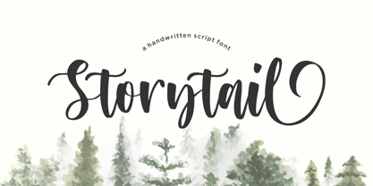 Storytail is a Handwritten Script Font. Storytail is a stylish and delicate script font. This font is PUA encoded which means you can access all of the glyphs and swashes with ease! - also multilingual support - Lowercase Ending Swash Enjoy the font, feel free to comment or feedback, send me PM or email. Thank you!
 - Whitehall JNL by Jeff Levine,
$29.00Whitehall JNL is the serif counterpart to Jeff Levine's Wingate JNL - both are strongly influenced by the Art Deco stylings of such condensed typefaces as Huxley Vertical and other narrow titling fonts. - HS Alkitab by Hiba Studio,
$59.00 Hs Alkitab is an Arabic display typeface, under “titles” category. It is useful for book titles, creative designs and modern logos. Also, it is used when a contemporary and simple look is desired that can fit with the characteristics of Latin fonts where horizontal parts are thinner than vertical ones. The font is based on some modern lines of Kufi calligraphy along with some derived ideas of Latin fonts, maintaining the beauty of the Arabic font and its fixed rates. Undoubtedly, the insertion of curved ornament in the vertical parts adds more beauty and fascinating diversity in the flow line between sharp, soft and curved parts. This font supports Arabic, Persian, Urdu and Kurdish, consisting of two weights (regular and bold) which can add to the library of Arabic fonts contemporary models that meet with the purposes of various designs for all tastes.
 - Dom by ParaType,
$30.00 Dom was designed by Peter Dombrezian for American Type Founders in 1951–52. It is an informal unjoined script typeface that looks brushwritten. Its letters are almost monotone, freely or casually drawn. Vertical strokes of them have irregular ending at different heights, and oval axis have slightly different slopes. This typeface is to create a friendly, informal look in signs, advertising, and invitations. The Cyrillic version of the Bitstream digital font was developed by Dmitry Kirsanov for ParaType in 2008.
 - Amsterdam Belmonteria by Letterena Studios,
$9.00 Amsterdam Belmonteria is a delicate and cursive handwritten font. This gentle font will look gorgeous on a variety of design ideas. This font is PUA encoded which means you can access all of the glyphs and swashes with ease!
 - HU Cheonggye KR by Heummdesign,
$25.00 HU Cheonggye KR is a typeface for titles with thick strokes and wide flats, mainly produced with a retro feel. In order to bring out the characteristics of the retro typeface, a difference in thickness between horizontal and vertical strokes was applied, and obtuse right-angled serifs were applied. This font contains Korean characters.
 - Pantano Pro by Latinotype,
$39.00 Pantano is a handmade grunge typeface inspired by the rustic style of Amazonia. This update adds more diacritics, alternate characters and more ligatures give a sensual and naturalistic touch to the written word. Designed by Luciano Vergara and LCF. Languages include: Basic Latin, Western European, Euro, Catalan, Baltic, Turkish, Central European, Romania, Pan African Latin.
 - 2011 Slimtype Sans by GLC,
$42.00 This light manual font, with two styles, is the sans serif version of our slab serif "2011 Slimtype". It is containing Western and Northern European, Icelandic, Baltic, Eastern, Central European and Turquish specific characters, plus old style numerals, ct, st and f standard ligatures. The two styles are both legible from 10-11 pts.
 - Koning Display by LucasFonts,
$49.00 Koning transports high-contrast sans serifs into the present. Koning is the Dutch for king. Given the design’s elegance, this name should come as no surprise. It has been recognized with numerous awards: TDC Certificate of Typographic Excellence and Award of Excellence from Communication Arts both in 2018, and Gold from German Design Awards in 2020.
 - Baldufa Paneuropean by Letterjuice,
$139.00 Baldufa is a charming typeface with strong personality, which looks very comfortable in text. There is a search to obtain complicated curves and detailed features, which gives the typeface a touch of beauty and elegance. However, this is also a self-conscious design that claims through the rounded serifs and irregular vertical stems appreciation for quirkiness and human imperfection. The letterforms are inspired by the slight distortions and idiosyncrasies that came with old printing methods. It has distinct, features such as rounded serifs, irregular vertical streams, ink traps and extremely thin junctions. In the Italic, serifs have been removed to enhance movement and expressivity. These experiments in form have not come at the cost of legibility: The typeface remains suitable for both small and display text. Baldufa Paneuropean covers Eastern and Western Latin, Greek and Cyrillic Extended.
 - 1925 My Toy Print Deluxe Pro by GLC,
$42.00 This family was created inspired from two French (one so common and a very rare large one) "toy print" boxes, named Le petit imprimeur, with rubber stamp characters from the 1920's. The big difference from our 1920 My Toy print is that this font is complete, with upper and lower cases, accented, complete punctuation and some symbols. The doubly of each usual character in each style (A-Z/a-z and numerals) allow to give a rich and variously uneven appearance, looking like the results of the real use of those old rubber stamps, with bad kernings and alignement. The font is containing West (including Celtic), Central, East European, Turkish and Cyrillic characters. The bold style may be used as a reinforcement, mixed with normal style without disadvantage, allowing finally four choices for each usual letter... The original size is 6mm (about 17 pts).