716 search results
(0.008 seconds)
- Bright Rainbow by Din Studio,
$29.00 Bright Rainbow is a classy brush font. The brush combined with handwritten font will make your design project more beautiful. Made for any professional project branding. It is the best for logos, branding and quotes. Every letter has a unique and beautiful touch. Features: Multilingual Support PUA Encoded Numerals and Punctuation Thank you for downloading from Din Studio.
 - Rankfine by Din Studio,
$29.00 Rankfine is a elegant calligraphy with natural and handwritten style. It brings a modern and attractive typeface. Made for any professional project branding. It is the best for logos, branding, wedding and quotes. Includes: Rankfine (OTF) Features: Stylistic Set Beautiful Ligatures Multilingual Support PUA Encoded Numerals and Punctuation Thank you for downloading premium fonts from Din Studio
 - Hawken by Din Studio,
$29.00 Hawken is a powerful sans serif display typeface come with sporty themes. Perfect for quotes, posters, logo, logotype, branding, business card, crafting needs, print, t-shirt, mug, merchandise, packaging, and many more. Includes: Hawken (OTF) Features: Alternates Stylistic Set Swashes Multilingual Support PUA Encoded Numerals and Punctuation Thank you for downloading premium fonts from Din Studio
 - Fiosthic by Din Studio,
$29.00 Fiosthic is a modern signature font with natural and handwritten style. It brings a elegant and attractive typeface. Made for any professional project branding. It is the best for logos, branding, wedding and quotes. Includes: Fiosthic (OTF) Features: Stylistic Set Beautiful Ligatures Multilingual Support PUA Encoded Numerals and Punctuation Thank you for downloading premium fonts from Din Studio
 - Roaster Brush by Din Studio,
$29.00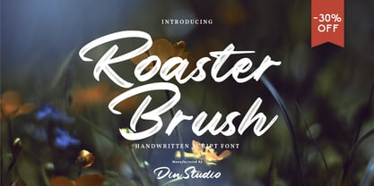 Roaster Brush is a elegant handwritten font. The handwritten combined with brush font will make your design project more attractive. Made for any professional project branding. It is the best for logos, branding and quotes. Every letter has a unique and beautiful touch. Features: Multilingual Support PUA Encoded Numerals and Punctuation Thank you for downloading from Din Studio.
 - Rithem by Din Studio,
$29.00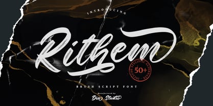 Rithem is a classy brush font. The brush combined with calligraphy font will make your design project more powerful. Made for any professional project branding. It is the best for logos, branding and quotes. Every letter has a unique and beautiful touch. Features: Multilingual Support PUA Encoded Numerals and Punctuation Thank you for downloading from Din Studio.
 - Sawah by Din Studio,
$29.00 Sawah is a modern and elegant display font. It celebrates abstract shapes in all their eclectic beauty. This font will look truly outstanding in a wide range of contexts. It is the best for logos, branding and quotes. Featured : Accents (Multilingual characters) PUA encoded Numerals and Punctuation (OpenType Standard) Thank you for downloading premium font from Din Studio.
 - Dellons Signature by Din Studio,
$29.00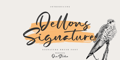 Dellons Signature is a elegant brush font. Combined with brush textured handwritten will make your design project more special. Made for any professional project branding. It is the best for logos, branding and quotes. Every letter has a unique and beautiful touch. Features: Beautiful Ligatures Multilingual Support PUA Encoded Numerals and Punctuation Thank you for downloading from Din Studio.
 - DINosaur by Type-Ø-Tones,
$60.00 DINosaur is the typographical mise en scène of a calligraphic standard for technical writing, found in a 1967 manual. Although its base is a regular grid and its main reference is the DIN norm, it is full of a multitude of small original features. The microtypographic details refer to the tools originally used for its reproduction.
 - Feel Better by Din Studio,
$29.00 Feel Better is a elegant handwritten font. The handwritten combined with brush font will make your design project more beautiful. Made for any professional project branding. It is the best for logos, branding and quotes. Includes: Feel Better (OTF) Features: Beautiful Ligatures Multilingual Support PUA Encoded Numerals and Punctuation Thank you for downloading from Din Studio.
 - Kickoff by Din Studio,
$29.00 Introducing Backyard - A Display Font This awesome typeface with amusing style looks very interesting for loads of different projects and promotions. It is perfect to be used on your website, for your social media branding, Pinterest banners, printed products, and more! Features: Multilingual Support PUA Encoded Numerals and Punctuation Thank you for downloading premium fonts from Din Studio
 - Wile by Monotype,
$29.99This exclusive Monotype design by Cynthia Hollandsworth is named after a popular executive, Don Wile of Agfa Compugraphic as a gift on his retirement. Agfa Wile is a classic Old Style font with wedge-shaped serifs and open proportions, and is suitable for both text and display uses. Agfa Wile's capital letters are influenced by inscriptional forms. - Palio by Eurotypo,
$34.00 Palio is a family of fonts derived from the classic Didone, its capitals are slightly condensed and the lower case definitively abandon the reminiscent of the baroque endings strokes, which are still endure in many typefaces. It is an elegant font especially the slant version that actually is a truly italic. This version very readable and is enriched with a series of alternative variables and swashes that make it more expressive for certain projects that need some flowering.
 - Gatara by Tour De Force,
$30.00 Gatara is serif font family with elements of Didone available in 6 weights and matching Italics. It is high contrasted typeface with some distinctive details such as stemmed shape of “h”, “n”, “m” and “a” letters, unique “f” and “k” in same style. Comes with Standard Ligatures and Fractions with Extended Latin character map. As Gatara contains dose of decoratively design, beside editorial use, branding or web font usage, it can be used effectively for titles as well.
 - Prushkov by Arrière-garde,
$9.00 Prushkov is the first typeface that I made. Its name comes from the town I lived in at the time. The design was inspired by both geometric typefaces like Futura, and didone fonts like Bodoni. Its aim (perhaps quite bold) is to blend high contrast with mathematical excellence. Prushkov will work well as a display font, both in uppercase and lowercase. It has a wide array of stylistic alternates for all of the capitals and some lowercase glyphs too.
 - Joane Stencil by Compañía Tipográfica de Chile,
$25.00 Joane Stencil™ is Joane's fearless sequel. Mixes the elegancy of French didones, calligraphic endings, glyphic serifs and the split of the Stencil is treated very carefully. Thus its features convey a warm unique style. Moreover, it has powerful OpenType features for each style, including stylistic sets, extended language support, beautiful ligatures, contextual alternates, lining figures, oldstyle figures, fractions, and many more. Joane Stencil is perfectly suited for magazines headlines, branding, advertising, labels, web and packaging.
 - Rosmatika by Ali Hamidi,
$29.00 Rosmatika is a contemporary Didone Serif with many ligature. This font is a display font with high contrast so it is suitable for use in branding projects, logos, wedding designs, social media posts, product packaging, labels, watermarks, invitations, advertisements and projects that require bold fonts and are easy to read. Rosmatika has more than 500 glyphs that support extended latin language and feature features such as standard and discretionary ligature, language specific forms, and manual alternate access.
 - Vagebond by Characters Font Foundry,
$17.50 Vagebond is a monoline family in three widths, Condensed (C), Normal (N), and Extended (XT). With Vagebond I was inspired by a very old television I once saw on a junkyard. I wanted to create a typeface with round edges that would fit within the 4 x 3 proportion of the screen. It had to be monoline, because that gives it a very simplistic and minimalistic look. Having created the XT width I felt it needed the both complementing widths to make it complete. The Condensed version, for me, is the funky rounded version of the DIN. I love DIN, but it sometimes feels just a bit to ‘normed’ for me. Vagebond C brings in a bit more personality. Although Vagebond looks kinda ‘oldstyle’, it works very well in futuristic designs. It feels best in combination with a super futuristic 3d object.
 - DINfun Pro Removed by CheapProFonts,
$10.00 A collection of DIN Mittelschrift variants where parts of the letters have been removed to create different effects. The Plain font is included if you buy the family pack, and can be mixed in. The DINfun Pro fonts are special versions of the classic DIN 1451 Mittelschrift, far removed from the original typeface's serious and no-nonsense roots. I have made them as companions to the classic, with some some very different expressions, complete with a large multilingual character set. Time to spice up that DIN profile! :) ALL fonts from CheapProFonts have very extensive language support: They contain some unusual diacritic letters (some of which are contained in the Latin Extended-B Unicode block) supporting: Cornish, Filipino (Tagalog), Guarani, Luxembourgian, Malagasy, Romanian, Ulithian and Welsh. They also contain all glyphs in the Latin Extended-A Unicode block (which among others cover the Central European and Baltic areas) supporting: Afrikaans, Belarusian (Lacinka), Bosnian, Catalan, Chichewa, Croatian, Czech, Dutch, Esperanto, Greenlandic, Hungarian, Kashubian, Kurdish (Kurmanji), Latvian, Lithuanian, Maltese, Maori, Polish, Saami (Inari), Saami (North), Serbian (latin), Slovak(ian), Slovene, Sorbian (Lower), Sorbian (Upper), Turkish and Turkmen. And they of course contain all the usual "western" glyphs supporting: Albanian, Basque, Breton, Chamorro, Danish, Estonian, Faroese, Finnish, French, Frisian, Galican, German, Icelandic, Indonesian, Irish (Gaelic), Italian, Northern Sotho, Norwegian, Occitan, Portuguese, Rhaeto-Romance, Sami (Lule), Sami (South), Scots (Gaelic), Spanish, Swedish, Tswana, Walloon and Yapese.
 - DINfun Pro Grunge by CheapProFonts,
$10.00 A collection of DIN Mittelschrift variants with some typical grunge style treatments. The Plain font is included if you buy the family pack, and can be mixed in. The DINfun Pro fonts are special versions of the classic DIN 1451 Mittelschrift, far removed from the original typeface's serious and no-nonsense roots. I have made them as companions to the classic, with some some very different expressions, complete with a large multilingual character set. Time to spice up that DIN profile! :) ALL fonts from CheapProFonts have very extensive language support: They contain some unusual diacritic letters (some of which are contained in the Latin Extended-B Unicode block) supporting: Cornish, Filipino (Tagalog), Guarani, Luxembourgian, Malagasy, Romanian, Ulithian and Welsh. They also contain all glyphs in the Latin Extended-A Unicode block (which among others cover the Central European and Baltic areas) supporting: Afrikaans, Belarusian (Lacinka), Bosnian, Catalan, Chichewa, Croatian, Czech, Dutch, Esperanto, Greenlandic, Hungarian, Kashubian, Kurdish (Kurmanji), Latvian, Lithuanian, Maltese, Maori, Polish, Saami (Inari), Saami (North), Serbian (latin), Slovak(ian), Slovene, Sorbian (Lower), Sorbian (Upper), Turkish and Turkmen. And they of course contain all the usual "western" glyphs supporting: Albanian, Basque, Breton, Chamorro, Danish, Estonian, Faroese, Finnish, French, Frisian, Galican, German, Icelandic, Indonesian, Irish (Gaelic), Italian, Northern Sotho, Norwegian, Occitan, Portuguese, Rhaeto-Romance, Sami (Lule), Sami (South), Scots (Gaelic), Spanish, Swedish, Tswana, Walloon and Yapese.
 - Haboro by insigne,
$- Haboro is a powerful workhorse. It’s a neoclassical font developed for numerous uses, ranging from editorial and corporate to web pages and apps. This new face from insigne Design takes a modern twist on the high-contrast typeface genre known as the Didone. Recognized for their ability to convey clarity, the geometric simplification of the Didone genre adds a level-headed rationality to whichever work it’s applied. Didones are used to lend style and sophistication to a wide number of applications—everything from style or cosmetic labels to annual reports. With its unique take on this classic genre, Haboro—with its slight wedge-shaped serifs and unique terminals—is still defined by elegance, tradition and timelessness. Even more to its versatility, this multi-purpose text face features whimsical terminals, which liven up even the most serious texts. If you desire, you can also opt for the more usual ball terminals by activating OpenType alternates. The Haboro family consists of seven weights from a Thin to a Black along with matching italics. The contrast from the letters’ thick strokes and thin strokes draws the eye to your design, making Haboro a powerful visual tool for communicating your message. The typeface also contains numerous ligatures and alternates. Choose between serif variants such as ball terminals or standard serifs by utilizing OpenType alternates. We recommend using the default contextual alternates and discretionary ligatures in order to benefit from all members of this fantastic font family. In addition, Haboro has a sizable set of option glyphs and numerous other OpenType variables to give your text the unique touches it needs. Haboro has all of the attributes you need to undertake your next project. Use its modified elegance to shape and mold your next design, whether a web site, app, branding package, or magazine. You’ll find there’s no job Haboro can’t take on.
 - Geometa Rounded by Wiescher Design,
$39.50 Geometa is based on Paul Renners Futura Classic, the one that he designed before he had to soften it to make it more appealing to the broad public. I thought the original design would lend itself perfect to make a rounded version, that has got more character than the ever so boring DIN-typeface. The type-designer for interesting solutions, Gert Wiescher
 - Speedline by Din Studio,
$29.00 Speedline is a classy brush font. The brush combined with handwritten font will make your design project more beautiful. Made for any professional project branding. It is the best for logos, branding and quotes. Every letter has a unique and beautiful touch. Features: Alternates Beautiful Ligatures Multilingual Support PUA Encoded Numerals and Punctuation Thank you for downloading from Din Studio.
 - Black Bones by Din Studio,
$29.00 Black Bones is a classy script font. Combined with brush textured handwritten will make your design project more powerful. Made for any professional project branding. It is the best for logos, branding and of course quotes. Every letter has a unique and beautiful touch. Features: PUA Encoded Multilingual Support Numerals and Punctuation Thank you for downloading premium fonts from Din Studio
 - Regular Brush by Din Studio,
$29.00 Regular Brush is a elegant brush font. The handwritten combined with brush font will make your design project more attractive. Made for any professional project branding. It is the best for logos, branding and quotes. Includes: Regular Brush (OTF) Features: Stylistic Set Beautiful Ligatures Multilingual Support PUA Encoded Numerals and Punctuation Thank you for downloading premium fonts from Din Studio
 - Geometra Rounded by Wiescher Design,
$39.50 Geometra is based on Paul Renners Futura Classic, the one that he designed before he had to soften it to make it more appealing to the broad public. I thought the original design would lend itself perfect to make a rounded version, that has got more character than the ever so boring DIN-typeface. The type-designer for interesting solutions Gert Wiescher
 - Shall Blossom by Din Studio,
$29.00 Shall Blossom is a lovely brush font. The handwritten combined with brush font will make your design project more attractive. Made for any professional project branding. It is the best for logos, branding and quotes. Includes: Shall Blossom (OTF) Features: Stylistic Set Beautiful Ligatures Multilingual Support PUA Encoded Numerals and Punctuation Thank you for downloading premium fonts from Din Studio
 - Batteny by Din Studio,
$29.00 Batteny is a classy script font. Combined with brush textured handwritten will make your design project more powerful. Made for any professional project branding. It is the best for logos, branding and of course quotes. Every letter has a unique and beautiful touch. Features: Beautiful Ligatures Multilingual Support PUA Encoded Numerals and Punctuation Thank you for downloading premium fonts from Din Studio
 - Garden Bed by Hanoded,
$15.00 A couple of weeks ago, I found my ink well, which I thought I had lost. I decided (there and then) to create a bunch of inky brush fonts, which resulted in Dirrrty and Scrawny Cat. And now, needless to say, Garden Bed. It is named after a strophe from one of my favorite Soundgarden songs: Just Like Suicide. Garden Bed is a hand made didone-ish font, with a very irregular baseline, some interesting glyphs and a secret garden filled with diacritics.
 - Medieval Times by Celebrity Fontz,
$24.99 Medieval Times is a digital revival of an illuminated alphabet dating back to a text from the medieval period. Each letter is made up of several different human or mythological animal figures engaged in activities that reflect the beliefs and myths of that enchanted era. Some examples of the beings that you will find in this font are: griffins, dragons, chimeras, lions, gargoyles, unknown mythical winged creatures, peasants, priests, saints, and warriors battling with spears. Comes with a full set of accented letters.
 - Quiche by Adam Ladd,
$25.00 Quiche is a high-contrast, sans serif typeface featuring ball terminals and angled stems. A complete branding suite, the 4 subfamilies were created to work harmoniously together based on the need. The design is influenced by the Didone genre, characterized by its elegance and extreme thick/thins, but it removes the serifs for a unique and modern expression. The high-contrast style exudes sophistication while the ball terminals soften the overall look to make it feel a little more approachable.
 - Seravee by Stawix,
$35.00 Seravee was inspired by the significant style of Modern (Didone) Typography. The bolder they become, the more exquisite and stylish along with excellent legible at the same time. Designed by Stawix Ruecha, Bangkok based type designer. Rather than programing process, geometric forms as they were, each weight was well-crafted manually by hand as a result of humanistic sense. Through various weight ranges (Black, Bold, Regular and Light), to ensure that Seravee will perfectly cover all aspects of usability in every layout.
 - Encorpada Classic by dooType,
$20.00 Encorpada classic brings the best features of the Didone genre, but with a 21st century look and feel. With smooth details Encorpada Classic is a elegant choice for your type library. The Encorpada family began in 2011 with the release of Encorpada Black. After that instant success, in 2012, dooType brought to us Encorpada PRO. Encorpada Classic retains the main look and feel of his predecessors, but is designed with more functional considerations. With 14 styles, Encorpada Classic is a fine choice.
 - ZionTrain by AndrijType,
$33.00 Originally ZionTrain was built as a Cyrillic typeface for public transport navigation system. We wanted comprehensible, distinctive letterforms, that can help everybody on the way from Babylon to Zion. Here, on MyFonts, we present the ZionTrain STD versions with western latin including smallcaps and oldstyle figures in some faces in TrueType format; also western, central, baltic and turkish latin charsets, smallcaps, oldstyle numerals, few alternates, some arrows and fractions in ZionTrain OT OpenType format. Look how people use it: http://use.type.org.ua/tagged/ziontrain
 - Elbow Grease by Hanoded,
$15.00 Elbow Grease was made with, yes, you’ve guessed it: Elbow Grease! It started off as a grungy font, but it didn’t look right, so I reworked all the glyphs. Then I forgot to save the font, so I had to start all over again. Naming a font was never this easy! Elbow Grease is a didone-ish font with some seriously warped glyphs, a lot of panache and a ‘get-it-done’ attitude. Also comes with a toolkit full of diacritics.
 - Absolute Beauty by My Creative Land,
$34.99 Absolute Beauty is a happy family of a smooth casual monoline signature script and a high contrast elegant didone serif. The signature script comes in three weights to cover as much design needs as possible - from websites to brand design, from magazines to billboards. It compliments from OpenType features such as ligatures, swashes, stylistic and contextual alternates, and is fully unicode mapped. Absolute Beauty serif is an ideal partner for the script: it features the same elegance and comes in two weights.
 - Clarize by Seventh Imperium,
$25.00 Clarize is an elegant high contrast serif fonts family, with the best features of the Didone style. Designed with consideration for more functionality with smooth details and a touch of modern and luxury, this font is perfect for designers who are developing in the field of books, fashion, magazine, blog, advertising, packaging, branding, etc. The family includes 10 styles: five weights from Light to Black Multilingual Languages. Clarize includes Ligature and discretionary "ct" and "st" that can be accessed via an access feature.
 - Lust Slim by Positype,
$50.00 Check out the new Lust Pro & Lust Pro Didone to see how the series has grown and evolved. Confident and versatile, Lust is an exercise in indulgence—an attempt to create something over the top and vastly useful. If Lust Slim seems both new and familiar, that’s because it is. The series unapologetically channels Herb Lubalin, but produced with a deliberate, contemporary twist. There is an intentional slyness infused in the letterforms—the extreme thick and thin lines flow effortlessly without becoming gratuitous. It’s always just enough, not too much. What makes the type series so appealing? The curves. When asked to describe the letterforms, most people unwittingly allude to the human form, using adjectives usually reserved for describing physical traits… creating all-too-familiar comparisons. Summerour has grown to accept this as unavoidable and reasonable given his acknowledgement of its influences and has provided nuances within the letterforms to accentuate that. Intended to be set large, the typeface has both Standard (Lust, Lust Didone and a single unified Italic) and Display variants making it perfect for editorial use and a flexible solution for any display need.
 - Essonnes by James Todd,
$40.00 Made up of sixteen individual weights and spread over three different optical sizes, Essonnes is designed to bring utility back to the Didot genre. It’s a common belief among designers that Didones don’t work for text. This wasn’t true in 1819 and it isn’t true today. Like its forbearers, Essonnes is a truly optical family—not just a study in adjusting contrast. The text and display weights have been designed from the ground up for their intended roles. This means that everything from the height of the uppercase & lowercase letters have been specifically tuned for their intended purpose. Like many typefaces, Essonnes started after falling in love with a piece of history. In this case, it was the eccentric forms of Pierre Didot’s Type and the evolution of the High contrast Didone throughout the 19th century. It was out of curiosity and love for these forms that led to the first draft of what would become Essonnes back in 2011. These unique situations—screens, modern printing methods, the previous 200 years of typographic innovation since the original design, my own life experiences—have led to a typeface that, while based on history, is not stuck in it.
 - Neuzeit Grotesk by URW Type Foundry,
$39.99 Neuzeit Grotesk was originally designed by Wilhelm Pischner (1904-1989) and was released by the font foundry D. Stempel in 1928-1939. In 1970, the German Standards Committee advised the standard use of Neuzeit-Grotesk for official signage and traffic directional systems, and the abbreviation DIN was added to the name of the font. DIN" stands for Deutsches Institut für Normung (The German Institute for Industrial Standards). Neuzeit Grotesk was also once the standard in the German printing industry. It has been seen as a straightforward and utilitarian typeface, with no unusual or distracting features. Like other typefaces from the 1920s, it reflects the philosophy of those times, "Form is Function." Today, however, because of its familiarity and practicality, Neuzeit™ Grotesk has acquired an almost cheerful and reassuring aura. Try it out for signage, magazine headlines, or flyers. See also Neuzeit S for text weights of Neuzeit Grotesk.