1,889 search results
(0.014 seconds)
- Smooth Brushings by Hanoded,
$20.00 When I was painting this font, I suddenly had the movie Cool Runnings (1993, directed by Jon Turteltaub) in my head. I had to name the font, so I came up with Smooth Brushings. Of course, this font has nothing to do with the movie. Smooth Brushings is an all caps brush font, which was made with a stiff brush and some China Ink. Upper and lower case glyphs can be mixed. It is a very legible and clear font, ideally suited for posters, product packaging and book covers.
 - Verge by Type Fleet,
$9.00 Verge exploratory information transmitter Verge type family operates at the very edge of art and technology in the typographic constellation. Its fairing is designed with a new technique that adds better stability to the curvature. It is prepared for all environments and communicates with minimized latency. The letters of this contemporary slab serif are compact, clear and rather simple. It is suitable for branding, longer texts, information graphics and signalization. The typeface’s x-height is a little above 70% of its capitals. The italics are designed at a 7° angle.
 - Pumpkin Muffin by Gassstype,
$23.00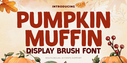 Hello Everyone, introduce our new product Font Pumpkin Muffin is a Display Brush Font.This is a Textured Natural Style and classy style with a clear style and dramatic movement. This font Pumpkin Muffin is great for your next creative project such as logos, printed quotes, invitations, cards, product packaging, headers, Logotype, Letterhead, Poster, Design this font is great for your creative projects such as watermark on photography, and perfect for logos & branding, invitation,advertisements,product designs, stationery, wedding designs,label ,product packaging, special events or anything that need handwritting taste.
 - Luckystrikes by Kustomtype,
$25.00 Introducing Luckystrikes, a handwritten script-font inspired by a poor amount of characters in the 1950-style advertising of the well-known American cigarettes. Kustomtype redrew this font with a very clear and cool old-script style. This font is great for all your creative projects. Luckystrikes comes with uppercase, lowercase, numerals, punctuations in script so you can use it to customize all your designs. Perfect to use for Logos, Letterhead, Poster, Apparel Design, Package design, Label design etc. Luckystrikes is designed by Coert De Decker in 2018 and published by Kustomtype Font Foundry.
 - Informational Gothic JNL by Jeff Levine,
$29.00 The Wood-Regan Instruments Company (Wrico) of New Jersey manufactured for decades a line of lettering kits called the Wrico Sign Maker. With only special ink pens, plastic templates and a template guide anyone could letter clean, clear signs, posters and notices. Based on the same principles of architectural templates, the lettering was [for the most part] utilitarian and functional. Few templates were of stylized or decorative lettering. Informational Gothic JNL and its oblique version are based on the four inch high lettering templates from one of those kits.
 - ABC Dotted Tracing by Beast Designer,
$15.99 ABC Dotted Tracing Font is a user-friendly typeface designed specifically to aid in early childhood education and handwriting practice. Featuring clear, dotted outlines of each letter, this font serves as a guide for young learners as they trace and familiarize themselves with the alphabet. The dotted lines help children develop fine motor skills and hand-eye coordination while practicing proper letter formation. This font is often utilized in educational materials, worksheets, and apps aimed at supporting kids in mastering the fundamentals of writing in a fun and engaging way.
 - Heraklion by Andrew Sinn,
$14.50 Heraklion letters are drawn with their gravity in the metric vertical – instead of resting on a baseline, they dance acrobatically on a string. This allows for a more drastic variation among the glyphs, which no longer have a fixed x-height. In order to create a simplistic and mathematic character, shapes are constrained to circles and straigh lines. The design principles result in a playful expressive set that is surprisingly clear. “A choreography where the individual actors freedom of expression is enclosed in foundational rules that create interconnectivity and belonging.”
 - Aelita by ParaType,
$30.00 Aelita is a low contrast serif typeface in 6 styles. It's distinguished by lowercase character alternates that noticeably change the text pattern. The main character set is quite strict and is characterized by sharp and clear terminals and stiff junctions between stems and bowls. Alternates are more facile and calligraphic. Neutral design of the main character set makes the typeface suitable for scientific and literary texts. Alternates are ideally suited for science fiction, fantasy and art books. The typeface was designed by Natalia Vasilyeva and released by ParaType in 2014.
 - Picturebook by Andy Peat,
$12.00 About this font family Picturebook was made for very young readers and is ideal for creating simple words and sentences in picture books. Produced in three weights with very clear, distinct character shapes to aid early reading and learning. Features 3 weights; Regular, Medium and Bold Multi language support To be able to access alternative fonts, make sure the software you use can support opentype features such as Microsoft Word, Paint, Adobe, Corel draw, Cricut and other applications. Designed and published by Andy Peat. www.andypeat.com Released December 2023
 - Alphonse by RagamKata,
$16.00 Alphonse Script Font exudes charm with its distinctive letter details. Crafted with a bold yet modern style, this font presents characters that are not just clear but also invite the eye to explore the beauty of its typography. With available alternate swash accents, each word comes alive, allowing users to express their creativity in an elegant and captivating manner. This font is good for logo design, Social media, Movie Titles, Books Titles, a short text even a long text letter and good for your secondary text font with sans or serif.
 - Mantab by Gassstype,
$23.00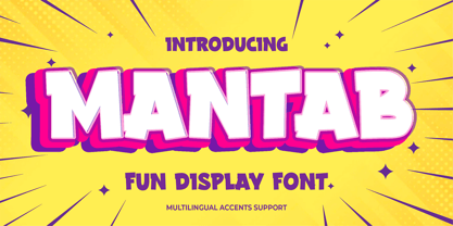 Hello Everyone, introduce our new product Font MANTAB is a Fun Display Font.This is a Textured Natural Style and classy style with a clear style and dramatic movement. This font MANTAB is great for your next creative project such as logos, printed quotes, invitations, cards, product packaging, headers, Logotype, Letterhead, Poster, Design this font is great for your creative projects such as watermark on photography, and perfect for logos & branding, invitation,advertisements,product designs, stationery, wedding designs,label ,product packaging, special events or anything that need handwritting taste.
 - Lorenza by Almarkha Type,
$25.00 LORENZA Elegant Sans Family Our latest product inspired by the famous logo is simple but classy, made with precision and measured. very good for combining your design work with a clear line and a circle with several different weights that are very comfortable in the design area you are easy to read and as a title on a blog or magazine page LORENZA Elegant Sans Family has symbols and punctuation and unique alternative letters perfect for logos & branding, photography, invitation, watermark, advertisements,product designs, stationery, wedding designs,label , and product packaging.
 - Hadsai by Jipatype,
$25.00 ฟอนต์ หาดทราย ลักษณะกลมมน เส้น Stem มีความหนาแตกต่างกันสองขนาด หนา-บาง ไม่เท่ากัน การเดินเส้นเลียนแบบลายมือ มาพร้อมกับฟีเจอร์ dlig ที่เปิดใช้งานแล้วจะยกตัวอักษรลำดับที่สองให้สูงขึ้นเล็กน้อยสลับกันเป็นฟันปลา เหมือนคลื่นเล็ก ๆ บนผิวน้ำ ให้ความรู้สึกเป็นมิตร น่ารักใสๆ มีไดนามิค สนุกสนาน ไม่เป็นทางการ เหมาะสำหรับการผาดหัว โปรยประโยคข้อความสั่น ๆ มีให้เลือกใช้ 9 น้ำหนัก ทั้งตัวตรงและตัวเอียงรวมเป็น 18 สไตล์ - Hadsai, rounded shape, stem lines are of two different thicknesses, look like handwriting. It comes with a dlig feature that is enabled to raise the letter to zigzag. Like a wave on the surface of the sea water, it feels friendly, cute, clear, dynamic, fun, casual. Suitable for headline and sub-headline. Available in 9 weights, both upright and italic, total of 18 styles.
 - GHEA Granshan by Edik Ghabuzyan,
$40.00 GHEA Granshan is a super font family. It has 9 upright weights and their Italics. It supports Latin Pro, Armenian, Greek, Cyrillic, Bulgarian & Ukrainian alternatives alphabet systems. The weights from Regular to Bold and their Italics can be used as text fonts. The weights thinner than Regular and thicker than Bold can be used as Display fonts. It is an easily readable fond and the eyes don't get tired while reading. GHEA Granshan has a slight contrast style and at the same time is quite bright and clear.
 - New Letter Gothic by ParaType,
$30.00 New Letter Gothic was designed for ParaType by Gayaneh Bagdasaryan based on monospaced Letter Gothic font by Roger Roberson, 1956–62. Due to clear and easy-to-read lettershapes of Letter Gothic the font is rather popular now for display and advertising matters. The idea was to create a font similar to Letter Gothic in lettershapes but with proportional widths of letters. For use in both display and text setting. New Letter Gothic has been adjudged an Award for Excellence in Type Design at Kyrillitsa ’99 International Type Design competition in Moscow, 1999.
 - Gerbera by Brownfox,
$44.99 Gerbera is a new sans-serif with a distinct personality that fuses geometric and organic elements. It is at once hip and quaint, clear yet idiosyncratic, restrained but sensual. Its deliberately varied classical capital proportions and geometric structure are balanced by slightly reversed stress and pinched terminals on curved strokes. This versatile font comes in five weights with their italics and offers a variety of Open Type features, including small caps, alternate characters and punctuation, five sets of figures, and CE, Baltic, and Cyrillic support. Designed by Gayaneh Bagdasaryan & Vyacheslav Kirilenko, 2014-2022.
 - Archivo by Scholtz Fonts,
$19.00 Is it calligraphic? Is it handwritten? Something like a fusion - casual, handwritten and calligraphic! My aim was to bring calligraphy into the 21st century, creating a present day version of a calligraphic script. Archivo is clear, legible and extremely versatile. It can be funky and modern, pretty and feminine, serious and old-style. Use it for posters, marketing material, invitations, greeting cards, cosmetic and clothing media. Archivo has standard OpenType features, and language support includes all European character sets. We recommend that you do not use Archivo as an "all-caps" font.
 - Fruitos by Fenotype,
$25.00 Fruitos is a funky font family with loads of interlocking ligatures. Fruitos is great for packaging, posters or any display use. Fruitos is divided into two families: Fruitos R (regular) is bouncy and has wider “serifs” whereas Fruitos S (straight) makes clear blocks and has straight forms. Both versions have a standard fill version, an Inline version and a Line version that can be used together with the standard version for colourful inline. Fruitos also has an underlined Titling Alternates for every basic character. Try Titling Alternates to spice up your words!
 - Deloire by Almarkha Type,
$29.00 Deloire Modern & Luxury Sans Family Our latest product inspired by the famous logo is simple but classy, made with precision and measured. very good for combining your design work with a clear line and a circle with several different weights that are very comfortable in the design area you are easy to read and as a title on a blog or magazine page. Deloire has symbols and punctuation and unique alternative letters perfect for logos & branding, photography, invitation, watermark, advertisements,product designs, stationery, wedding designs,label ,product packaging.
 - Santai by Gassstype,
$23.00 Hello Everyone, introduce our new product Font SANTAI is a Fun Display Font .This is a Textured Natural Style and classy style with a clear style and dramatic movement. This font SANTAI is great for your next creative project such as logos, printed quotes, invitations, cards, product packaging, headers, Logotype, Letterhead, Poster, Design this font is great for your creative projects such as watermark on photography, stationery, wedding designs,label ,product packaging, special events or anything that need handwritting taste. That is has charming, authentic and relaxed characteristic more natural look to your text.
 - Larch by Mans Greback,
$29.00 Larch is a clear and crisp high quality script typeface. It consists of five weights: White, Bright, Shaded, Dark & Black. Each style is working great separately, but they make the perfect combination together. Larch is designed by Måns Grebäck in 2016. The font supports hundreds of languages. It contains contextual and stylistic alternates, swashes and ligatures. Write # after any lowercase letter to make swashes! You can also write % after the following letters to make left swashes: b d f h i j k l t Example: Black% Lar#ch
 - Magic Daisy by Supfonts,
$10.00 Hello, friends. I keep experimenting with handwritten fonts, shapes and lines. I want the font to set the tone, the atmosphere, look defiant, and read well. Try my new font, I think it combines all these qualities. Simple and clear, looks at ease. It is perfect for decoration or design where you don't need strict style :) Test it out below to see how it could look for your next project! Includes: Uppercase and lowercase Numbers and punctuation Foreign language support Ligatures Check out my blog: https://www.instagram.com/zloillev pinterest.com/dmitriychirkov7 Enjoy
 - Saki by Thinkdust,
$10.00 Saki is big and bold, presenting messages in an easy to understand, pleasant to read manner. Simple straight edges, shallow curves and sans-serif, Saki was created with legibility and minimalism in mind and its thick weight gives it great scalability. It is admirable for maintaining such close attention to form, each character fitting neatly into the space provided and slotting together smoothly for undistracted reading. For use in headlines and similar large text, Saki is the font you need to get your message across loud and clear, no ifs, ands or buts.
 - Barefoot by Ingrimayne Type,
$14.95 Suppose you were at a sandy beach and you wanted to write a message by making footprints in the sand. You might end up with letters much like those in Barefoot, a typeface made with bare feet. It is all caps but most of the letters on the lower-case keys differ from those on the upper-case keys. It looks best at large point sizes where the details of the feet are clear. It comes with a large assortment of accented letters to support most European languages.
 - Donna Lena by Eurotypo,
$39.00 Donna Lena is a chancery cursive, feminine in character. Elegant and timeless, this font marks the return of the classical canons of the Renaissance thanks to its open forms and the clear-cut ends, while recalls the graceful ways and the intense gaze of the ladies that populate the Florentine paintings in the sixteenth century. Donna Lena is soft and slightly inclined, with a fast ductus and marked contrasts in thickness to highlight the gesture. Different stylistic variations and ligatures are considered to make the most of the many OpenType features.
 - Bayoneta Pro by Sudtipos,
$39.00 Bayoneta is not your usual handcut alphabet, though it can seem so. It can also seem like carefully constructed lettering inspired by Polynesian cultures. By bridging that gap between knife-wielding kitsch and studied display lettering, Bayoneta offers quite a various range of theme possibilities. Its clear and attractive shapes can provide the eye-catching spontaneity on a book cover, the expressive shout on a skateboard or a muscle shirt, the mouth-watering brand on a protein bar package, or the main notice on a theme park ride sign.
 - Ye Paradigma by Yinon Ezra,
$30.00 Sans-serif, with clean and fresh Character. "Ye Paradigma" has been established in order to keep its forms as simple as possible - without losing the unique character of each letter, and without simplifying too much. The process was gradual, like the ripening of a sauce that leaves it to be reduced to strengthen flavors, so the letters ripened while reducing unnecessary details, until the taste became more concentrated and uniform. The result is a clean, fresh, remarkably useful 24 fonts typeface, with a clear and stable graphic language.
 - Revoxa by Almarkha Type,
$29.00 Revoxa – Modern Sans, Display Sans made specifically developed for contemporary design styles, made with three styles; Regular- Cut – line. These styles have been carefully designed to coat each other, creating an alternative third style. This feature allows you to adjust opacity and blending modes and different color settings, giving various possible results. very good for combining your design work with a clear line and a circle with several different weights that are very comfortable in the design area you are easy to read and as a title on a blog or magazine page
 - Romes by PeachCreme,
$16.00 Hi, peaches! Glad to introduce to you our latest “Romes” font duo that combines classy serif and cute script fonts. The exquisite curves of the serif font and natural beautiful flow of the script font can give your projects a voguish and elegant touch! Romes Script is a lovely and at the same time clear and easy-to-read handwriting font. Romes is a moderately bold font that blends traditional influences into a contemporary aesthetic. This font duo works well for branding, weddings, social media, product design, stationery, advertising, and many more.
 - Acello by Craft Supply Co,
$20.00 Acello – Geometric Sans Serif Font Modern Simplicity Acello, the Geometric Sans- serif font, effortlessly infuses modern simplicity into your display designs. Clean lines and a sleek aesthetic captivate your audience, ensuring a contemporary appeal. Versatile Elegance Crafted for diverse display purposes, Acello seamlessly adapts, adding a touch of versatile elegance to logos, headlines, and more. Its adaptability ensures a refined look for any visual project. Readability Redefined Prioritizing clarity, Acello’s balanced proportions enhance readability. Each character is meticulously crafted for optimal legibility, ensuring your message is clear and accessible to all.
 - Linotype Pide Nashi by Linotype,
$29.99Linotype Pide Nashi is part of the Take Type Library, chosen from the entries of the Linotype-sponsored International Digital Type Design Contests of 1994 and 1997. German artist Verena Gerlach created a typeface which looks almost like Arabic at the first glance, only with the second do the familiar forms become clear. Rounded lower case letters, generous, sweeping capitals and diamond-shaped ornaments give the font its Arabic feel. The exotic Linotype Pide Nashi is best suited for short and middle length texts and headlines and especially for ornamental texts. - Haboro Slab Soft by insigne,
$32.99 Haboro Slab Soft is a scion of the Haboro hyperfamily. This concept powers through with its well built, accommodating nature. Haboro Slab Soft’s serifs are rounded, giving it a softer look. The Haboro hyperfamily is a comprehensive design suite that provides solutions for many projects. The iconic angled wedge makes this family ideal for apparel, packaging, apps, corporate identities and advertising campaigns. Subfamilies in the hyperfamily include the original Haboro, a Didone face, Haboro Sans, Serif, Soft, and Slab. The Haboro hyperfamily is known for its ability to make your copy appear clear and simple. The Haboro typeface is built on a common underlying model. It has the same cap height, the same x-height, and the same basic character shape. This unification of shape and proportion results in a complementary set of typefaces. Haboro Slab Soft’s wide variety of ligatures and OpenType alternatives give your message the clarity it deserves. The Haboro Slab Soft family includes seven weights, from Thin to ExBold, three widths, and matching italics. There are over 550 glyphs per style and support for over 70 Latin-based languages. Haboro Slab Soft includes features such as small caps, ligatures, fractions, and alternatives. Haboro Slab Soft is there when you need to present information in a clear and friendly fashion.
 - Lafemme Vibe by Jolicia Type,
$27.00 LaFemme Vibe is a conceptual serif font that exudes a modern and elegant aesthetic, tailored specifically for women. Featuring uppercase characters with distinctive curly signatures, LaFemme Vibe combines the following elements to create a unique visual experience: Classy Serifs: LaFemme Vibe boasts serif characters with soft, graceful serifs that add an element of sophistication to each letterform. Asymmetrical Charm: This font is intentionally imperfect in its symmetry, as if crafted by a gentle, artistic hand. It radiates an inviting and charming quality. Curly Signature Flourish: The curly, signature-like embellishments that adorn the letterforms in LaFemme Vibe infuse a personal and artistic touch. This imparts the sense that each word written with this font is a unique work of art. Modern Harmony: Despite its classical elements, LaFemme Vibe maintains a modern sense of harmony. The letters appear assertive yet gentle, making it perfectly suited for contemporary women seeking timeless elegance. Elegance and Chic: LaFemme Vibe embraces an elegant and chic aesthetic that is particularly fitting for products or designs targeted towards women who aspire to exude luxury and style. LaFemme Vibe is a typographic masterpiece created to bring a modern and elegant sensibility to women who appreciate beauty in every detail. It’s a font that effortlessly blends classic charm with contemporary allure, making it an ideal choice for a wide range of design projects aimed at celebrating the essence of femininity.
 - Eveningnews by Wiescher Design,
$39.50 Since many years I live in Munich and read the daily newspaper Abendzeitung. One morning they had redesigned the paper, using Eric Gill's Joanna for the body copy and a tweaked version of Franklin Gothic for the headlines. Since both typefaces are my all-time favorites, I was very pleased. The old hand-lettered title lettering designed by in-house designer Ernst Friedrich Adler around 1947 or 48 was untouched as it always was. Adler had worked for the newspaper an incredible 47 years! Ernst Friedrich Adler celebrated his 100th birthday in the summer of 2007 looking very healthy. But someone had adapted his title lettering for use in the chapter headings, and I did not like the way that was done. Every morning I saw those letters and thought "one day I have to clean that up". About 15 years later I finally did it! Being at it, I designed the whole typeface and added a second fancy cut. And, what do you know, the people at the Abendzeitung called me up and said they liked what I did and started using it. So since that day in 2005 I can read my morning paper without having to wonder about the chapter headings. Well maybe one day they will do another redesign and maybe they will use another one of my fonts. Your editorial typeface designer, Gert
 - Sisters by Type-Ø-Tones,
$40.00 Sisters is a lively set of stencil display typefaces designed by Type-Ø-Tones’ co-founder Laura Meseguer. The family features four fresh fonts that share foundational principles of construction yet complement each other—as sisters do—by celebrating their differences. Variations in contrast, weight, and design characteristics result in four distinct styles dubbed One through Four. This cool quartet contains no lowercase, asserting the family’s rightful place in the titling typography space. Like many Type-Ø-Tones typefaces, Sisters was conceived as a custom lettering project—in this case, the design was crafted for the identity of an art exhibition. Laura initially drew only the limited character set the show required, but from the outset, she saw great potential for a fully developed type family based on her lettering concept. The first member of Laura’s new family was, naturally, Sisters One. She later added contrast to produce Sisters Two, then equalized the weight of Sisters Two to create Sisters Three. To round out the group, Laura added a deco touch to Sisters Two, resulting in the festive but retro-elegant Sisters Four. Each Sister shares DNA with the other members of the family, just as human siblings do :). Credit for the Sisters name goes to Eider Corral and we couldn’t imagine a more fitting moniker for this little family.
 - Artusi by Zetafonts,
$39.00 Pellegrino Artusi was a celebrated Italian food writer, who is credited with the creation of one of the most influential cookbooks in the history of Italian cuisine. Taking inspiration from his legacy, Francesco Canovaro decided to work on a typographic homage to the delicacy and finesse of Italian traditional cuisine. Aptly named Artusi, the typeface is an enchanting combination of traditional Italian style, contemporary refinement and a playful touch of innovation. It is a transitional serif typeface with both text and display versions, developed on a wide range of seven weights and including a huge range of alternates, OpenType features and ligatures. Each weight of Artusi works like a different course in a balanced meal. Lighter weights are our starters, with their high contrast between thicks and thins, delicate curves, balanced proportions and subtle spiky serifs. The main course are naturally the regular and bold weights, where traditional Italian old style is enriched with a peppery kick of modern details. For dessert, the heavy weights offer luscious curves, opulent calligraphic swashes and eye-catching details, suitable for packaging and logos. When it comes to typography, let Pellegrino Artusi’s legacy inspire you. From packaging to web pages, Artusi typeface will bring a feeling of tradition, craft and quality to any project. Because, as Pellegrino would say, “To make a great impression, you have to choose the finest ingredients”... Buon Appetito!
 - ALS SyysScript by Art. Lebedev Studio,
$63.00 Handwriting of a strong Carelian personality revived: It’s autumn time once again, harvesting season, mushroom & berry time – the favourite season of my Karelian aunt Katri. A postcard she sent me more than twenty years ago had inspired me to SyysScript, “Script of Autumn” in Finnish. Katri had a very kind but also energetic personality, and I always thought her handwriting was a mirror of it. By making SyysScript I felt I could revive some of her unforgettable character. My Finnish autumn font has by now become a favourite for many and is branding fine food in both the Eastern and the Western hemisphere – even far beyond the arctic circle. “SyysScript“ is actually a growing family. For enhanced functionality in small sizes I added “SyysScript Eco” a year ago, a style with shortened extensions and simplified letterforms especially suited for packaging. And this autumn, a special one for Finland which is celebrating its 99th birthday, SyysScript grew again: Two long awaited newcomers, “SyysScript FeltTip” and “SyysScript FeltTip Eco” joined the family. They are bolder and softer than the previous styles but keep their positive, lighthearted feel. Use them to make a powerful individual mark on any background. – They are equally well suited for paper, packaging, a screen or even a concrete wall! Language support: Western and Central European, Extended Cyrillic.
 - Astrum Heart by Fontex,
$45.00 Astrum Heart is a very decorative script font using elegant caligraphic handwritten letters, that are all mutually interconnected, creating a unique look & feel of a personalized human handwritting. It’s clean and prefined lines makes Astrum Heart very appealing and modern, although it being very classical in it’s core essence. Capital letters are projected in a way to contain a stylized heart in it’s construction. Heart, as a symbol of love, makes this font unique for writting love letters, Valentine Day postcards, wedding invitations, etc. Idea for the creation of this font had originally came up from the need to create a beautiful design for Saint Valentine’s Day, but none of the existing fonts cut it - so I decided to create a new and unique typeface to fill this need. Letters and other characters are recognizeable by prefined ornaments, incorporated in a very subtle way. Whitespace between capital letters, lower-case letters, numbers and other characters are done in a way to minimize the need for kerning. Font Astrum Heart, besides being a celebration of class and exclusivity, is a very luxurious and elegant handwritten font. Words consisting of lower-case letters have the possibility of being decorated by adding a small heart at the beginning, anywhere between the letters, or at the end of the word. Character set for this font contains all western and central-european latin characters.
 - Rusty Forest by Mans Greback,
$69.00 Rusty Forest is a typeface that takes you back to the days of golden design, when travel and adventure were celebrated in striking posters. This font's rustic appearance, created by its brush-style strokes, evokes images of a cabin in the woods, surrounded by the beauty of nature. It's as if you can smell the campfire smoke and hear the rustling of leaves in the wind. This font is perfect for designers looking to add a touch of vintage charm to their projects, whether it be a poster for a national park or a logo for a wilderness-themed brand. Its 1950s-inspired style will transport viewers back in time to a simpler era, where the call of the wild was all one needed to feel free. The Rusty Forest family includes Bold, Italic, Bold Italic, and Regular, offer a range of options to suit different design needs. The font is built with advanced OpenType functionality and has a guaranteed top-notch quality, containing stylistic and contextual alternates, ligatures and more features; all to give you full control and customizability. It has extensive lingual support, covering all Latin-based languages, from Northern Europe to South Africa, from America to South-East Asia. It contains all characters and symbols you'll ever need, including all punctuation and numbers.
 - Geminian by Sudtipos,
$49.00 Geminian is a set of fonts that started as a simple idea based on a theoretical level and developed during a long time, to be able to take shape under a creative impulse inspired by the need to communicate, today more than ever. From an astrological point of view, it celebrates and contributes to this practice, the study of stars position and movement and their influence on people's destiny. As a good Gemini, this set revives the main features of the opposite twins sign. Gemini is associated with thoughts, creativity, and communication. Its ruler Mercury (Hermes for the ancient Greeks), messenger of the Gods, and spokesman of the divine word, gives the natives of this sign intelligence, wit, eloquence and poetry. Geminian aims to be a medium to carry different messages from one end to the other. And this is because when using words, Geminis always surprise. Thanks to this gitf (and language and communication), they are able to bring up the most ingenious ideas, to solve any problem and to contribute new perspectives. These qualities may be the secret of its magnetism. The Geminian set comes in 5 styles including a script with multiple ligatures and alternates, 3 sets of caps and dingbats. In addition the complete font family supports a wide variety of Latin alphabet-based languages.